Library blocks
Neutral, production-ready section blocks from the System theme, organized by category and ready for any Blockstudio project.
Collage
AboutPhoto collage of team, office, events.
Culture
AboutCulture section with photos and description.
Founder
AboutFounder spotlight with photo, bio, and quote.
Hero
AboutCompany hero with mission statement and large photo.
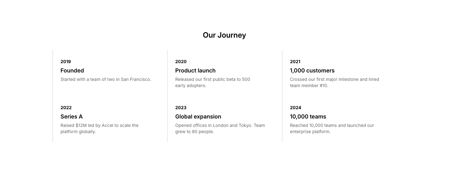
History
AboutCompany history timeline with milestones.
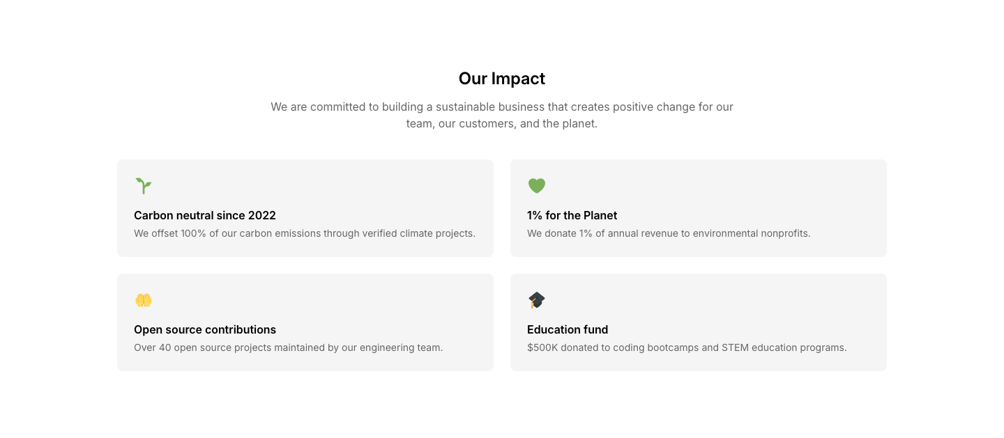
Impact
AboutSocial impact and sustainability section with stats.

Investors
AboutInvestor logos with funding round info.
Location
AboutOffice photo with address and map.
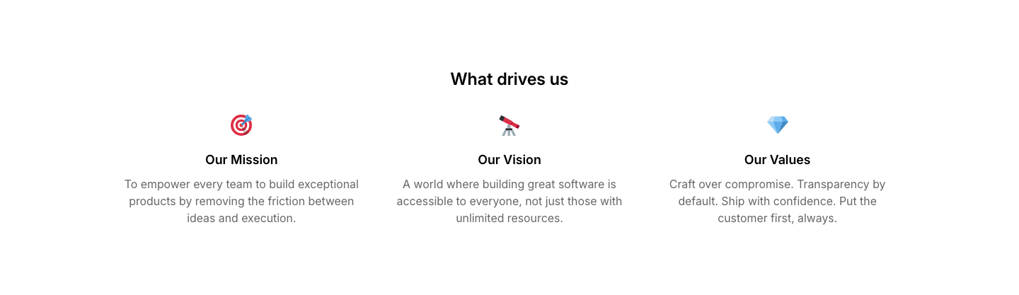
Mission
AboutMission, vision, and values in three columns.

Partners
AboutStrategic partners section with logos and descriptions.

Press
AboutPress mentions with publication logos and quotes.
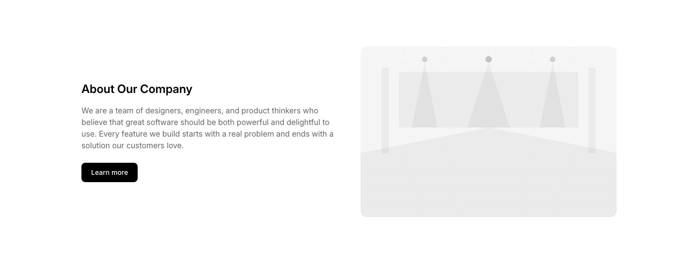
Split
AboutTwo columns: company info left, photo right.
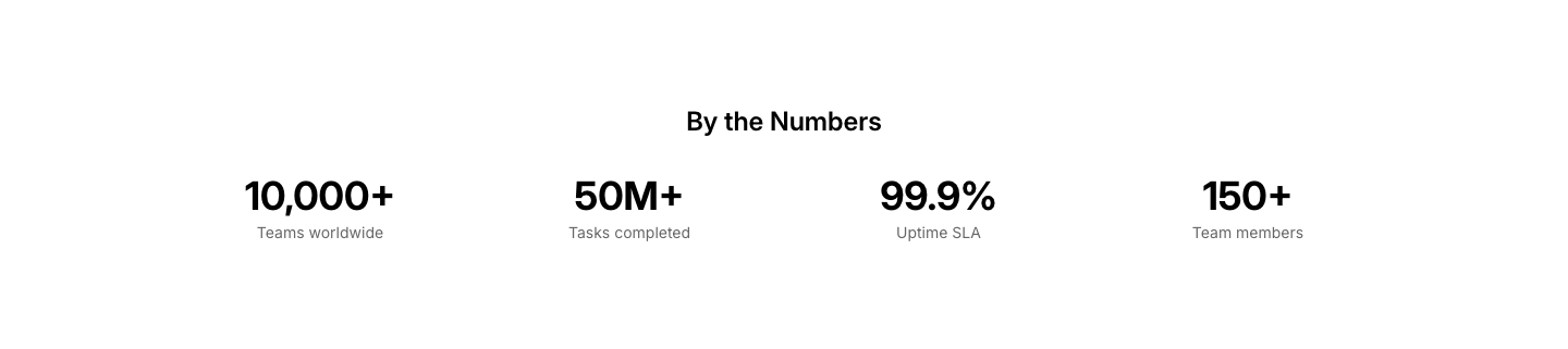
Stats
AboutCompany stats (employees, customers, revenue) in a row.
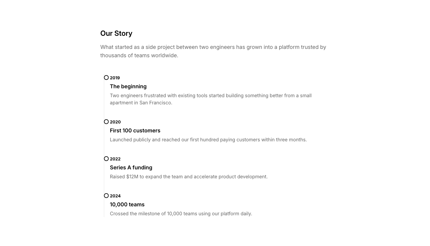
Story
AboutFounding story with timeline and narrative text.
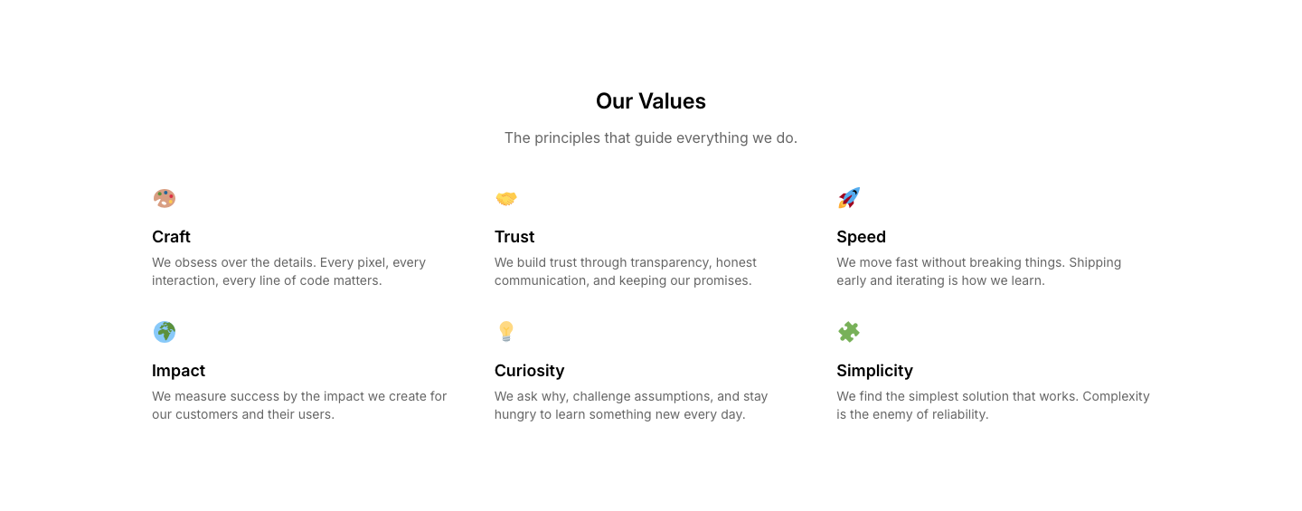
Values
AboutGrid of company values with icons and descriptions.
Video
AboutAbout video with company overview.
Awards
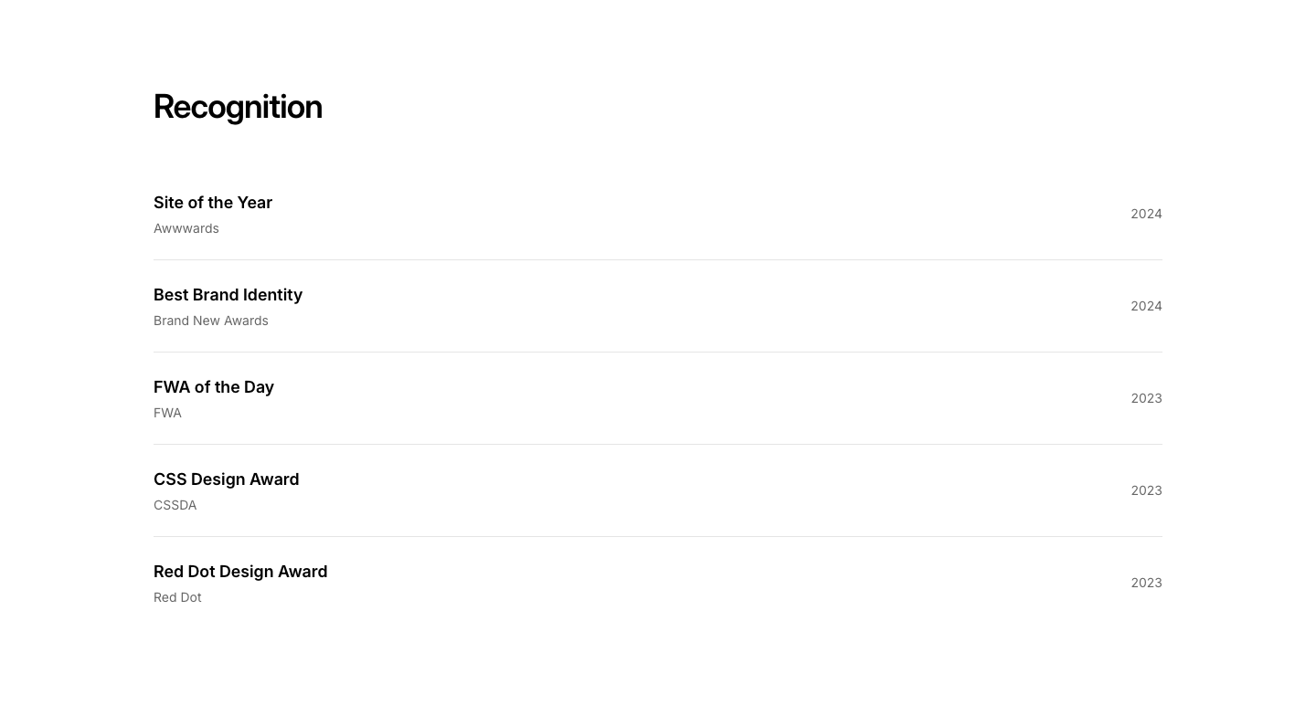
AgencyAgency awards and recognition section.
Case Study
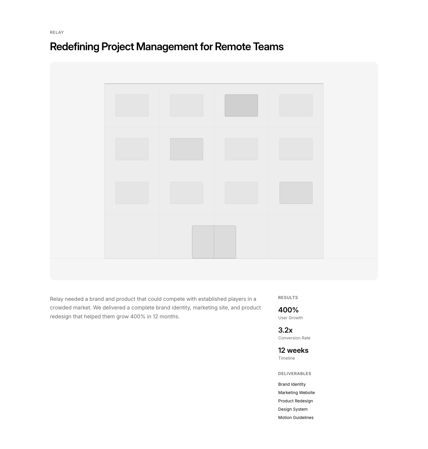
AgencyDetailed case study with metrics and deliverables.
Clients
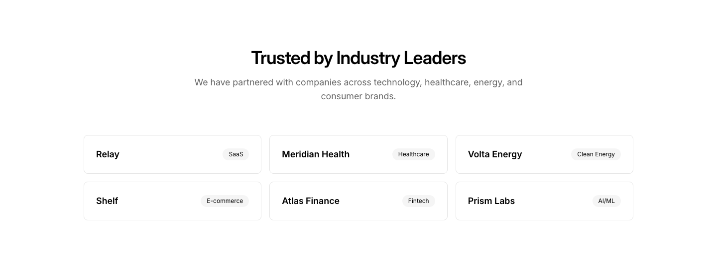
AgencyClient list with logos and industry tags.
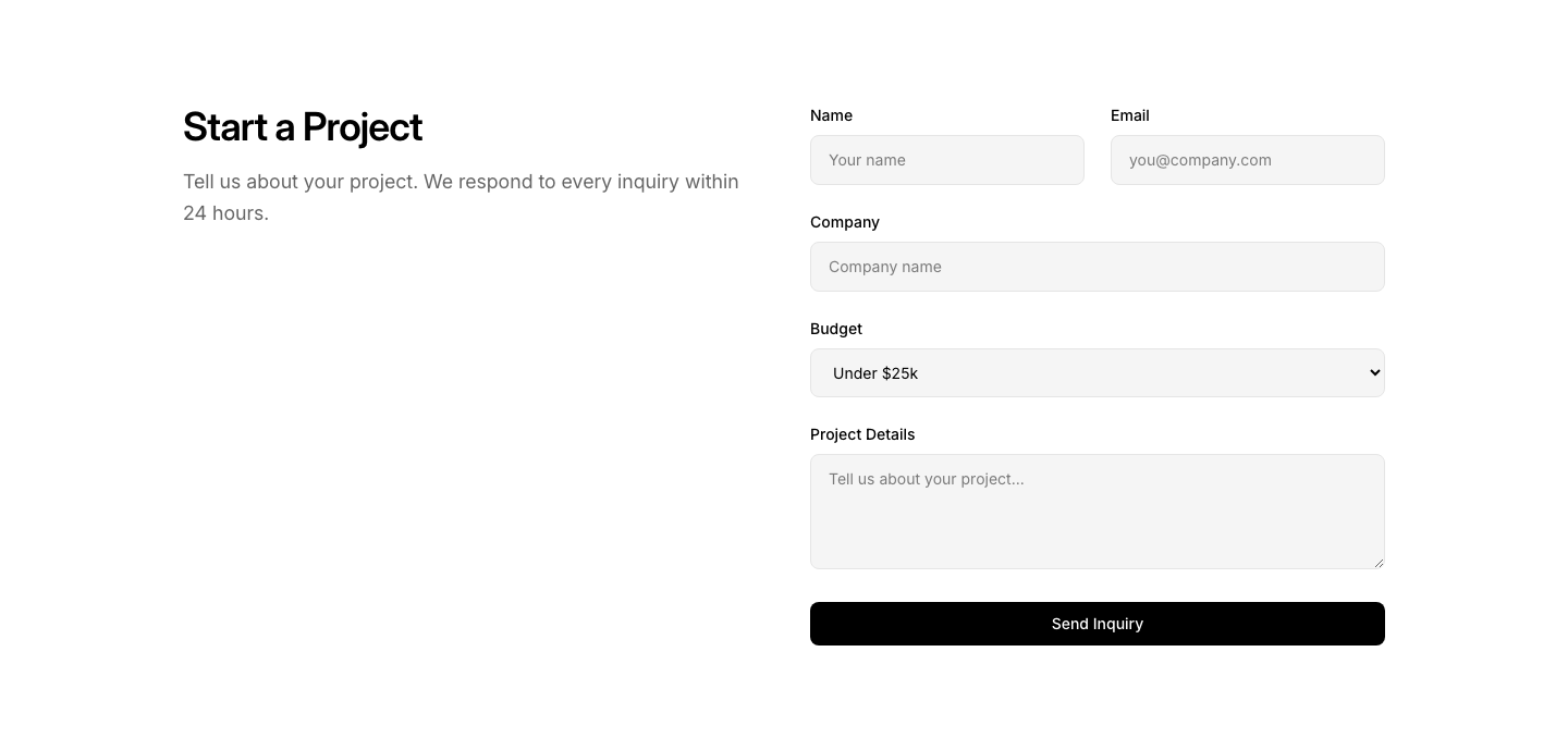
Contact
AgencyProject inquiry form with budget and timeline fields.
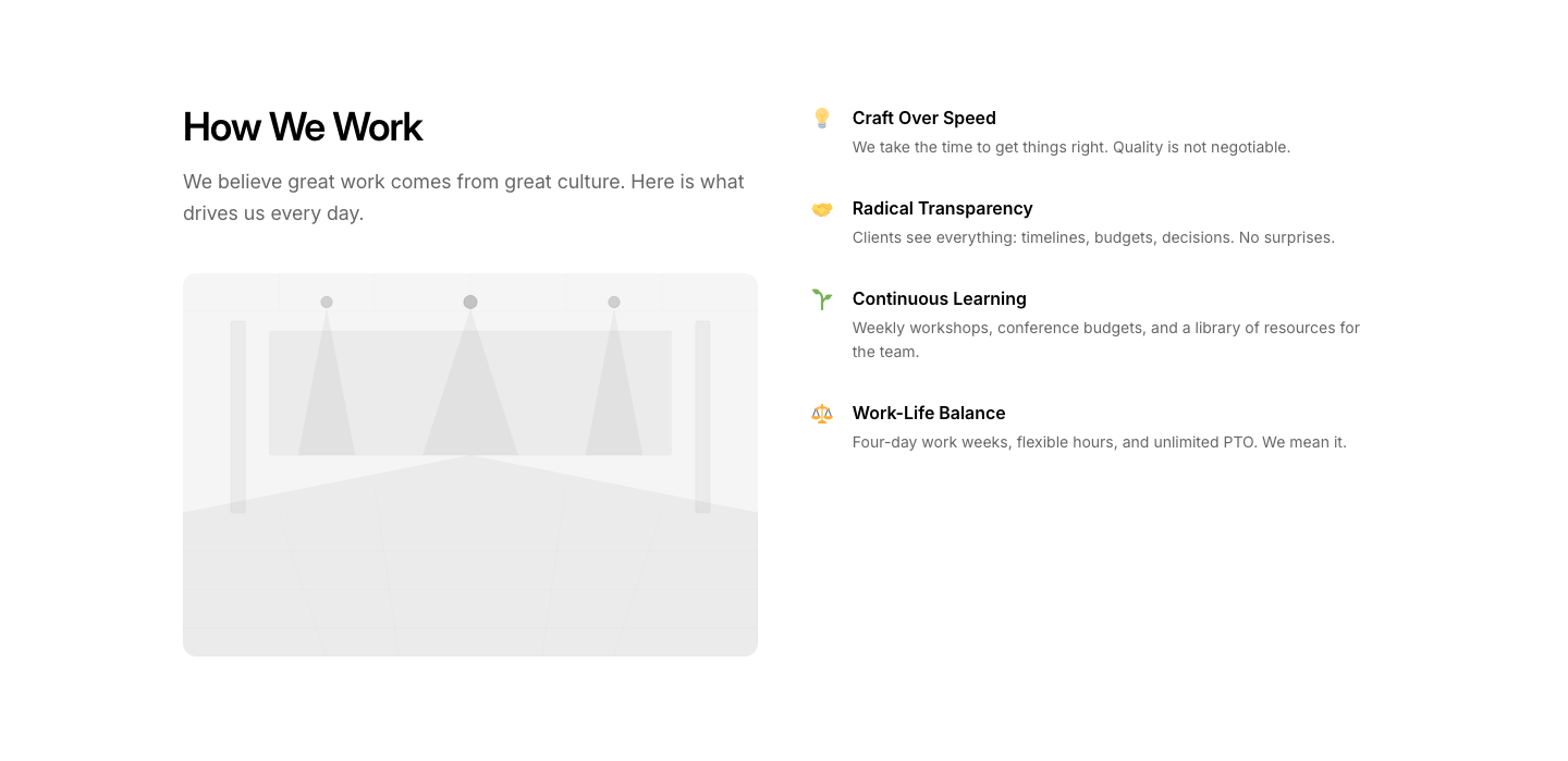
Culture
AgencyAgency culture section with office photos and values.
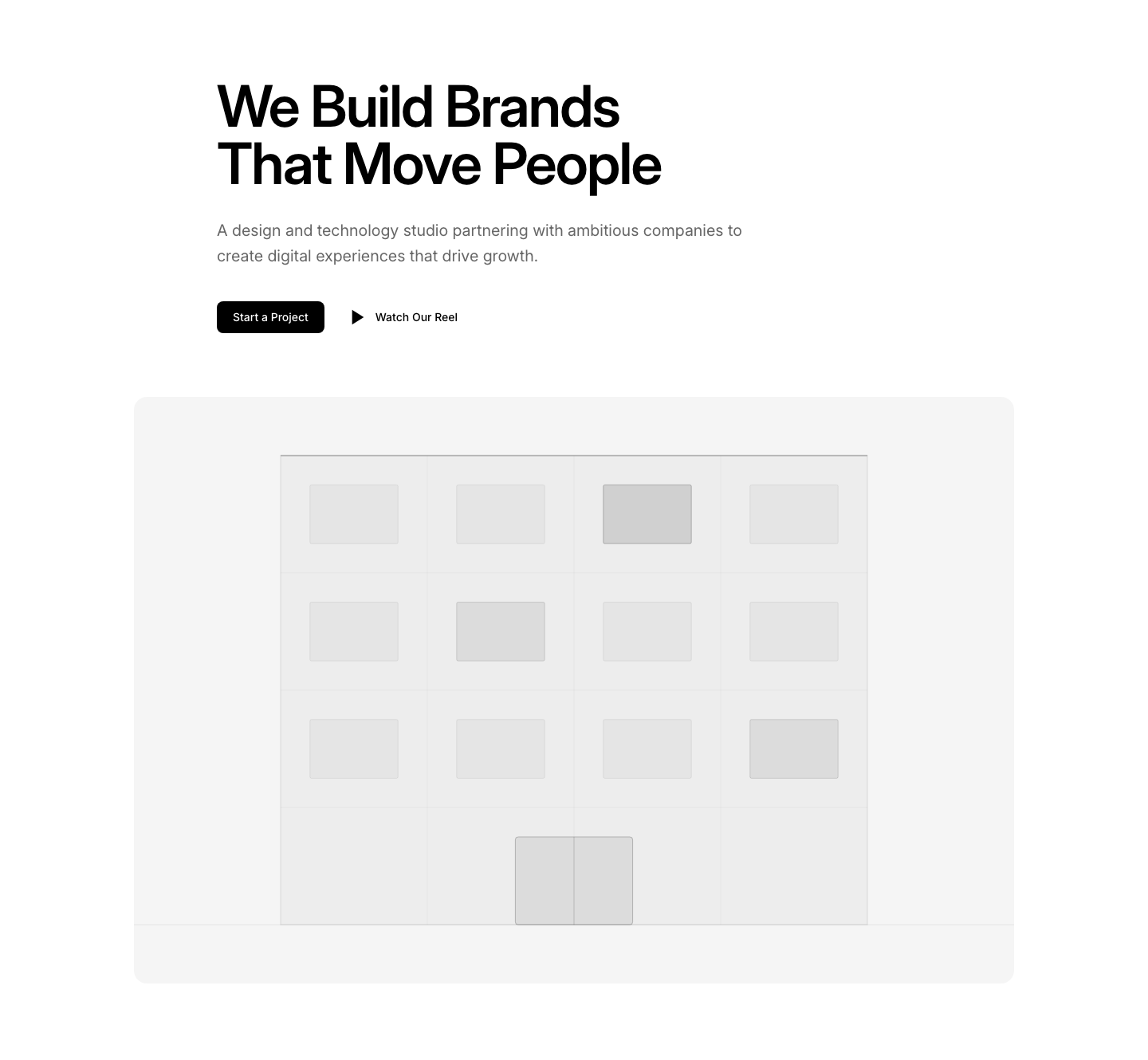
Hero
AgencyAgency hero with bold statement and portfolio reel.
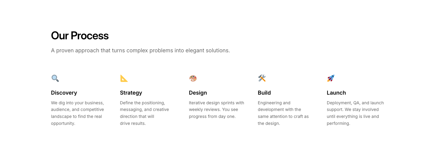
Process
AgencyCreative process steps from brief to delivery.
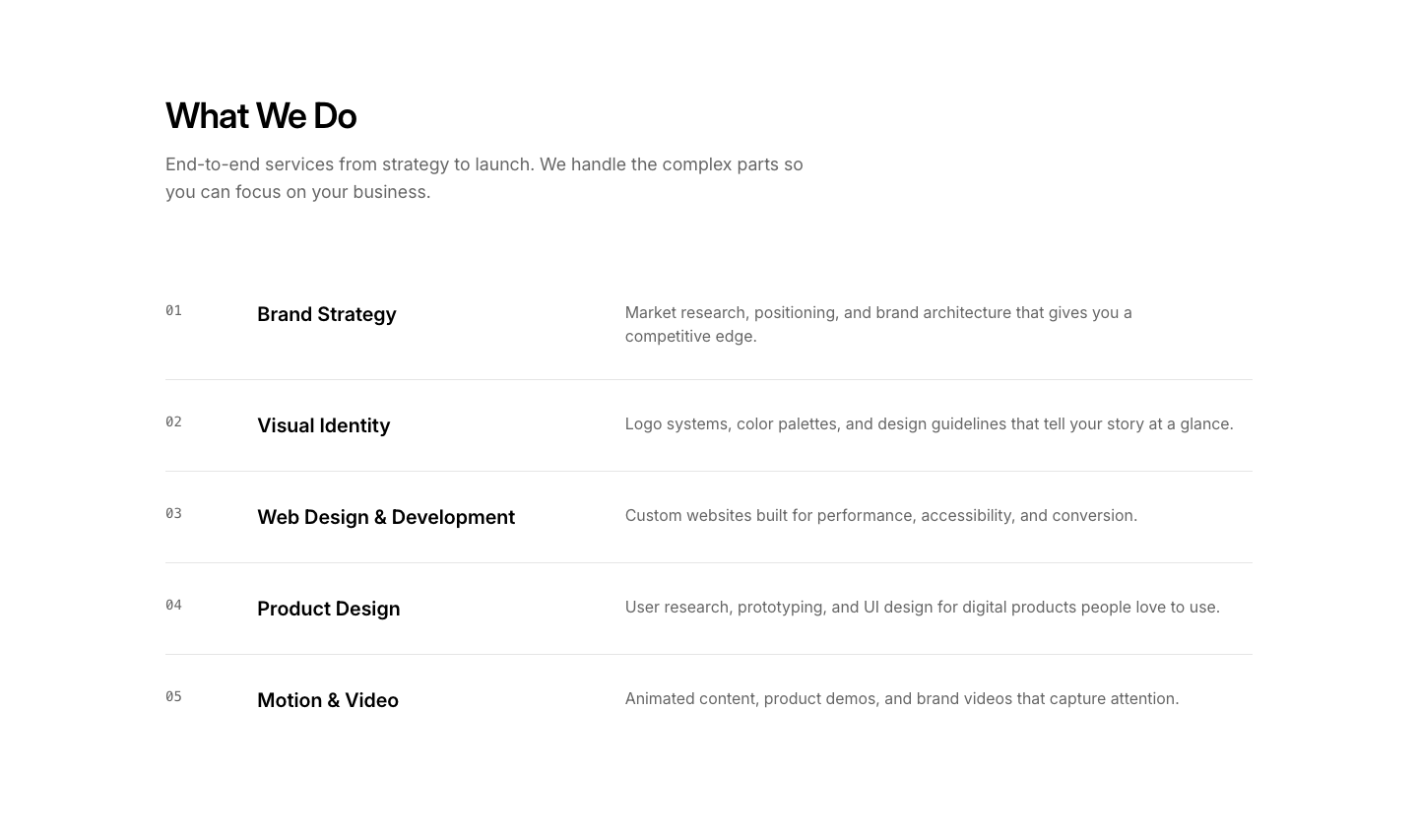
Services
AgencyService offerings with creative descriptions.
Team
AgencyTeam section with creative role titles.
Work
AgencySelected work showcase with project cards.

Banner
AlertFull-width alert banner with icon, message, and dismiss button.

Callout
AlertProminent callout box with icon, heading, description, and link.

Floating
AlertFloating alert card with icon, title, description, and action buttons.

Inline
AlertInline alert with colored left border, heading, and description.
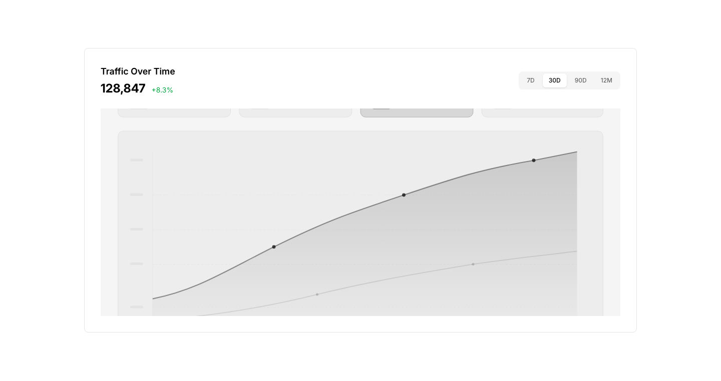
Chart
AnalyticsLarge chart panel with time range selector.
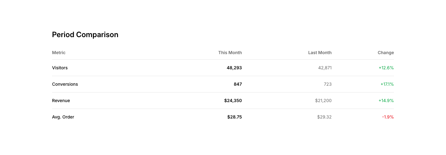
Compare
AnalyticsPeriod comparison: this month vs last month metrics.
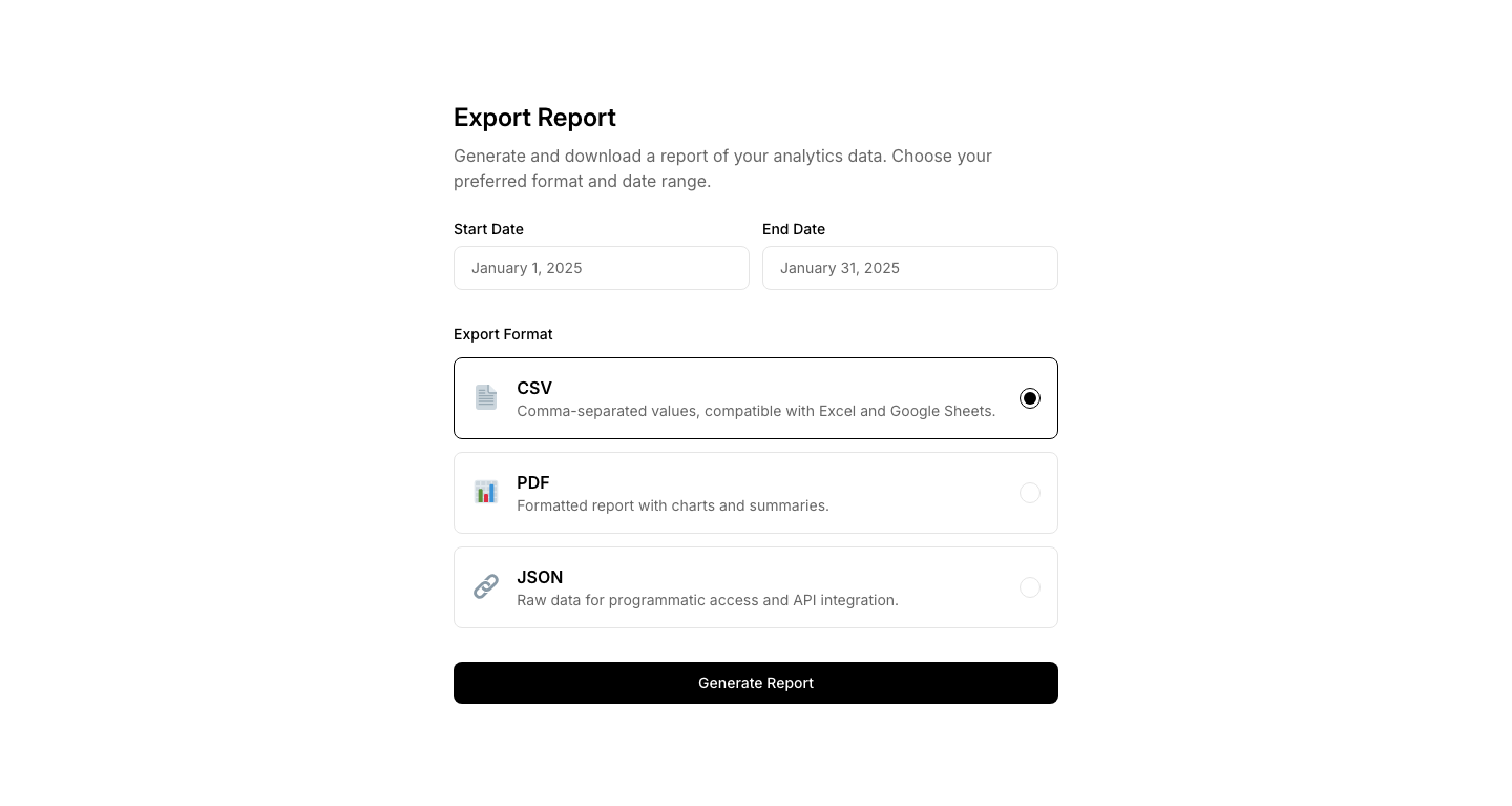
Export
AnalyticsReport export section with format and date range options.
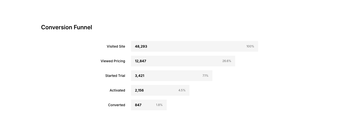
Funnel
AnalyticsConversion funnel visualization with stage percentages.
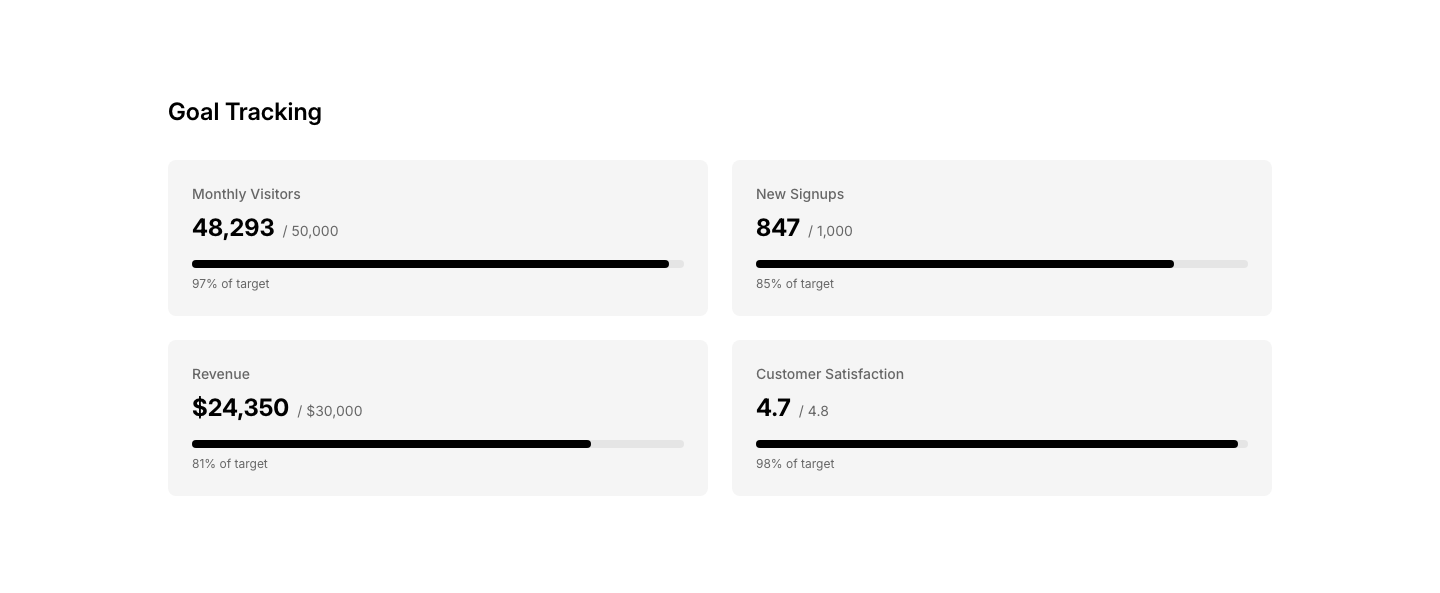
Goal
AnalyticsGoal tracking dashboard with progress toward targets.
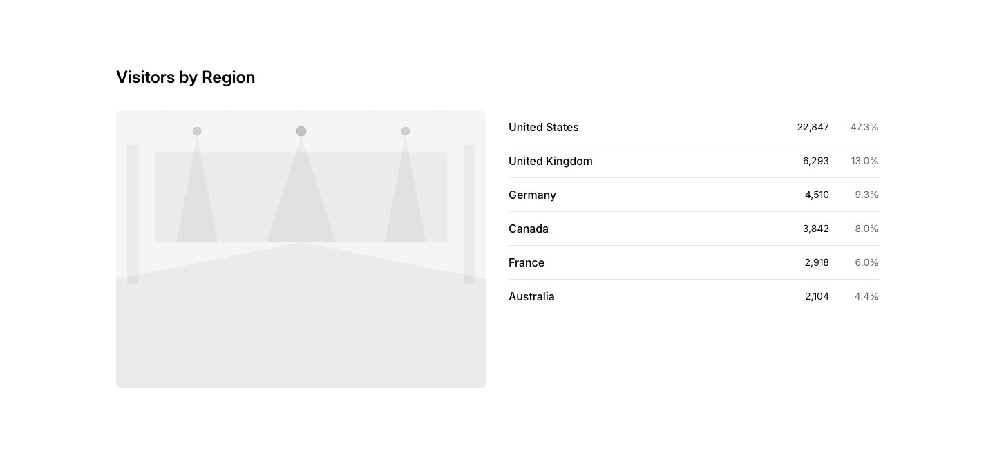
Map
AnalyticsGeographic analytics map with regional data.
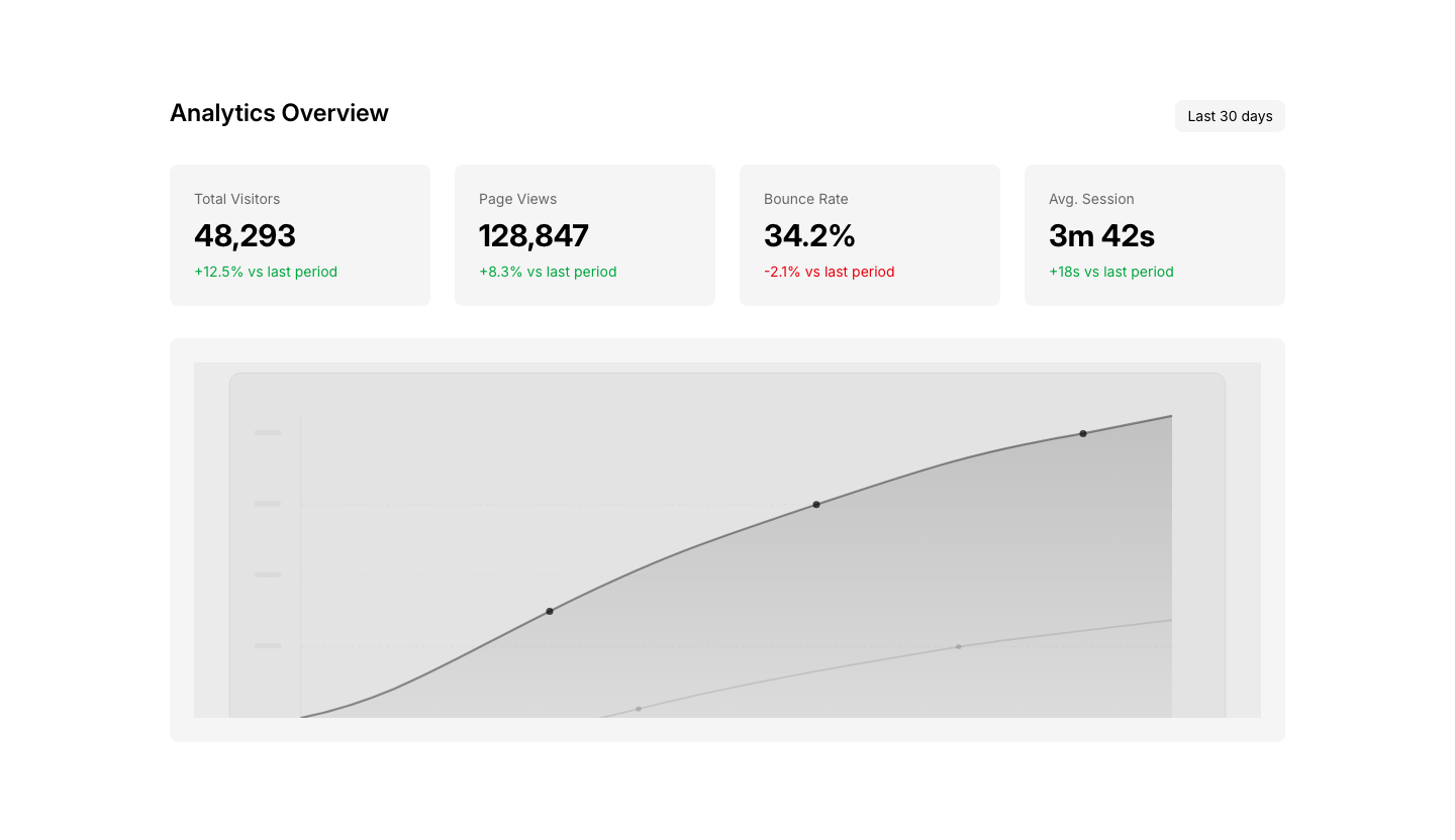
Overview
AnalyticsAnalytics overview with key metrics and trend chart.
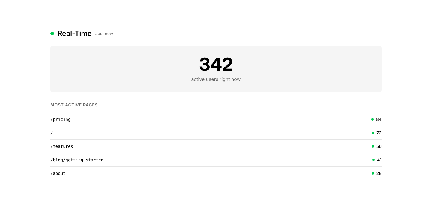
Realtime
AnalyticsReal-time visitor/activity counter with live updates.
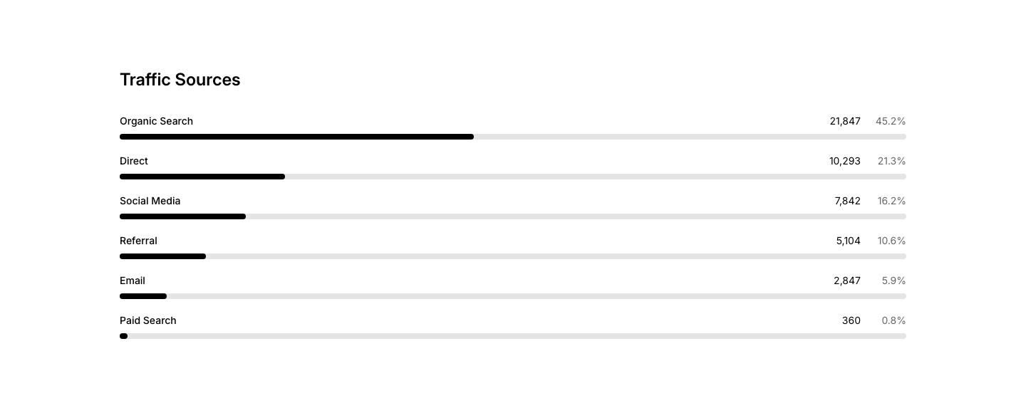
Source
AnalyticsTraffic sources breakdown with percentages.
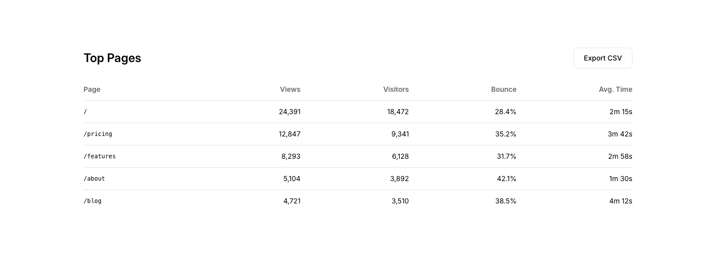
Table
AnalyticsData table with sortable columns and export button.

Banner
AnnouncementAnnouncement banner strip across page top.

Card
AnnouncementAnnouncement card with date, title, and summary.
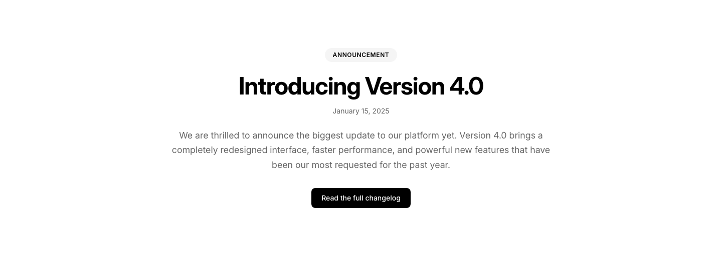
Hero
AnnouncementFull-page announcement with heading and details.
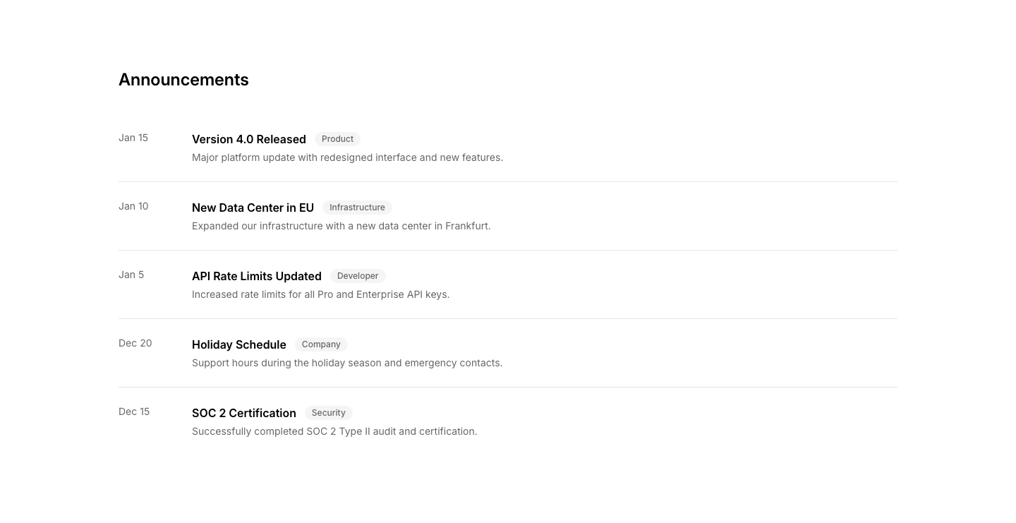
List
AnnouncementList of announcements with dates and categories.
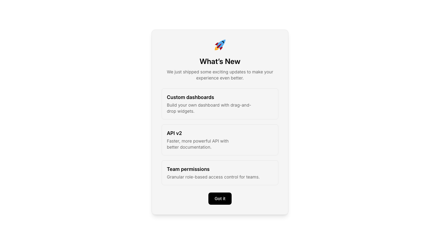
Modal
AnnouncementAnnouncement in a modal/popup format.

Sidebar
AnnouncementAnnouncement widget for sidebar placement.
Author
ArticleAuthor bio box at the end of an article.
Body
ArticleLong-form article body with rich typography.
Comments
ArticleComments section with nested replies.
Header
ArticleArticle title, author, date, read time, and feature image.
Newsletter
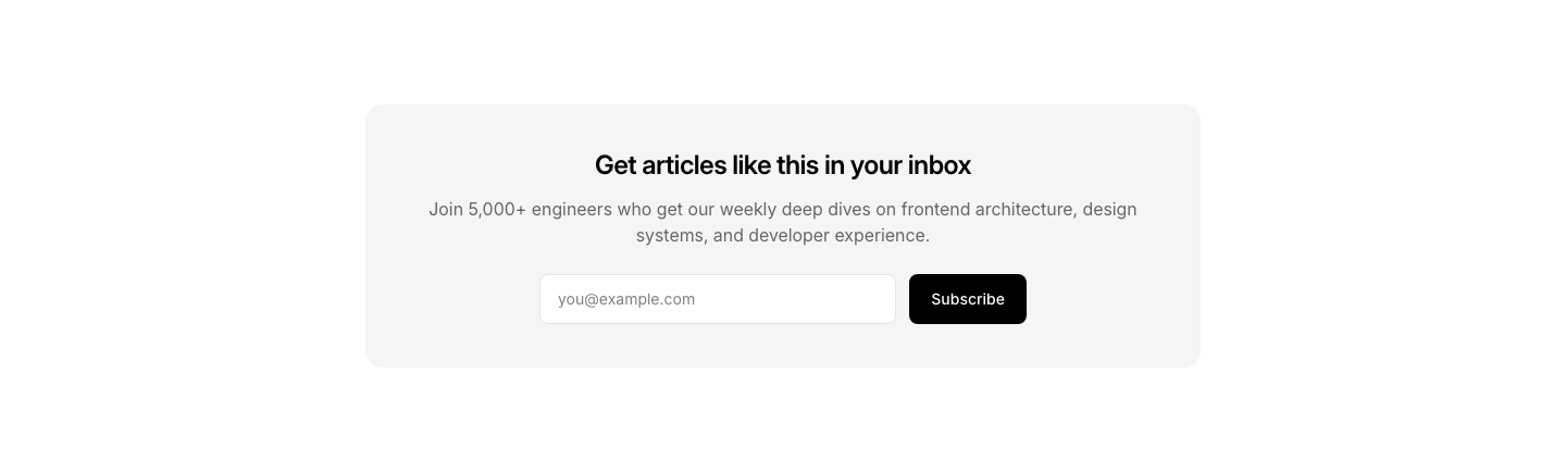
ArticleNewsletter signup embedded within article content.
Related
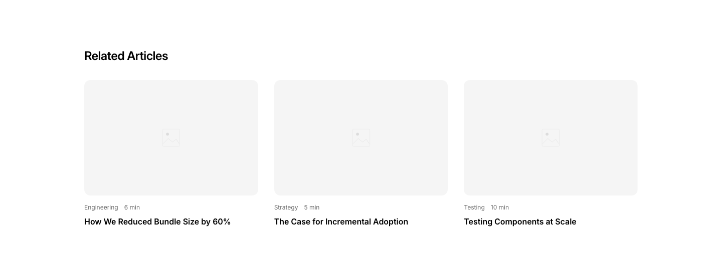
ArticleRelated articles section at the end of a post.

Share
ArticleSocial sharing bar for articles.
TOC
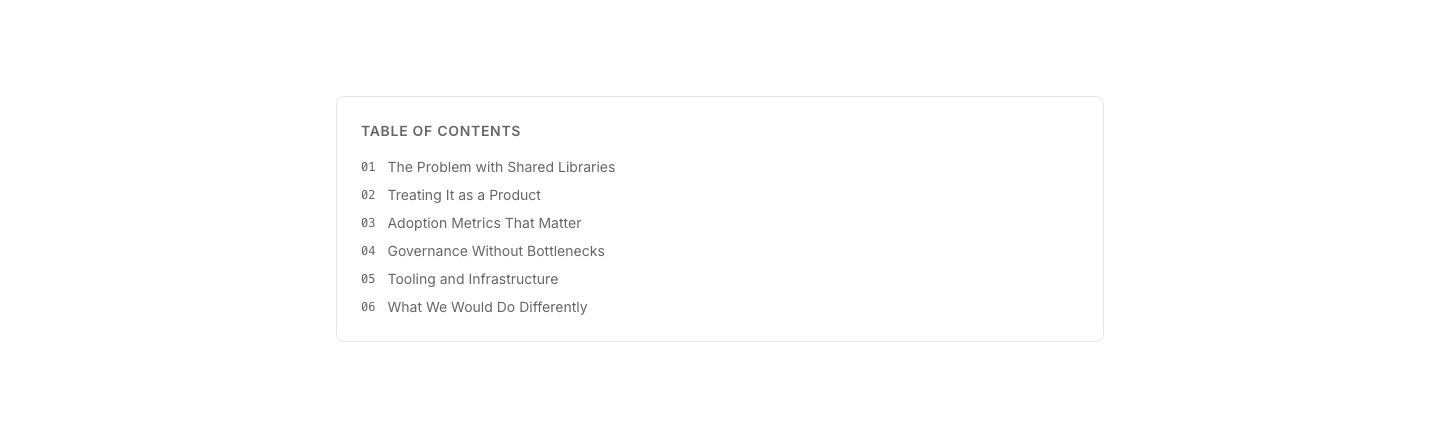
ArticleFloating table of contents sidebar for long articles.
Forgot
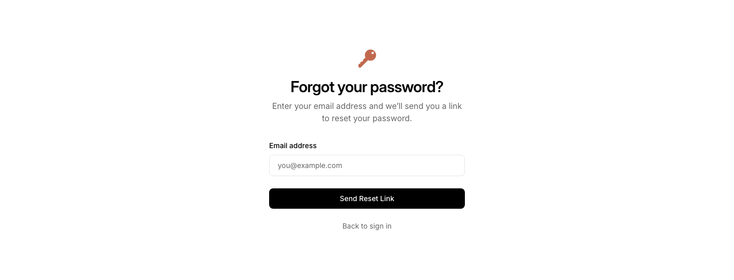
AuthForgot password page with email input.
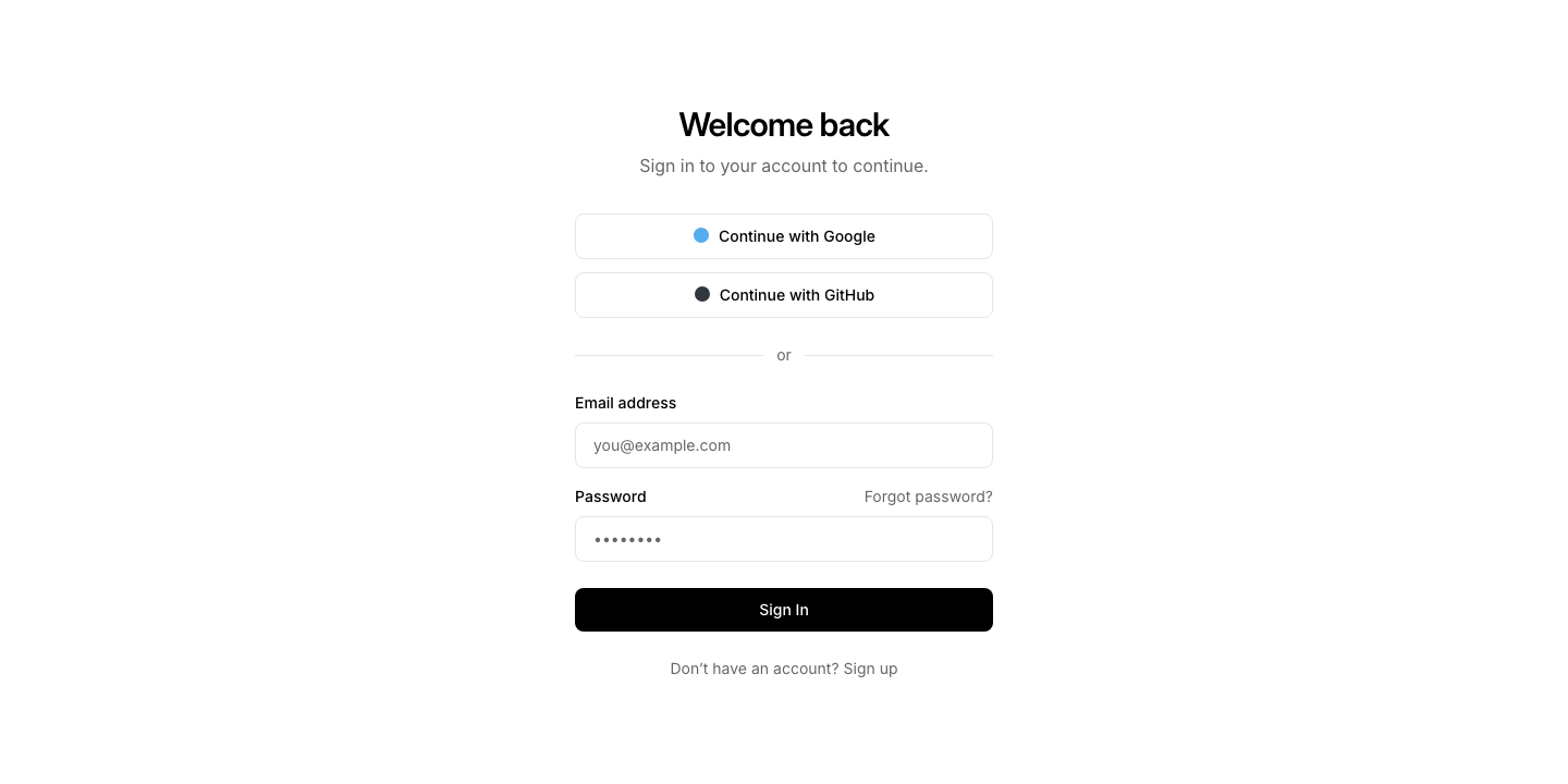
Login
AuthFull login page with form, social login, and signup link.

Minimal
AuthMinimal centered auth form, no side content.
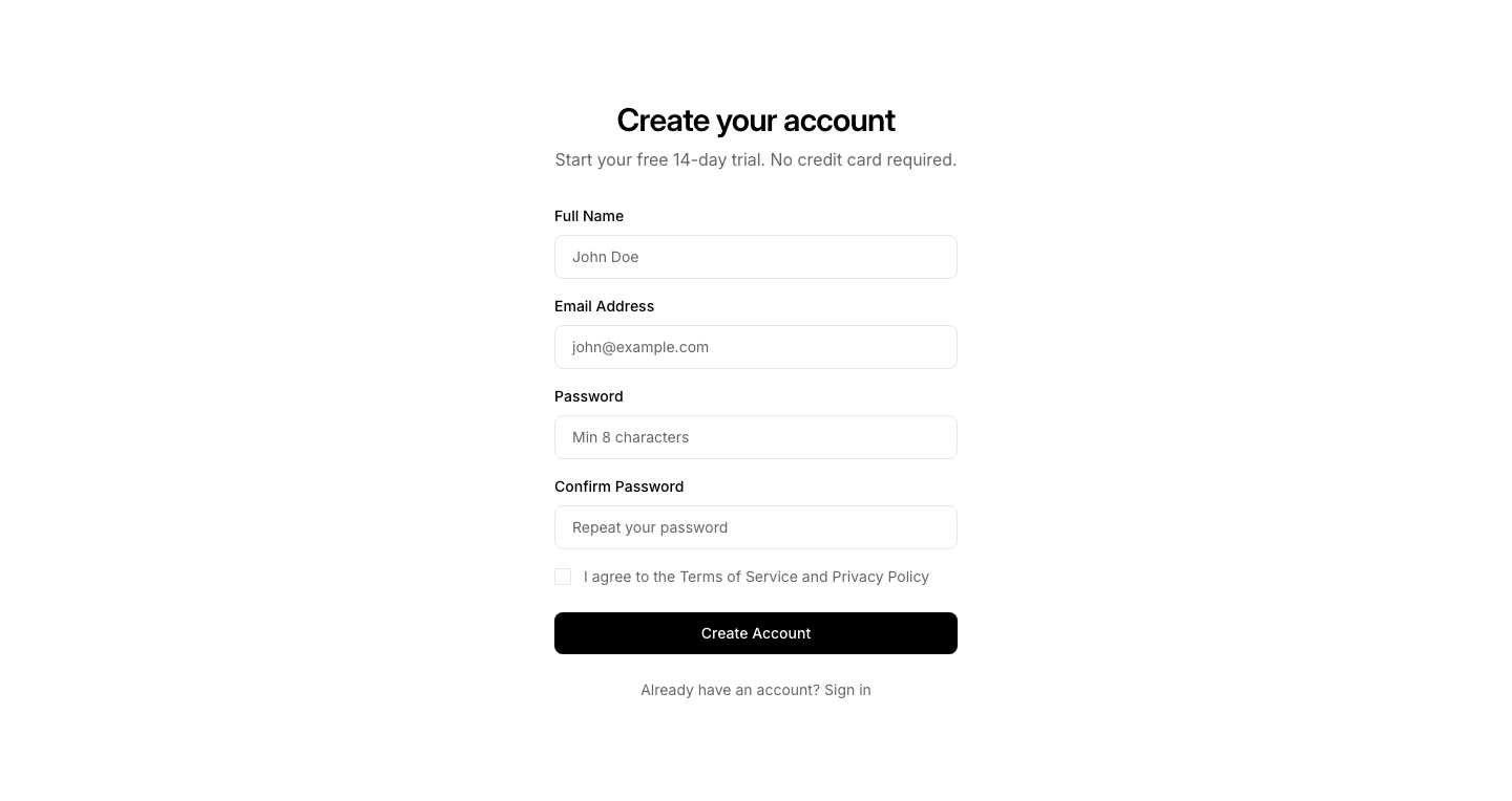
Register
AuthRegistration page with form fields and terms checkbox.

Reset
AuthPassword reset page with new password fields.
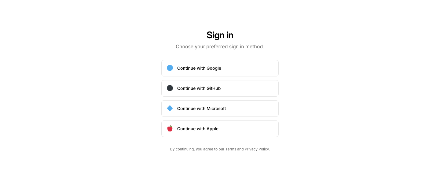
Social
AuthSocial login buttons (Google, GitHub, etc.) page.
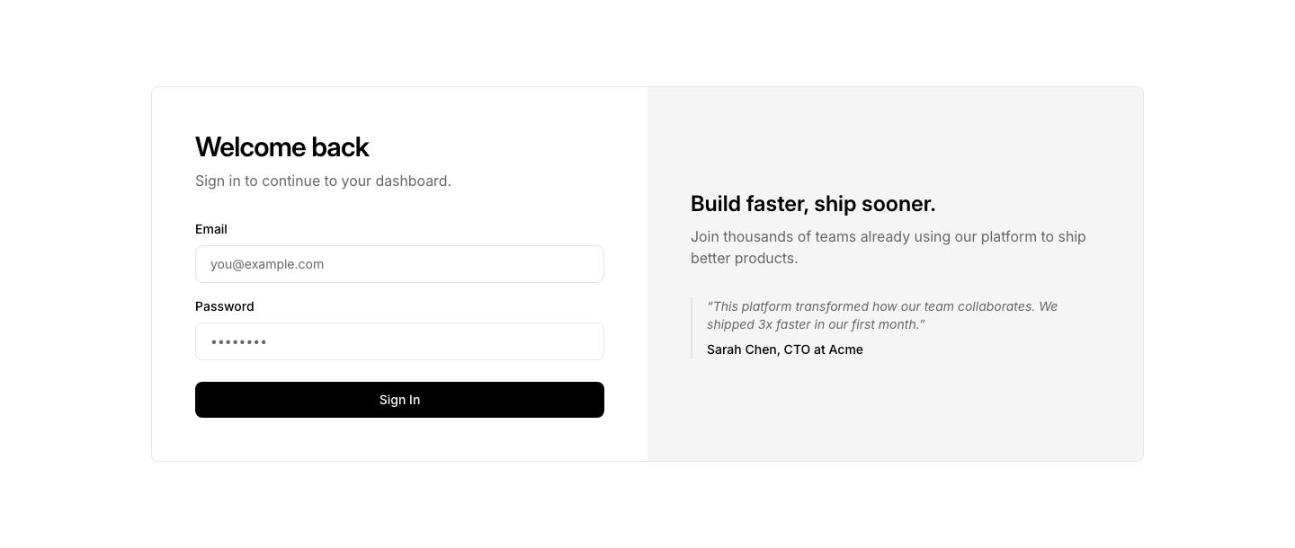
Split
AuthSplit auth page: form on left, branding/image on right.

Two Factor
AuthTwo-factor authentication code input page.
Badge
AvatarAvatar circles with notification badge counts.
Grid
AvatarGrid of avatars with names and roles.

Group Overlap
AvatarOverlapping avatar circles in a row with +N counter.
Initials
AvatarGrid of initials-based avatars with names below each circle.

Stack
AvatarOverlapping avatar stack with "+N more" count.
Status
AvatarAvatar with online, offline, or away status indicator dot.

Bar
AwardHorizontal bar of award names and years.

Card
AwardAward card with trophy icon, title, year, and description.
Certificate
AwardCertificate-style award display with border and details.
Featured
AwardFeatured single award highlight with trophy and description.
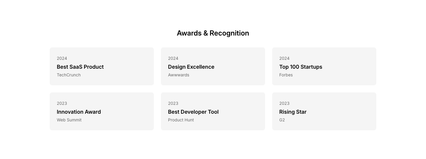
Grid
AwardGrid of award cards with name, issuer, and year.

Logos
AwardAward and certification logos in a horizontal row.
Press
AwardPress mentions and awards with publication logos.
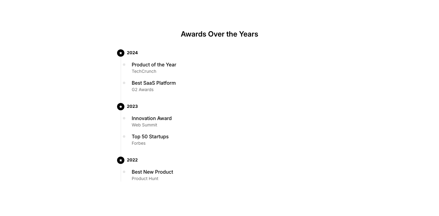
Timeline
AwardAwards shown on a timeline by year.
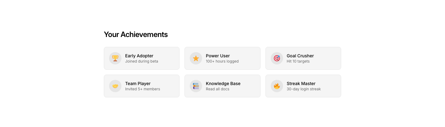
Achievement
BadgeAchievement/reward badges with icons and labels.
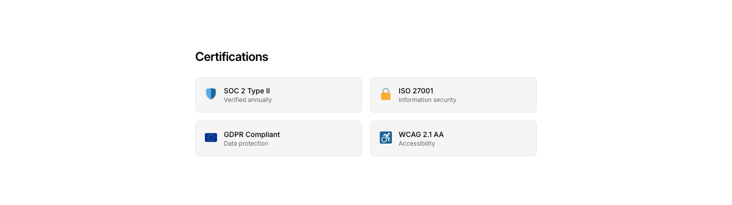
Certification
BadgeProfessional certification badges with details.
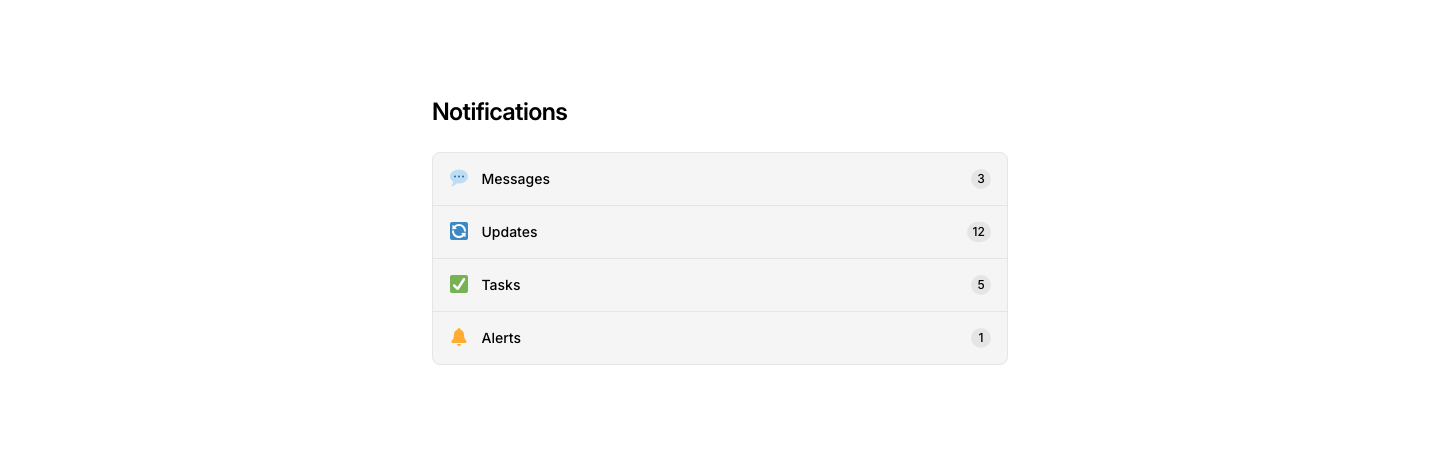
Notification
BadgeNotification badge row with icon, text, and unread count.

Ribbon
BadgeCorner ribbon badge on a card.

Row
BadgeRow of badges/tags for categorization.

Status
BadgeStatus badges with colored dots.

Tech
BadgeTechnology/framework badges with logos.

Trust
BadgeTrust/security badges row.
Verified
BadgeVerified trust badges with checkmarks.

Version
BadgeVersion number badge with release info.

Cookie
BannerCookie consent banner with accept, decline, and privacy link.

Countdown
BannerBanner with countdown timer for limited-time offer.

Feedback
BannerHelp us improve feedback request banner.

Promo
BannerPromotional banner with badge, text, and call-to-action link.

Top
BannerFull-width top announcement bar with emoji, text, and link.

Update
BannerProduct update/changelog banner with version number.
Asymmetric
BentoAsymmetric bento grid with one large card and two smaller cards.
Dashboard
BentoDashboard-style bento grid with stat cards, chart area, and activity feed.
Features
BentoFeature showcase in a 2x3 bento grid with mixed card sizes.
Gallery
BentoPhoto gallery in asymmetric bento grid layout with captions.
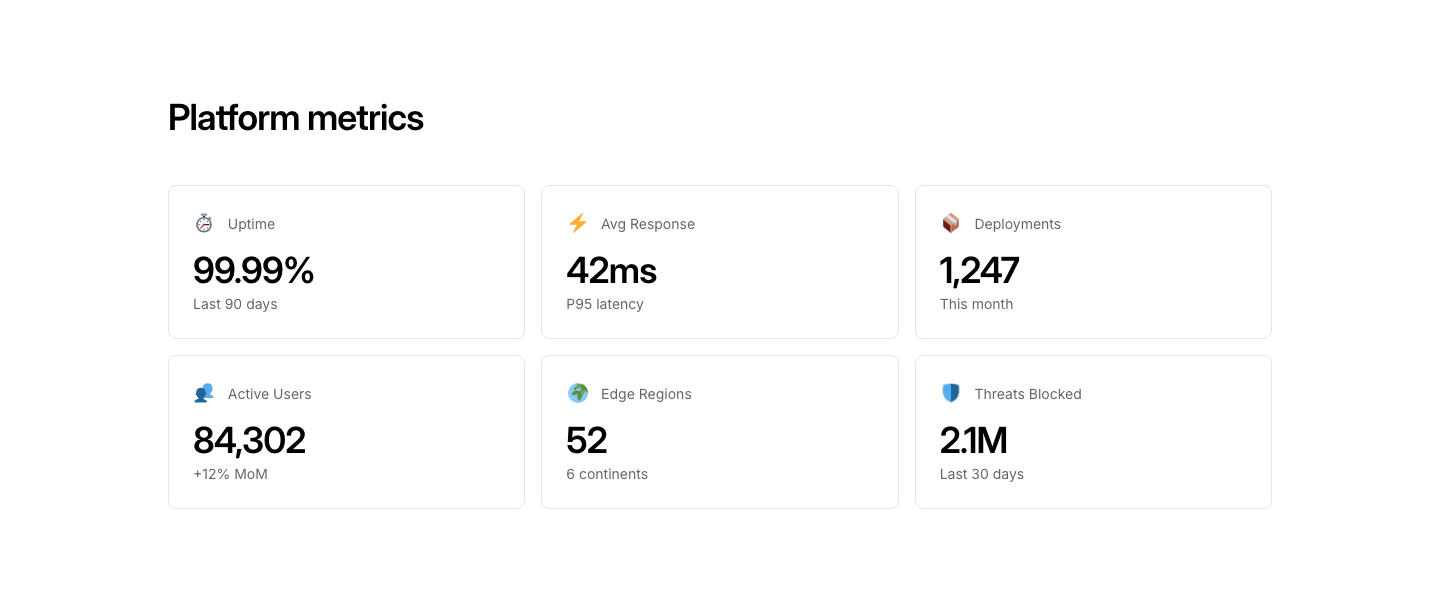
Metrics
BentoMetrics and stats displayed in a bento grid with visual indicators.
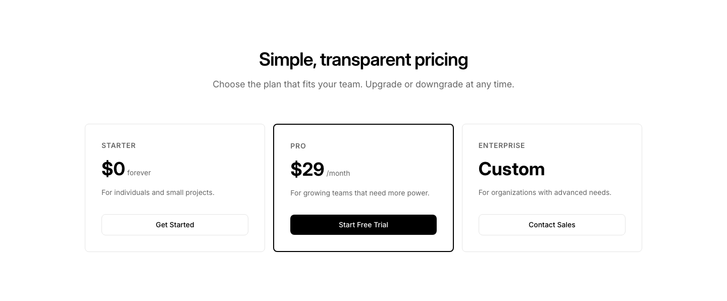
Pricing
BentoPricing plans in an asymmetric bento grid layout.
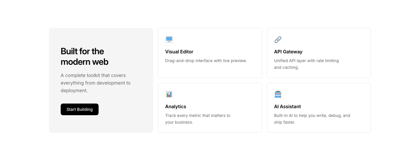
Showcase
BentoProduct showcase in bento layout with headline card and feature tiles.
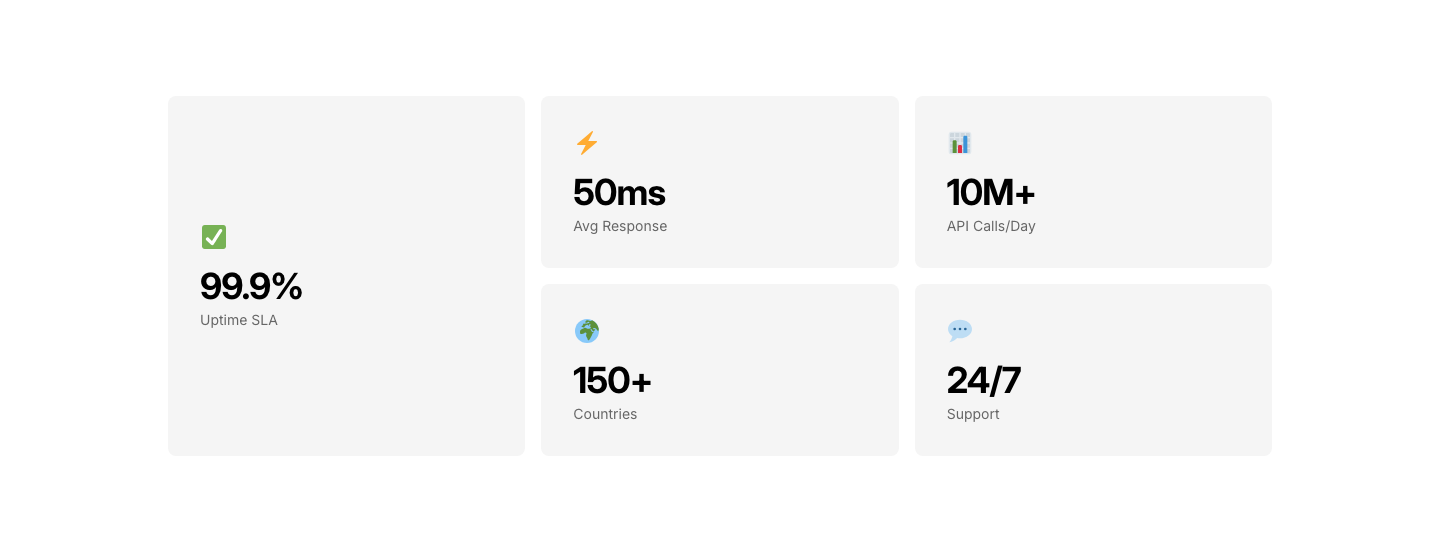
Stats
BentoBento grid of key metrics with large numbers and labels.
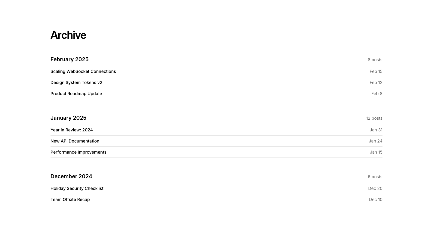
Archive
BlogMonthly archive list with post counts per month.
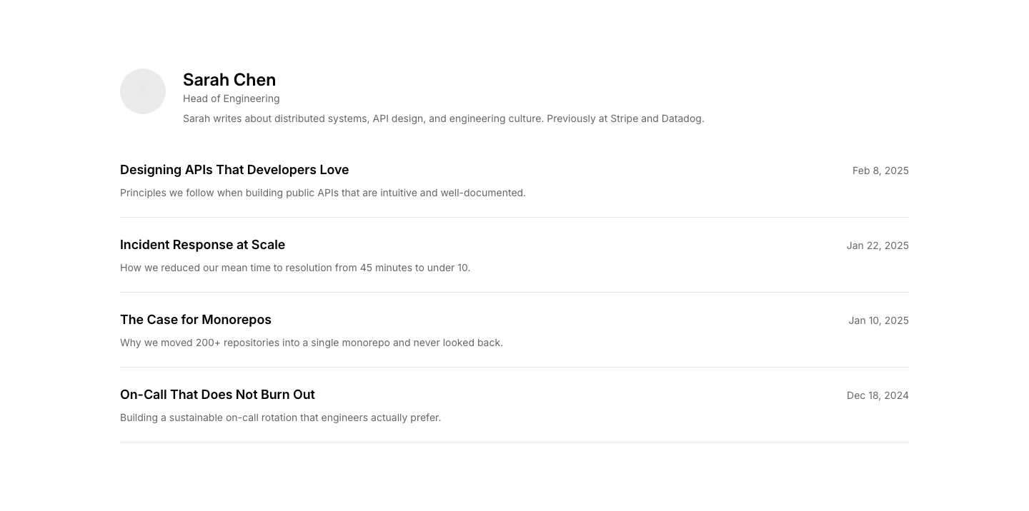
Author
BlogPosts grouped by author with author bio header.
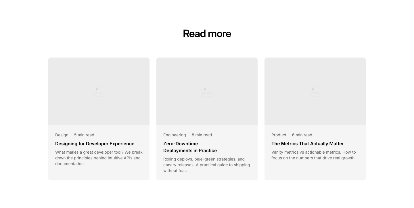
Cards
BlogBlog post cards with image, category, read time, and excerpt.
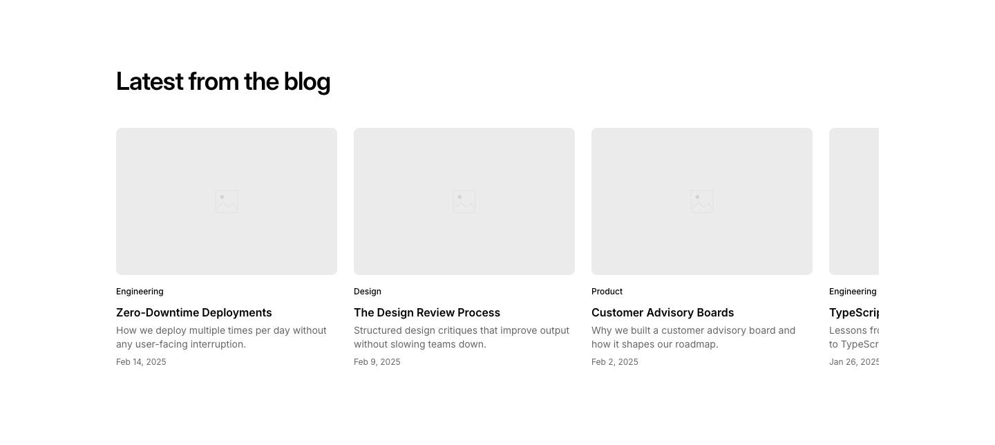
Carousel
BlogHorizontally scrollable row of post cards.
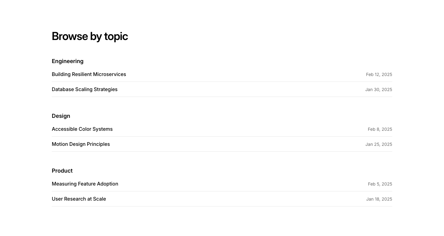
Category
BlogPosts organized under category headings.
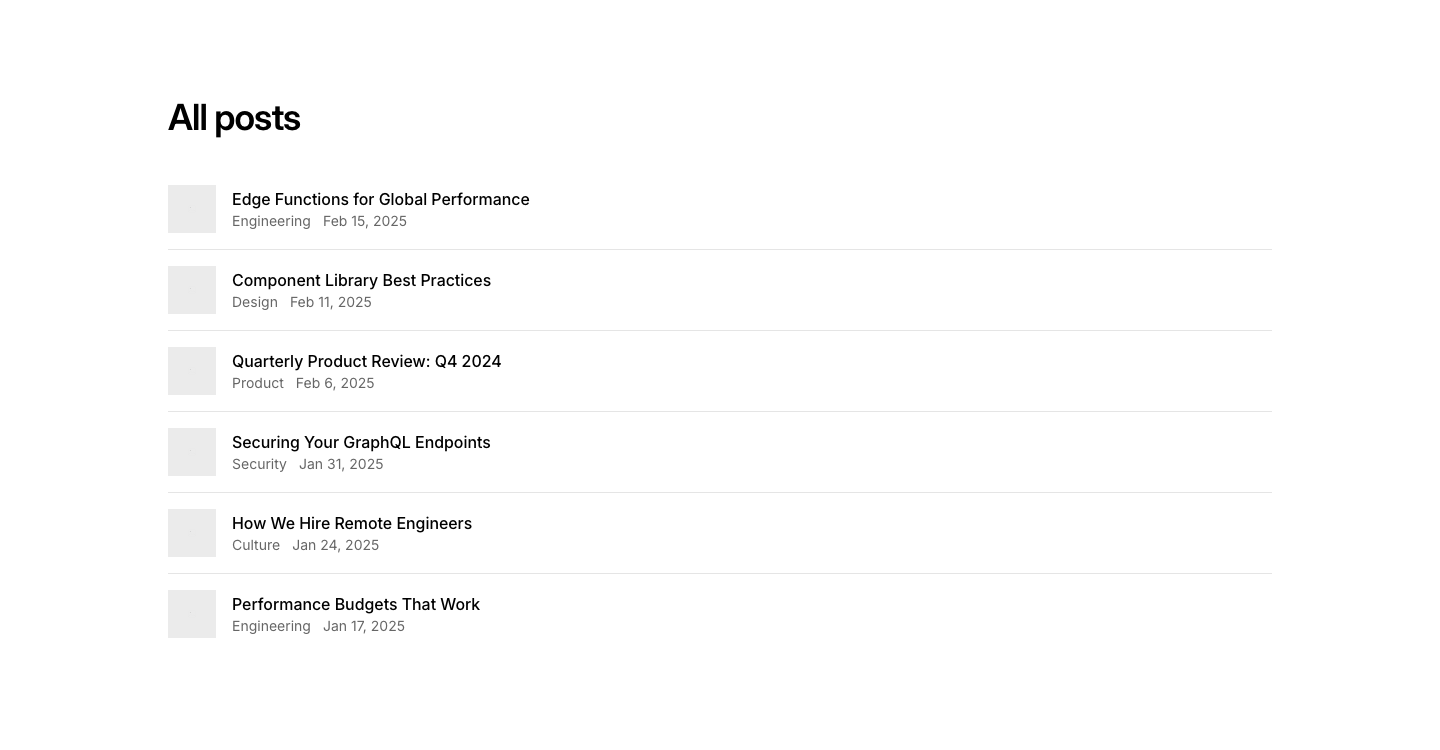
Compact
BlogDense list with small thumbnails, title, and date on one line.
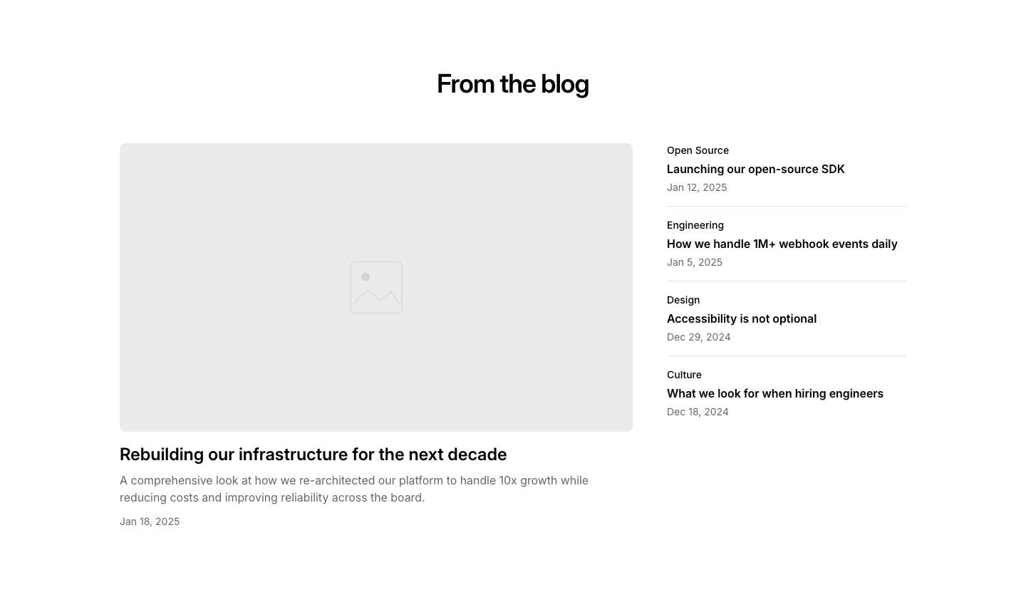
Featured
BlogLarge featured post with a sidebar of smaller posts.
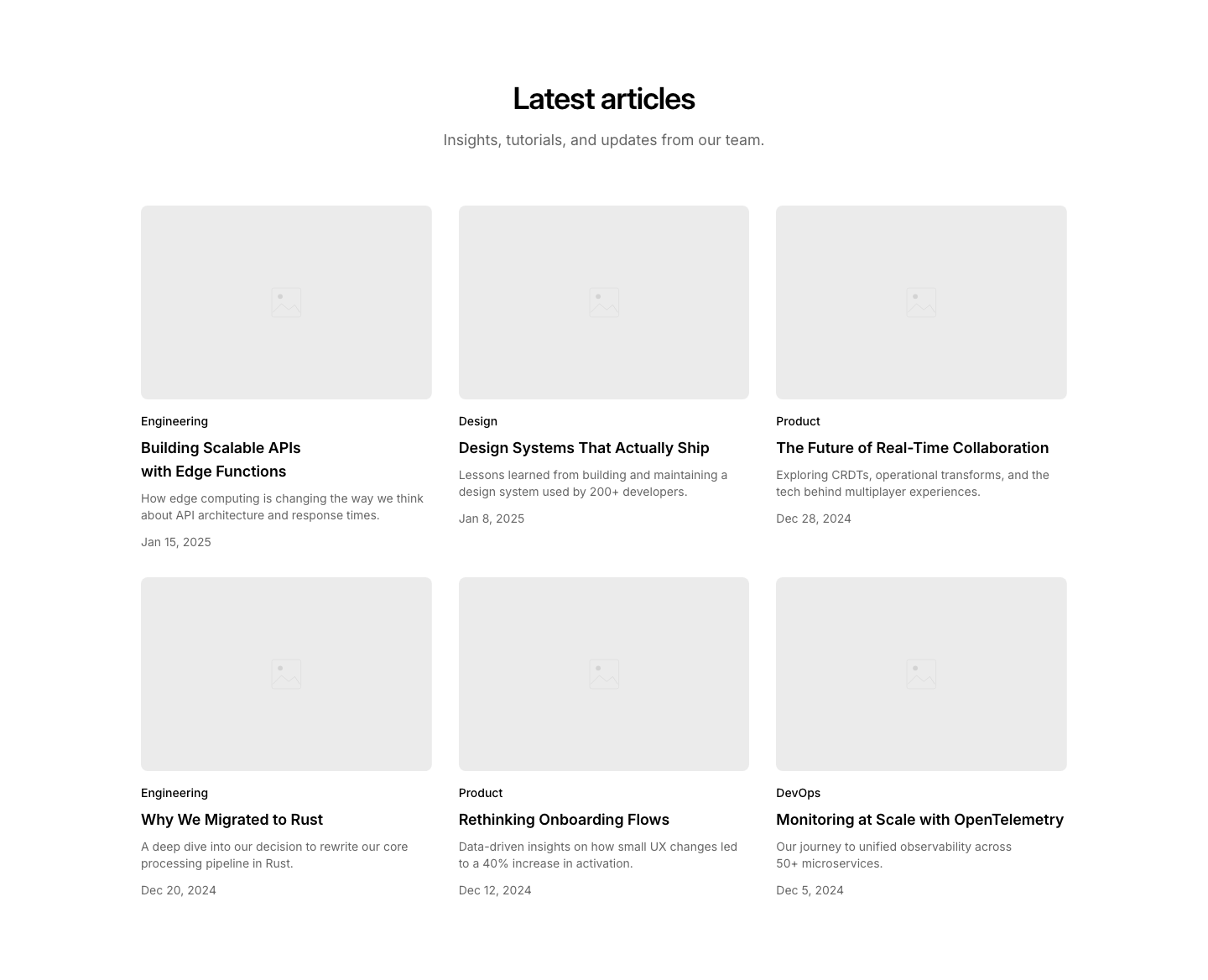
Grid
Blog3-column grid of blog post cards with image, category, title, excerpt, and date.

Hero
BlogSingle post hero with full-width image, title, excerpt, and metadata.
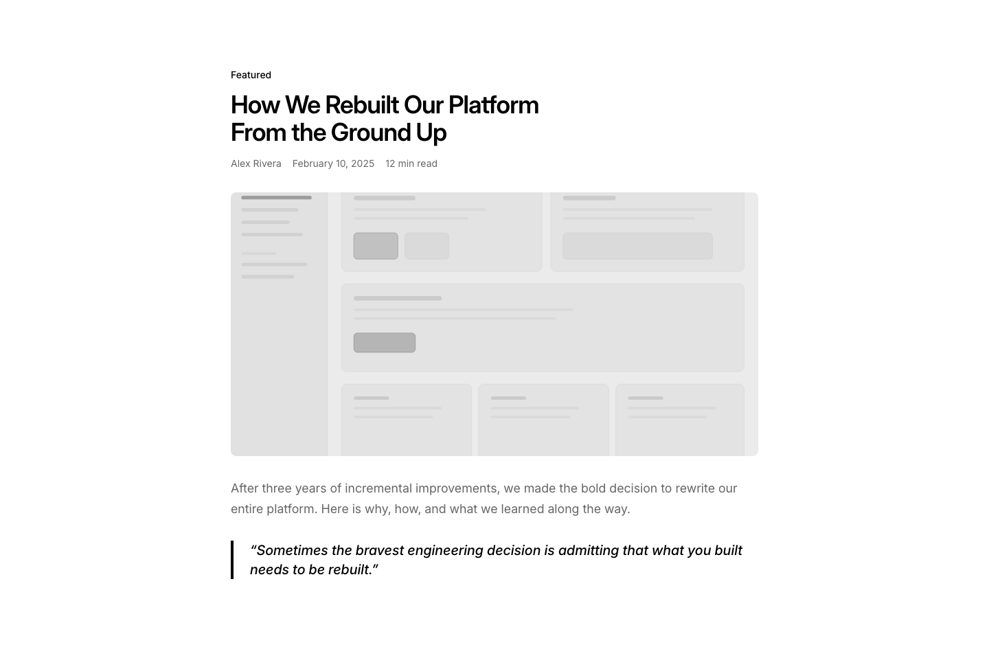
Highlight
BlogSingle post with large pull quote and inline images.
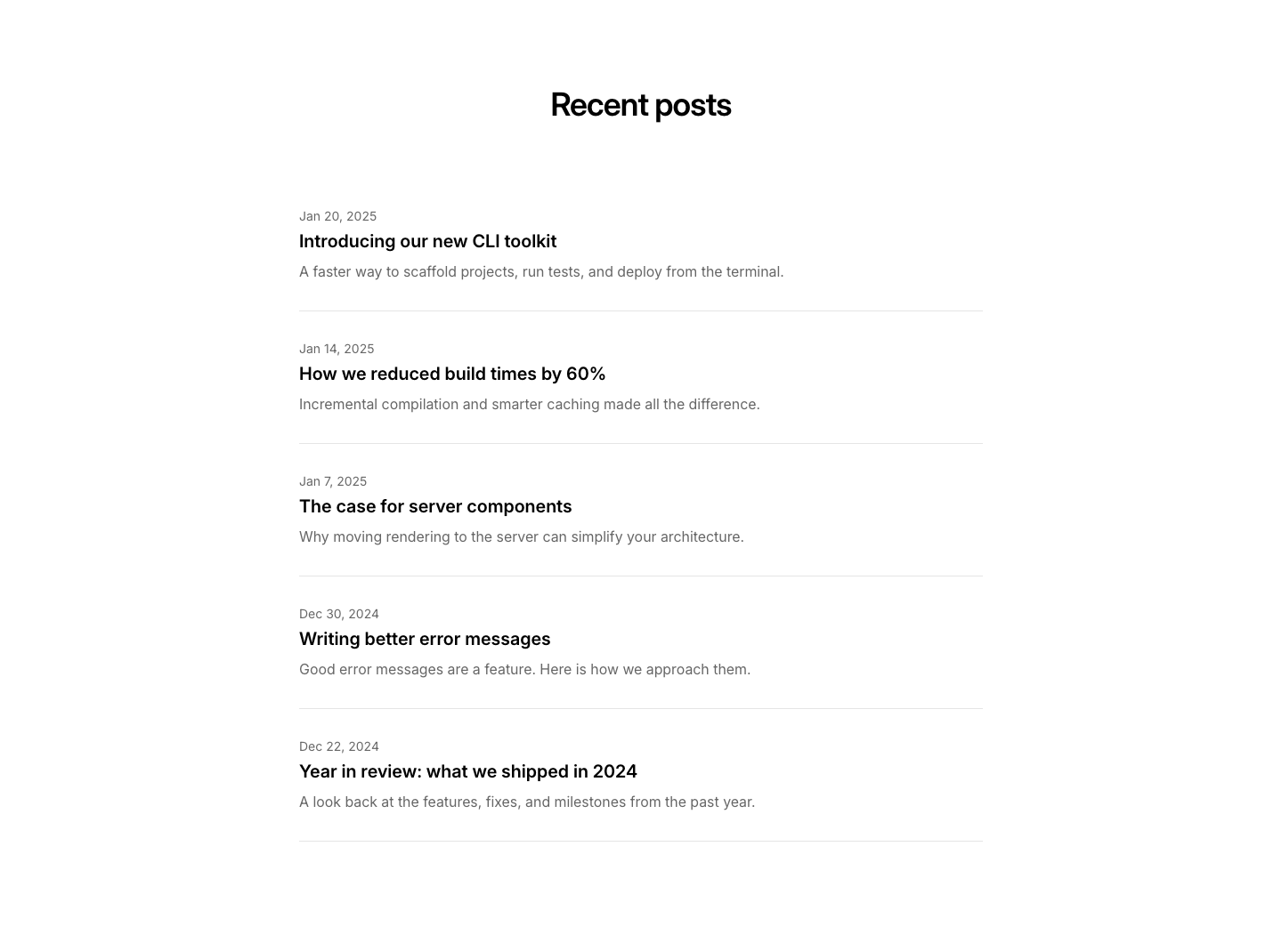
List
BlogVertical list of blog posts with date, title, and excerpt.
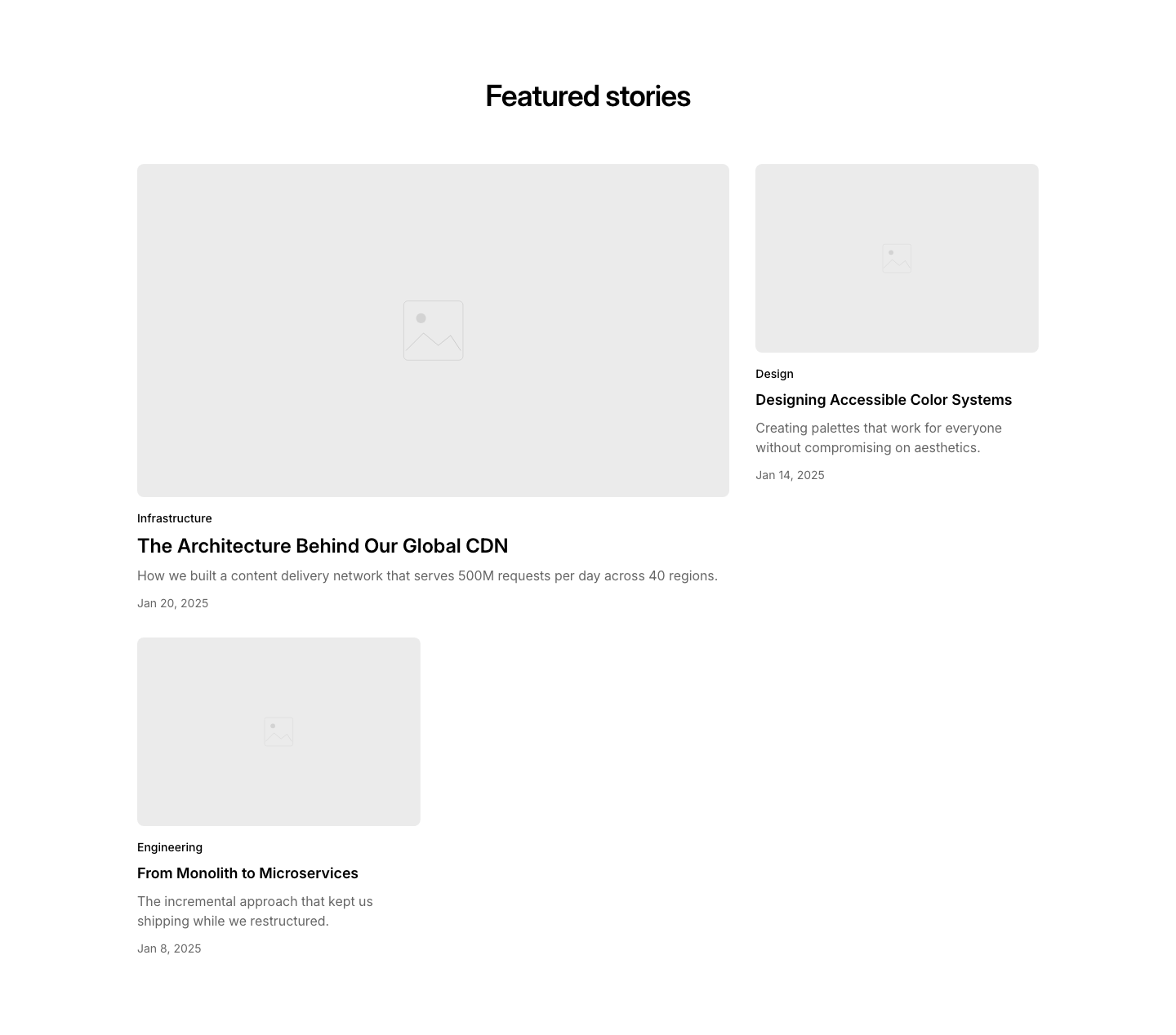
Magazine
BlogAsymmetric magazine layout with one large and two smaller posts.
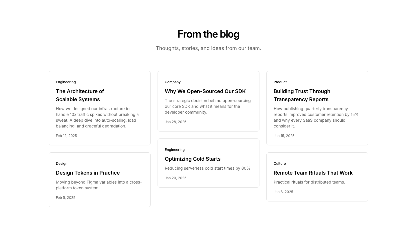
Masonry
BlogMasonry grid of blog post cards with varying heights.
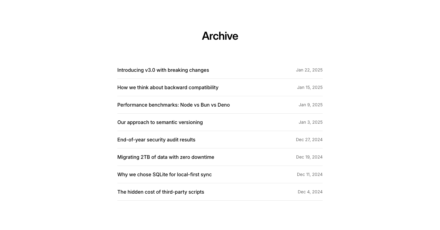
Minimal
BlogMinimal post list with title and date side by side.
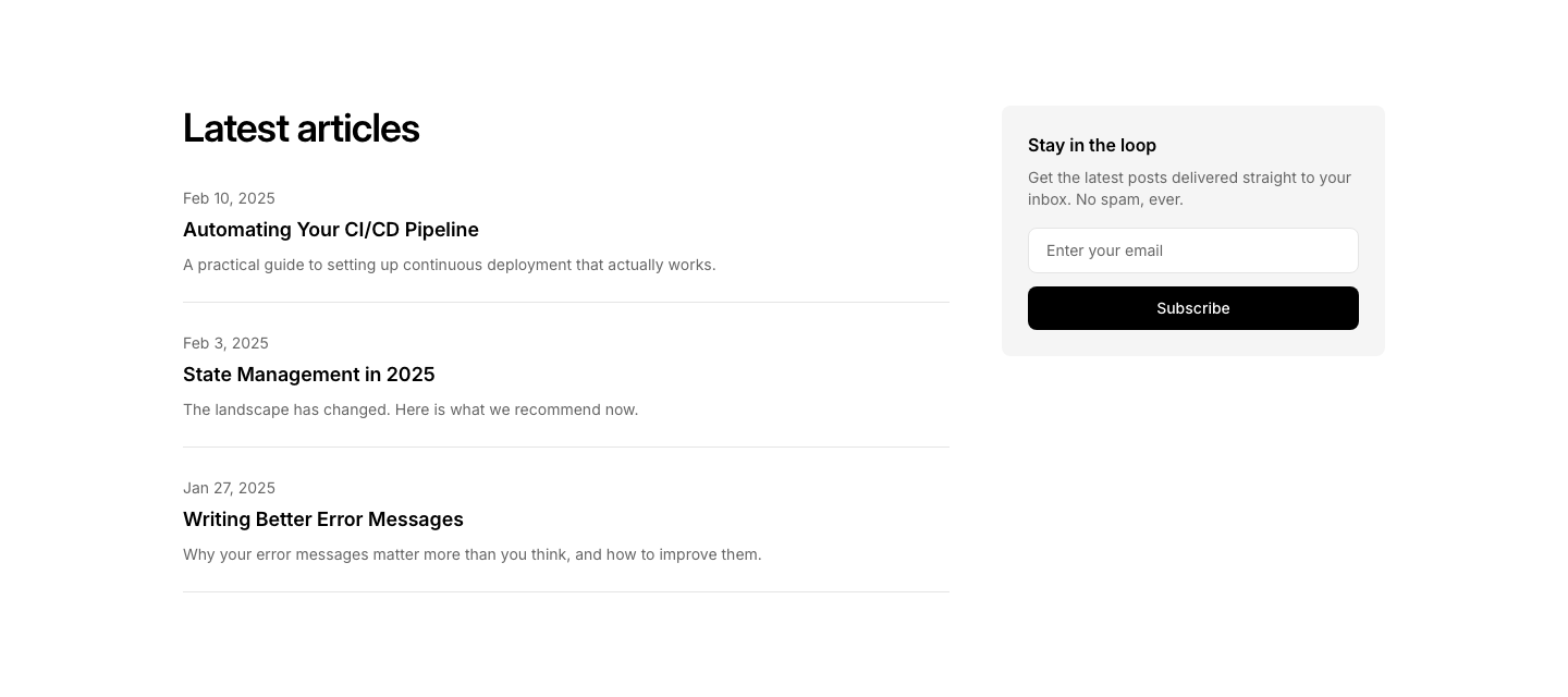
Newsletter
BlogBlog section with newsletter signup form integrated.
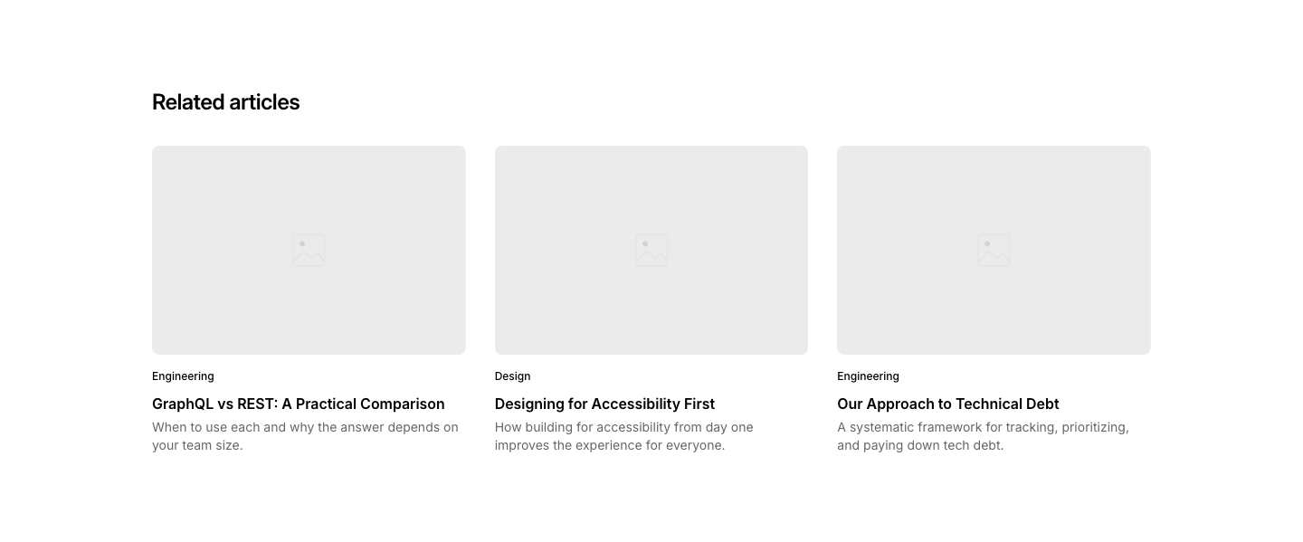
Related
BlogRelated posts section with 3 card suggestions.
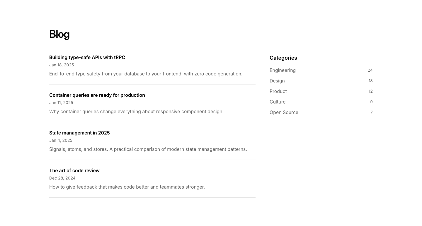
Sidebar
BlogTwo-column blog layout with posts list and category sidebar.
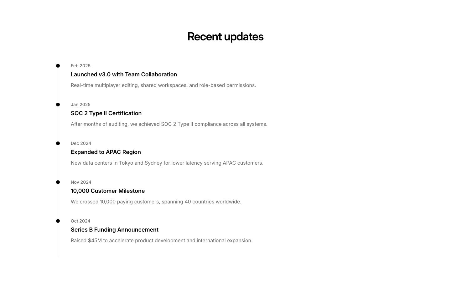
Timeline
BlogPosts arranged along a vertical timeline by date.
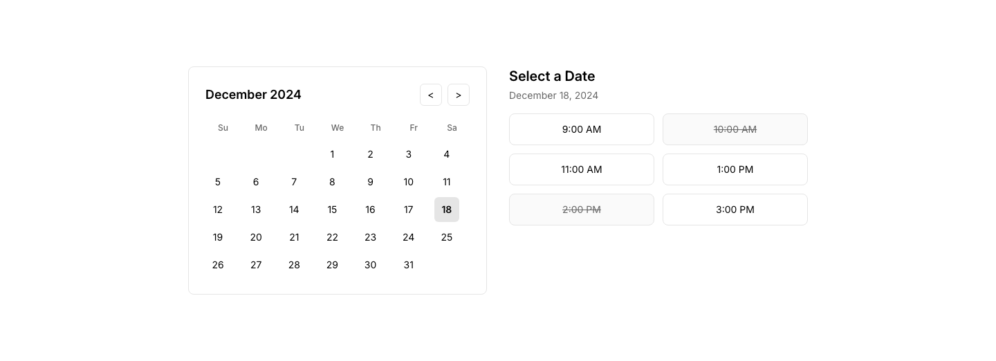
Calendar
BookingCalendar view with available/booked time slots.
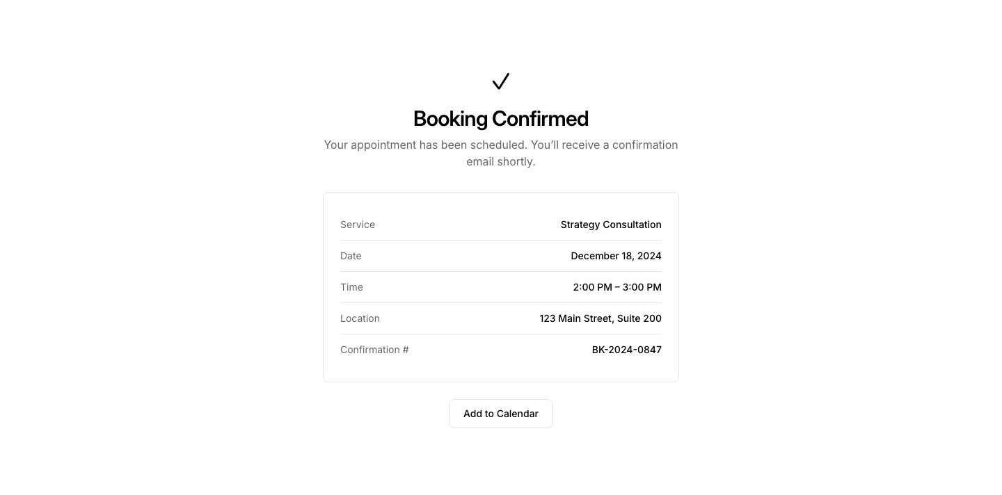
Confirmation
BookingBooking confirmation with details and calendar link.
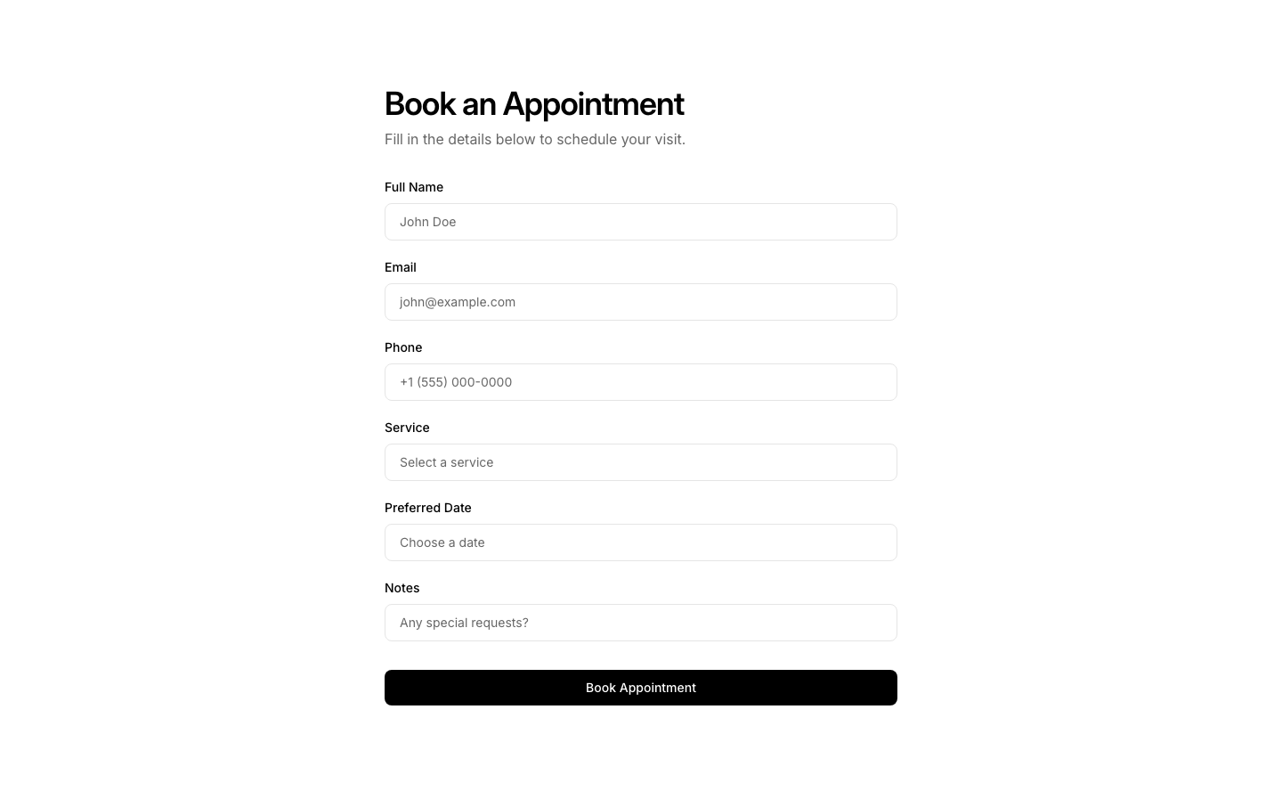
Form
BookingBooking form with date, time, service selection.

Minimal
BookingSimple date/time picker with one-click book button.
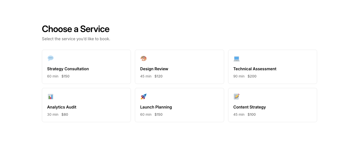
Services
BookingService selection grid for booking.
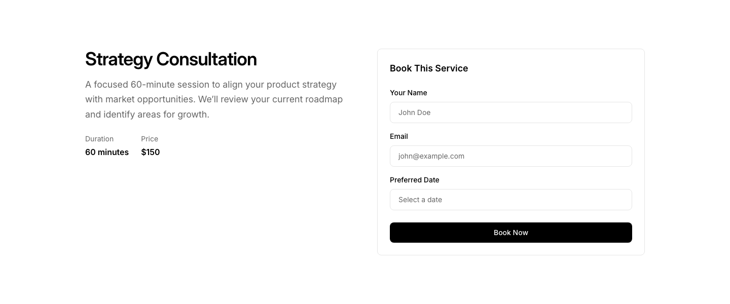
Split
BookingService info on left, booking form on right.
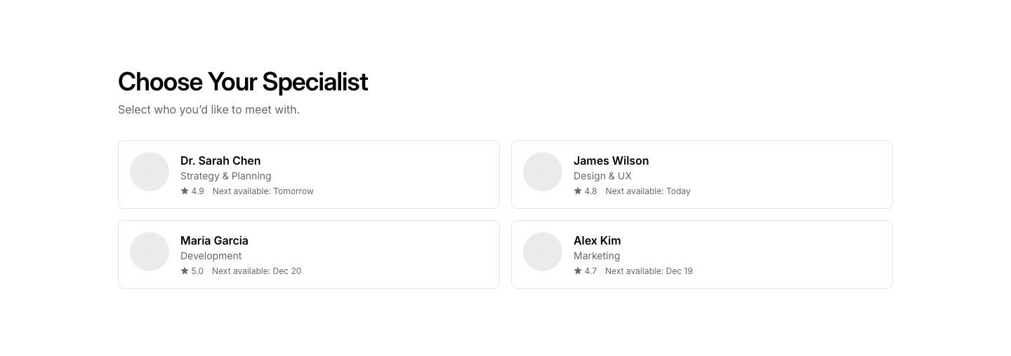
Staff
BookingStaff member selection for appointment booking.
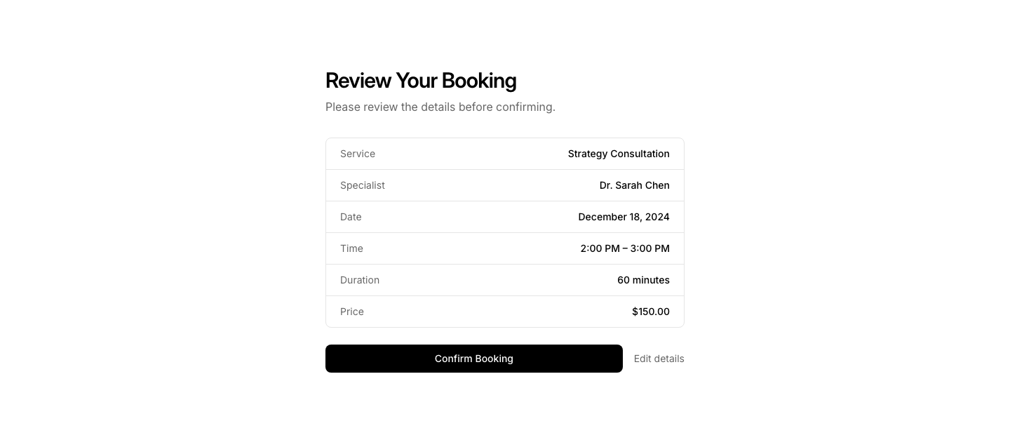
Summary
BookingBooking summary before confirmation with edit option.
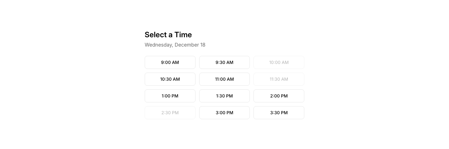
Time
BookingTime slot picker grid for a selected date.

Widget
BookingCompact booking widget embeddable in any section.

Back
BreadcrumbBack navigation link with arrow and parent page title.

Collapsed
BreadcrumbLong breadcrumb trail with middle items collapsed.

Dropdown
BreadcrumbBreadcrumbs with dropdown for sibling pages.

Icon
BreadcrumbBreadcrumbs with folder/page icons.

Simple
BreadcrumbSimple breadcrumb navigation with slash separators.

Styled
BreadcrumbBreadcrumbs as pill/tag-styled links.
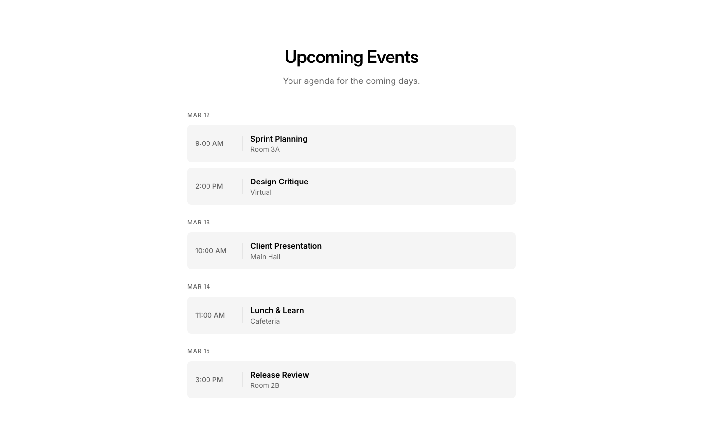
Agenda
CalendarAgenda list view of upcoming events.
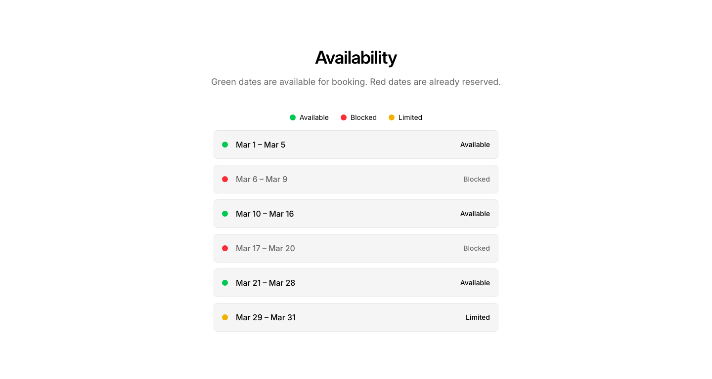
Availability
CalendarAvailability calendar with open/blocked dates.
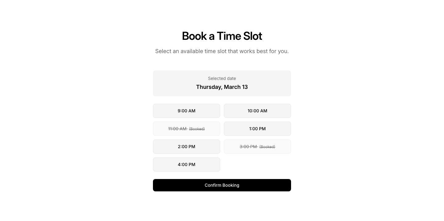
Booking
CalendarCalendar with clickable slots for booking.
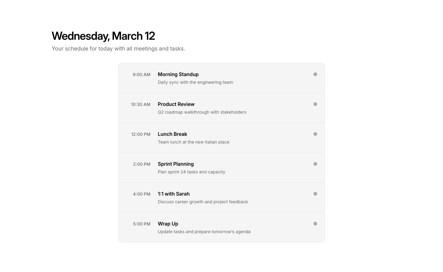
Day
CalendarSingle day view with detailed time slots.

Mini
CalendarCompact mini calendar widget for sidebars.
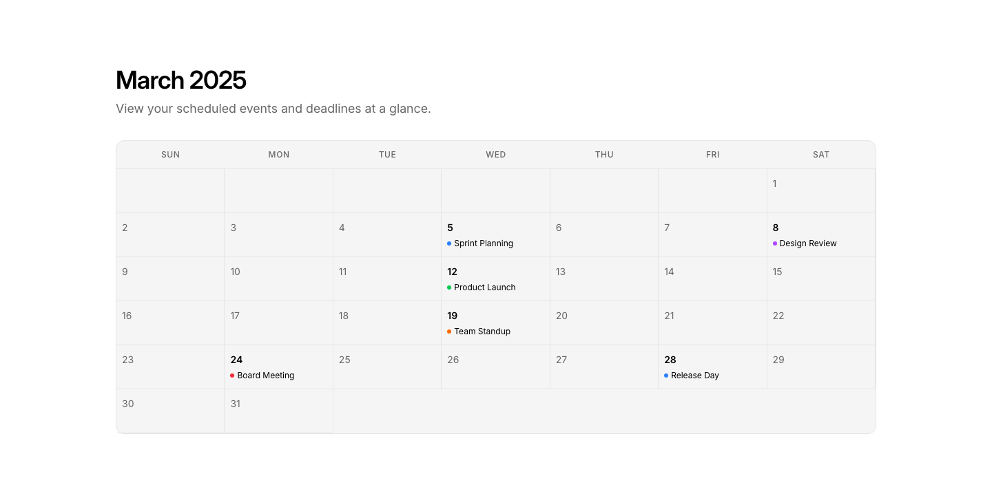
Month
CalendarFull month calendar grid with event indicators.
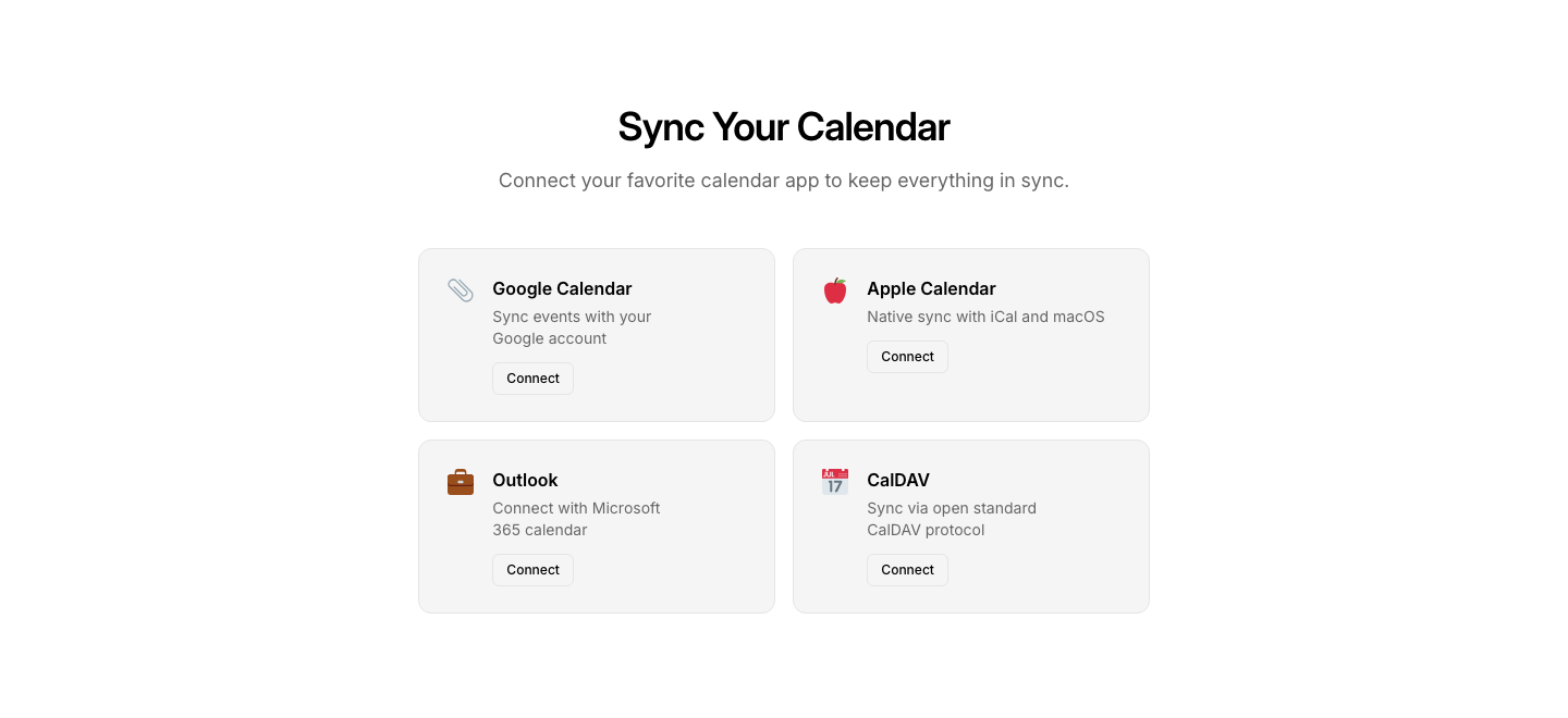
Sync
CalendarCalendar sync options with platform icons.
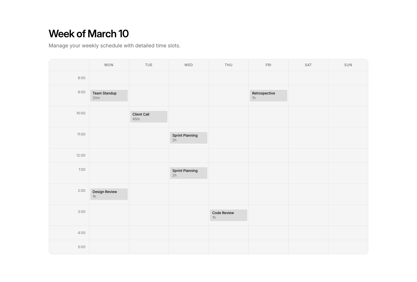
Week
CalendarWeekly view with hourly time slots and events.

Action
CardCard with primary and secondary action buttons.

Basic
CardSimple card with heading, text, and optional link.

Horizontal
CardHorizontal card with image left, content right.

Icon
CardCard with large icon, title, and text.
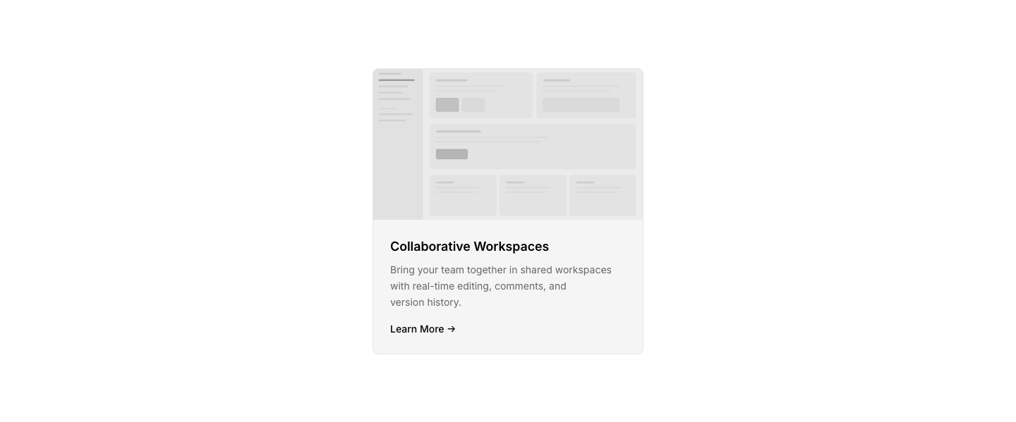
Image
CardCard with image header, title, and description.

Overlay
CardCard with background image and text overlay.
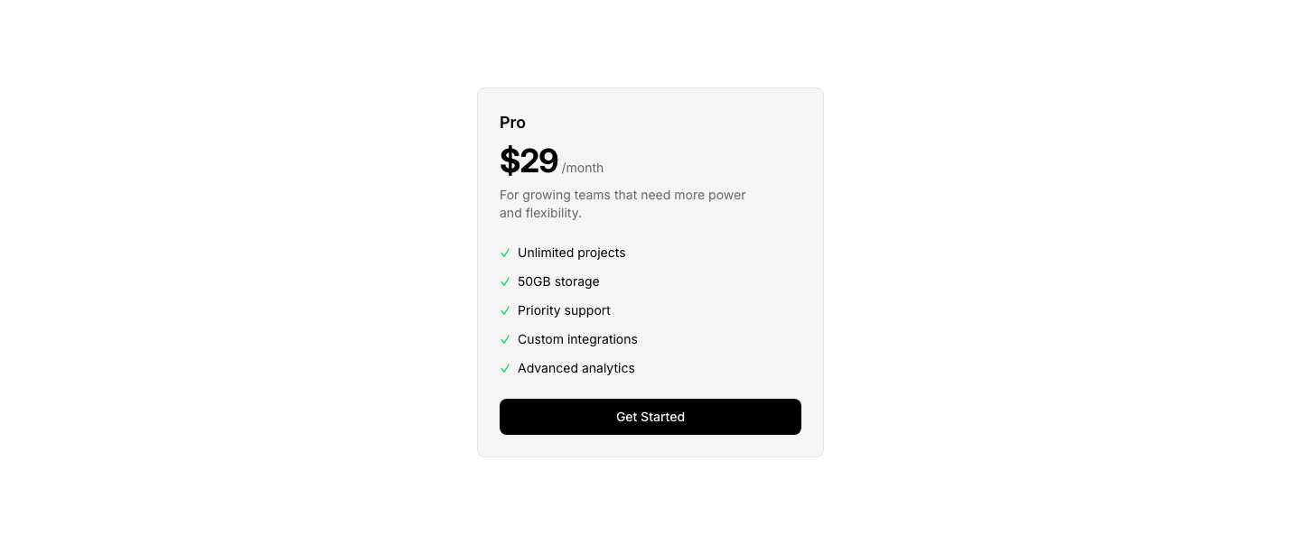
Pricing
CardPricing card with plan name, price, features, and CTA.

Profile
CardCard with avatar, name, role, and action buttons.

Stat
CardCard with large number, label, and trend indicator.

Testimonial
CardTestimonial card with quote, avatar, and rating.
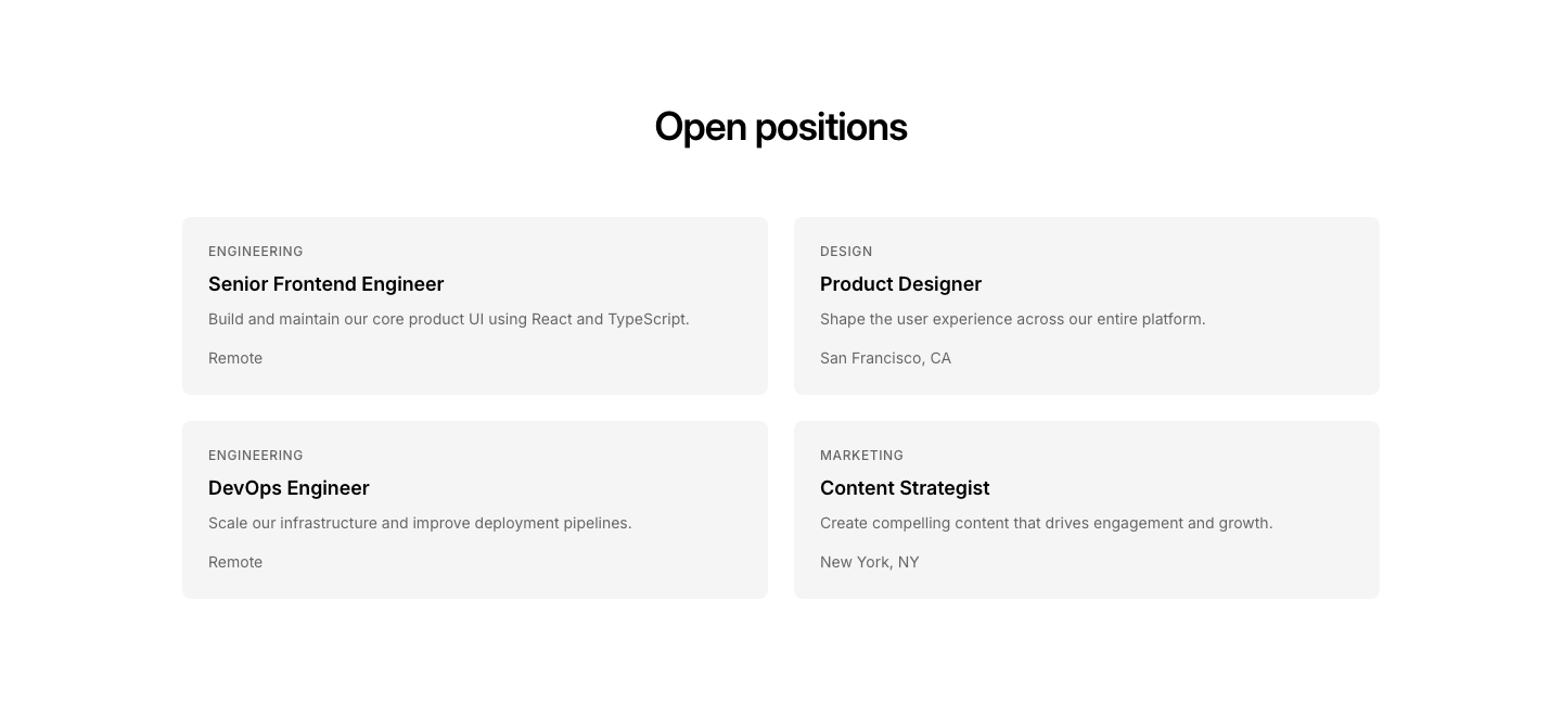
Cards
CareerJob openings displayed as cards with department, title, and location.
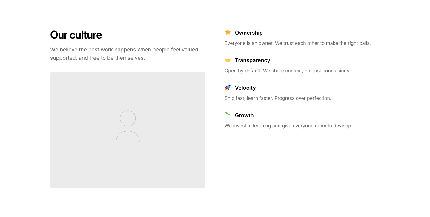
Culture
CareerCompany culture section with values and photos.
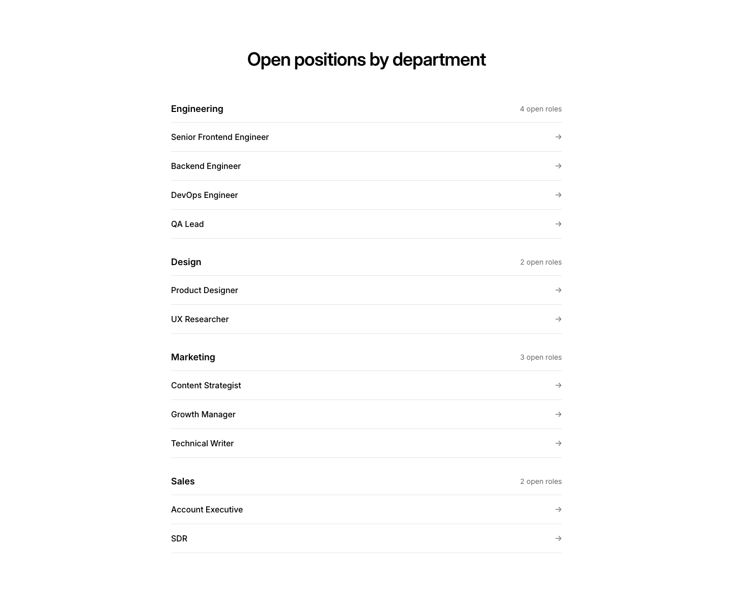
Department
CareerOpen roles grouped by department.
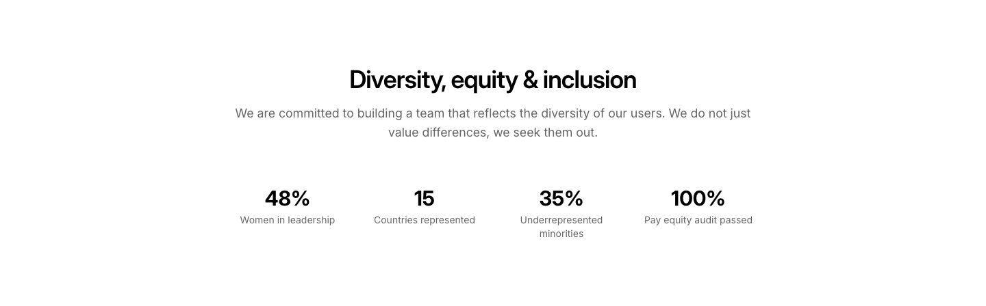
Equity
CareerDiversity and inclusion statement with stats.
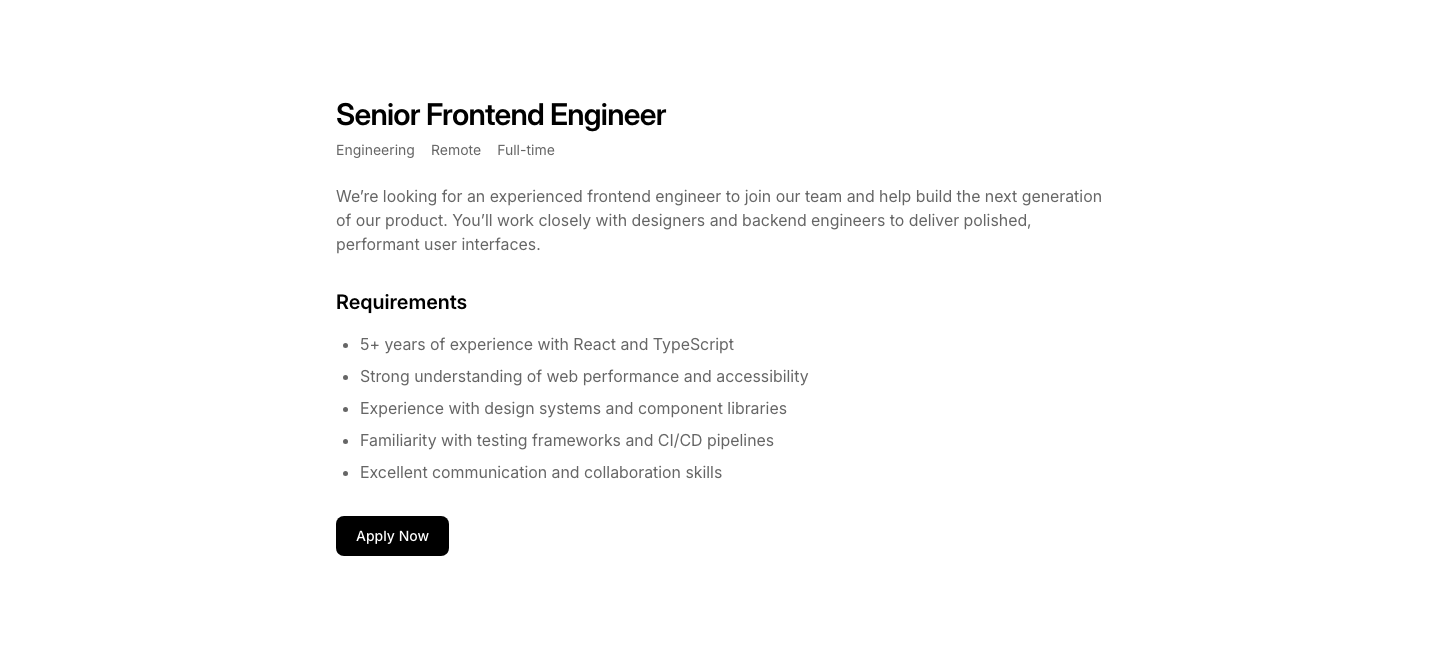
Featured
CareerFeatured job posting with full details and requirements list.
Intern
CareerInternship program section with application info.
List
CareerJob listing with title, department, location, and type.
Location
CareerOffice locations with photos and open roles per location.
Perks
CareerCompany perks and benefits grid with emoji icons.
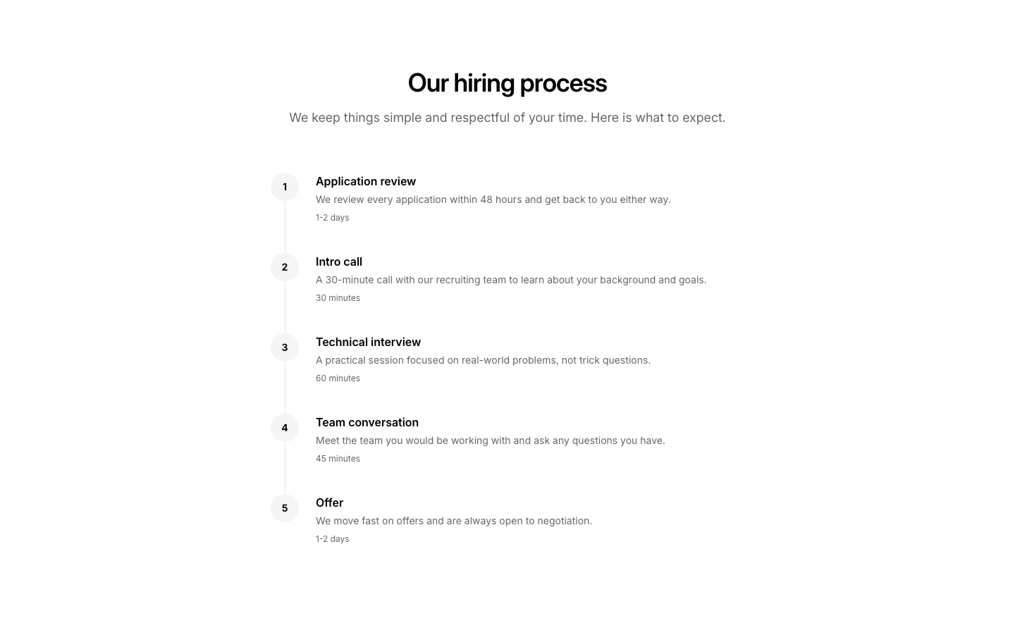
Process
CareerHiring process steps explanation.
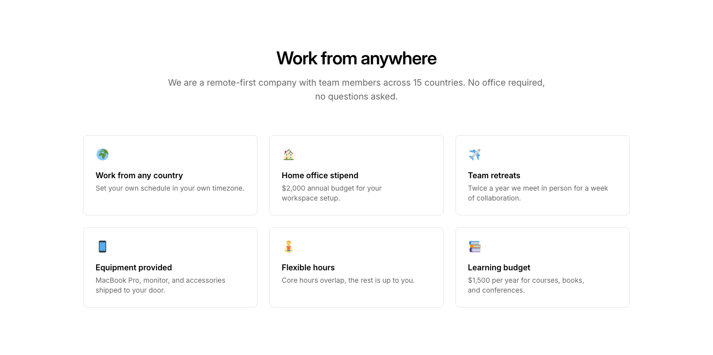
Remote
CareerRemote work policy and benefits section.
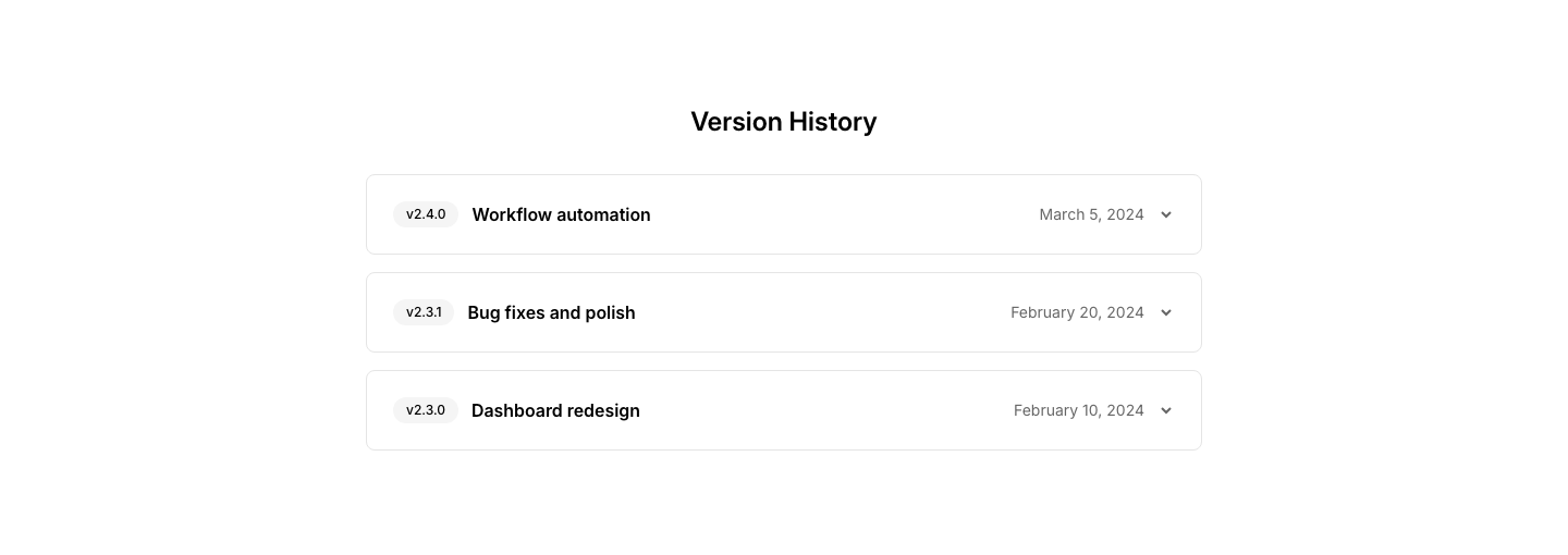
Card
ChangelogEach version in its own card with collapsible details.
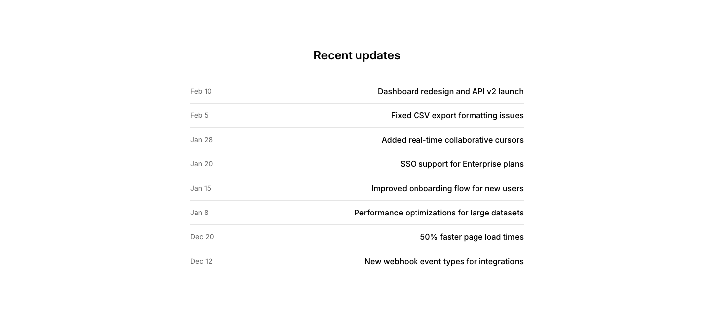
Compact
ChangelogDense compact changelog list with dates and titles.
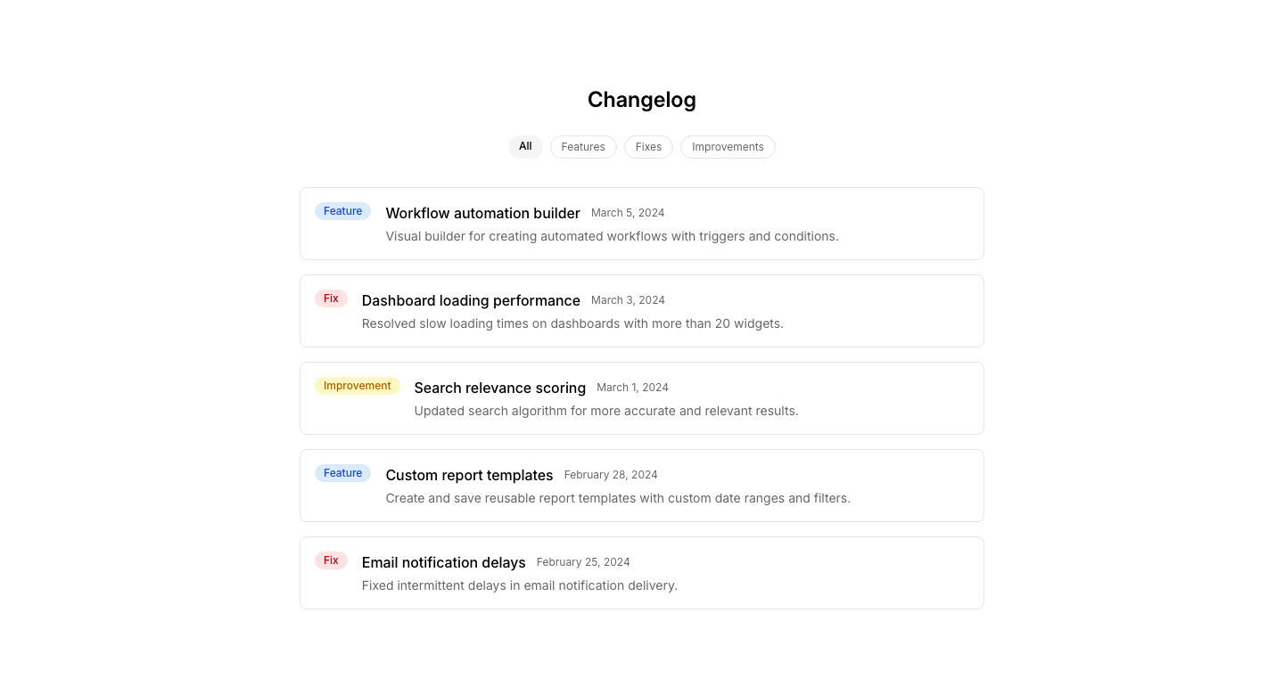
Filter
ChangelogChangelog with filter by type (feature, fix, improvement).
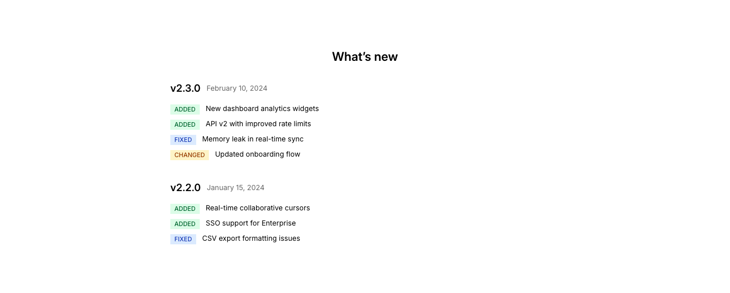
Grouped
ChangelogGrouped changelog with typed change entries per version.
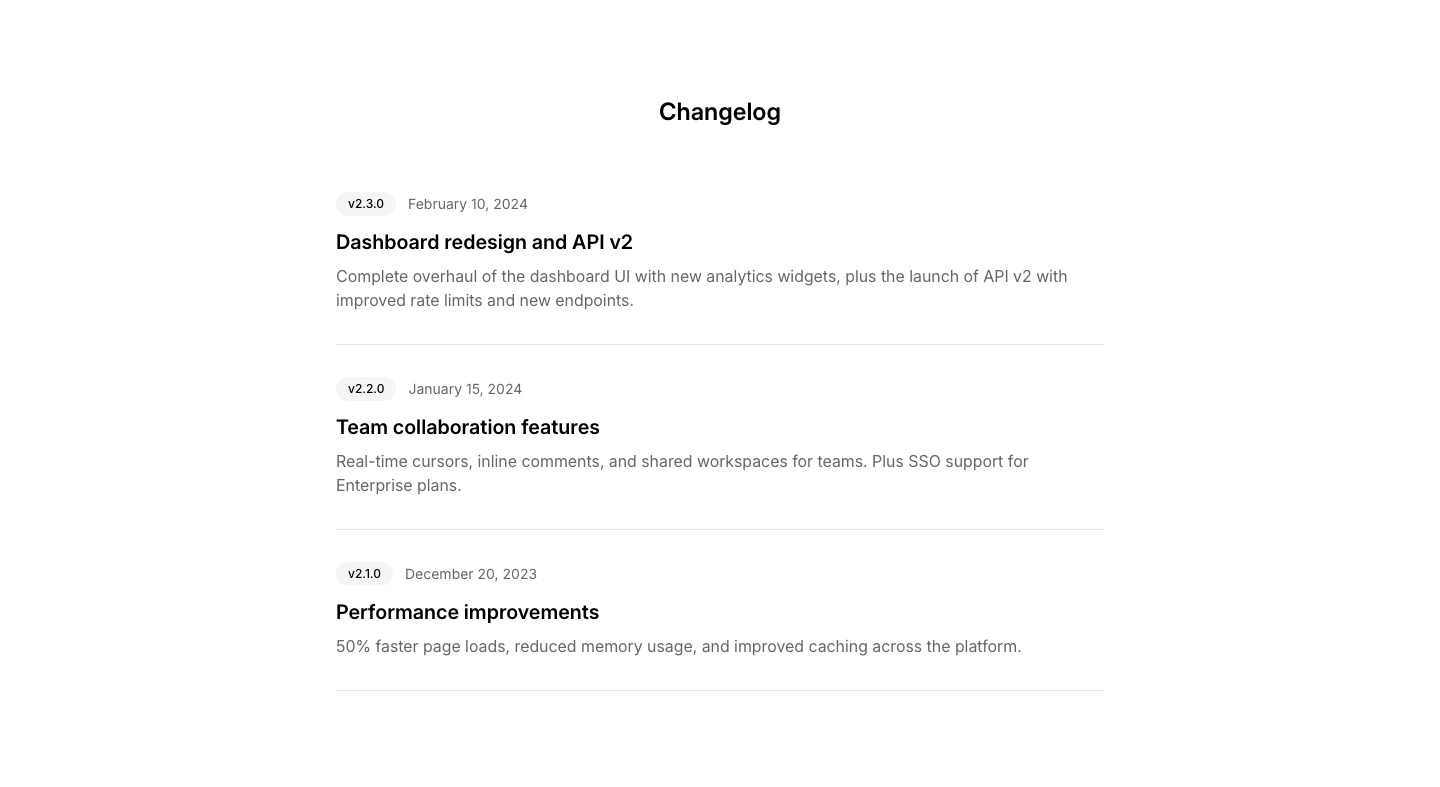
List
ChangelogVertical changelog with version badges, dates, and descriptions.
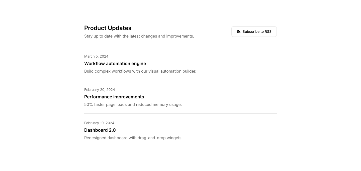
RSS
ChangelogChangelog with RSS subscribe link and notification options.
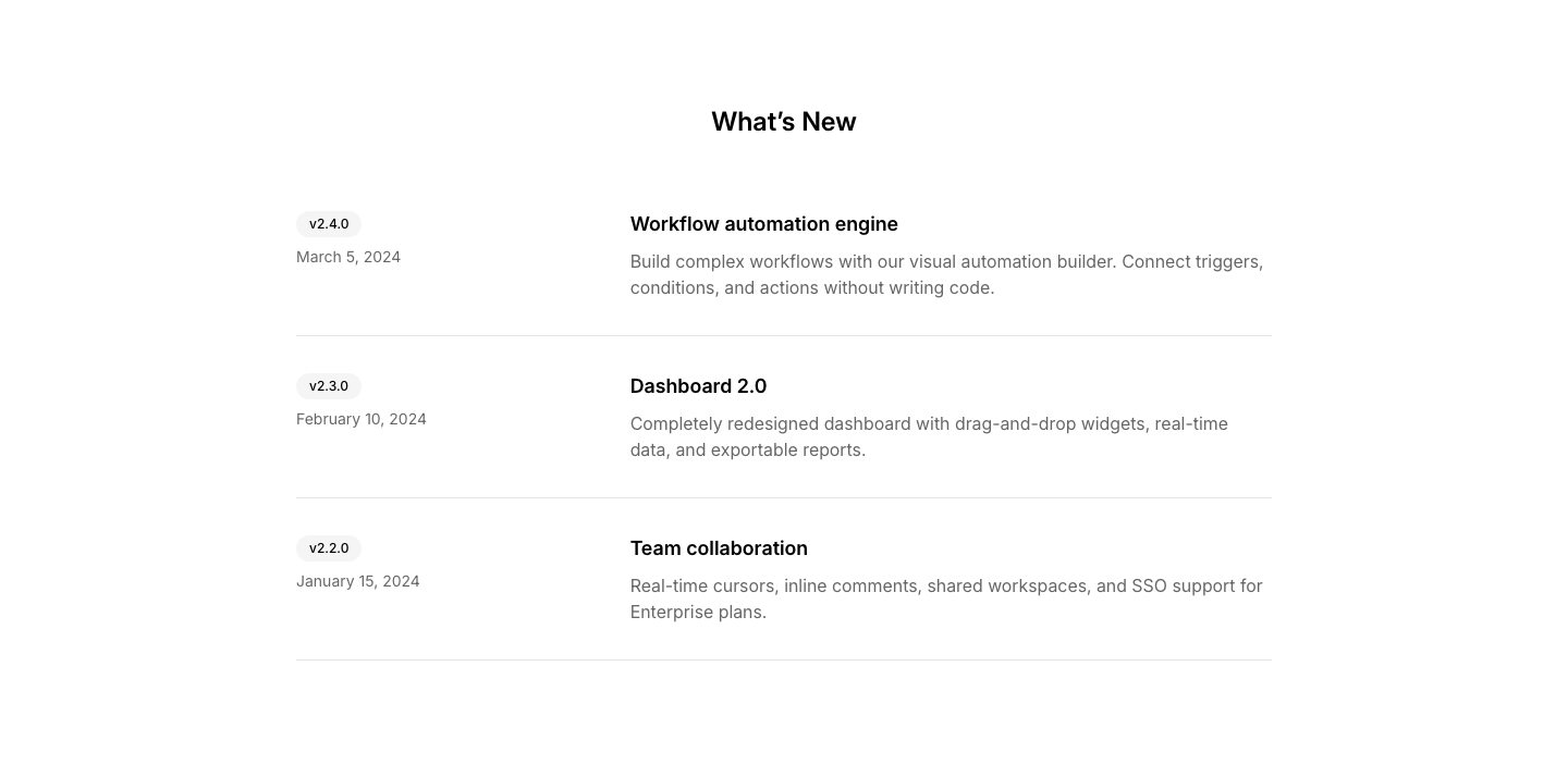
Split
ChangelogVersion info left, detailed changes right.
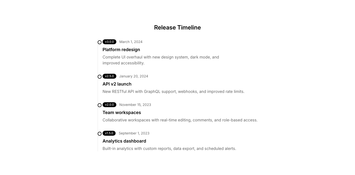
Timeline
ChangelogChangelog as a vertical timeline with version markers.
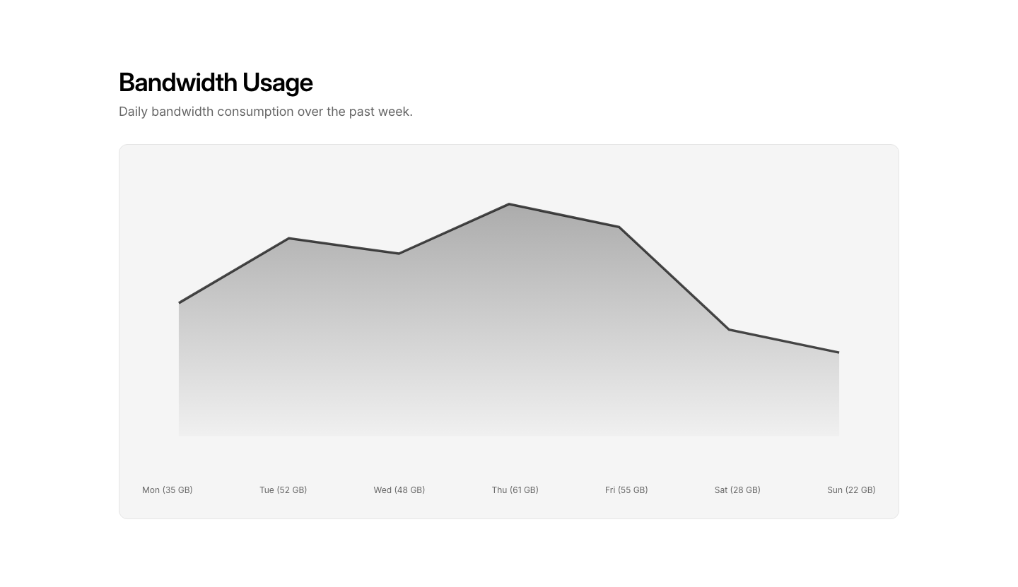
Area
ChartArea chart with gradient fill under the line.
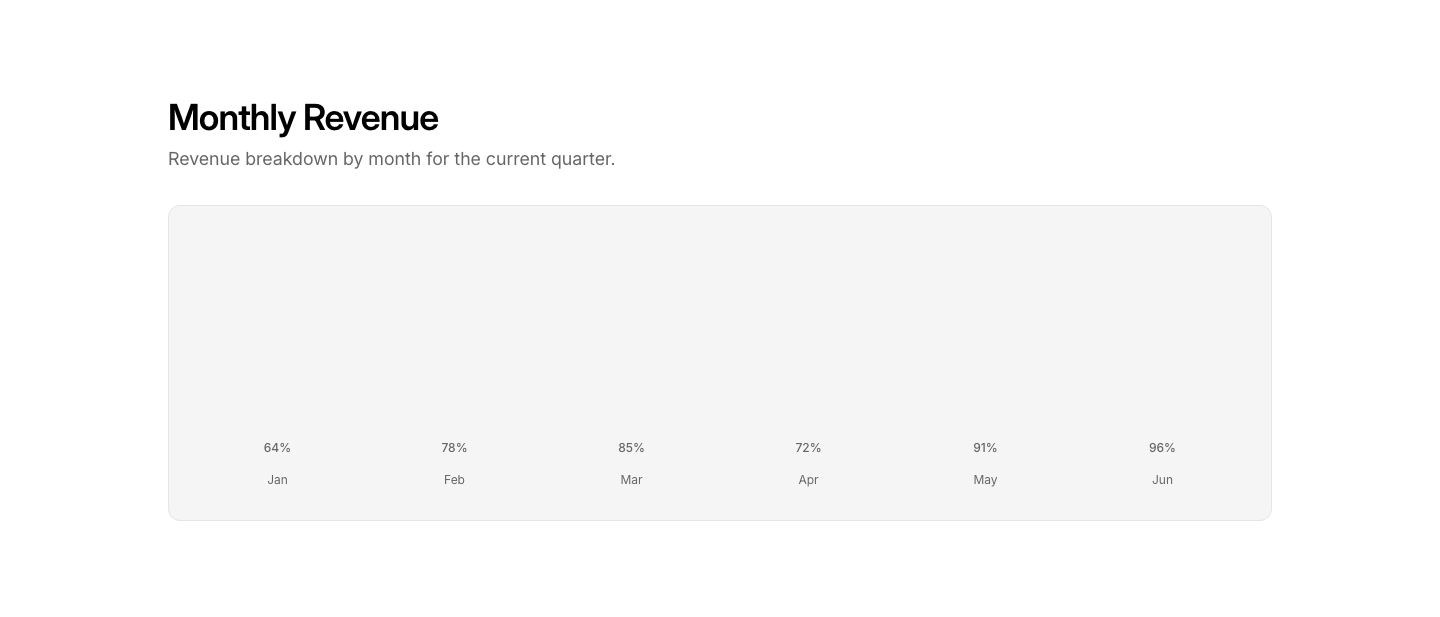
Bar
ChartVertical bar chart with labels and values.
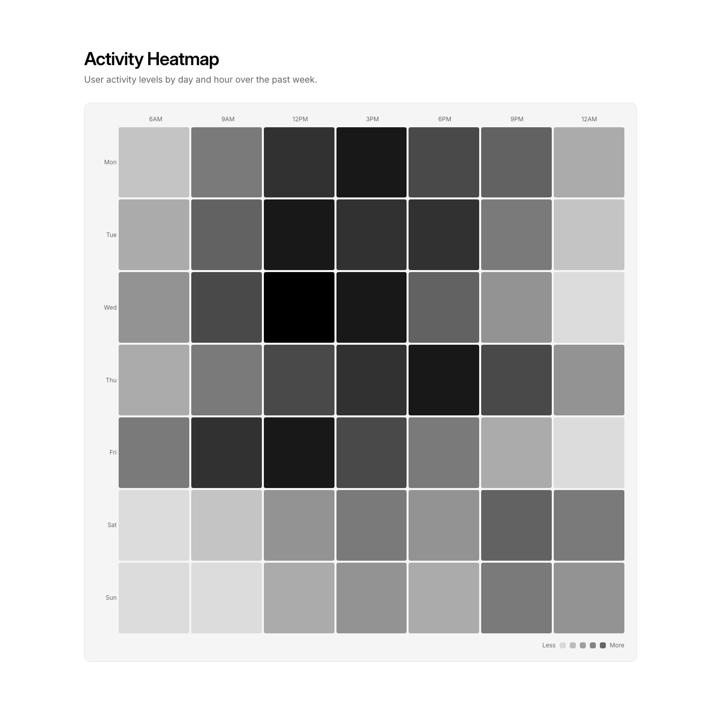
Heatmap
ChartHeatmap grid showing intensity by category and time.
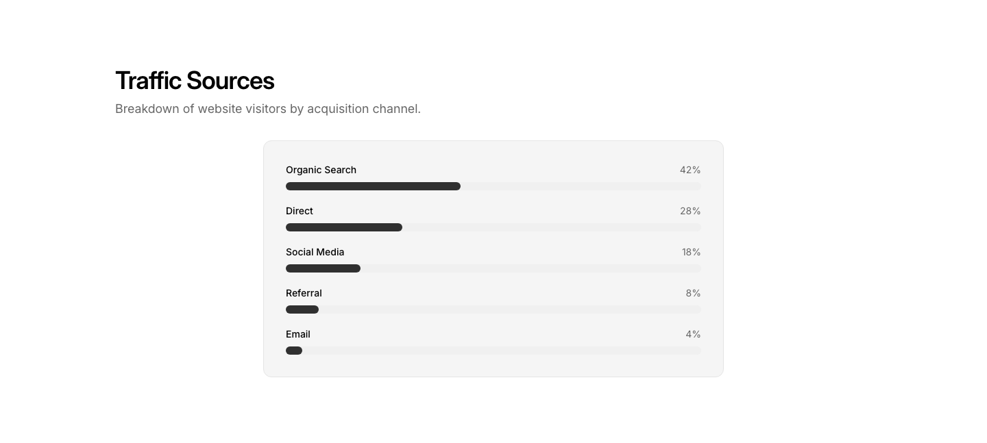
Horizontal
ChartHorizontal bar chart for ranking/comparison data.
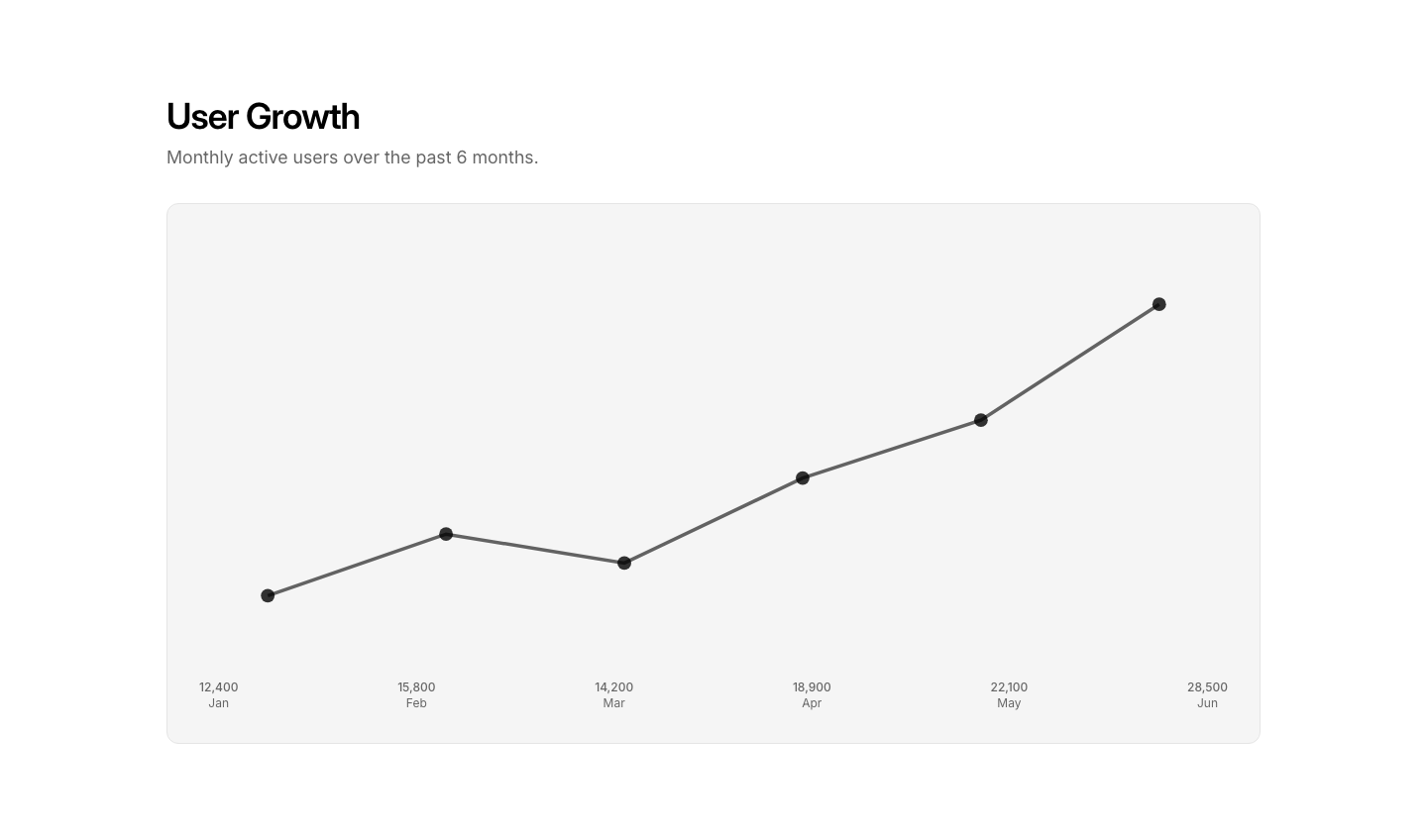
Line
ChartLine chart with data points and trend line.
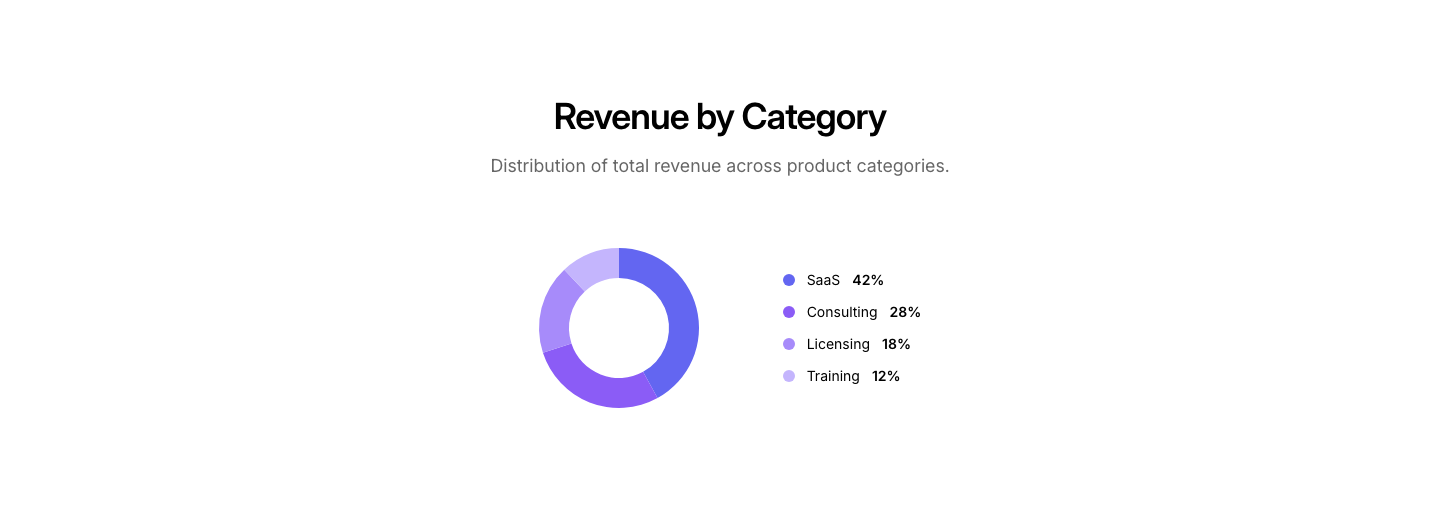
Pie
ChartPie/donut chart with legend and percentages.
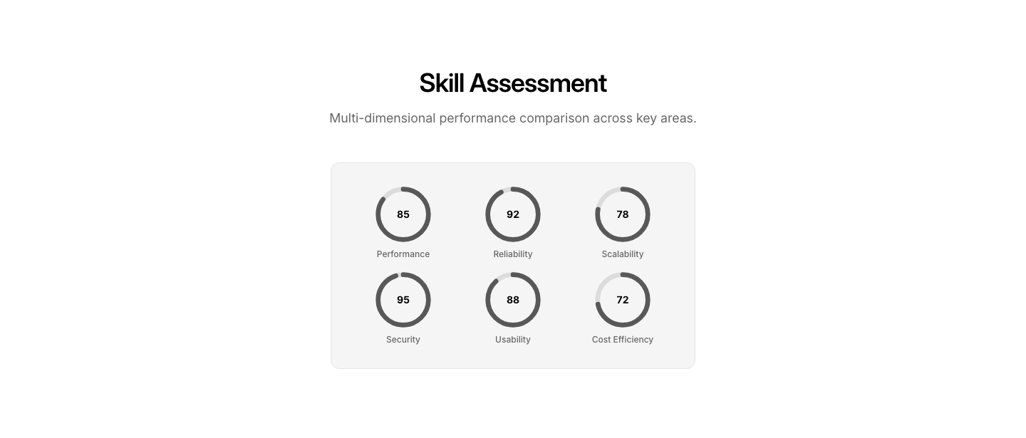
Radar
ChartRadar/spider chart for multi-dimensional comparison.
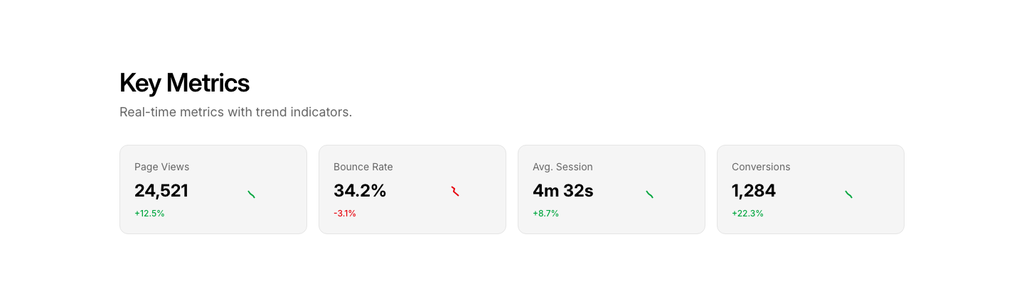
Sparkline
ChartInline sparkline charts beside metric labels.
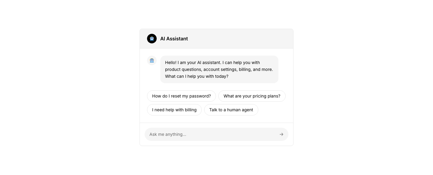
Bot
ChatAI chatbot interface with suggested responses.
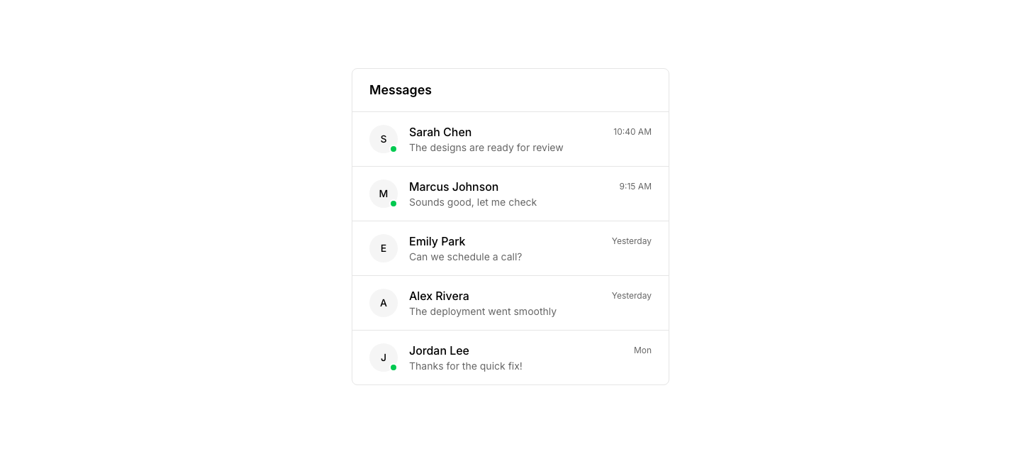
Contacts
ChatChat contacts list with online status and last message.
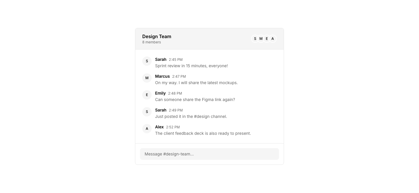
Group
ChatGroup chat with multiple participant avatars.
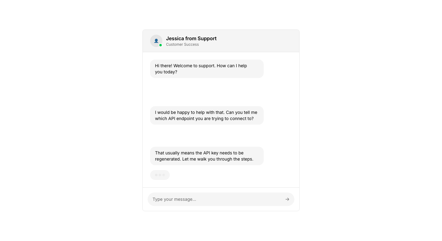
Support
ChatSupport chat layout with agent info and typing indicator.

Widget
ChatFloating chat widget button with unread count.
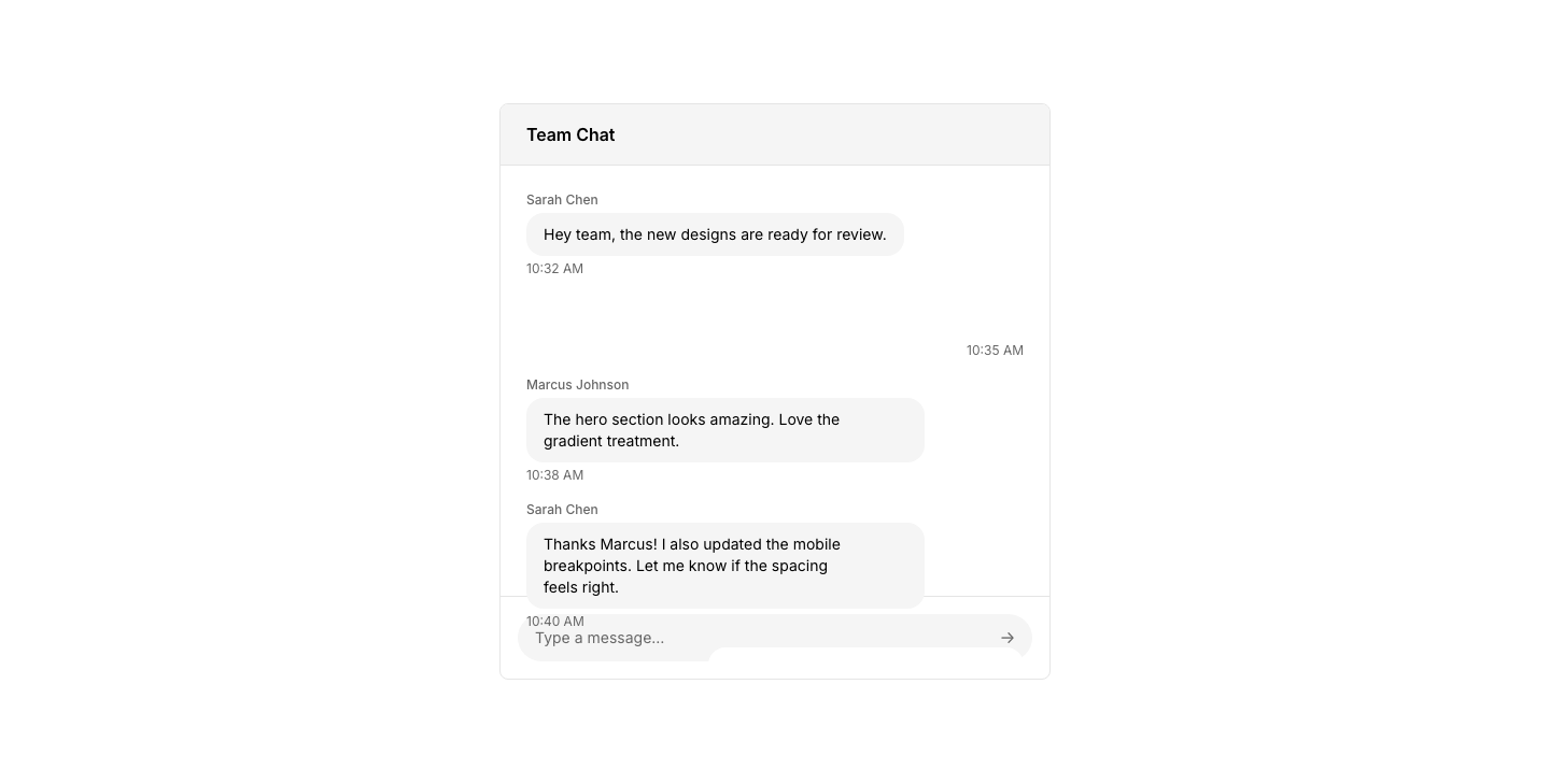
Window
ChatChat window with message bubbles and input field.
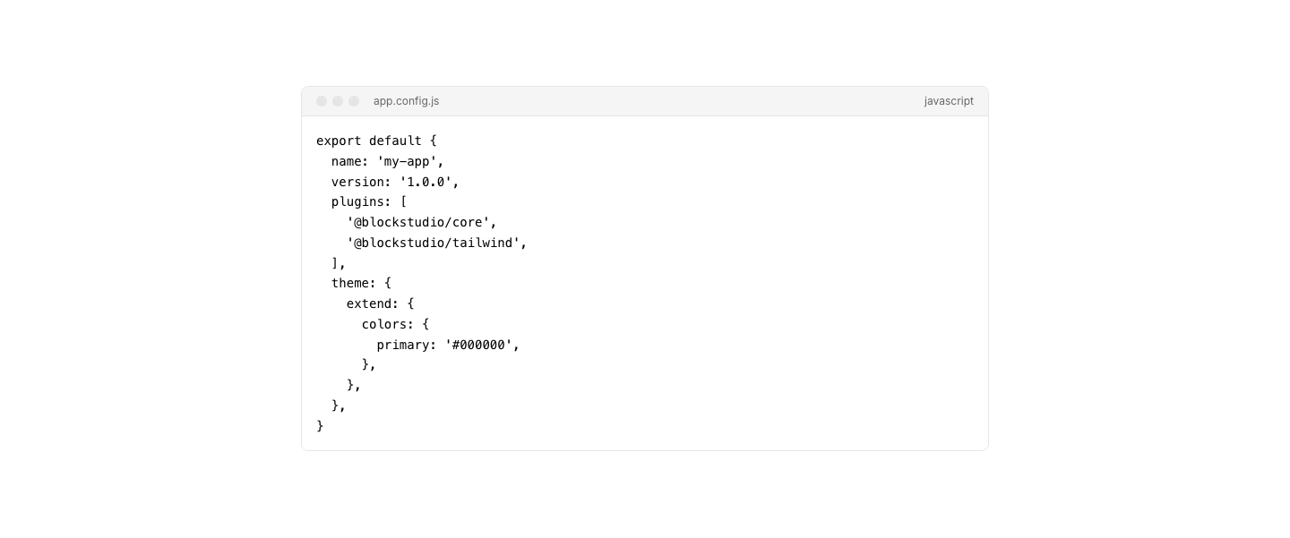
Block
CodeStyled code block with language label and line numbers.
Comparison
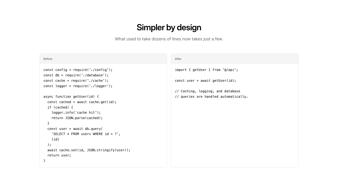
CodeSide-by-side code comparison with before and after panels.
Diff
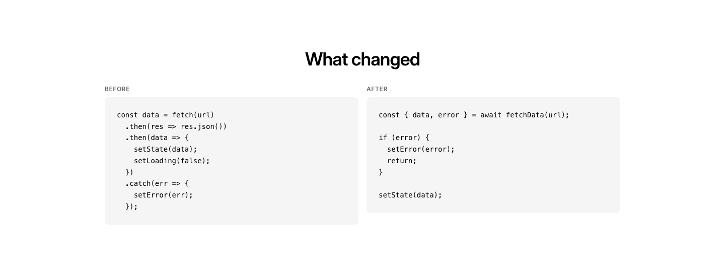
CodeSide-by-side before/after code diff view.
Playground
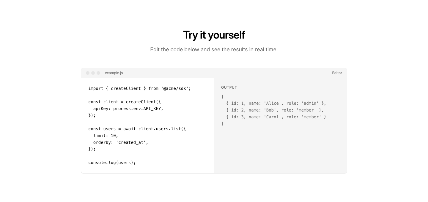
CodeInteractive code playground with editor and output panel.
Snippet
CodeCompact code snippet with copy button and description.
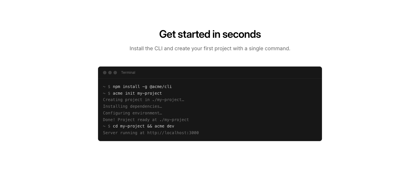
Terminal
CodeTerminal/CLI output display with command prompt and output.
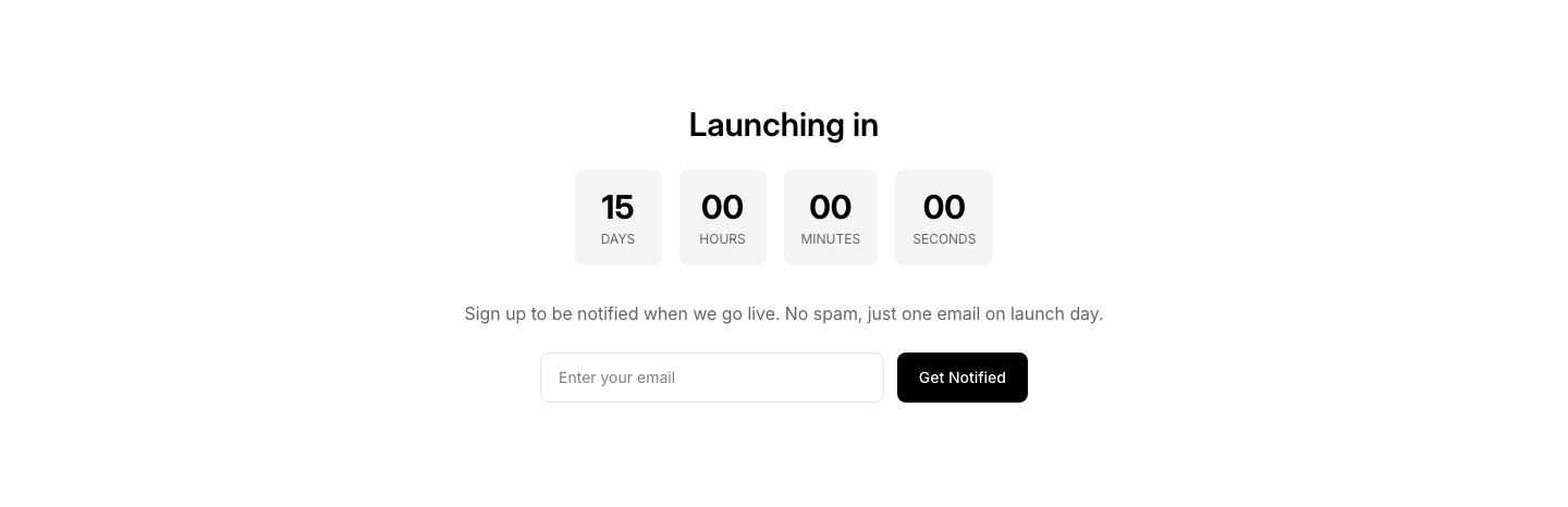
Countdown
Coming SoonComing soon page with countdown timer and email signup.
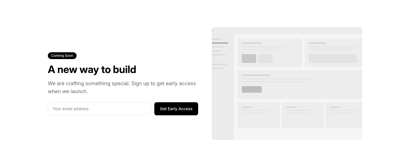
Preview
Coming SoonComing soon page with a product preview image and email signup.

Progress
Coming SoonComing soon page with a progress bar showing development completion.

Simple
Coming SoonSimple coming soon page with email signup form.

Social
Coming SoonComing soon page with social media links to stay connected.
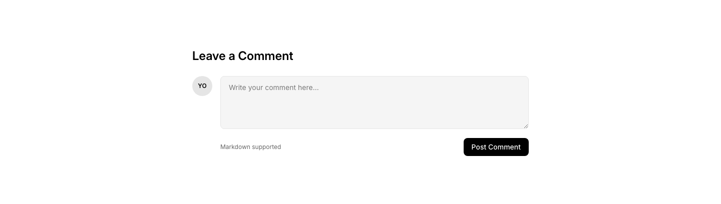
Form
CommentComment input form with avatar and submit button.
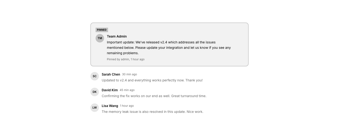
Highlighted
CommentPinned/highlighted comment at the top of thread.
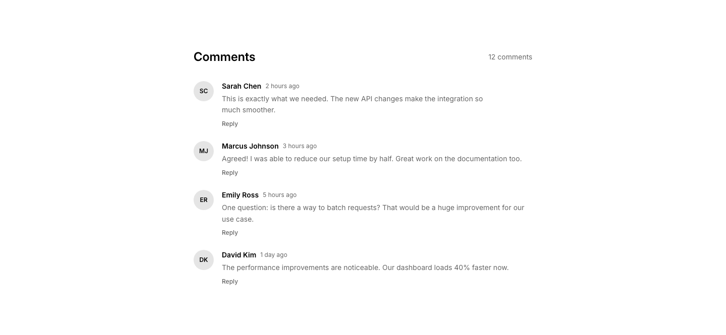
List
CommentComment thread with avatar, name, timestamp, and text.
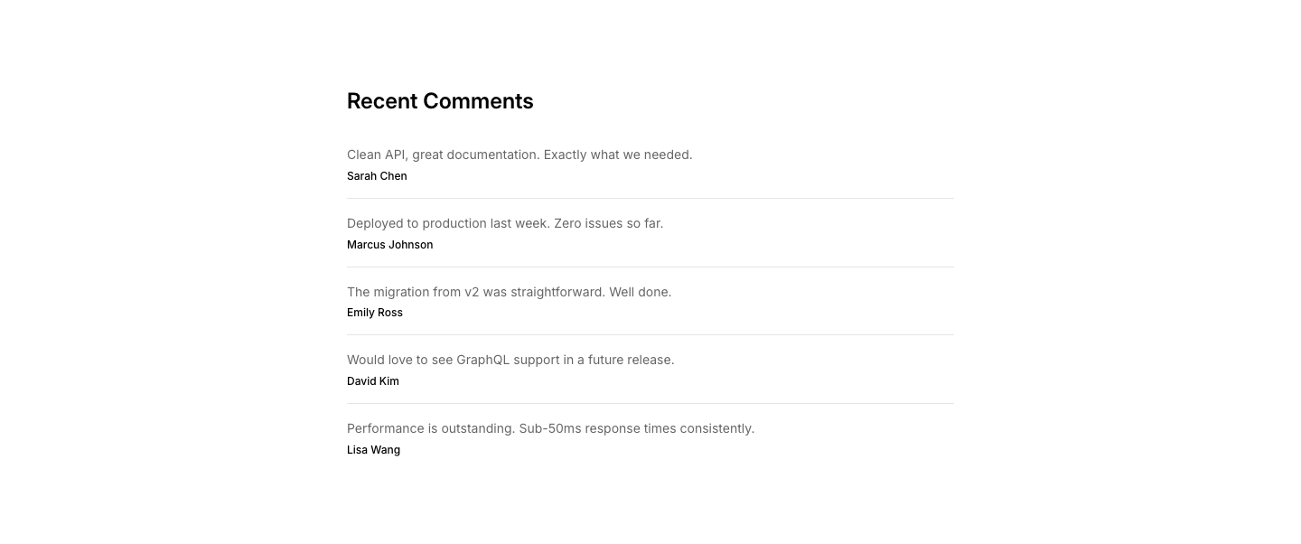
Minimal
CommentMinimal comment list with name and text only.
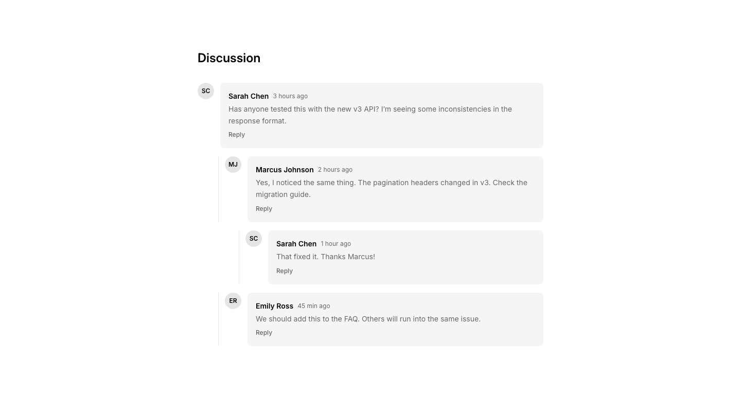
Nested
CommentNested/threaded comments with reply indentation.
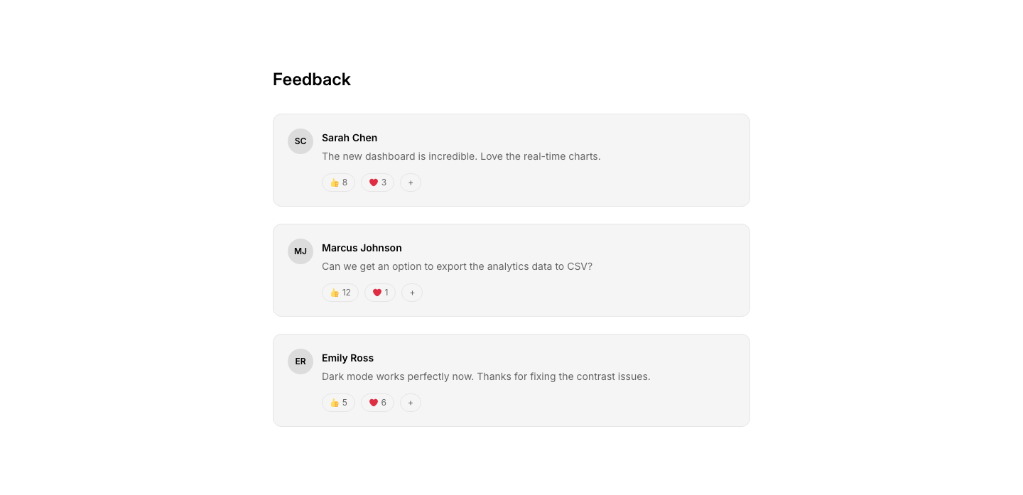
Reaction
CommentComments with emoji reaction buttons.
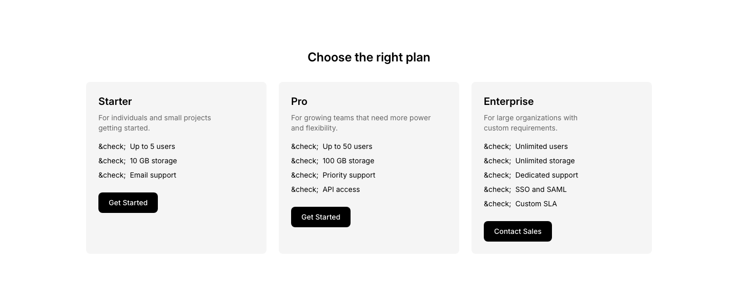
Cards
ComparisonSide-by-side comparison cards with feature lists.
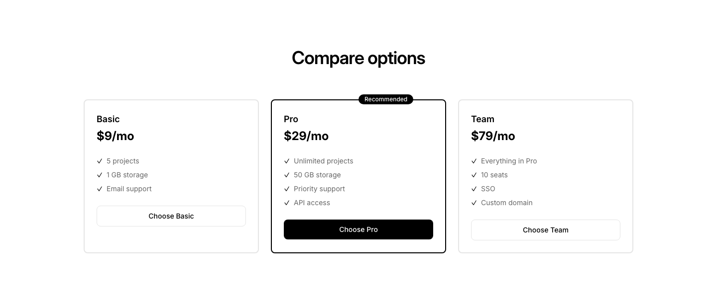
Highlight
ComparisonOne recommended option highlighted among alternatives.
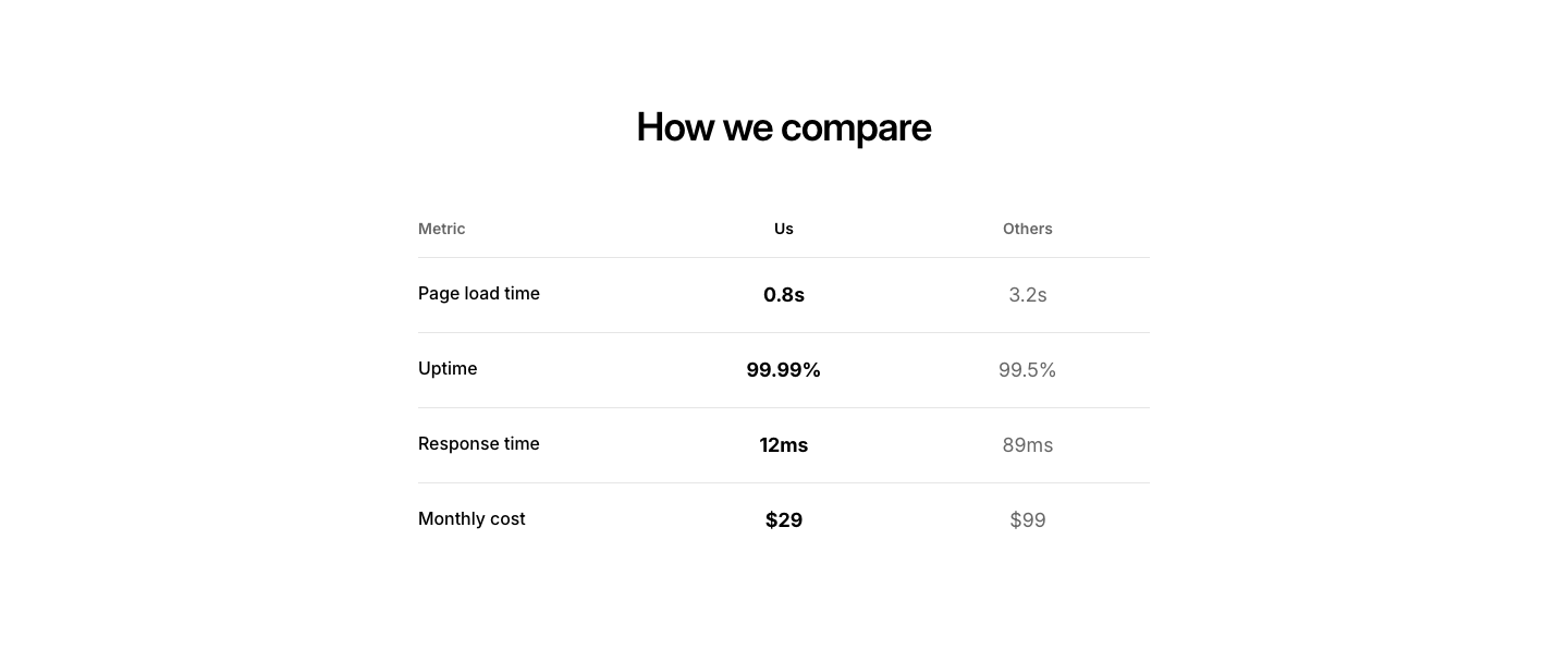
Metric
ComparisonSide-by-side metric comparison (speed, cost, quality).
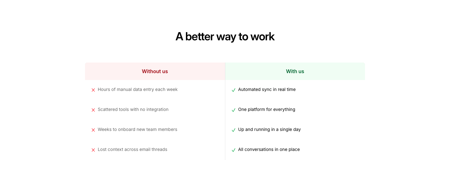
Narrative
ComparisonStory-driven comparison: Without us vs With us sections.
Slider
ComparisonImage slider comparing before and after states.
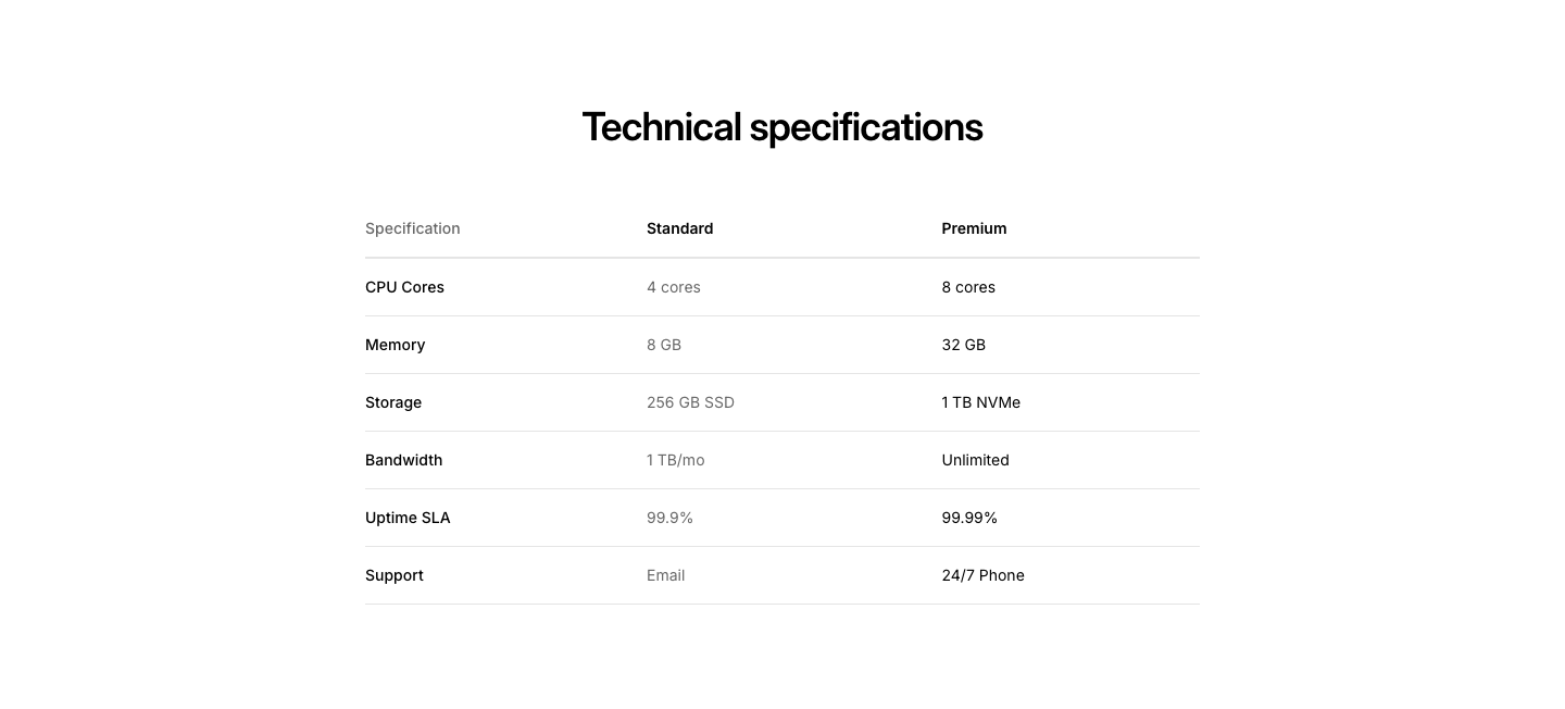
Spec
ComparisonTechnical specification comparison table.
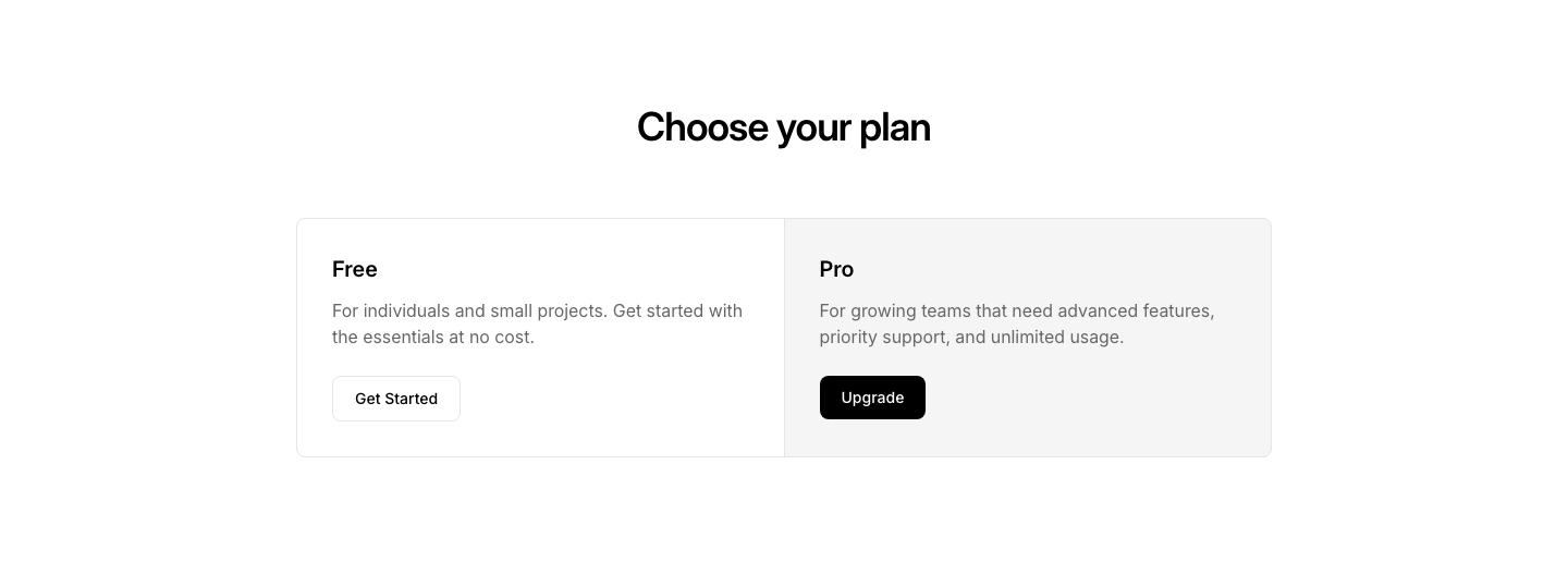
Split
ComparisonSplit screen with two options side by side.
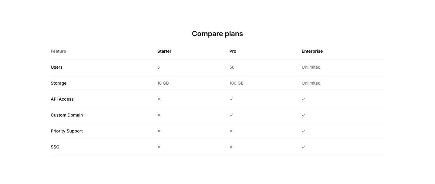
Table
ComparisonFeature comparison table with multiple plan columns.
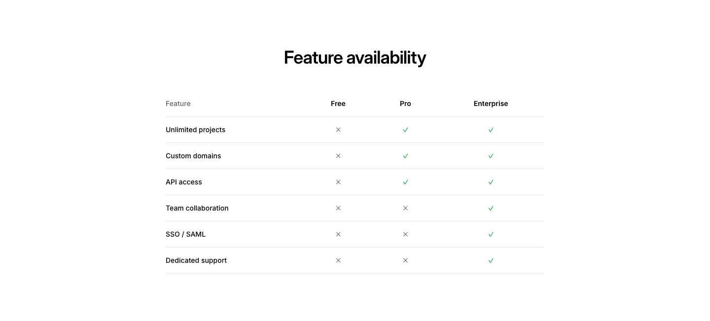
Tier
ComparisonFeature availability by tier with colored indicators.
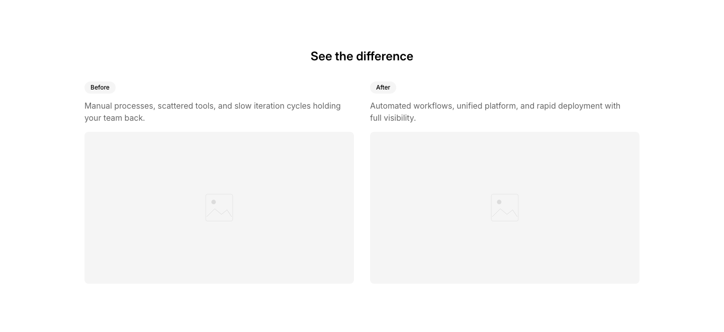
Toggle
ComparisonBefore and after visual comparison with side-by-side layout.
Card
ContactContact information displayed in a grid of cards.
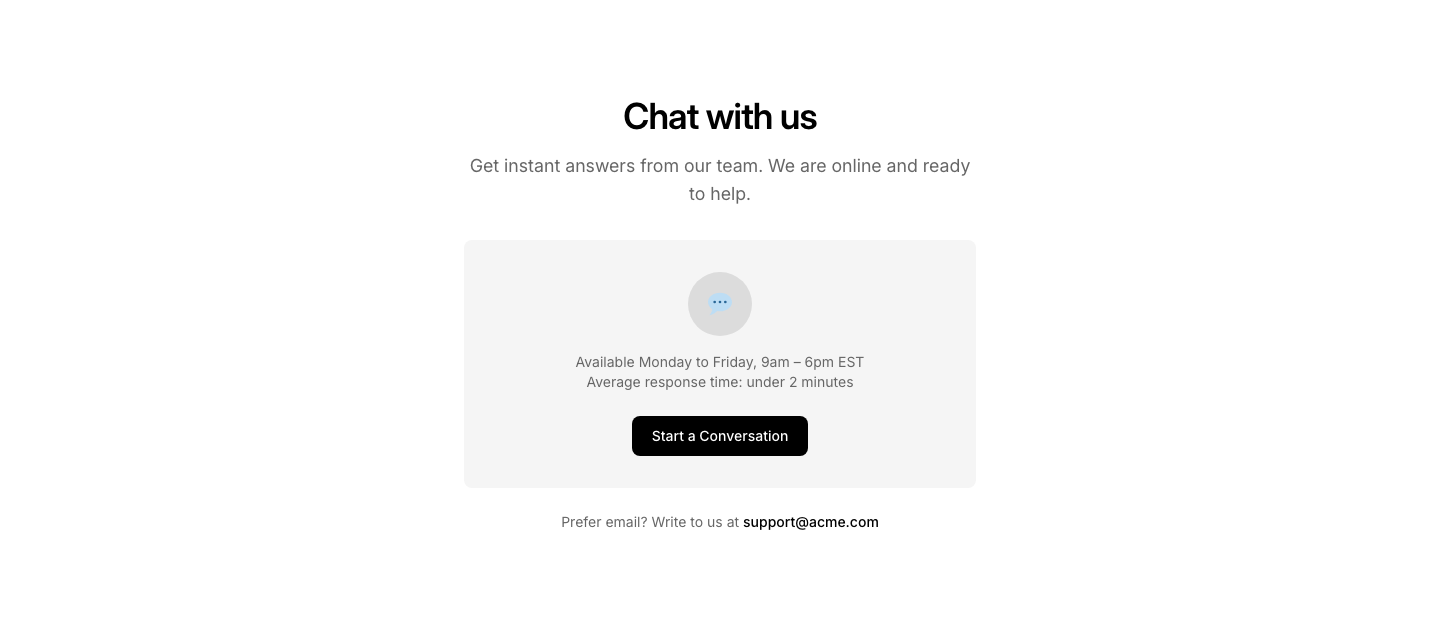
Chat
ContactContact section with live chat widget placeholder.
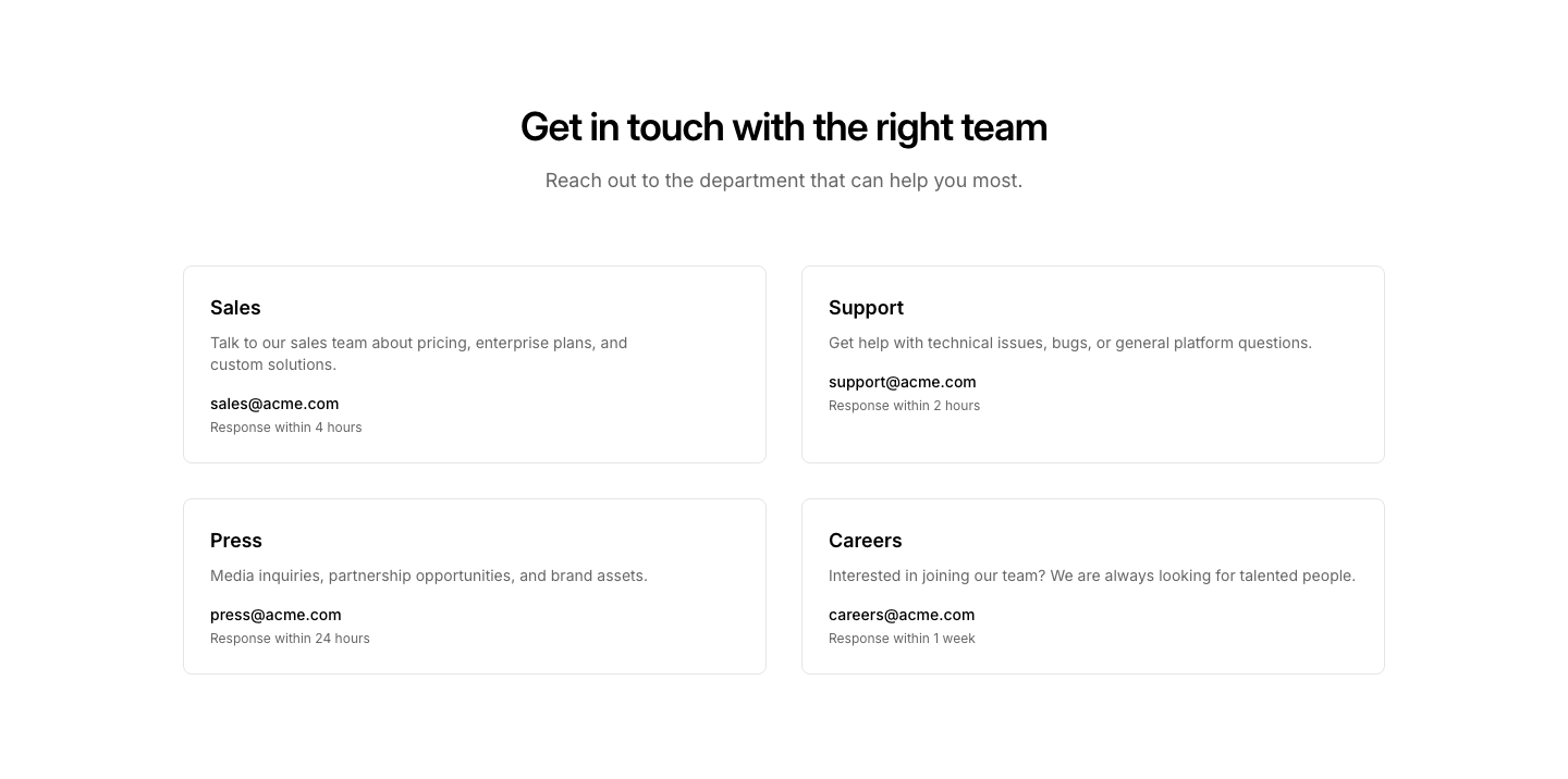
Department
ContactContact options by department (Sales, Support, Press).
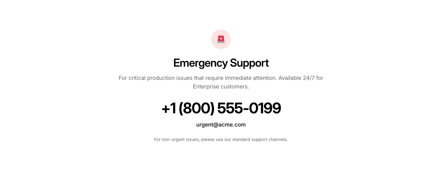
Emergency
ContactUrgent contact with large phone number and emergency info.
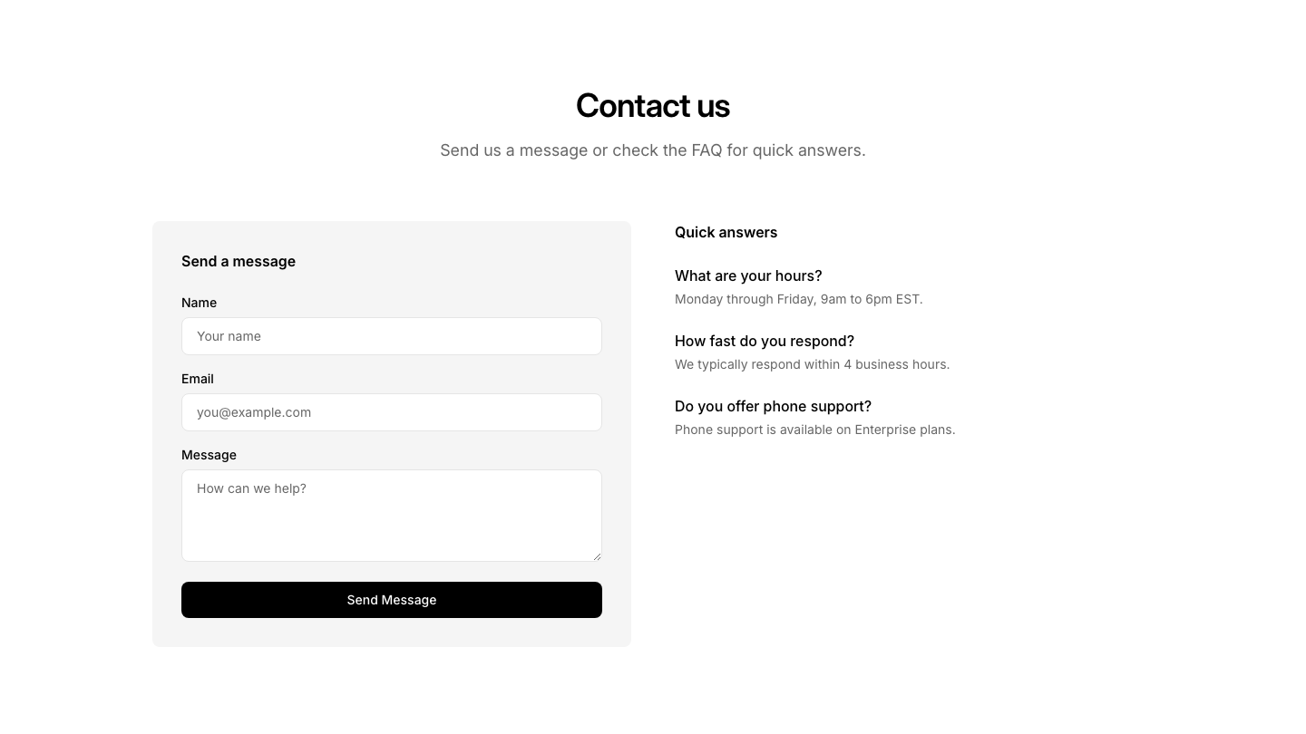
FAQ
ContactContact form with FAQ section beside it.
Hours
ContactContact info with business hours listed.
Map
ContactTwo-column contact layout with details and map placeholder.

Minimal
ContactMinimal contact section with heading, description, and email link.
Offices
ContactMultiple office locations with addresses in a grid.
Simple
ContactSimple contact form with heading, description, and form fields.
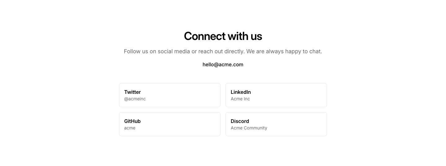
Social
ContactContact section with social media links prominently featured.
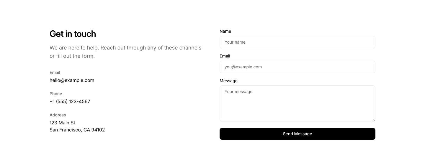
Split
ContactTwo-column contact layout with details on left and form on right.

Blockquote
ContentStyled blockquote with left border accent and attribution.
Callout
ContentHighlighted box with icon, heading, and text.
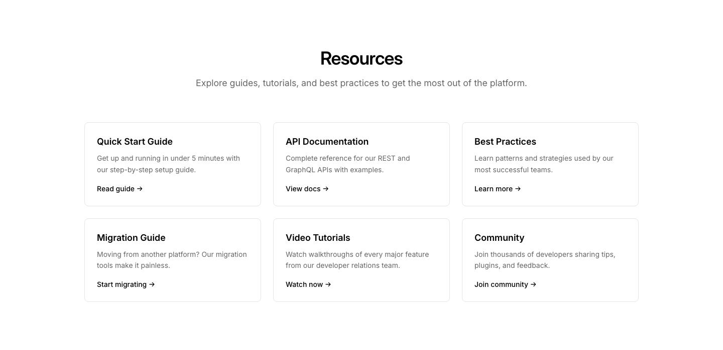
Card Grid
ContentGrid of content cards with heading, text, and optional link.
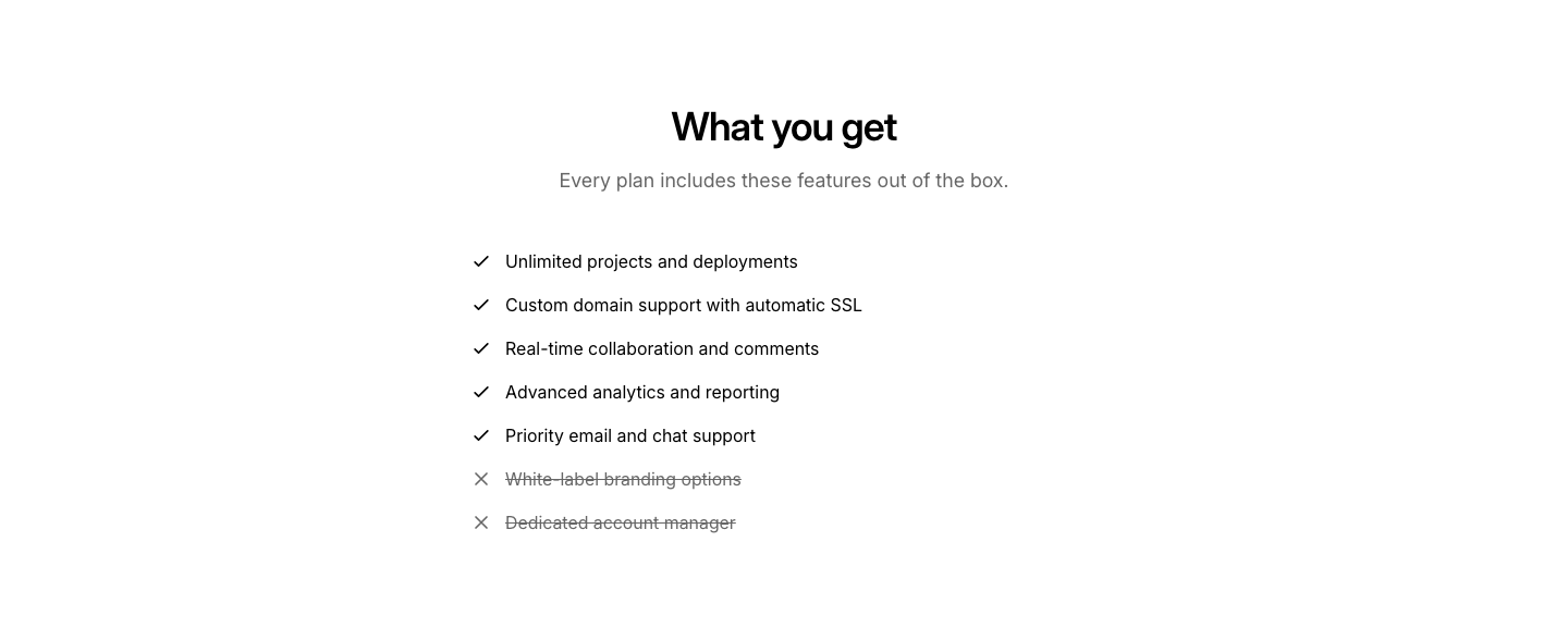
Checklist
ContentChecklist of items with check/cross icons.
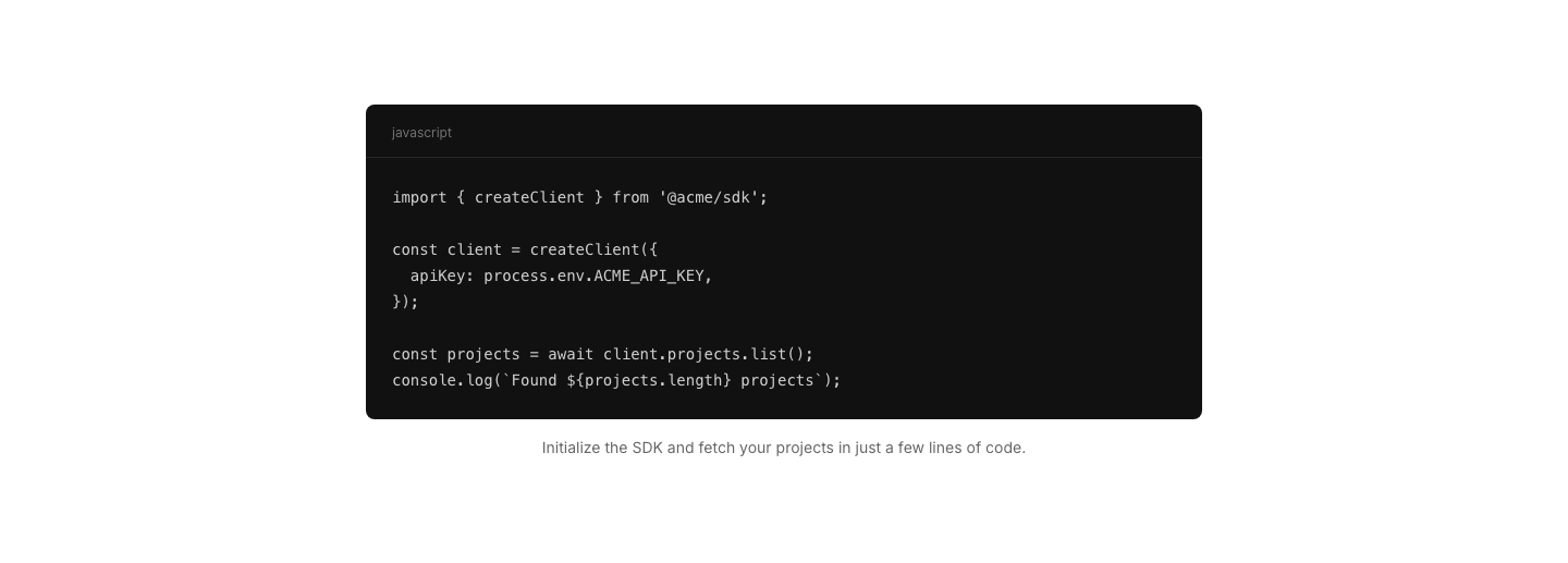
Code
ContentCode snippet block with optional caption.
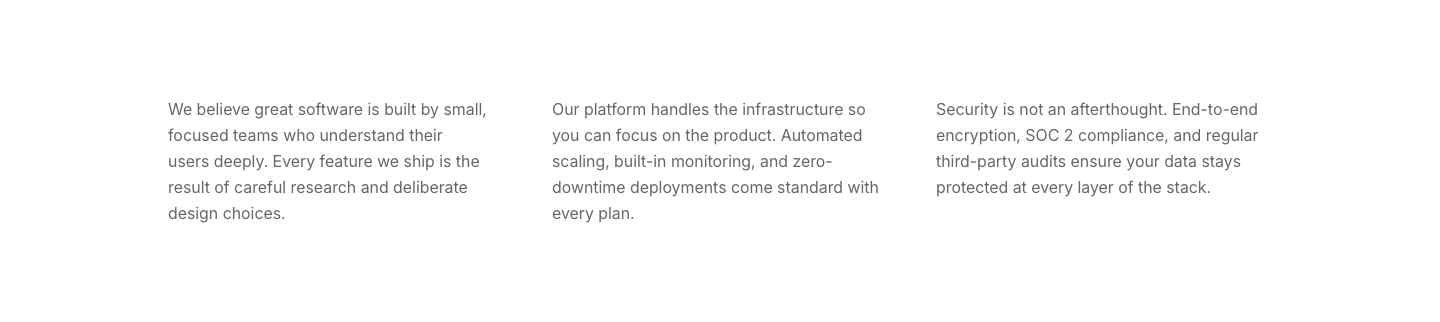
Columns
ContentThree or four short text columns.
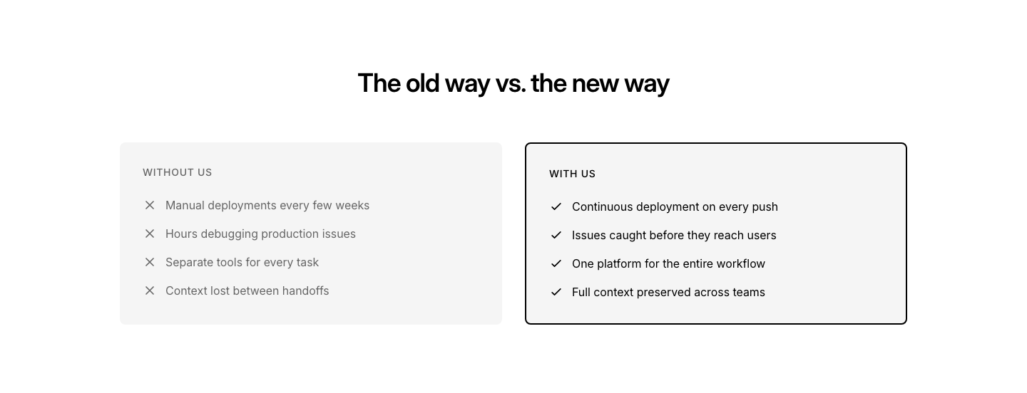
Comparison
ContentTwo-column pros/cons or before/after text comparison.
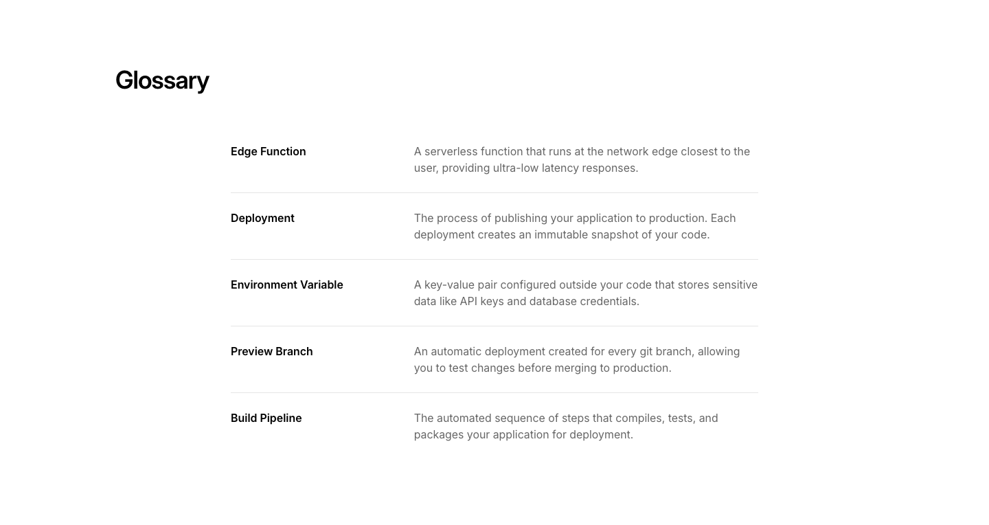
Definition
ContentTerm and definition pairs in a description list layout.
Embed
ContentGeneric embed wrapper with heading and caption.
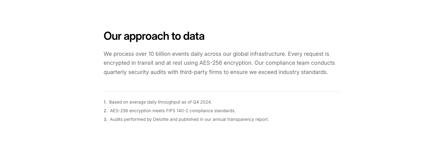
Footnote
ContentBody text with numbered footnotes at the bottom.
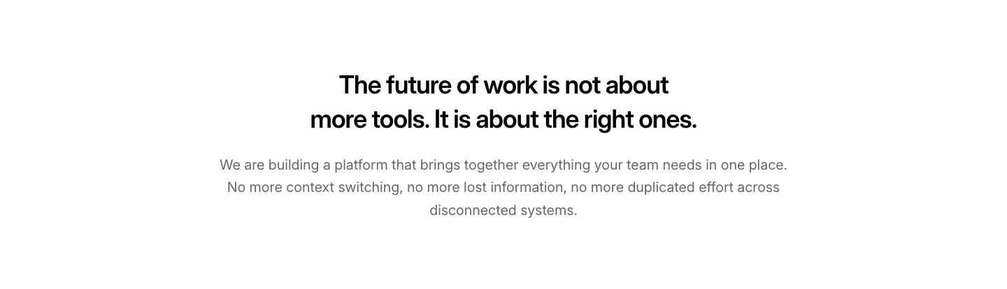
Highlight
ContentLarge text block with a bold highlighted heading.
Image
ContentImage with text beside it.
Letter
ContentLetter-style content with greeting, body, and signature.
Longform
ContentArticle-style long content with drop cap and large body text.
Manifesto
ContentLarge-type statement text, centered, with minimal formatting.

Notice
ContentInfo, warning, or success notice box with icon and text.
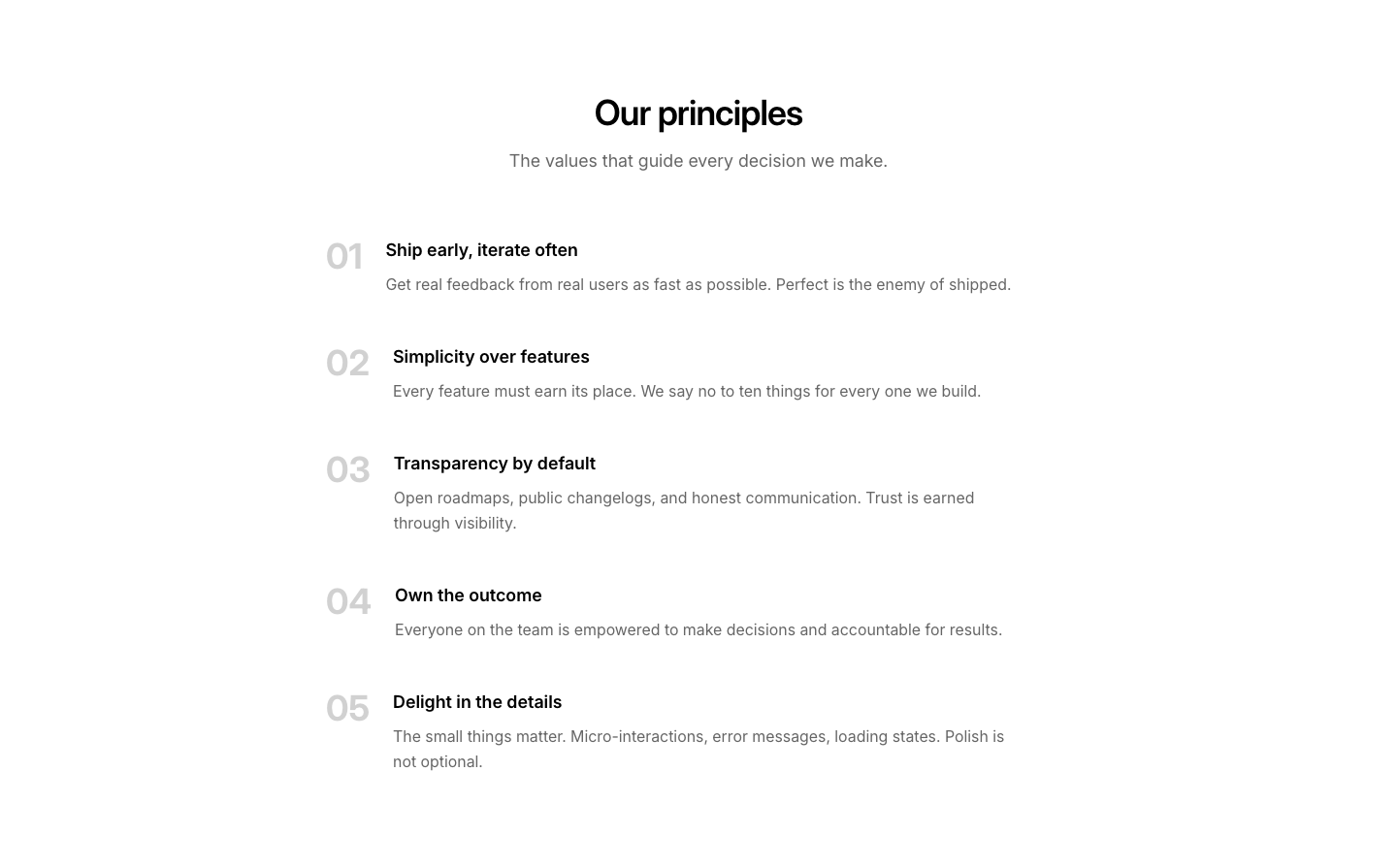
Numbered List
ContentNumbered list with large numbers and descriptions.
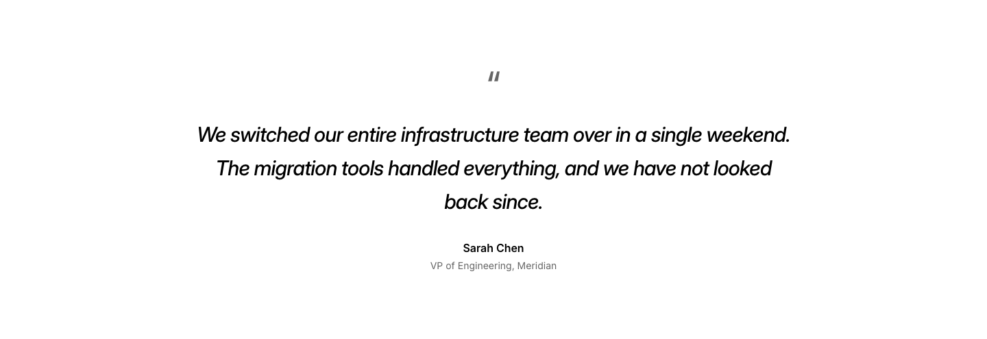
Quote
ContentLarge pull quote with attribution.
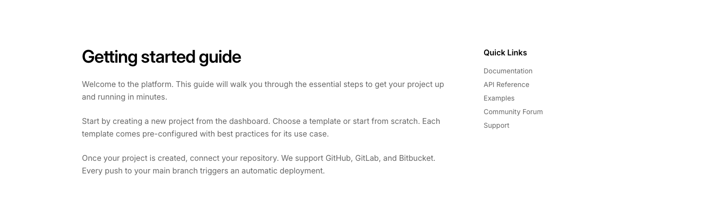
Sidebar
ContentMain content area with a narrow sidebar on the right.
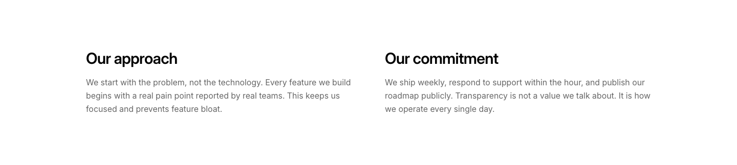
Split
ContentTwo columns of text with independent headings.
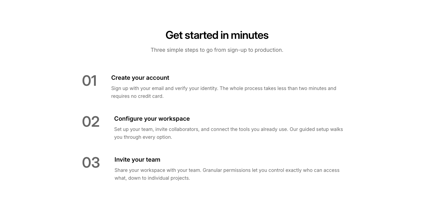
Step
ContentNumbered steps with title and description per step.
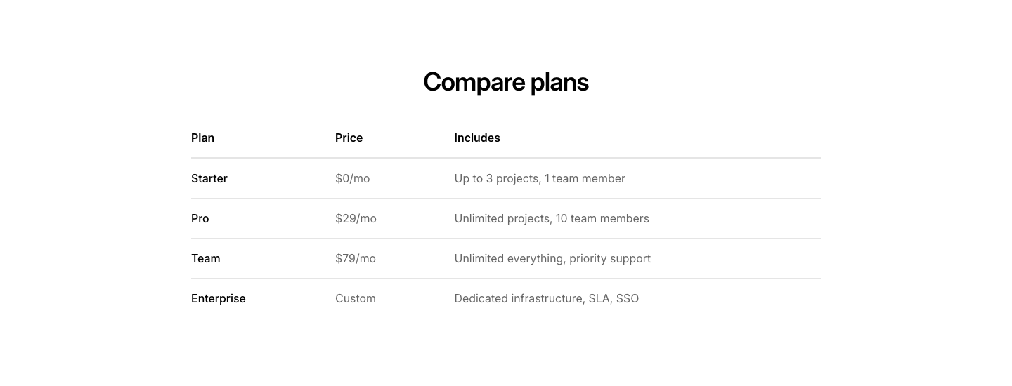
Table
ContentSimple data table with heading row.

Tabs
ContentTabbed content panels with horizontal tab navigation.

Text
ContentHeading and body paragraph.
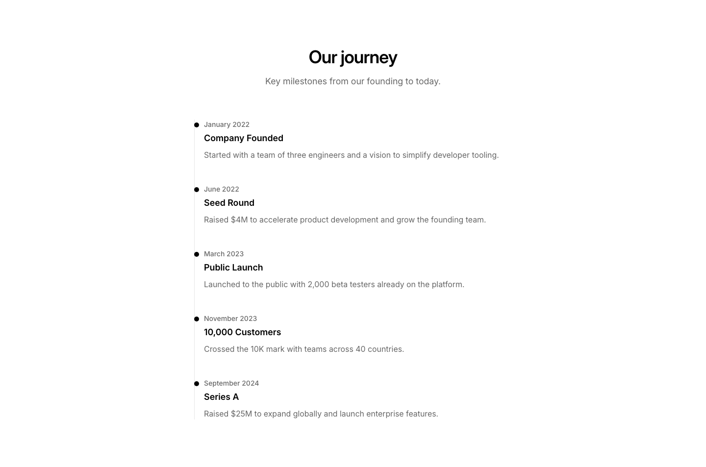
Timeline
ContentContent organized along a vertical timeline.

TOC
ContentTable of contents with anchor links to page sections.
Video
ContentHeading and description above an embedded video.
Card
CountdownCountdown timer with elevated card containers for each time unit.

Circular
CountdownCountdown timer with circular ring progress indicators for each unit.
Hero
CountdownHero countdown section with heading, description, timer, and CTA.

Minimal
CountdownMinimal single-line countdown with inline time values and labels.

Simple
CountdownSimple countdown timer with four time unit boxes.
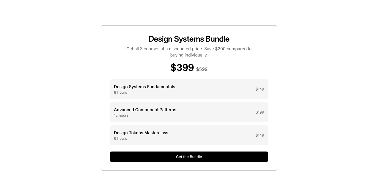
Bundle
CourseCourse bundle offer with savings and included courses.
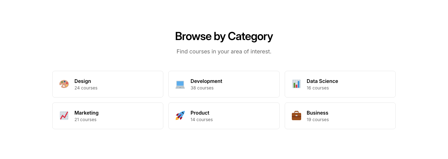
Category
CourseCourse categories with icons and course counts.
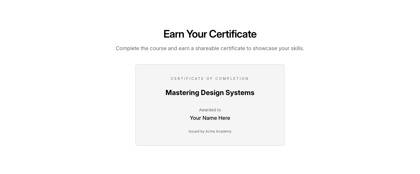
Certificate
CourseCourse completion certificate preview.
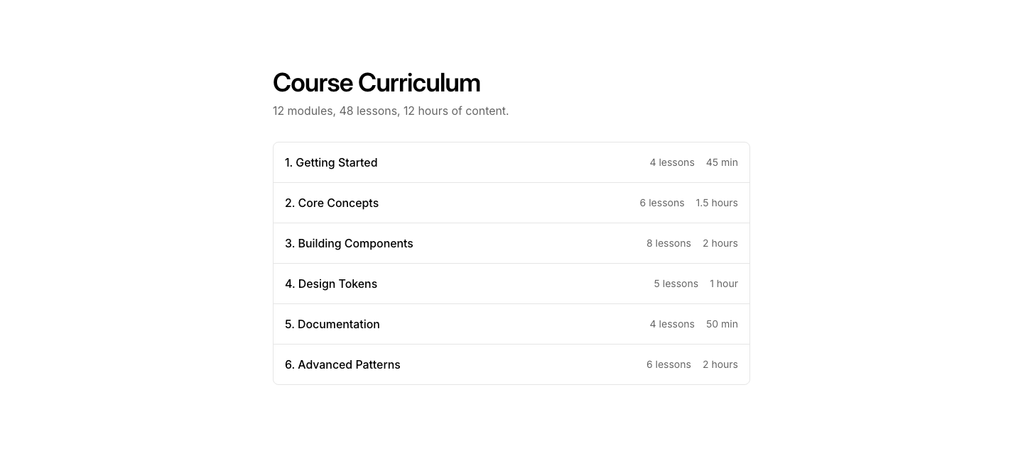
Curriculum
CourseCourse outline with expandable module/lesson list.
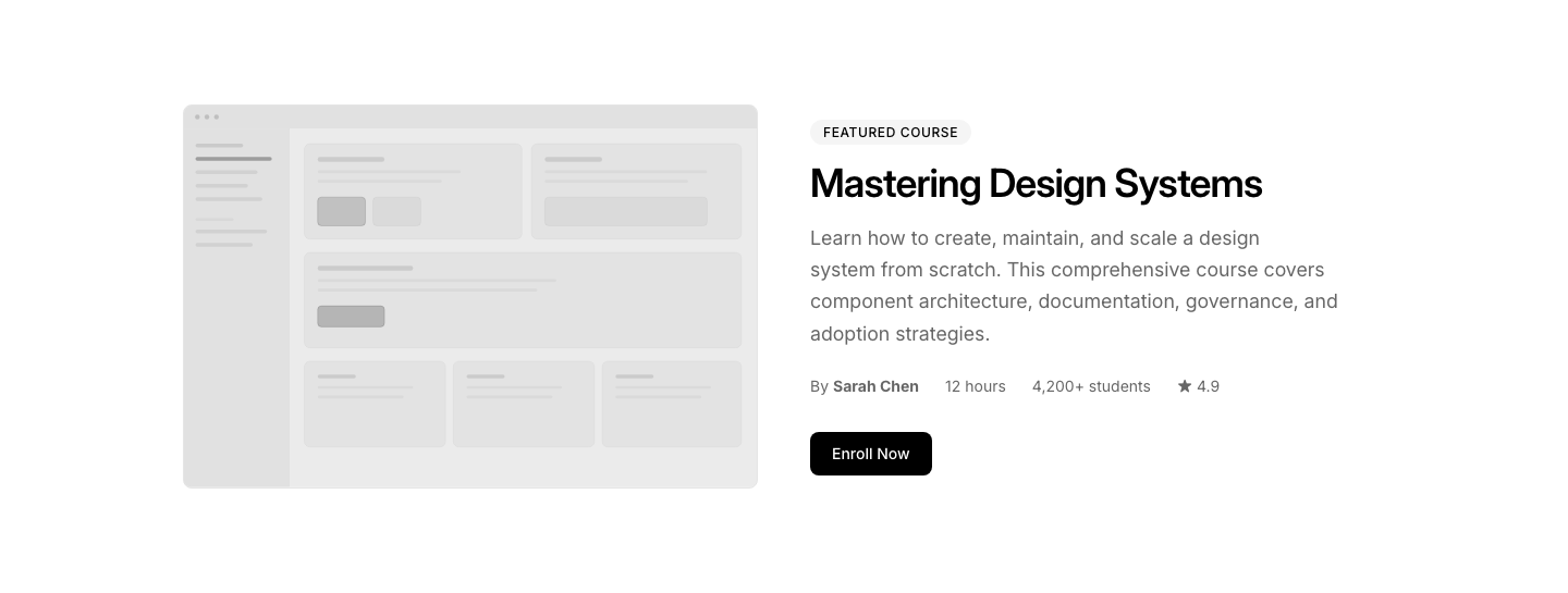
Featured
CourseFeatured course with large image and full description.
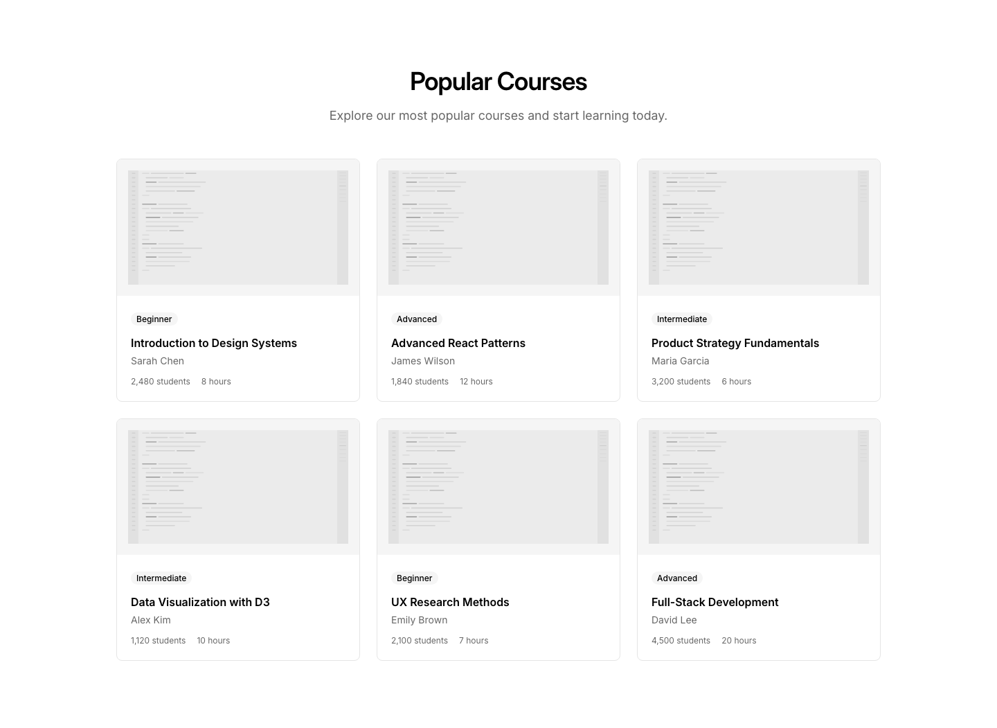
Grid
CourseGrid of course cards with image, title, and progress.

Instructor
CourseInstructor profile with bio, courses, and rating.
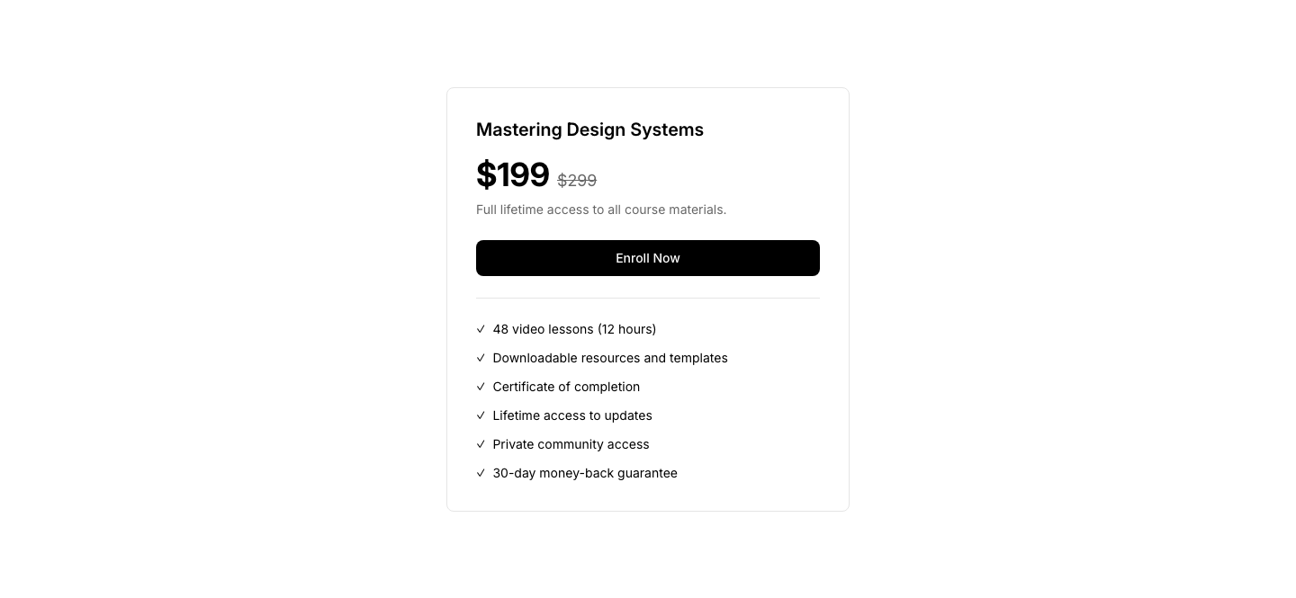
Pricing
CourseCourse pricing with enrollment CTA and included features.
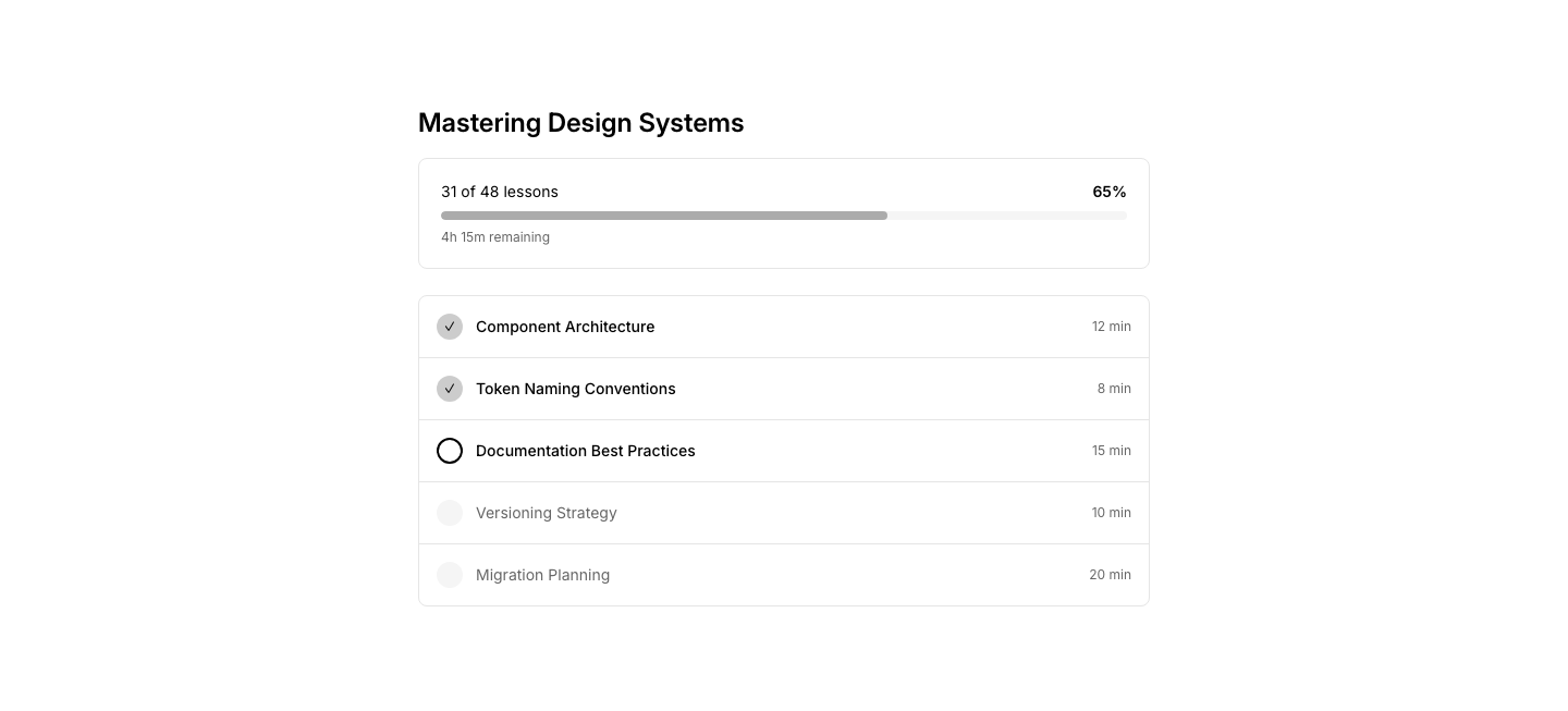
Progress
CourseCourse progress tracker with completed/remaining lessons.
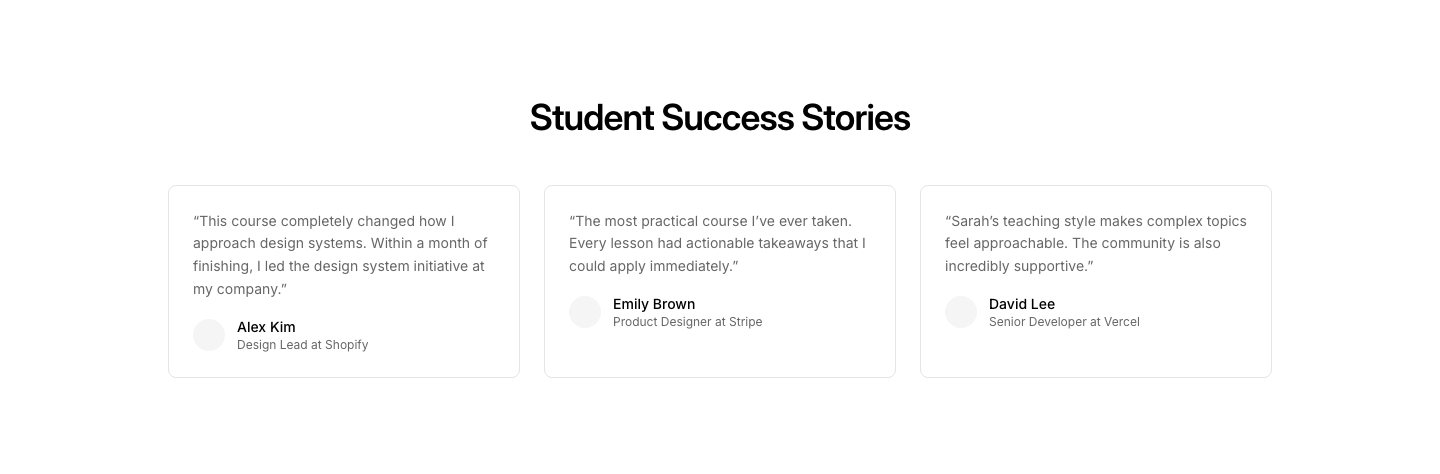
Testimonial
CourseStudent testimonials about a specific course.

Banner
CtaFull-width banner call to action with centered heading and button.

Card
CtaCall to action inside a bordered card with heading, description, and button.

Centered
CtaCentered call to action with heading, description, and button.
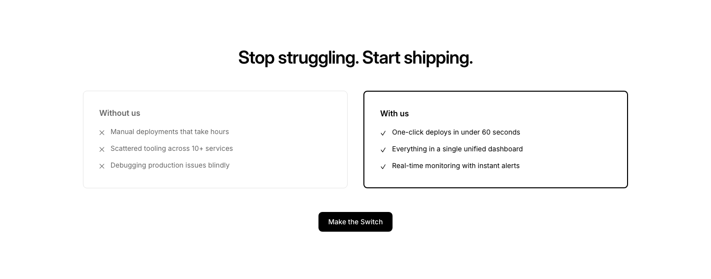
Comparison
CtaCTA with before/after comparison to motivate action.

Countdown
CtaCTA with countdown timer creating urgency.

Download
CtaApp download call to action with App Store and Google Play buttons.
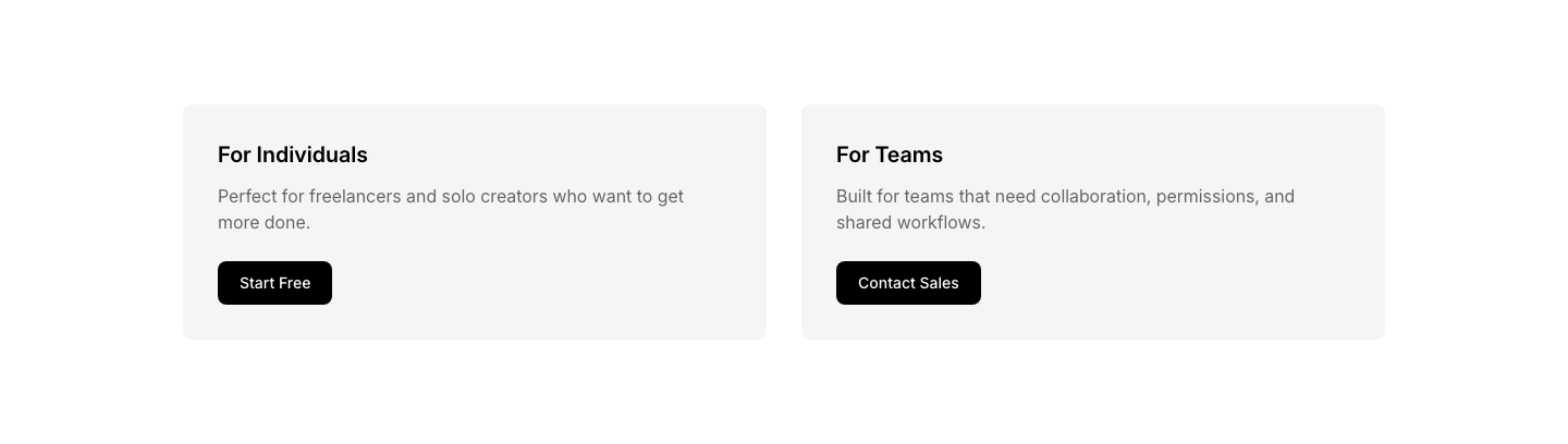
Dual
CtaTwo side-by-side call to action cards for different audiences.

Floating
CtaFloating CTA card that appears at bottom-right.
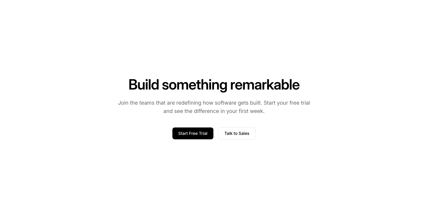
Fullscreen
CtaViewport-height CTA section with centered content.

Gradient
CtaCTA with gradient background band and white text.
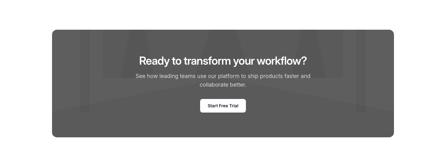
Image
CtaCTA with background image and overlay text.
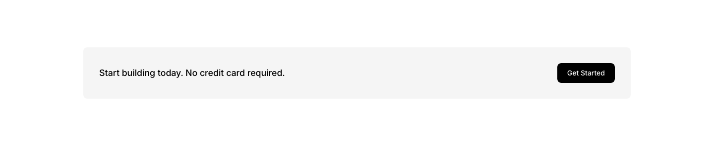
Inline
CtaInline call to action with text and button side by side.

Minimal
CtaMinimal text-only call to action with an underlined link.

Newsletter
CtaNewsletter signup with email input and subscribe button.

Split
CtaTwo-column call to action with content on left and buttons on right.
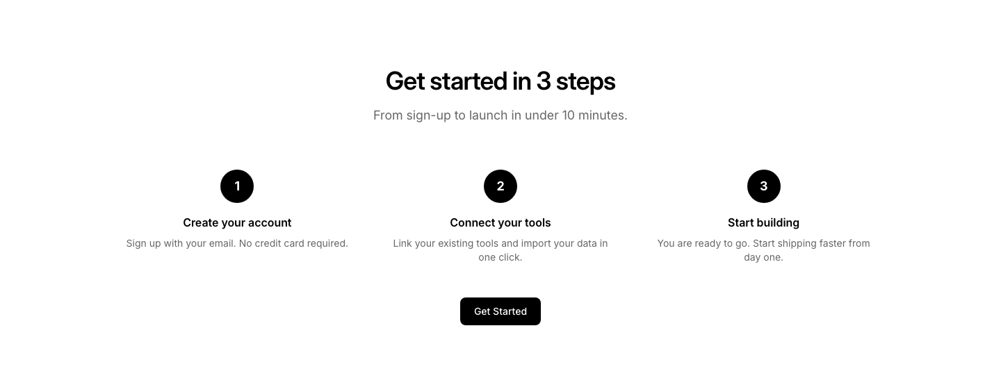
Steps
CtaCTA broken into 3 steps: sign up, configure, launch.

Sticky
CtaBottom bar call to action with text and button.
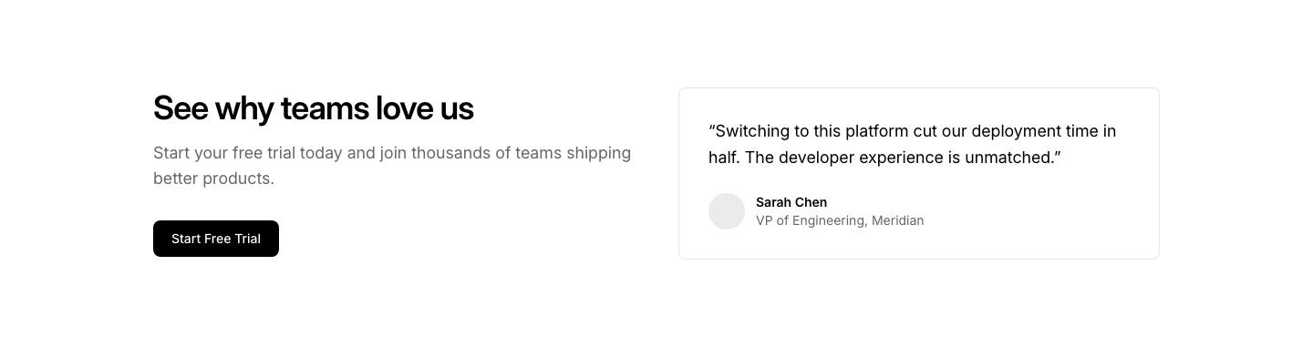
Testimonial
CtaCTA with a testimonial quote embedded alongside.

Trial
CtaFree trial CTA with No credit card required subtext.
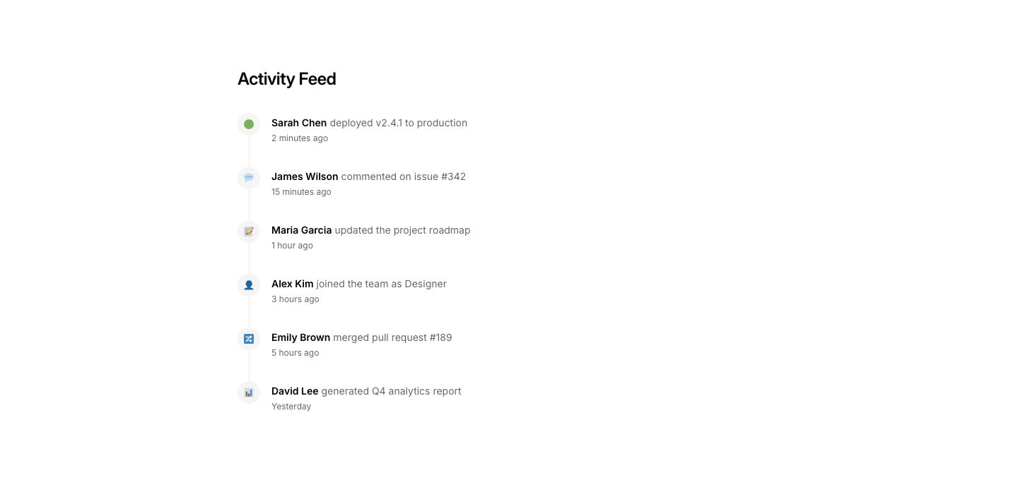
Activity
DashboardActivity feed with timestamps and user actions.
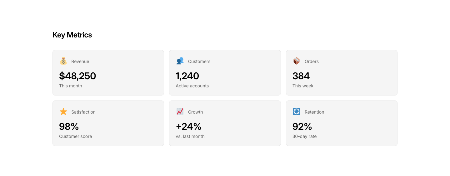
Cards
DashboardGrid of metric/status cards with icons.
Chart
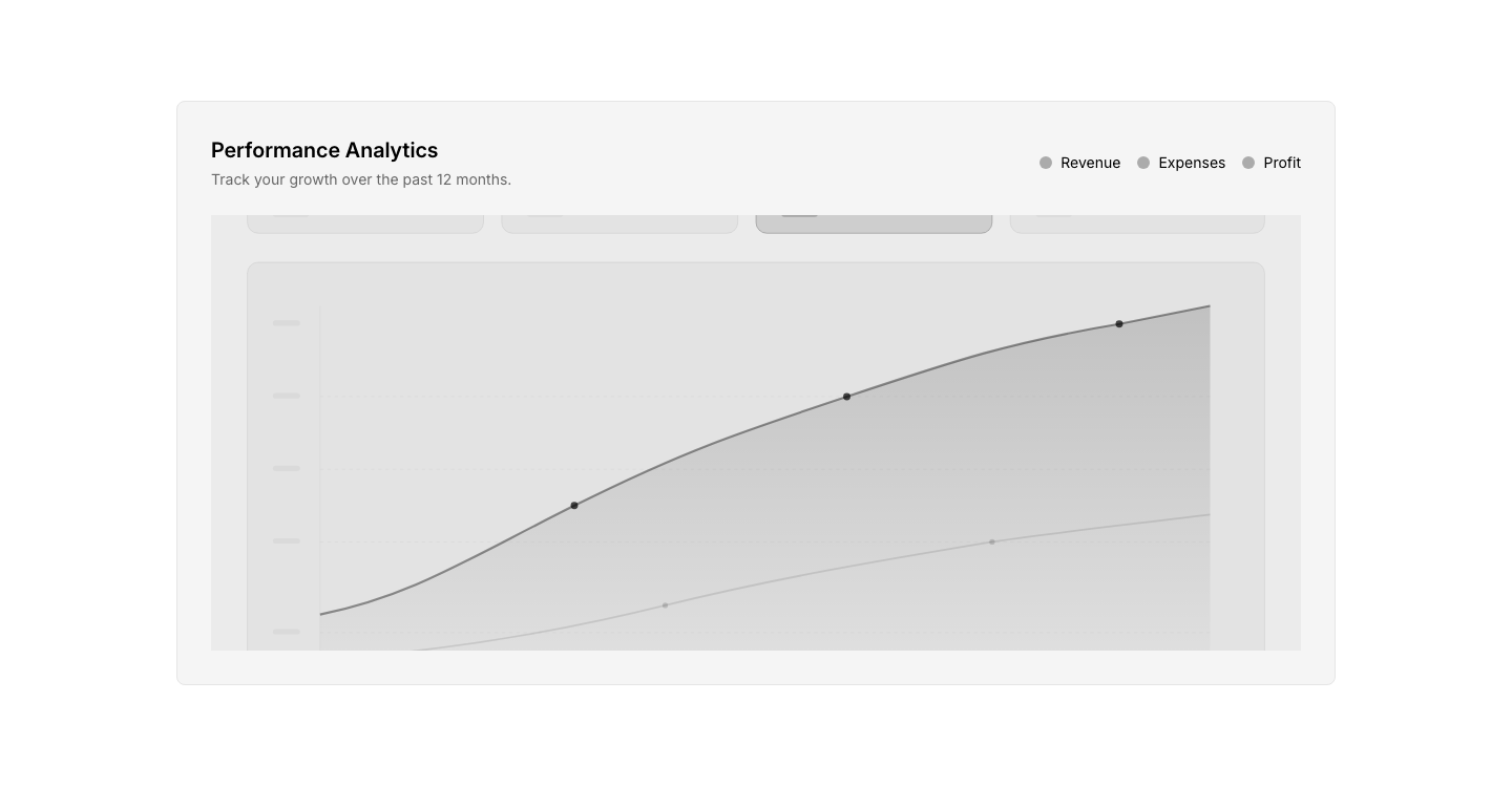
DashboardChart panel with controls and legend.
Loading
DashboardLoading/skeleton state for dashboard panels.
Notification
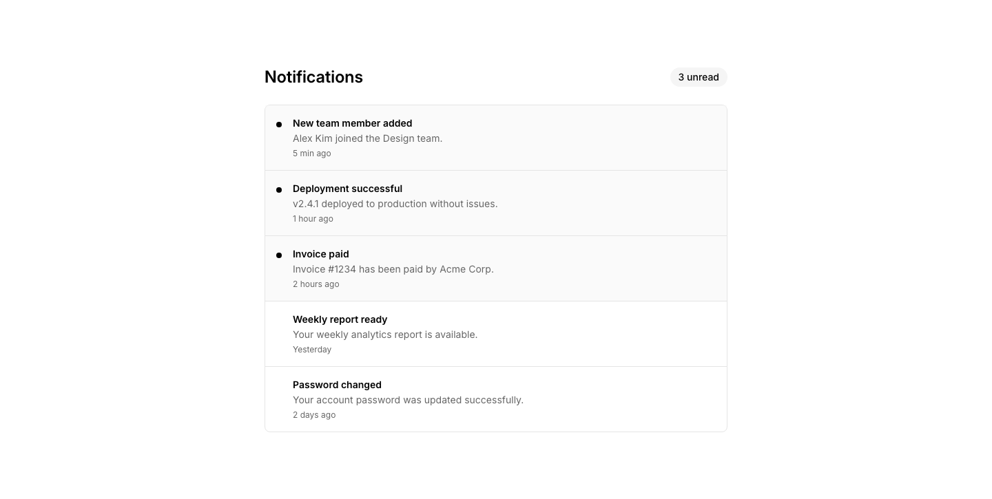
DashboardNotification center with unread/read items.
Overview
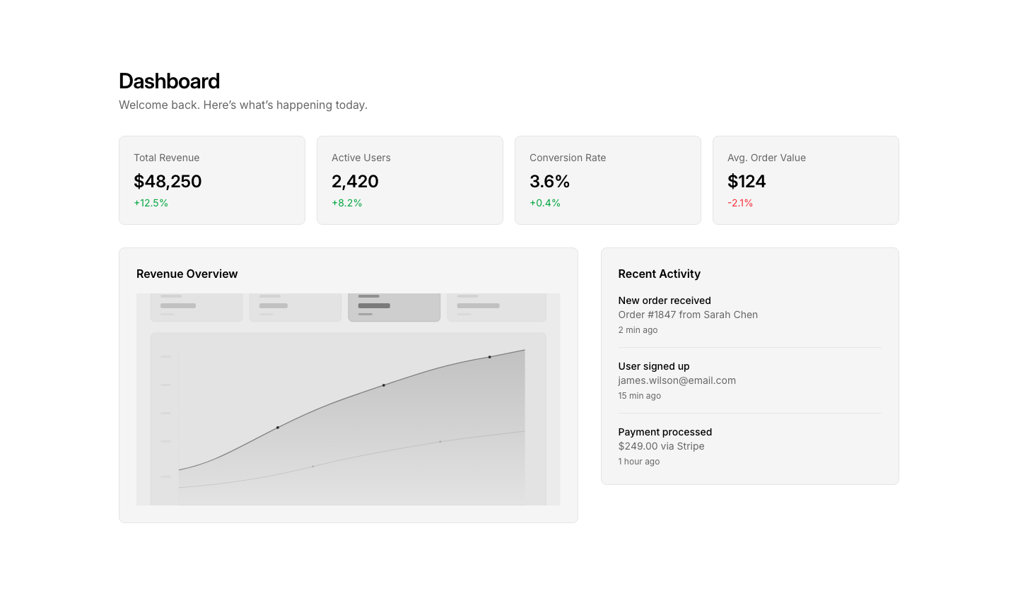
DashboardDashboard overview with KPI cards, chart, and activity feed.
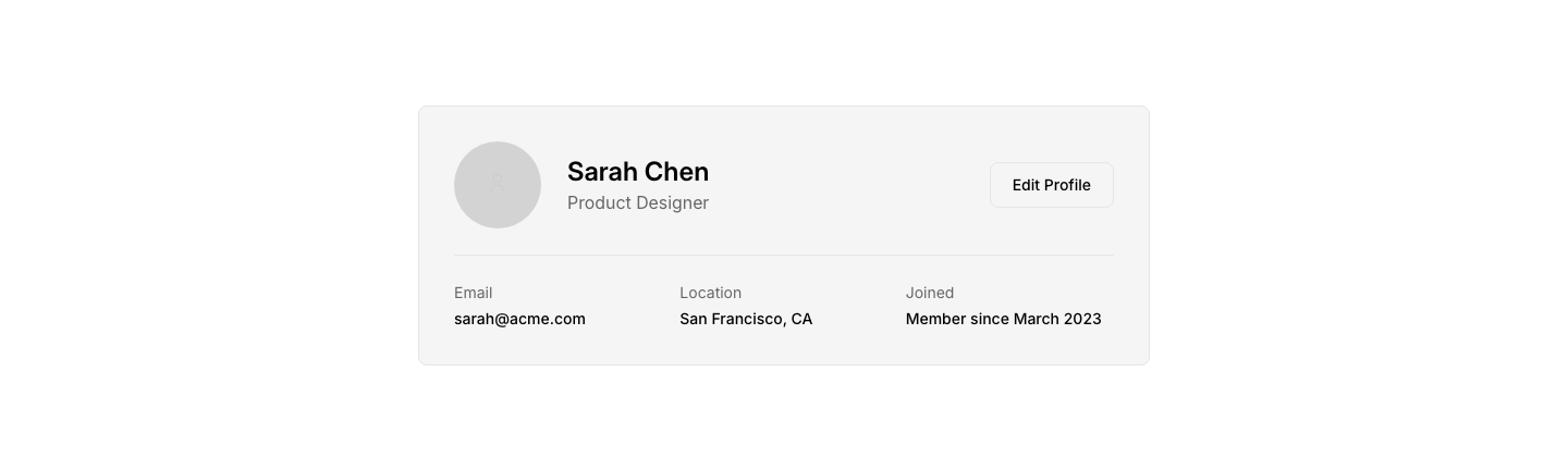
Profile
DashboardUser profile panel with avatar, info, and edit button.
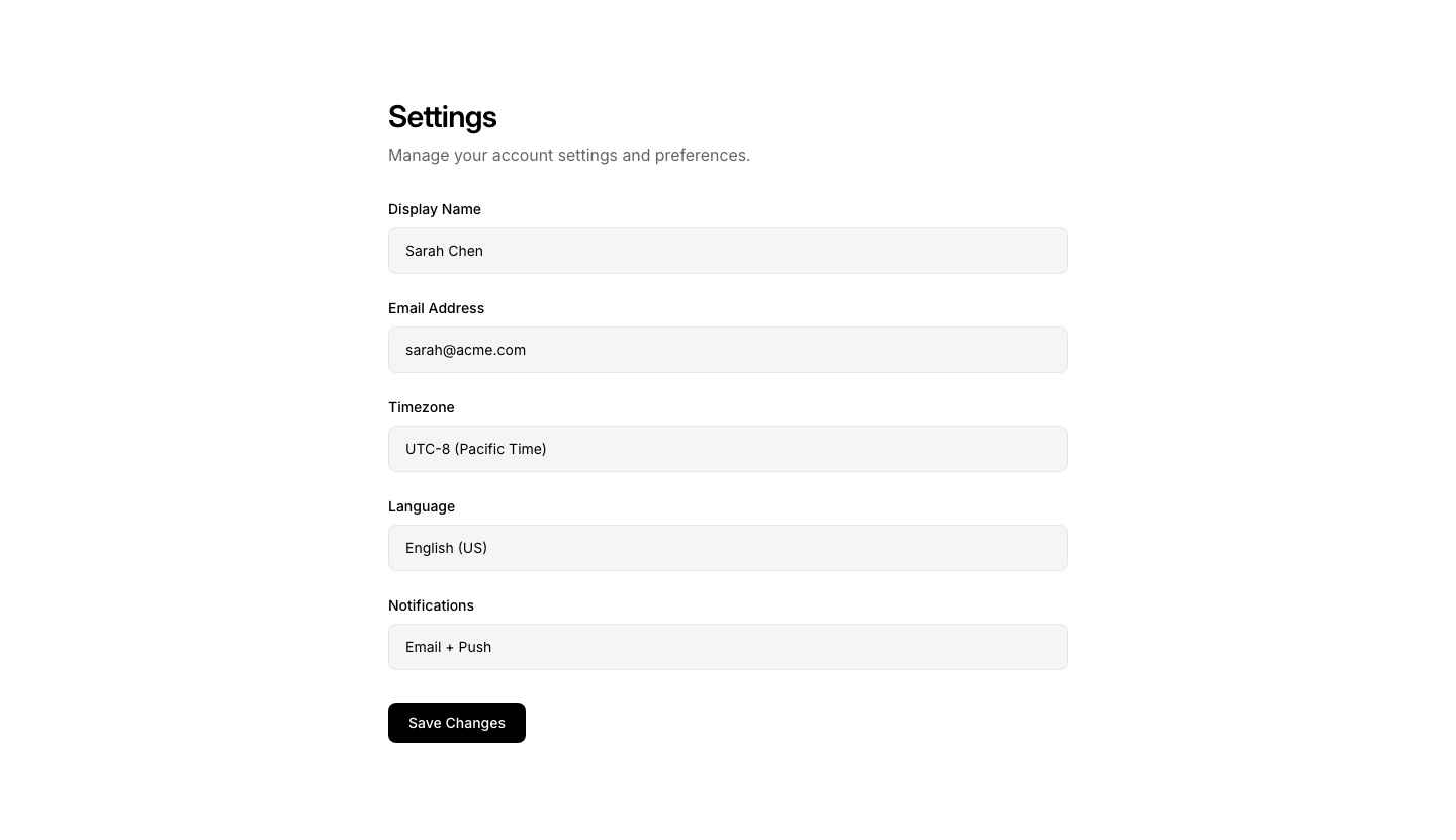
Settings
DashboardSettings panel with form fields and save button.
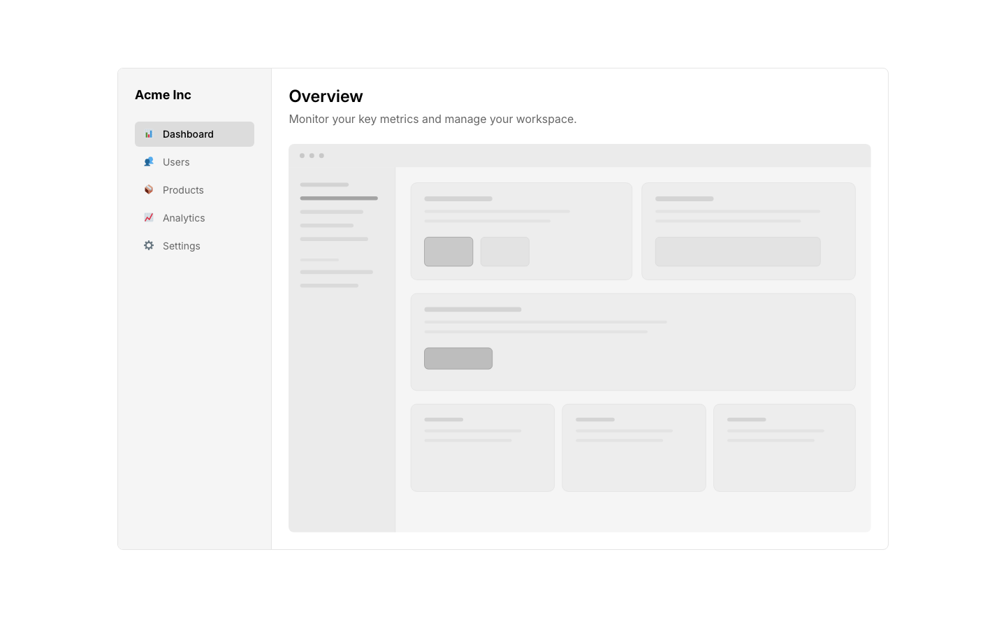
Sidebar
DashboardDashboard layout with sidebar nav and main content area.
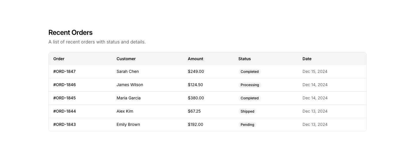
Table
DashboardData table with columns, rows, and action buttons.
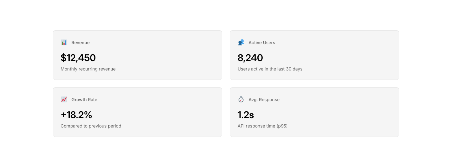
Widget
DashboardConfigurable widget card with title and content.

Angled
DividerAngled/diagonal divider between sections.

Dots
DividerRow of dots as a section separator.

Gradient
DividerGradient line that fades from color to transparent.

Label
DividerHorizontal divider with a centered text label.

Simple
DividerSimple horizontal rule divider.

Wave
DividerSVG wave shape as a section divider.
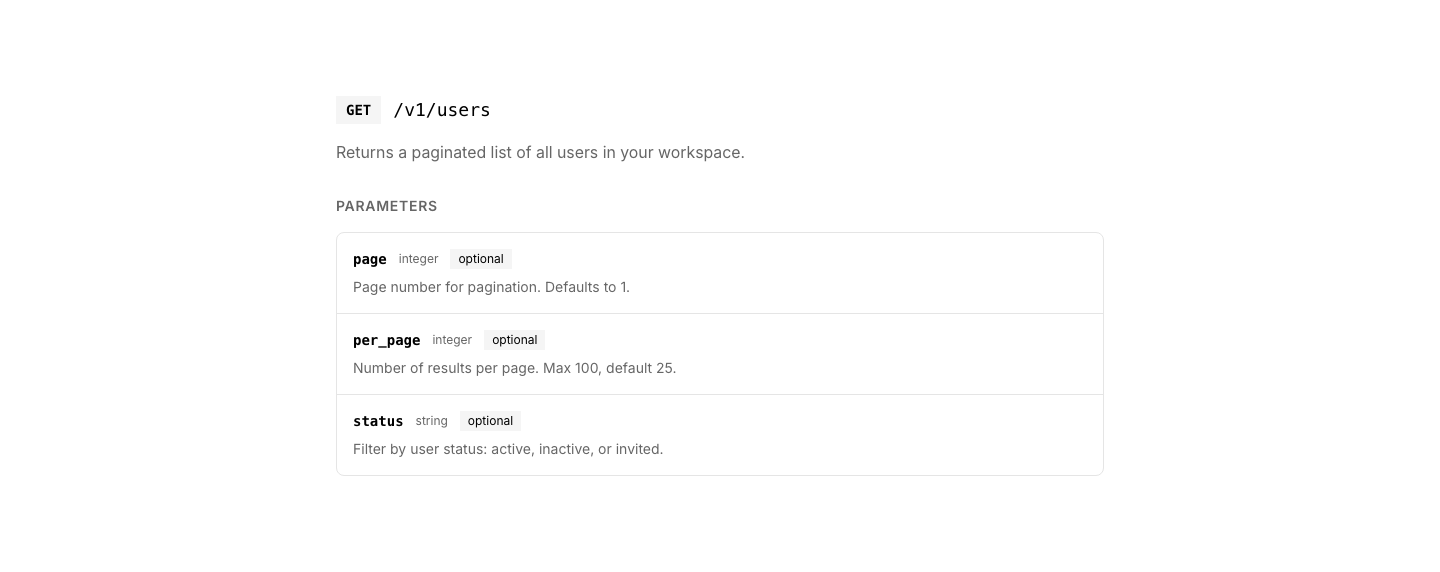
API
DocsAPI endpoint documentation with method, path, and params.
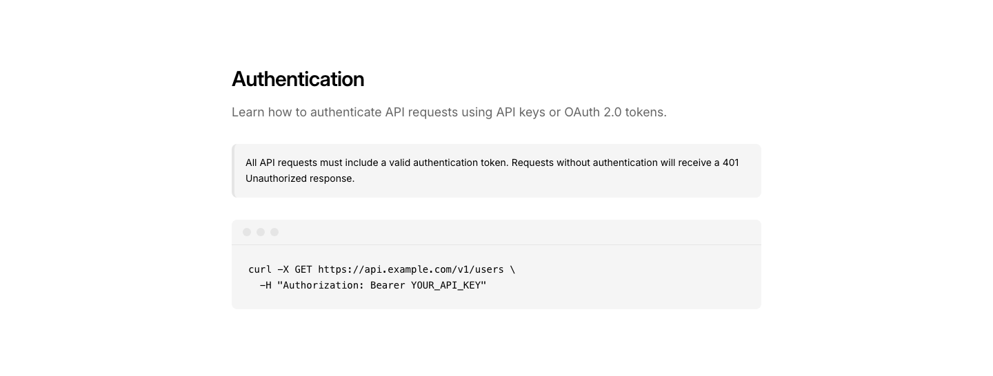
Article
DocsDocumentation article with code blocks and callouts.
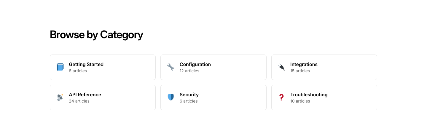
Category
DocsDocumentation category cards with article counts.
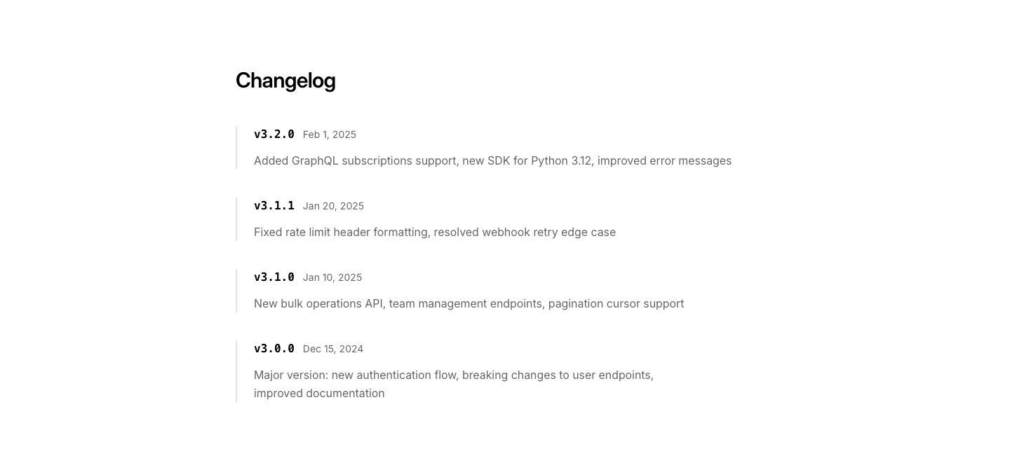
Changelog
DocsDocumentation changelog with version history.
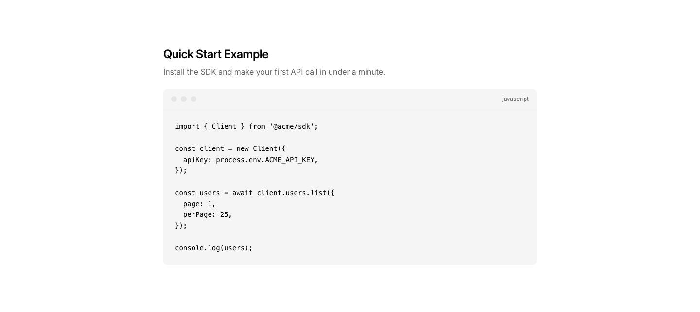
Code
DocsCode example block with syntax highlighting and copy button.

Feedback
DocsWas this helpful? feedback section on docs pages.
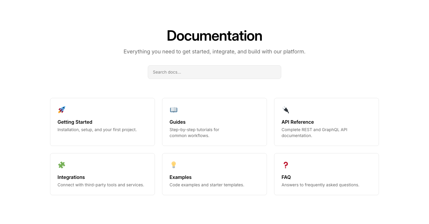
Hero
DocsDocumentation landing page with search and category links.

Nav
DocsDocumentation breadcrumb and prev/next navigation.
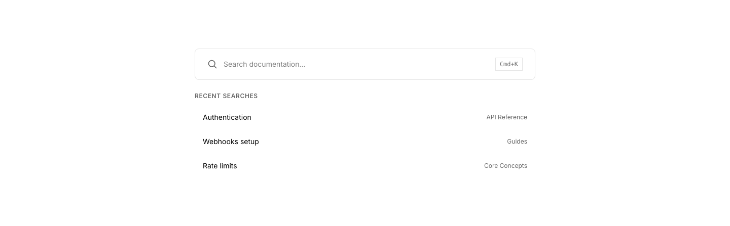
Search
DocsDocumentation search with instant results.
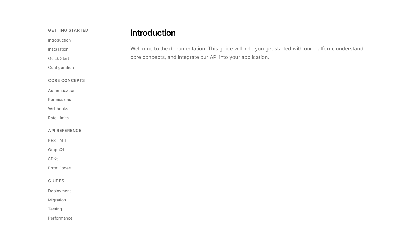
Sidebar
DocsDocumentation layout with sidebar navigation.
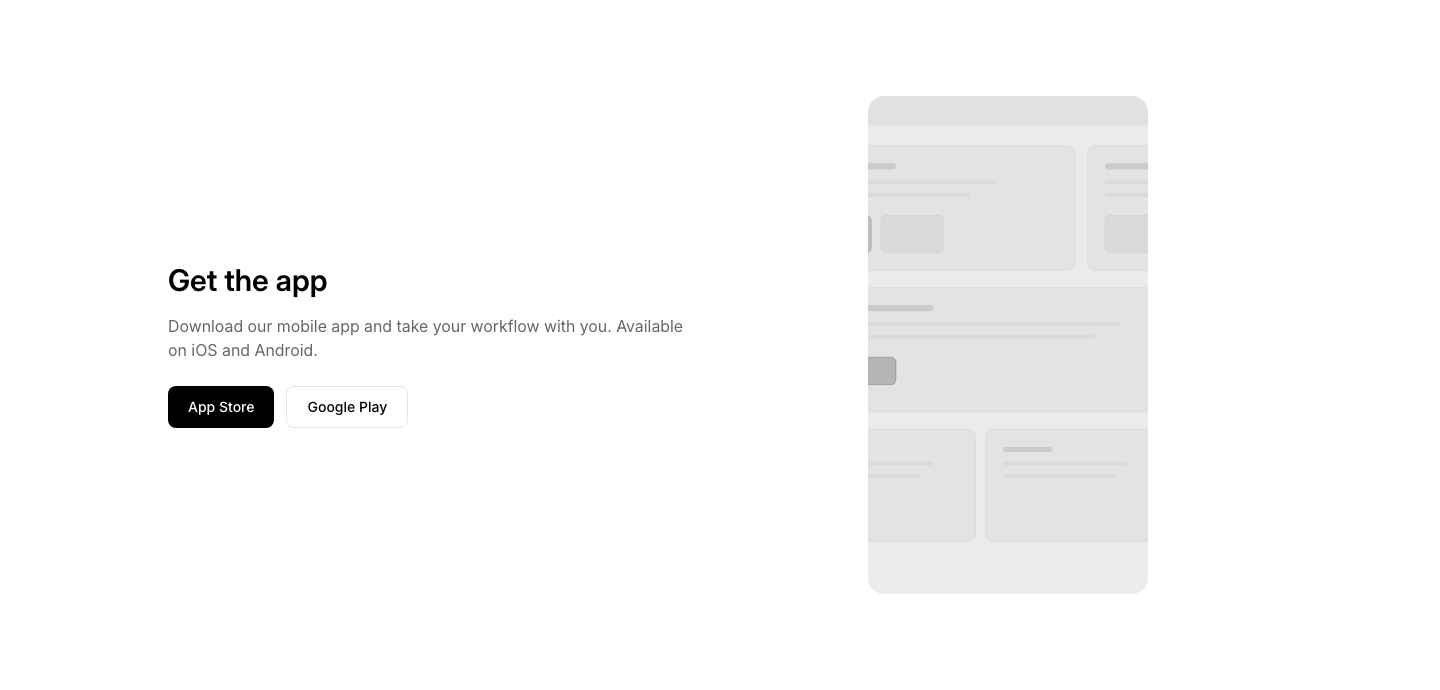
App
DownloadApp download section with store buttons and phone mockup.
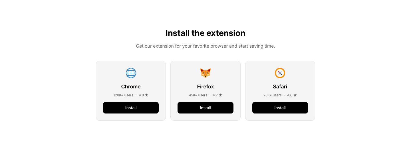
Extension
DownloadBrowser extension or plugin download cards with install buttons.

File
DownloadDownloadable file list with names, sizes, and download buttons.

QR
DownloadQR code download section for mobile app with store badges.
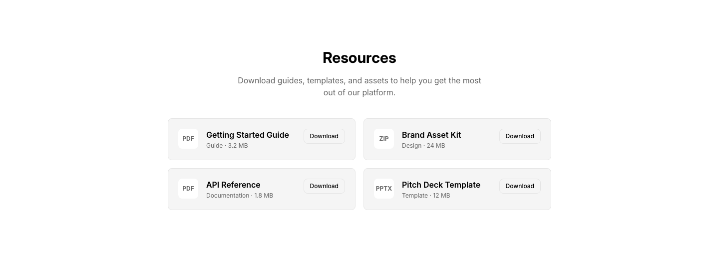
Resource
DownloadResource library with categorized downloadable assets and previews.
Split
DownloadSplit layout with download details and preview image.
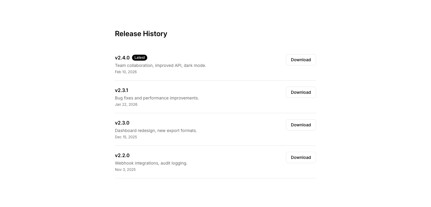
Version
DownloadVersion history download list with release notes and download links.
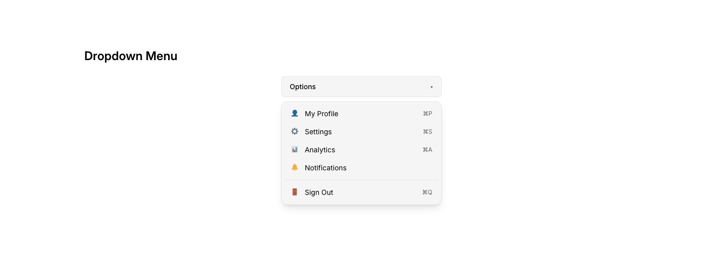
Menu
DropdownDropdown menu with labeled options and icons.
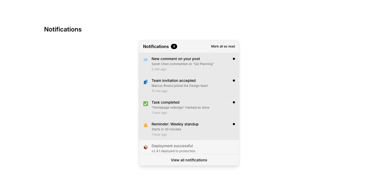
Notification
DropdownNotification dropdown with unread items and mark-all-read.
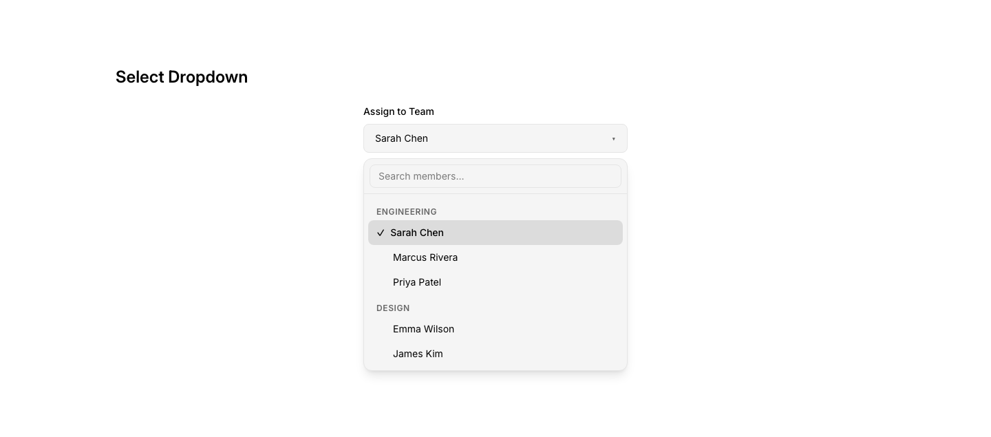
Select
DropdownCustom select dropdown with search and grouping.
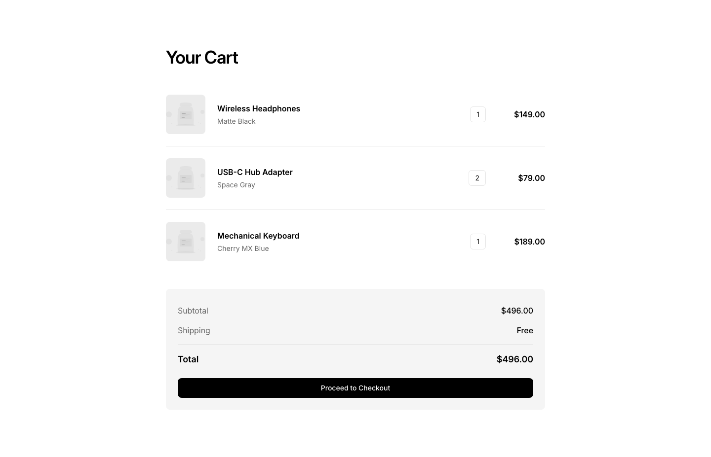
Cart
EcommerceShopping cart summary with items, quantities, total.
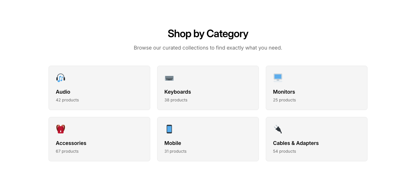
Category
EcommerceProduct category cards with images and counts.
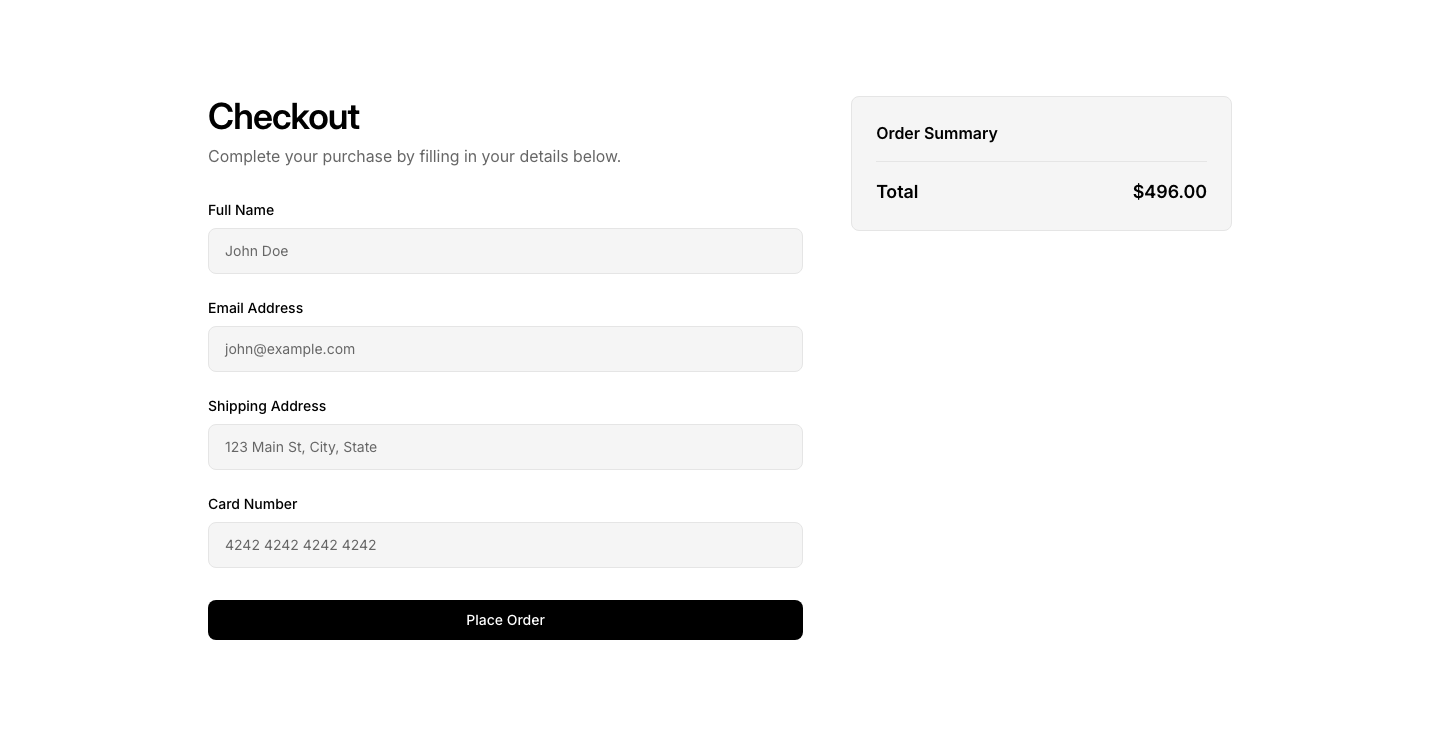
Checkout
EcommerceCheckout form with shipping and payment fields.
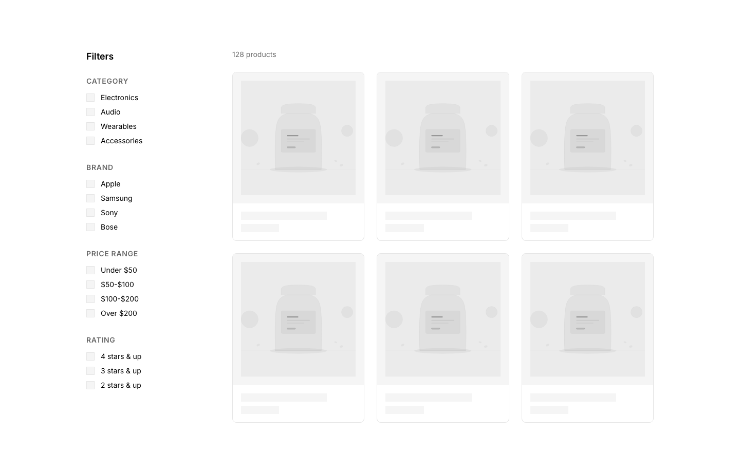
Filter
EcommerceProduct filter sidebar with checkboxes and ranges.
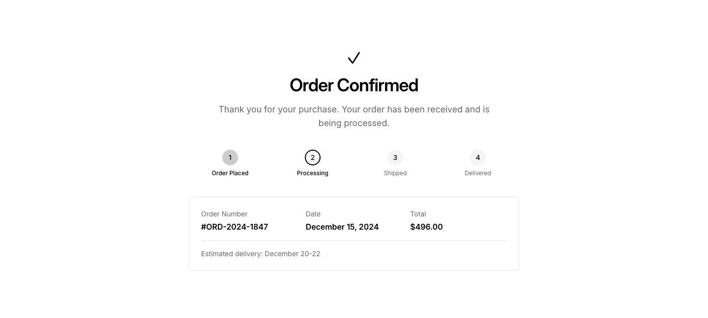
Order
EcommerceOrder confirmation summary with details and tracking.
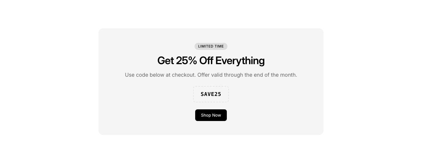
Promo
EcommercePromotional banner with discount code and CTA.
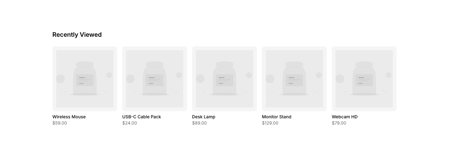
Recently
EcommerceRecently viewed products row.
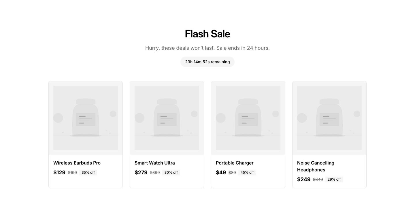
Sale
EcommerceSale countdown with featured discounted products.
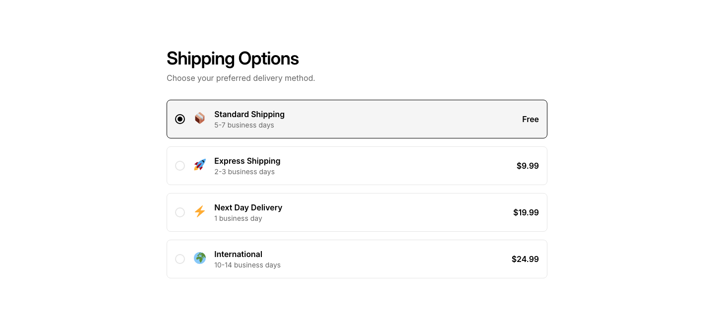
Shipping
EcommerceShipping options and estimated delivery info.
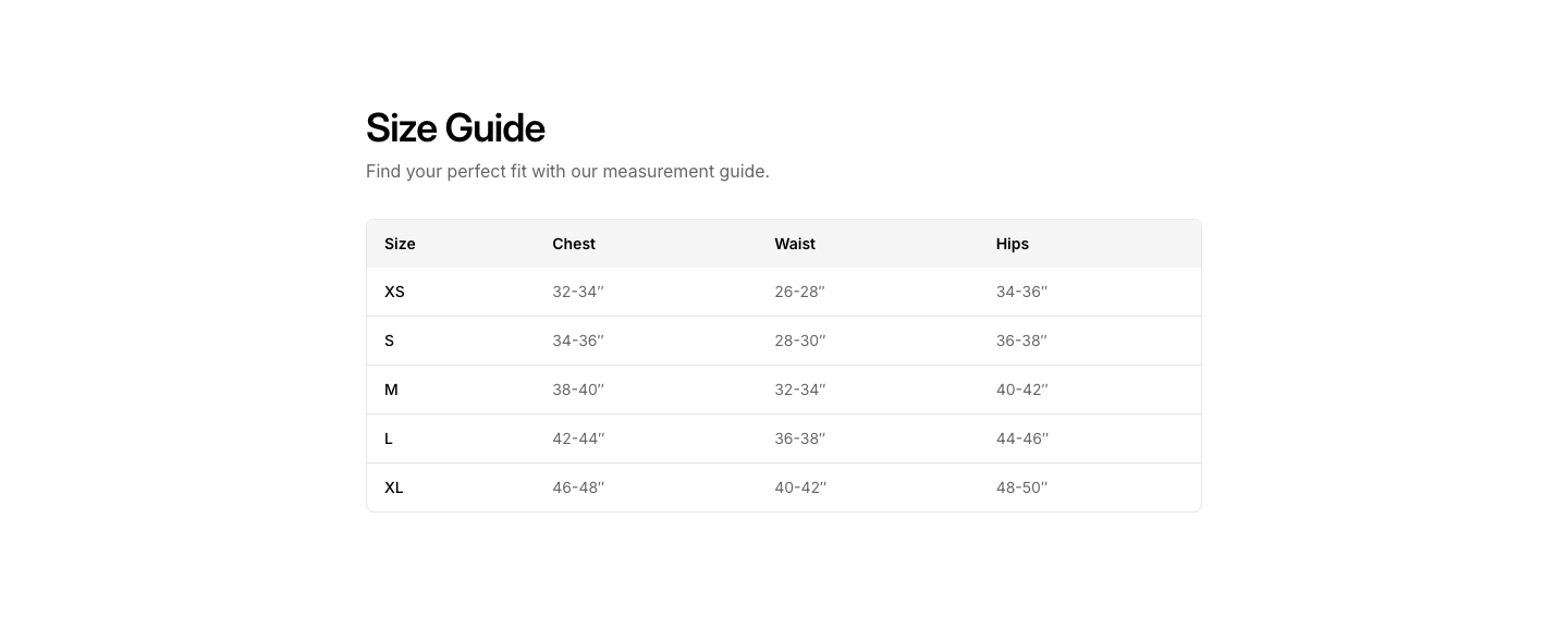
Size
EcommerceSize guide table with measurements.
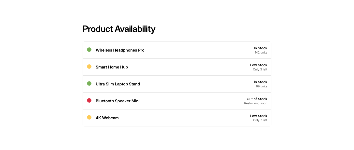
Stock
EcommerceStock availability indicator with urgency message.
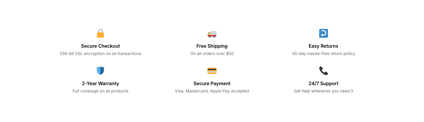
Trust
EcommerceTrust badges, secure payment icons, and guarantees.
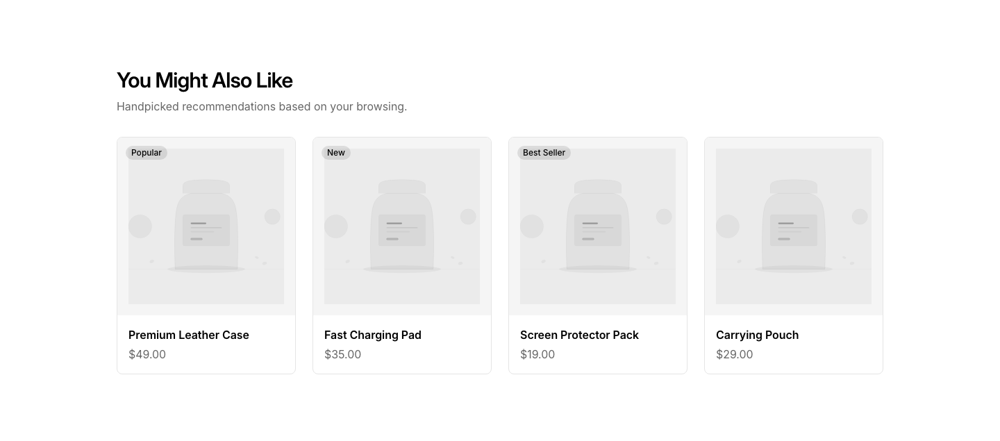
Upsell
Ecommerce"You might also like" product suggestions.
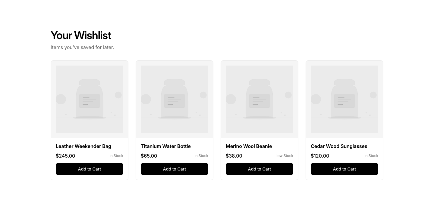
Wishlist
EcommerceWishlist/saved items grid with add-to-cart buttons.
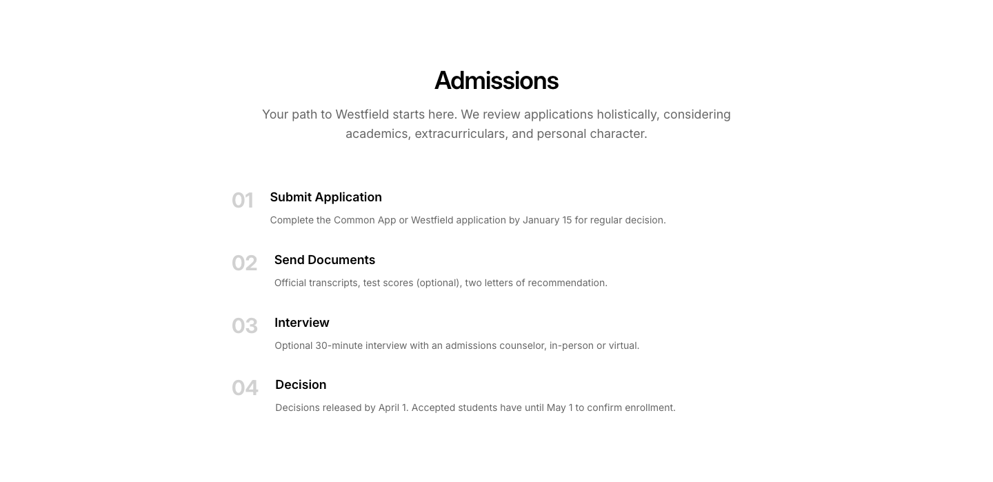
Admission
EducationAdmission requirements and process timeline.
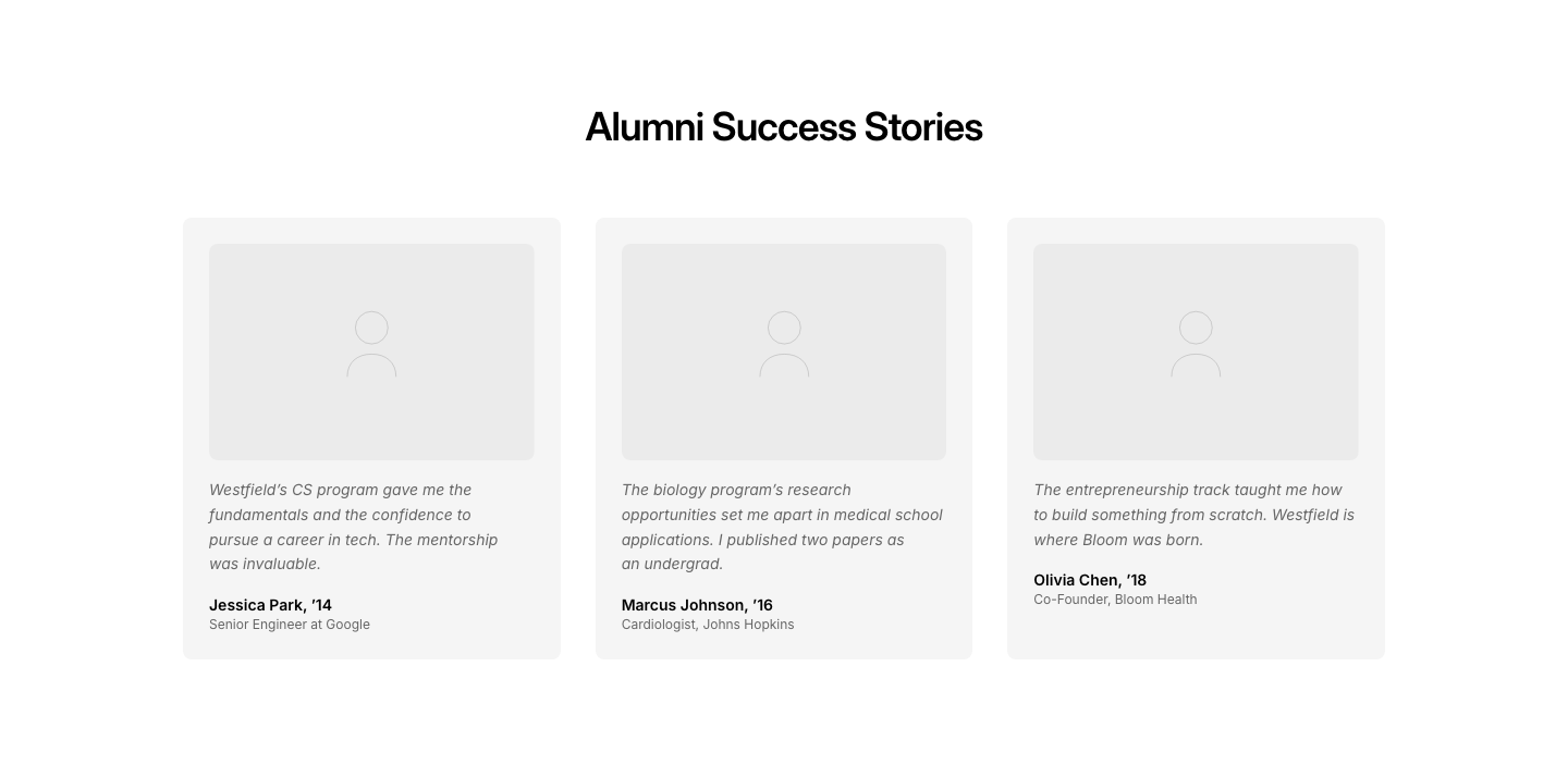
Alumni
EducationAlumni success stories with career outcomes.
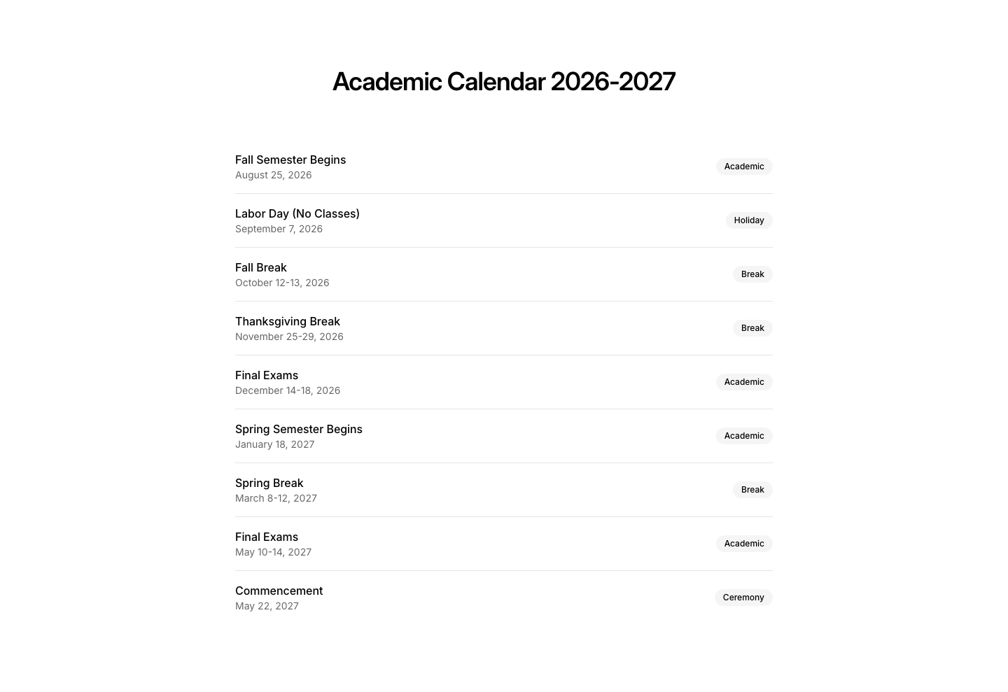
Calendar
EducationAcademic calendar with important dates.
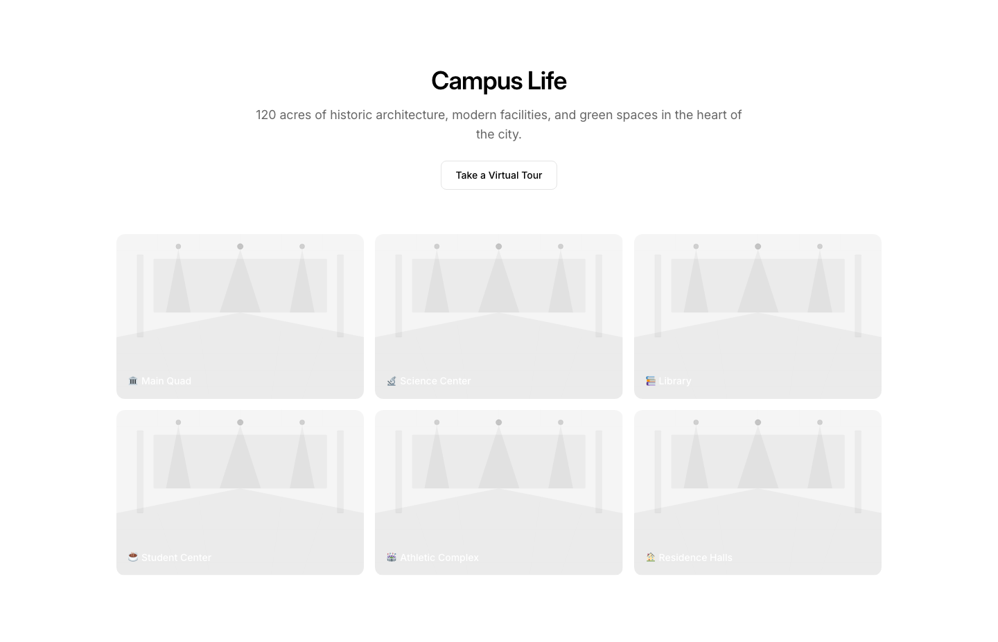
Campus
EducationCampus photo gallery with virtual tour link.
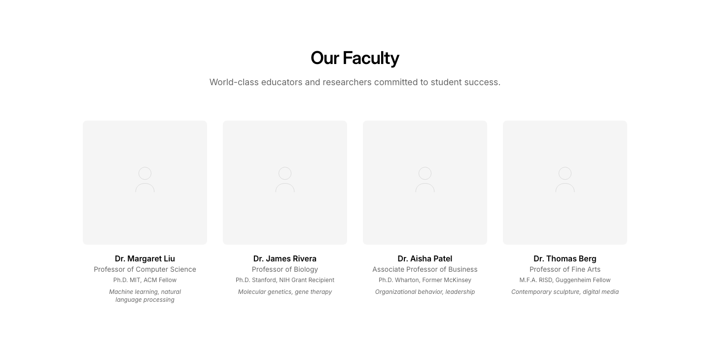
Faculty
EducationFaculty member cards with credentials and research.
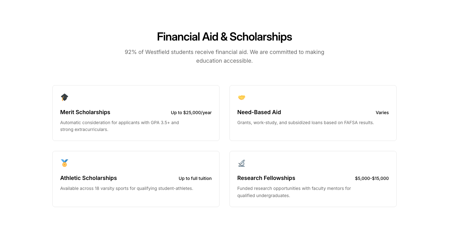
Financial
EducationFinancial aid and scholarship information section.

Hero
EducationSchool/university hero with enrollment CTA.

Programs
EducationAcademic program cards with degree and duration.
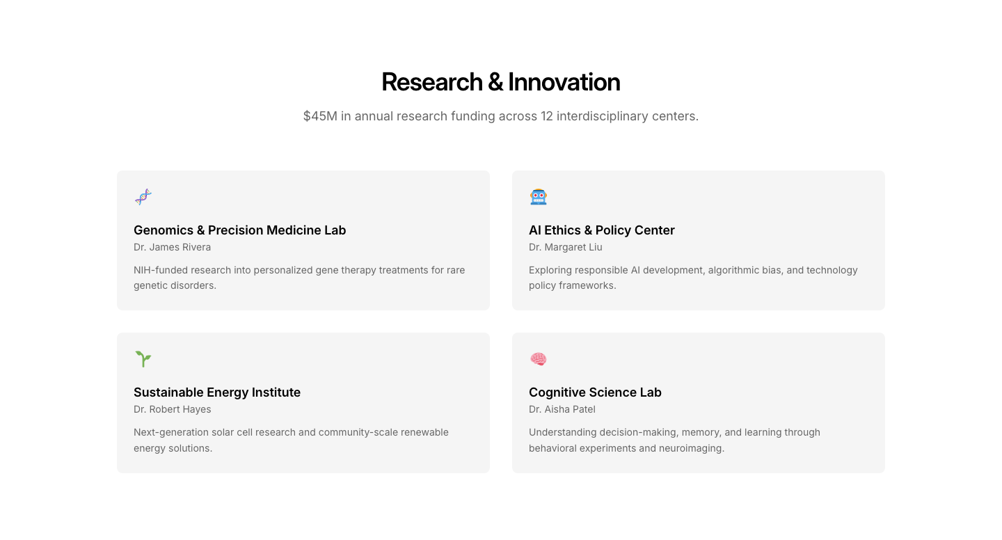
Research
EducationResearch highlights with publications and projects.
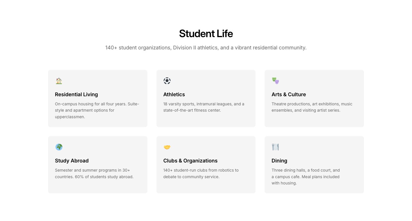
Student
EducationStudent life section with activities and housing info.

Cart
EmptyEmpty cart state with illustration and CTA.

Search
EmptyEmpty search state with illustration and CTA.
403
ErrorAccess denied page with login/contact options.
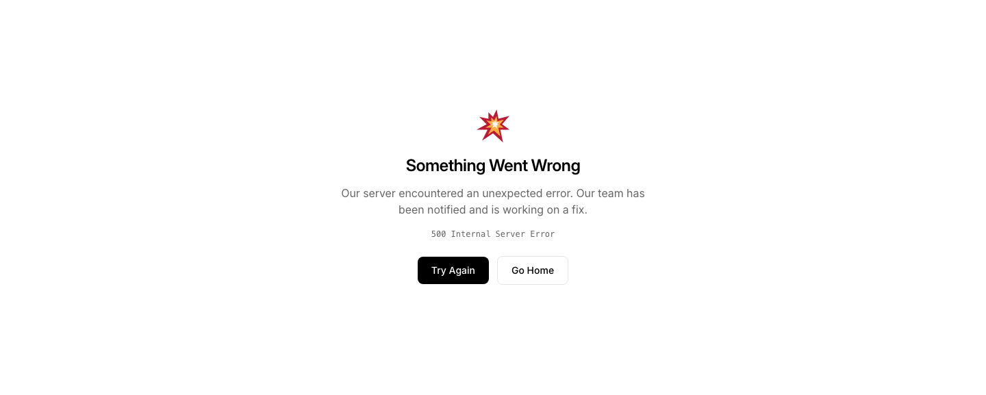
500
ErrorServer error page with retry button.
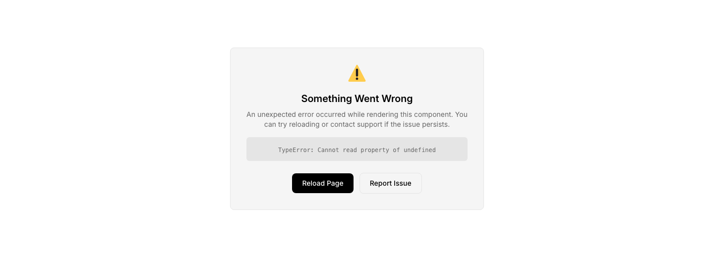
Boundary
ErrorGeneric error boundary with error details and retry.
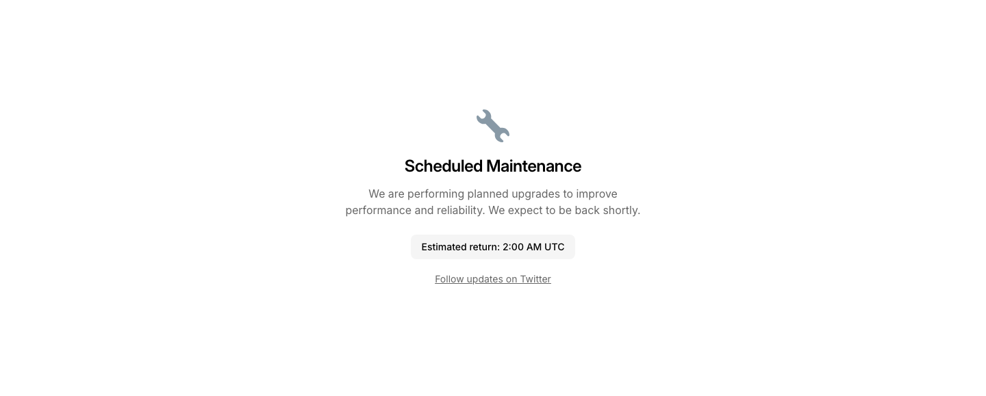
Maintenance
ErrorMaintenance mode page with estimated return time.
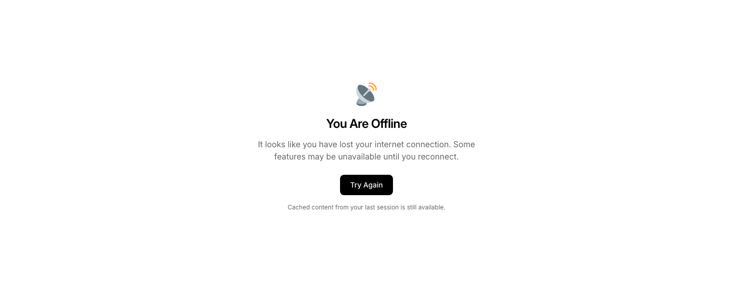
Offline
ErrorOffline state with cached content notice.
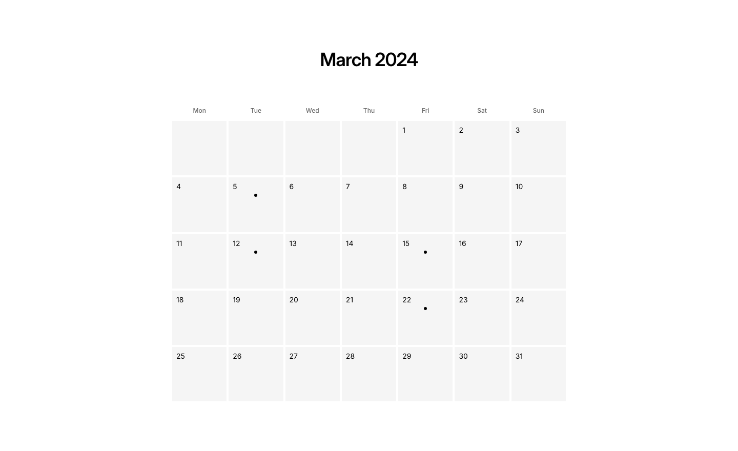
Calendar
EventMonthly calendar grid with event dots.
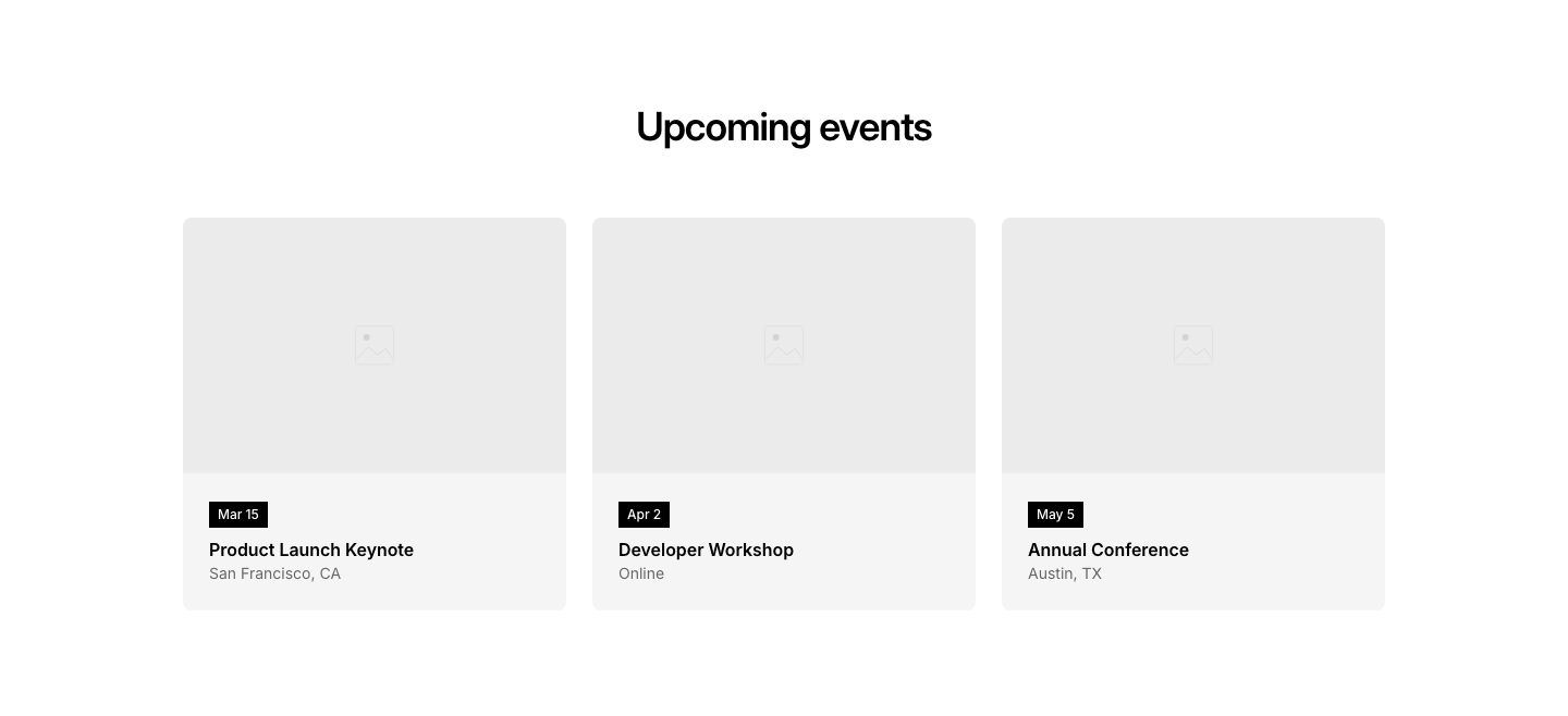
Cards
EventEvent cards with image, date badge, title, and location.
Countdown
EventCountdown display with title, static timer boxes, and event details.

Featured
EventFeatured event with image, details, and registration button.
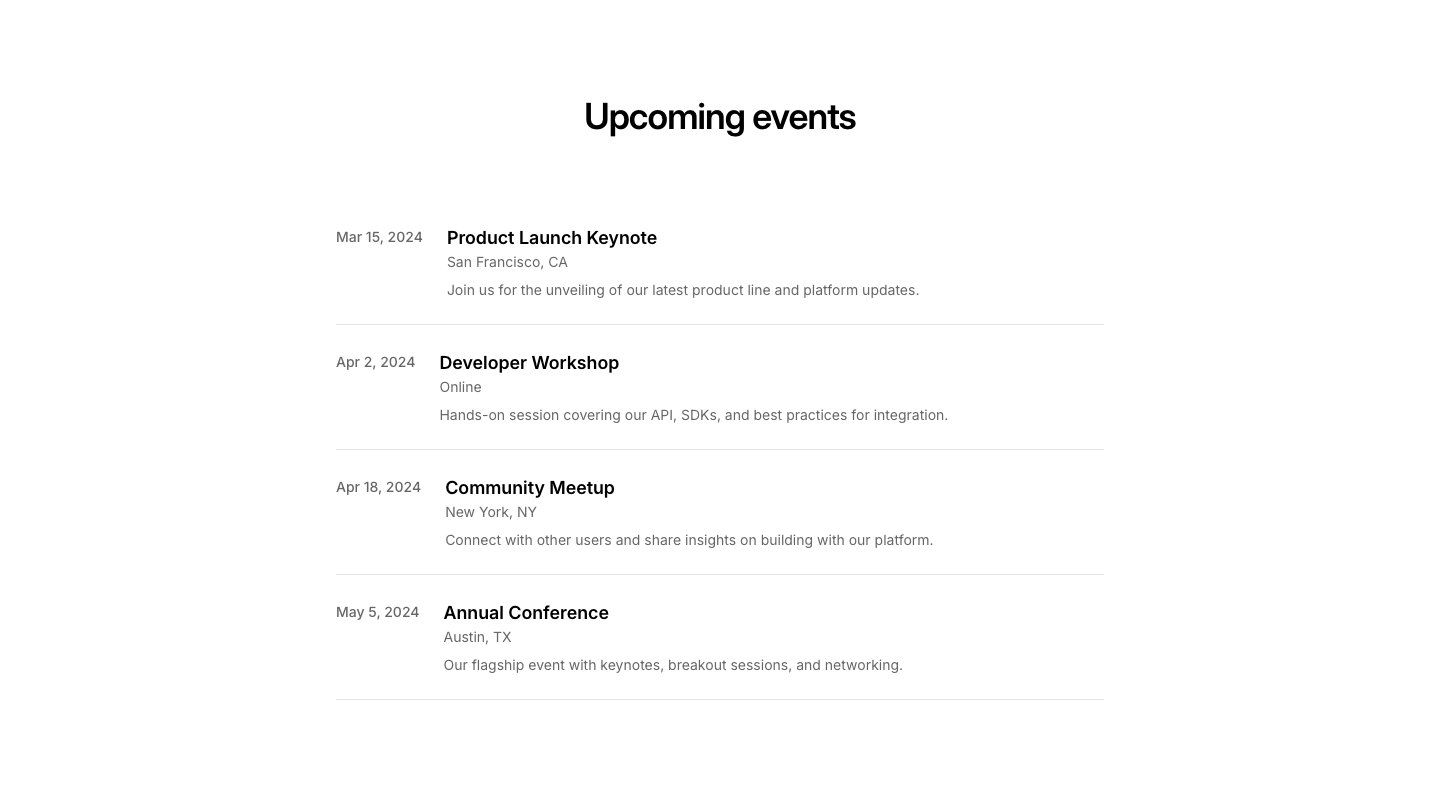
List
EventVertical list of upcoming events with date, title, and location.
Past
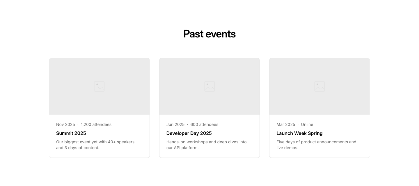
EventPast events archive with photos and recap.
Register
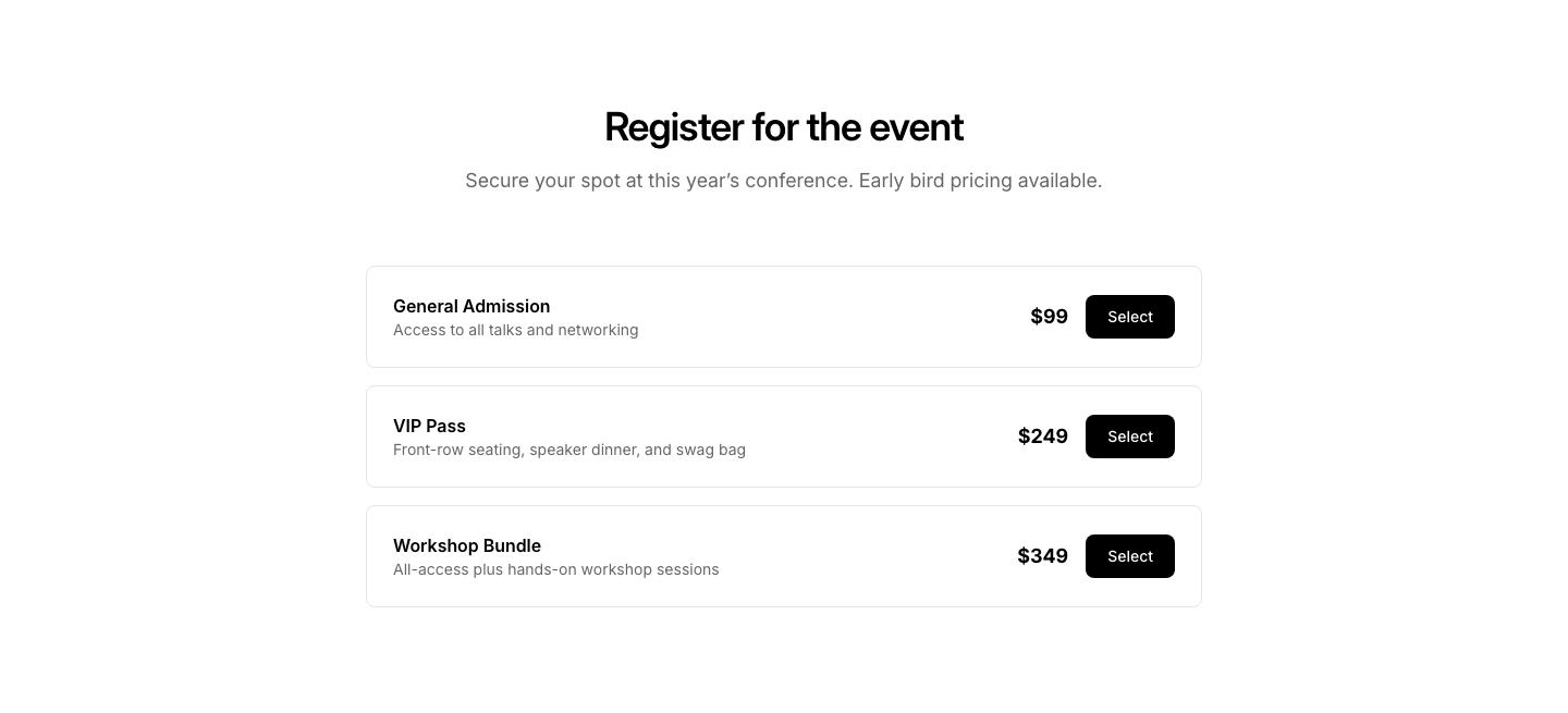
EventEvent registration form with ticket selection.
Schedule
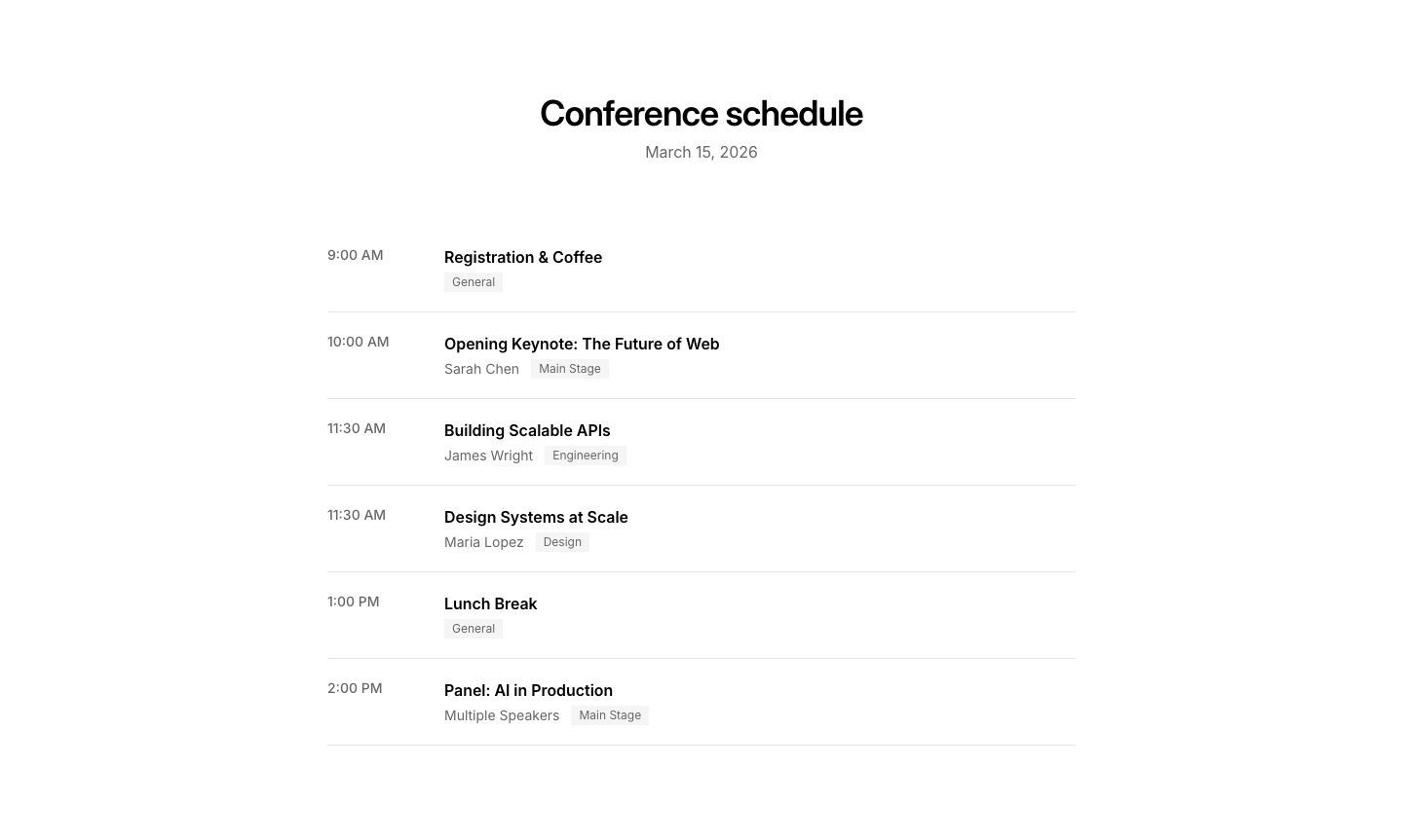
EventMulti-track conference schedule with time slots.
Speaker
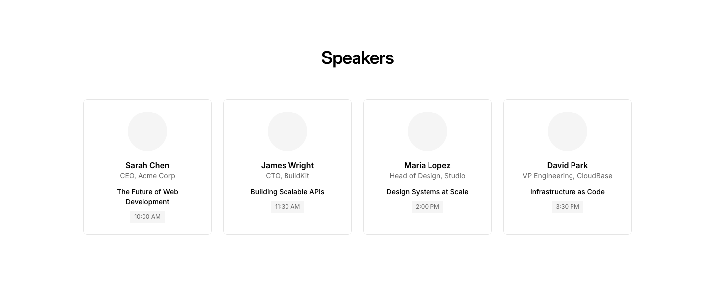
EventSpeaker cards with photo, name, topic, and time slot.
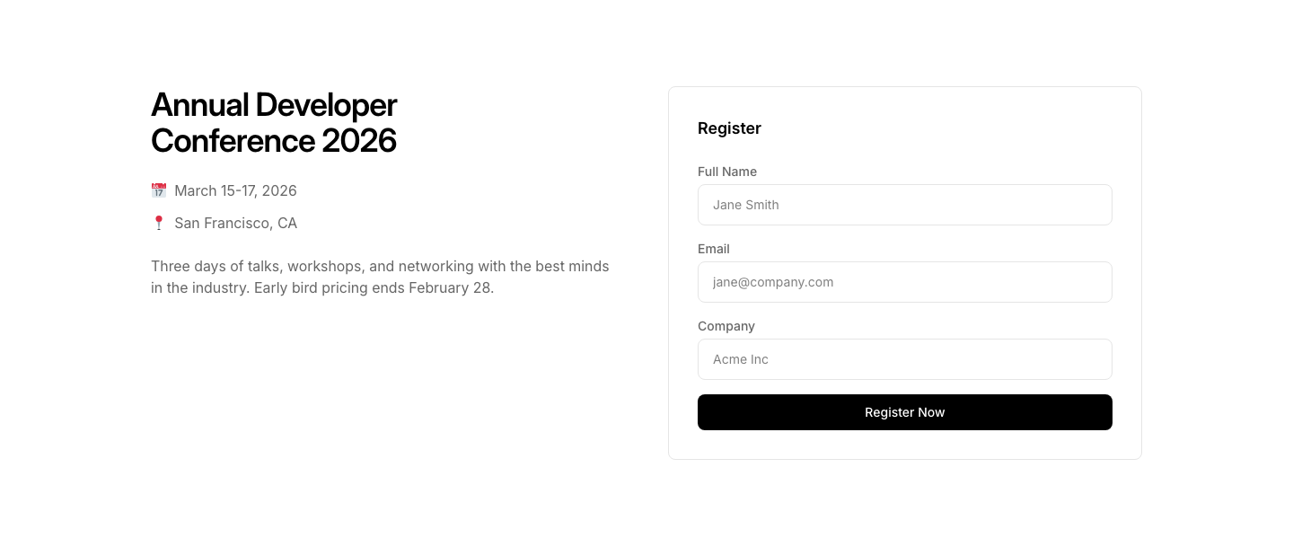
Split
EventEvent details on left, registration form on right.
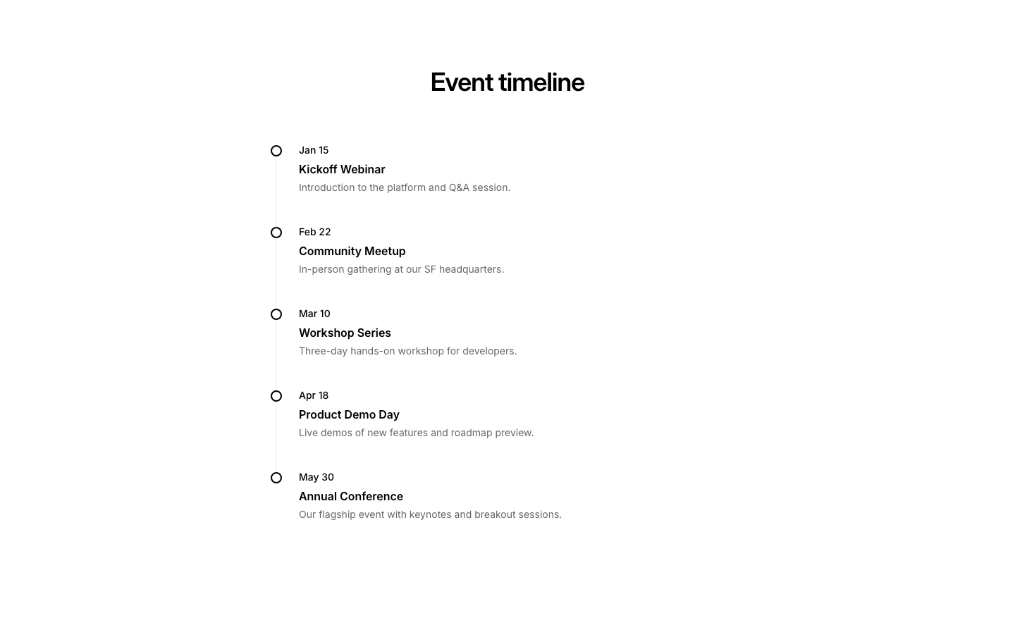
Timeline
EventEvents arranged on a vertical timeline.
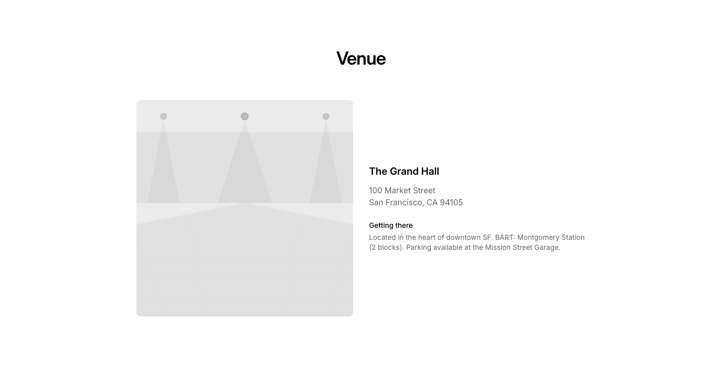
Venue
EventVenue info with map, address, and directions.
Accordion
FaqExpandable FAQ accordion using native details/summary elements.
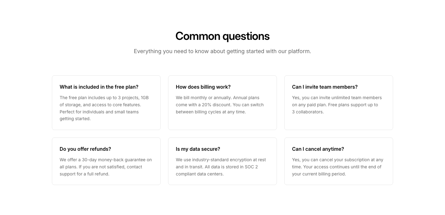
Cards
FaqEach Q&A pair in its own bordered card.
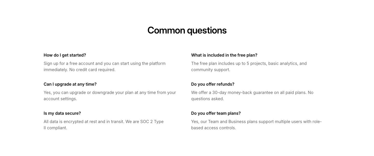
Columns
FaqTwo-column grid layout of frequently asked questions.
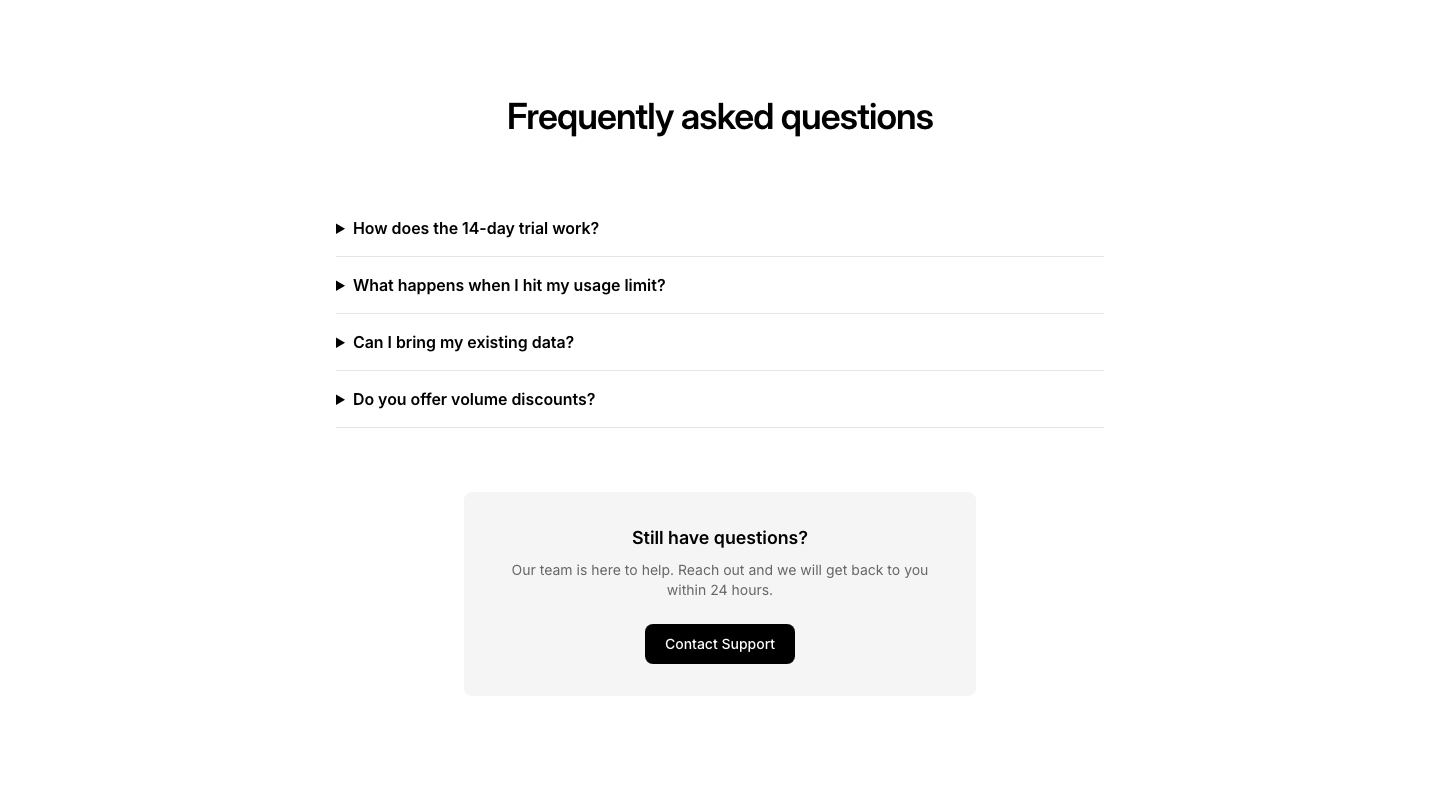
CTA
FaqFAQ section with a Still have questions? CTA at the bottom.
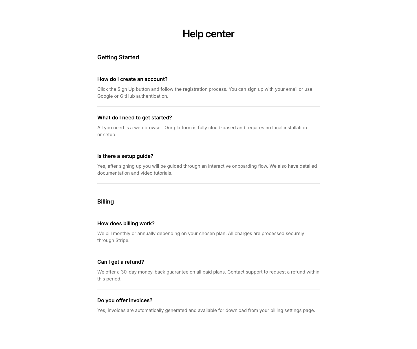
Grouped
FaqFAQ organized by category groups with section headings.
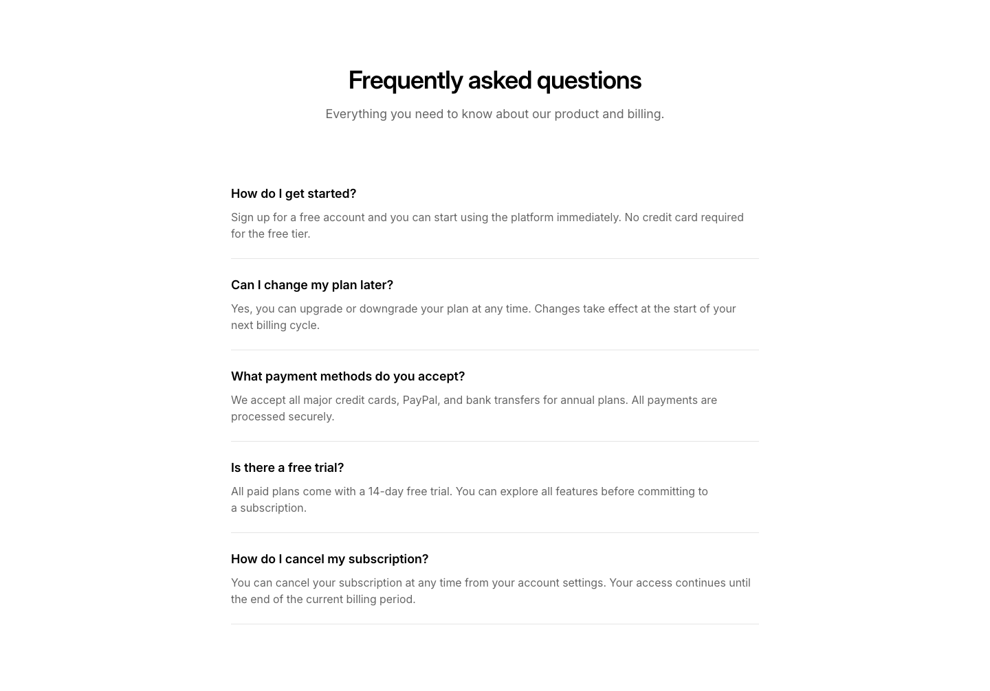
List
FaqStacked list of frequently asked questions with visible answers.
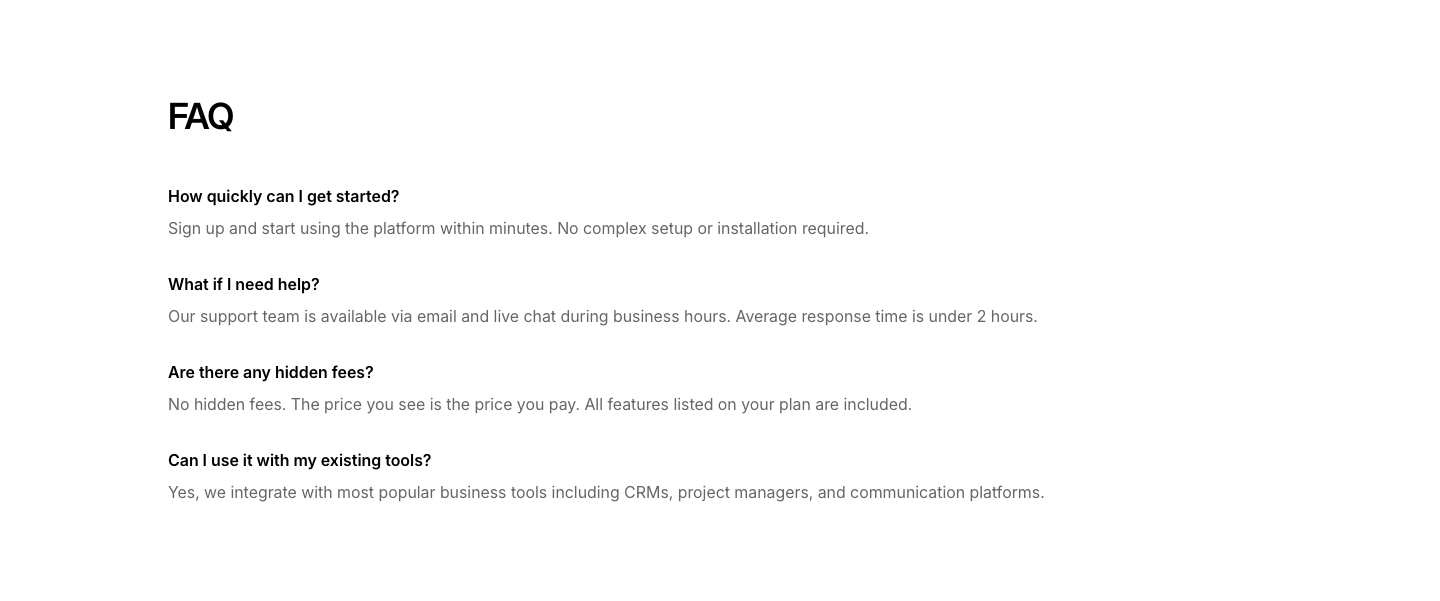
Minimal
FaqCompact Q&A list with no dividers or cards.
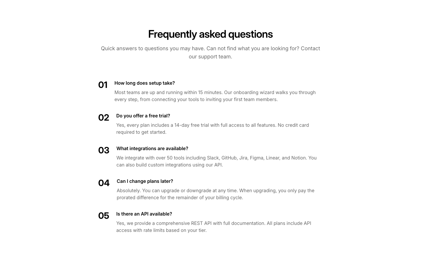
Numbered
FaqNumbered FAQ items with large number on left, Q&A on right.
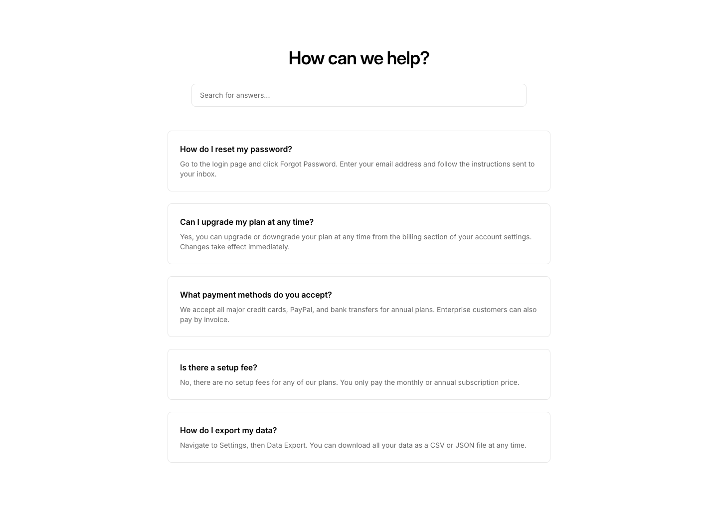
Search
FaqFAQ section with a search input to filter questions.
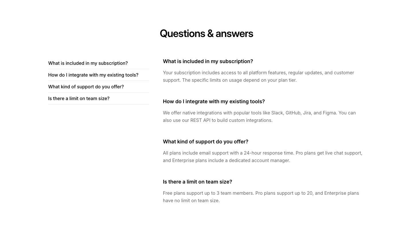
Side
FaqTwo-column FAQ with question index on the left and answers on the right.
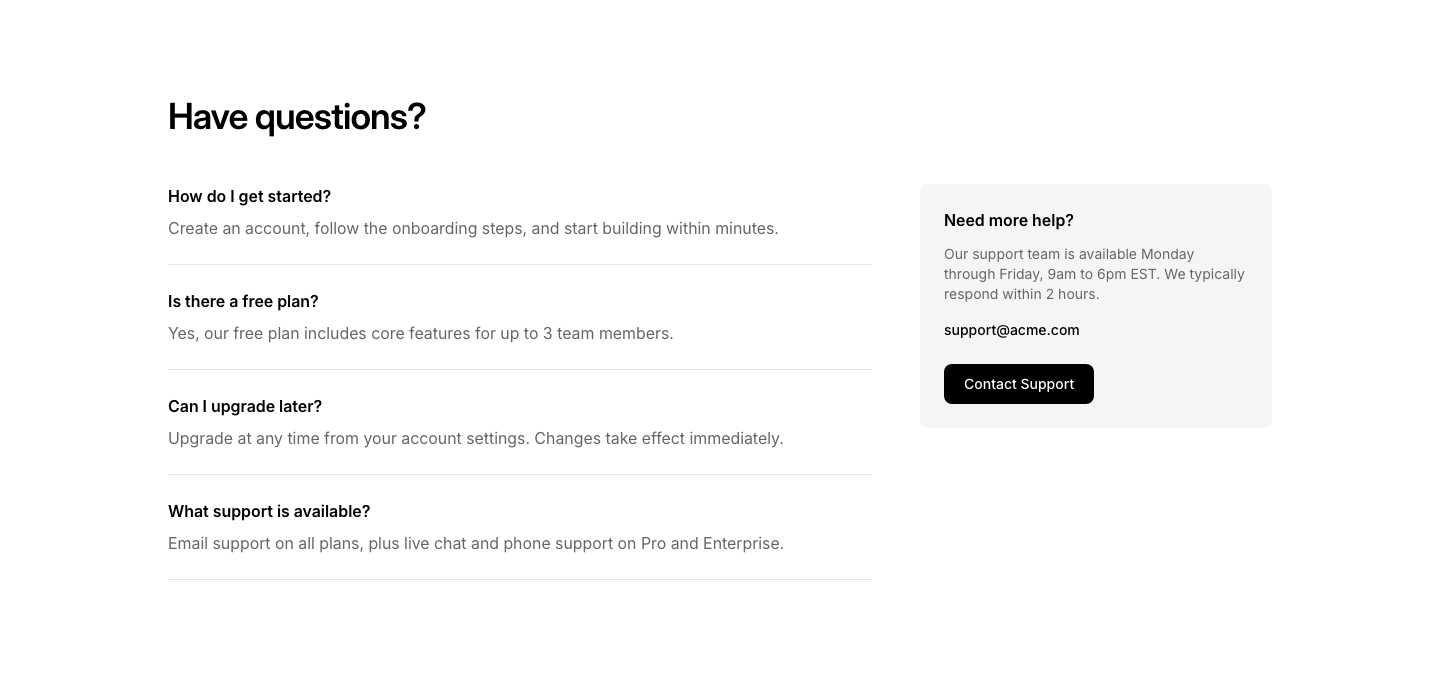
Split
FaqFAQs on the left, contact info or support link on the right.
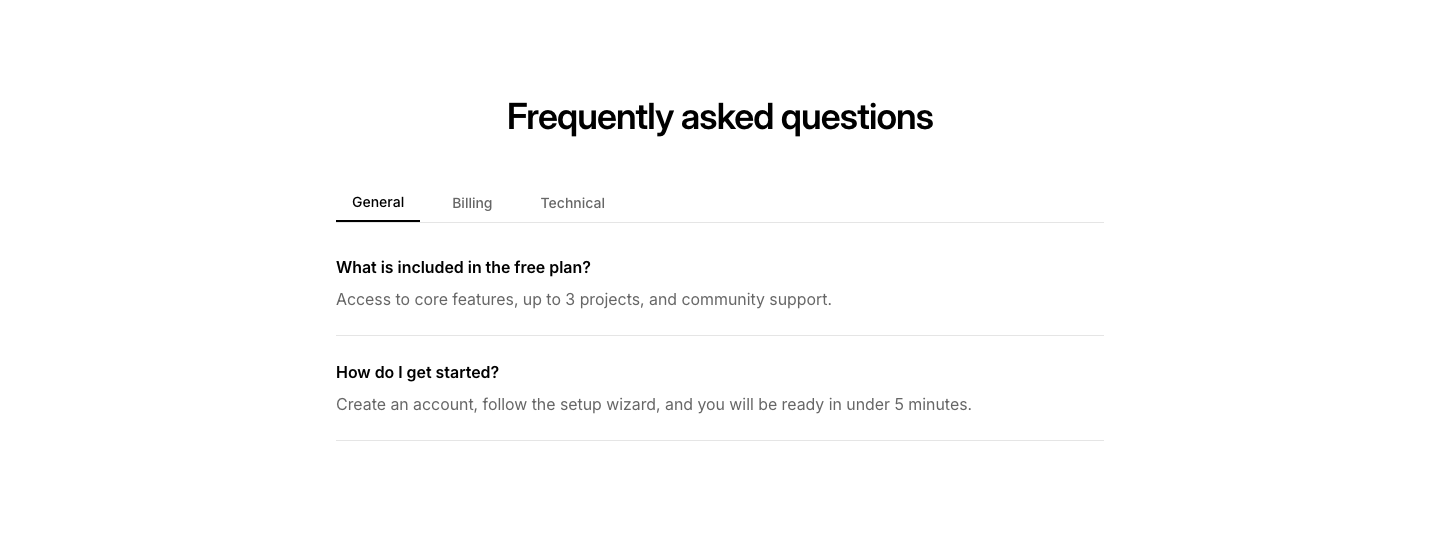
Tabbed
FaqFAQs organized in tabs by category.
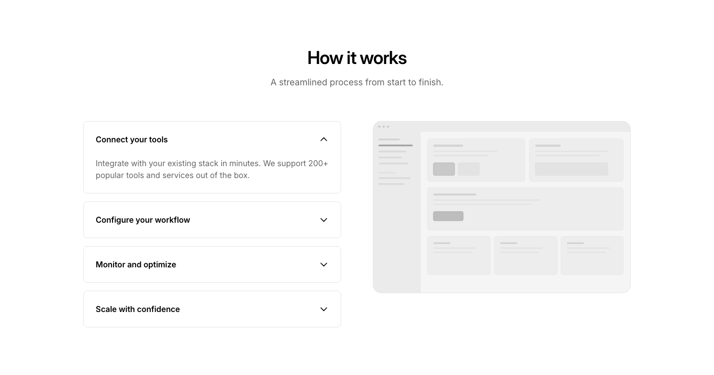
Accordion
FeatureExpandable feature sections with image that changes per open item.
Badge
FeatureCentered grid of small badge-style features with icon and label only.
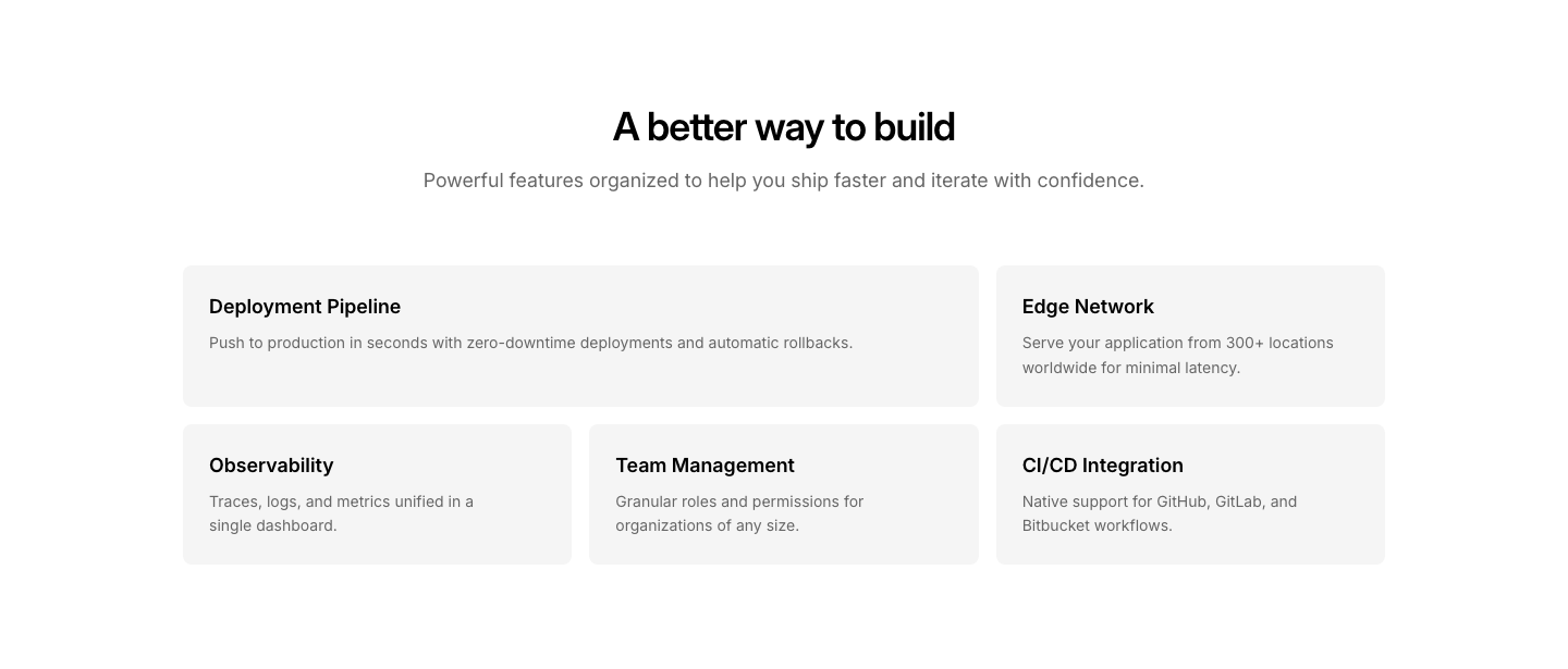
Bento
FeatureBento grid with mixed-size cards for feature highlights.
Card
FeatureSingle feature card with image, heading, text, and link.
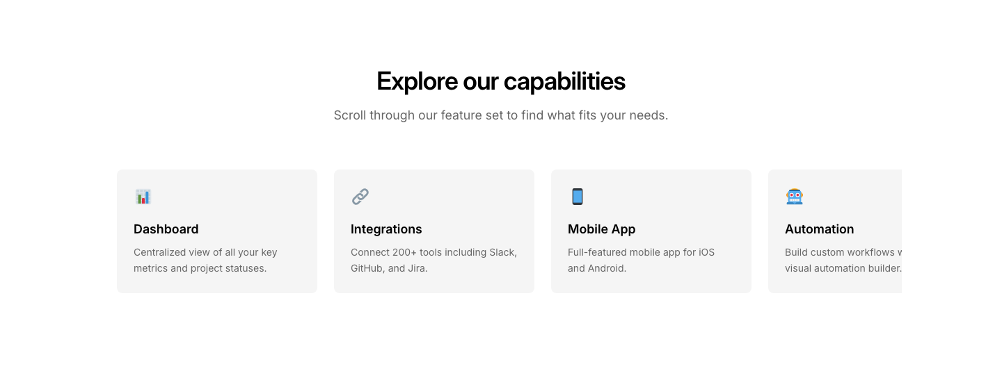
Carousel
FeatureHorizontally scrollable feature cards row.
Center
FeatureSingle centered feature with large icon, heading, and text.
Checklist
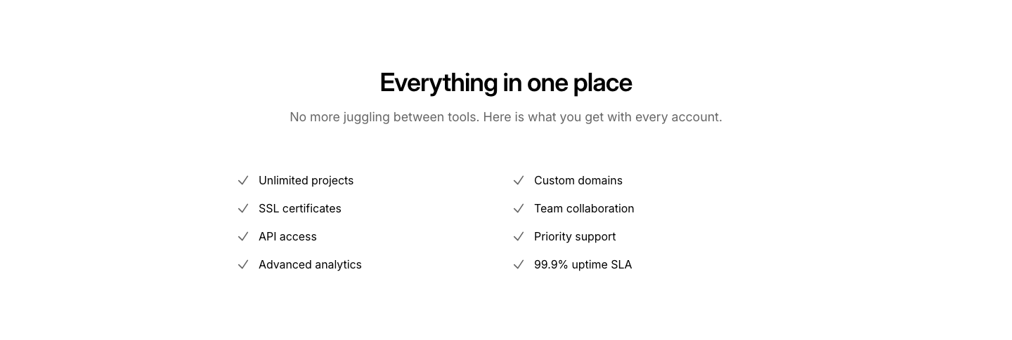
FeatureTwo-column checklist with check icons and labels.
Code
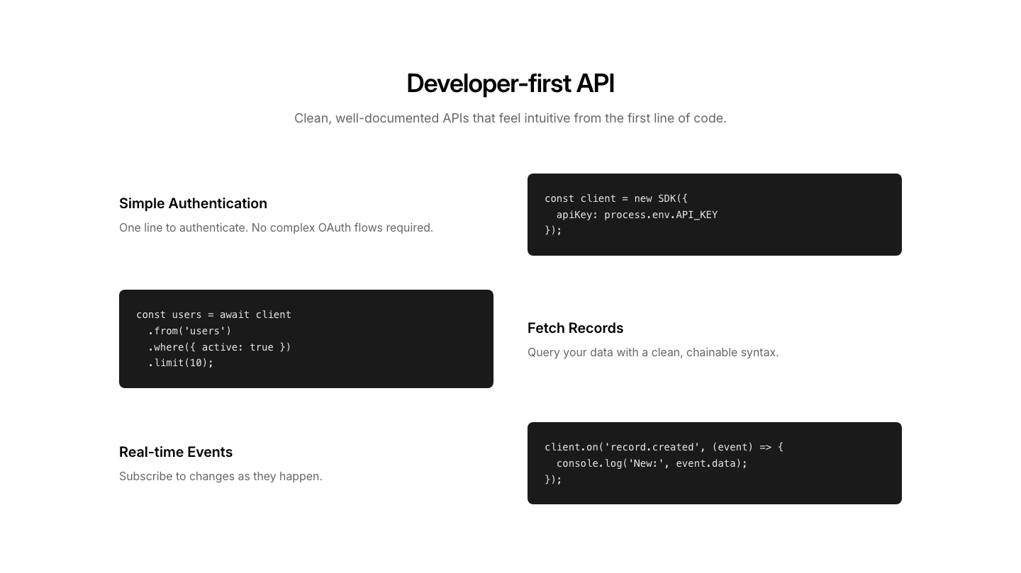
FeatureFeature sections with code snippet examples beside them.
Columns
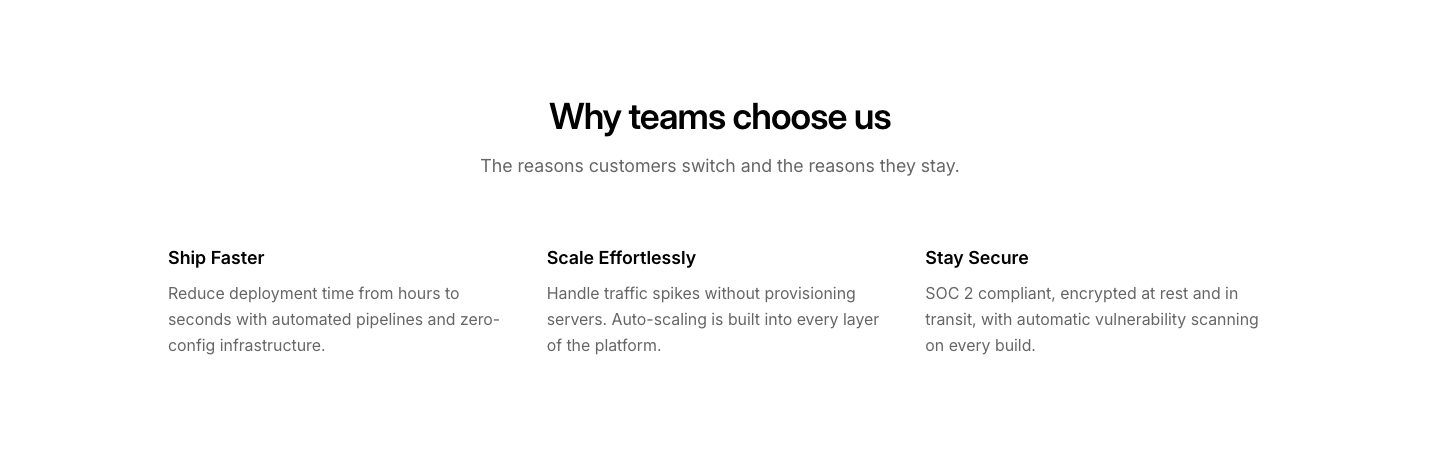
FeatureTwo or three column text blocks with headings. No icons, no cards.
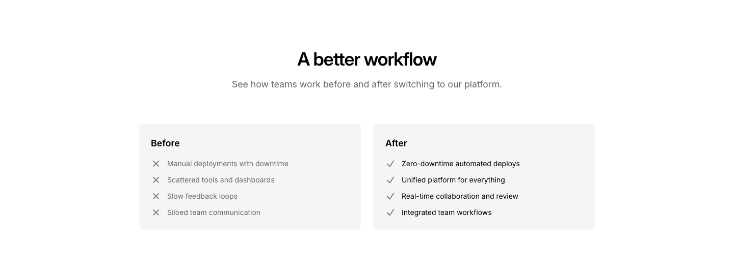
Comparison
FeatureBefore and after comparison with side-by-side cards.
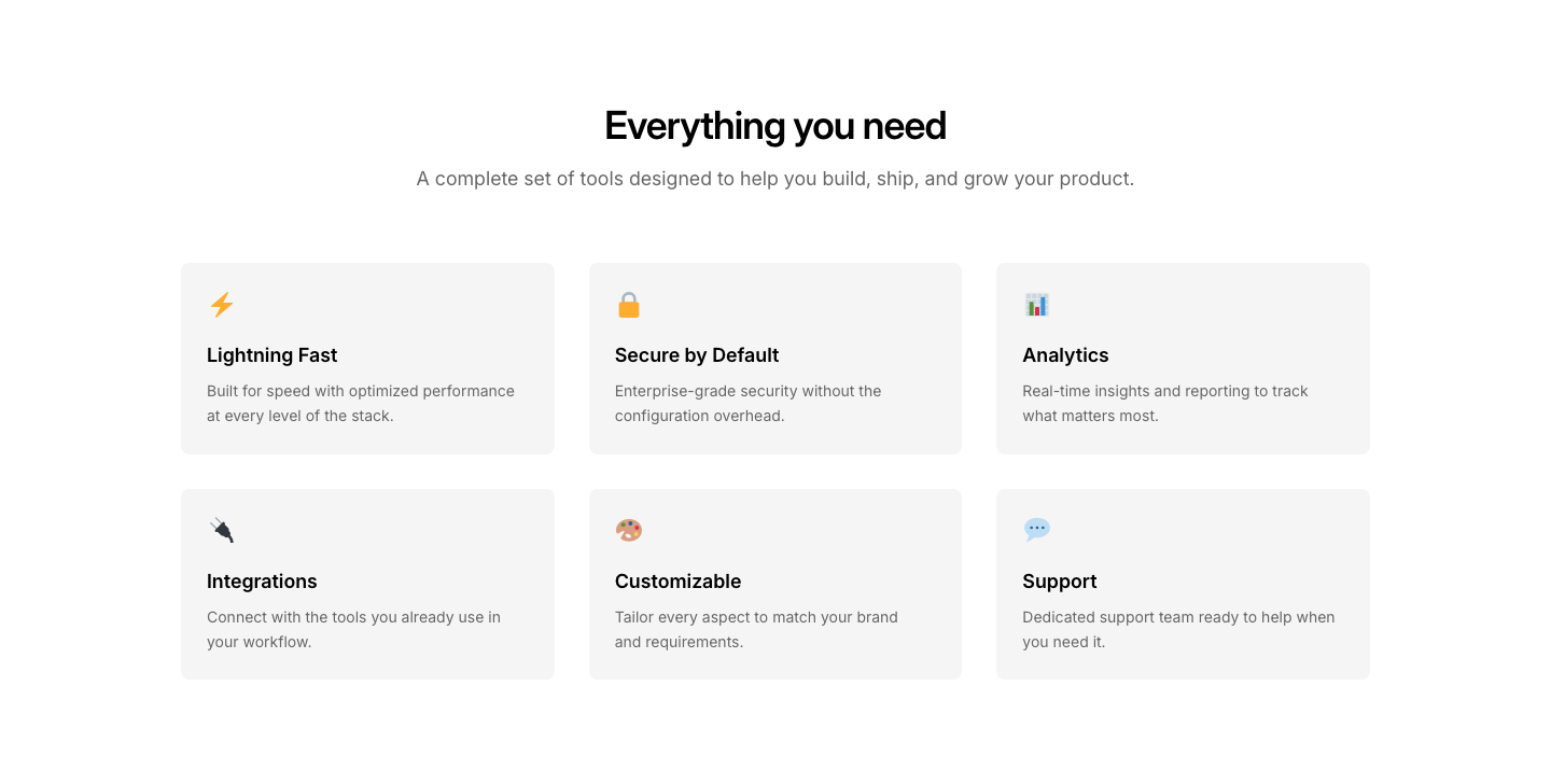
Grid
Feature3-column grid of feature cards with icon, title, and description.
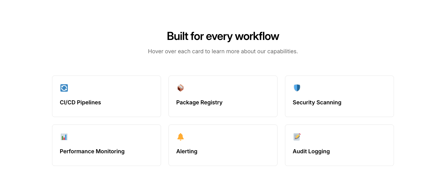
Hover
FeatureGrid of cards that reveal description text on hover.
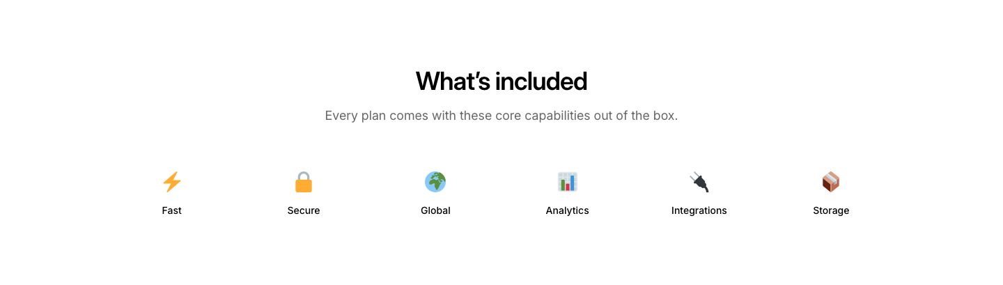
Icon
FeatureSingle row of icons with labels underneath.
Image Grid
Feature2x2 grid where each cell is an image with a caption below.
Large
FeatureTwo columns with a large image on one side and feature bullets on the other.
List
FeatureAlternating rows of text and image, stacked vertically.
Minimal
FeatureSimple two-column text pairs with title left and description right.
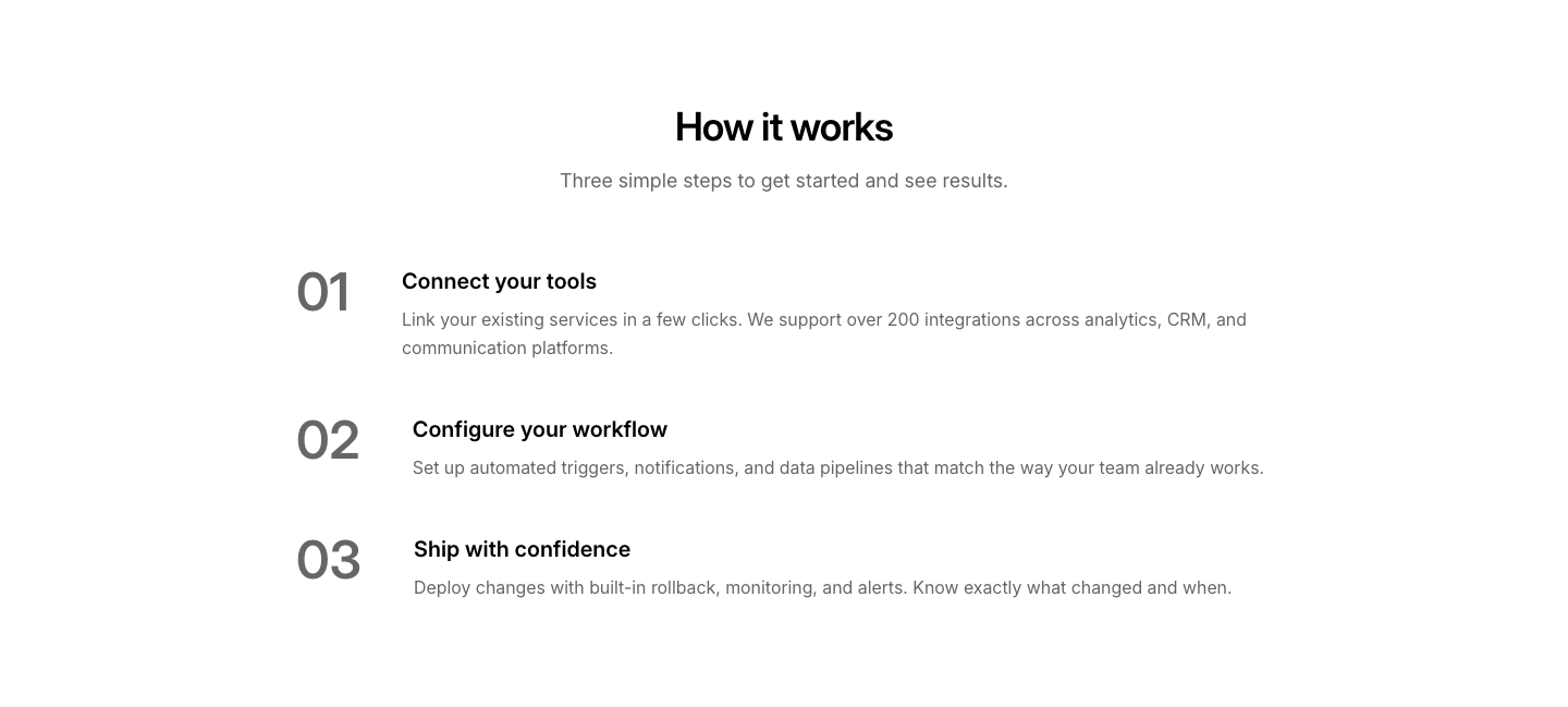
Numbered
FeatureNumbered list of features with descriptions.
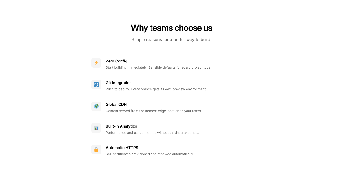
Side Icons
FeatureVertical list with icons on the left, text on the right, no cards.
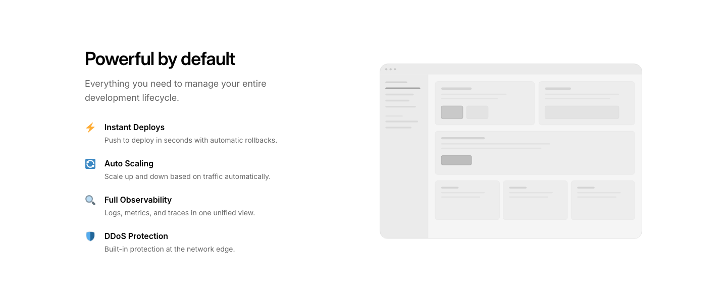
Split Image
FeatureTwo columns: feature list on left, single large image on right.
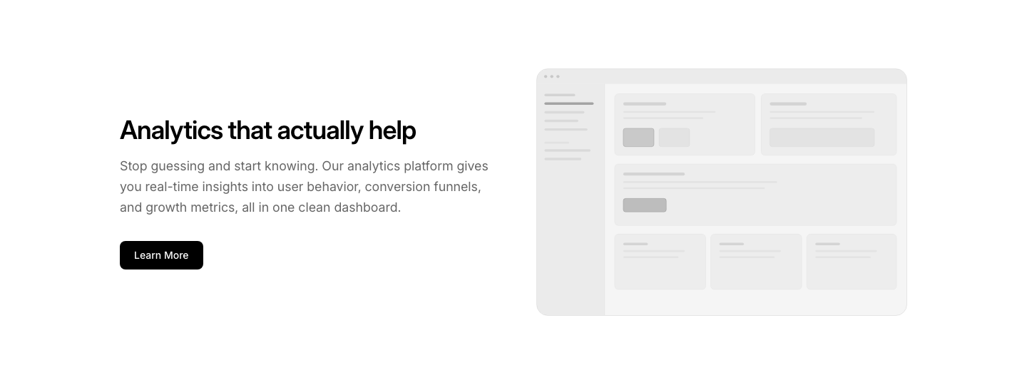
Spotlight
FeatureOne feature highlighted large with supporting text and image.
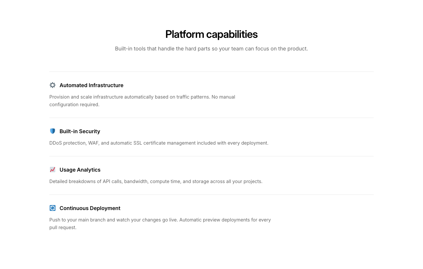
Stack
FeatureFull-width stacked rows with icon, heading, and paragraph.
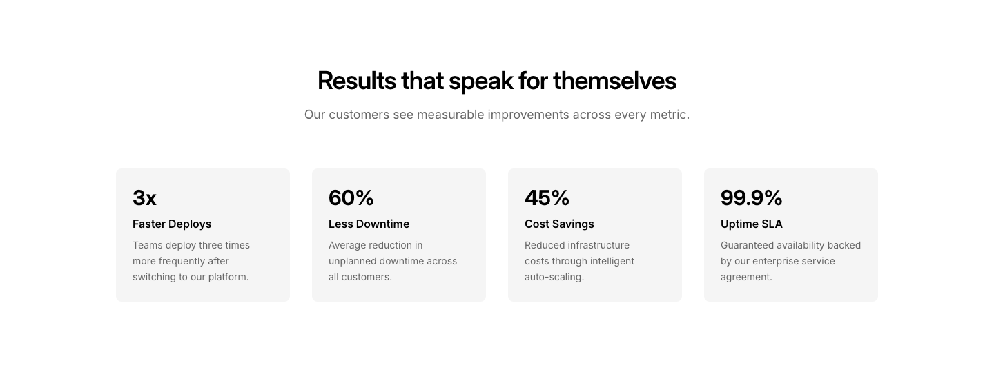
Stat
FeatureFeature cards each with a key metric number above the description.
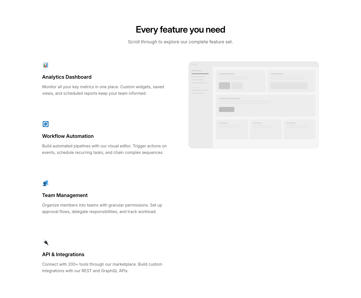
Sticky
FeatureScrollable feature list with a sticky image that changes per section.
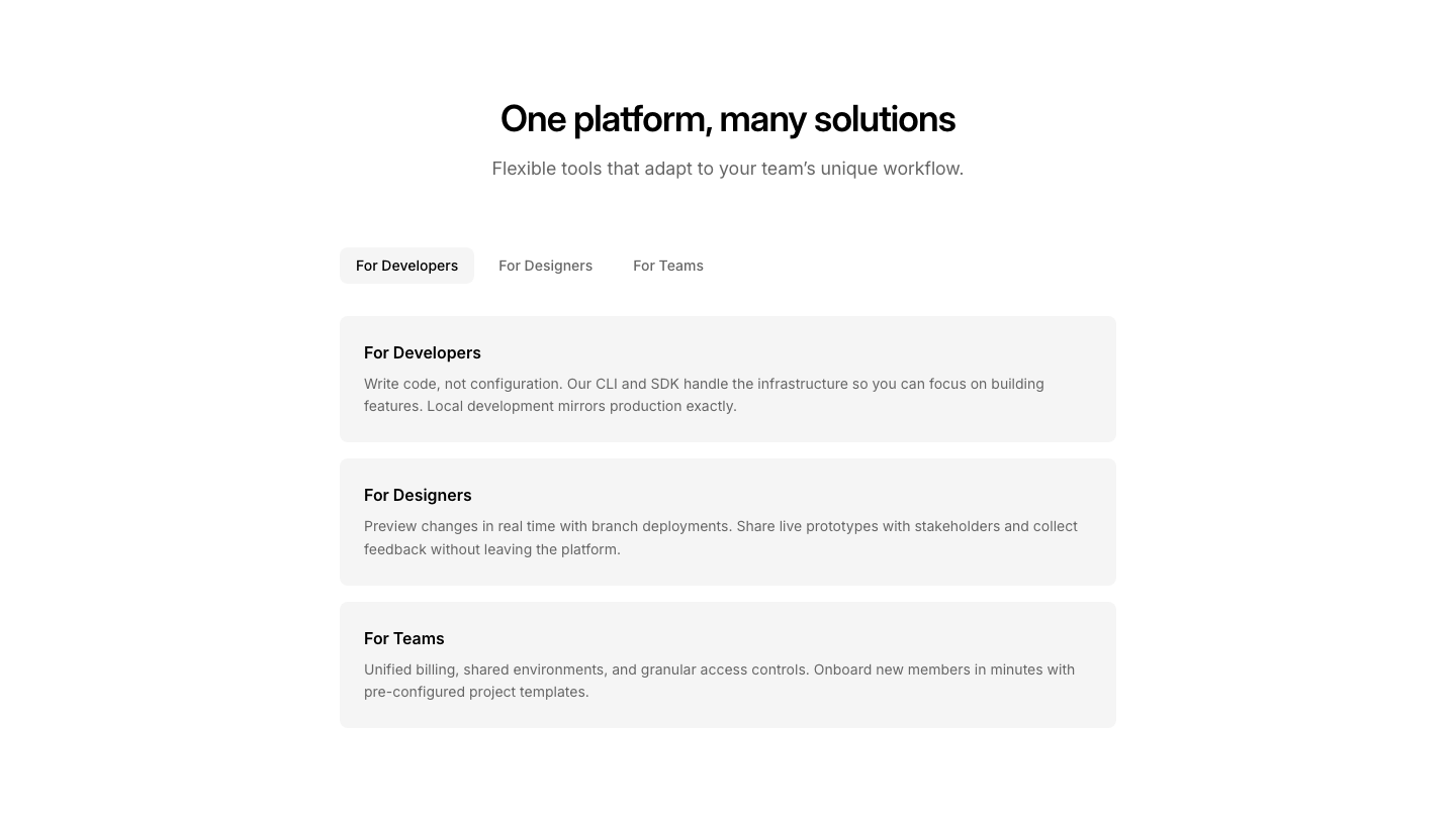
Tabs
FeatureTabbed interface with feature descriptions displayed as stacked cards.
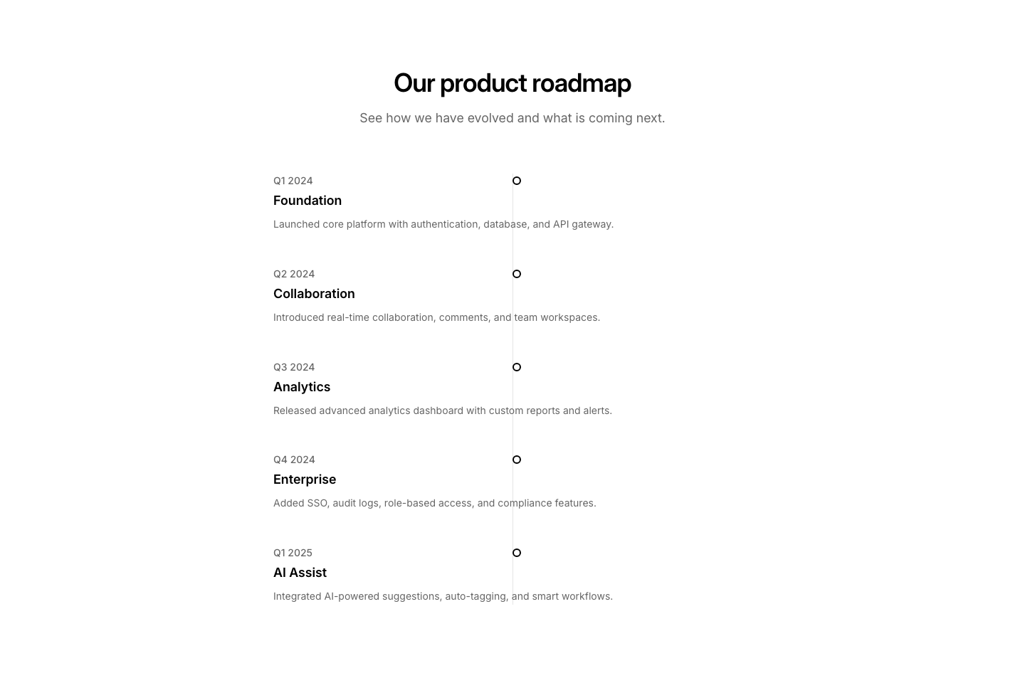
Timeline
FeatureFeatures presented as a vertical timeline with connecting line.
Two Col
FeatureTwo features side by side, each with image above and text below.
Video
FeatureFeature grid where each card has a video thumbnail instead of an icon.
Zigzag
FeatureAlternating full-width rows: image left/right with text opposite.

Emoji
FeedbackEmoji-based feedback (sad to happy faces).
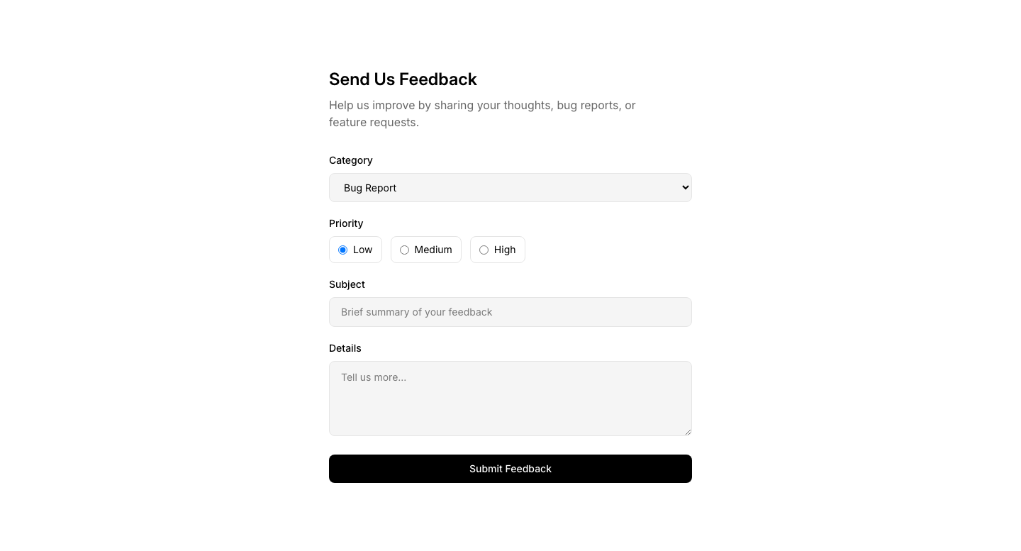
Form
FeedbackDetailed feedback form with category and priority.

Inline
Feedback"Was this helpful?" Yes/No inline feedback.

NPS
FeedbackNet Promoter Score survey (0-10 scale).

Rating
FeedbackStar or numeric rating with optional comment.
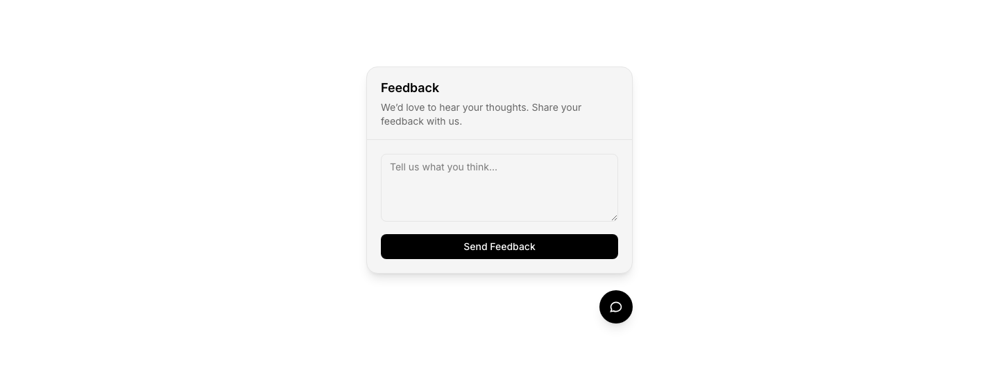
Widget
FeedbackFloating feedback button that opens a form.
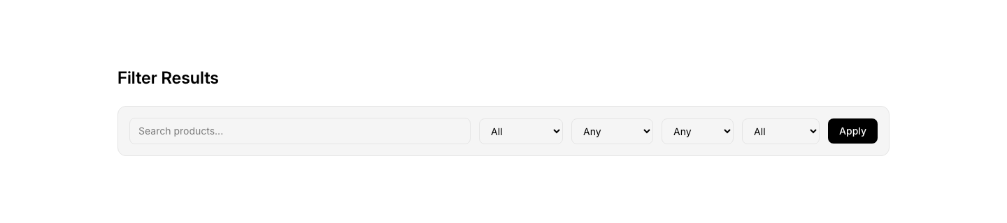
Bar
FilterHorizontal filter bar with dropdowns and search.

Range
FilterRange slider filter for price or numeric values.
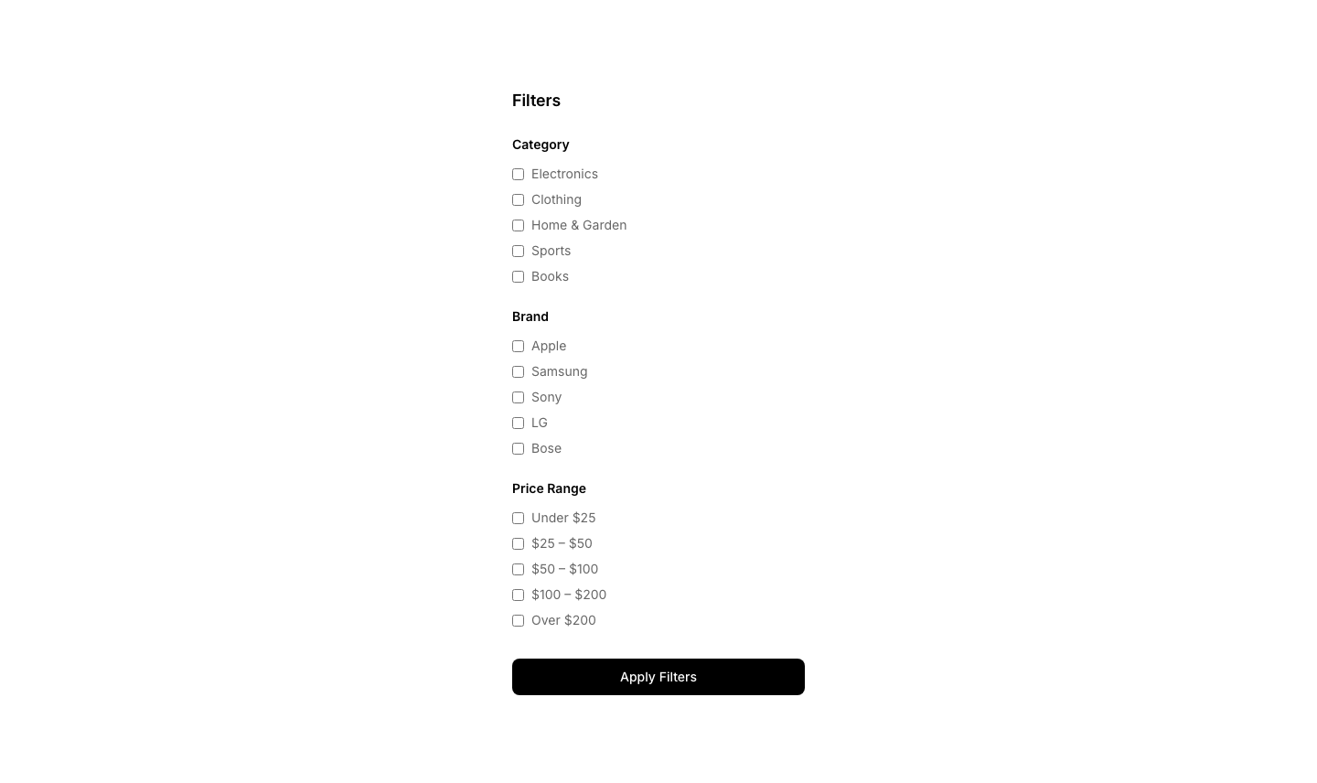
Sidebar
FilterVertical filter sidebar with checkbox groups.

Sort
FilterSort dropdown with options (newest, price, popular).

Tags
FilterActive filter tags with remove buttons.

Toggle
FilterToggle filter buttons for quick category switching.
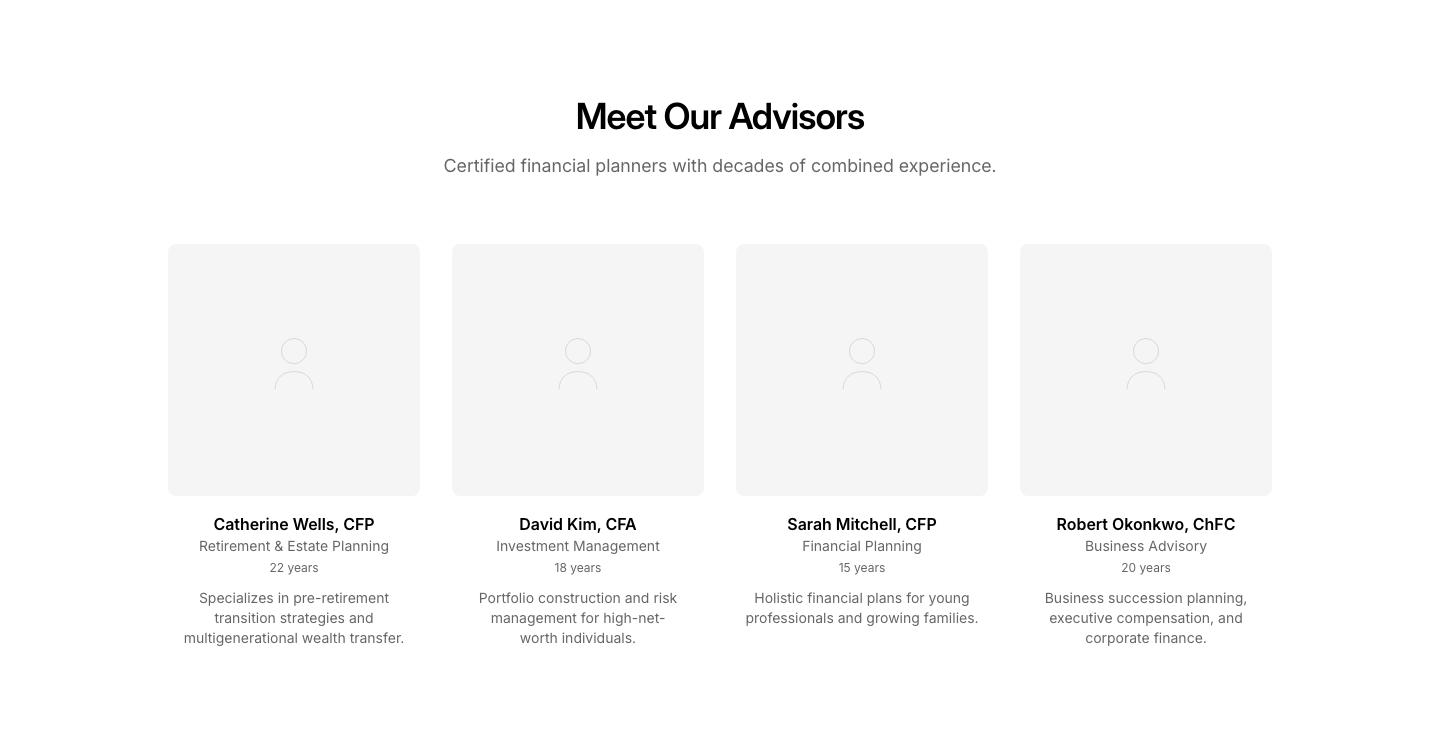
Advisors
FinanceFinancial advisor cards with booking links.
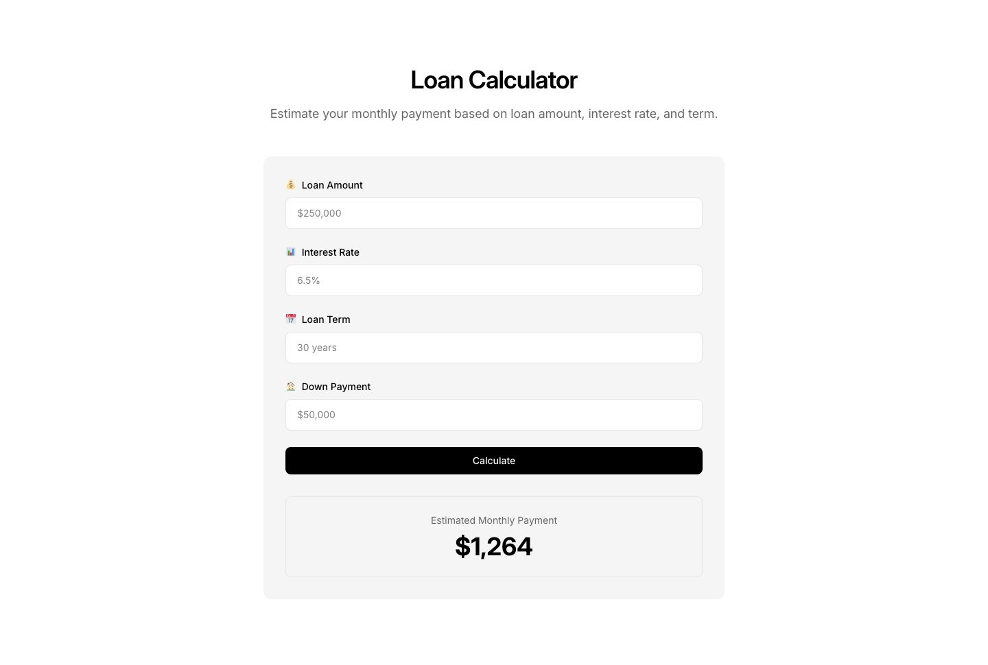
Calculator
FinanceFinancial calculator (loan, mortgage, investment).
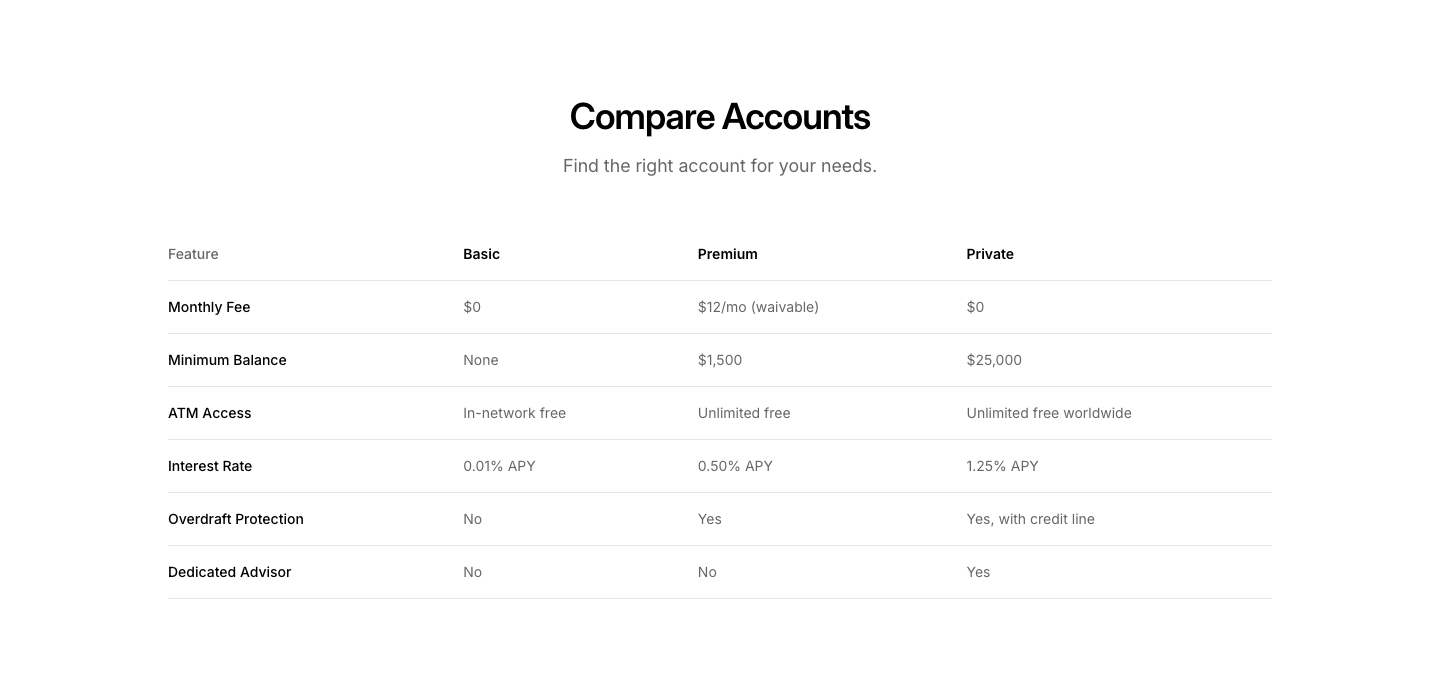
Comparison
FinanceFinancial product comparison table.
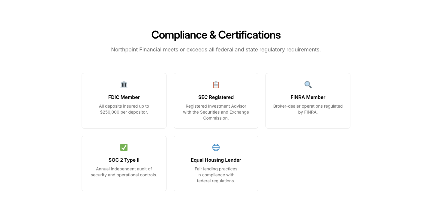
Compliance
FinanceRegulatory compliance and certifications section.
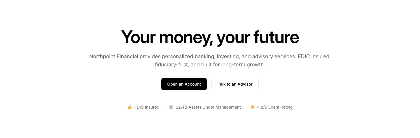
Hero
FinanceFinance hero with trust indicators and account CTA.
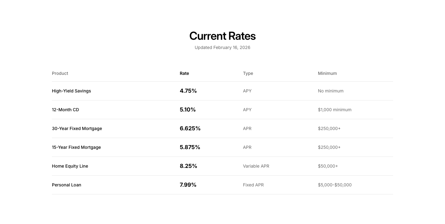
Rates
FinanceCurrent rates table (interest, exchange, APY).
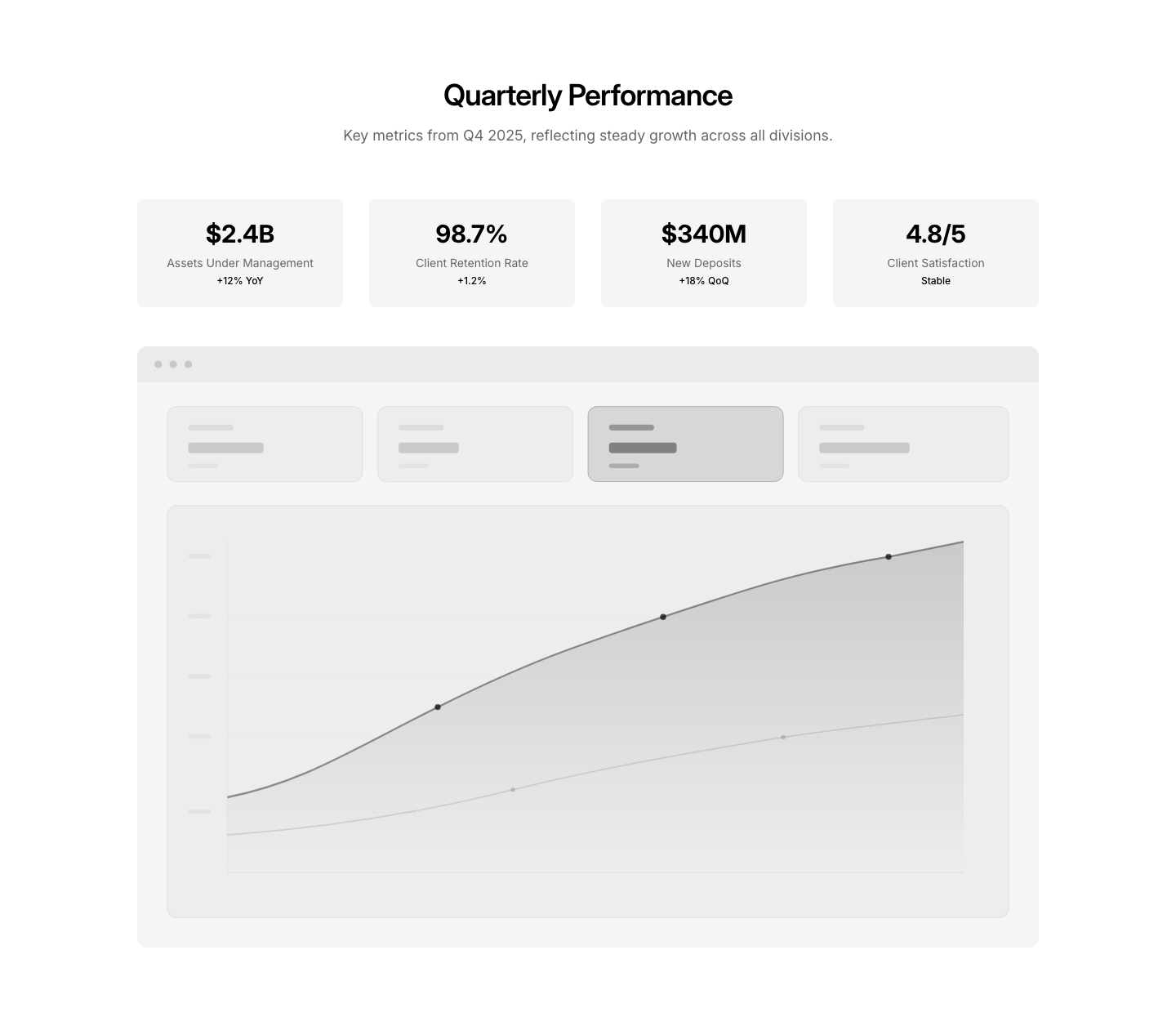
Report
FinanceFinancial report/chart section with key metrics.
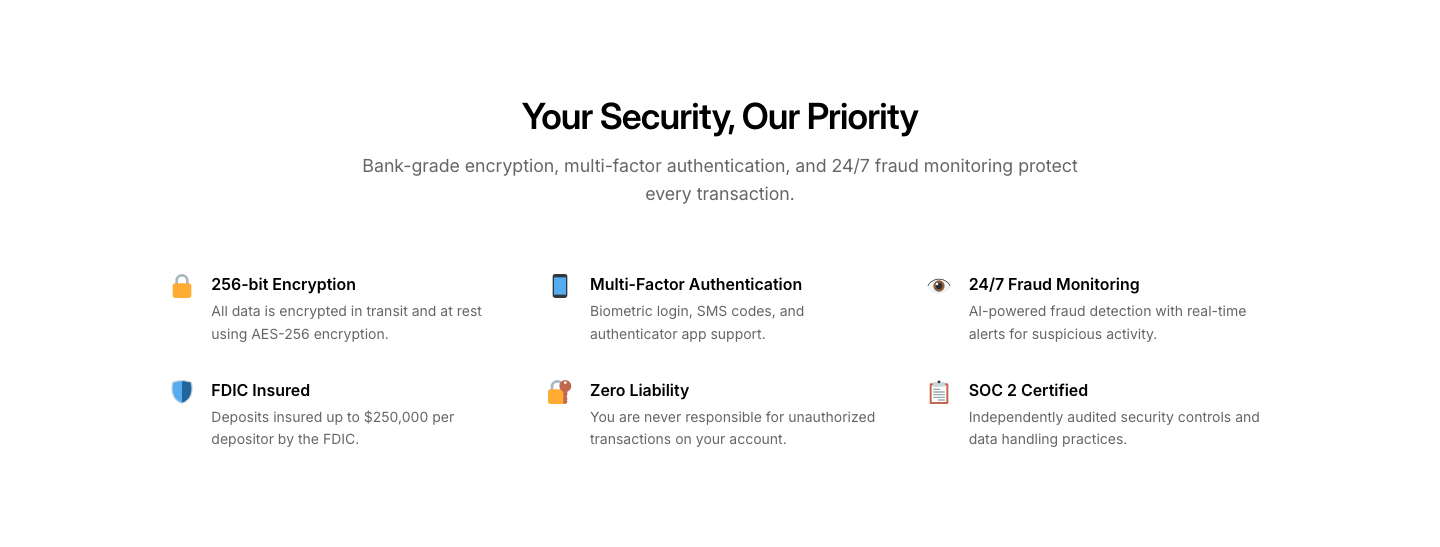
Security
FinanceSecurity features section with trust badges.
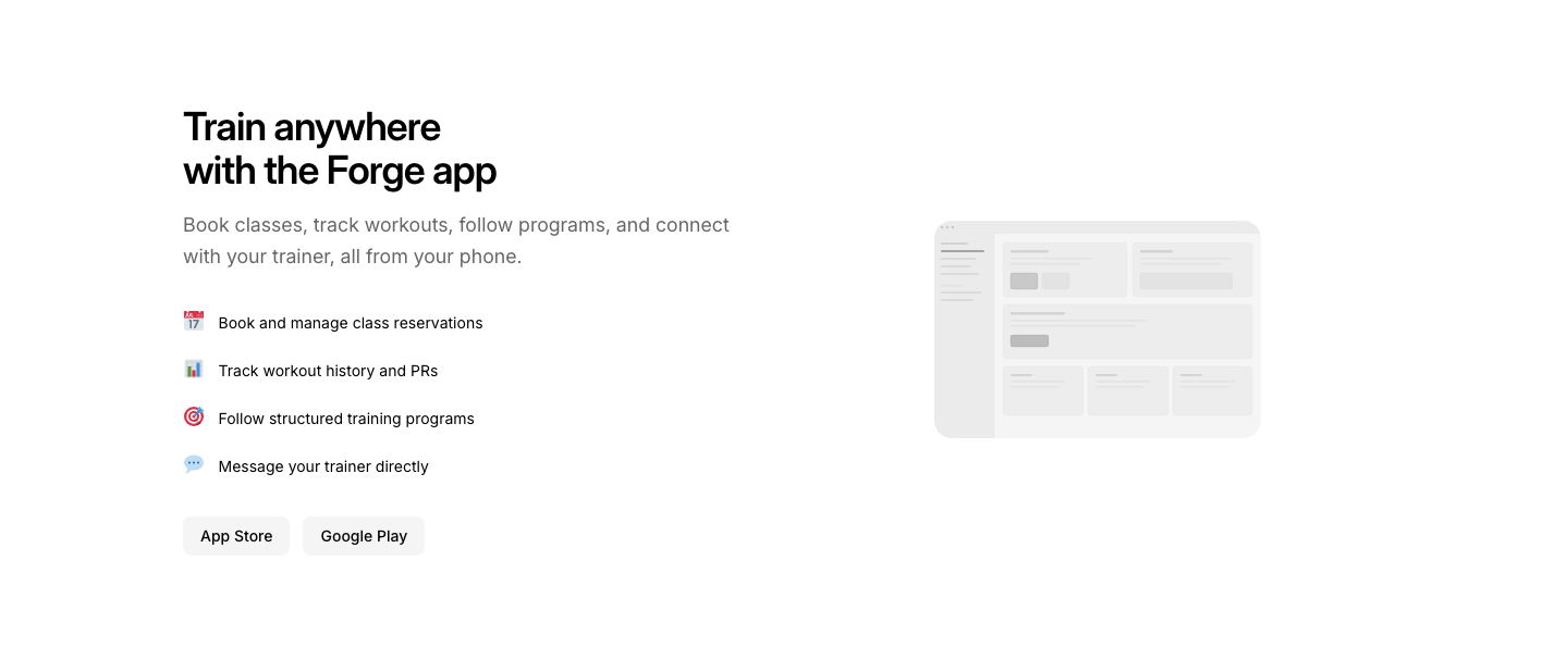
App
FitnessFitness app download section with feature preview.
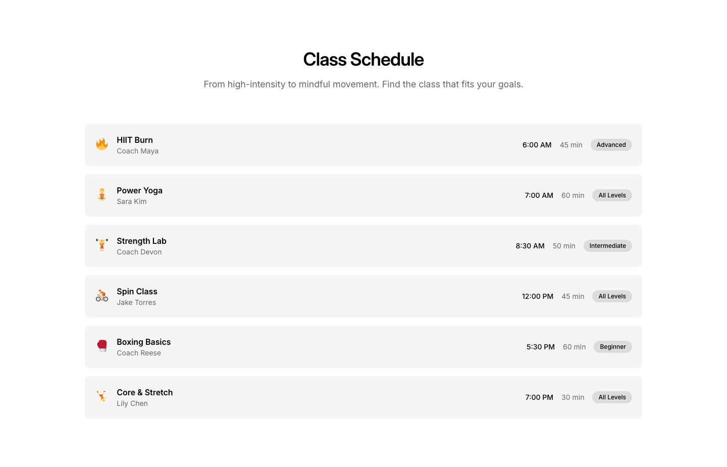
Classes
FitnessClass schedule grid with times and instructors.
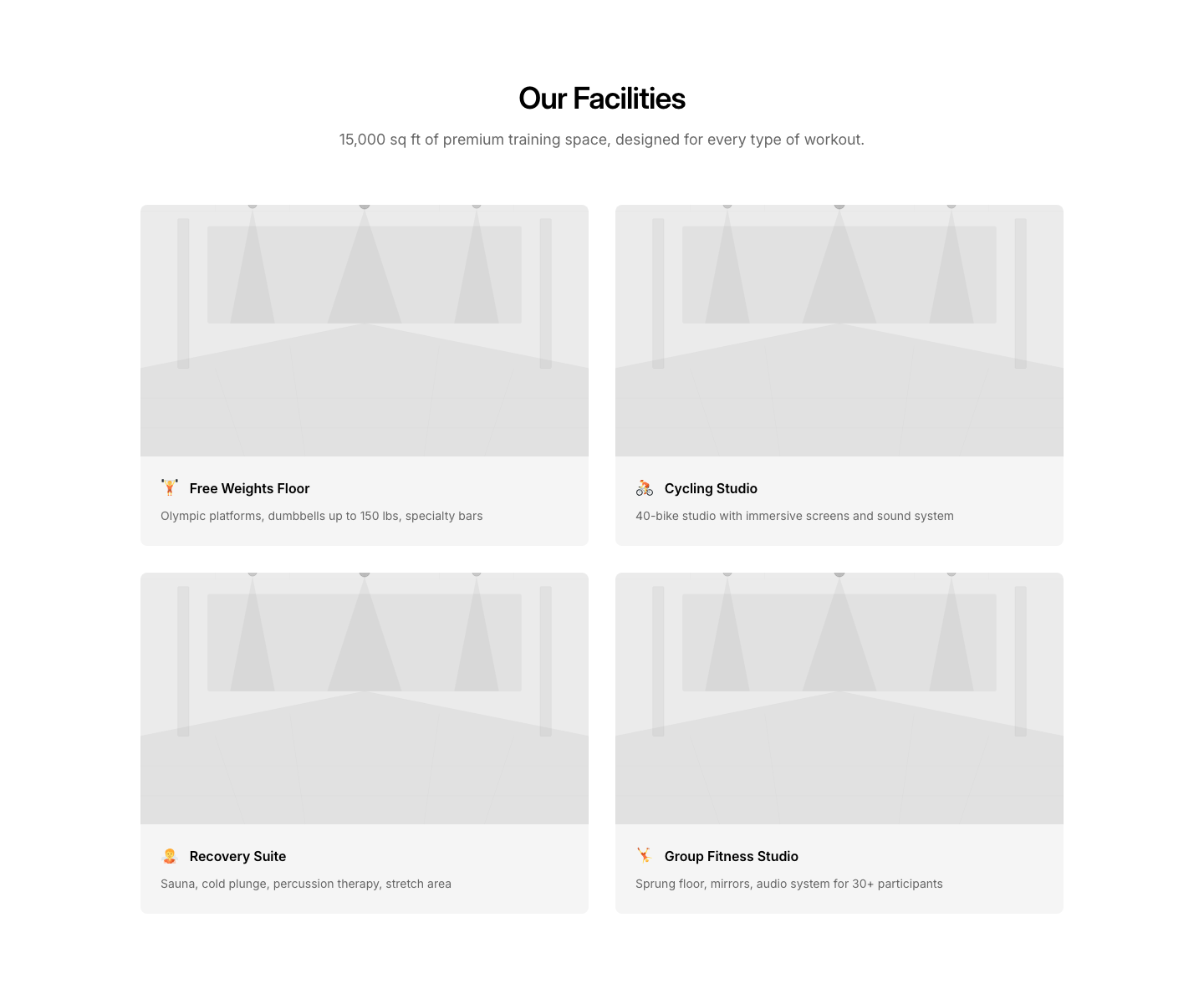
Facilities
FitnessFacility features grid with photos and descriptions.
Hero
FitnessGym/fitness hero with bold image and membership CTA.
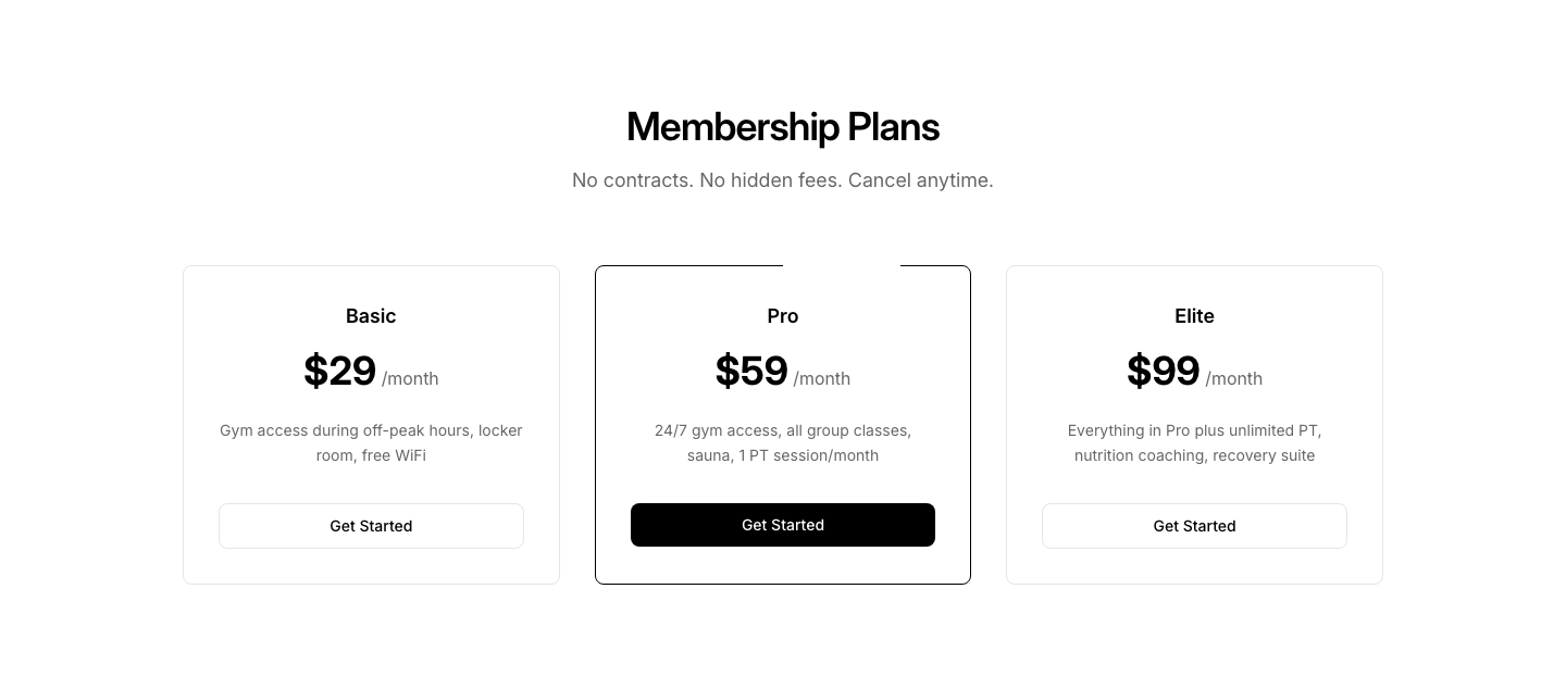
Pricing
FitnessMembership tiers with features and pricing.
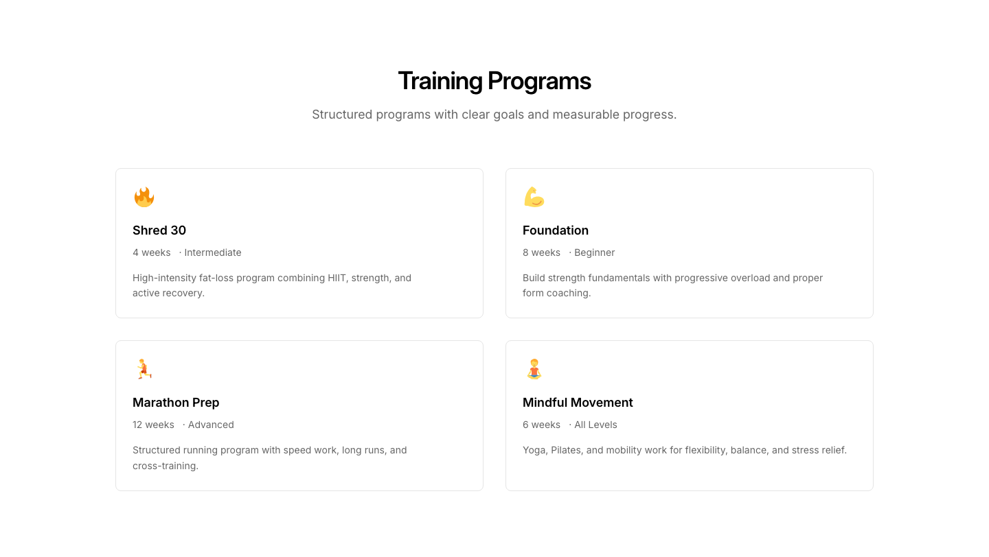
Programs
FitnessTraining program cards with duration and difficulty.
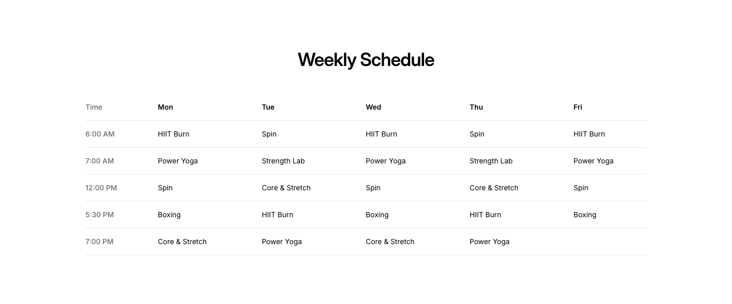
Schedule
FitnessWeekly class schedule table by day and time.
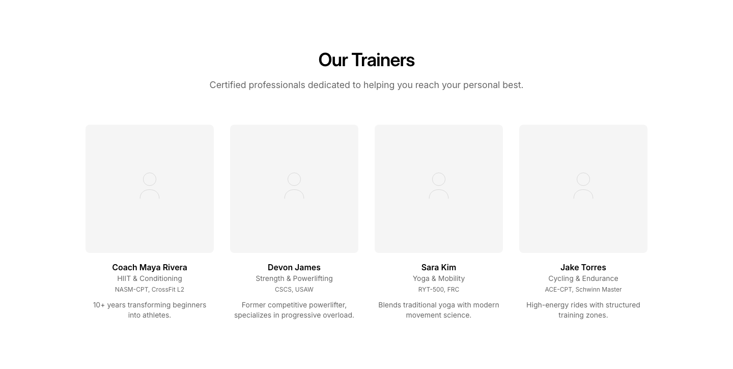
Trainers
FitnessTrainer cards with photo, specialty, and booking.
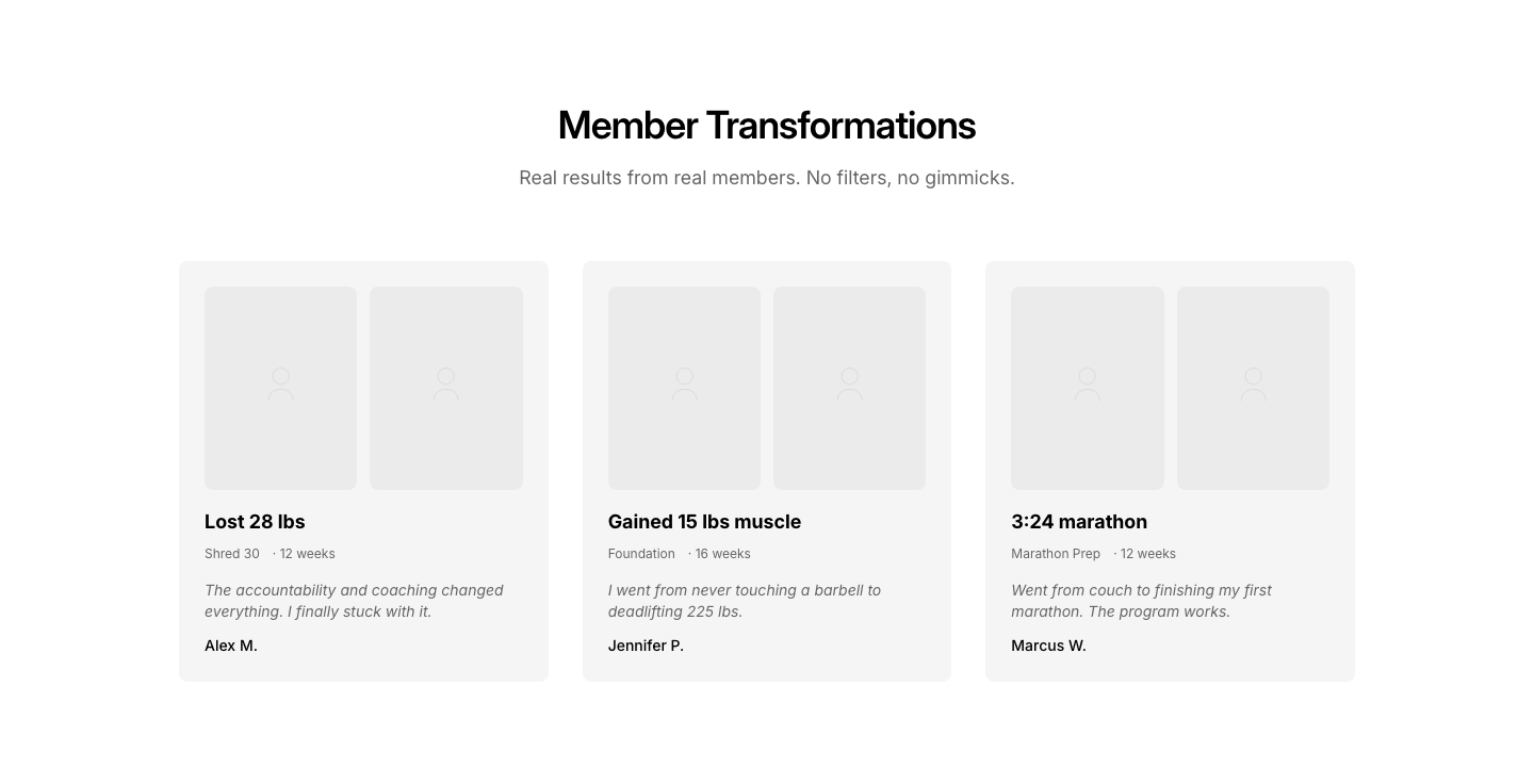
Transformation
FitnessBefore/after transformation photos with stats.
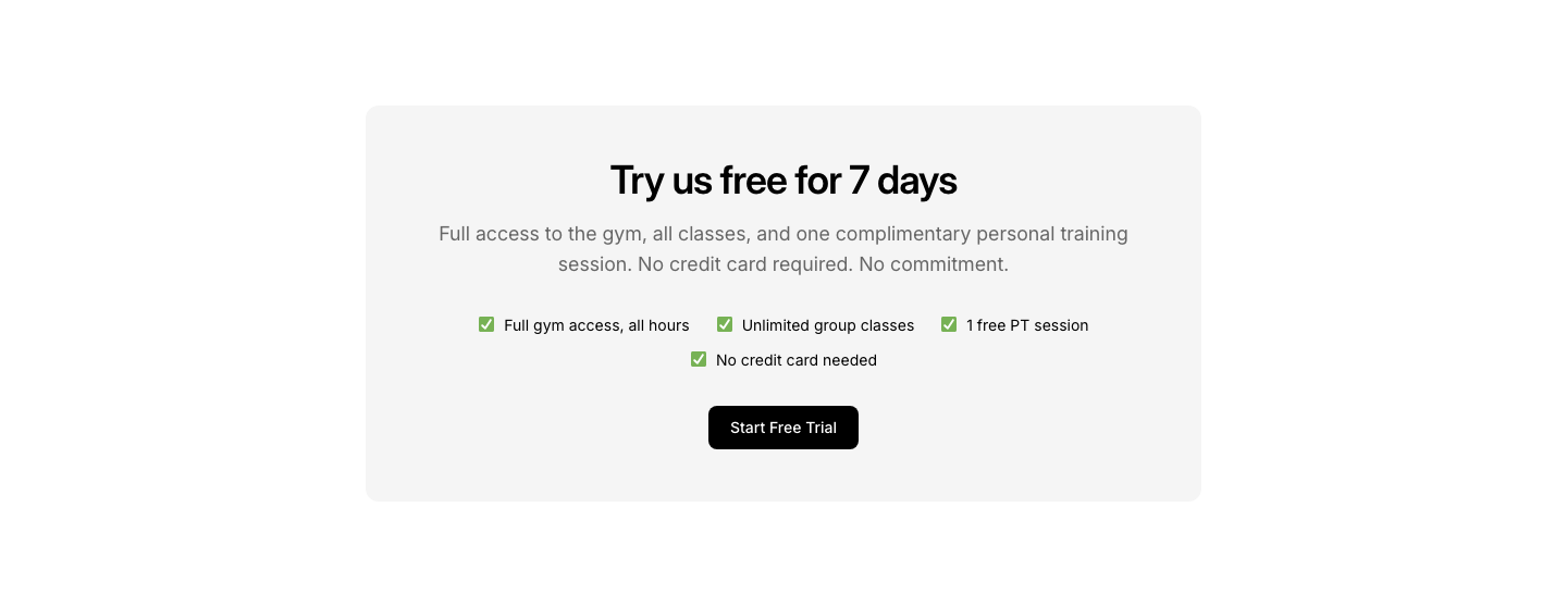
Trial
FitnessFree trial signup with no-commitment messaging.
App
FooterFooter with app store download badges prominently.
Branded
FooterFull-width colored footer with brand background.

Centered
FooterCentered footer with logo, links, social links, and copyright.
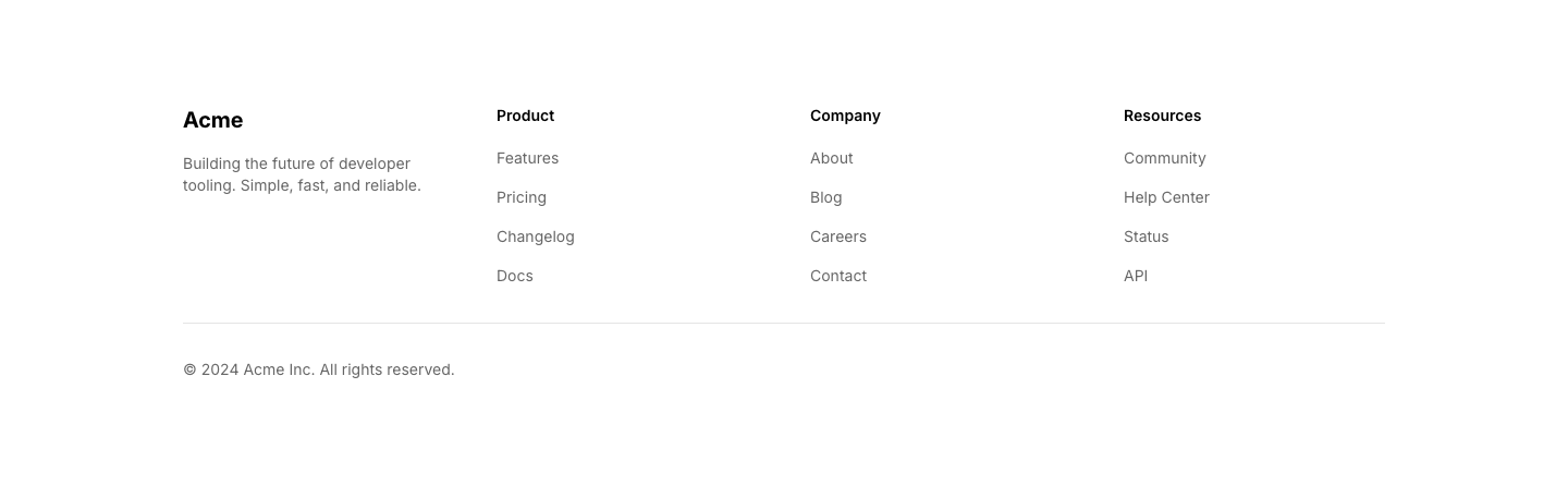
Columns
FooterMulti-column footer with logo, description, link columns, and copyright.
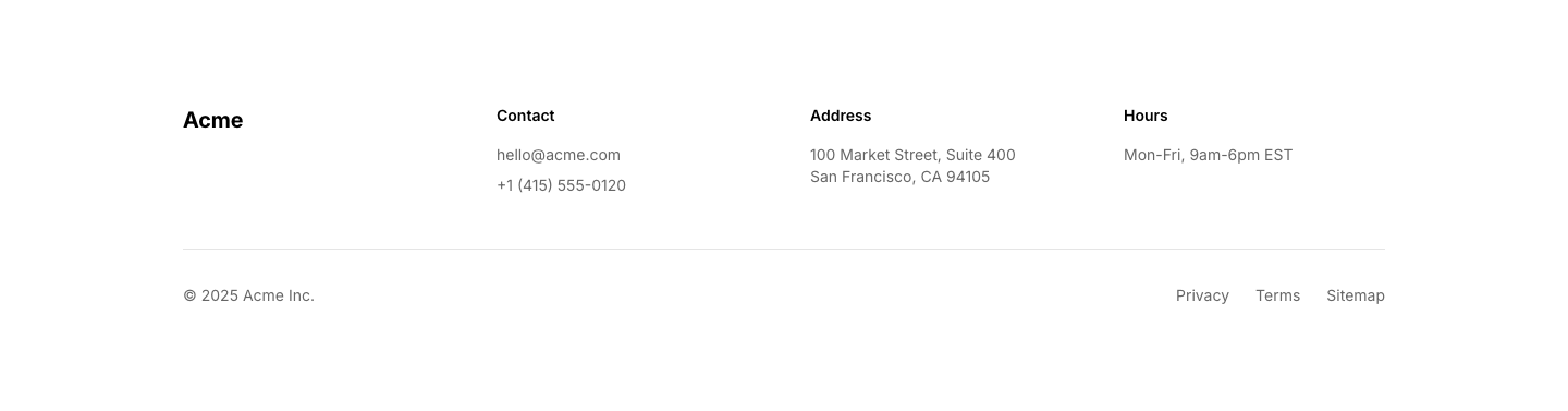
Contact
FooterFooter with contact info, map link, and hours.
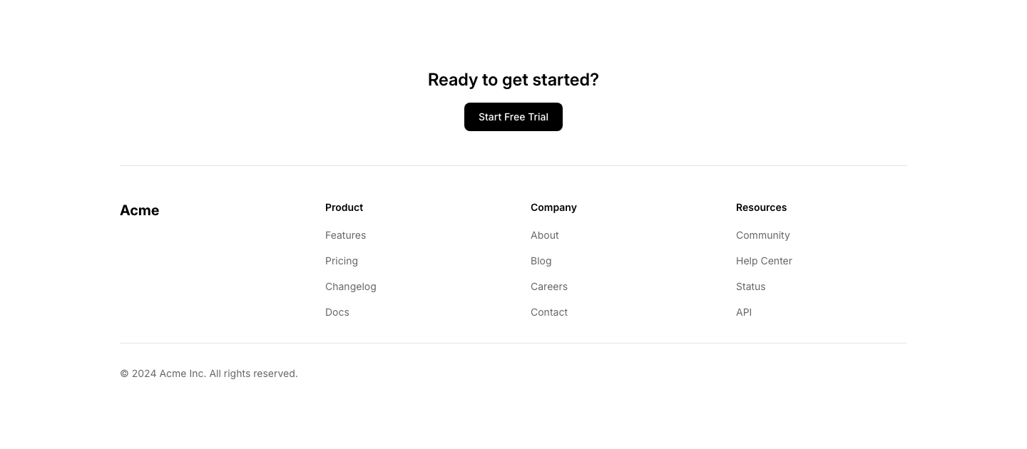
CTA
FooterFooter with call-to-action section above standard columns and copyright.
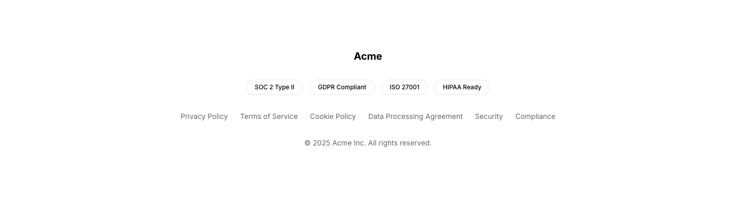
Legal
FooterFooter focused on legal links, compliance badges, certifications.
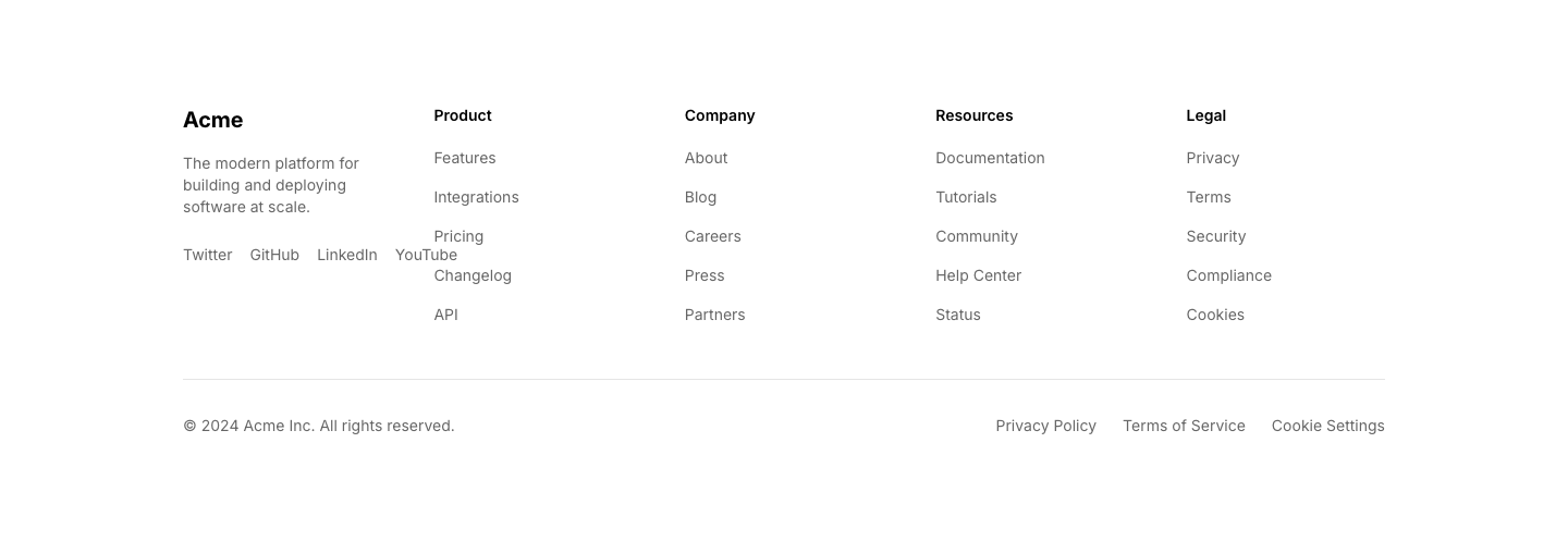
Mega
FooterLarge footer with logo, description, social links, four link columns, and bottom bar.

Minimal
FooterMinimal single-line footer with copyright and links.
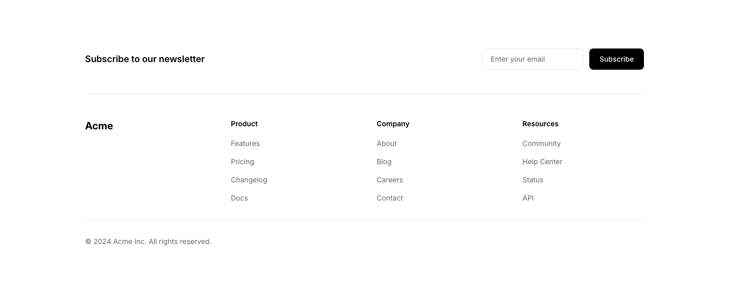
Newsletter
FooterFooter with newsletter signup row above standard columns and copyright.

Simple
FooterSingle-row footer with logo, links, and copyright.
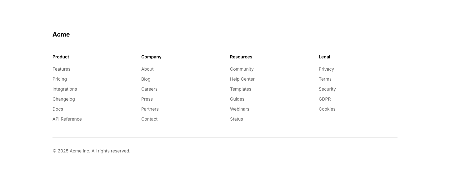
Sitemap
FooterComprehensive sitemap-style footer with all page links.

Social
FooterFooter focused on social links with large icons.
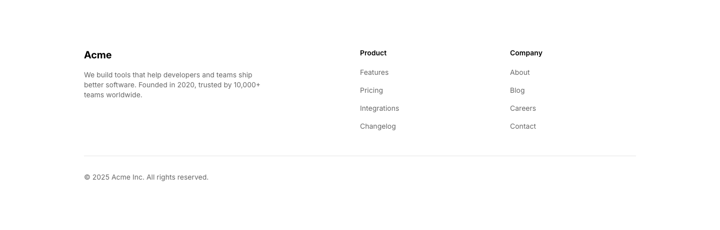
Split
FooterTwo-column footer: brand info left, link columns right.
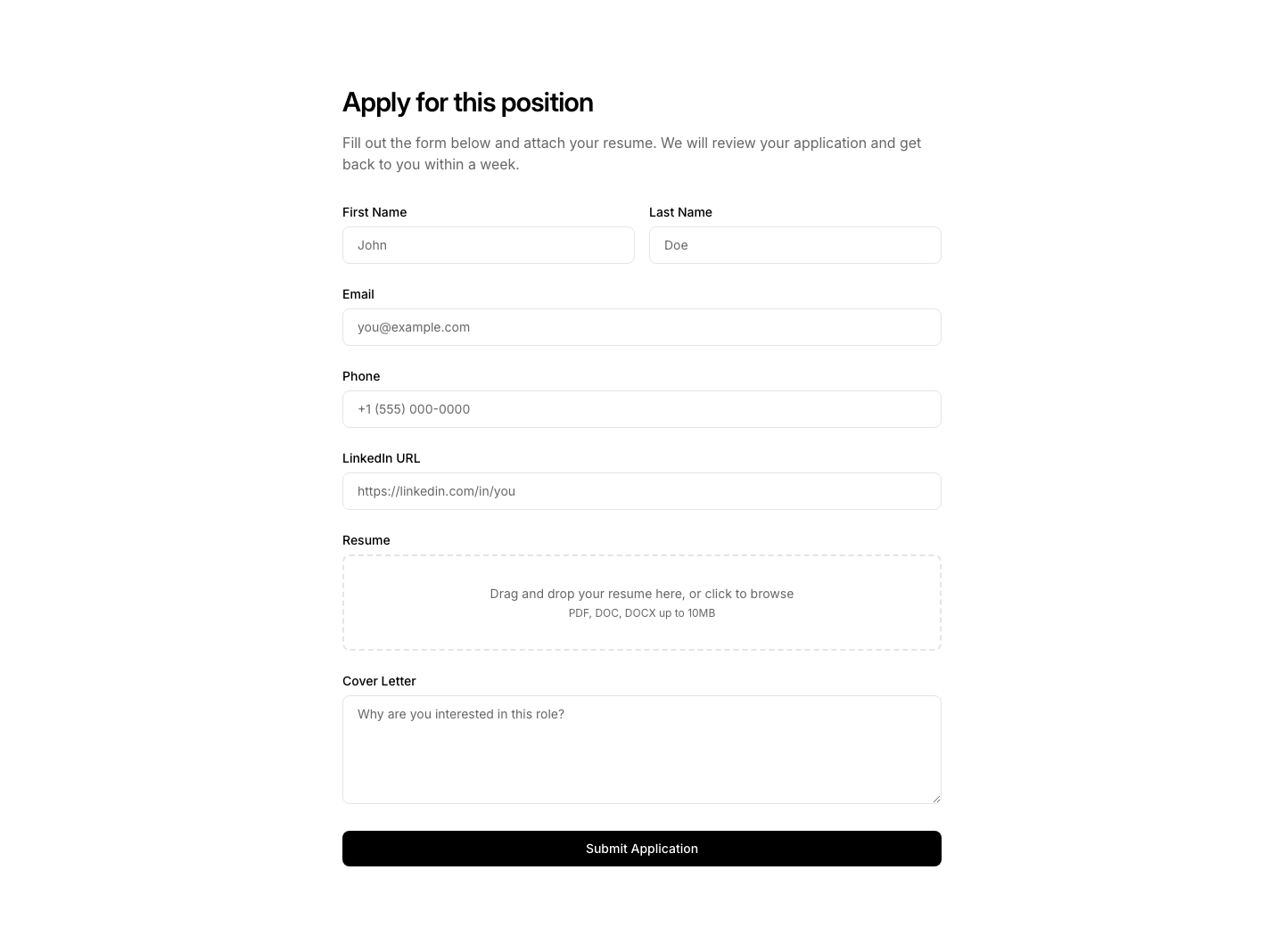
Application
FormJob application form with file upload and text fields.
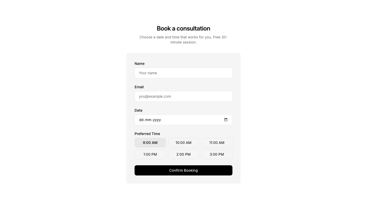
Booking
FormBooking form with date, time, and service selection.
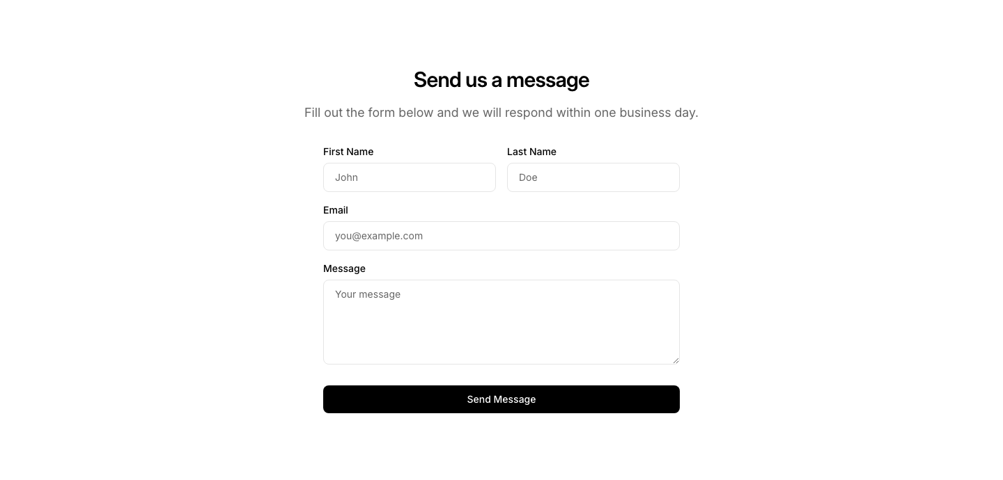
Contact
FormContact form with name, email, and message fields.
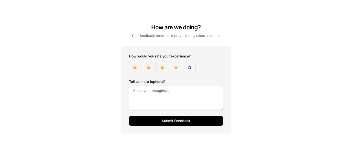
Feedback
FormFeedback form with rating scale and comment field.
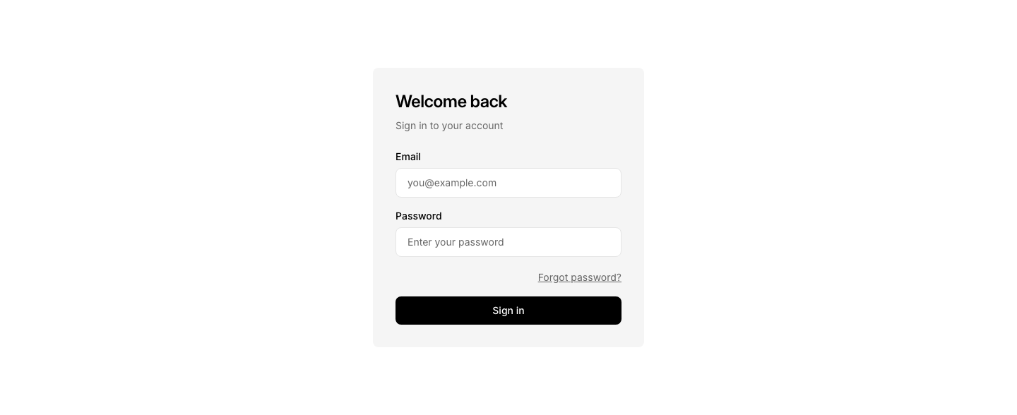
Login
FormLogin form with email, password, and forgot password link.
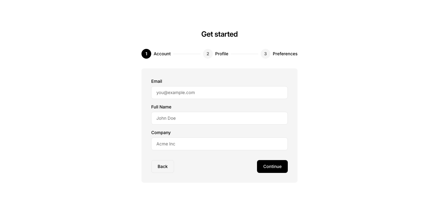
Multi-Step
FormMulti-step form with progress indicator.
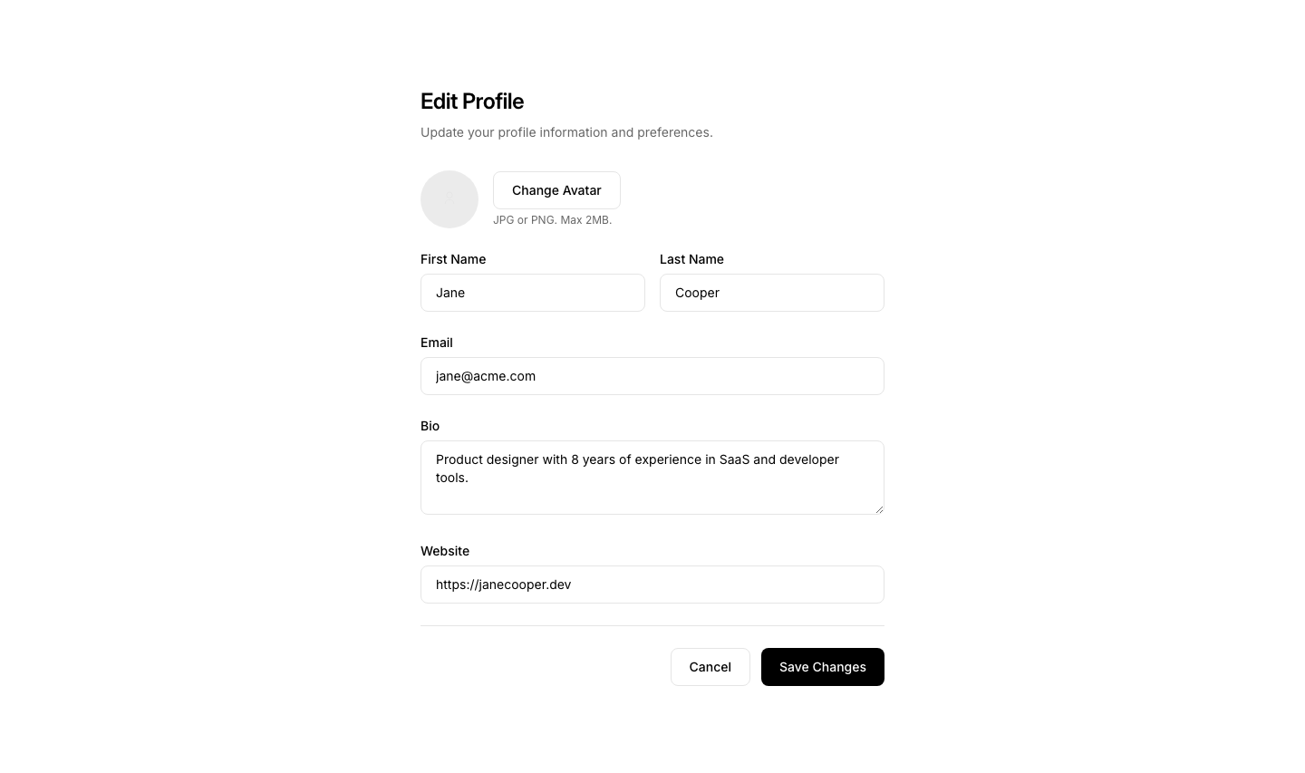
Profile
FormProfile edit form with avatar, name, bio fields.
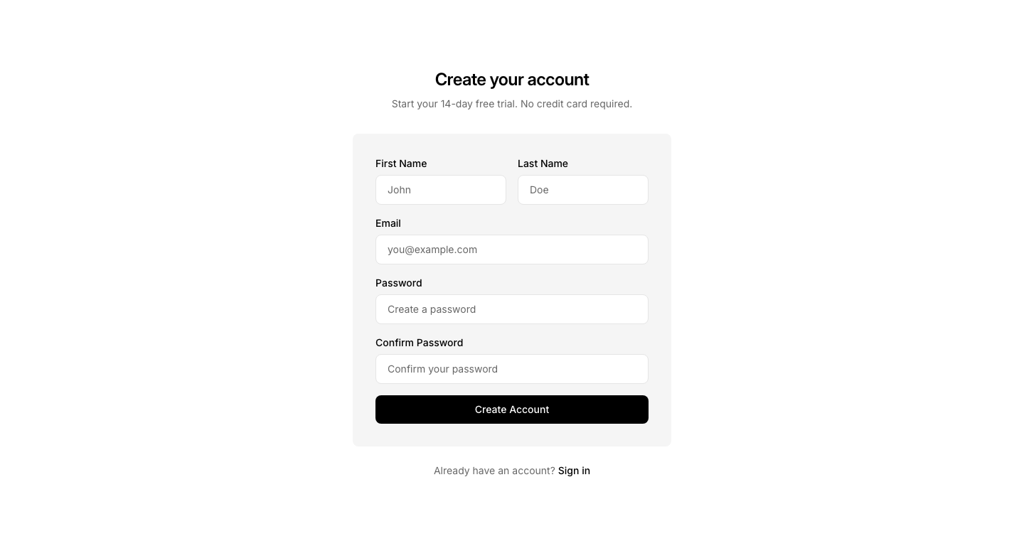
Register
FormFull registration form with name, email, password, and confirm password.

Subscribe
FormEmail subscription form with input and button in a single row.
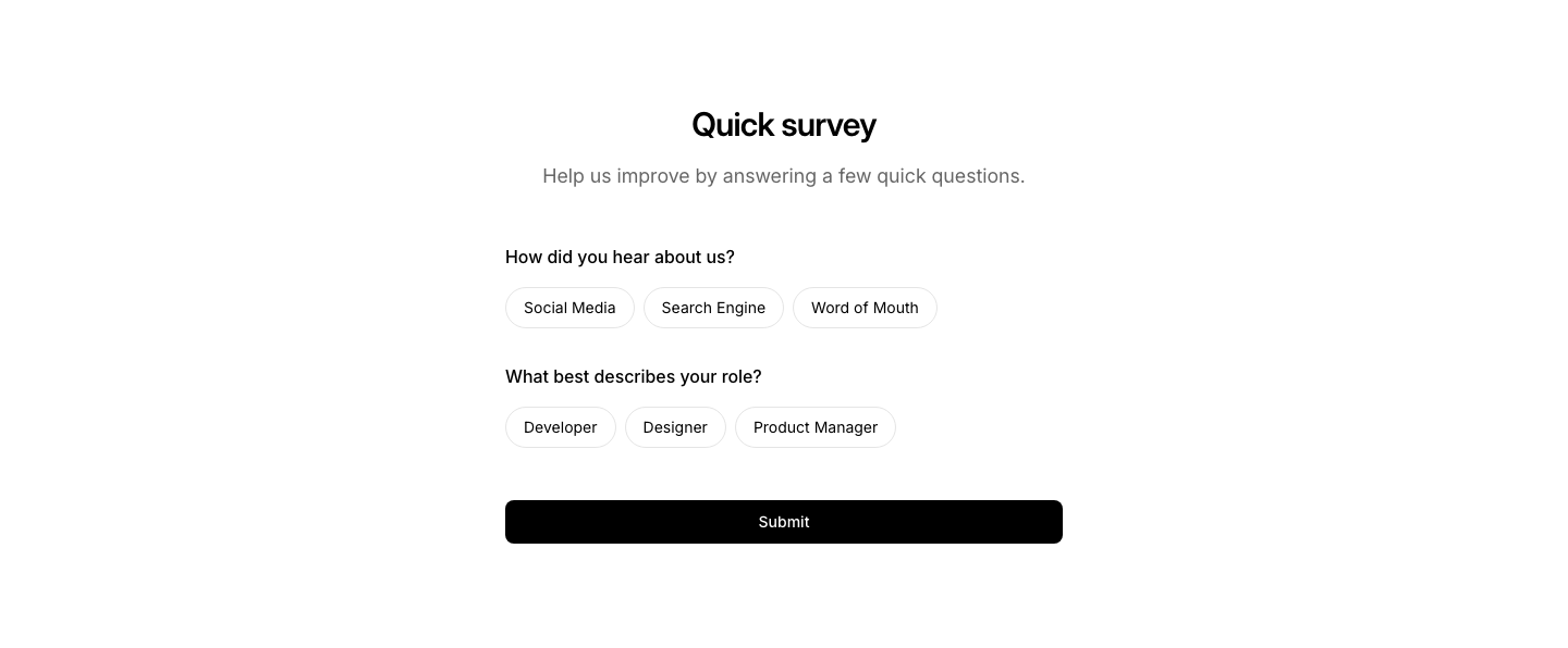
Survey
FormSurvey form with questions and selectable pill-style options.

Waitlist
FormWaitlist signup form with email input and social proof counter.
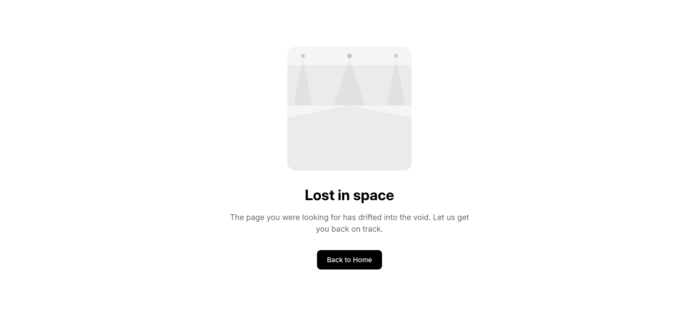
Illustration
Fourohfour404 page with a large illustration placeholder, heading, and button.

Minimal
FourohfourUltra-minimal 404 with just the error code and a single text link.

Redirect
Fourohfour404 page with automatic redirect countdown and manual link.
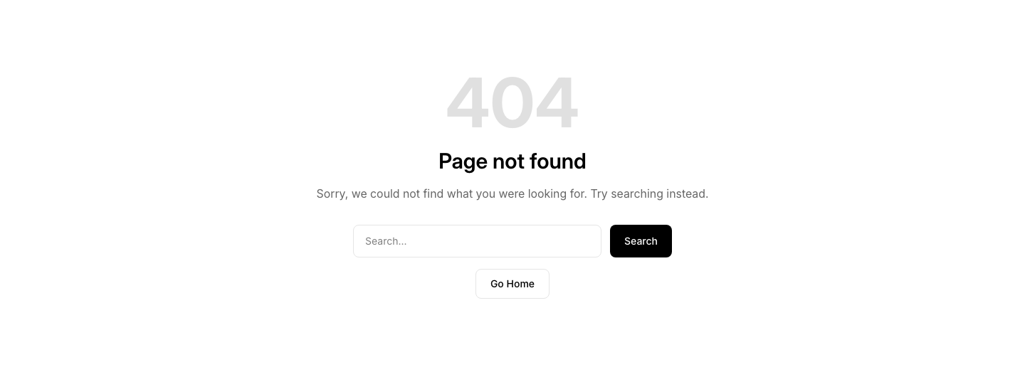
Search
Fourohfour404 page with search form and home button.

Simple
FourohfourSimple 404 page with error code, message, and home button.
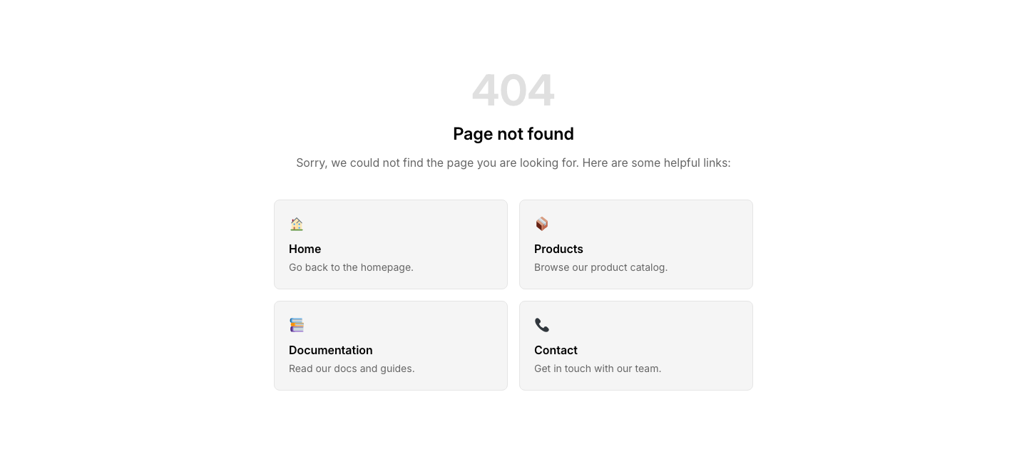
Suggestions
Fourohfour404 page with suggested pages to help visitors find what they need.
Caption
GalleryImage grid with visible captions below each image.
Carousel
GalleryHorizontally scrollable image carousel with snap points.
Columns
GalleryTwo or three column image layout with equal heights.
Comparison
GalleryBefore/after image comparison slider.
Featured
GalleryOne large image with thumbnails below it.
Fullwidth
GalleryFull-width cinematic image with caption.
Grid
GalleryResponsive image grid with optional captions.

Lightbox
GalleryThumbnail grid gallery with hover effect.
Masonry
GalleryMasonry-style image gallery with alternating aspect ratios.
Scroll
GalleryHorizontal scroll gallery with snap points.
Slider
GalleryFull-width image slider with navigation arrows.

Auth
HeaderHeader with login/signup buttons or user avatar dropdown.

Branded
HeaderFull-width colored brand bar with white text.

Centered
HeaderCentered header with logo above navigation links.
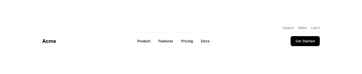
Dual
HeaderTwo-bar header with utility links above and main navigation below.
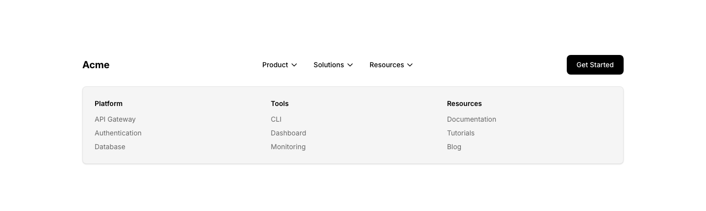
Mega
HeaderHeader with mega dropdown panel showing sample navigation grid.

Minimal
HeaderMinimal header with logo and hamburger menu icon.

Notification
HeaderHeader with notification bell icon and dropdown.

Search
HeaderHeader with prominent search bar in the nav area.

Sidebar
HeaderVertical sidebar navigation instead of top bar.

Transparent
HeaderTransparent header with logo, navigation links, and outlined button.
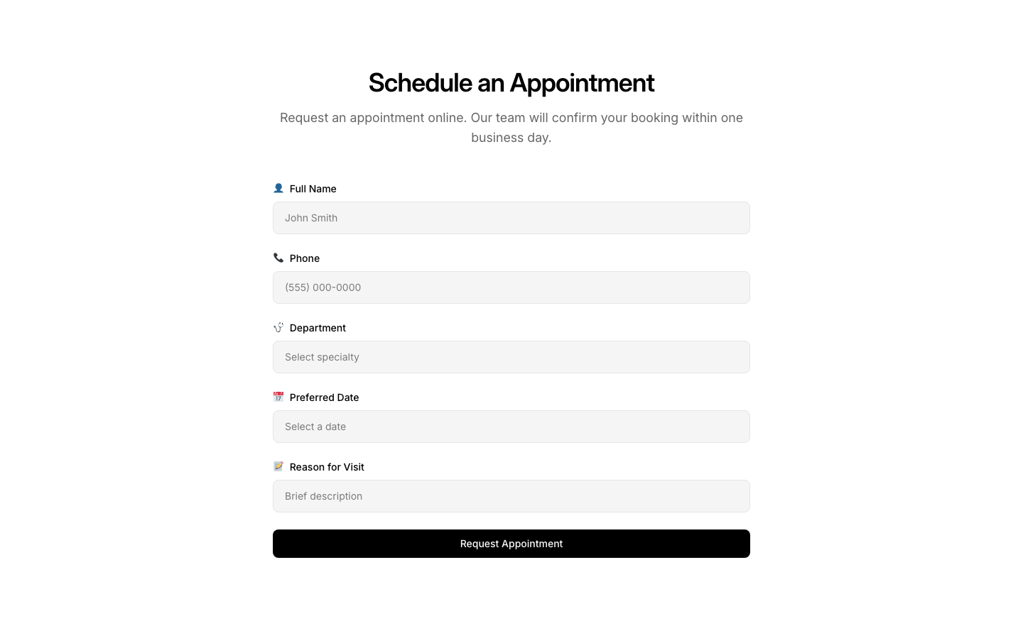
Appointment
HealthcareAppointment booking form with specialization picker.
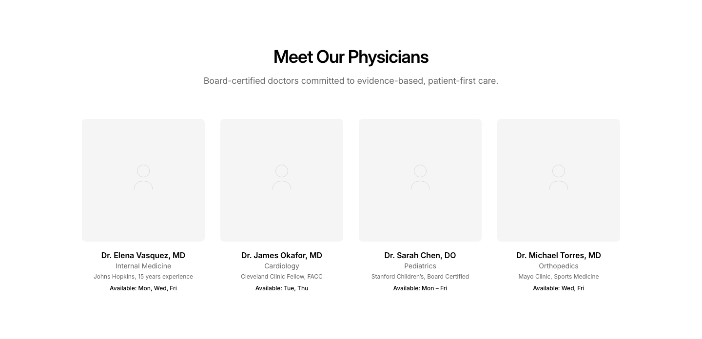
Doctors
HealthcareDoctor cards with photo, specialty, and availability.
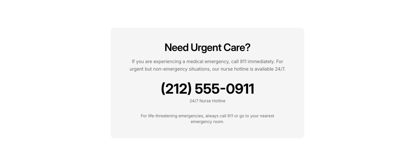
Emergency
HealthcareEmergency contact section with prominent phone number.

Hero
HealthcareHealthcare hero with trust signals and appointment CTA.
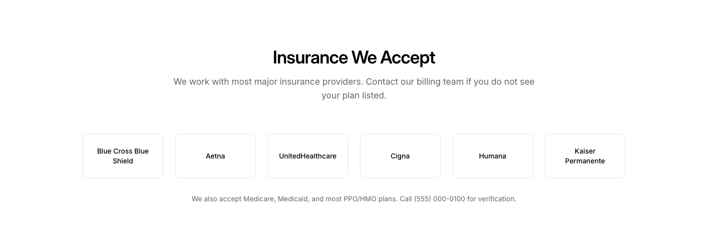
Insurance
HealthcareAccepted insurance providers grid with logos.
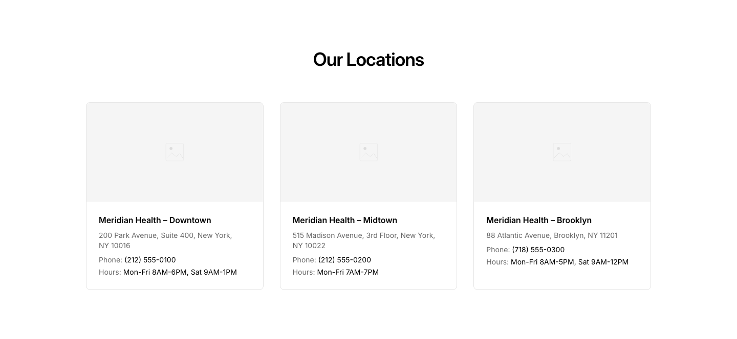
Location
HealthcareClinic locations with map and hours.
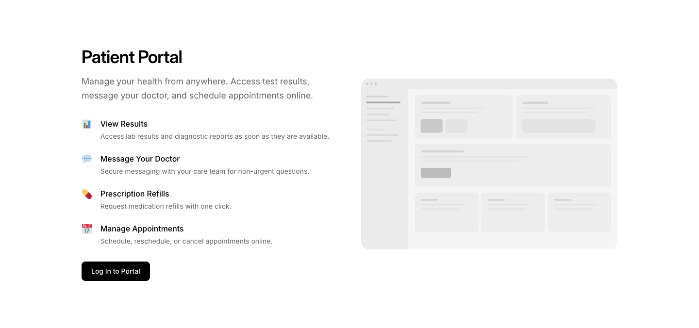
Portal
HealthcarePatient portal login/features overview section.
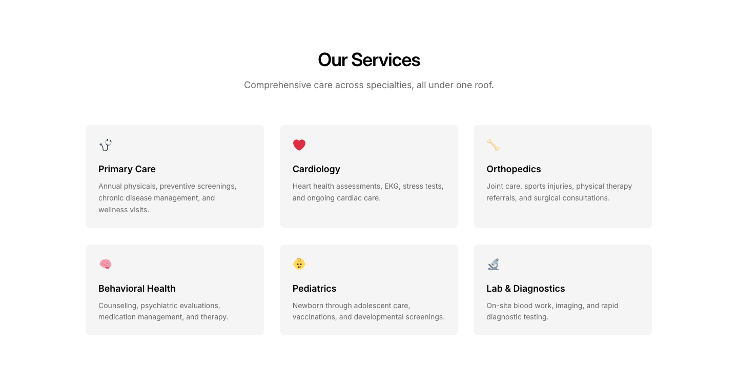
Services
HealthcareMedical services grid with icons and descriptions.
Animated
HeroCentered text with subtle animated background pattern (CSS only).
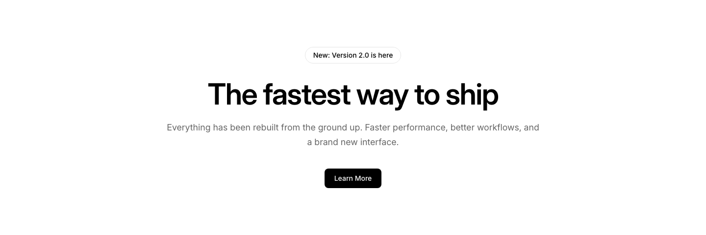
Announcement
HeroSmall badge above the heading, centered layout.

App
HeroCentered text with app store badges below.

Breadcrumb
HeroPage hero with breadcrumb trail above the heading.
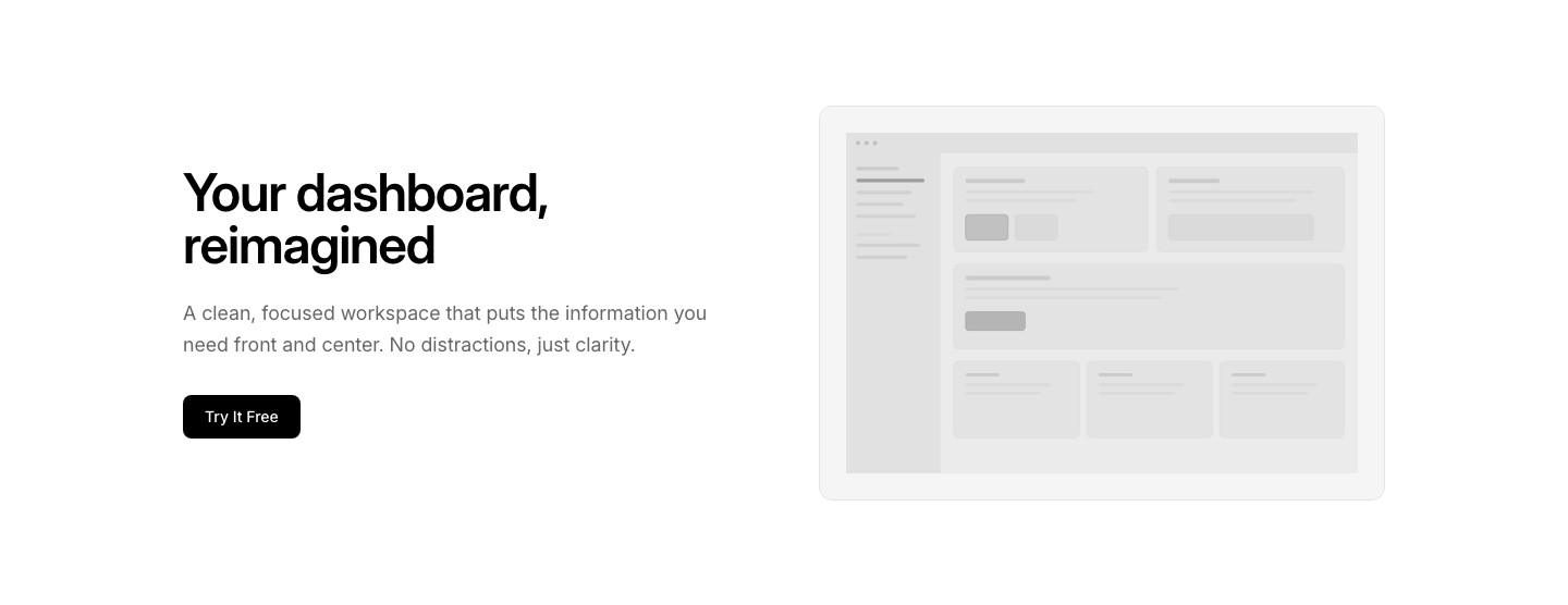
Card
HeroText with a floating card/UI preview beside it.
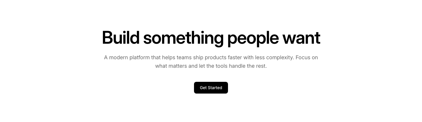
Centered
HeroCentered heading, description, and single button.
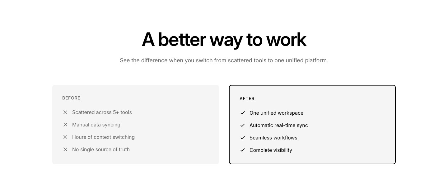
Comparison
HeroSplit hero: before on left, after on right with center divider.
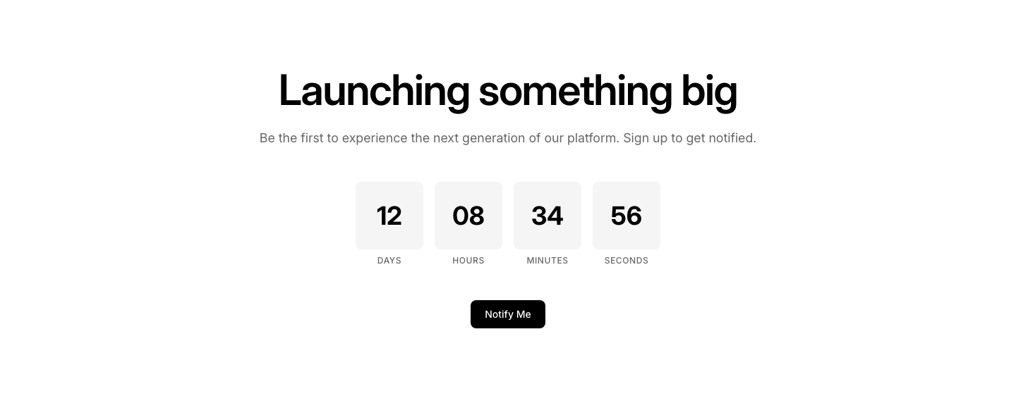
Countdown
HeroCentered heading with countdown timer boxes below.

CTA
HeroCentered heading with two buttons: primary and secondary.
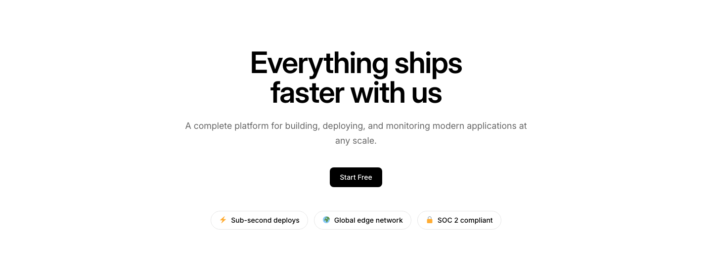
Feature
HeroCentered heading with three feature pills/badges in a row below.
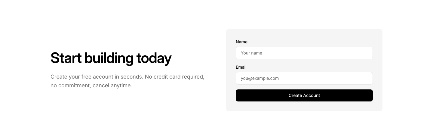
Form
HeroSplit layout: text left, signup form right.
Fullscreen
HeroViewport-height hero with vertically centered content.
Gradient
HeroFull-bleed gradient background with centered text and glow effect.
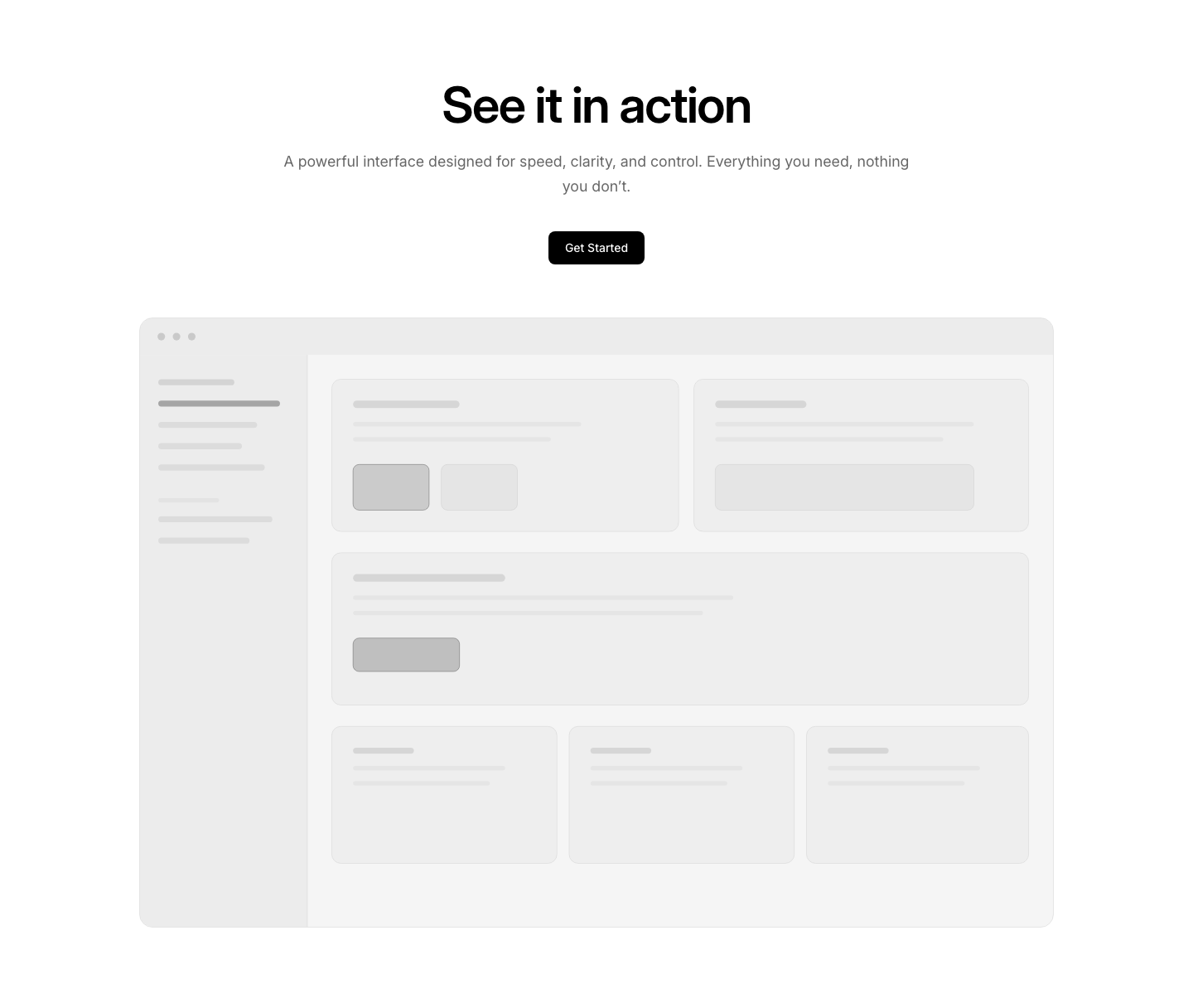
Image
HeroCentered text above a full-width image.
List
HeroCentered heading with a short bullet list of value props.
Logo Bar
HeroCentered hero with a row of trusted-by logos below the CTA.
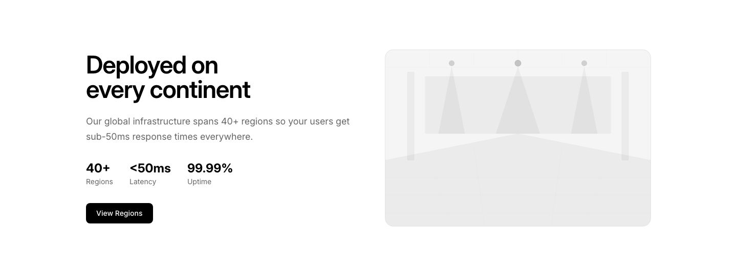
Map
HeroSplit: text left, embedded map or location image right.
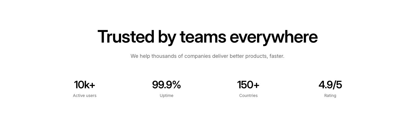
Metric
HeroCentered heading with key stats in a row below.

Minimal
HeroJust heading and subtext. No button, no image.
Newsletter
HeroCentered heading with inline email signup form below.
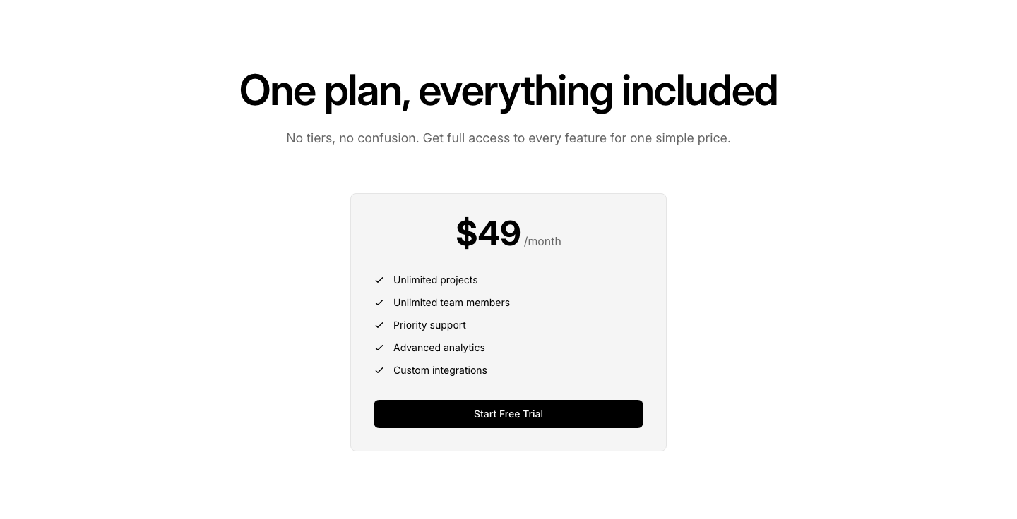
Pricing
HeroHero heading with a single pricing card embedded below.
Product
HeroProduct image centered large with floating feature badges around it.
Split
HeroTwo columns with text on the left and image on the right.
Split Reverse
HeroTwo columns: image left, text right (reverse of split).
Stack
HeroStacked layout: badge, heading, description, buttons, image, all full-width.
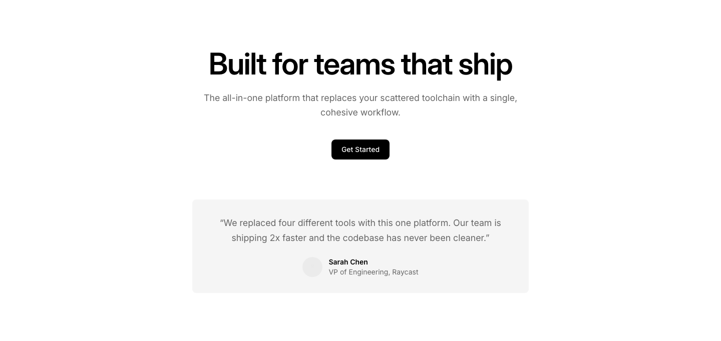
Testimonial
HeroCentered heading with a single testimonial quote below the CTA.
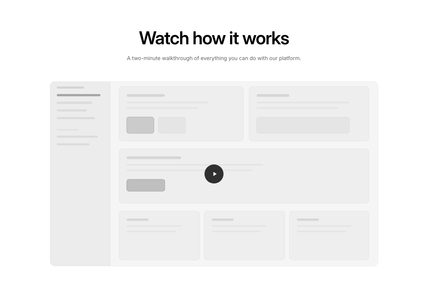
Video
HeroCentered text above an embedded video.
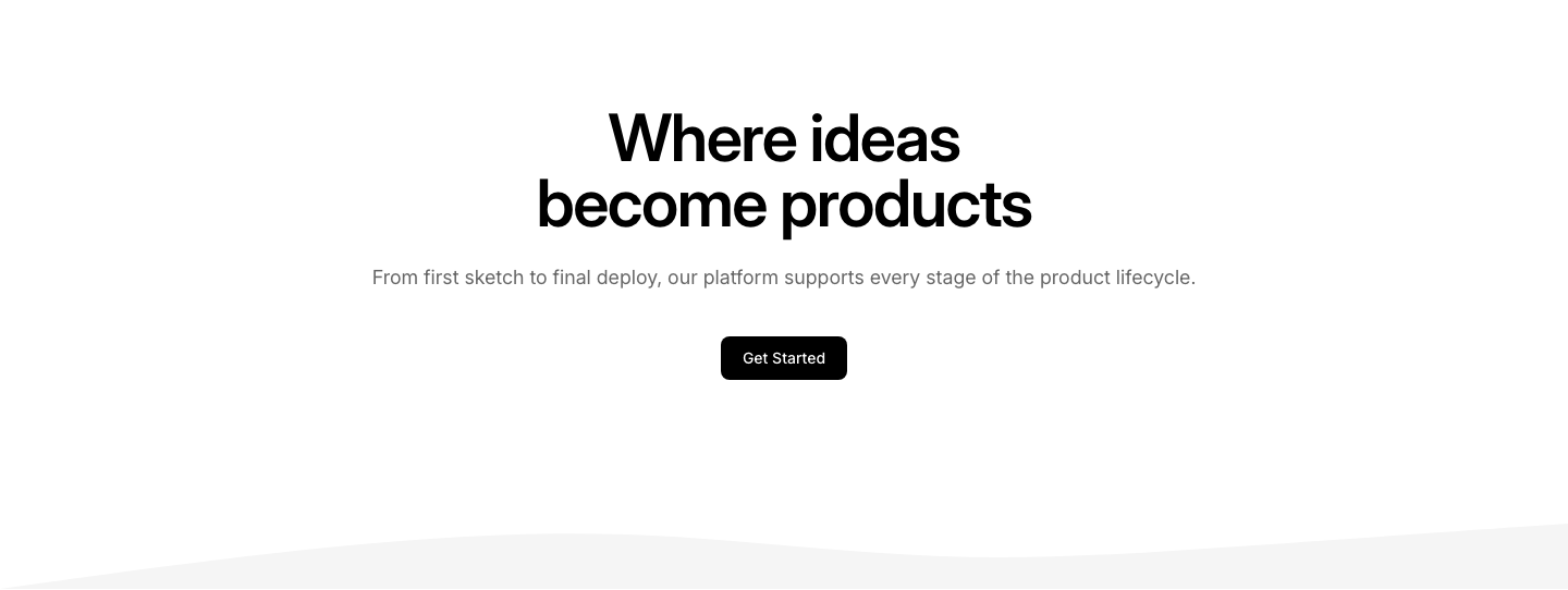
Wave
HeroCentered content with a decorative SVG wave divider at the bottom.
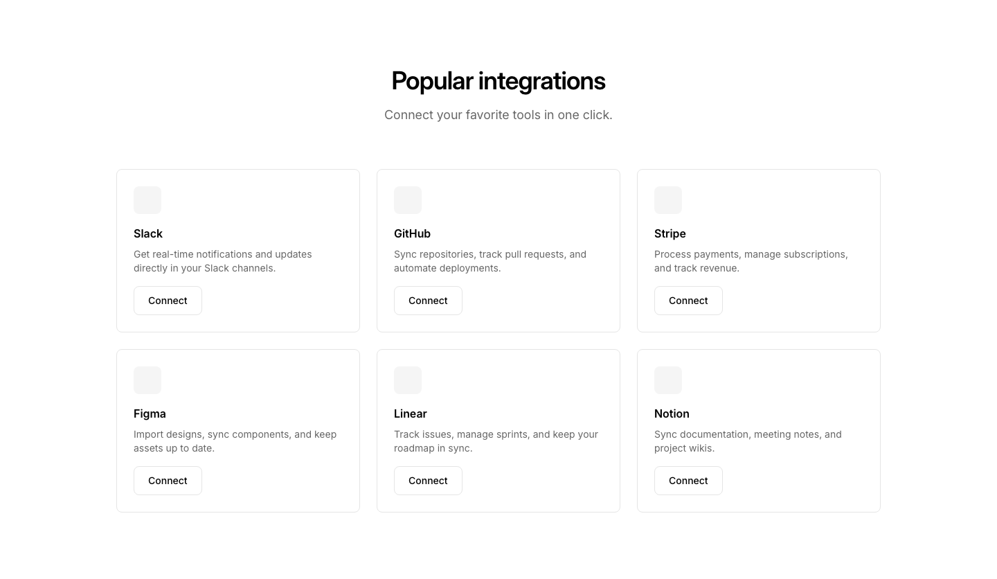
Cards
IntegrationCards with logo, name, description, and Connect button.
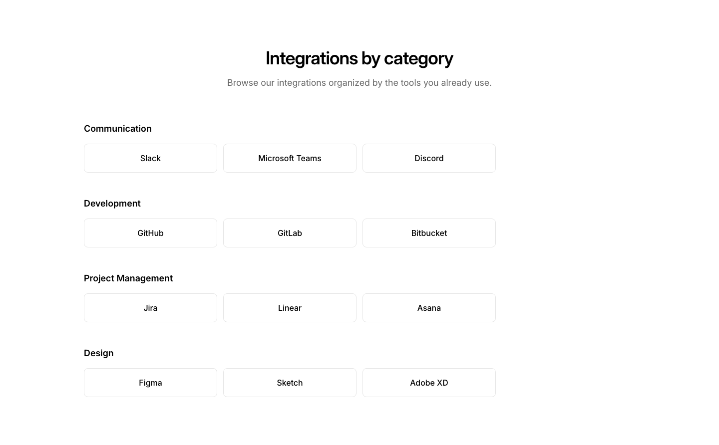
Category
IntegrationIntegrations grouped by category (CRM, Analytics, etc.).
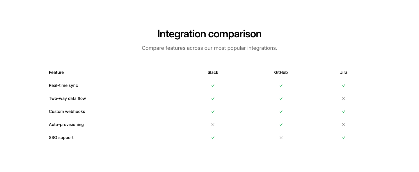
Comparison
IntegrationIntegration comparison table with feature support.
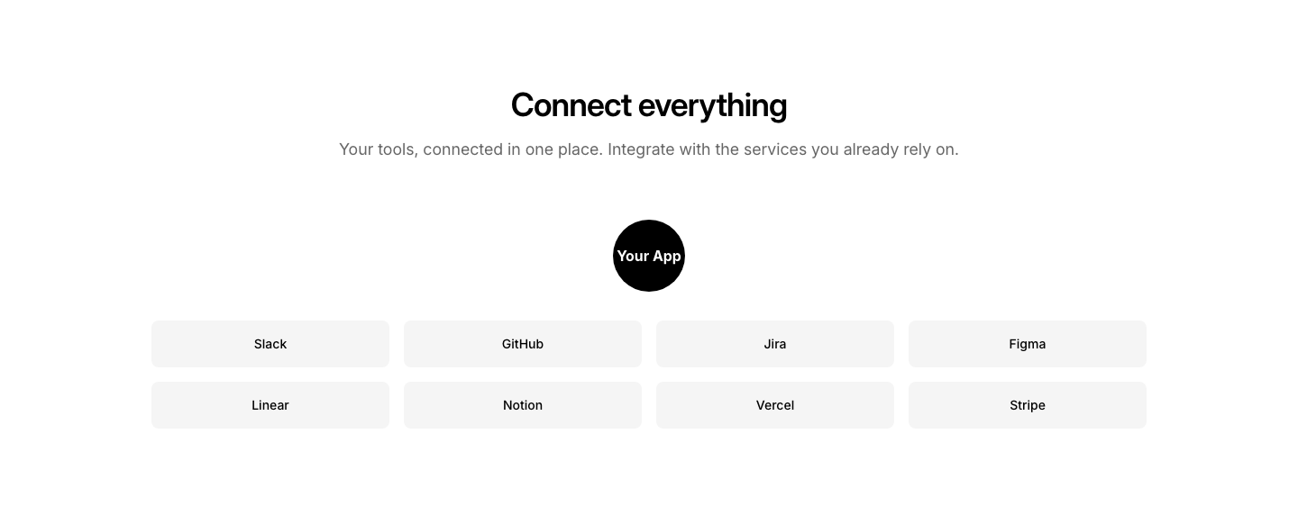
Connect
IntegrationHub-and-spoke integration visualization with center app and surrounding tools.
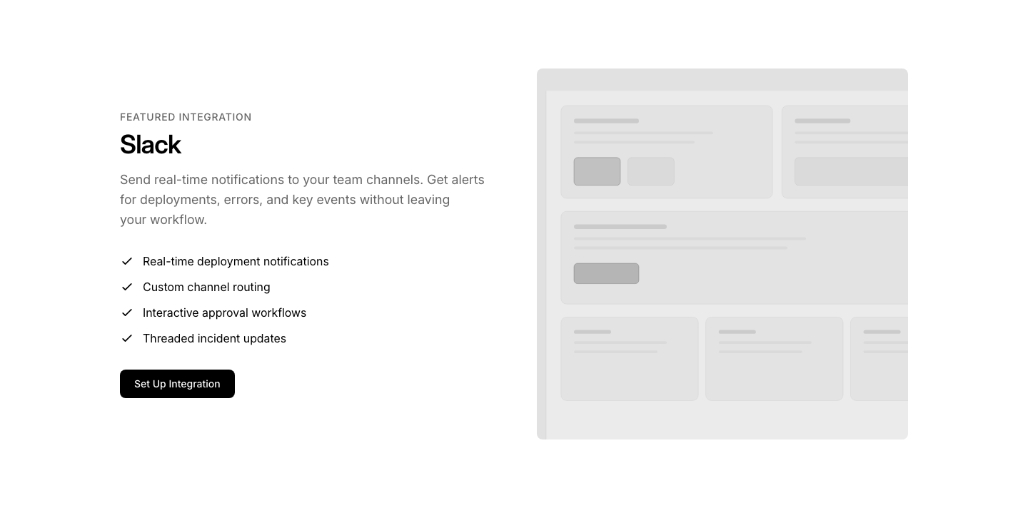
Featured
IntegrationFeatured integration spotlight with details, features, and visual.
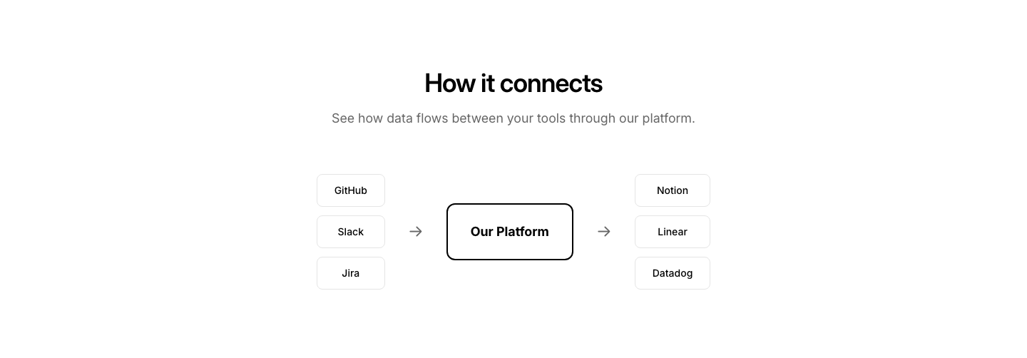
Flow
IntegrationVisual flow diagram showing data moving between integrations.
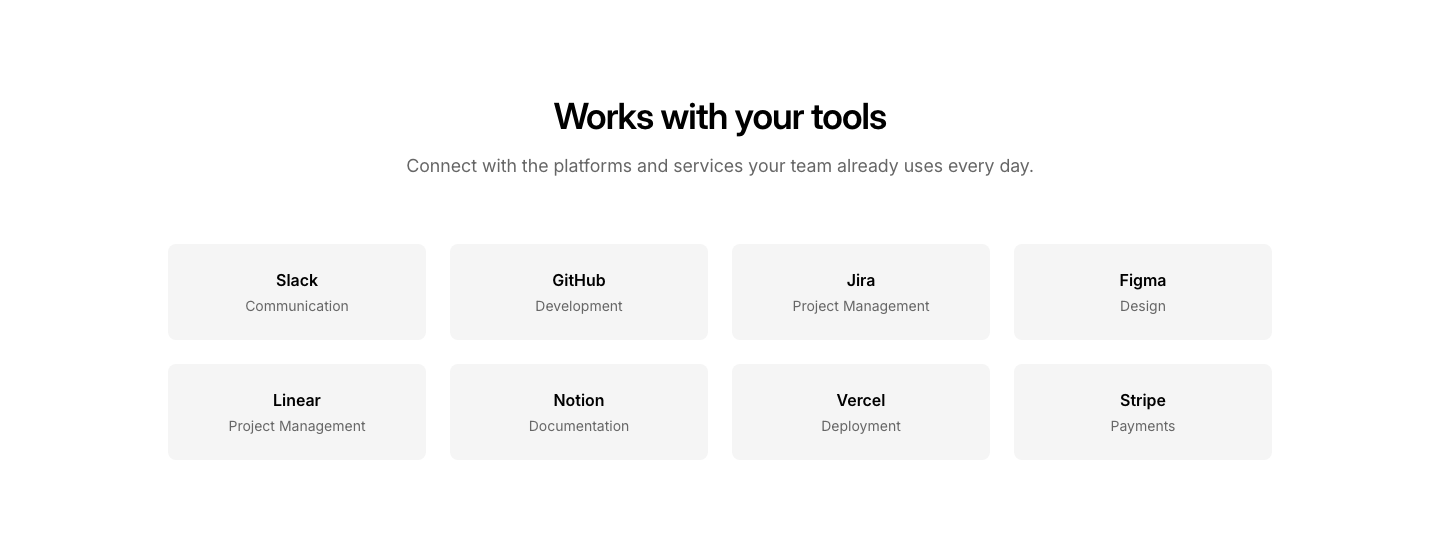
Grid
IntegrationGrid of integration cards with name and category.

Marquee
IntegrationScrolling marquee of integration names in a seamless loop.
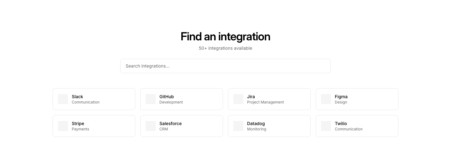
Search
IntegrationSearchable integration directory with filter.
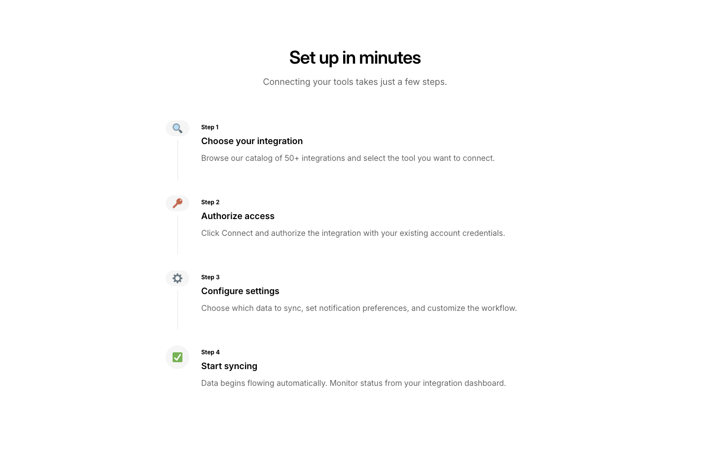
Steps
IntegrationStep-by-step integration setup guide layout.
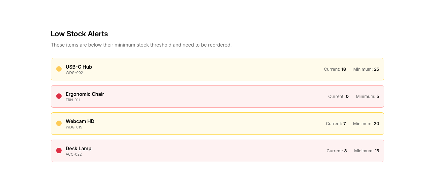
Alert
InventoryLow stock alert section with affected items.
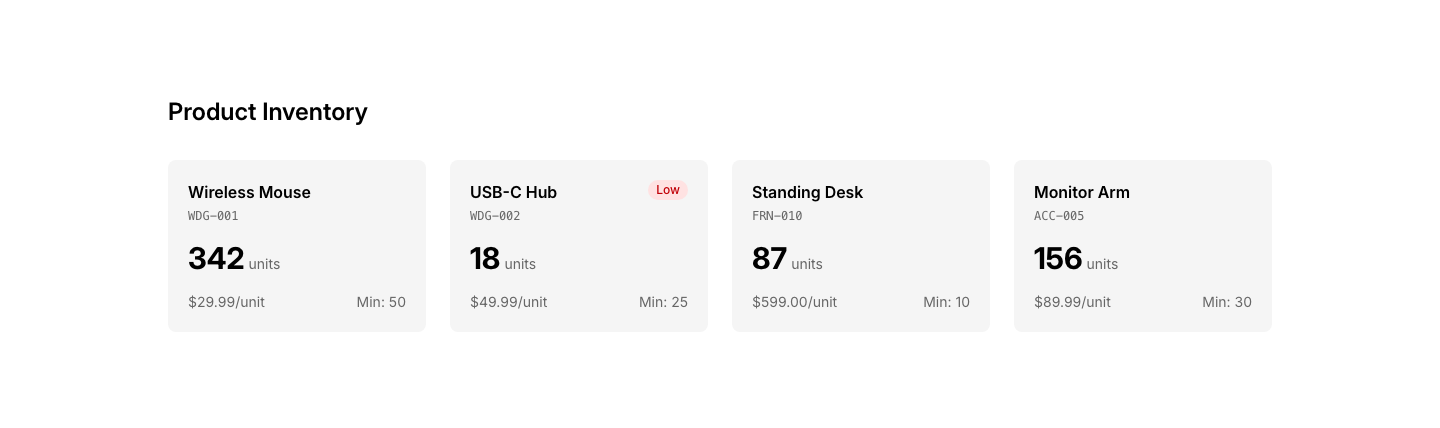
Cards
InventoryProduct inventory cards with quantity and reorder button.
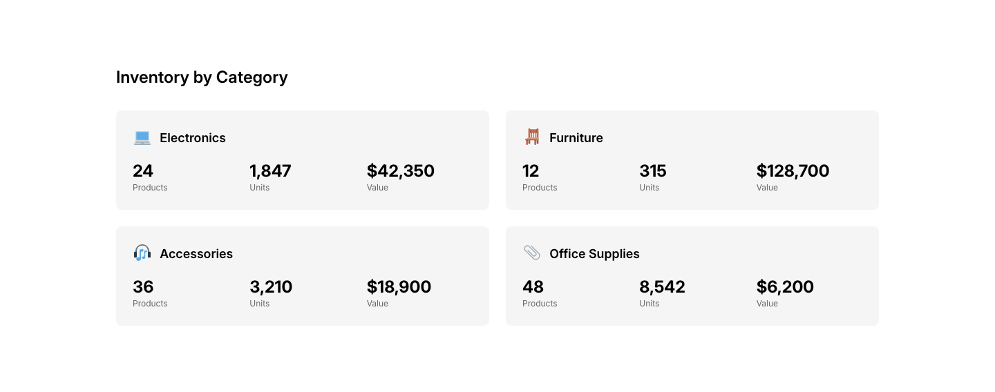
Category
InventoryInventory organized by product category.
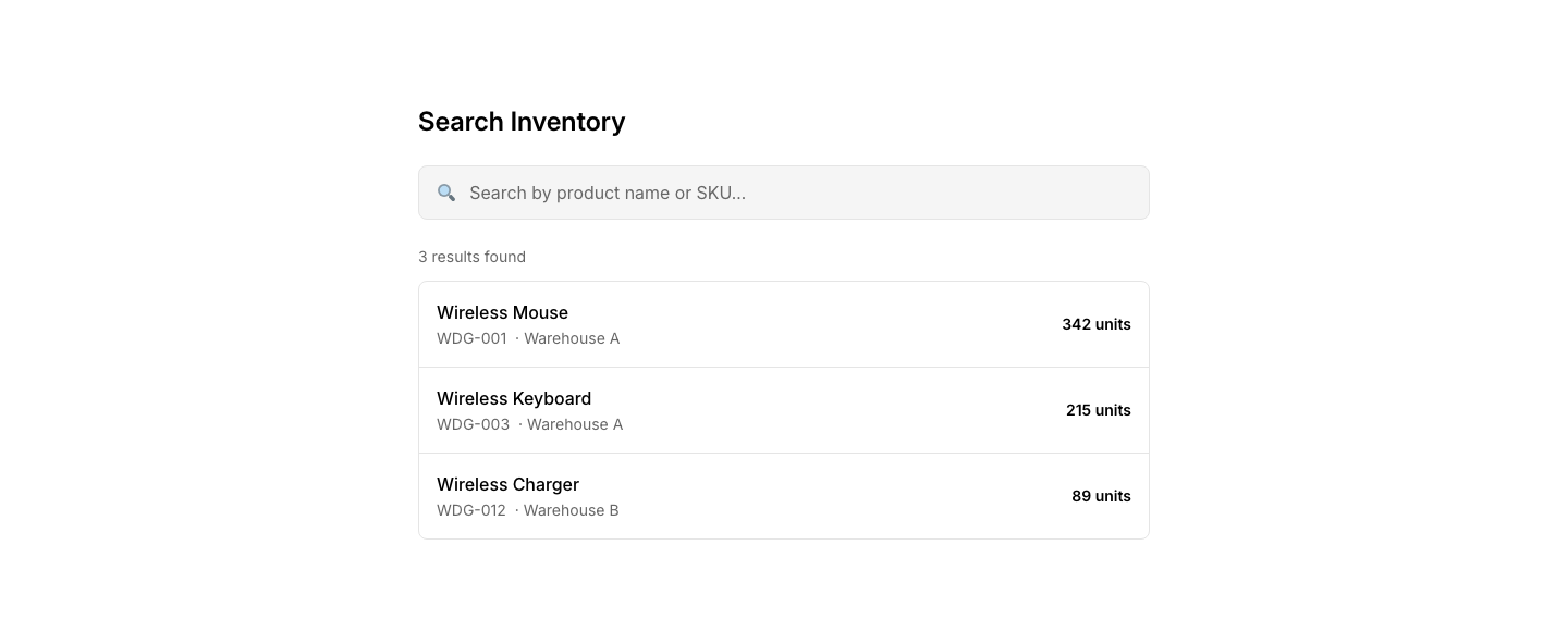
Search
InventoryInventory search with SKU and name lookup.
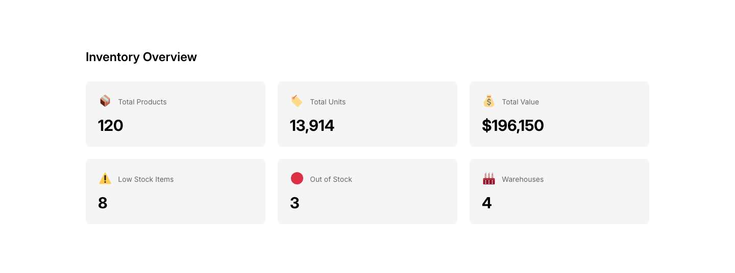
Summary
InventoryInventory summary dashboard with totals and alerts.
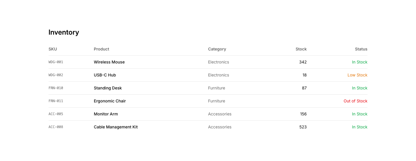
Table
InventoryInventory list table with stock levels and status.
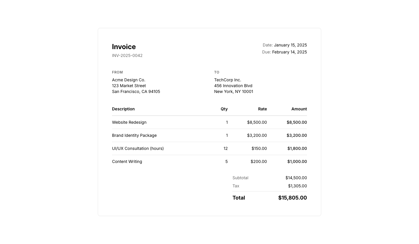
Detail
InvoiceFull invoice with line items, subtotals, and total.
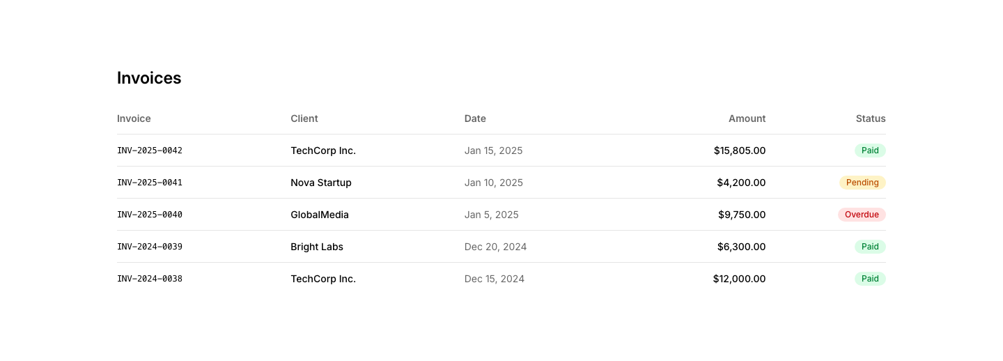
List
InvoiceList of invoices with date, number, status, amount.
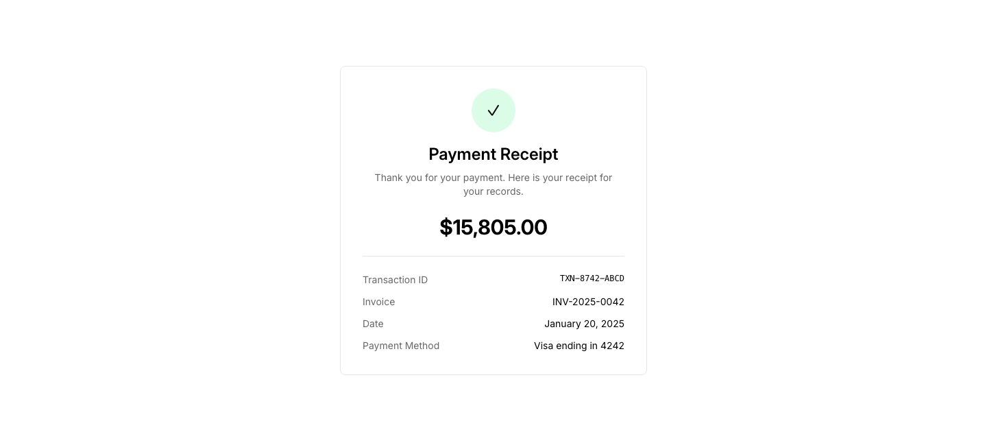
Receipt
InvoicePayment receipt confirmation with transaction details.

Summary
InvoiceInvoice summary card with amount due and due date.
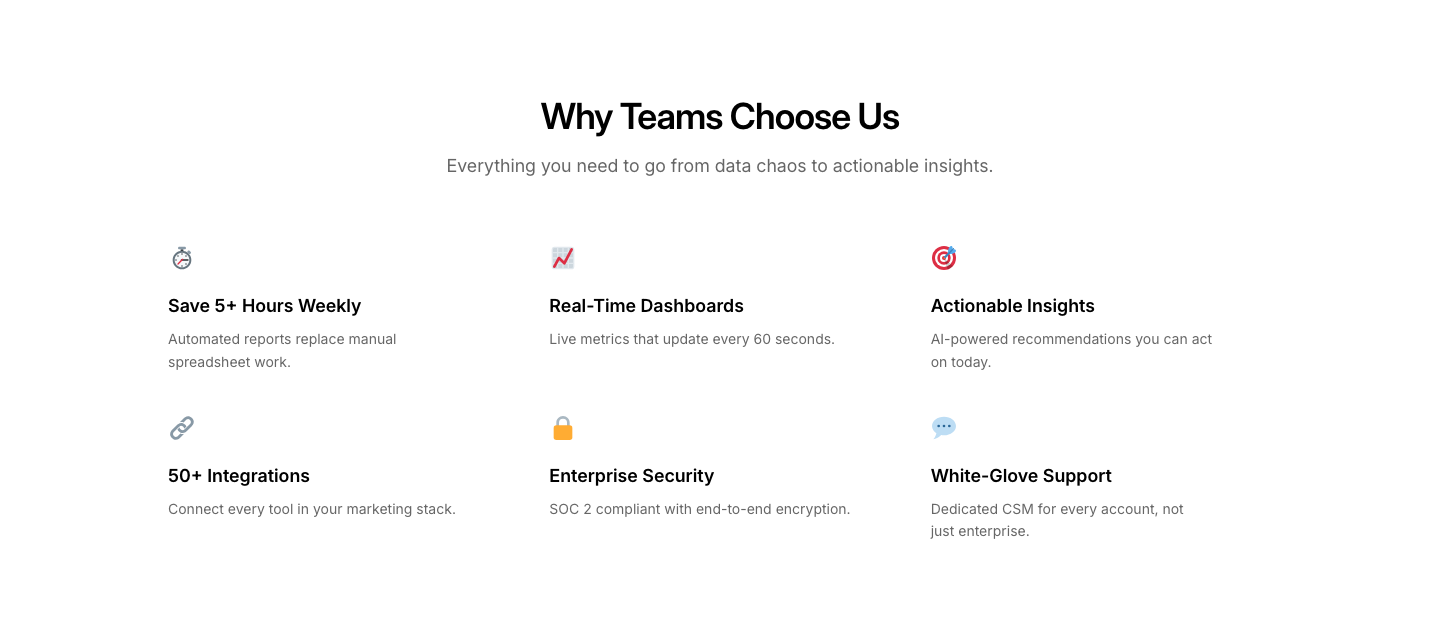
Benefits
LandingBenefits section with icon and short description each.
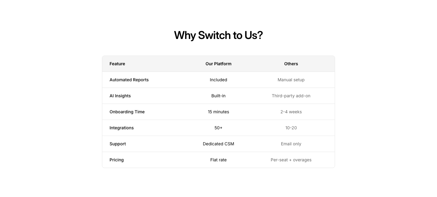
Comparison
LandingWhy us vs alternatives comparison section.

Exit
LandingExit-intent popup content with special offer.
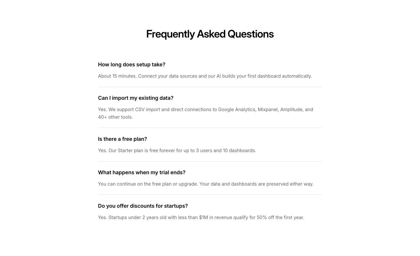
FAQ
LandingLanding page FAQ targeting conversion objections.
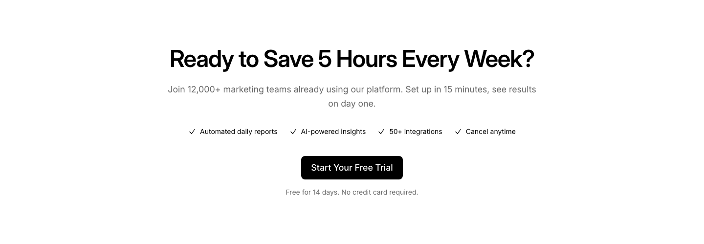
Final CTA
LandingFinal conversion CTA with summary of value props.
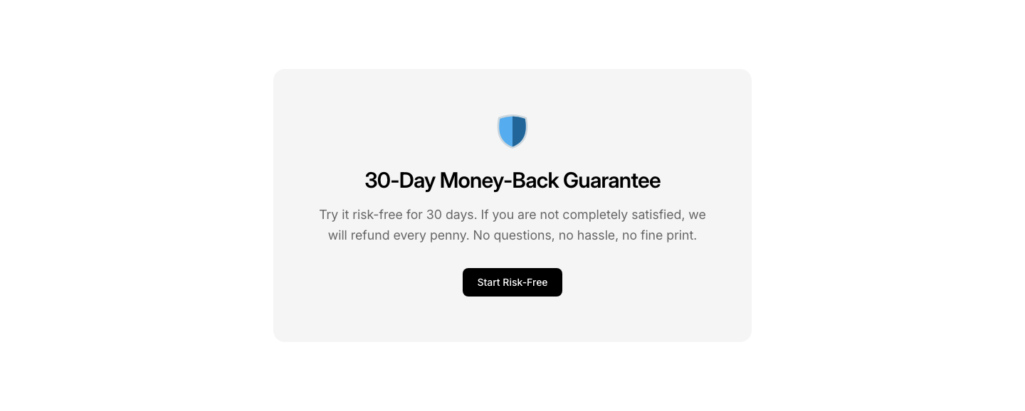
Guarantee
LandingMoney-back guarantee or risk reversal section.
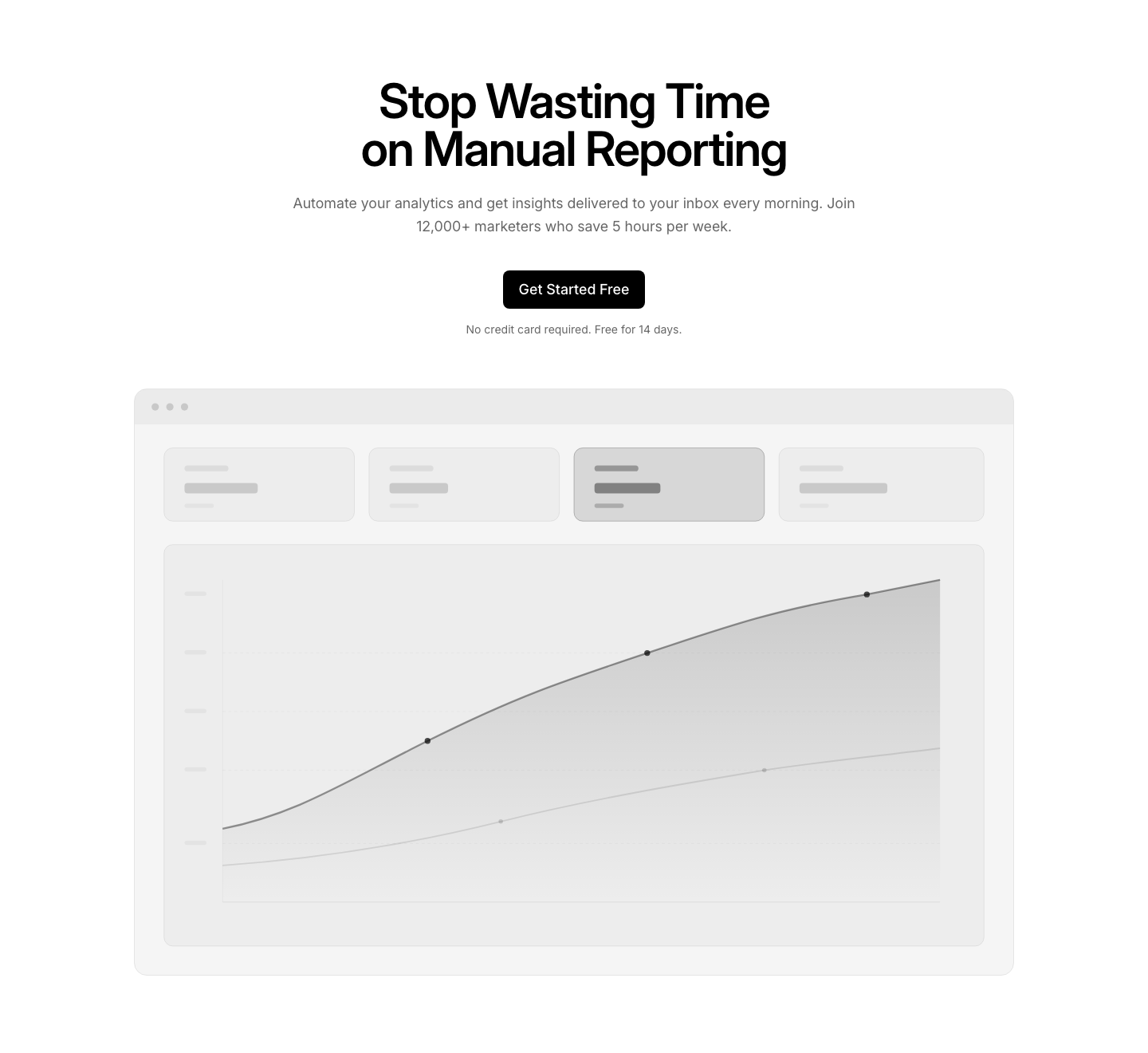
Hero
LandingHigh-conversion hero with single focused CTA.
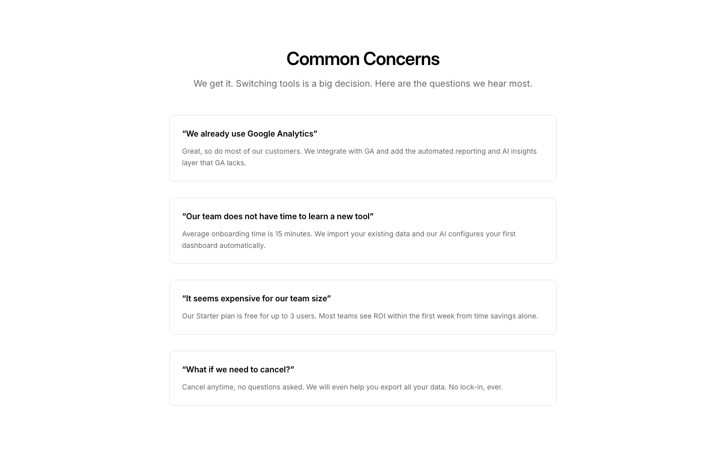
Objection
LandingObjection handling section addressing common concerns.
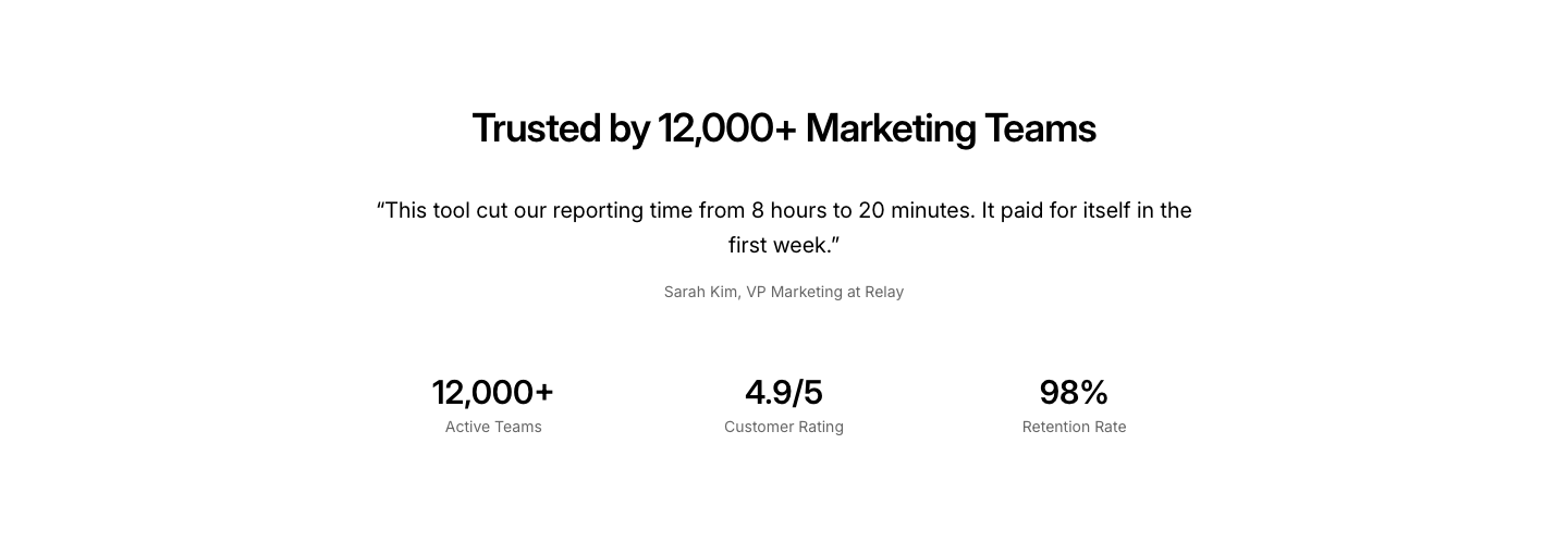
Social Proof
LandingSocial proof section with logos, testimonials, and stats.

Urgency
LandingUrgency/scarcity section with countdown or limited spots.
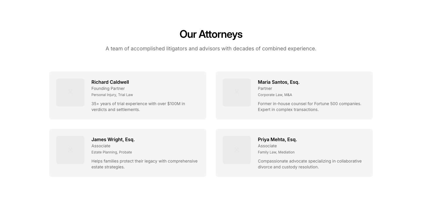
Attorneys
LegalAttorney profiles with credentials and specializations.
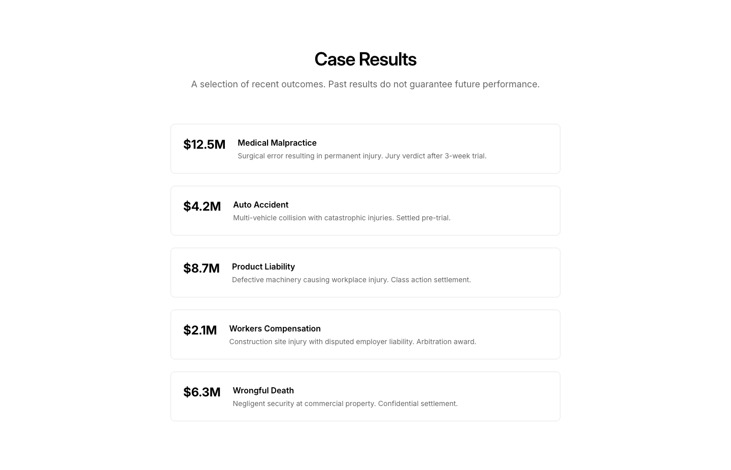
Case
LegalCase results with outcomes and settlements.
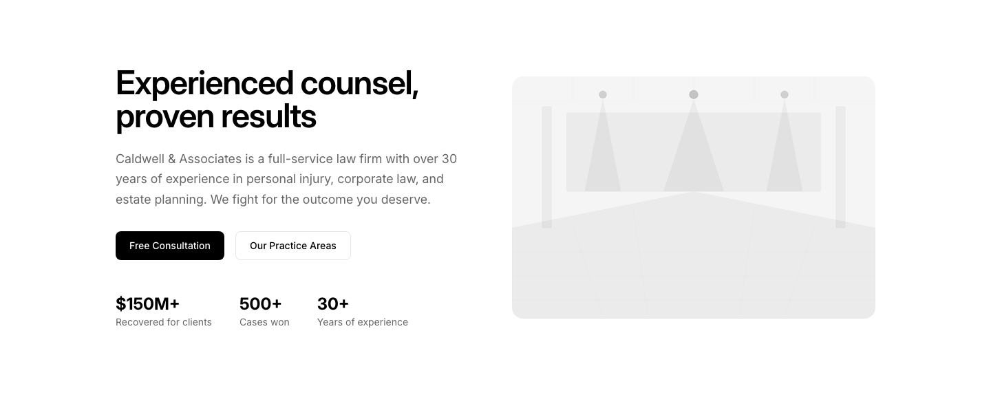
Hero
LegalLaw firm hero with practice areas and consultation CTA.
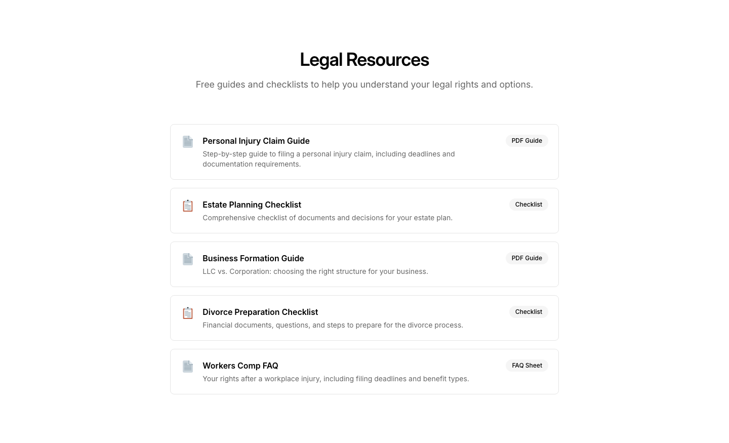
Resource
LegalLegal resources and guides download section.
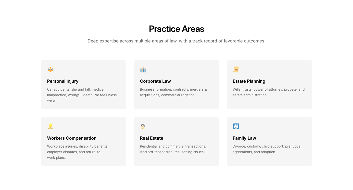
Services
LegalPractice area cards with descriptions.
Bordered
ListList items separated by borders.
Check
ListChecklist with green checkmark icons.
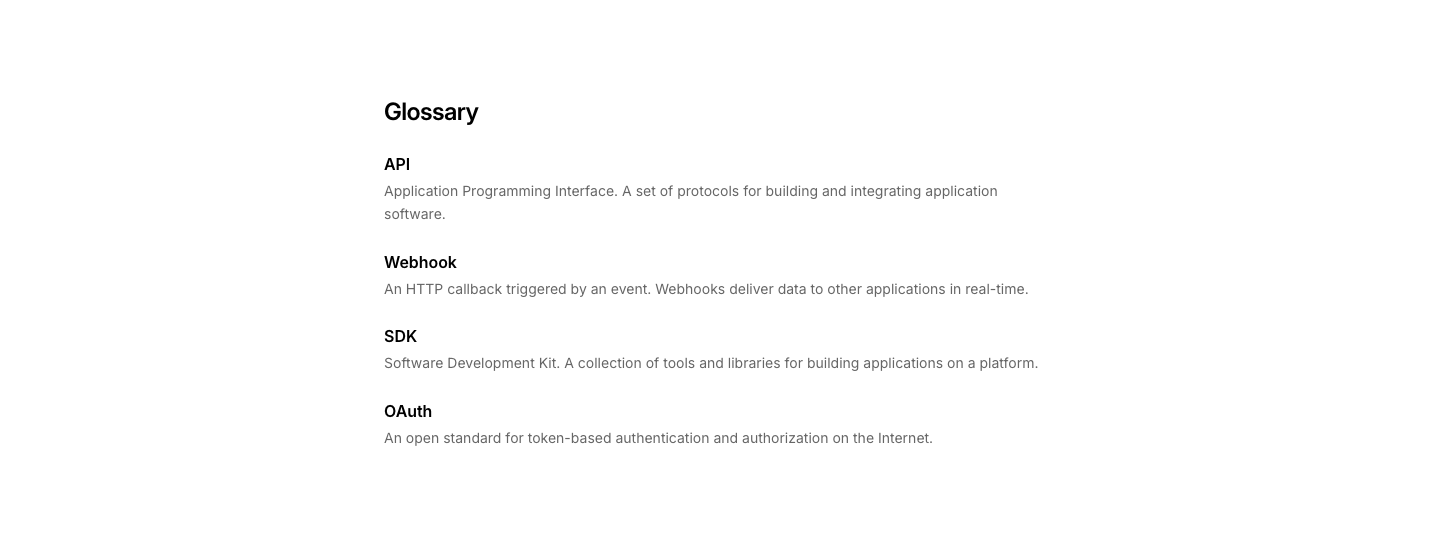
Description
ListDescription list with term and definition pairs.

Icon
ListList items with custom icons on the left.
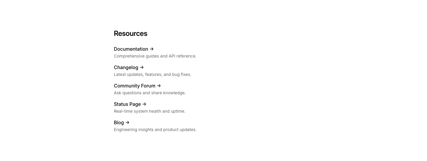
Link
ListList of links with descriptions.
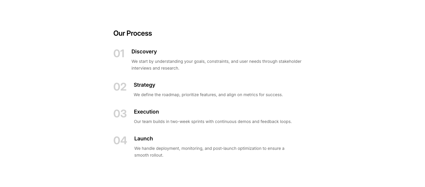
Numbered Large
ListLarge numbers on left, content on right.

Simple
ListSimple bulleted or numbered list.
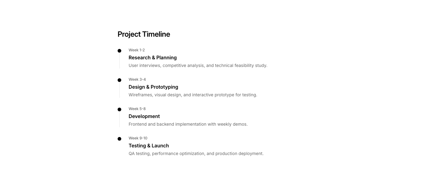
Timeline
ListList styled as a mini timeline.

Dots
LoadingAnimated dots loading indicator.

Progress
LoadingLoading state with progress percentage bar and message.
Skeleton
LoadingFull-width loading skeleton with shimmer placeholder bars.

Spinner
LoadingClassic spinner loading with message.

Text
LoadingLoading state with animated text dots and step checklist.

Bar
LogoSingle row of logos, evenly spaced.
Cards
LogoEach logo in its own card with company name below.

Cloud
LogoScattered logo placement at varying sizes (tag cloud style).

Count
LogoRow of logos with and 200+ more text at the end.
Featured
LogoLogos with company names and a short quote or label each.
Grid
LogoMulti-row grid of logos for large partner lists.

Marquee
LogoAuto-scrolling horizontal strip of logos (CSS animation).

Minimal
LogoGreyscale logos in a single row, no background cards.
Split
LogoTrusted by text on left, logo grid on right.
Tier
LogoLogos grouped by tier (gold, silver, bronze partners).
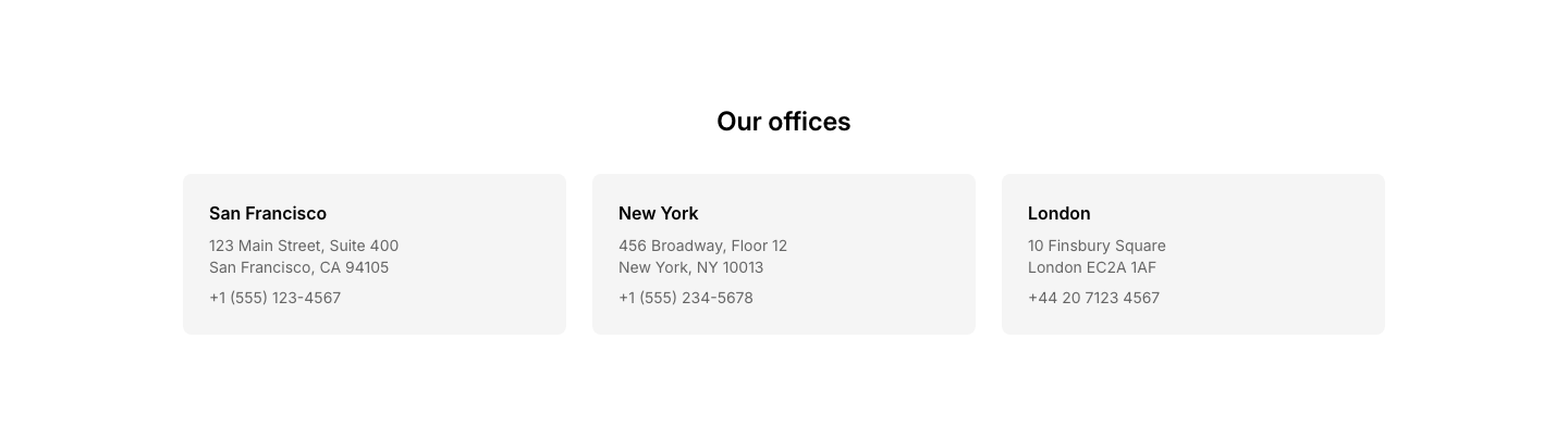
Cards
MapGrid of office location cards with contact details.
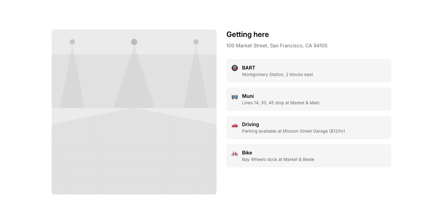
Directions
MapMap with step-by-step directions and transport options.
Fullwidth
MapFull-width map placeholder with heading and caption.

Minimal
MapSmall map embed with single address line below.
Pins
MapMap with multiple labeled location pins.
Region
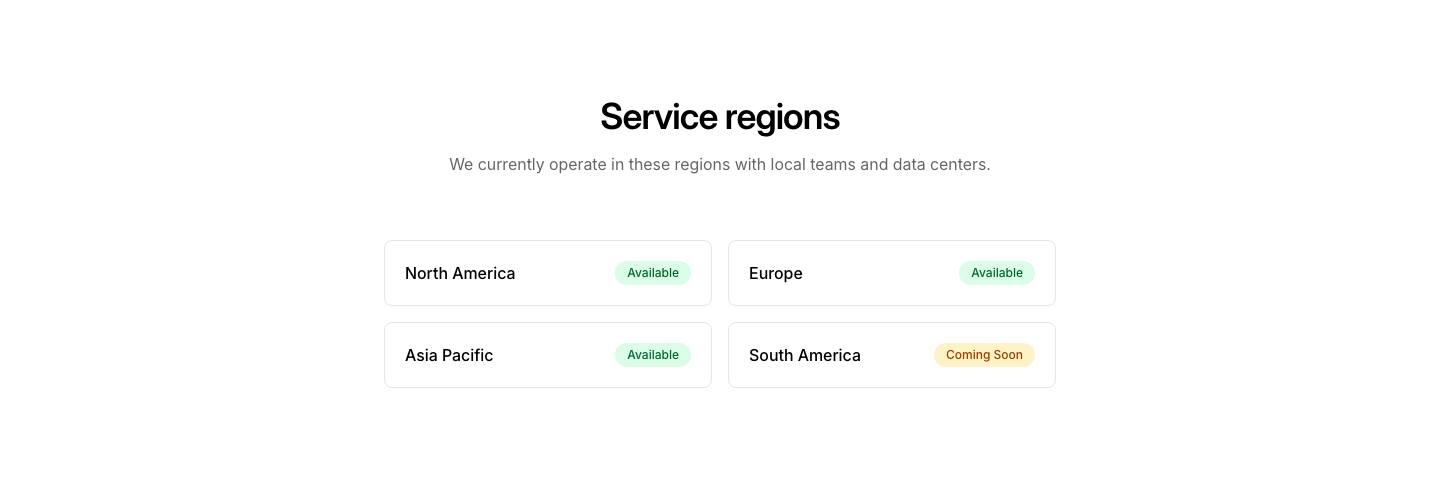
MapRegional map with highlighted service areas.
Split
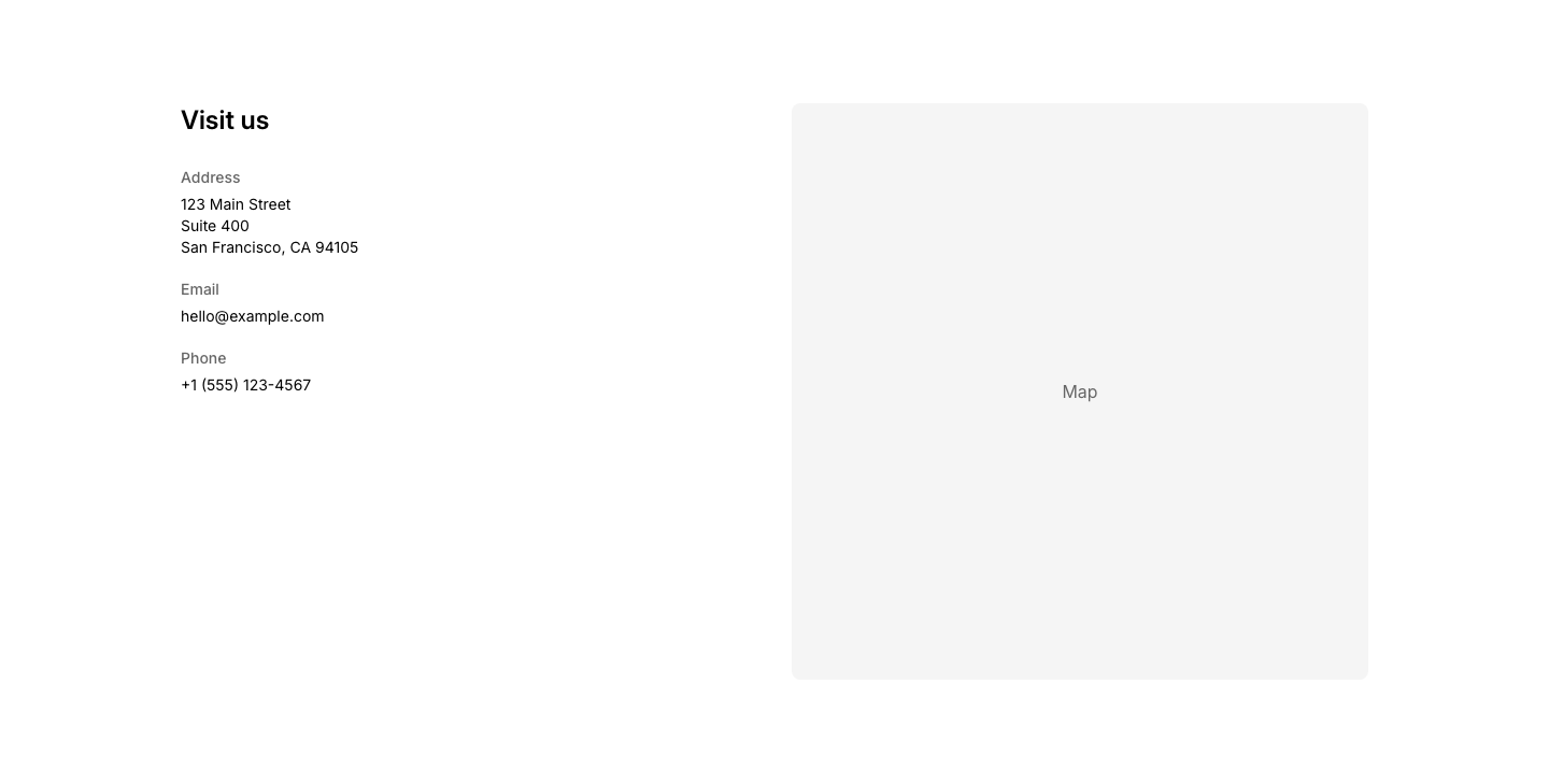
MapTwo-column layout with contact details and map placeholder.
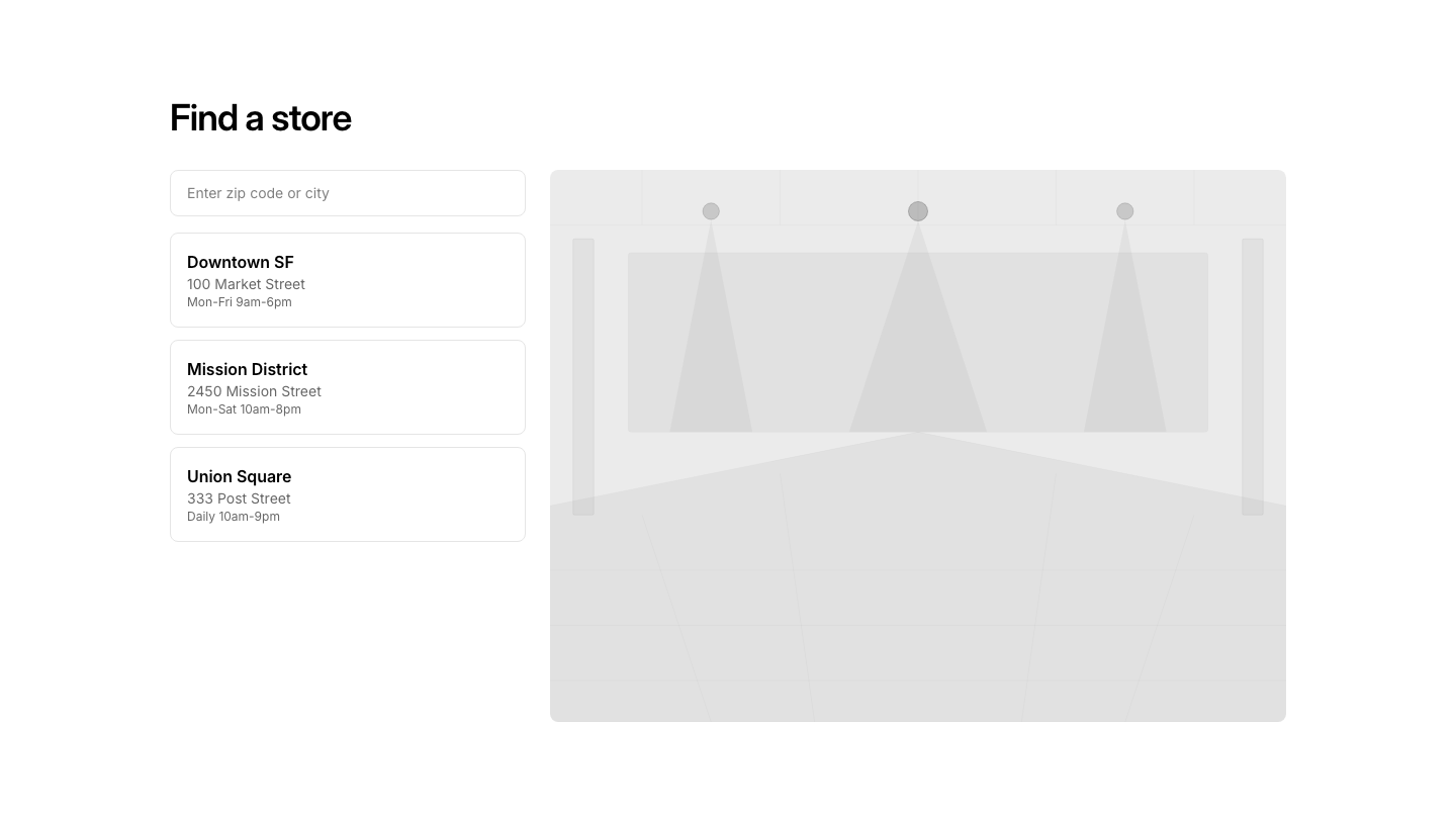
Store
MapStore locator with search input and results list beside map.

Dual
MarqueeTwo marquee rows scrolling in opposite directions.

Image
MarqueeScrolling image gallery with continuous loop animation.

Logo
MarqueeScrolling logo strip with company names.

Mixed
MarqueeScrolling marquee with emoji and text pairs.

Stat
MarqueeScrolling stats/numbers strip.

Testimonial
MarqueeScrolling testimonial quotes strip.

Text
MarqueeScrolling text marquee with continuous loop animation.

Vertical
MarqueeVertical scrolling content strip.
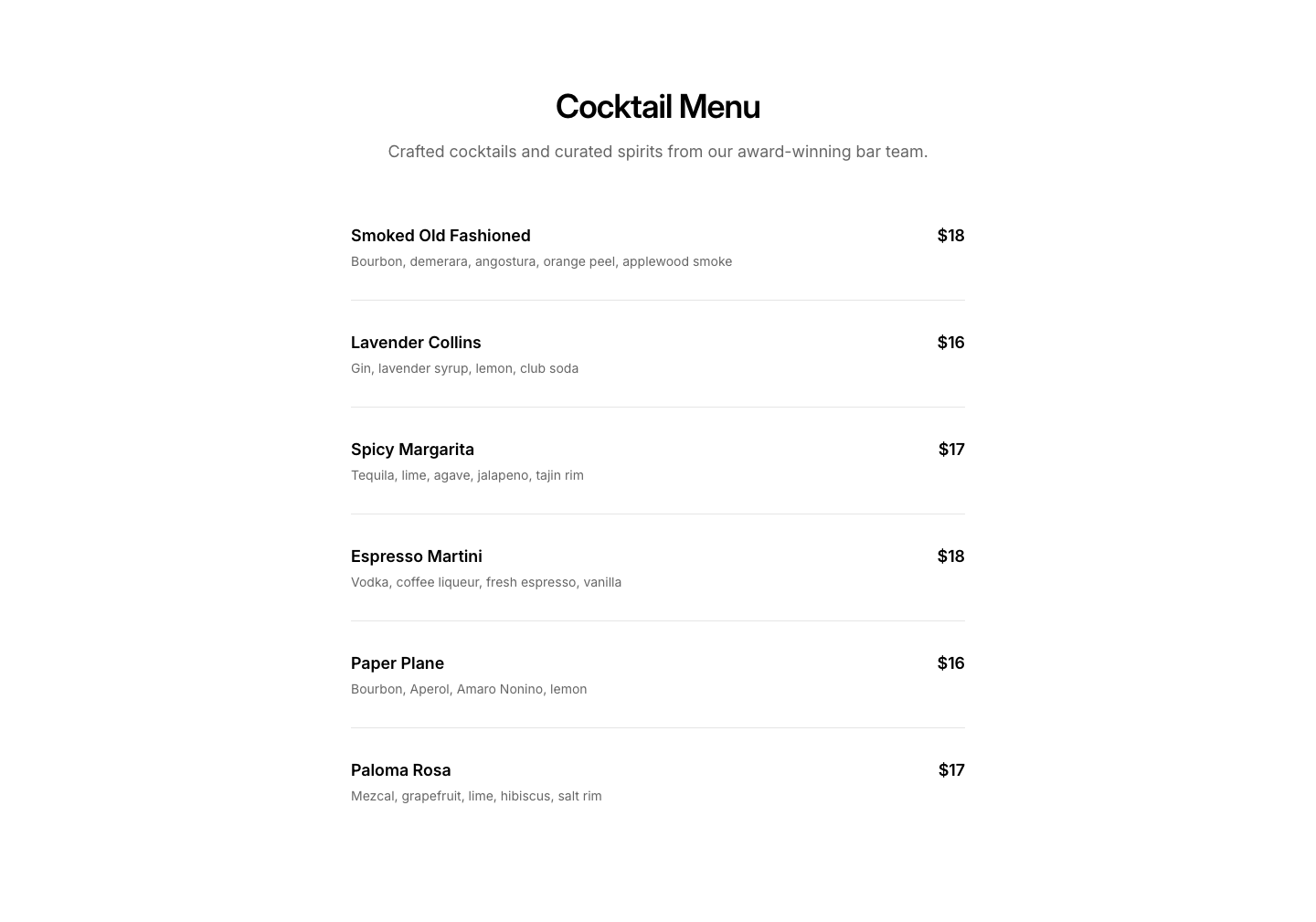
Bar
MenuBar/cocktail menu with drink descriptions.
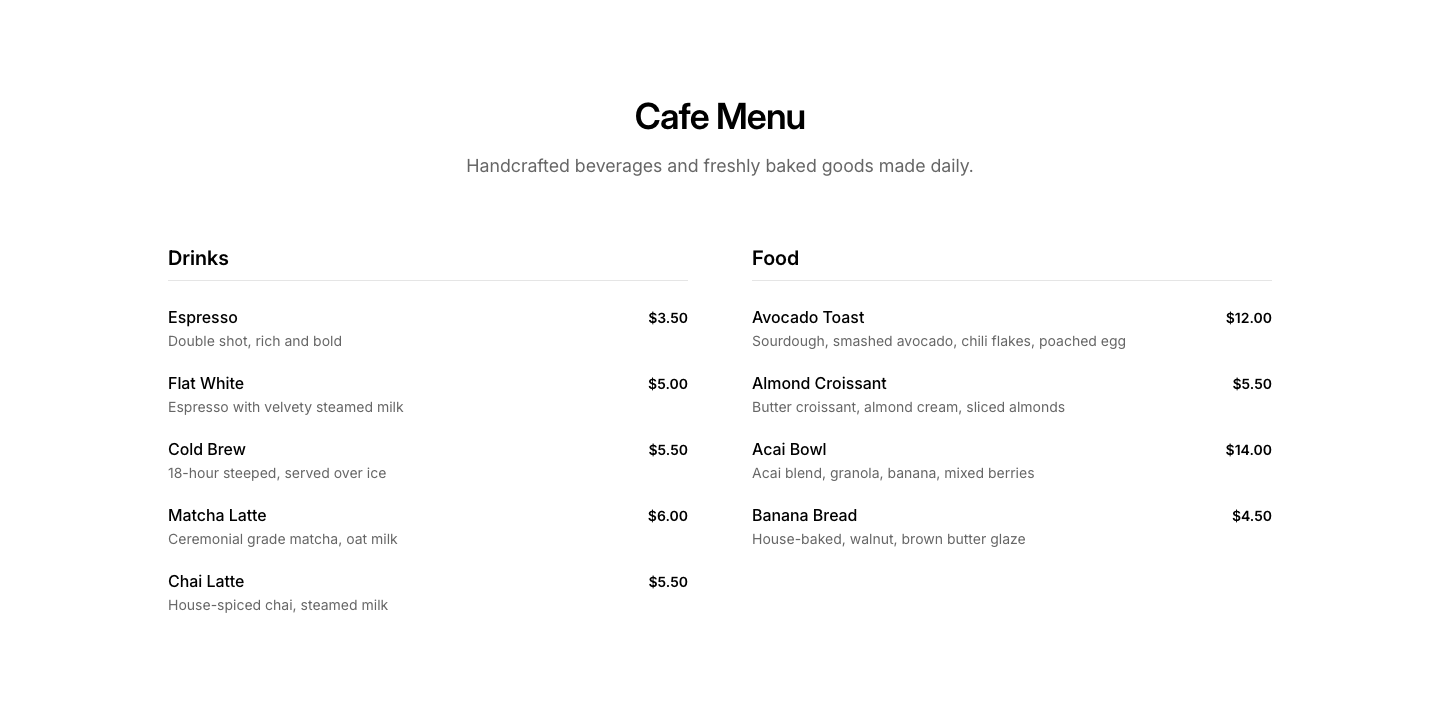
Cafe
MenuCafe/coffee shop menu with drinks and food sections.
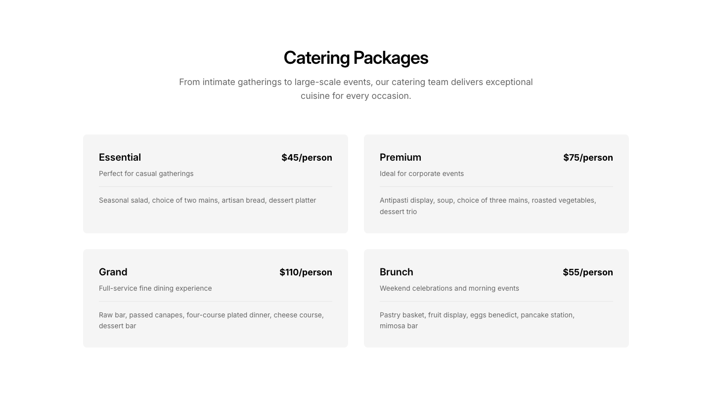
Catering
MenuCatering menu with package options.
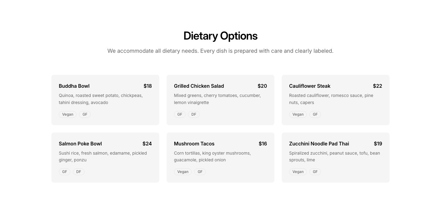
Dietary
MenuMenu with dietary filters (vegan, GF, etc.).
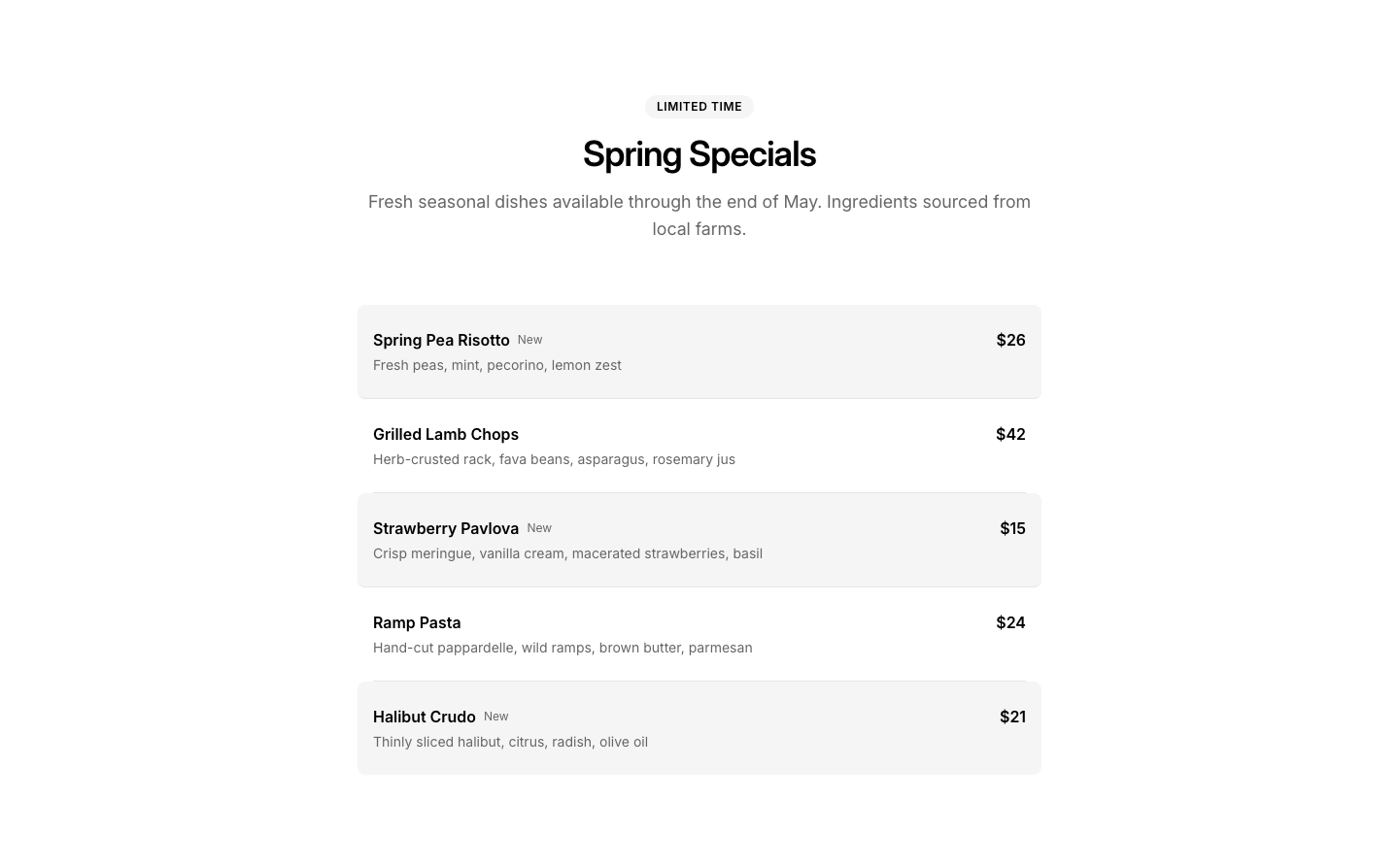
Seasonal
MenuSeasonal menu with limited-time items highlighted.
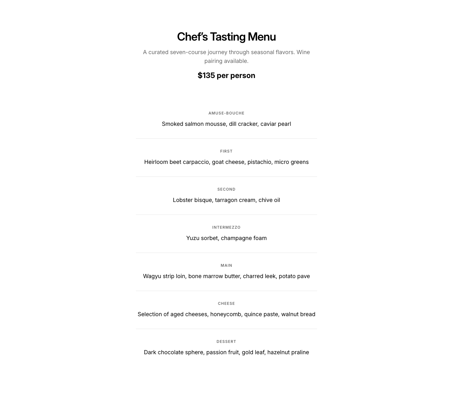
Tasting
MenuTasting/prix fixe menu with courses.
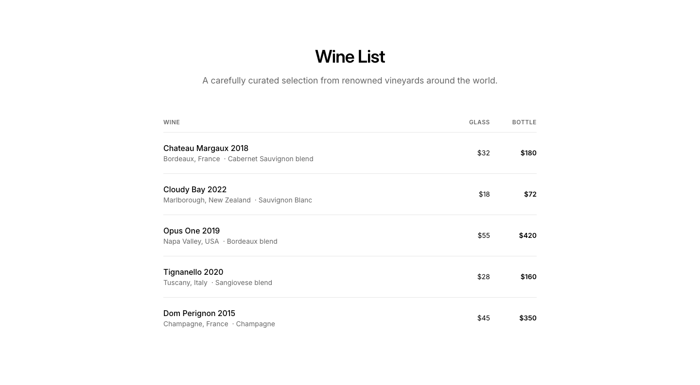
Wine
MenuWine list with regions, varieties, and prices.
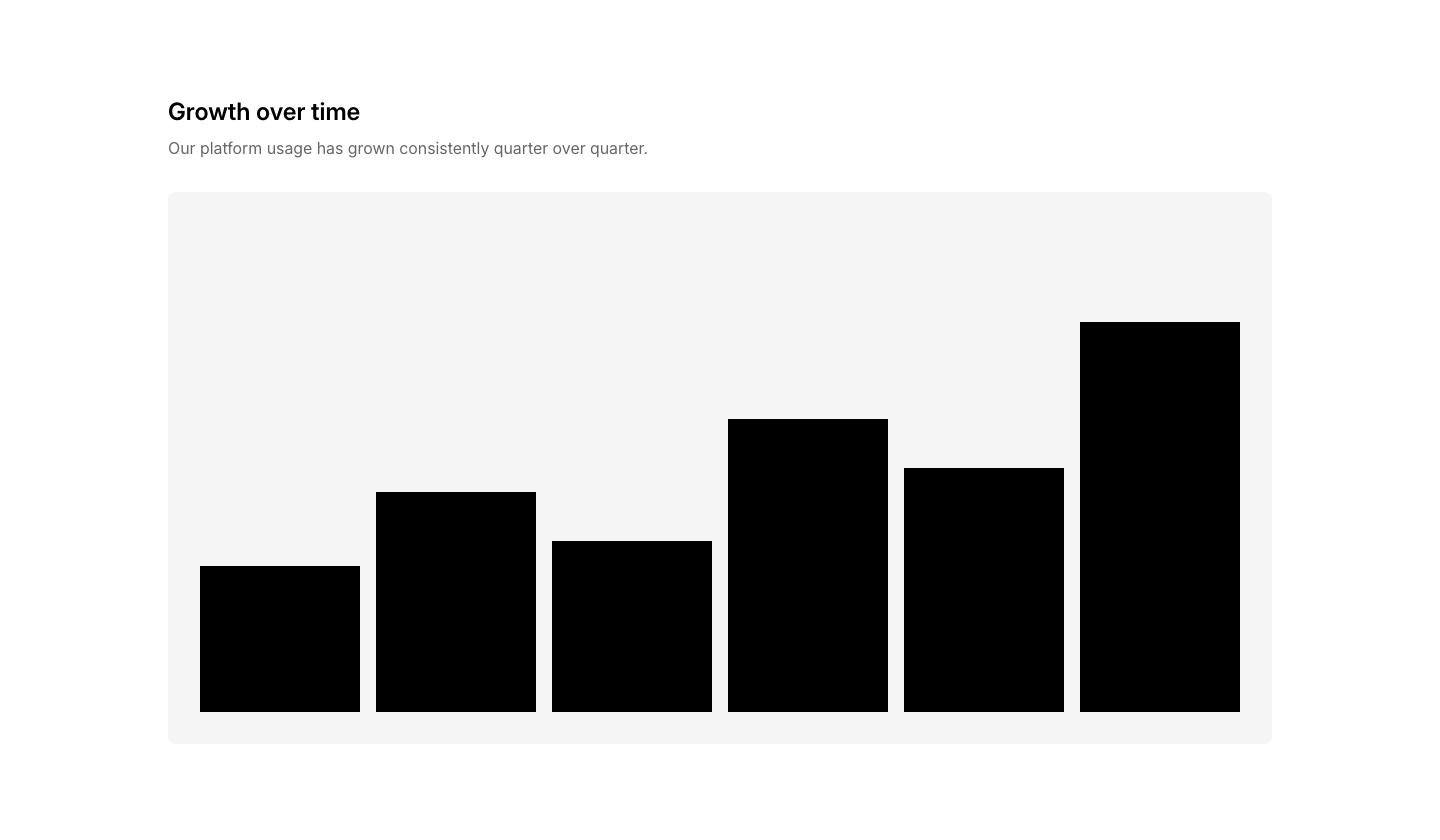
Chart
MetricBar chart visualization with heading and description.
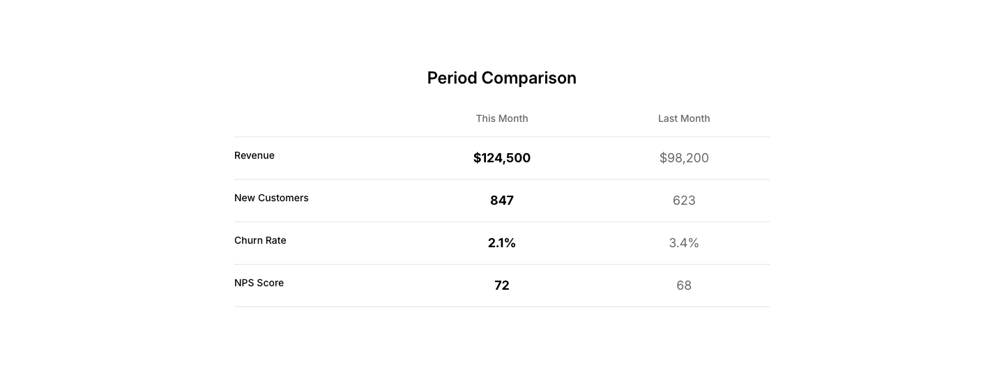
Comparison
MetricSide-by-side metric panels comparing two periods.
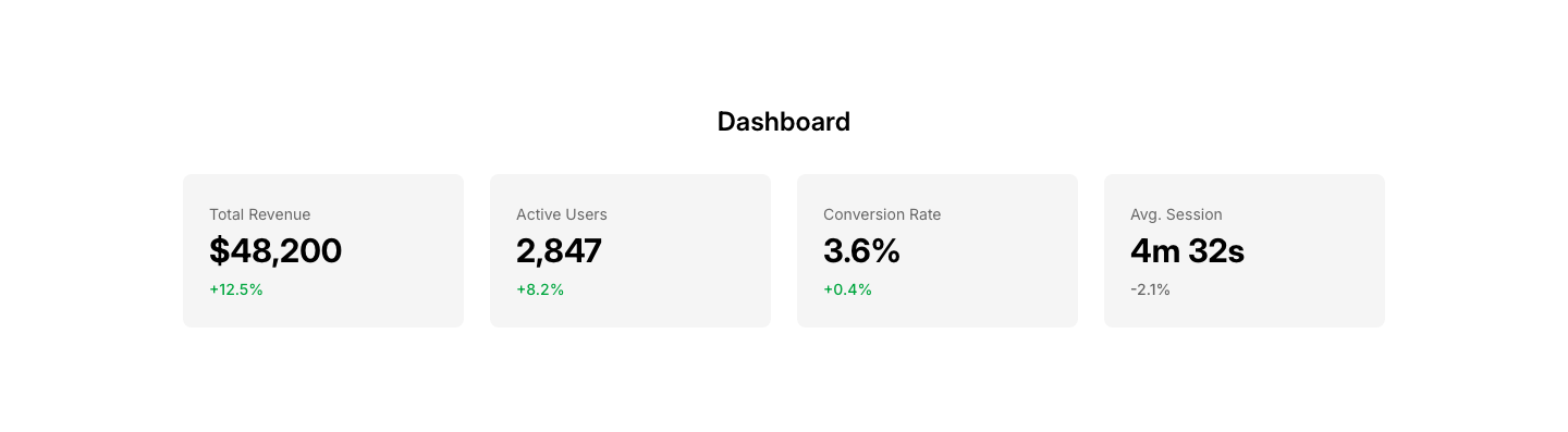
Dashboard
MetricDashboard-style KPI cards with values and change indicators.
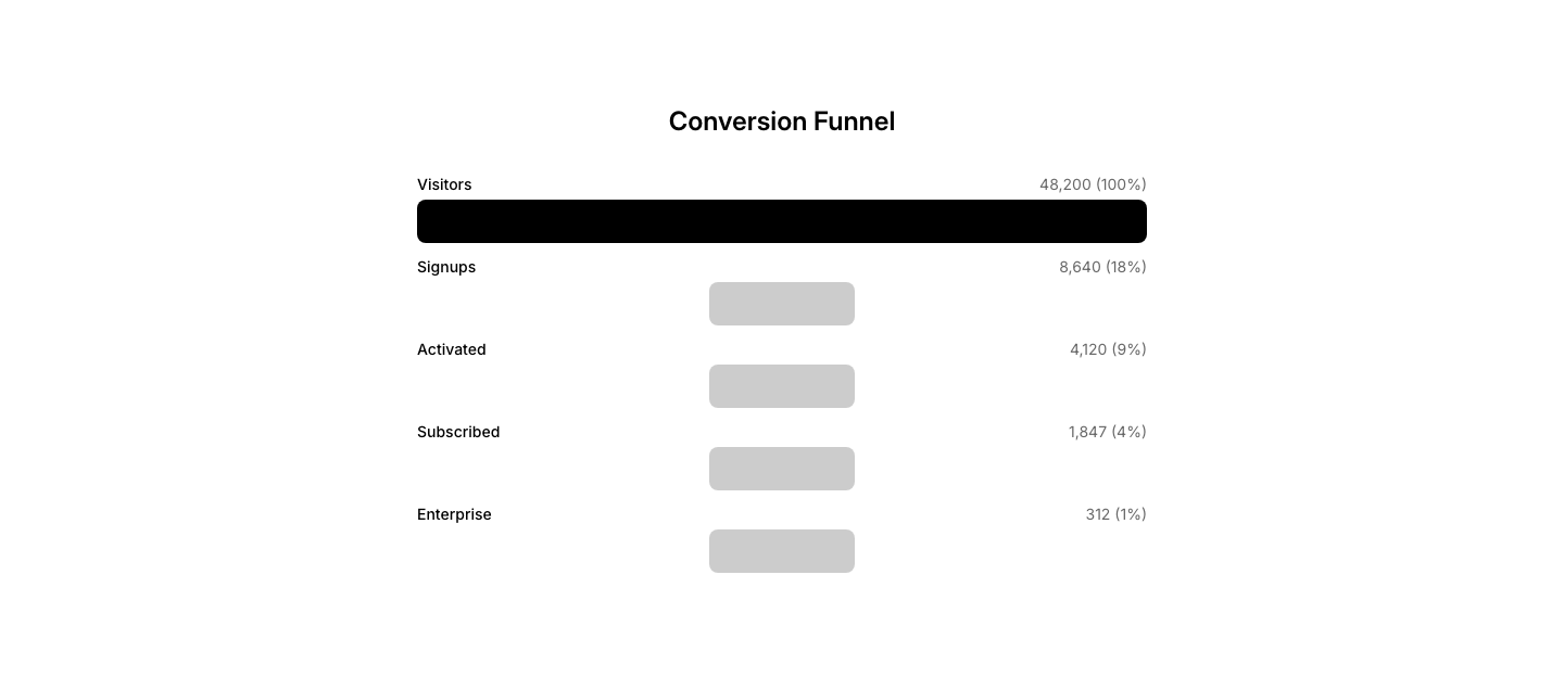
Funnel
MetricFunnel visualization showing conversion stages.
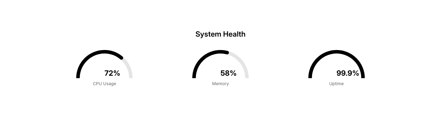
Gauge
MetricSemicircular gauge indicators with values and labels.
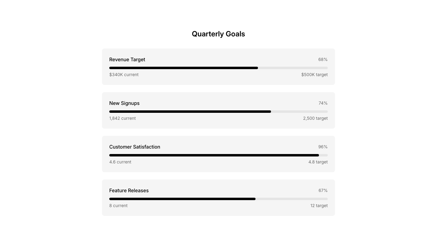
Goal
MetricGoal tracking with progress toward targets.
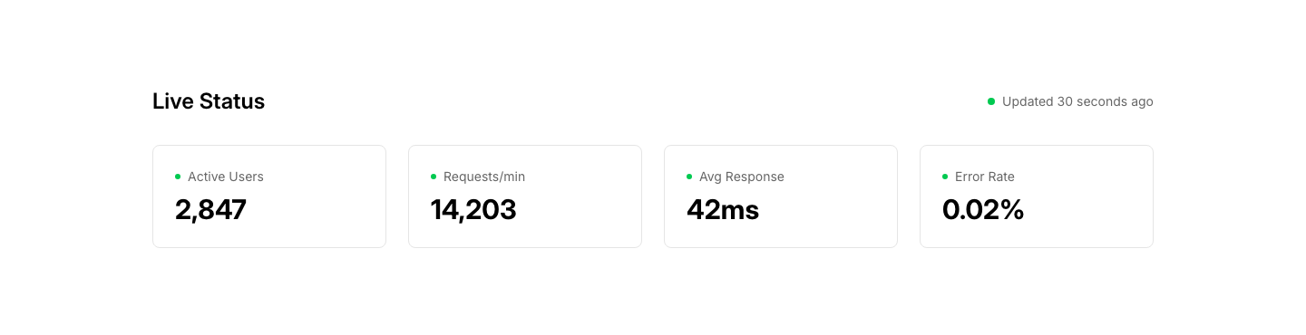
Live
MetricLive metric display with last updated timestamp.
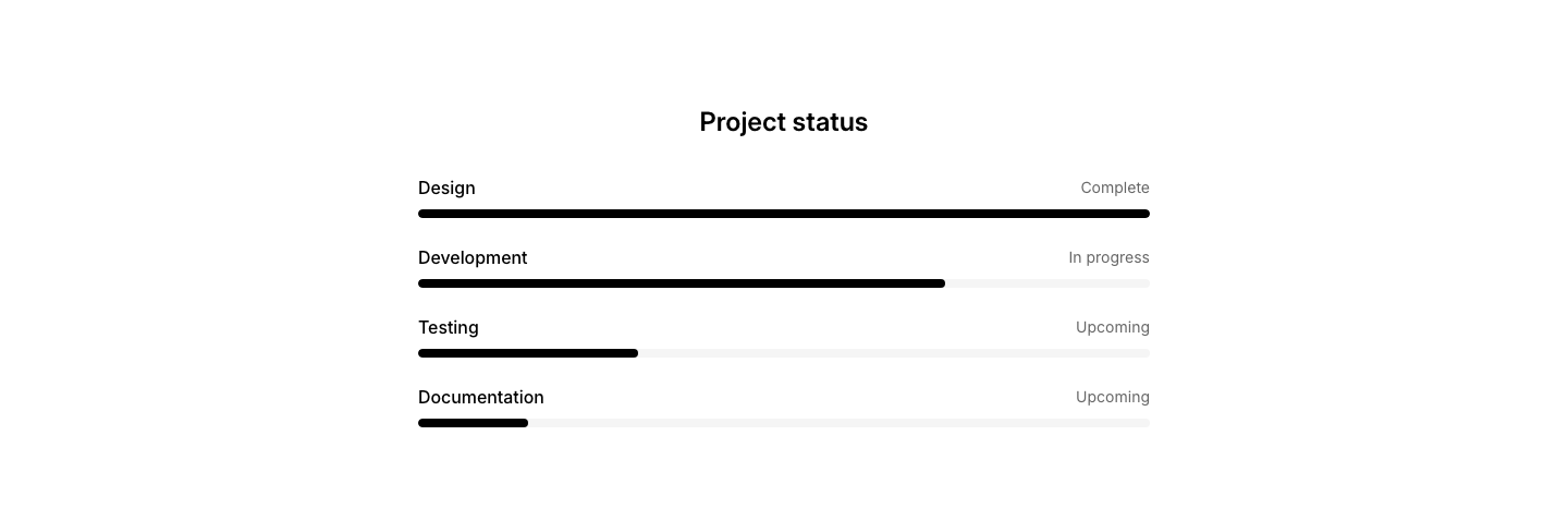
Progress
MetricProgress bars showing project or task completion status.
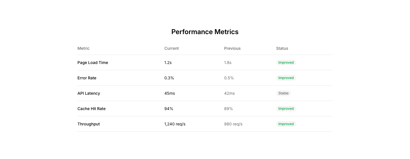
Table
MetricData table with sortable columns and row highlights.

Alert
ModalAlert modal with icon, message, and dismiss button.

Confirm
ModalConfirmation dialog with message and confirm/cancel buttons.
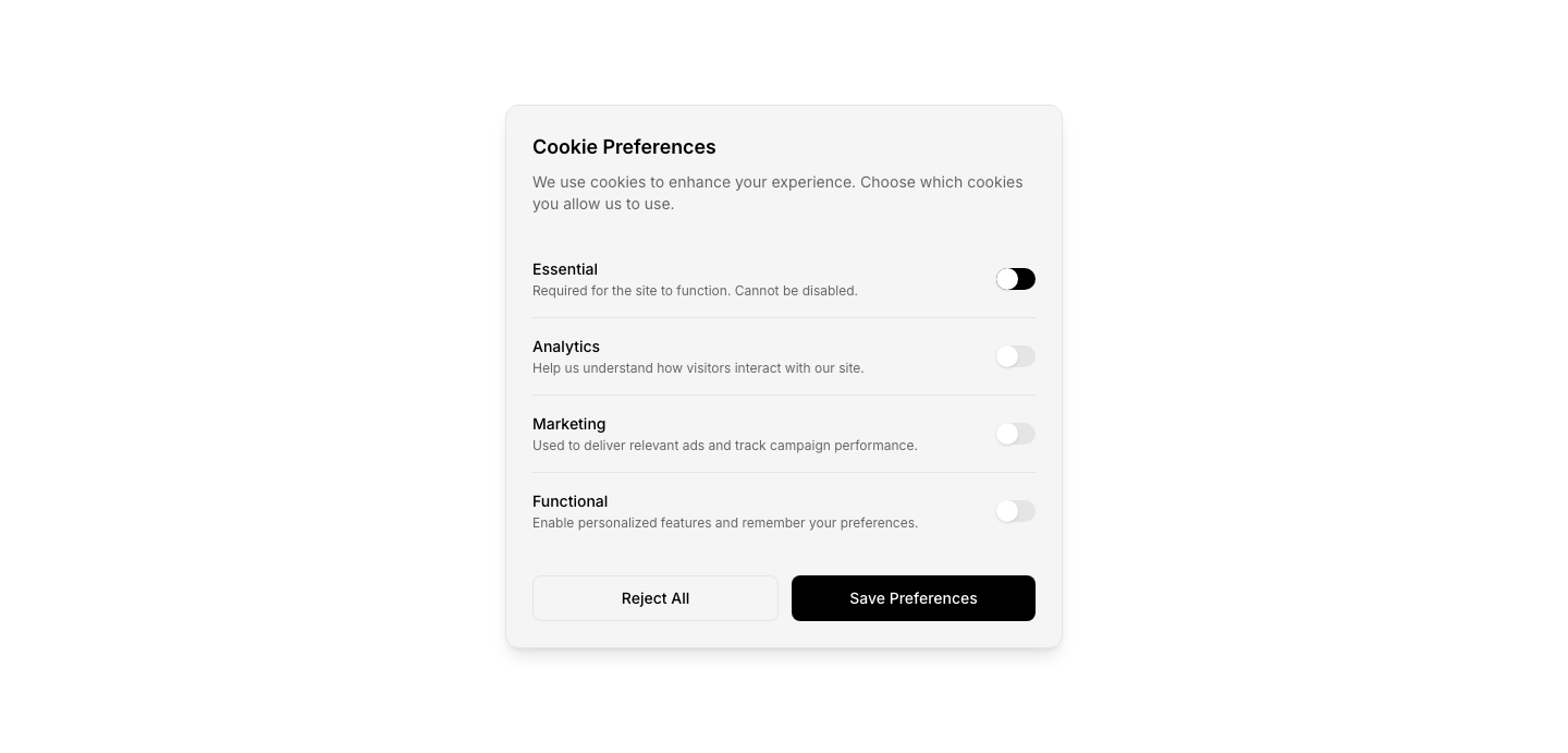
Cookie
ModalCookie preferences modal with toggles per category.
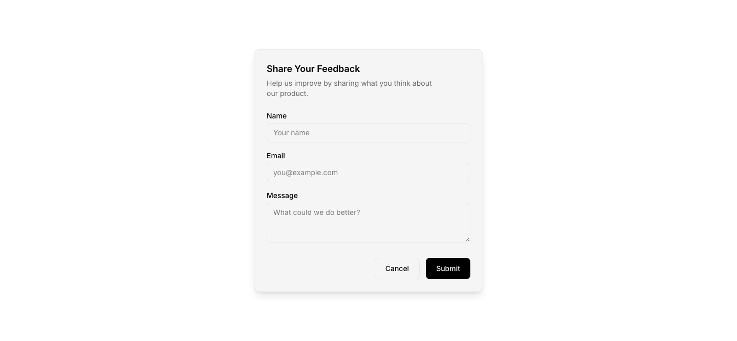
Form
ModalModal with a form for newsletter, feedback, etc.
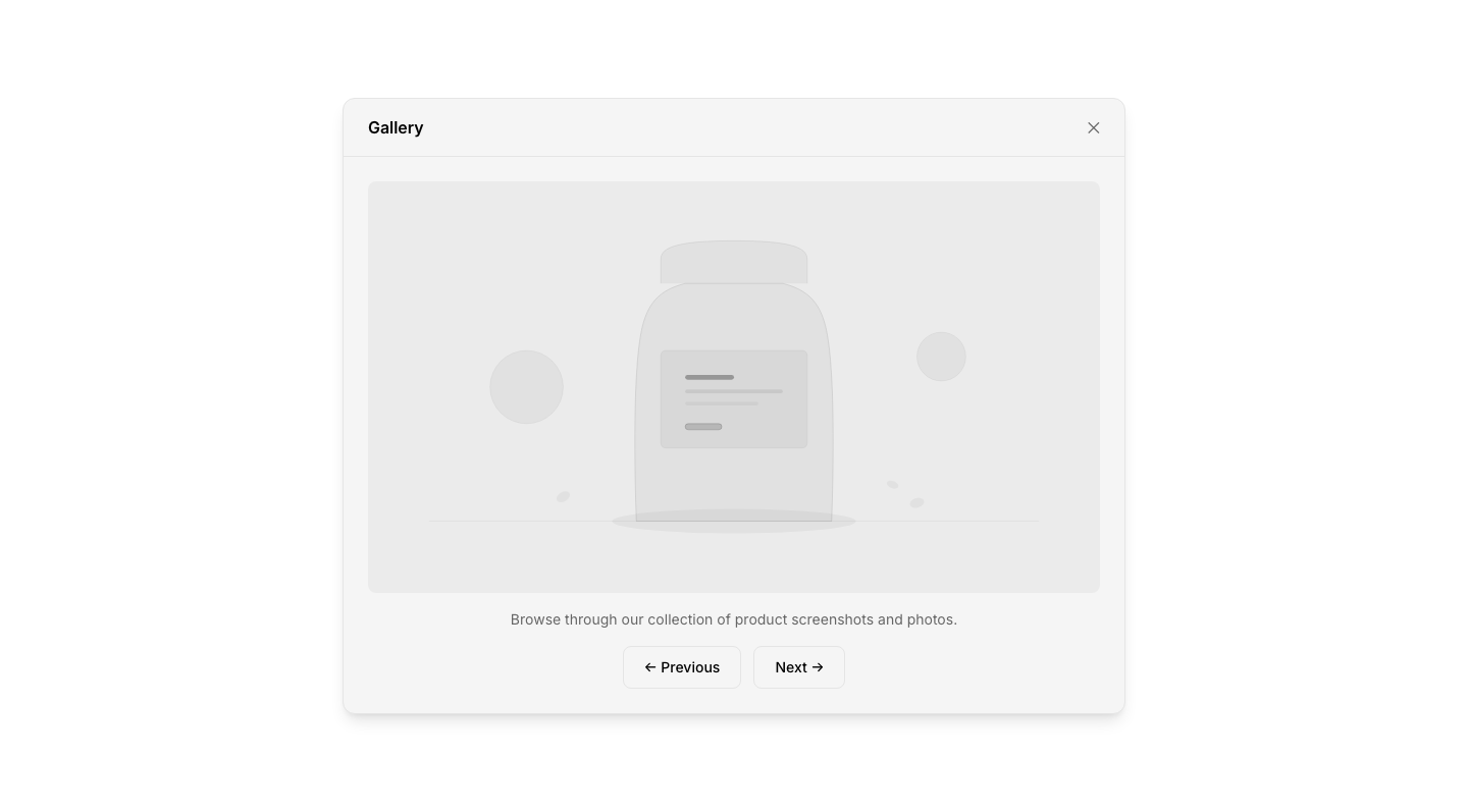
Gallery
ModalLightbox modal for image gallery viewing.

Onboarding
ModalMulti-step onboarding modal with slides.
Video
ModalVideo player in a modal overlay.
Album
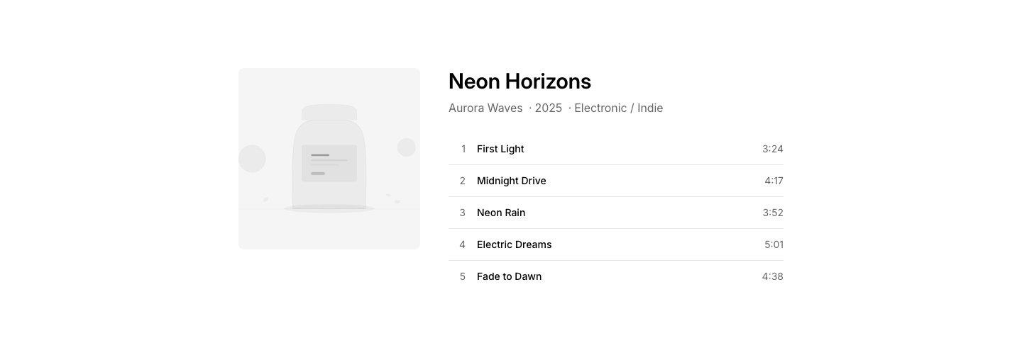
MusicAlbum showcase with cover, tracklist, and streaming links.
Artist
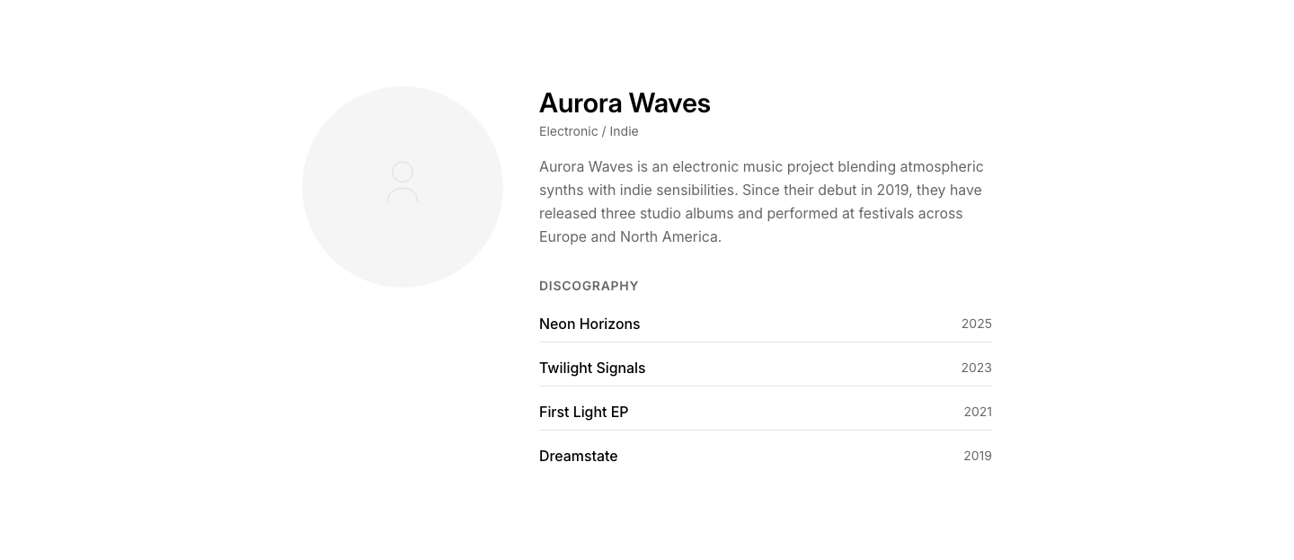
MusicArtist profile with photo, bio, and discography.
Event
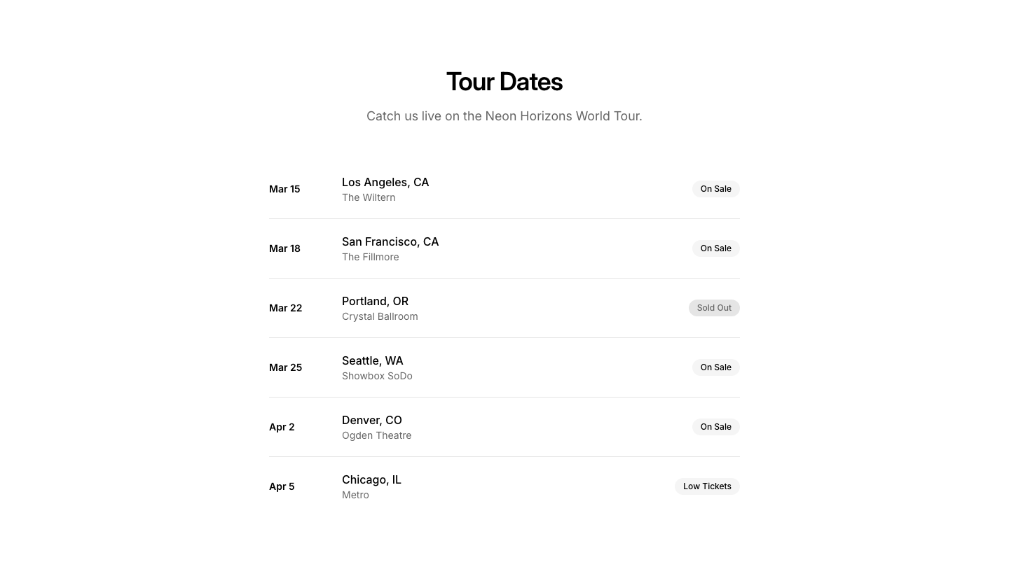
MusicConcert/tour dates list with venue and ticket links.
Player
MusicAudio player with album art, controls, and progress.
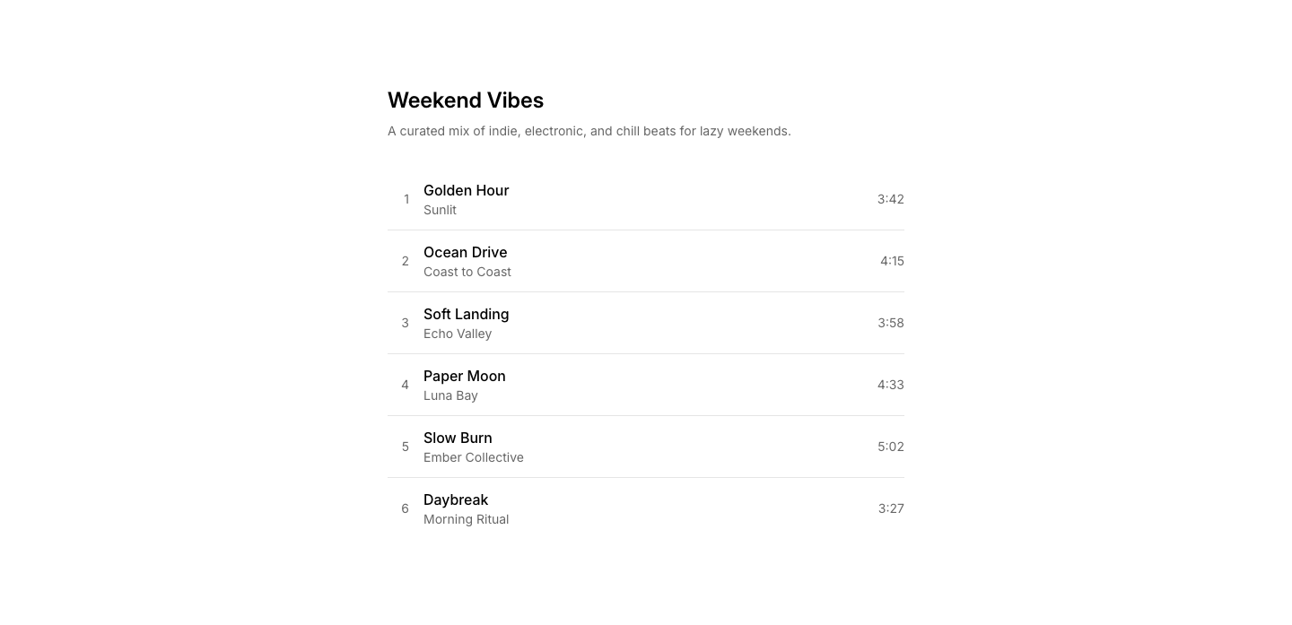
Playlist
MusicPlaylist with track list, duration, and play buttons.
Release
MusicNew release announcement with cover art and stream CTA.
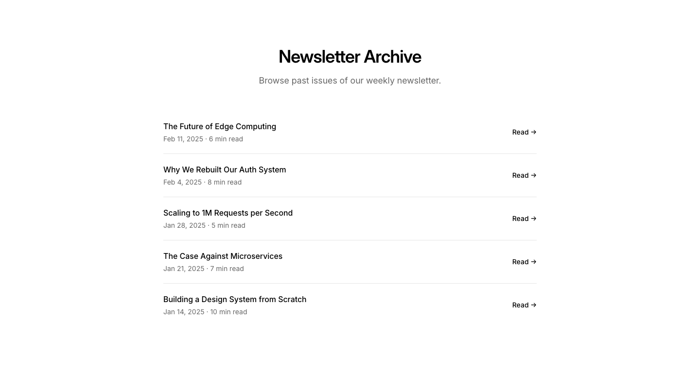
Archive
NewsletterPast newsletter issues list with dates and links.

Centered
NewsletterCentered newsletter signup with heading and email input.
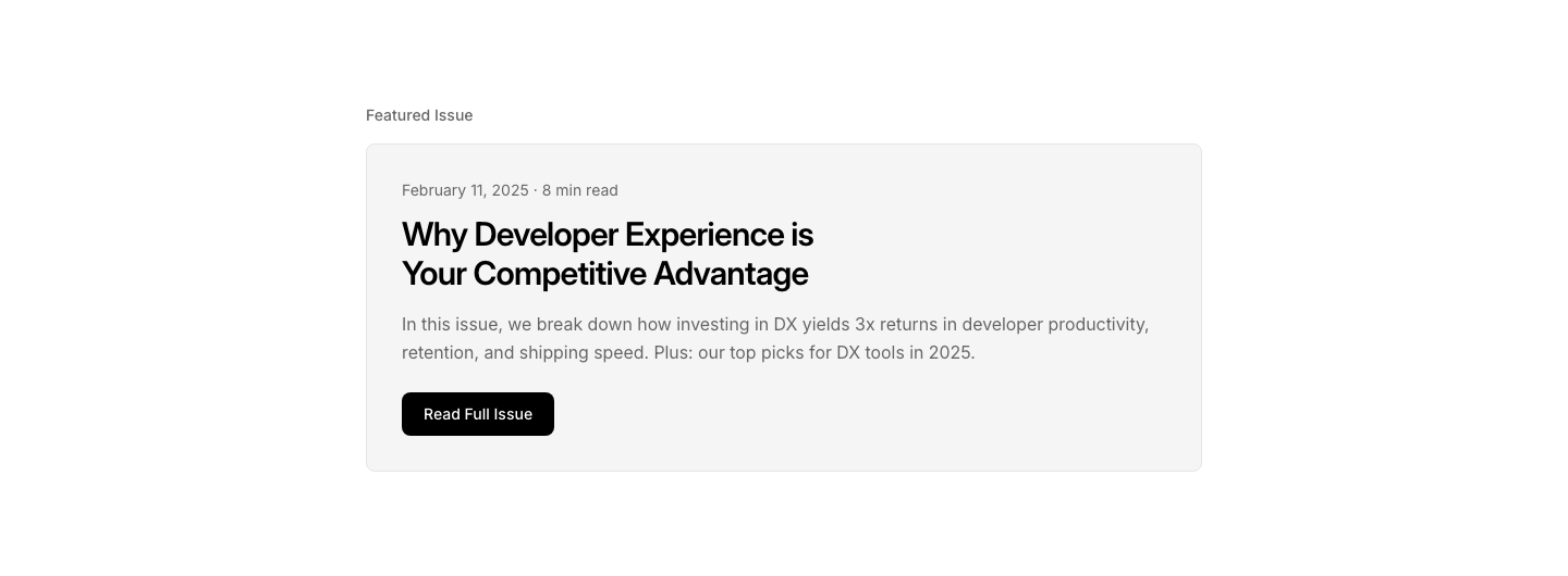
Featured
NewsletterFeatured newsletter issue with excerpt and read link.
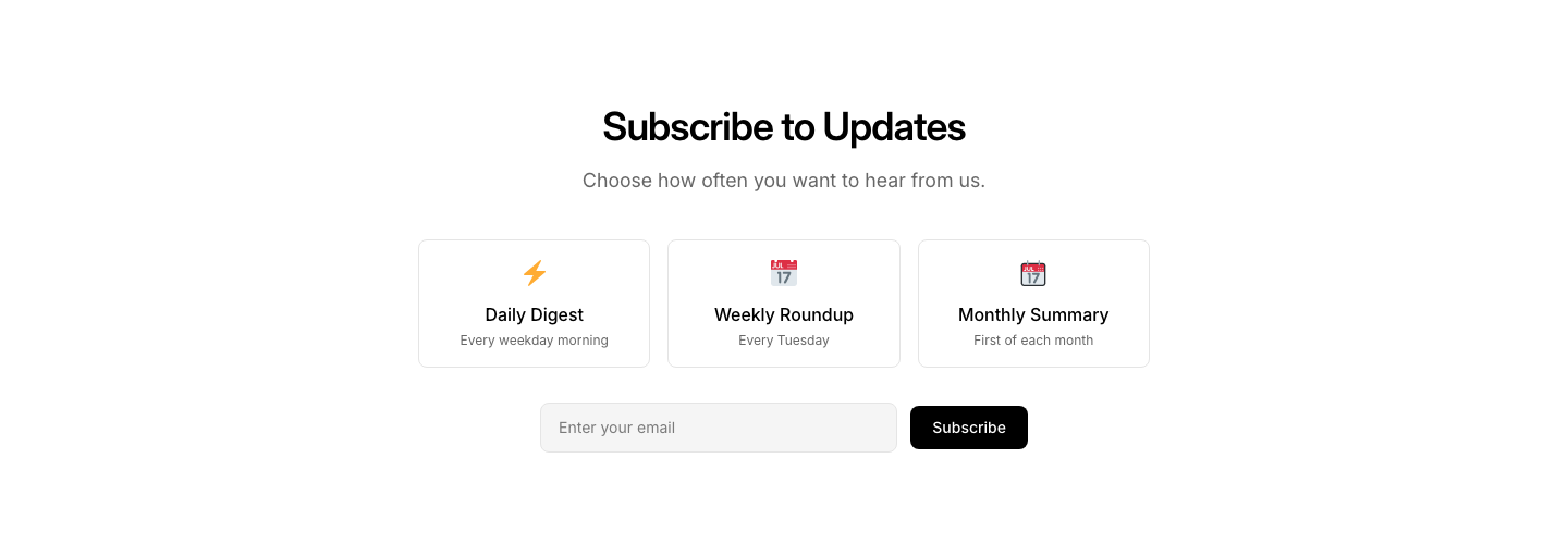
Frequency
NewsletterNewsletter with frequency preference selection.

Minimal
NewsletterCompact inline email input with subscribe button.

Popup
NewsletterNewsletter signup as a popup/modal content block.
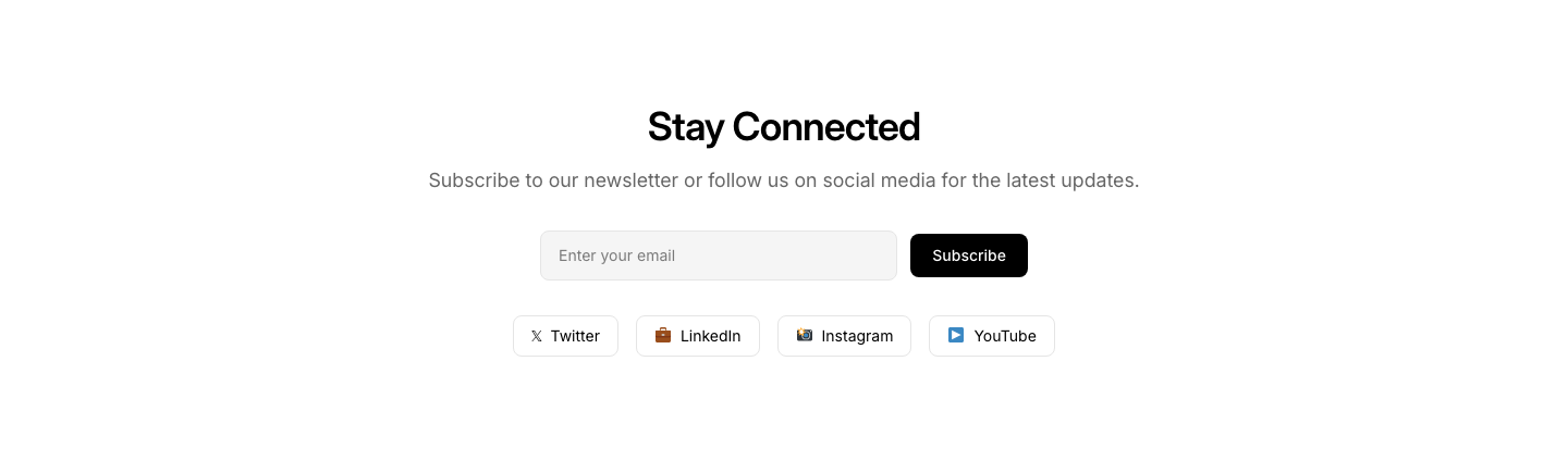
Social
NewsletterNewsletter with social follow links alongside.
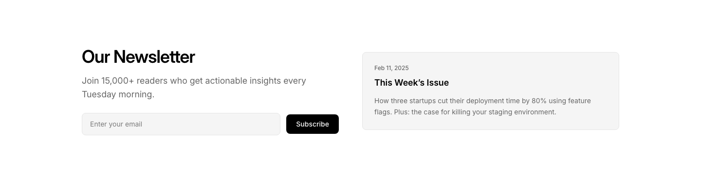
Split
NewsletterNewsletter signup on left, preview of recent issue on right.
Campaign
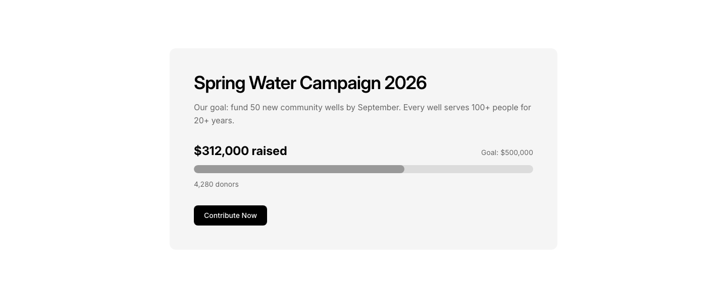
NonprofitActive campaign section with progress bar toward goal.
Donate
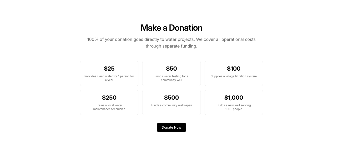
NonprofitDonation form with preset amounts and recurring option.
Events
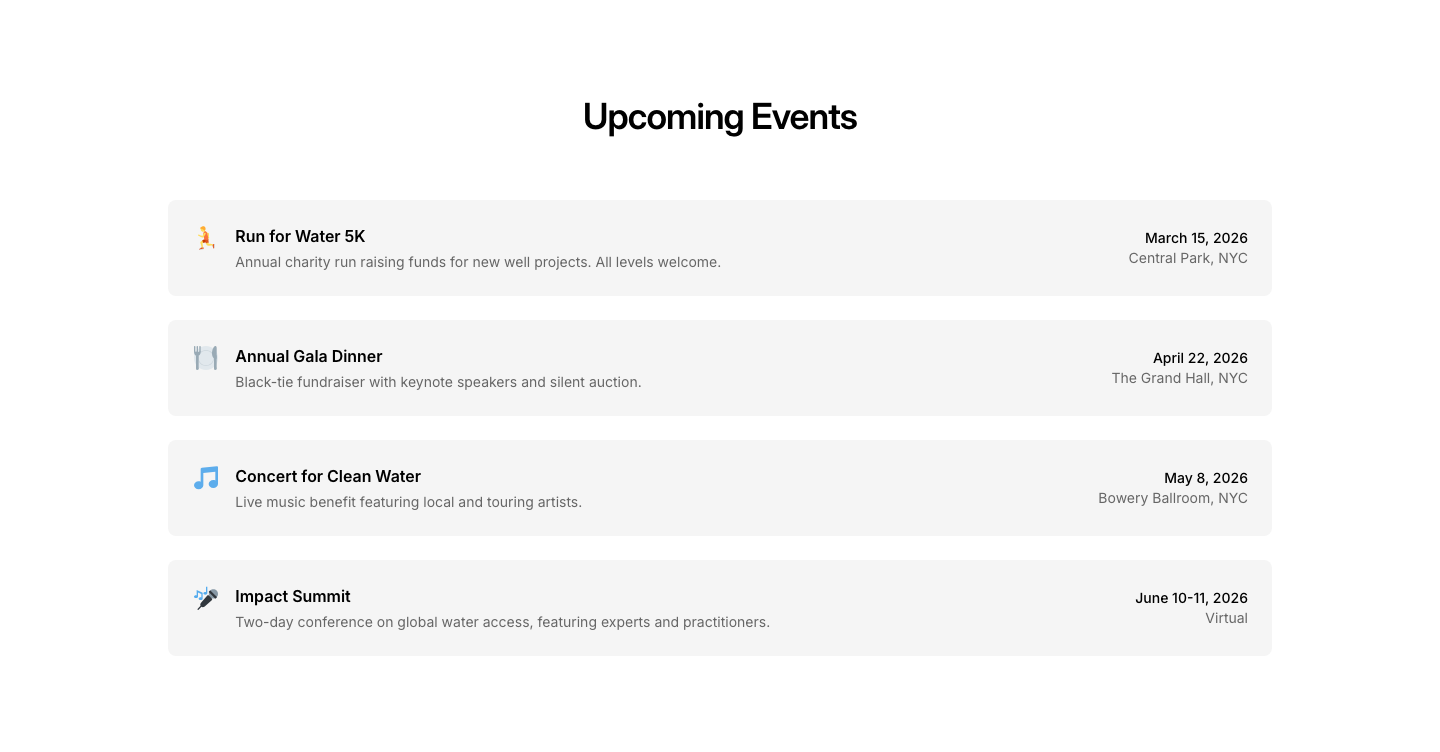
NonprofitFundraising events list with registration.
Hero
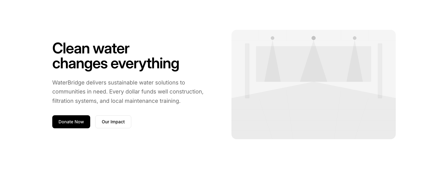
NonprofitCause-focused hero with impact image and donate CTA.
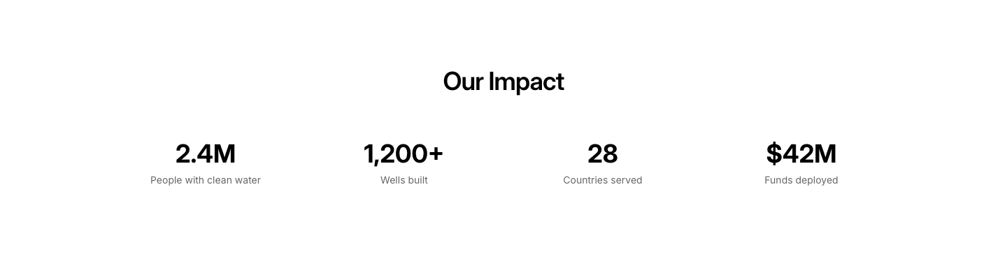
Impact
NonprofitImpact metrics showing funds raised, people helped.
Newsletter
NonprofitCause newsletter signup with impact highlights.
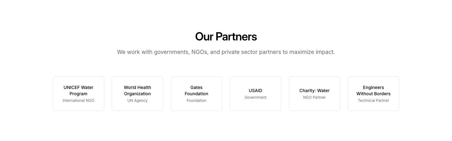
Partners
NonprofitPartner organization logos and descriptions.
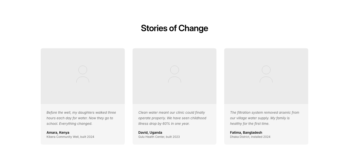
Stories
NonprofitBeneficiary stories with photos and quotes.
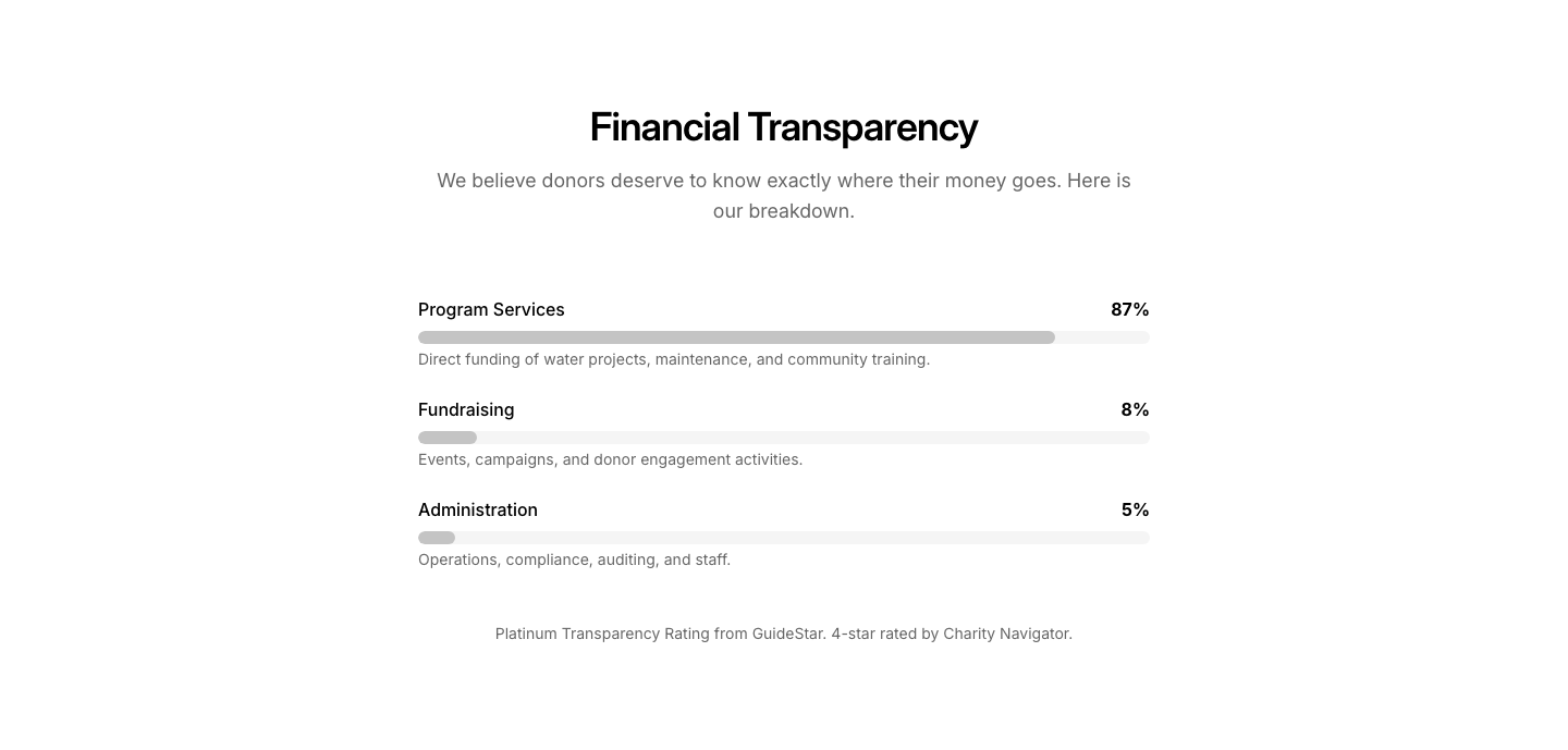
Transparency
NonprofitFinancial transparency section with charts.
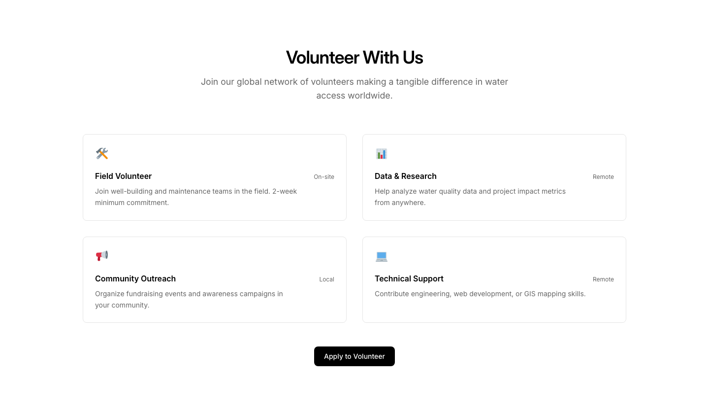
Volunteer
NonprofitVolunteer opportunities with sign-up form.

Banner
NotificationFull-width notification banner with icon, message, and dismiss action.

Bar
NotificationInline notification bar with emoji, text, and link.
Inline
NotificationInline notification with emoji, heading, and description.

Modal
NotificationModal-style notification dialog with heading, message, and action buttons.
Slide
NotificationSlide-in notification panel positioned to the right side.

Stack
NotificationStacked notification cards with different severity levels.

Status
NotificationStatus notification showing system health with indicator and message.

Toast
NotificationToast notification card positioned to the bottom right.
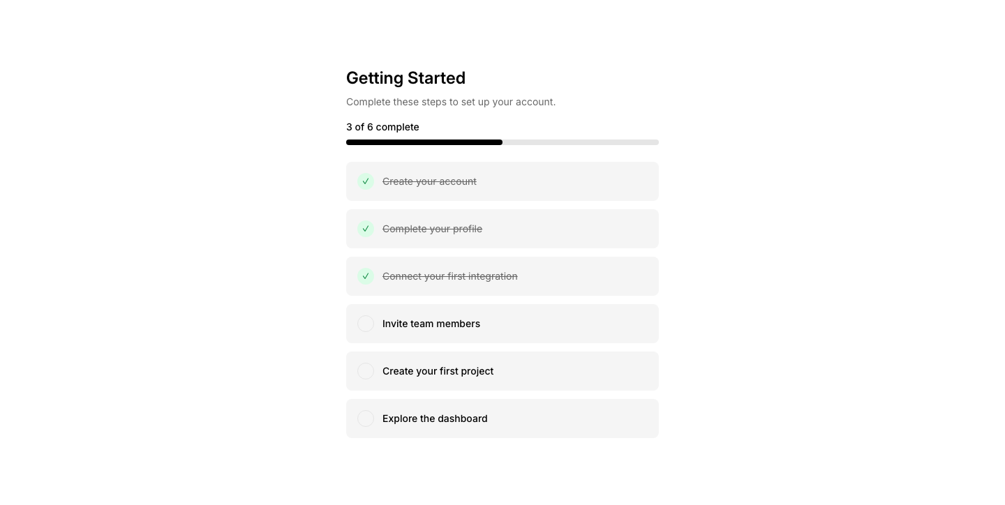
Checklist
OnboardingGetting started checklist with completion tracking.
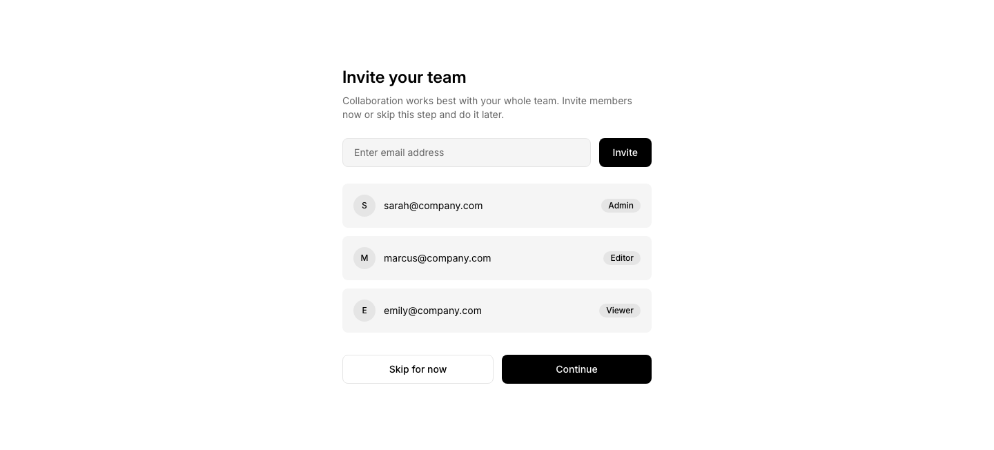
Invite
OnboardingTeam invite step with email input and role selection.
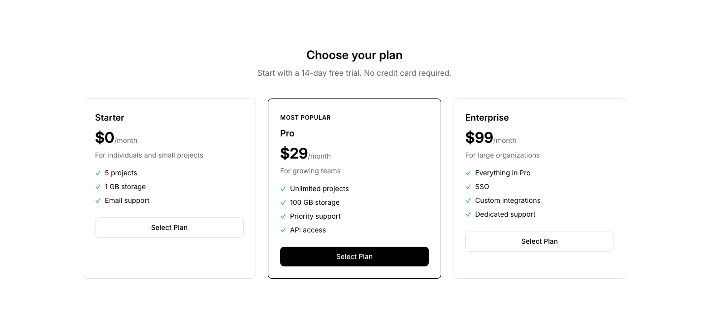
Plan
OnboardingPlan selection step during onboarding flow.
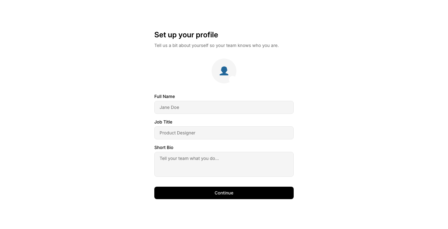
Profile
OnboardingProfile setup step with avatar, name, and preferences.
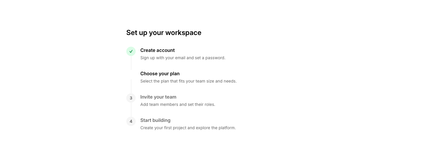
Steps
OnboardingMulti-step setup wizard with progress indicator.
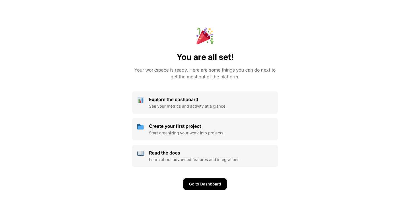
Success
OnboardingOnboarding completion screen with next steps.
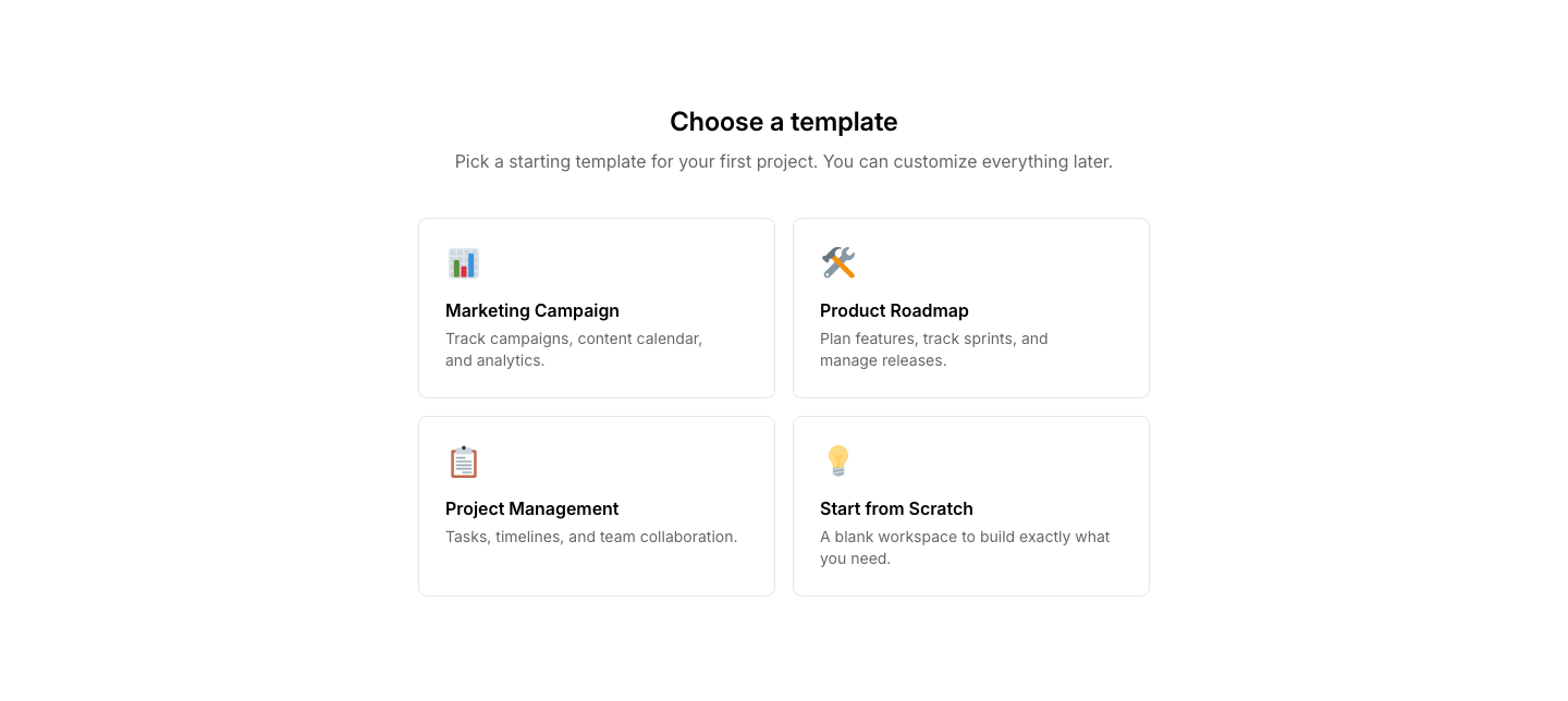
Template
OnboardingTemplate selection grid during setup.
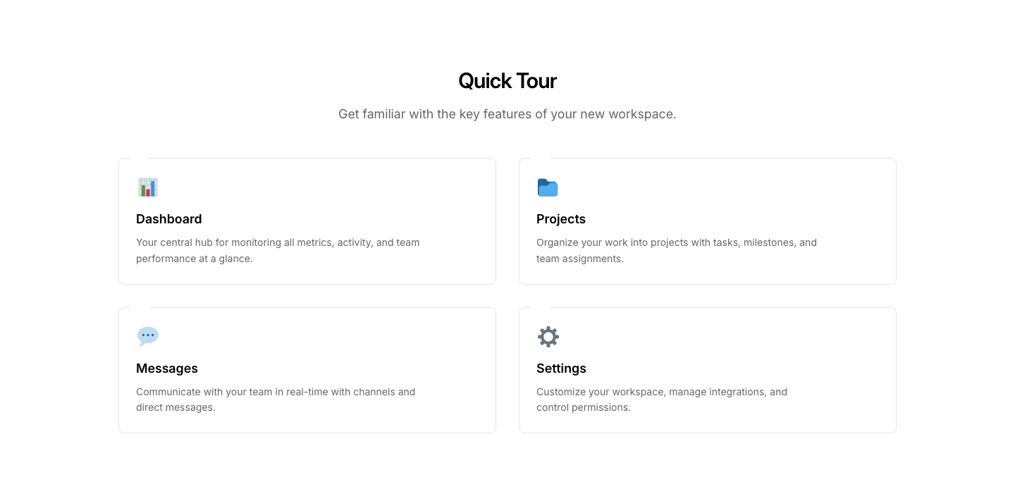
Tour
OnboardingProduct tour with highlighted features and tooltips.
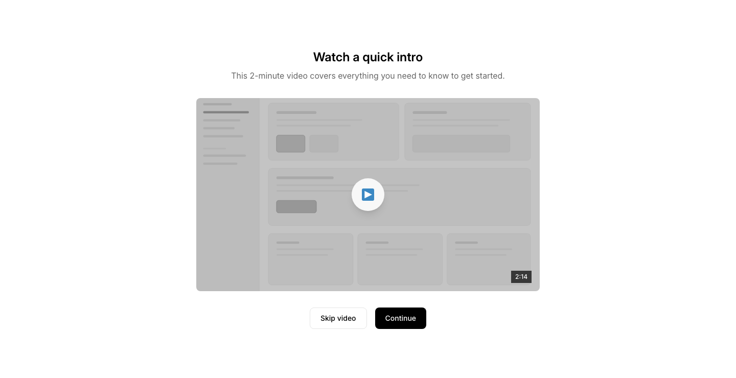
Video
OnboardingWelcome video step with skip option.

Welcome
OnboardingWelcome screen with greeting and get-started button.

Infinite
PaginationInfinite scroll trigger with loading spinner.

Jump
PaginationPage input field to jump to a specific page number.

Load More
PaginationLoad more button with item count display.

Numbered
PaginationNumbered pagination with previous/next buttons.

Progress
PaginationProgress bar showing how far through content you are.
Simple
PaginationPrevious/next buttons only, no page numbers.
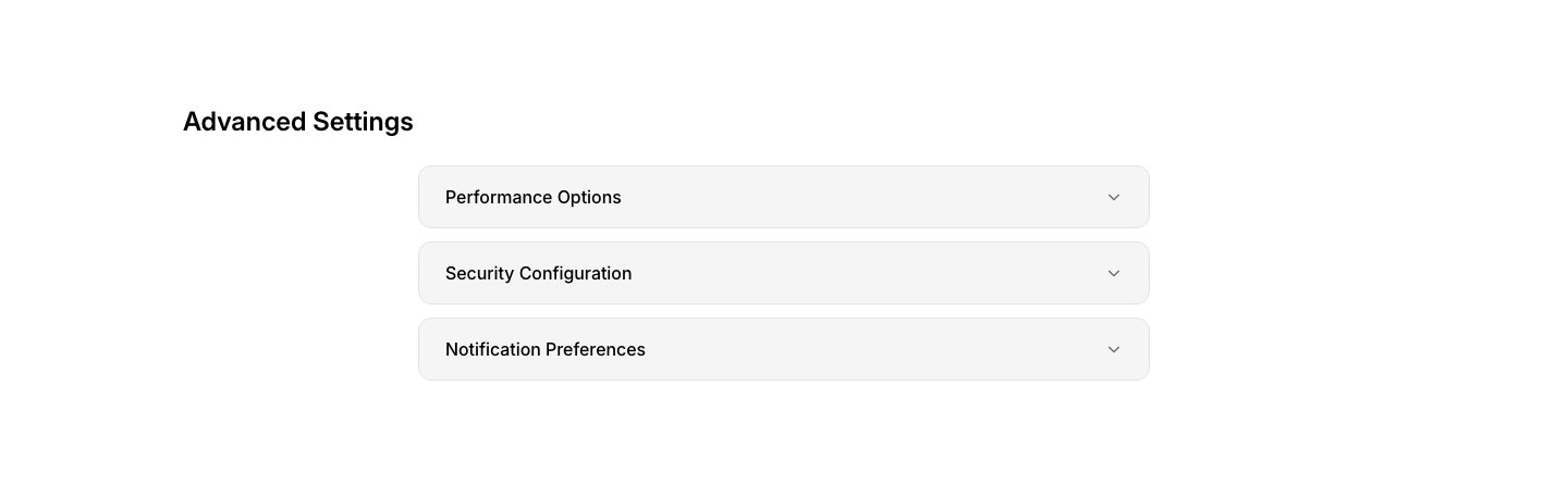
Collapsible
PanelCollapsible content panel with expand/collapse toggle.

Info
PanelInformation panel with heading, text, and icon.
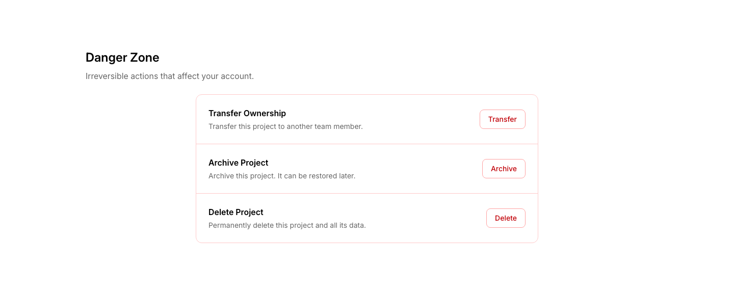
Split
PanelSplit panel: content on left, actions on right.
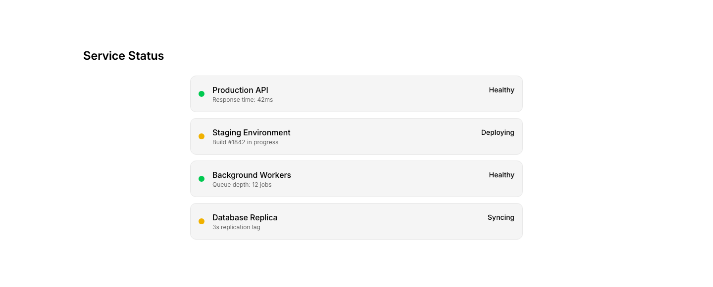
Status
PanelStatus panel with indicator dot, title, and details.

Sticky
PanelSticky panel that follows scroll within a container.

Tabbed
PanelPanel with tabbed content sections.
About
PhotographyPhotographer bio with portrait and story.
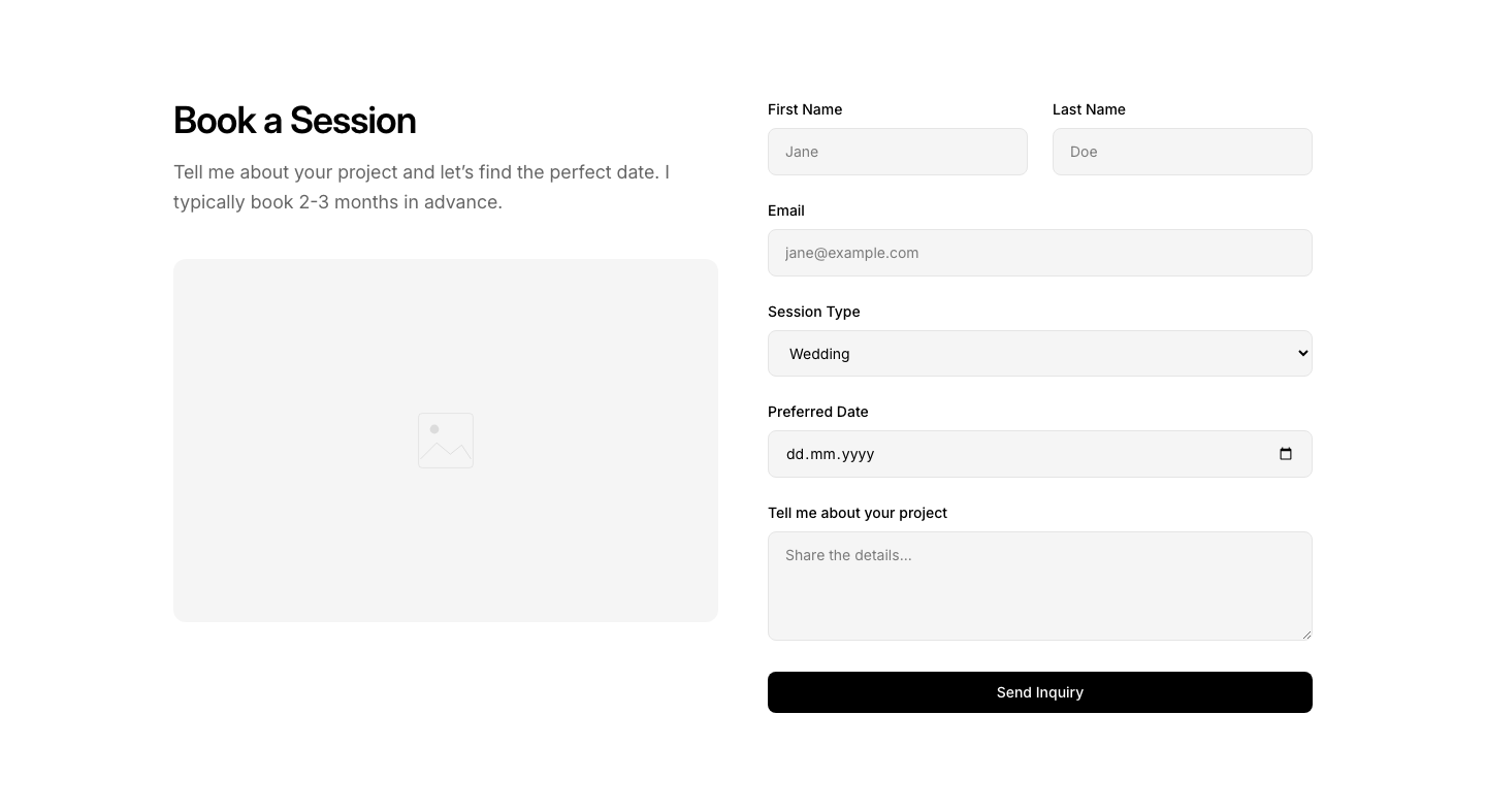
Booking
PhotographySession booking form with date and package selection.
Gallery
PhotographyFull-screen photo gallery with category filters.
Hero
PhotographyPhotographer portfolio hero with signature image.
Journal
PhotographyPhoto journal/blog with image-heavy entries.
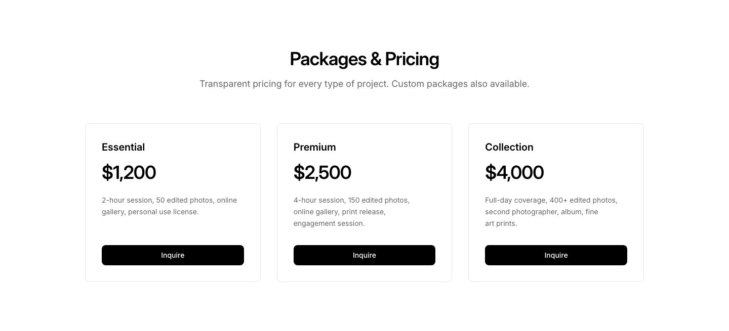
Packages
PhotographyPhotography packages with pricing and deliverables.
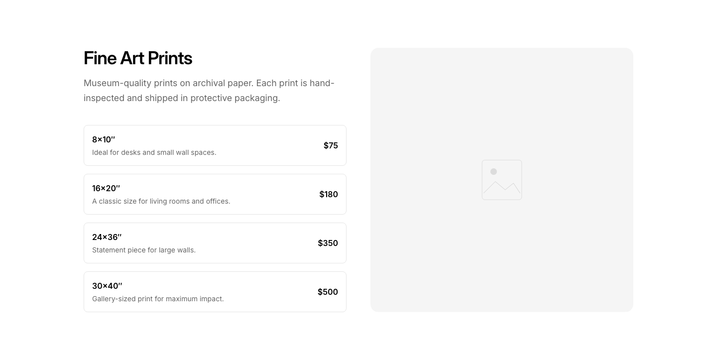
Print shop section with sizes and pricing.
Testimonial
PhotographyClient testimonials with session photos.
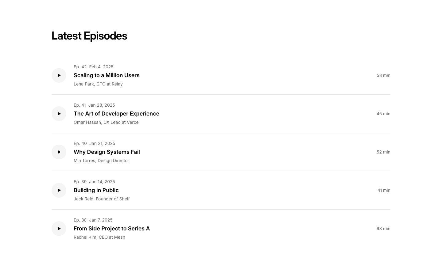
Episodes
PodcastEpisode list with play button, title, duration, date.
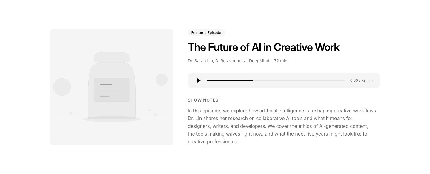
Featured
PodcastFeatured episode with large player and show notes.
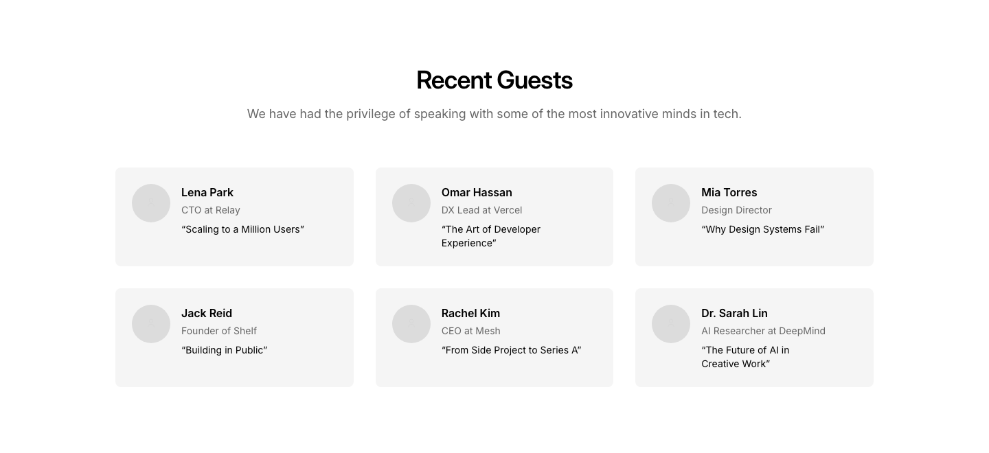
Guest
PodcastGuest cards for upcoming or past episodes.
Hero
PodcastPodcast hero with cover art and platform links.

Host
PodcastHost profile with bio and social links.
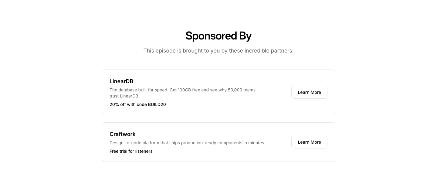
Sponsor
PodcastPodcast sponsor section with logos and descriptions.
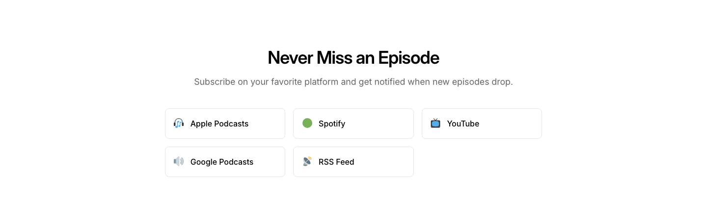
Subscribe
PodcastSubscribe section with platform icons (Spotify, Apple, etc.).
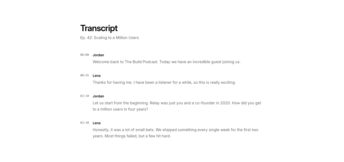
Transcript
PodcastEpisode transcript section with timestamps.
Before After
PortfolioBefore/after image comparison for each project.
Cards
PortfolioPortfolio cards with image, description, and tags.
Carousel
PortfolioHorizontally scrollable project cards.
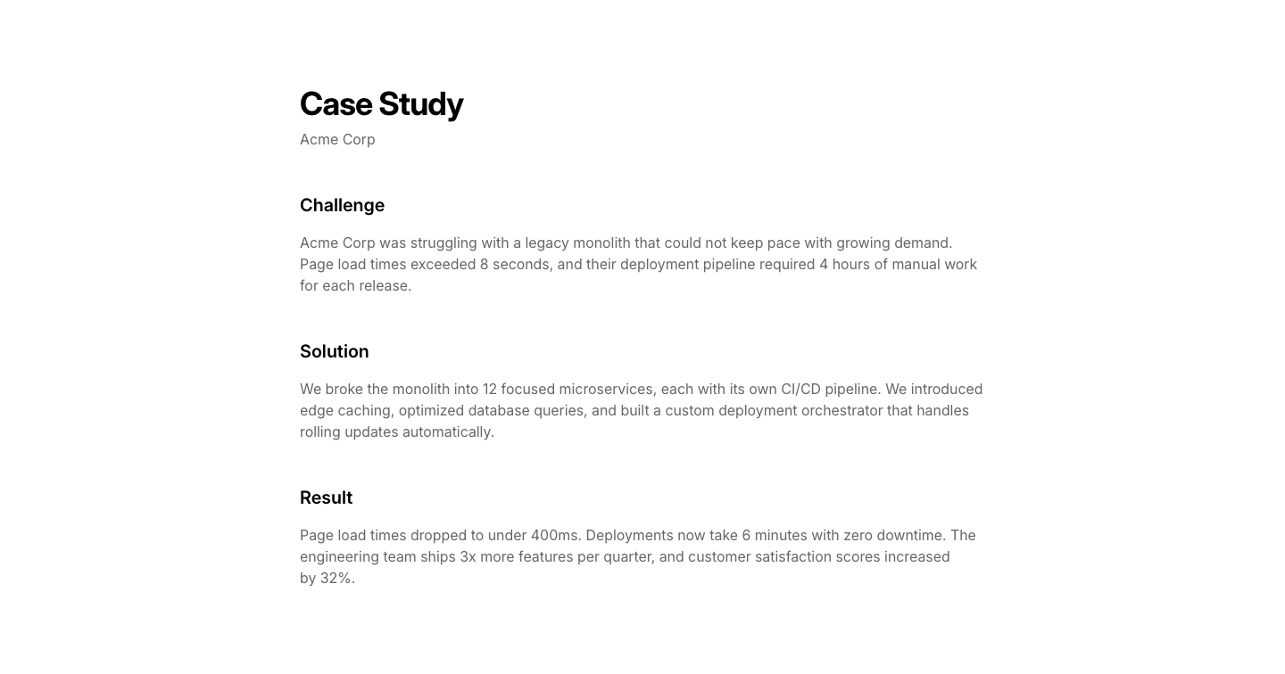
Case
PortfolioCase study layout with challenge, solution, and result sections.
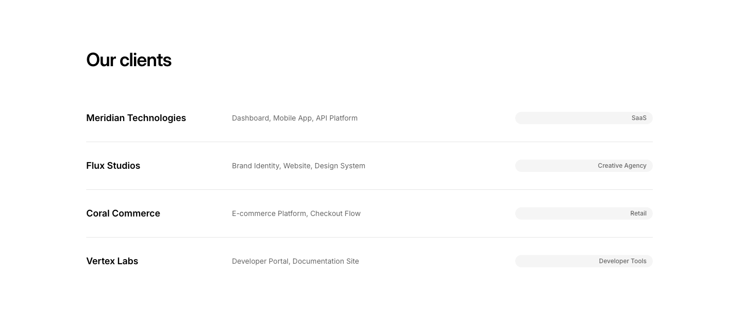
Client
PortfolioPortfolio organized by client with logo and project list.
Featured
PortfolioFeatured project spotlight with image, description, and metadata.
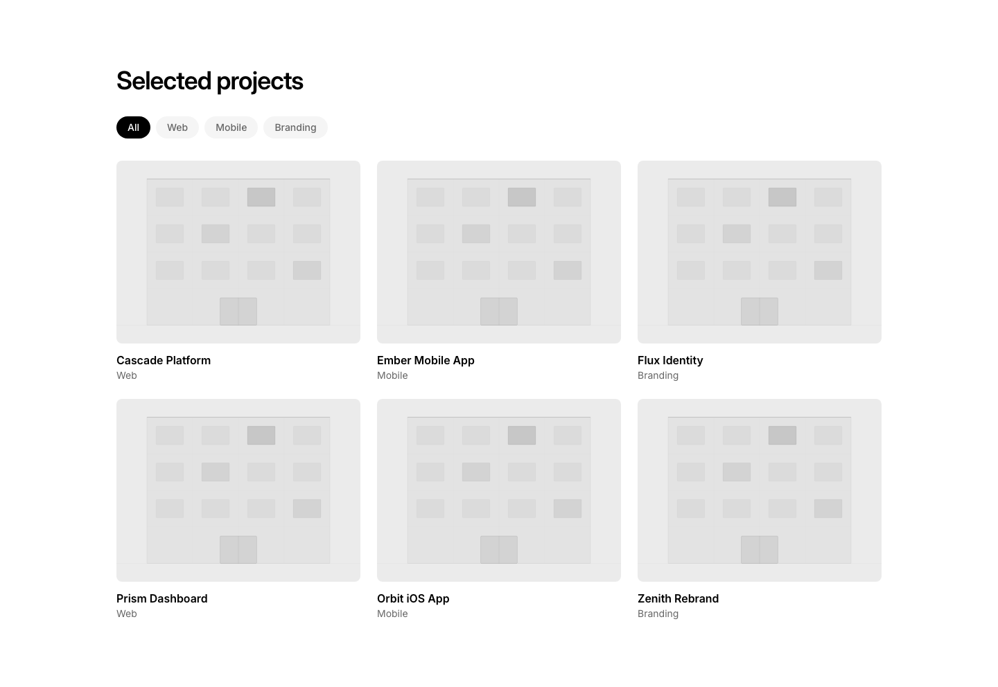
Filter
PortfolioPortfolio grid with category filter tabs above.
Gallery
PortfolioFull-width project gallery with lightbox thumbnails.
Grid
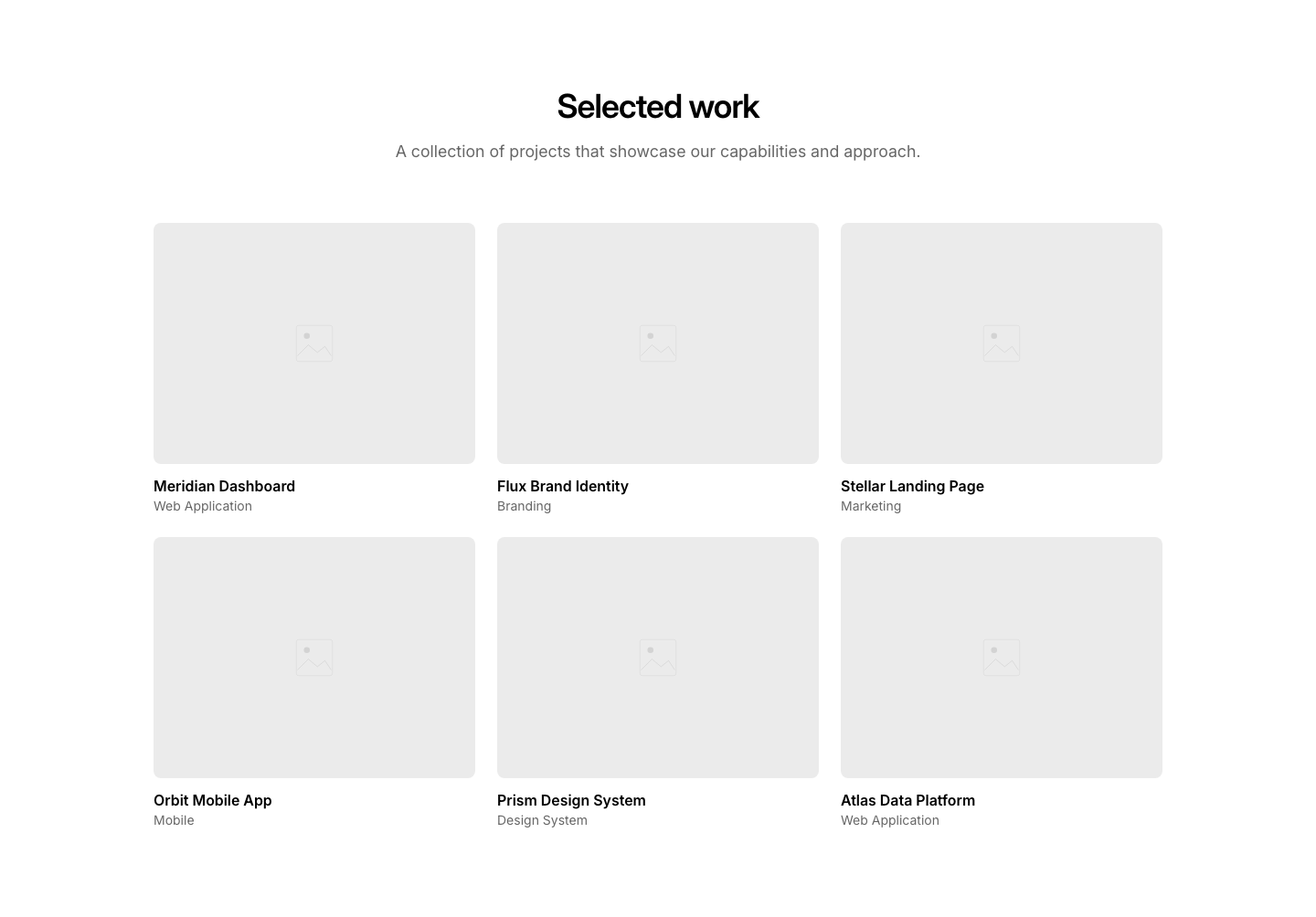
Portfolio3-column grid of portfolio projects with image, title, and category.
Masonry
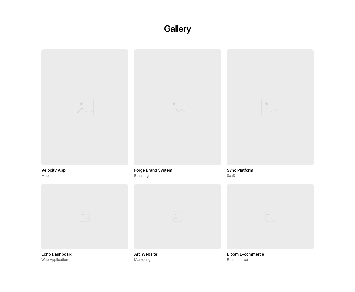
PortfolioMasonry-style portfolio grid with alternating aspect ratios.
Minimal
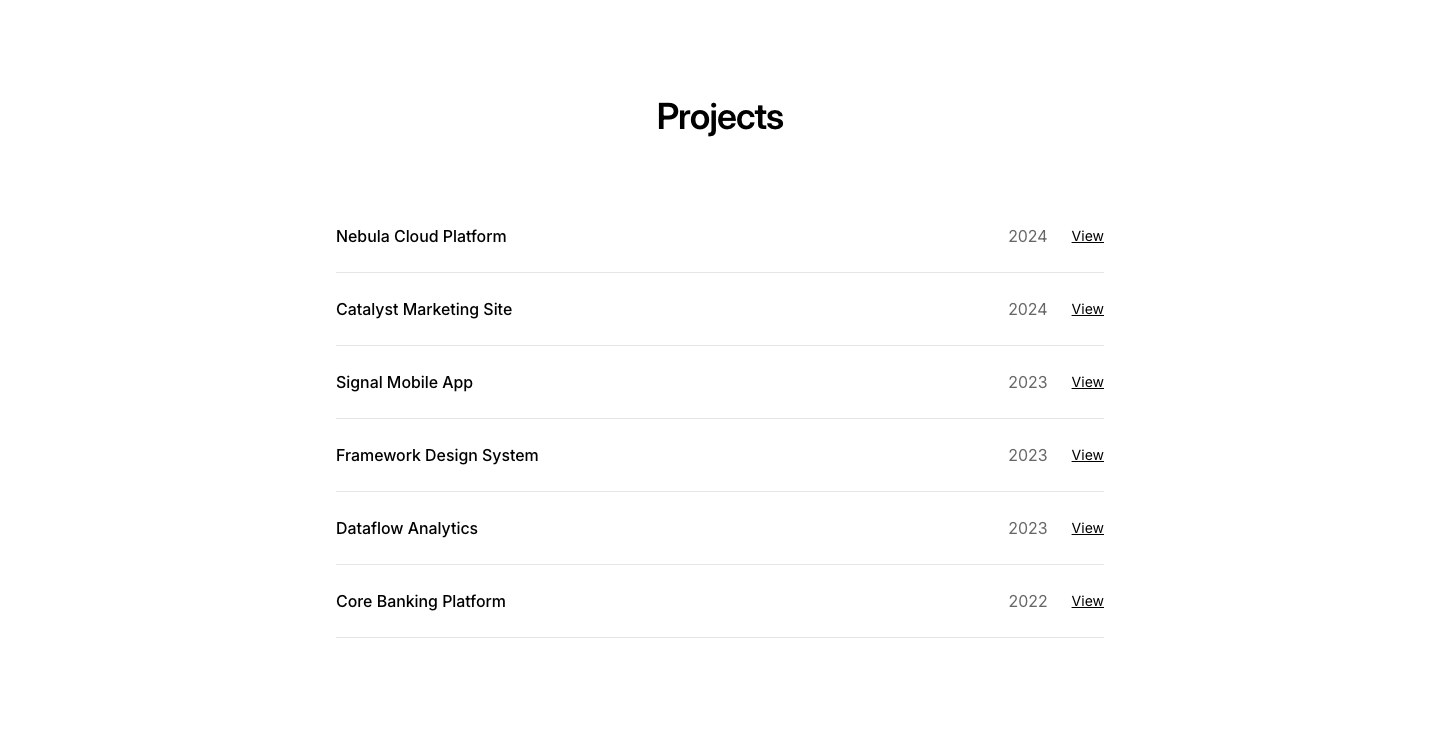
PortfolioMinimal project list with title, year, and link.
Split
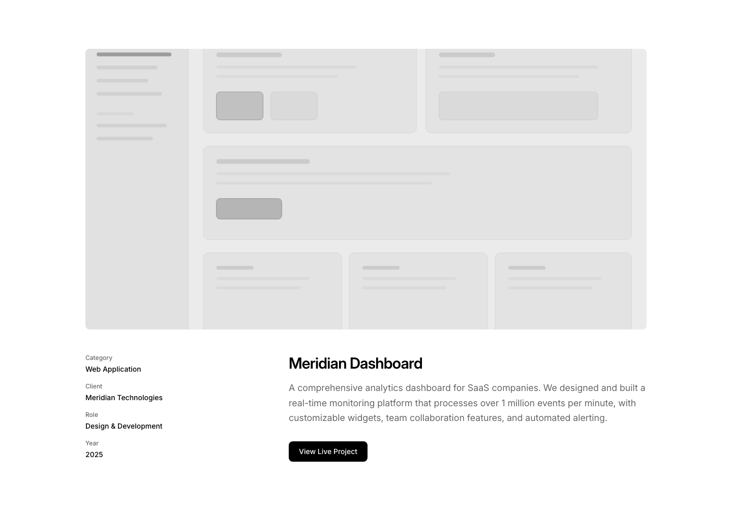
PortfolioLarge image top, project details and description below.
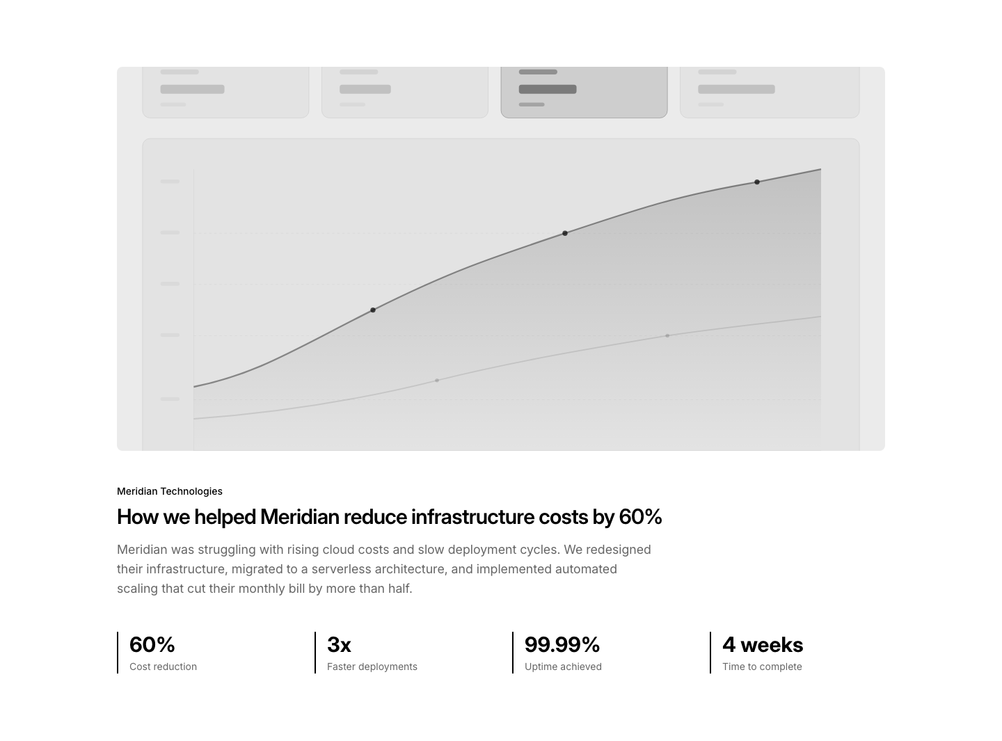
Stat
PortfolioCase study with key metrics highlighted (3x ROI, 50% faster).
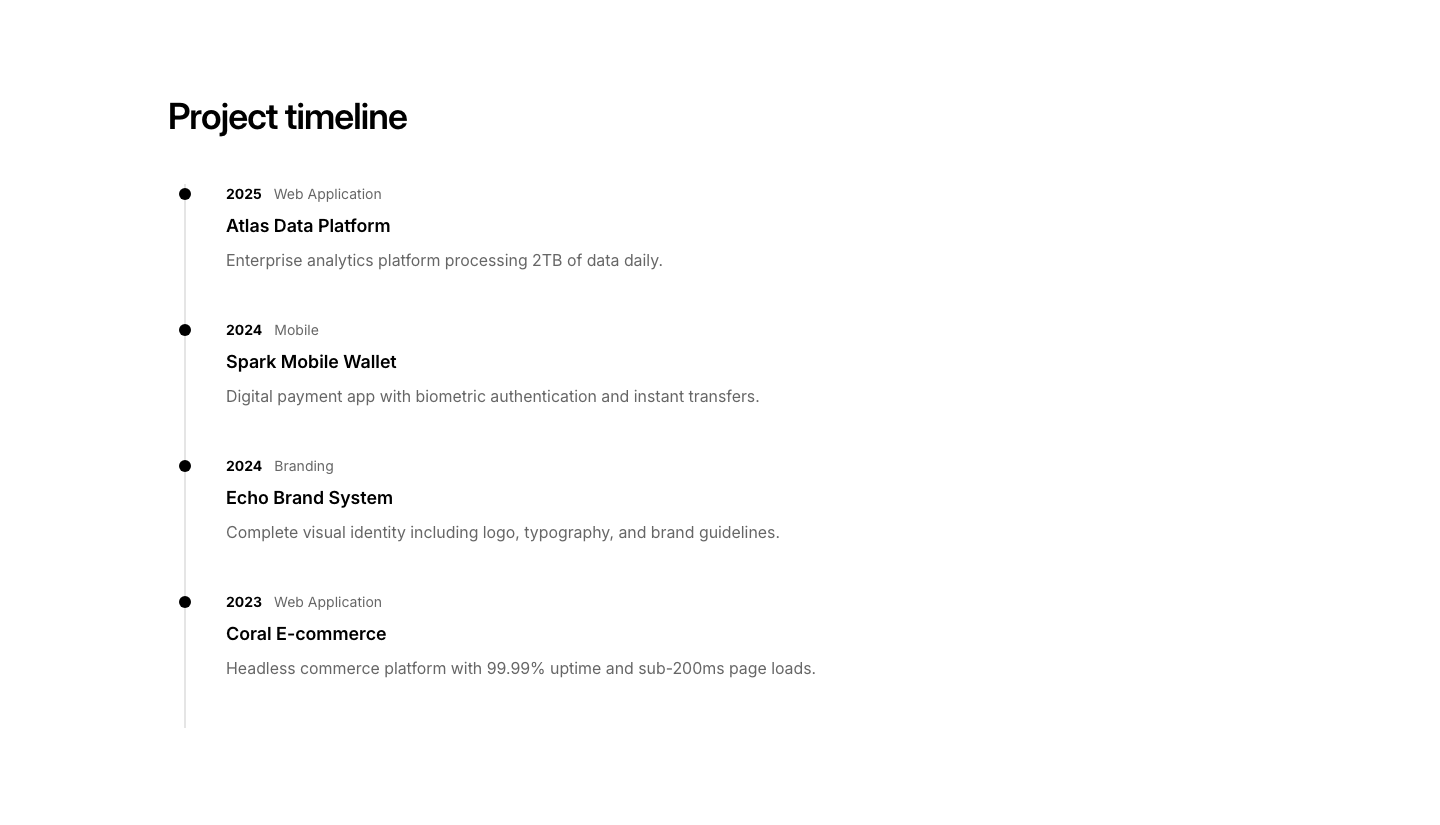
Timeline
PortfolioProjects shown chronologically along a timeline.
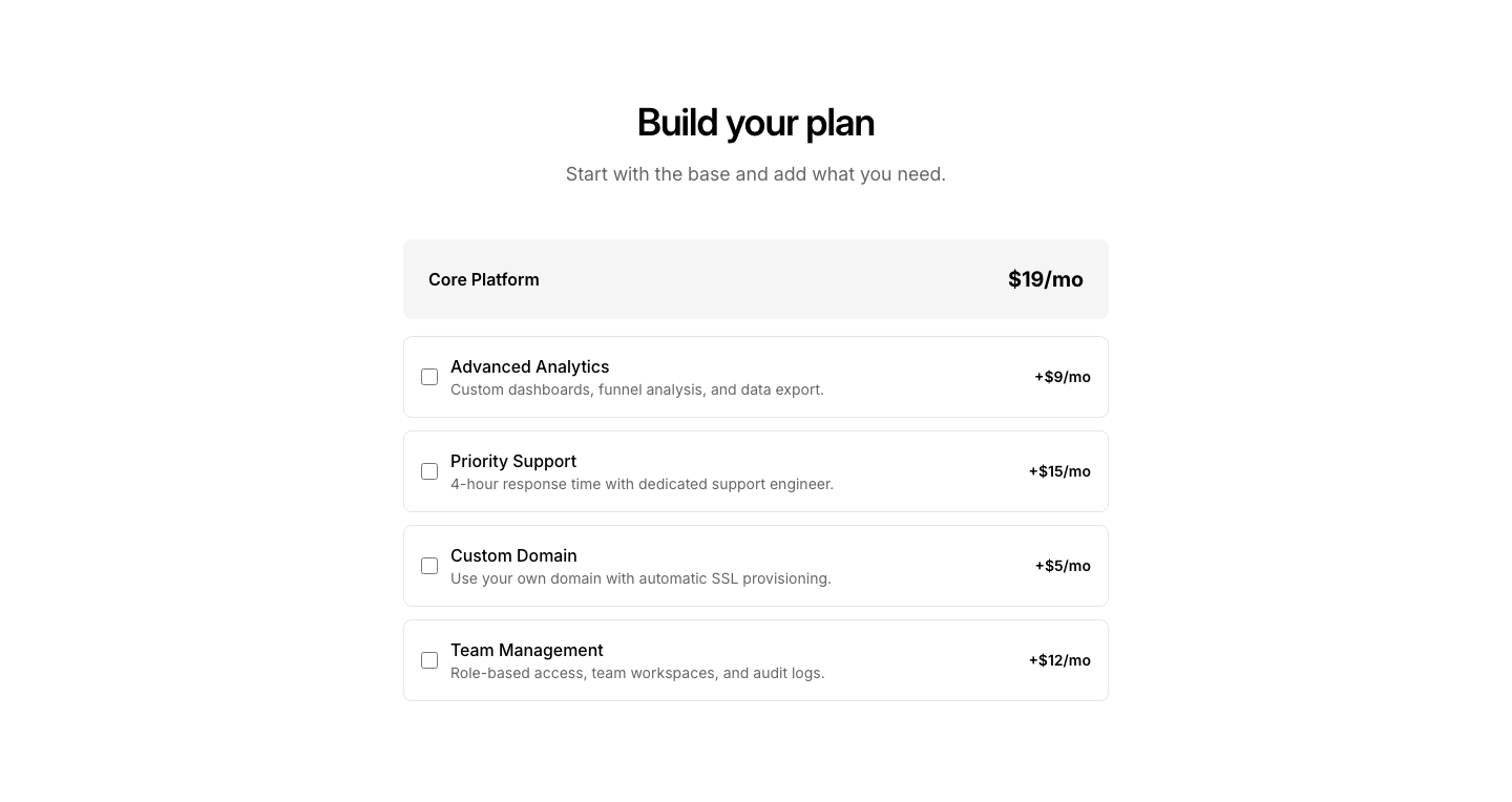
Addon
PricingBase plan with optional add-on checkboxes that adjust total.
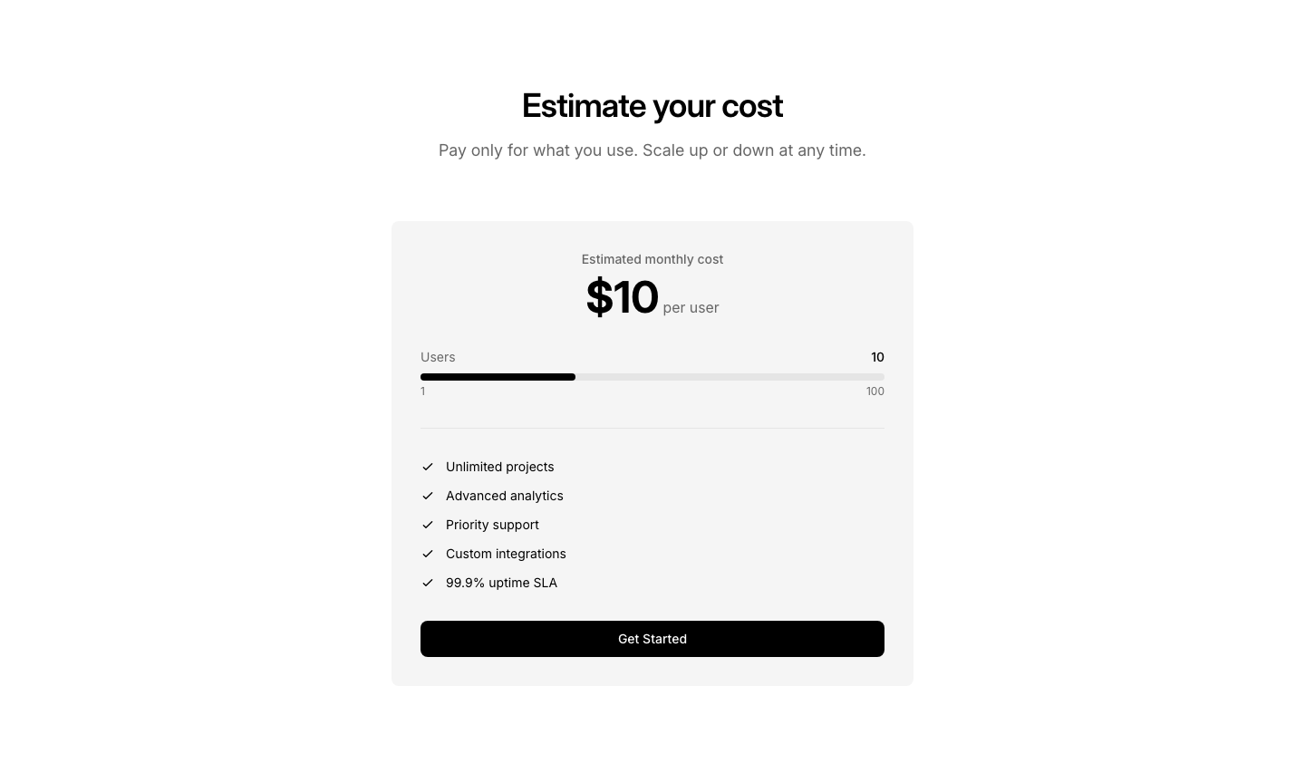
Calculator
PricingInteractive pricing calculator with per-unit pricing display.
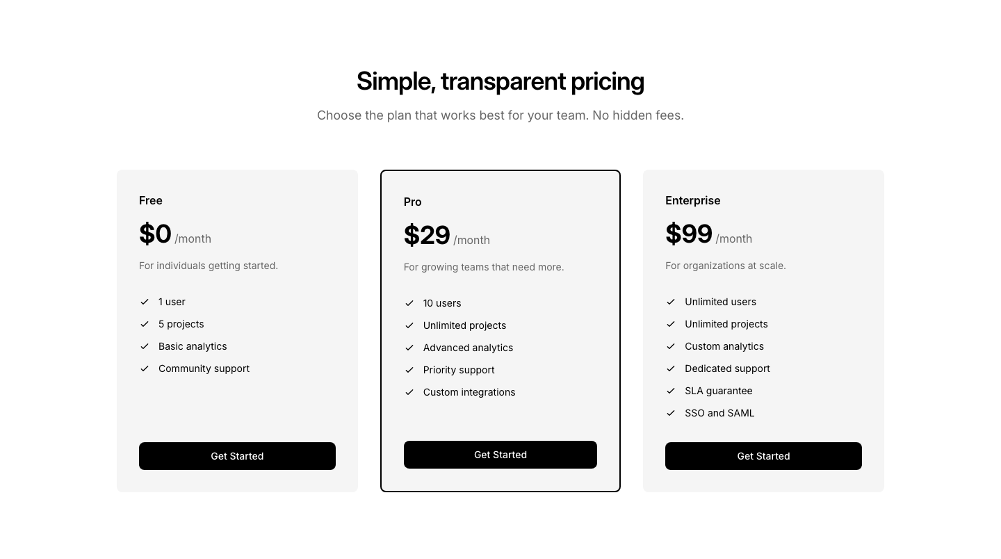
Cards
PricingGrid of pricing plan cards with features and highlighted option.
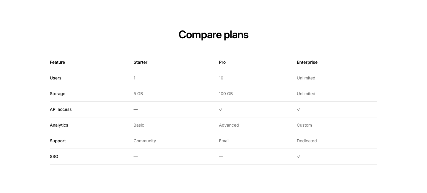
Comparison
PricingFeature comparison table across multiple pricing tiers.
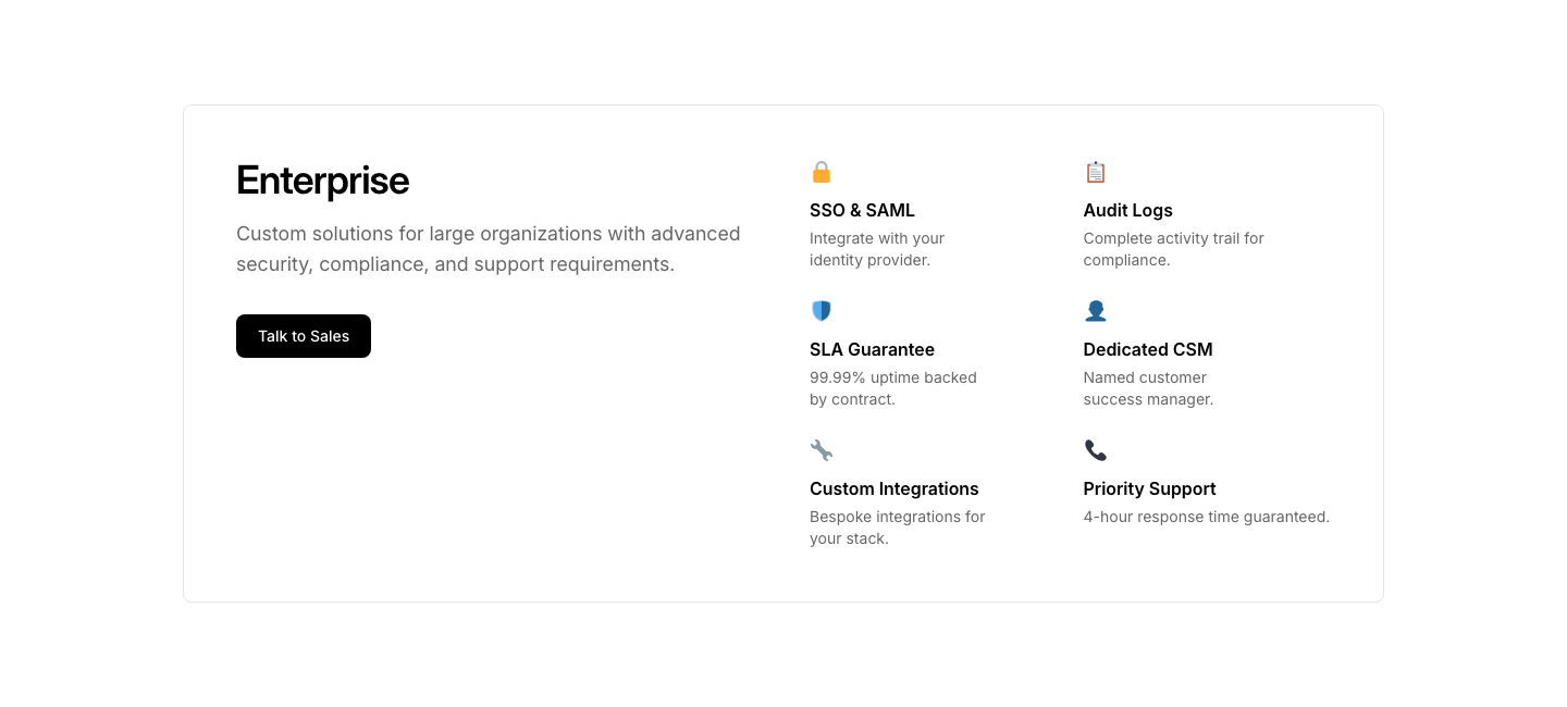
Enterprise
PricingSingle enterprise plan with custom pricing CTA and feature grid.
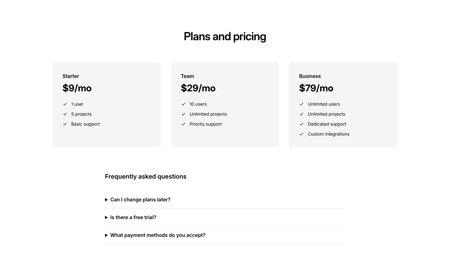
FAQ
PricingPricing plan cards with frequently asked questions section below.
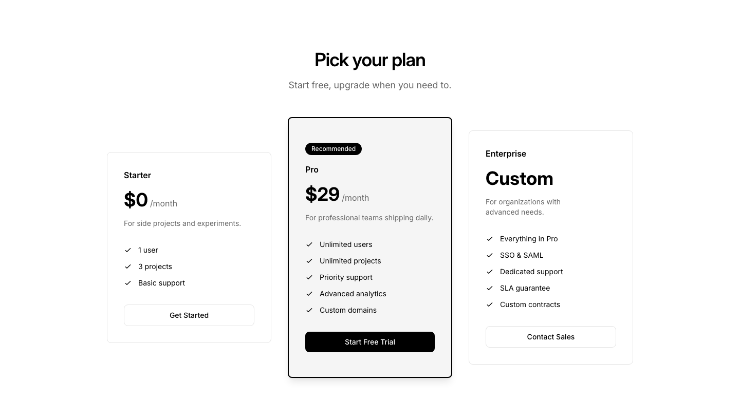
Featured
PricingThree tiers with middle plan highlighted as recommended.
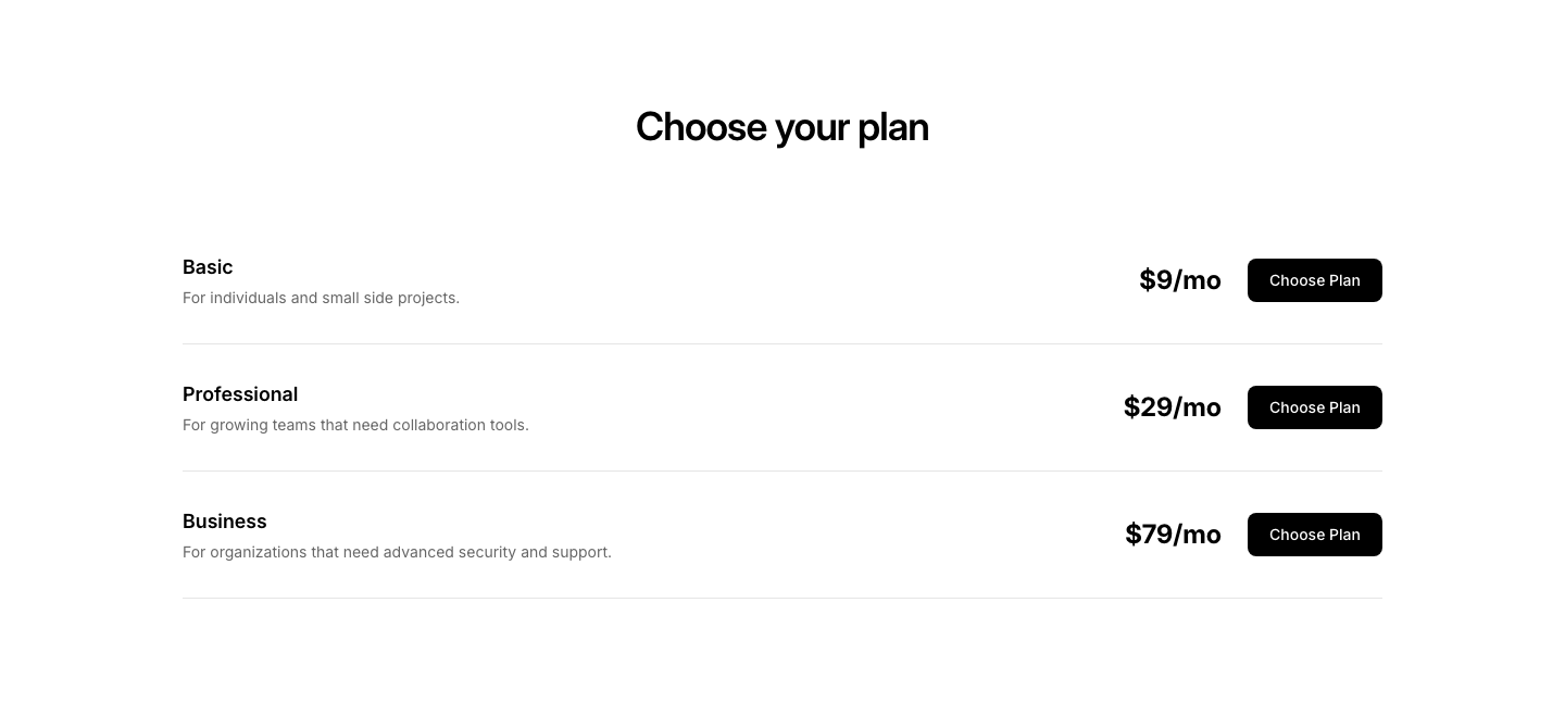
Horizontal
PricingStacked horizontal pricing rows with plan details and buttons.
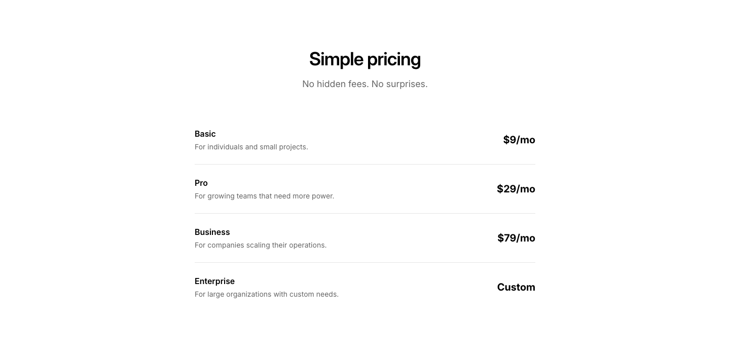
Minimal
PricingText-only pricing list, no cards, just plan name and price.
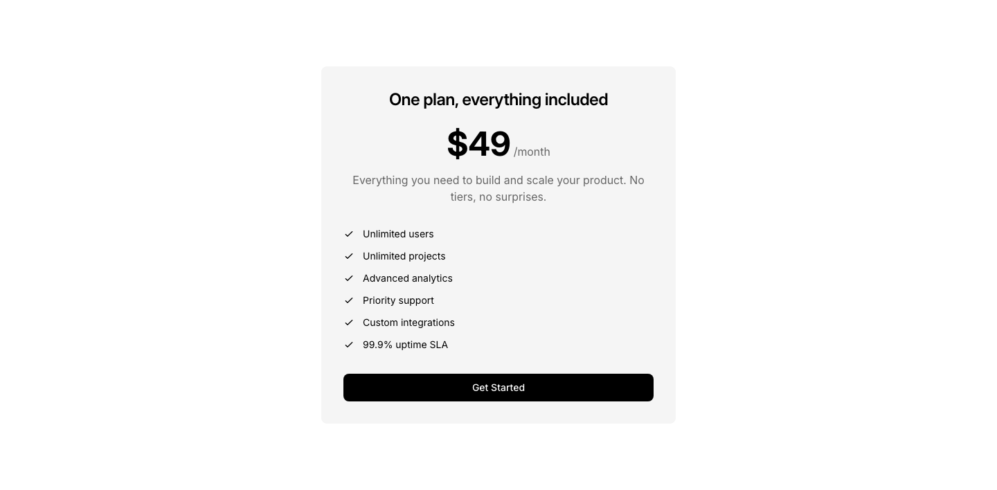
Simple
PricingSingle centered pricing card with features checklist.
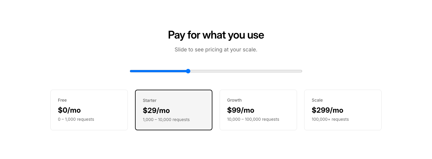
Slider
PricingPrice slider that adjusts tier based on usage volume.
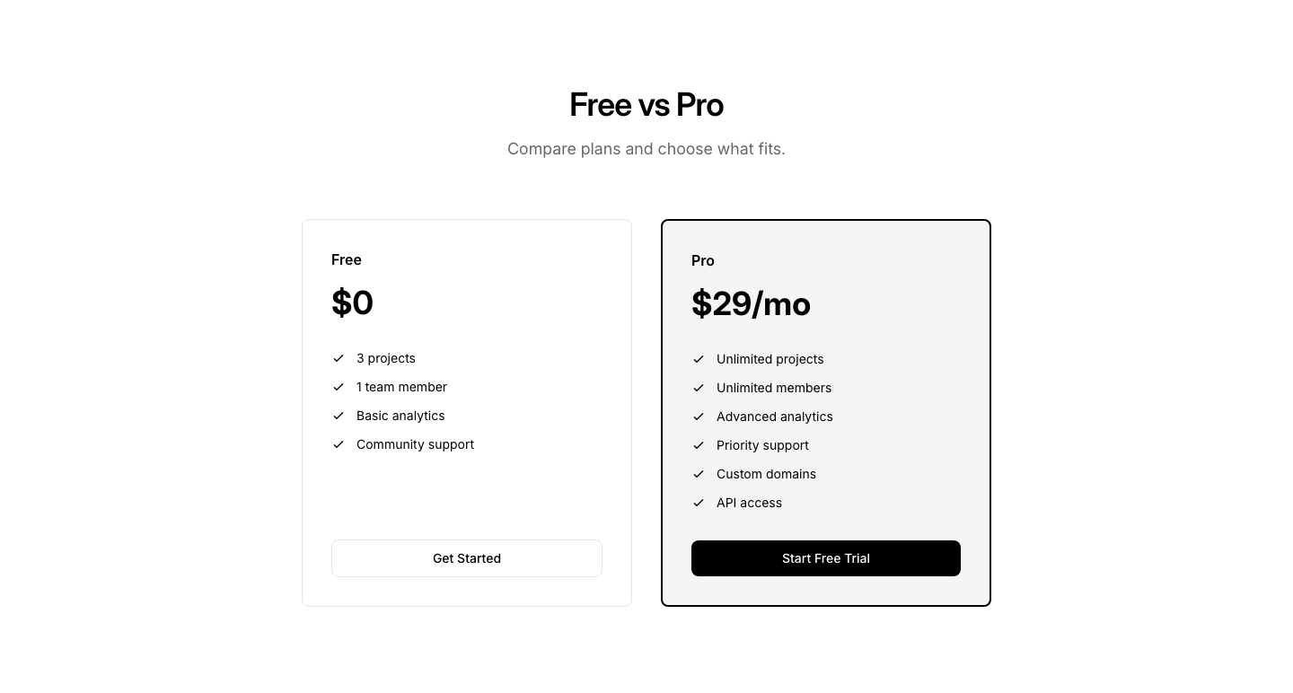
Split
PricingTwo plans side by side: free vs paid with feature comparison.
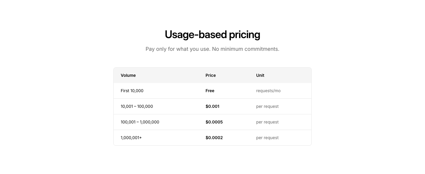
Usage
PricingPay-as-you-go table with usage tiers and per-unit pricing.
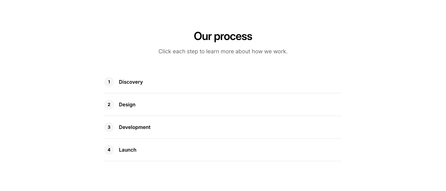
Accordion
ProcessEach step expands to show details when clicked.
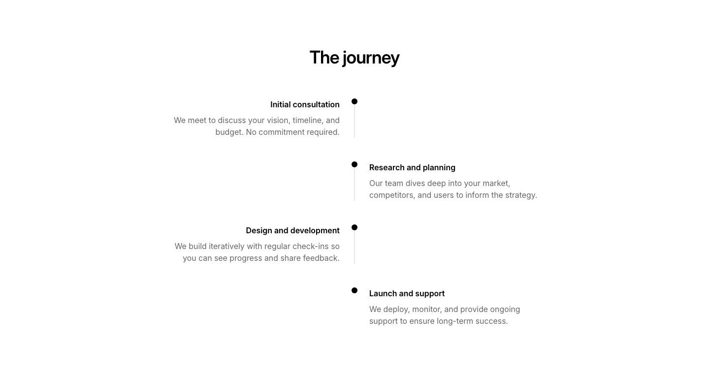
Alternating
ProcessSteps alternating left and right with a center timeline.
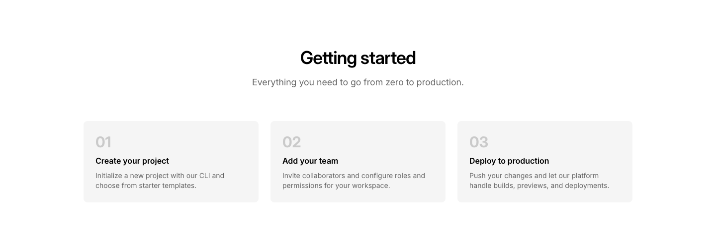
Cards
ProcessProcess steps displayed as numbered cards.
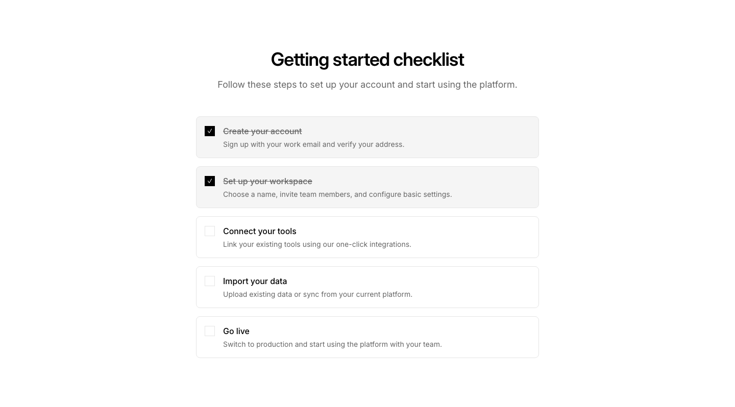
Checklist
ProcessProcess as a checklist with checkable items.
Circle
ProcessCircular process diagram with steps around the perimeter.
Flow
ProcessFlowchart-style diagram with decision points and arrows.

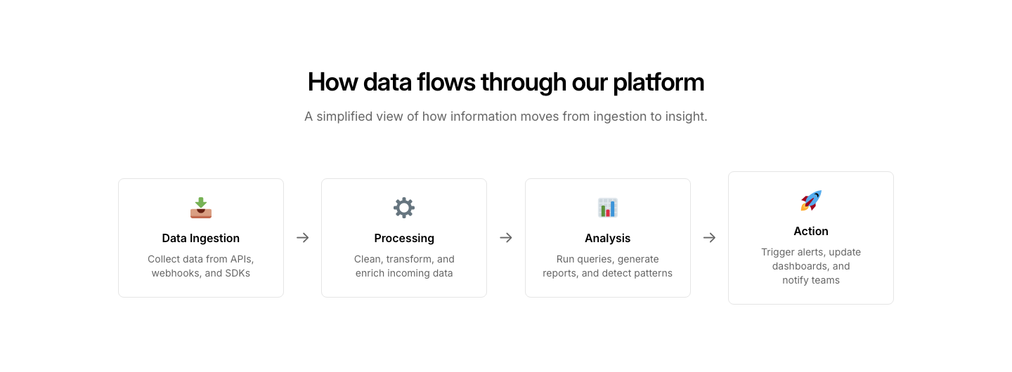
Icon
ProcessProcess flow with emoji icons and arrows between steps.
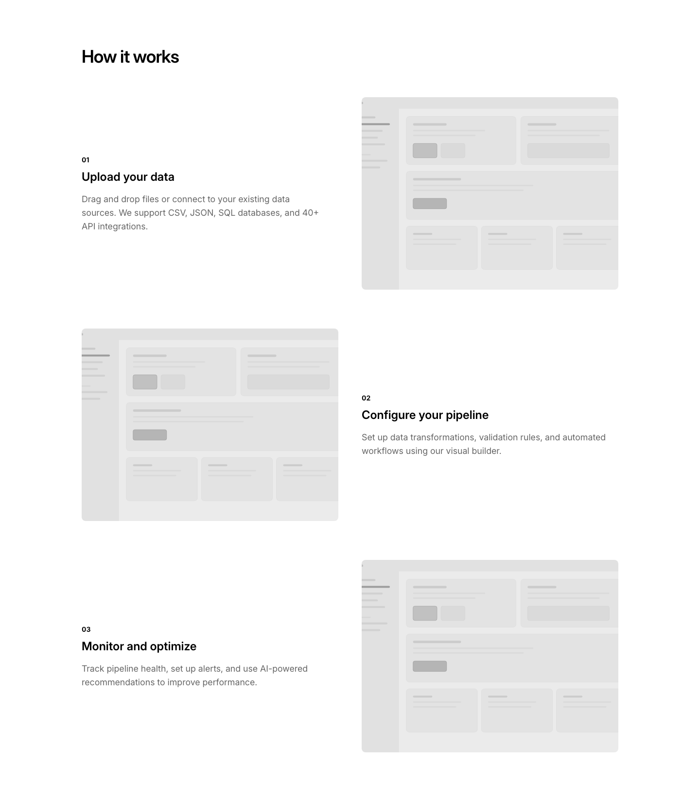
Image
ProcessSteps with accompanying images that change per step.
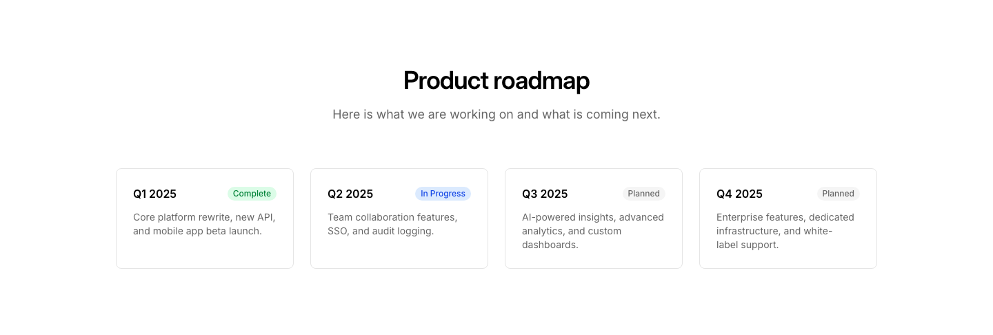
Roadmap
ProcessVisual roadmap with phases and milestones along a path.
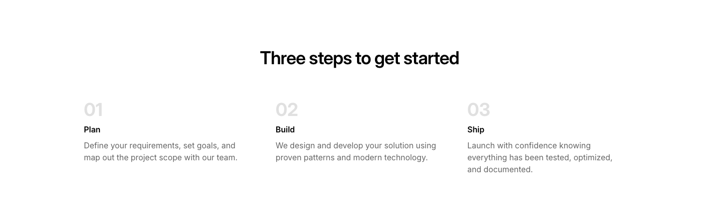
Simple
ProcessSimple numbered process steps in a 3-column grid.
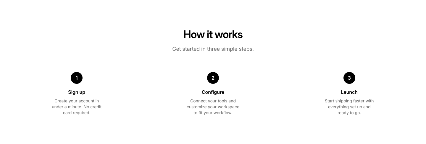
Steps
ProcessHorizontal step-by-step process with numbered circles and connector lines.
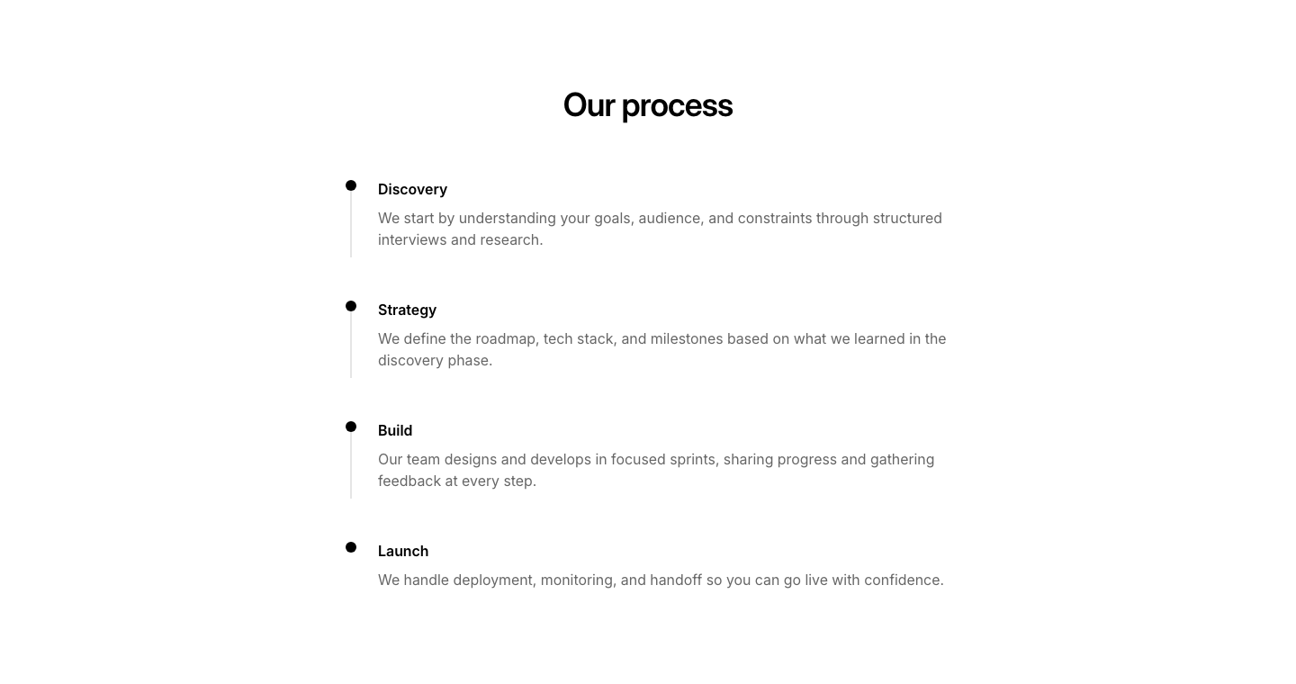
Vertical
ProcessVertical timeline with dots and connecting line.
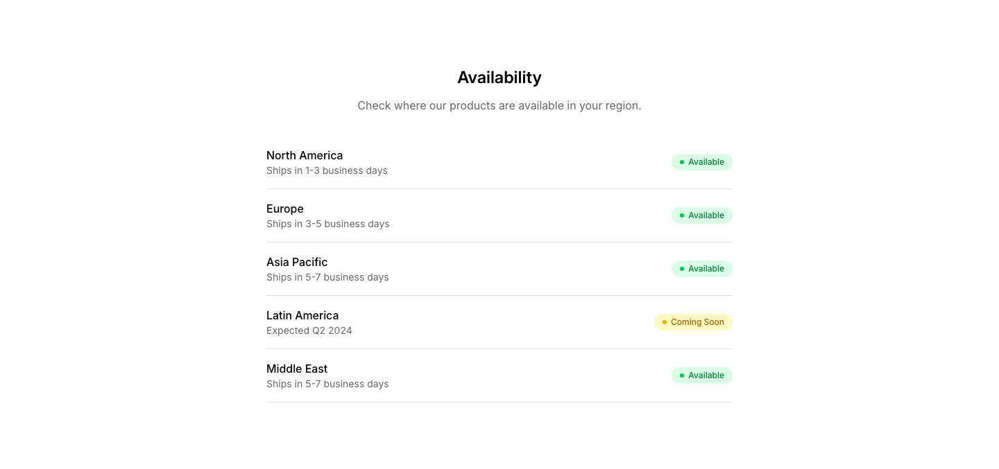
Availability
ProductProduct availability checker by region/store.
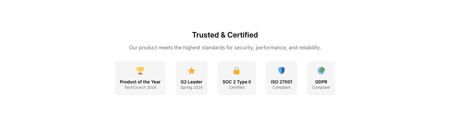
Badge
ProductProduct with award badges and certification marks.
Bundle
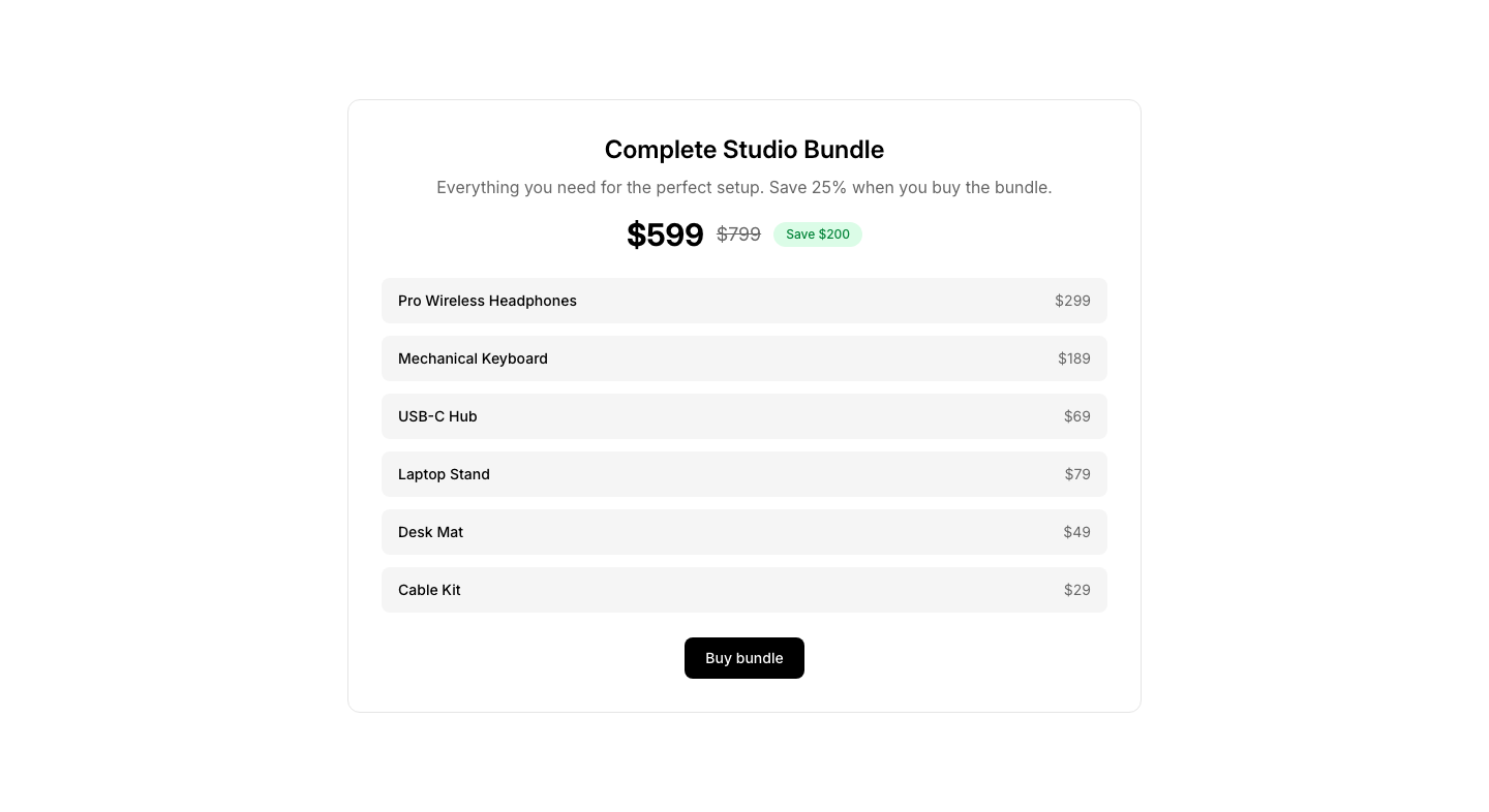
ProductProduct bundle with included items and savings.
Card
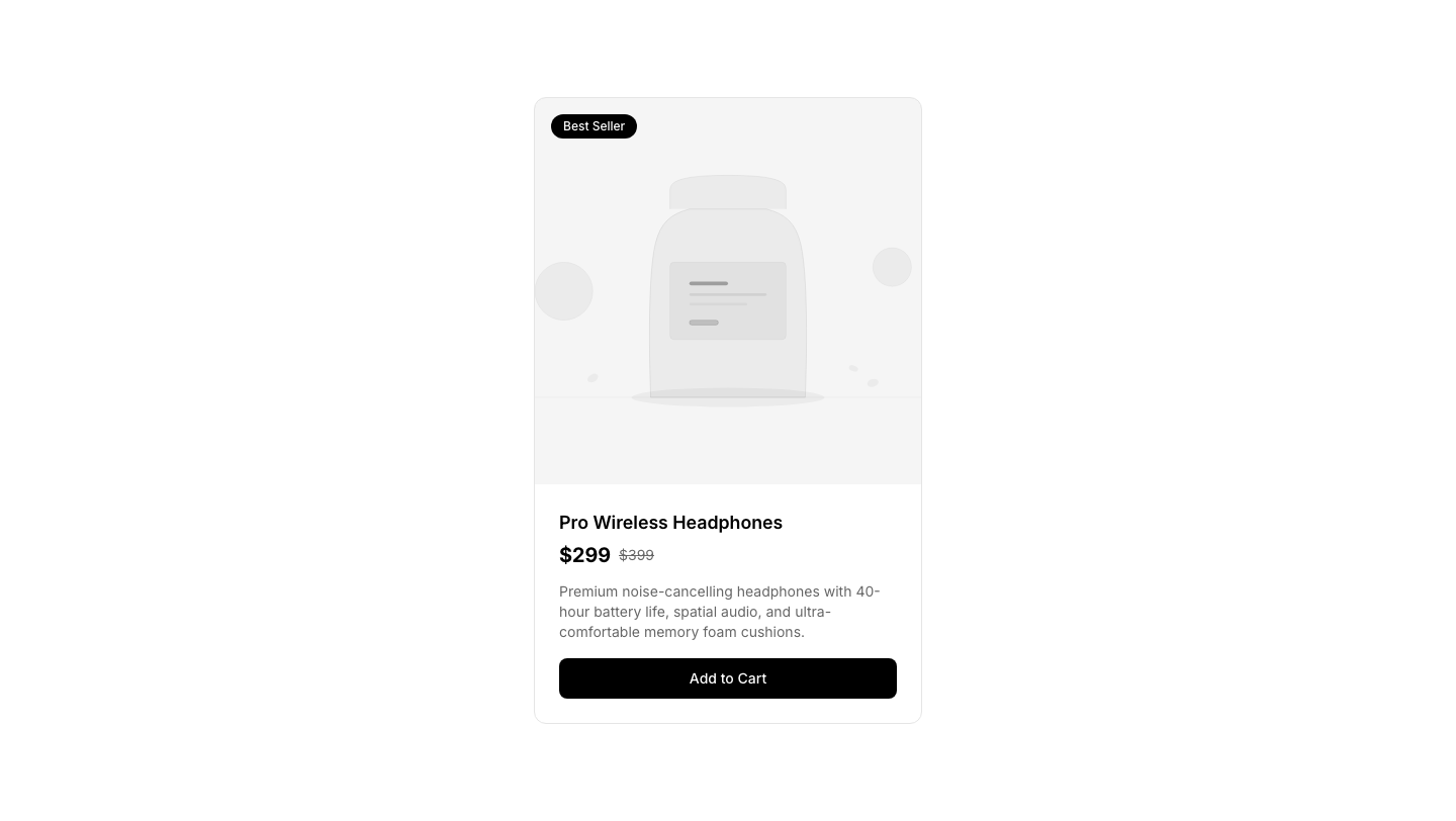
ProductSingle product card with image, price, and add-to-cart.
Carousel
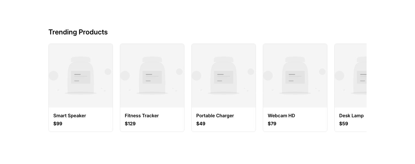
ProductHorizontally scrollable product cards.
Featured
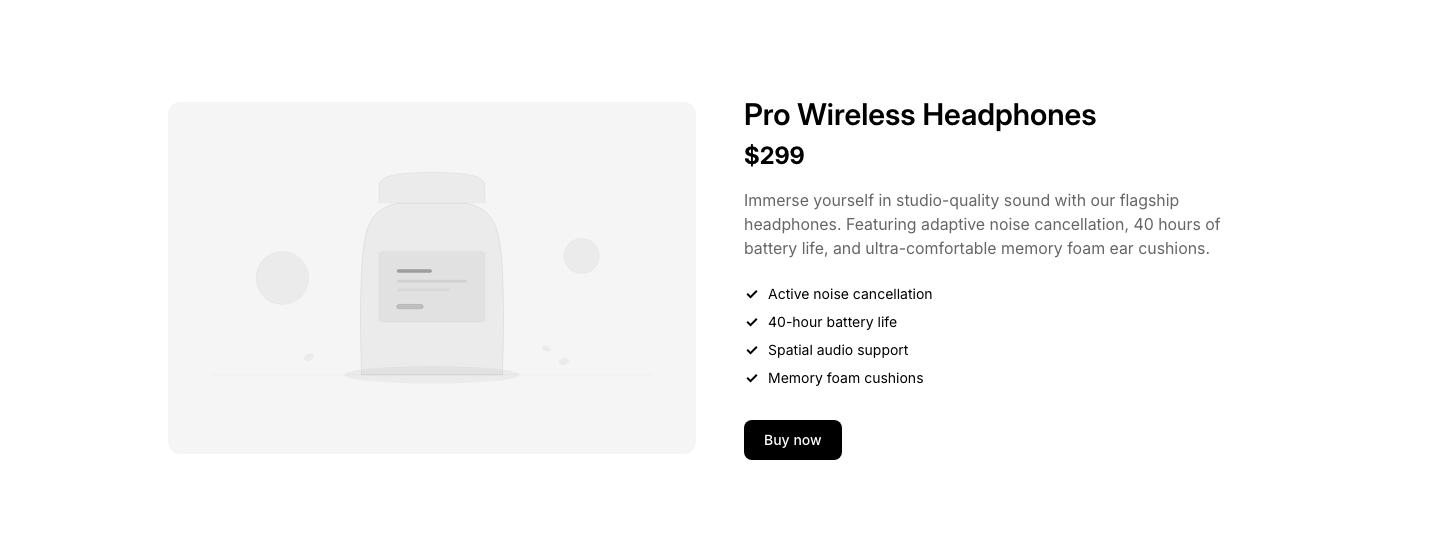
ProductFeatured product with large image and detailed description.
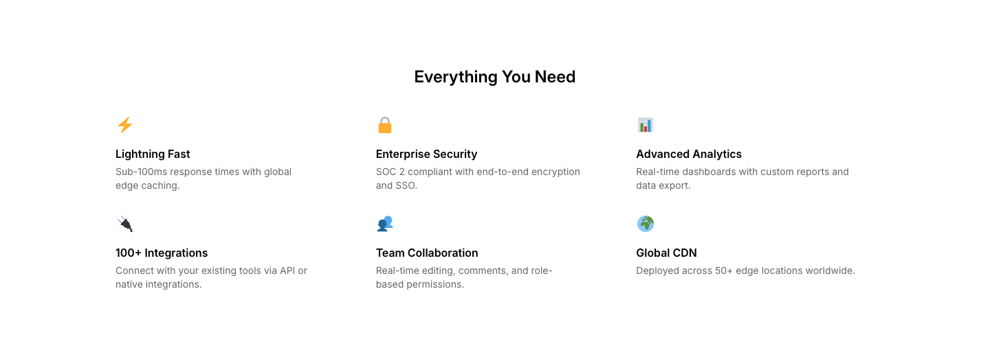
Features
ProductProduct feature grid with specs and descriptions.
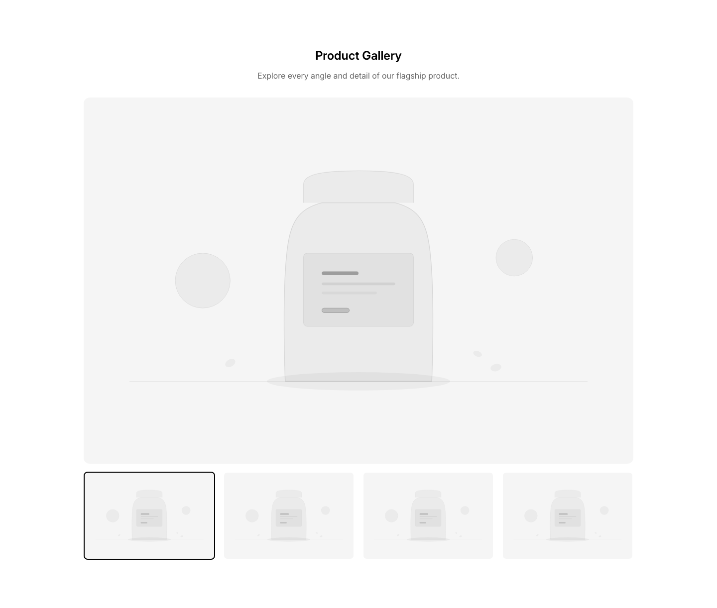
Gallery
ProductProduct image gallery with thumbnail navigation.
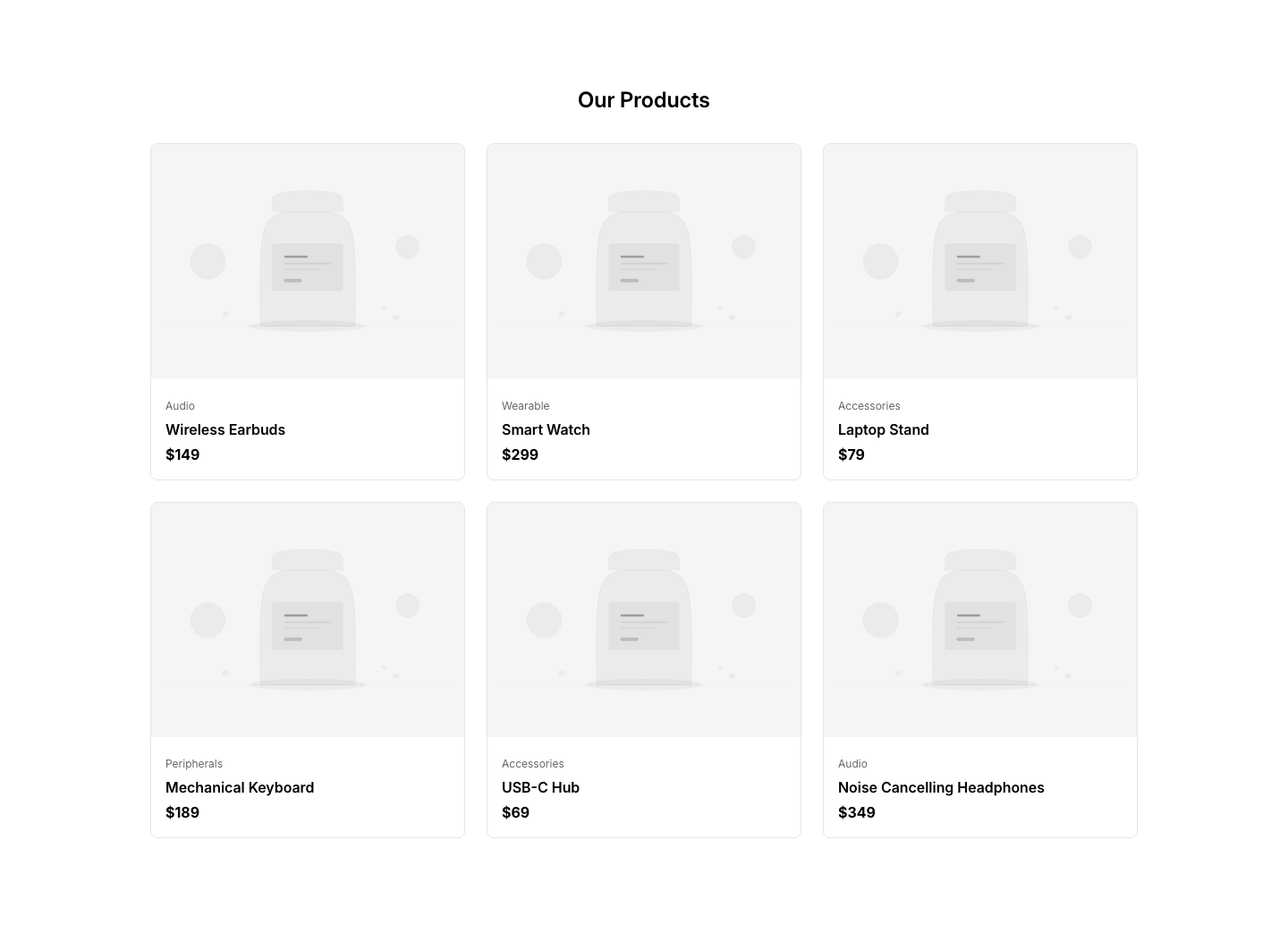
Grid
ProductGrid of product cards with images and prices.
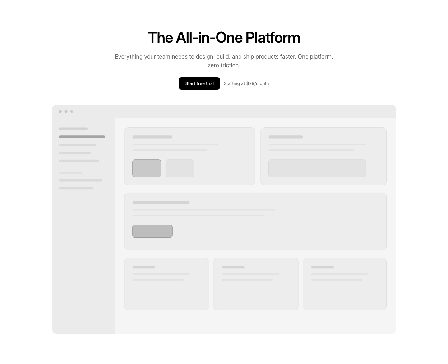
Hero
ProductProduct showcase hero with large image and key details.
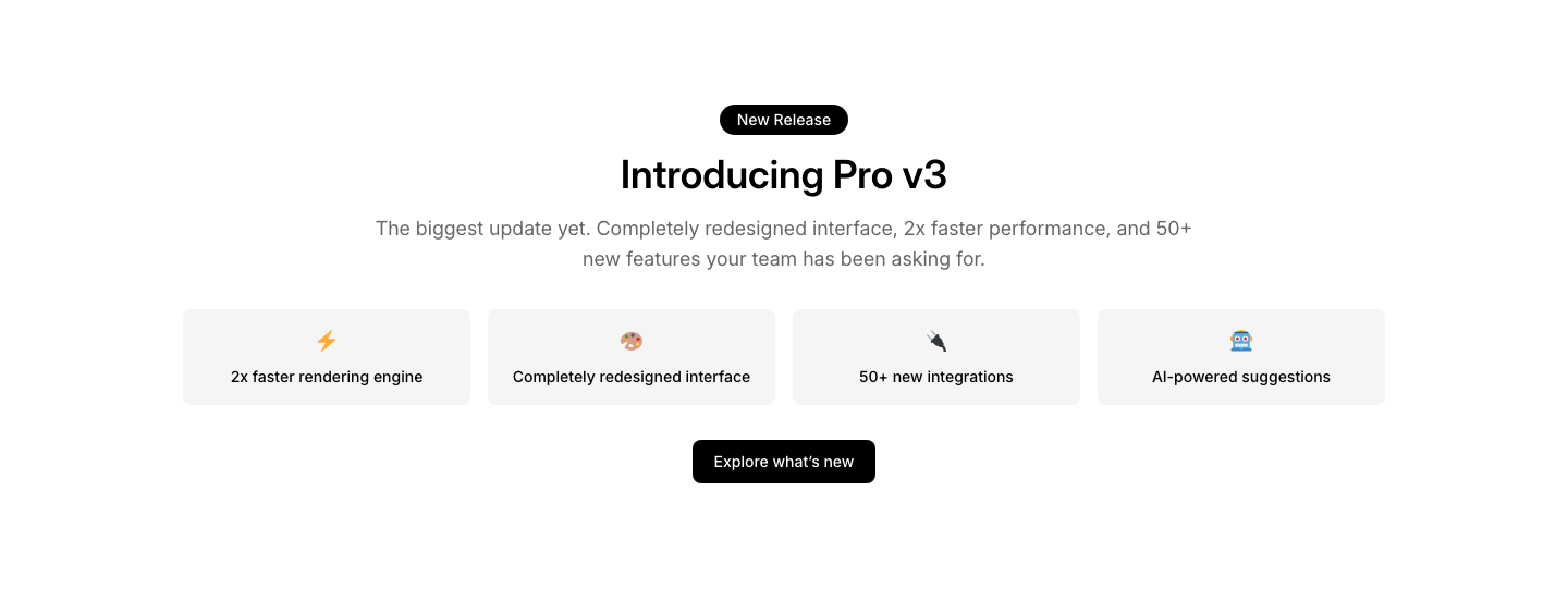
Launch
ProductProduct launch announcement with feature highlights.
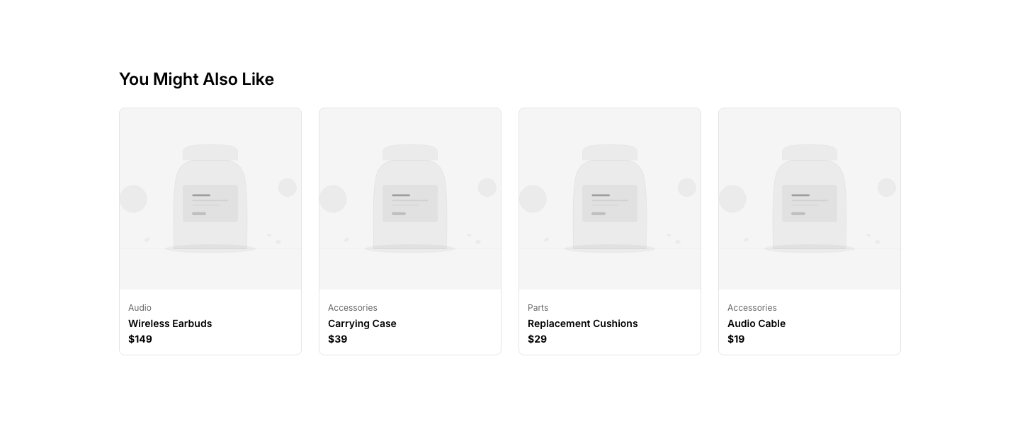
Related
ProductRelated products suggestion row.
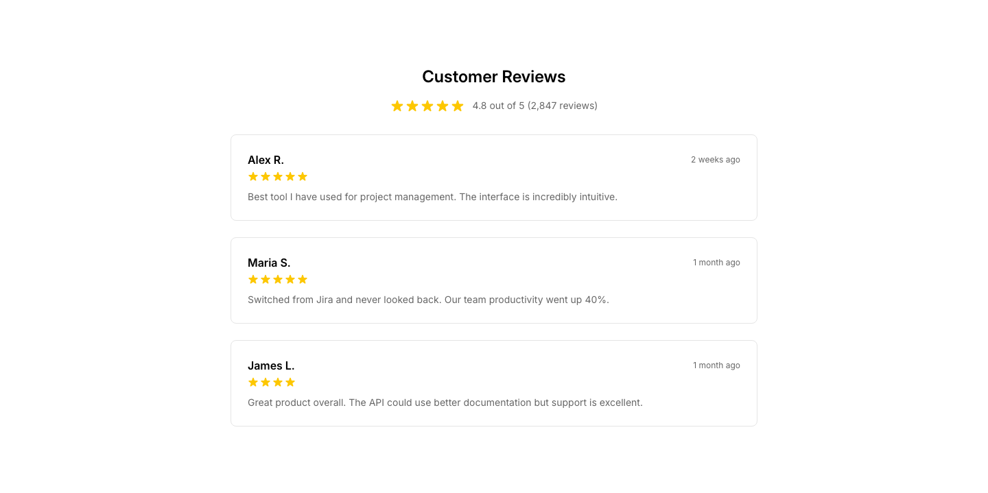
Reviews
ProductCustomer reviews section with ratings and comments.
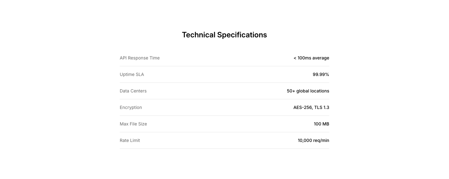
Specs
ProductTechnical specifications table for a product.
Video
ProductProduct demo video with description.
Activity
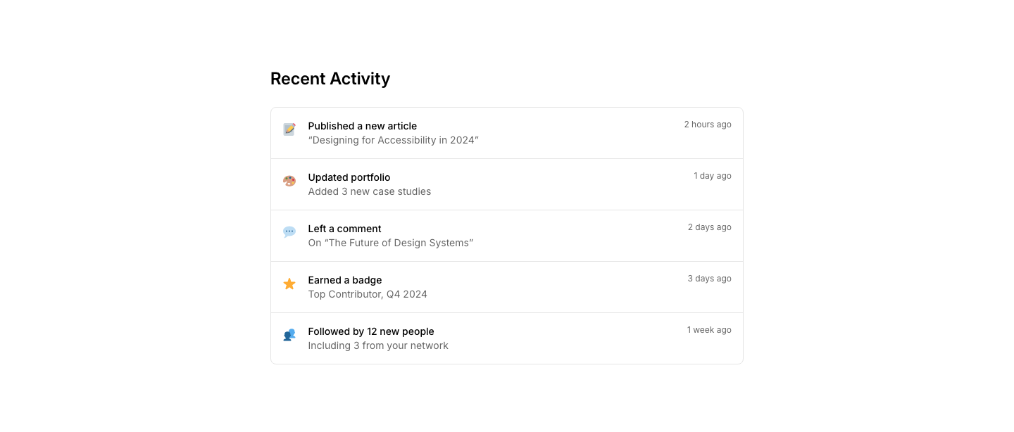
ProfileUser activity feed with recent actions.
Badge
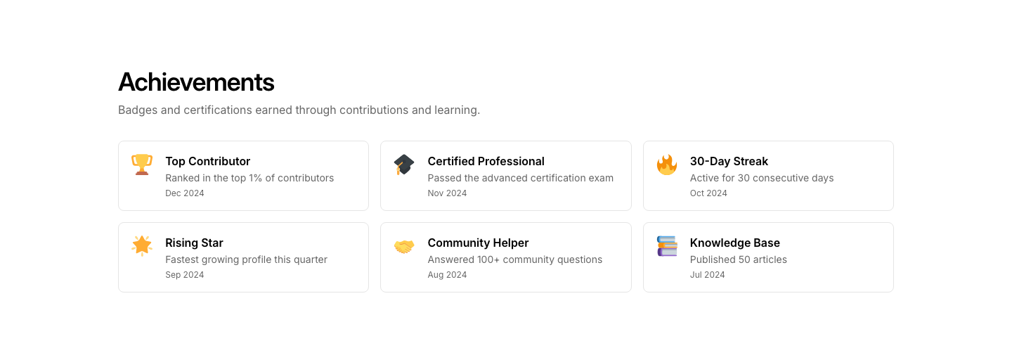
ProfileProfile with achievement badges and certifications.

Card
ProfileCompact profile card with avatar, name, role, and links.
Detail
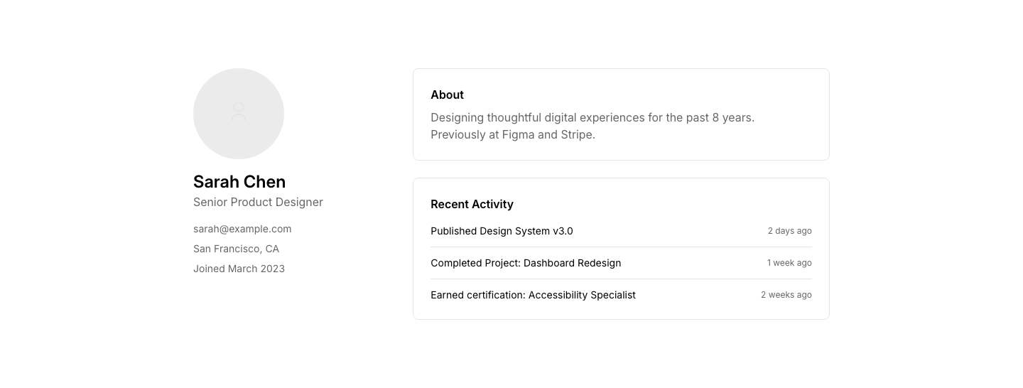
ProfileFull profile page with all details and activity.
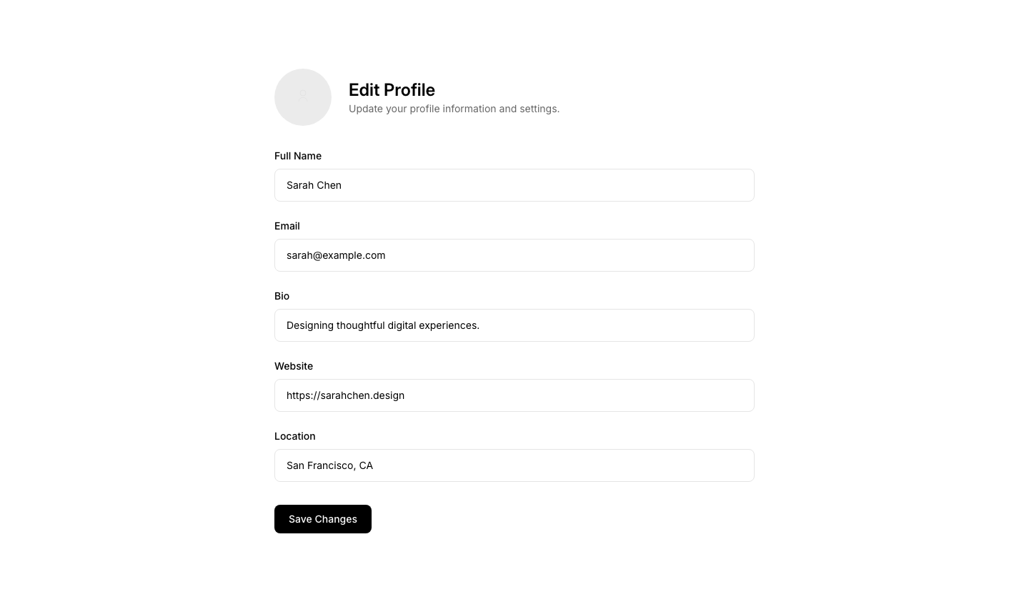
Edit
ProfileProfile editing form with field groups.
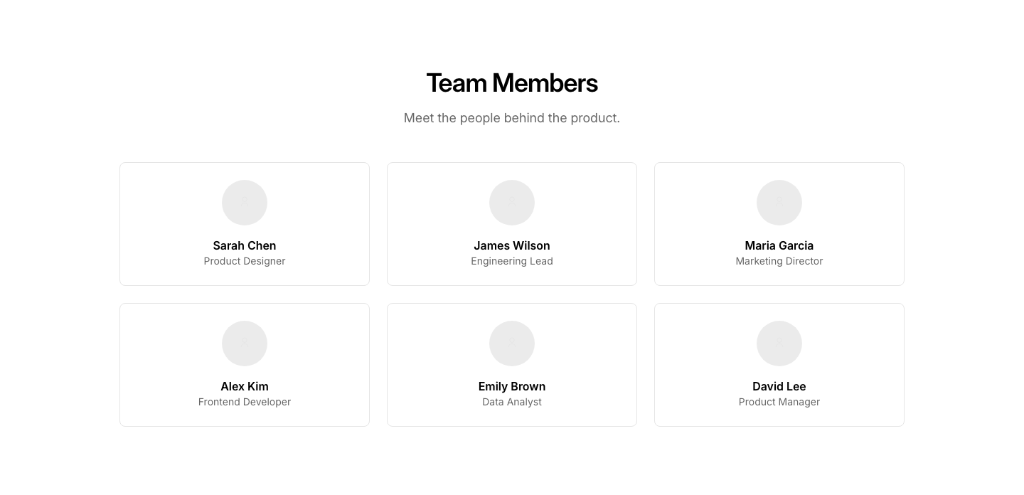
Grid
ProfileGrid of user profile cards (member directory).
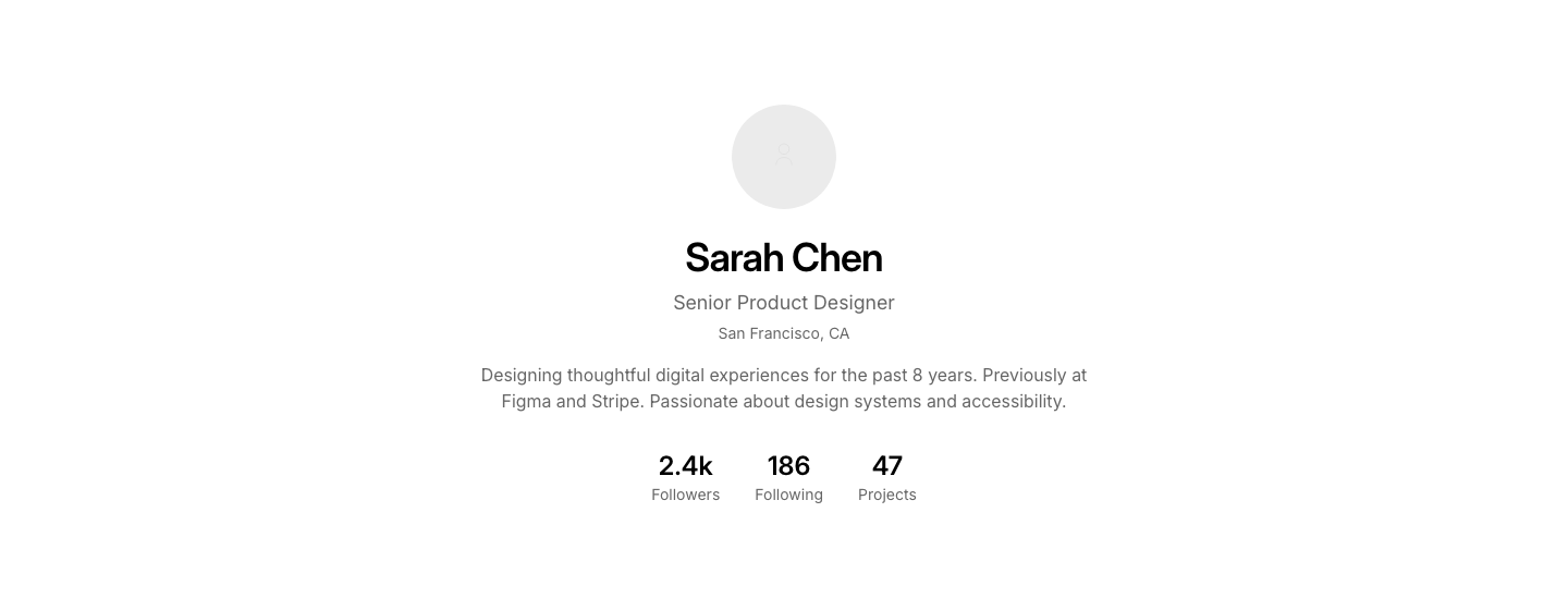
Hero
ProfileUser profile hero with avatar, name, bio, and stats.

Minimal
ProfileMinimal profile: just name, role, and avatar.
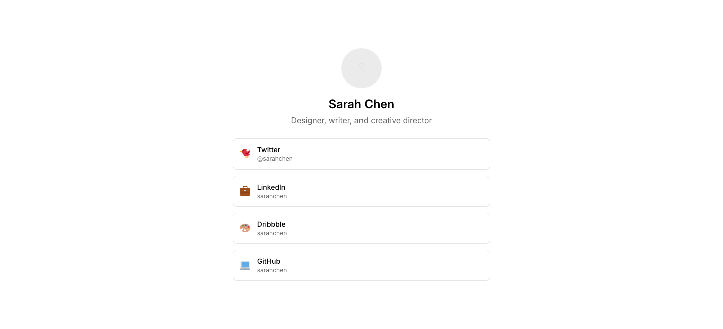
Social
ProfileProfile with social links and portfolio.

Stats
ProfileProfile statistics (followers, posts, projects).
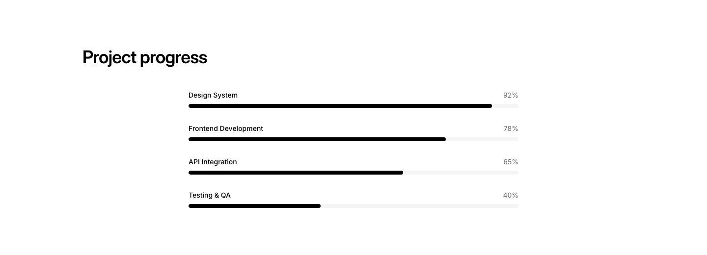
Bar
ProgressHorizontal progress bars with labels and percentages.
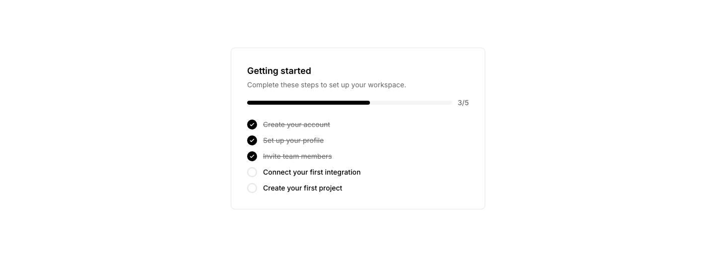
Checklist
ProgressOnboarding checklist with progress bar and task completion state.
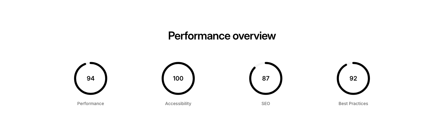
Circular
ProgressCircular progress rings with percentage labels.
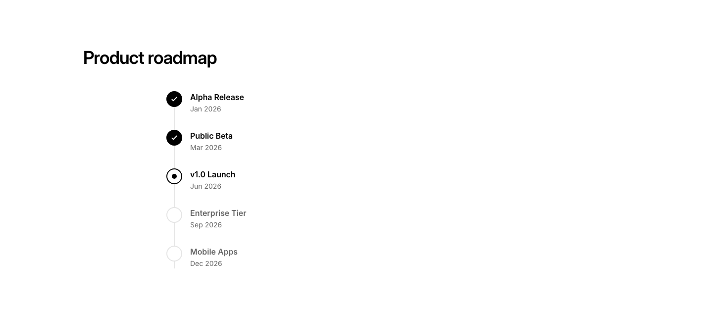
Milestone
ProgressMilestone tracker with completed and upcoming checkpoints.

Steps
ProgressHorizontal step progress indicator with numbered steps.
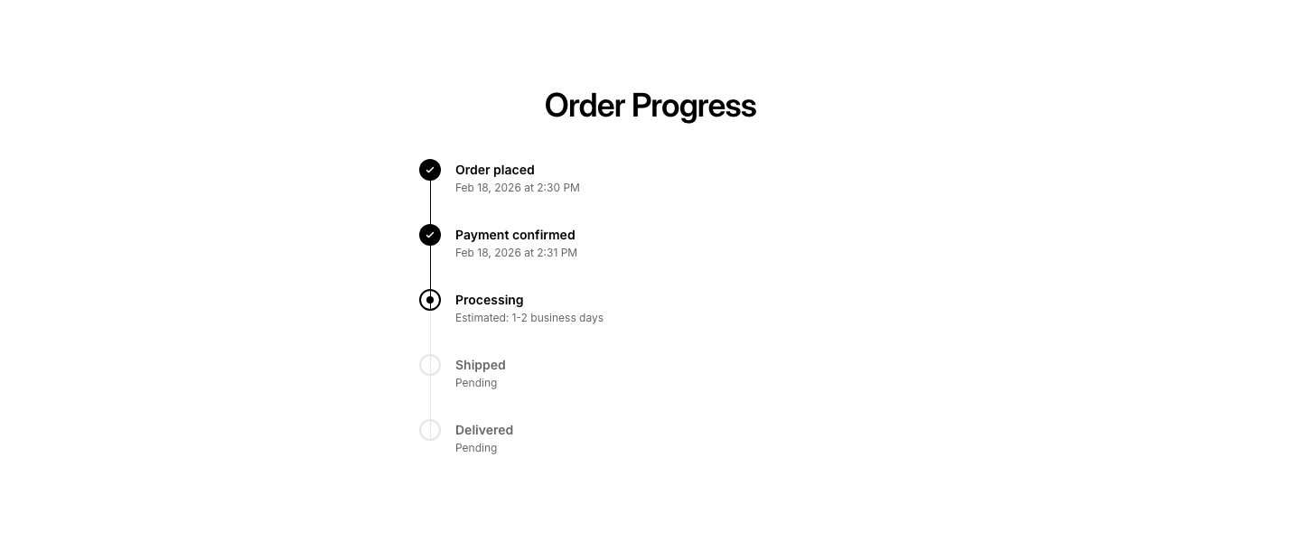
Timeline
ProgressVertical progress timeline with completed, current, and upcoming steps.
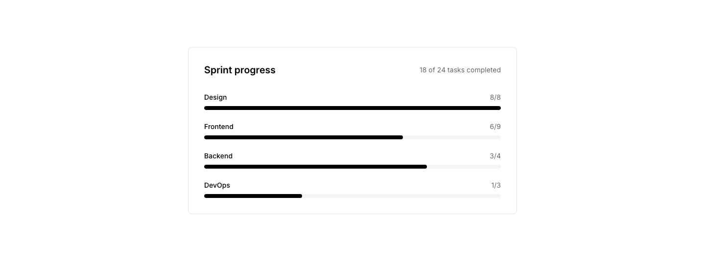
Tracker
ProgressProject task tracker with categories and completion status.
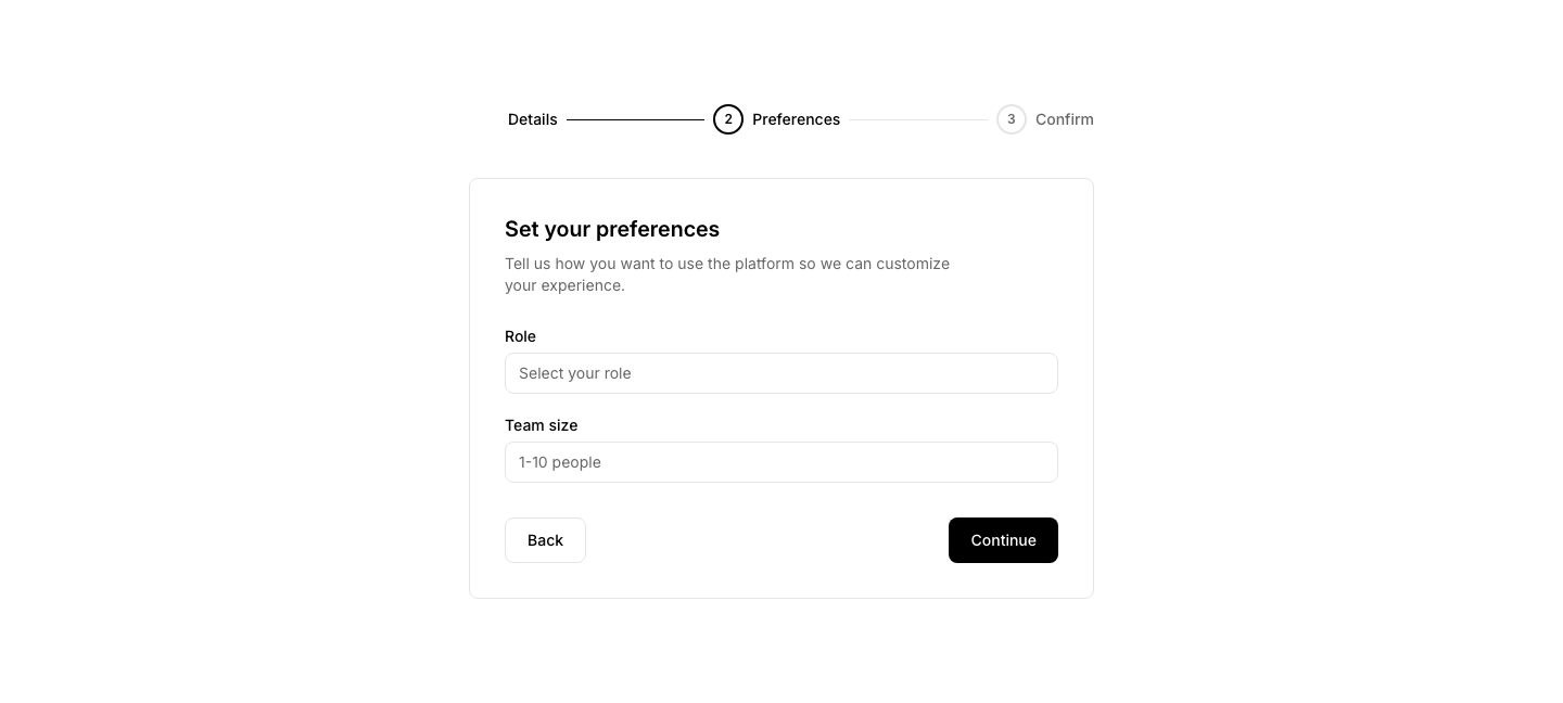
Wizard
ProgressMulti-step wizard with current step form and navigation.

Agent
PropertyAgent profile card with contact info and listings.
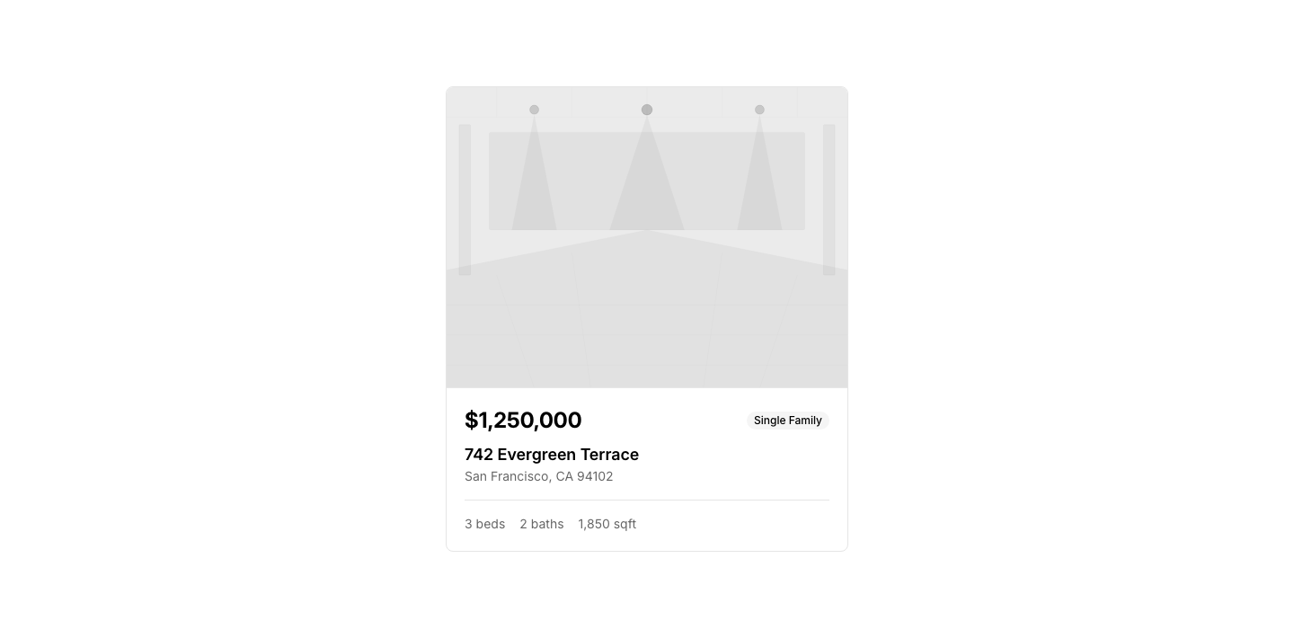
Card
PropertyProperty listing card with image, price, beds/baths.
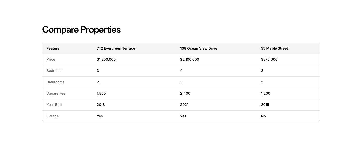
Comparison
PropertySide-by-side property comparison table.
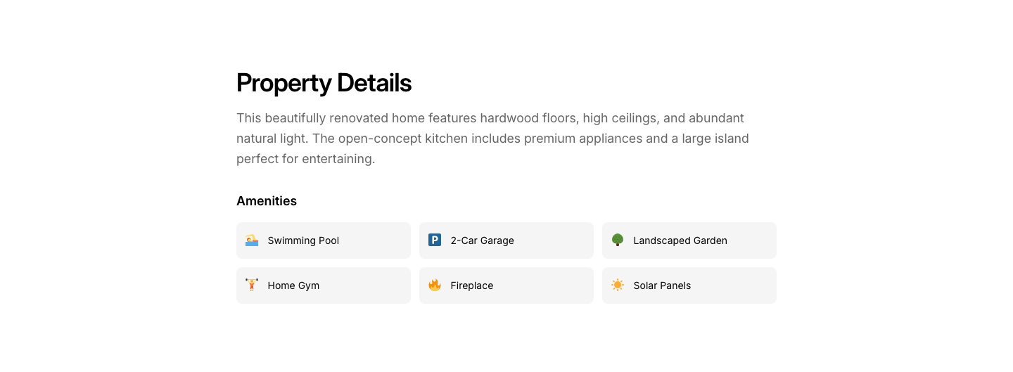
Details
PropertyFull property details: specs, description, amenities.
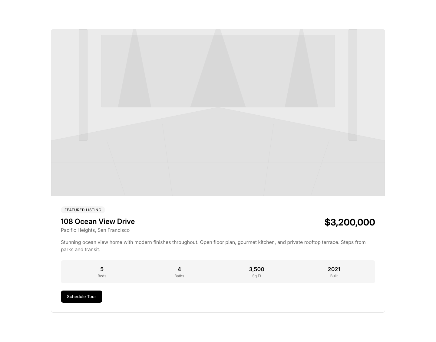
Featured
PropertySingle featured property with large gallery and details.
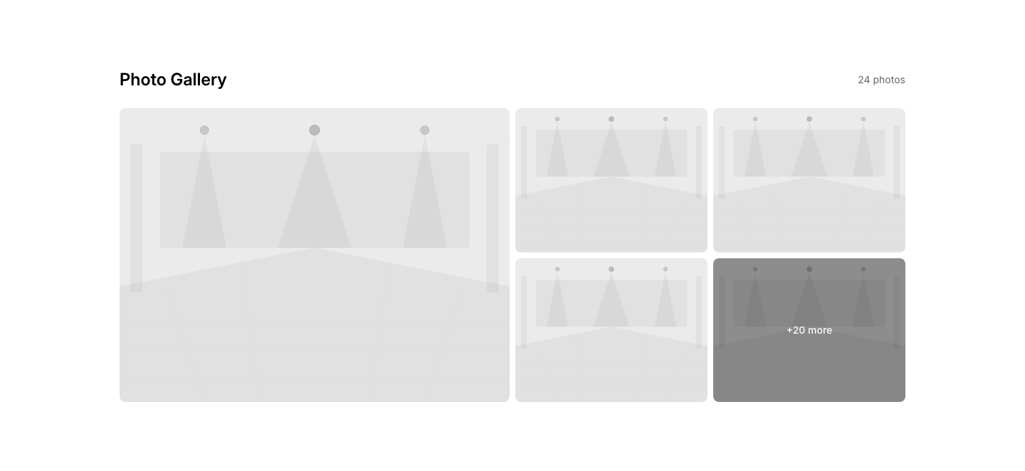
Gallery
PropertyProperty photo gallery with fullscreen viewer.
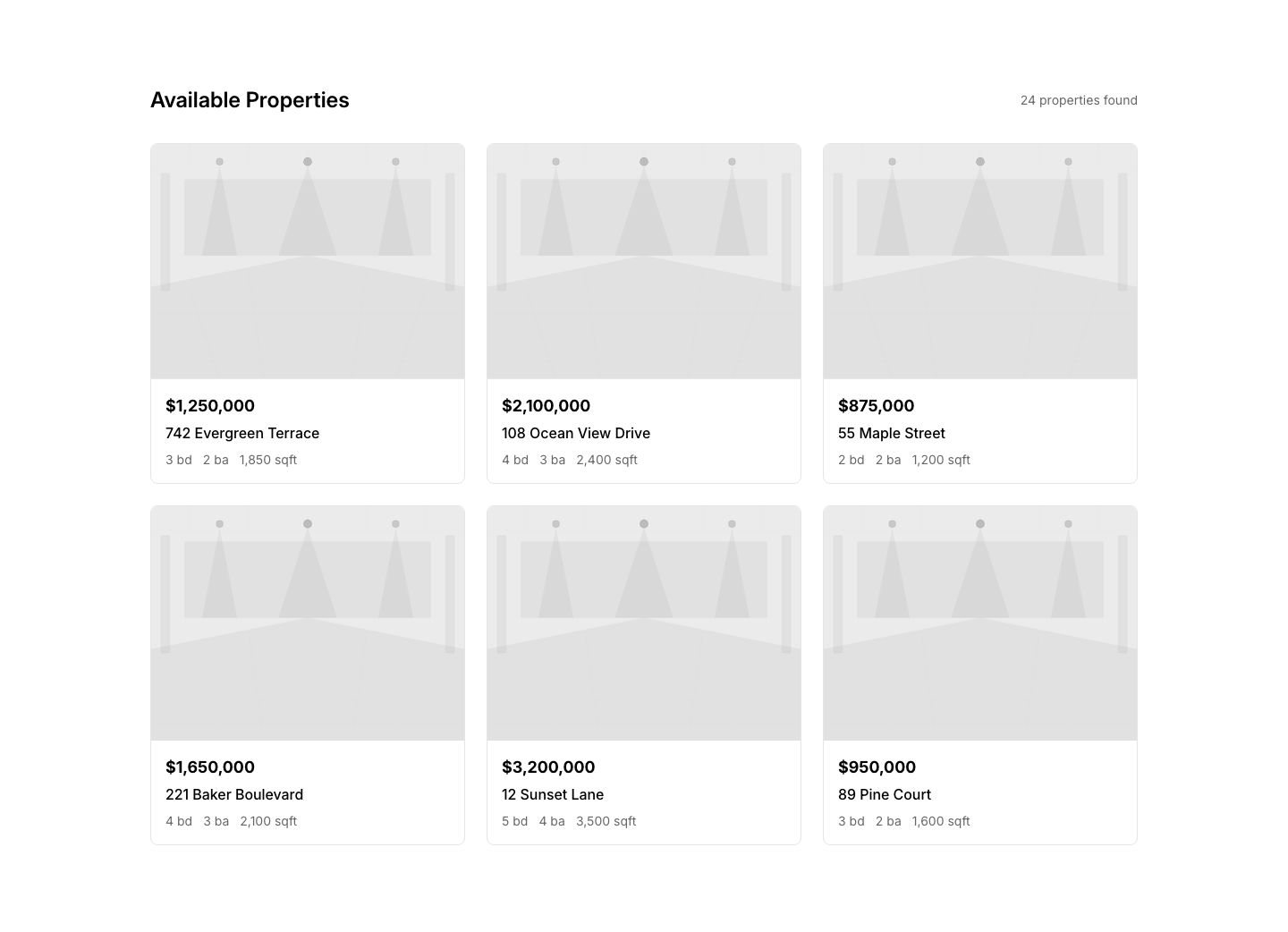
Grid
PropertyGrid of property listings with filters.
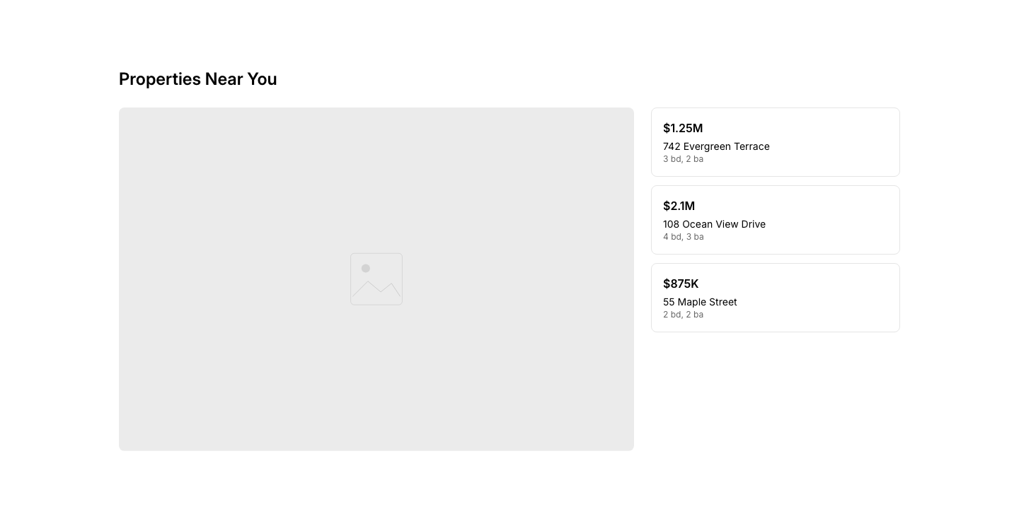
Map
PropertyProperty locations on a map with price pins.
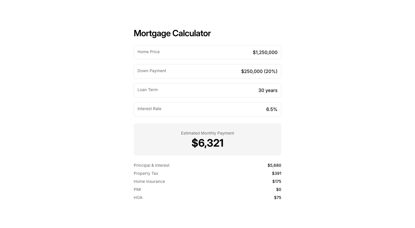
Mortgage
PropertyMortgage calculator with monthly payment estimate.
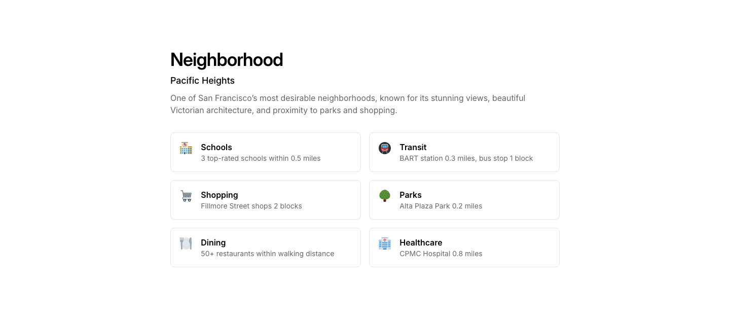
Neighborhood
PropertyNeighborhood info with schools, transit, and amenities.
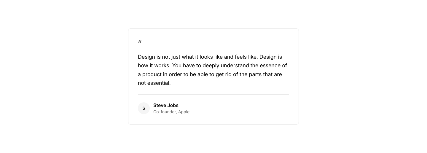
Card
QuoteQuote in a bordered card with attribution.

Centered
QuoteLarge centered quote with decorative quotation marks.
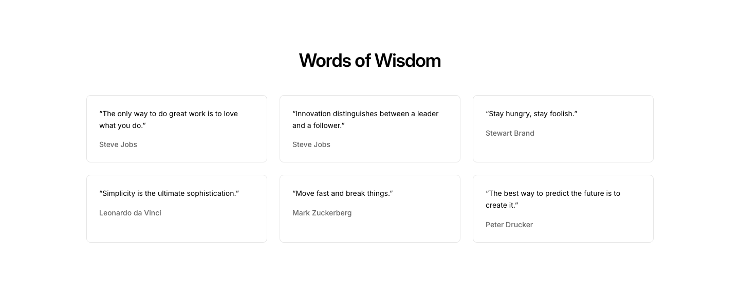
Collection
QuoteCollection of quotes in a grid or masonry layout.

Minimal
QuoteSimple italic quote with author name below.
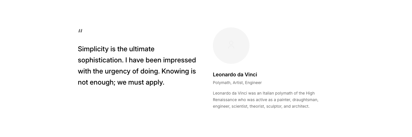
Split
QuoteQuote on left, author photo and bio on right.
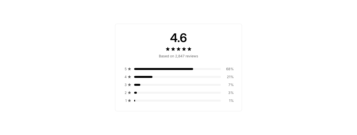
Breakdown
RatingRating breakdown with bar chart showing distribution by star count.

Compact
RatingCompact inline rating display with stars, score, and review count.
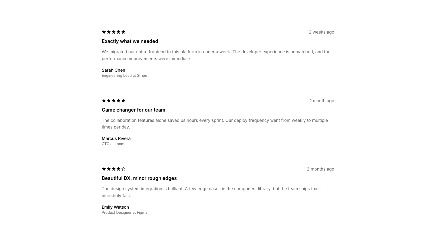
Detailed
RatingDetailed review card with stars, reviewer info, and review text.

Summary
RatingRating summary card with large score, stars, and key highlights.
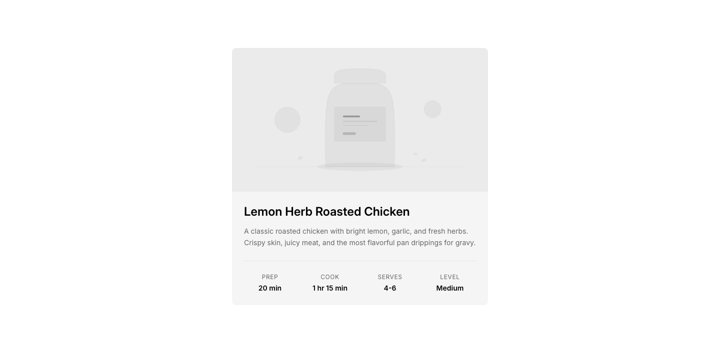
Card
RecipeRecipe card with photo, time, servings, and difficulty.
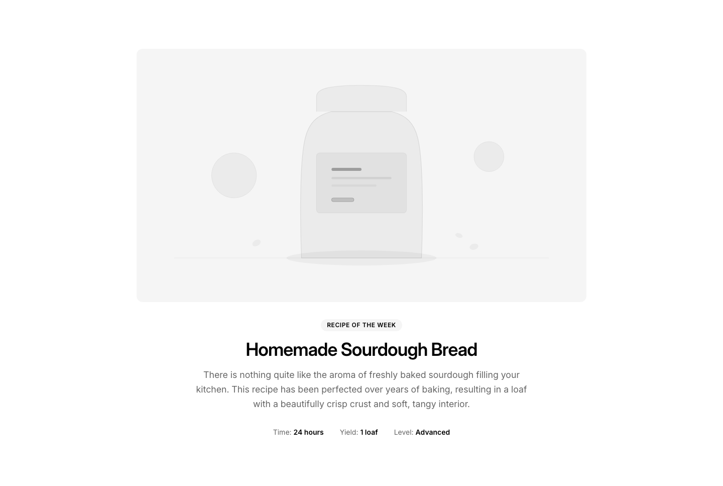
Featured
RecipeFeatured recipe with large hero image and intro.
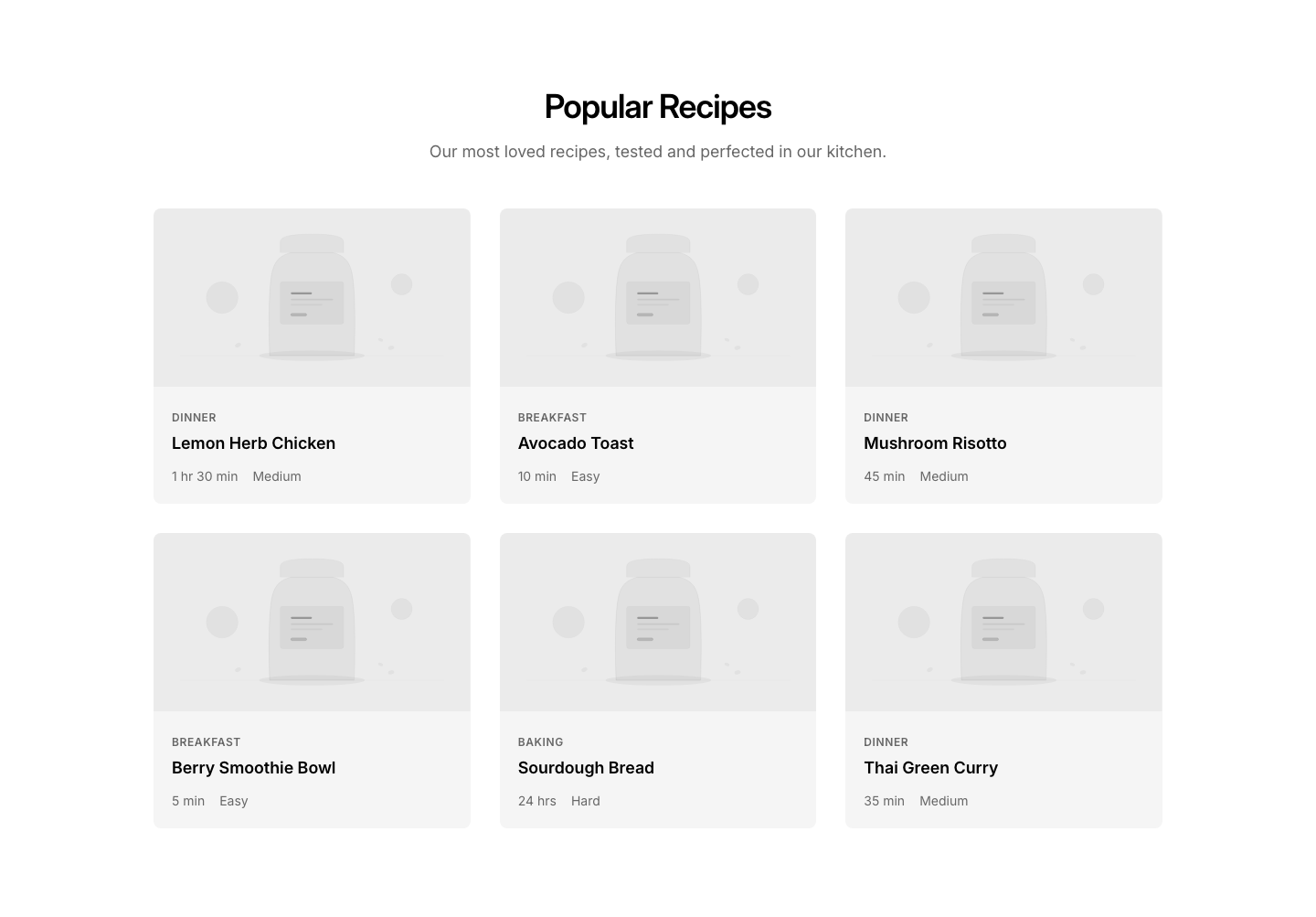
Grid
RecipeGrid of recipe cards for browsing.
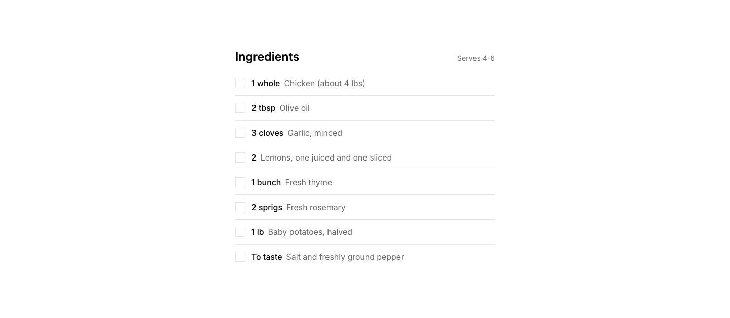
Ingredients
RecipeIngredient list with quantities and checkboxes.
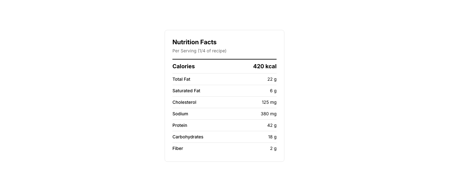
Nutrition
RecipeNutrition facts table per serving.
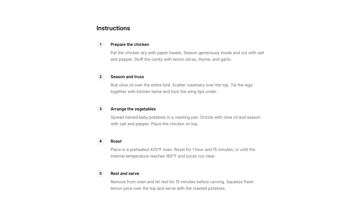
Steps
RecipeStep-by-step cooking instructions with photos.
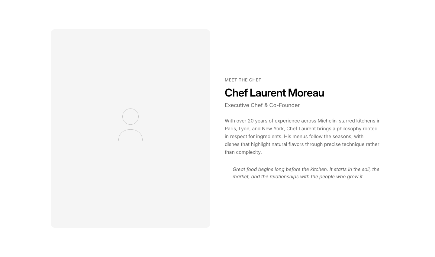
Chef
RestaurantChef profile with photo and bio.
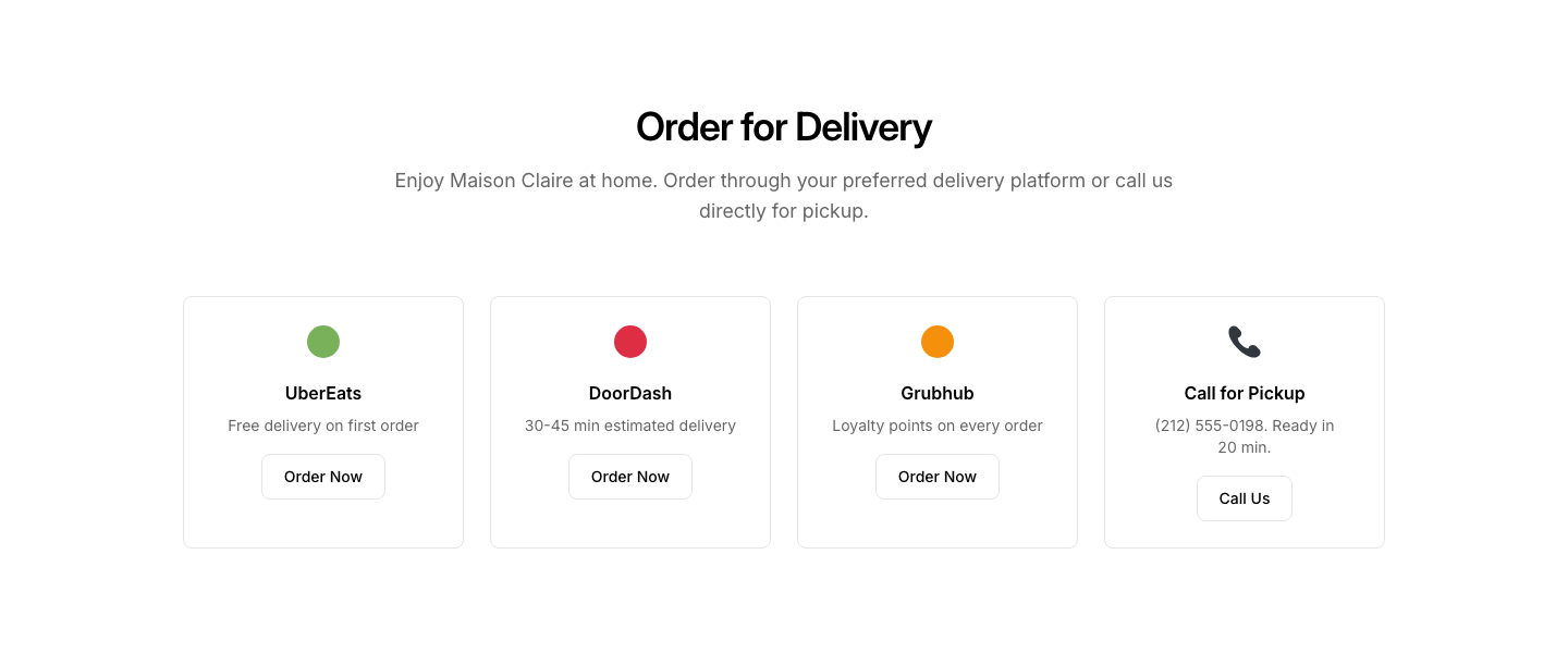
Delivery
RestaurantDelivery/takeout ordering options with platform links.
Gallery
RestaurantFood/interior photo gallery grid.
Hero
RestaurantRestaurant hero with ambiance photo and tagline.
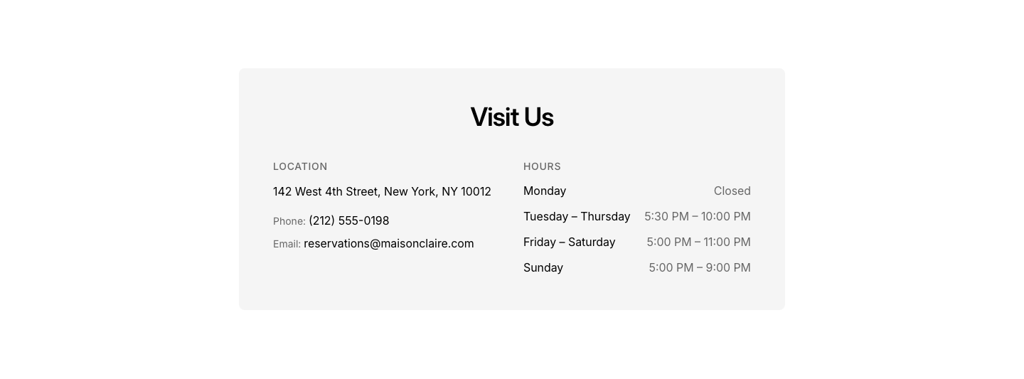
Hours
RestaurantHours, location, and contact info card.
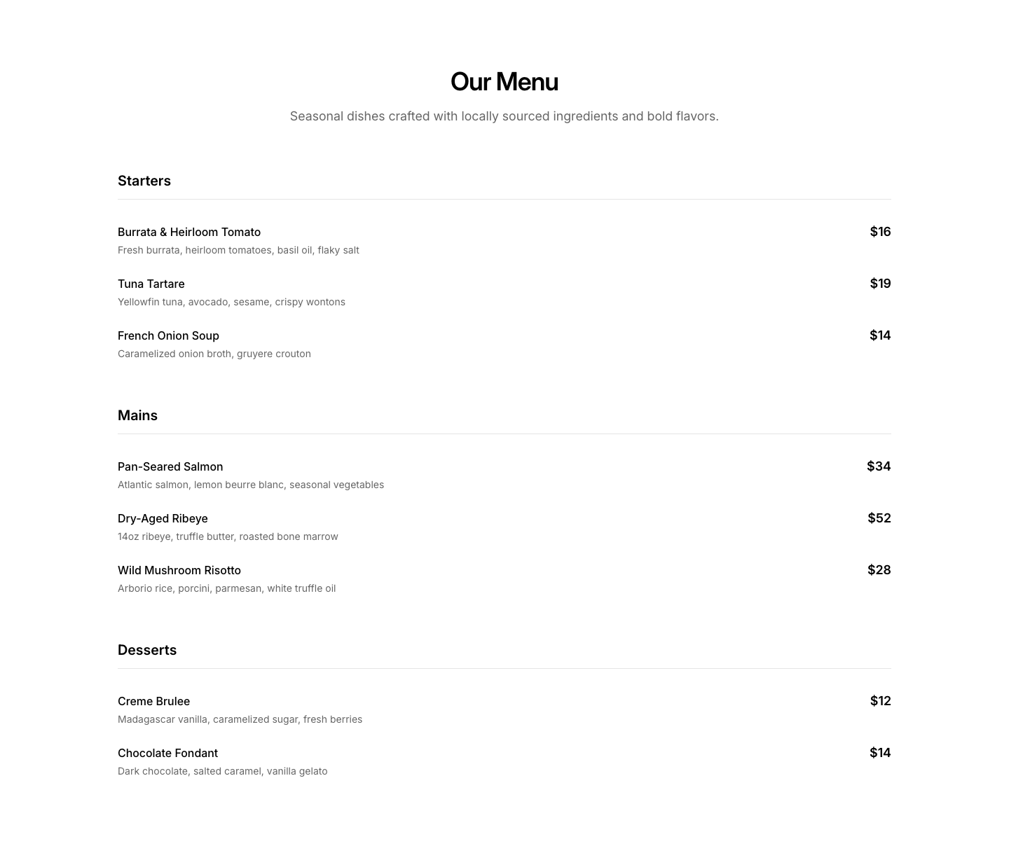
Menu
RestaurantMenu with categories, items, descriptions, and prices.
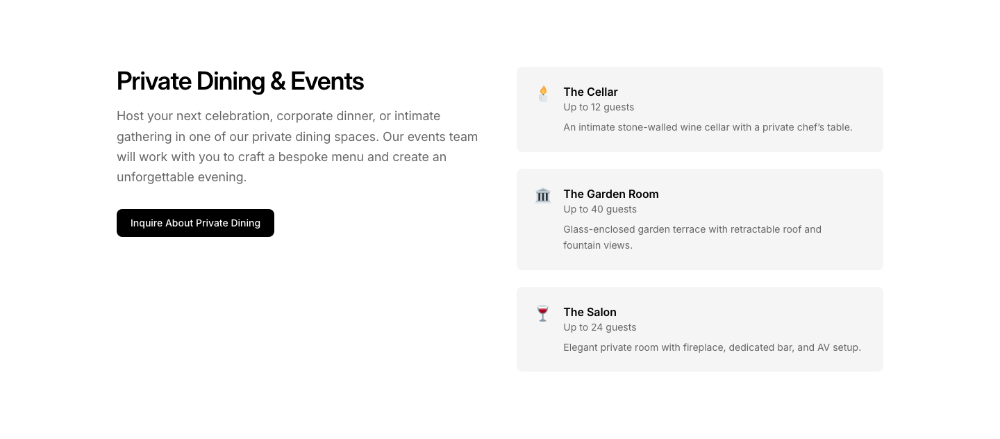
Private Dining
RestaurantPrivate dining/events booking section.
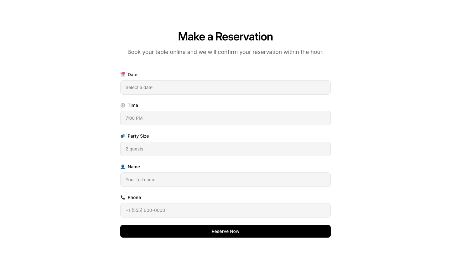
Reservation
RestaurantReservation form with date, time, party size.
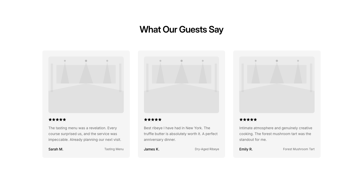
Reviews
RestaurantCustomer review cards with dish photos.
Specials
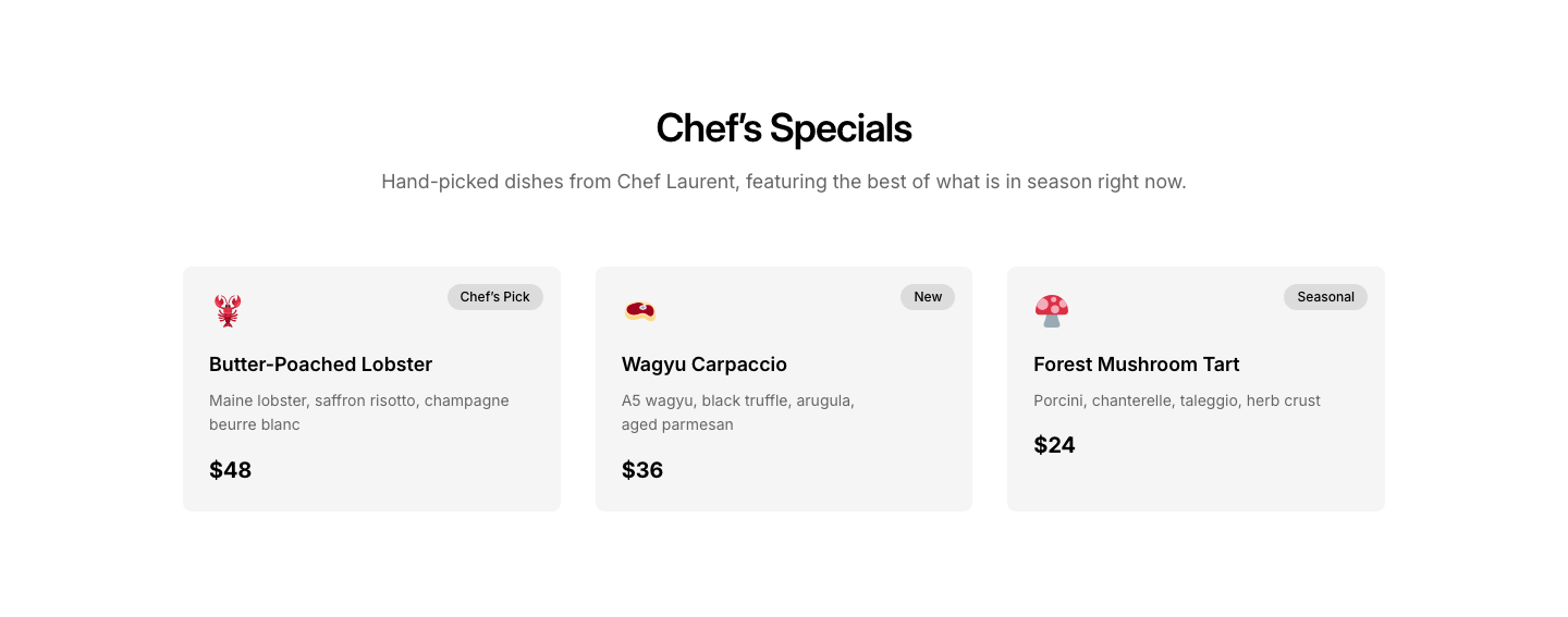
RestaurantDaily specials or chef's picks section.

Badge
ReviewAggregate review badge (4.9/5 from 2000+ reviews).
Cards
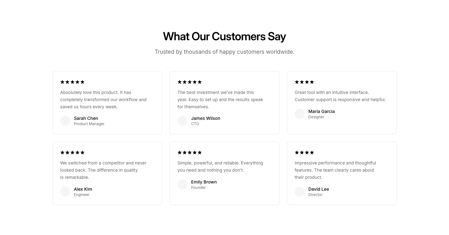
ReviewGrid of review cards with rating, text, and author.
Comparison
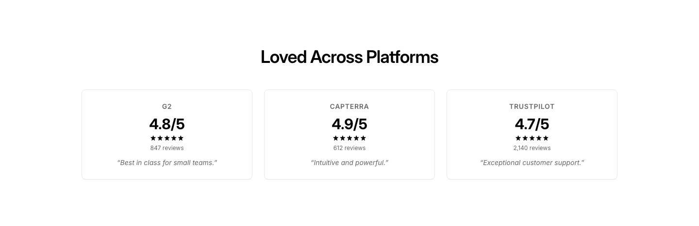
ReviewSide-by-side review snippets from different platforms.
Featured
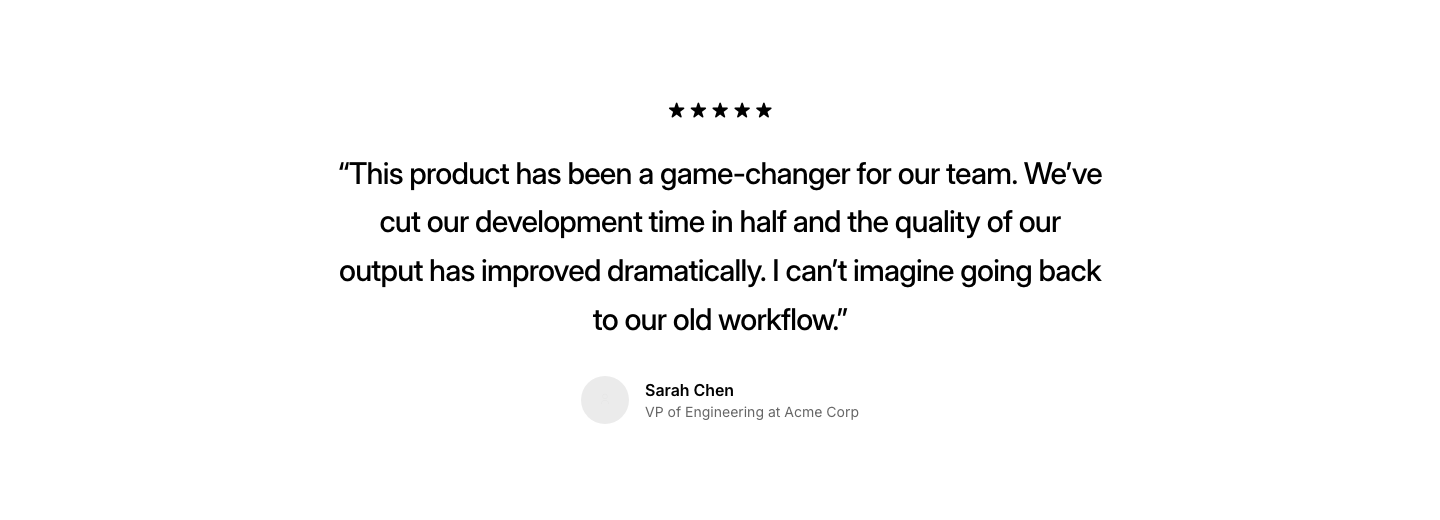
ReviewSingle featured review with large quote and author.
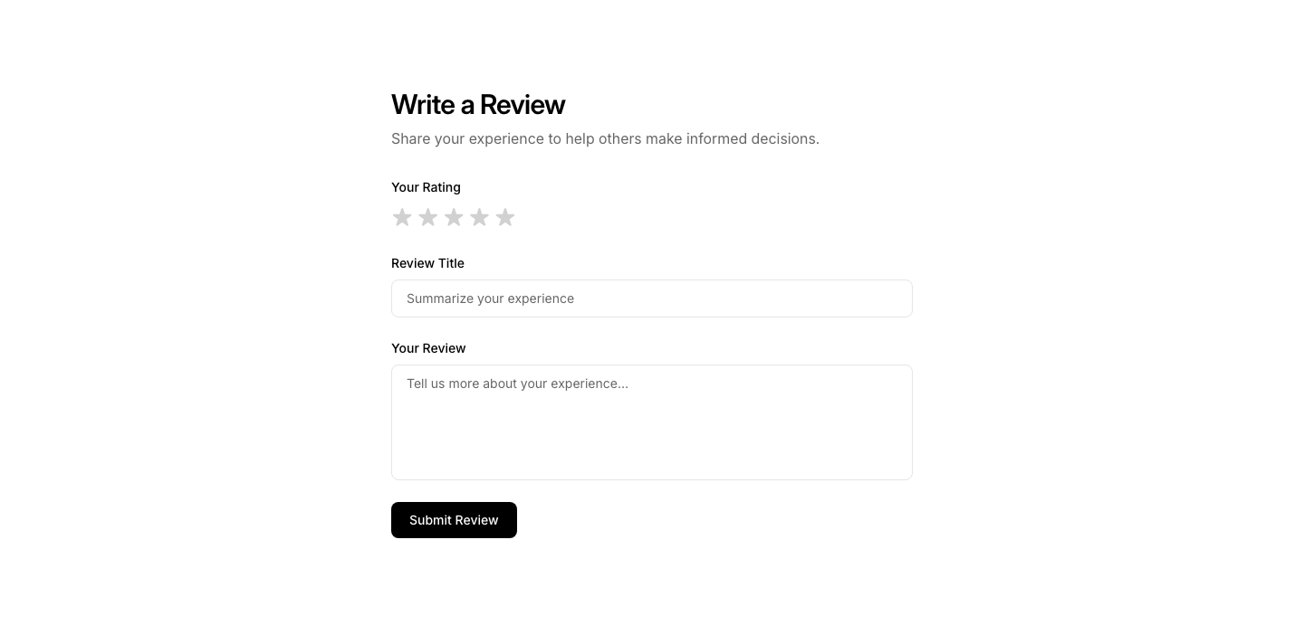
Form
ReviewReview submission form with star rating and text input.
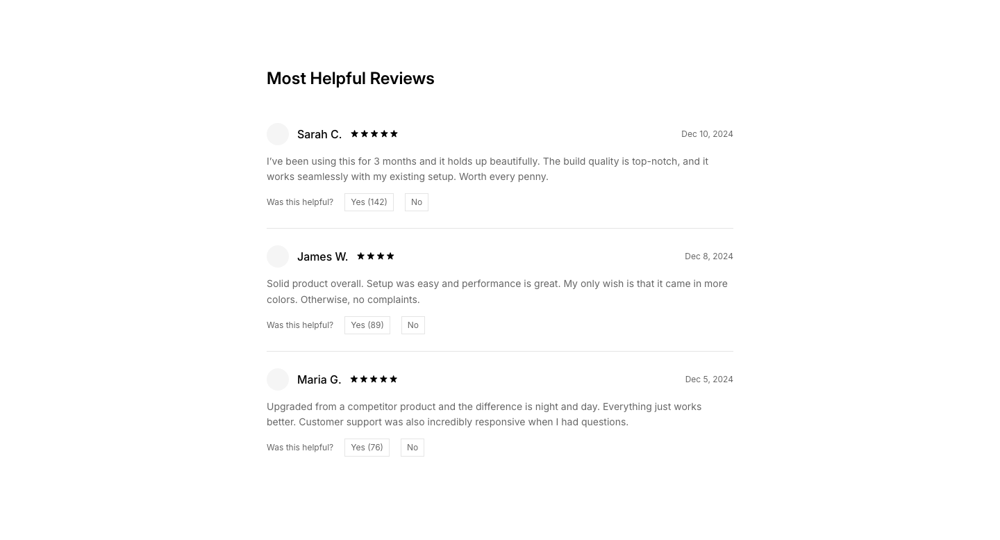
Helpful
ReviewReviews with "Was this helpful?" voting buttons.
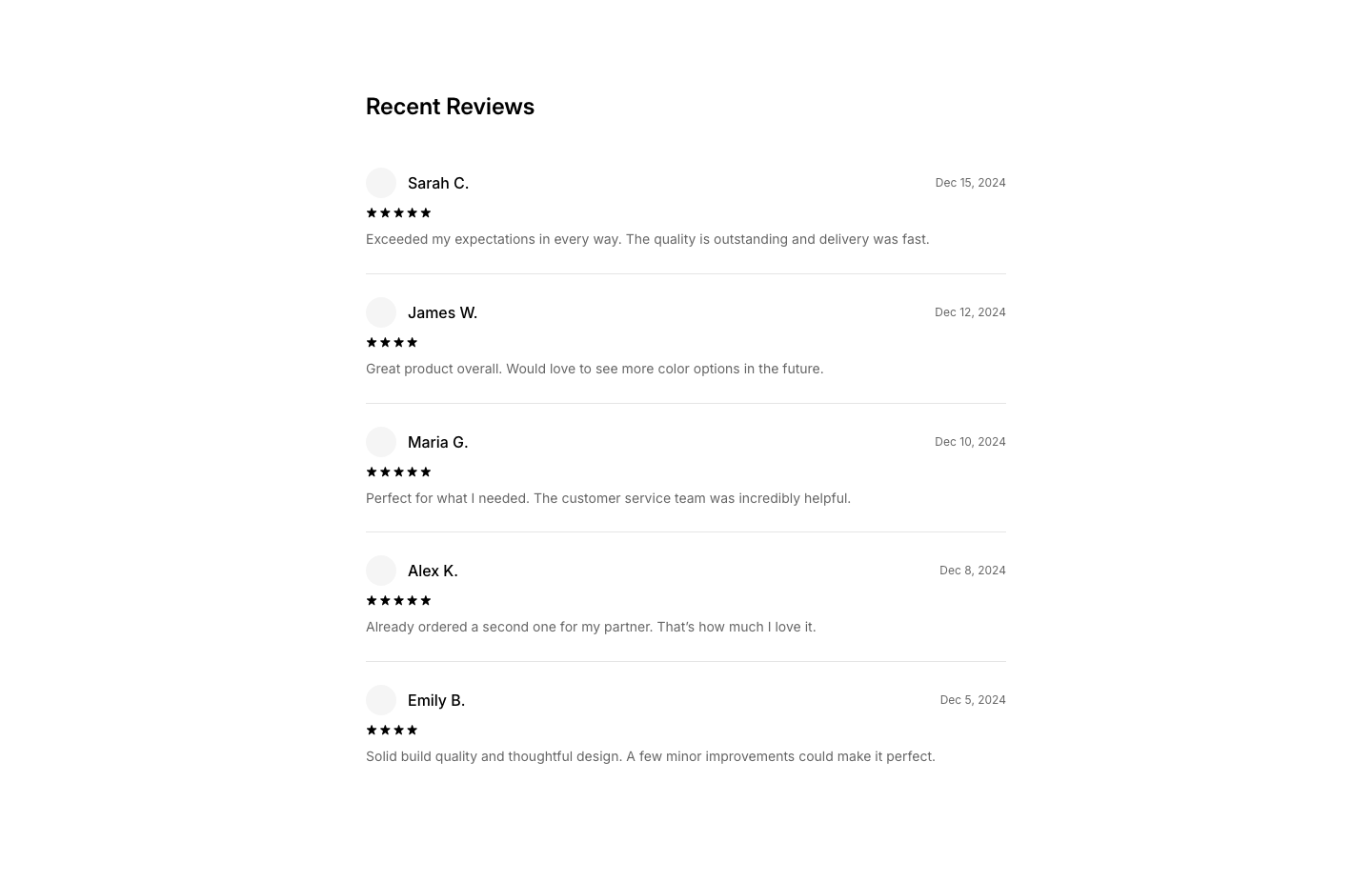
List
ReviewVertical list of reviews with ratings and dates.
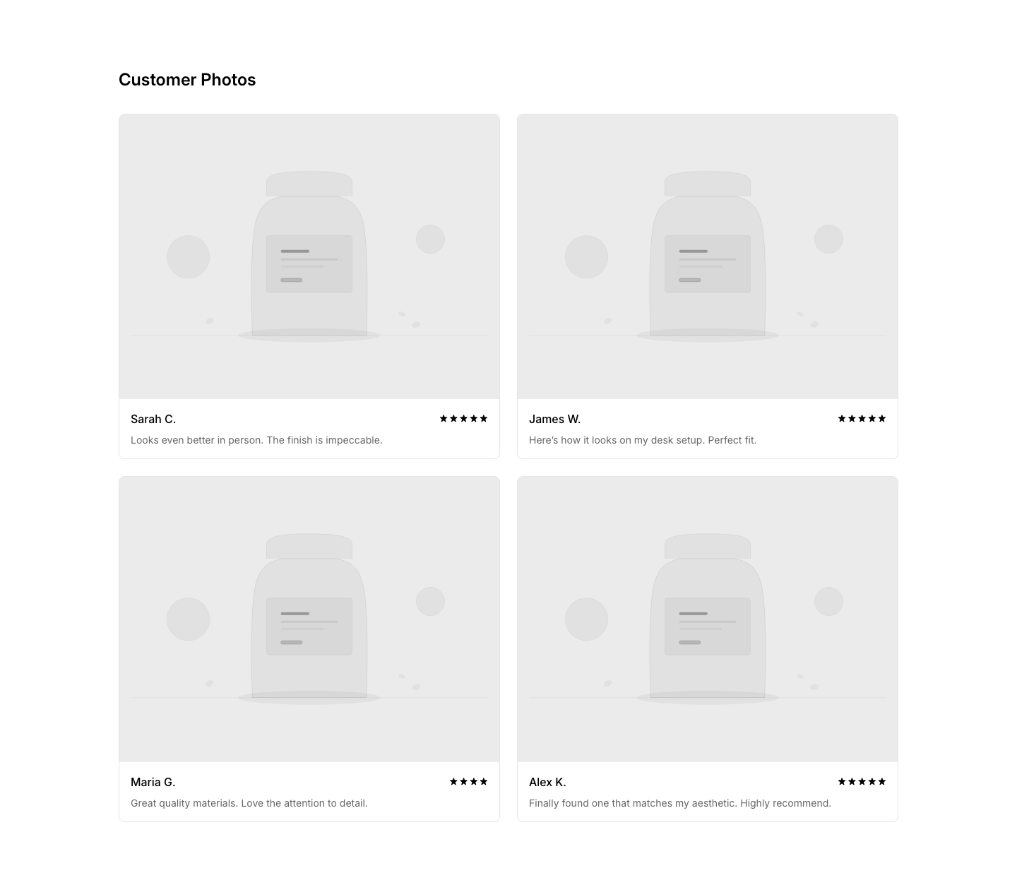
Photo
ReviewReviews with customer-uploaded photos.
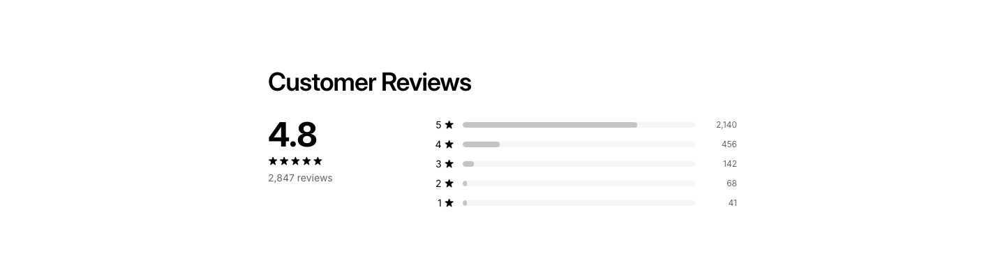
Summary
ReviewReview summary: average rating, star distribution, total count.
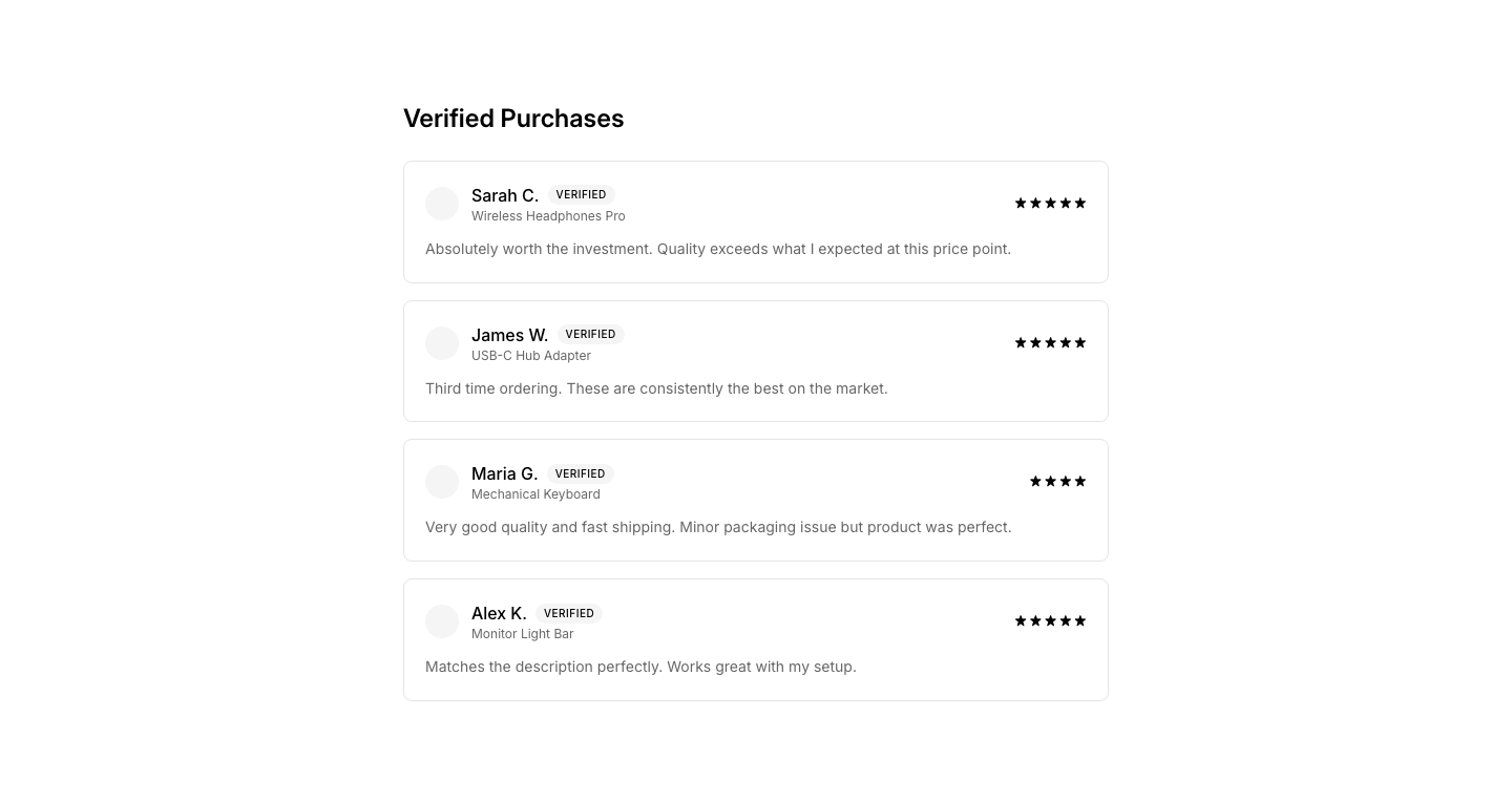
Verified
ReviewReviews with verified purchase badge.
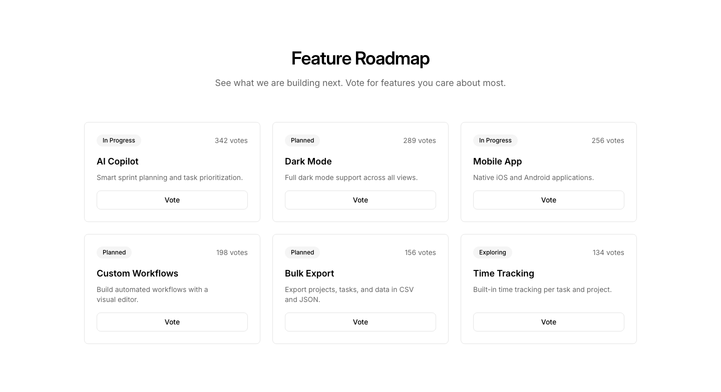
Cards
RoadmapRoadmap feature cards with status badges and votes.
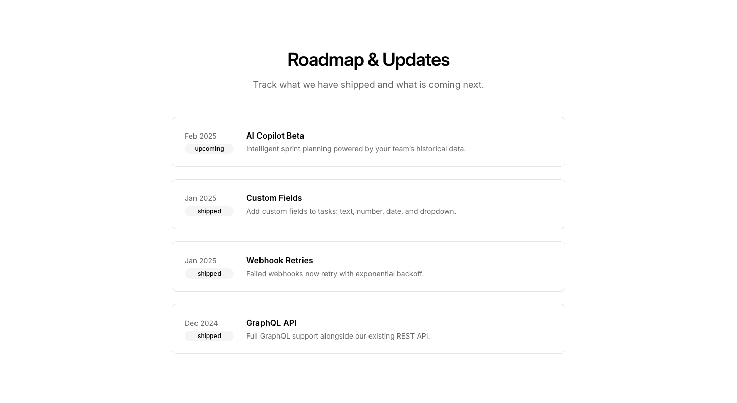
Changelog
RoadmapCombined roadmap and changelog view.
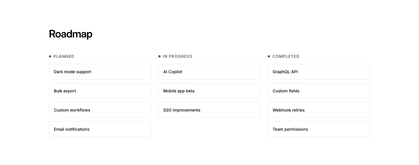
Kanban
RoadmapKanban-style roadmap with columns (planned, in progress, done).
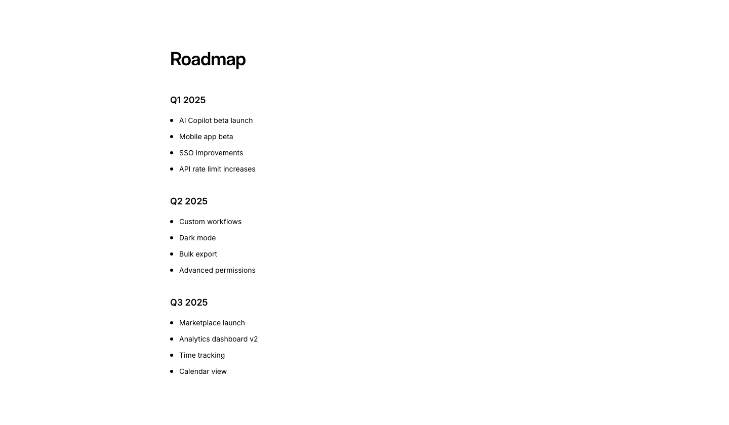
List
RoadmapRoadmap as a grouped list by quarter/milestone.
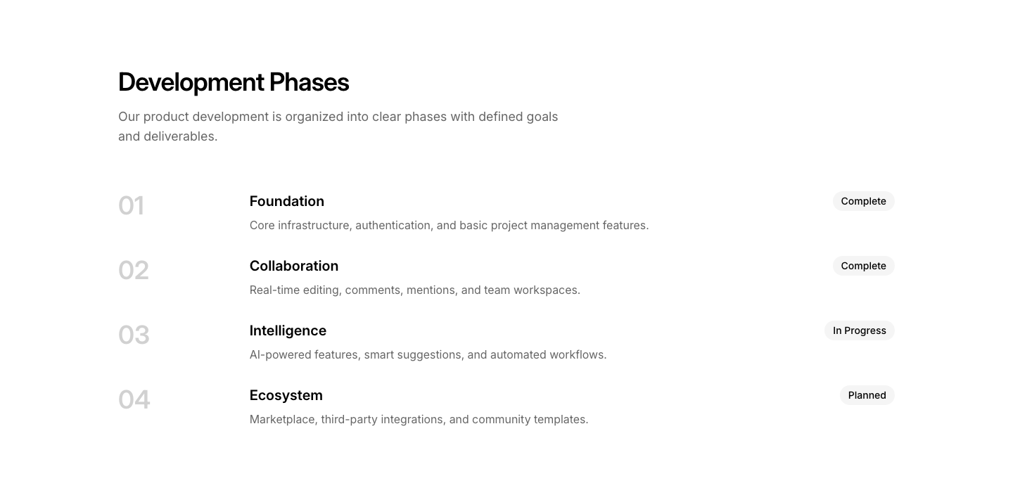
Phase
RoadmapRoadmap organized by development phases.
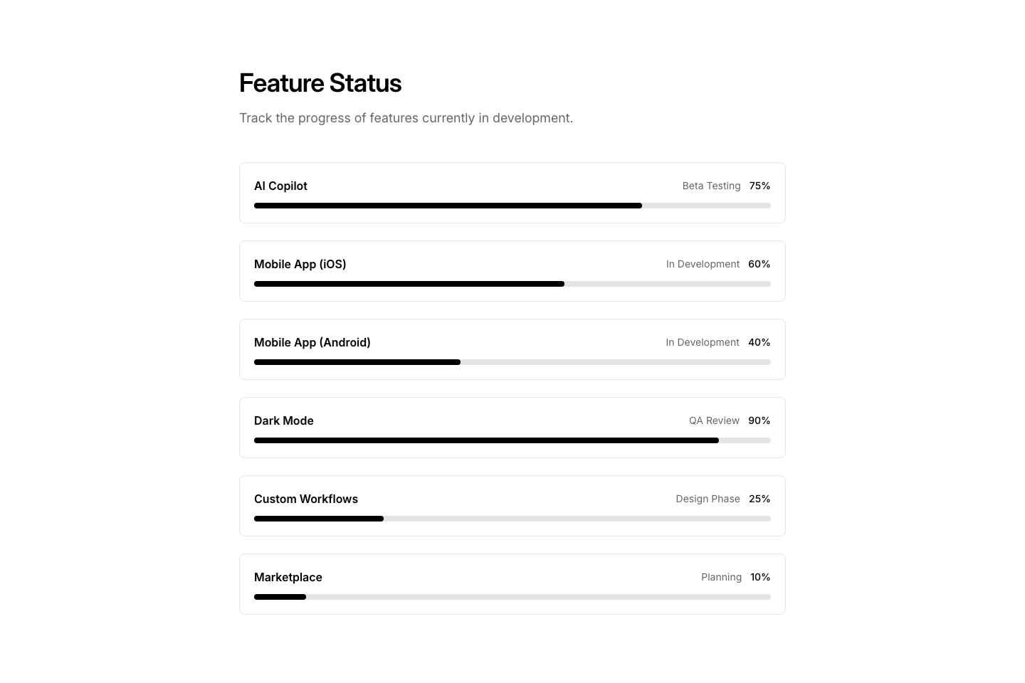
Status
RoadmapFeature status page with progress indicators.
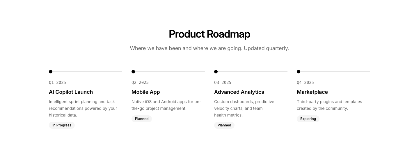
Timeline
RoadmapProduct roadmap as a horizontal timeline.
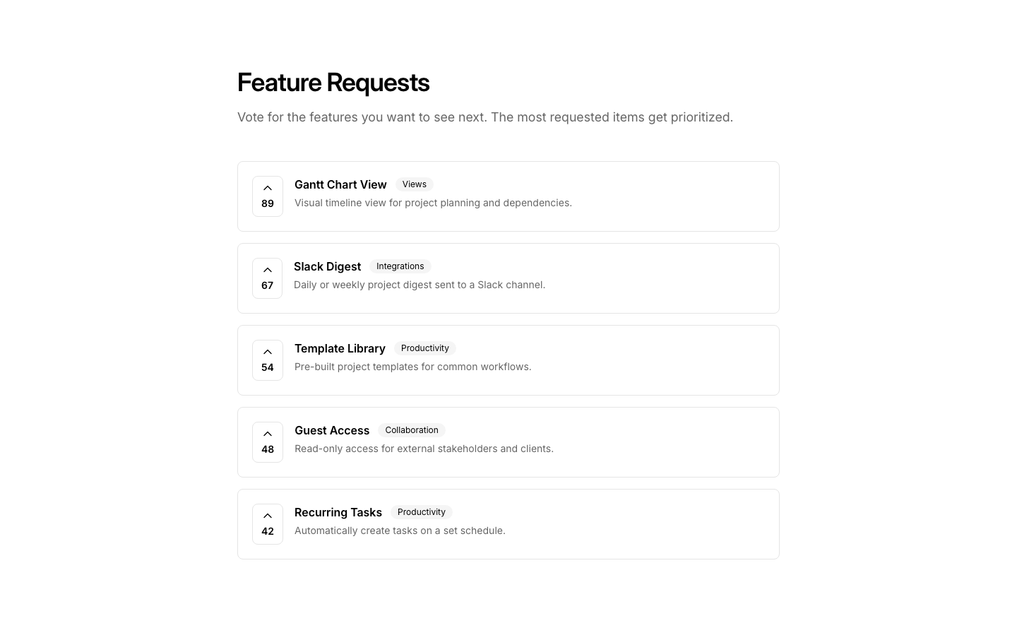
Vote
RoadmapFeature voting board where users can upvote ideas.
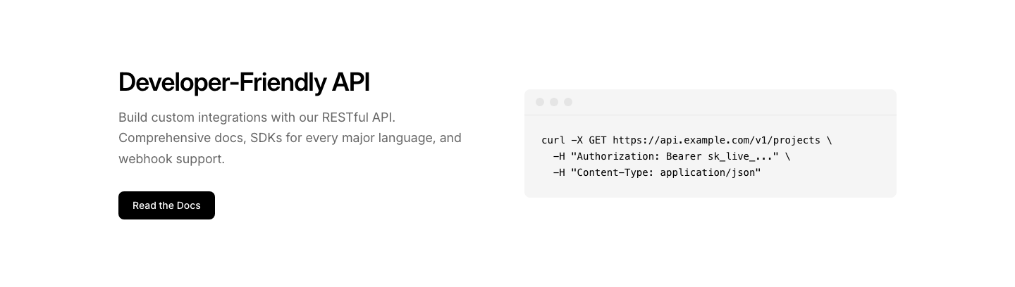
API
SaasAPI documentation teaser with code sample.
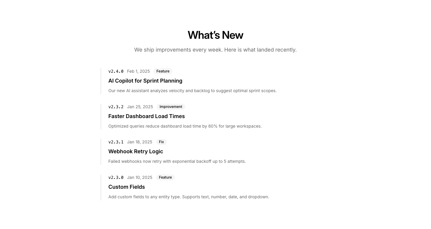
Changelog
SaasProduct updates feed with version tags.
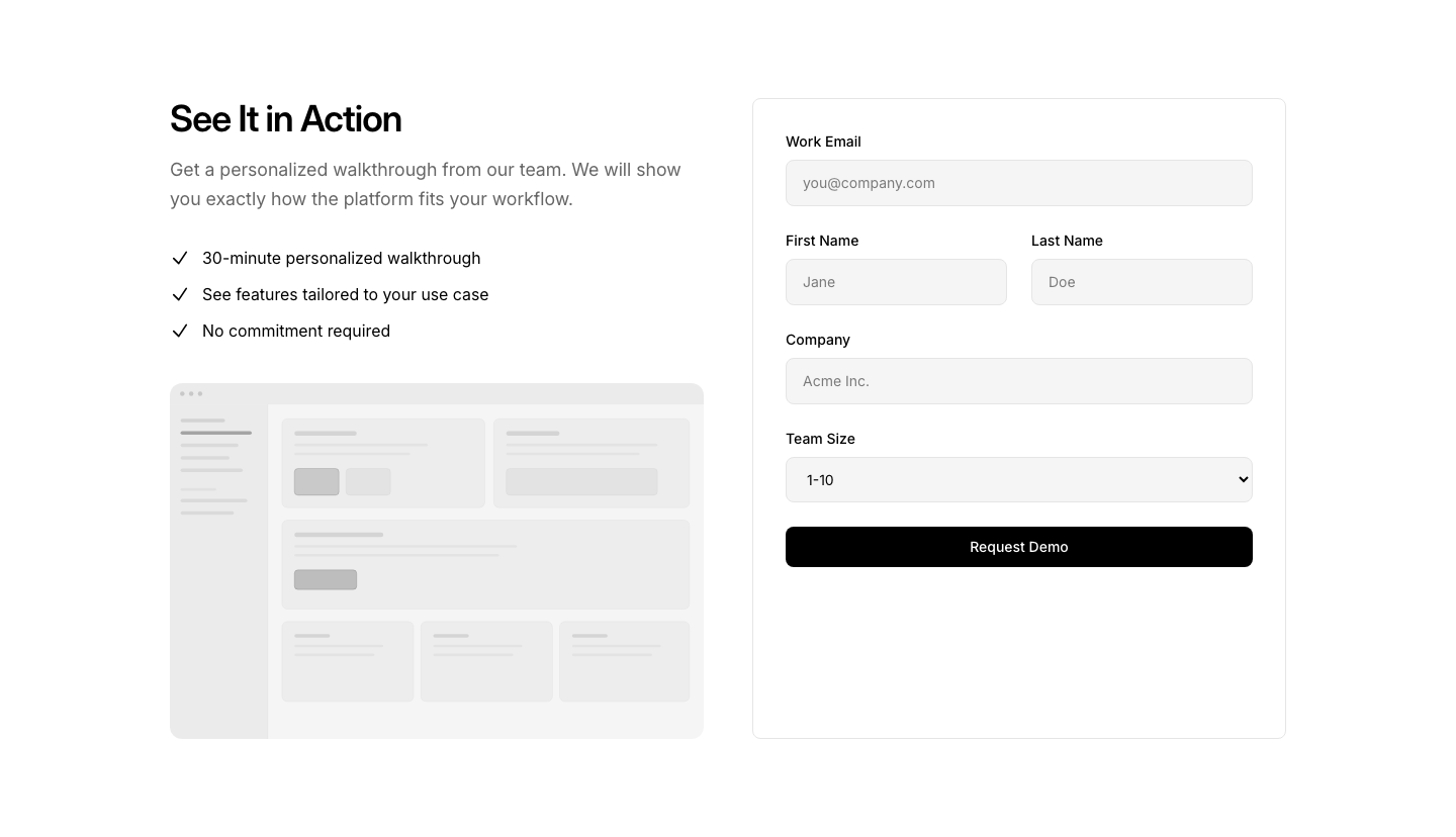
Demo
SaasInteractive demo request section with form.
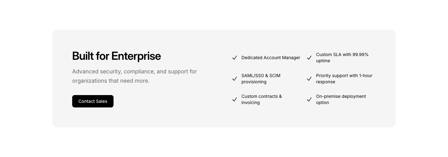
Enterprise
SaasEnterprise features section with custom demo CTA.
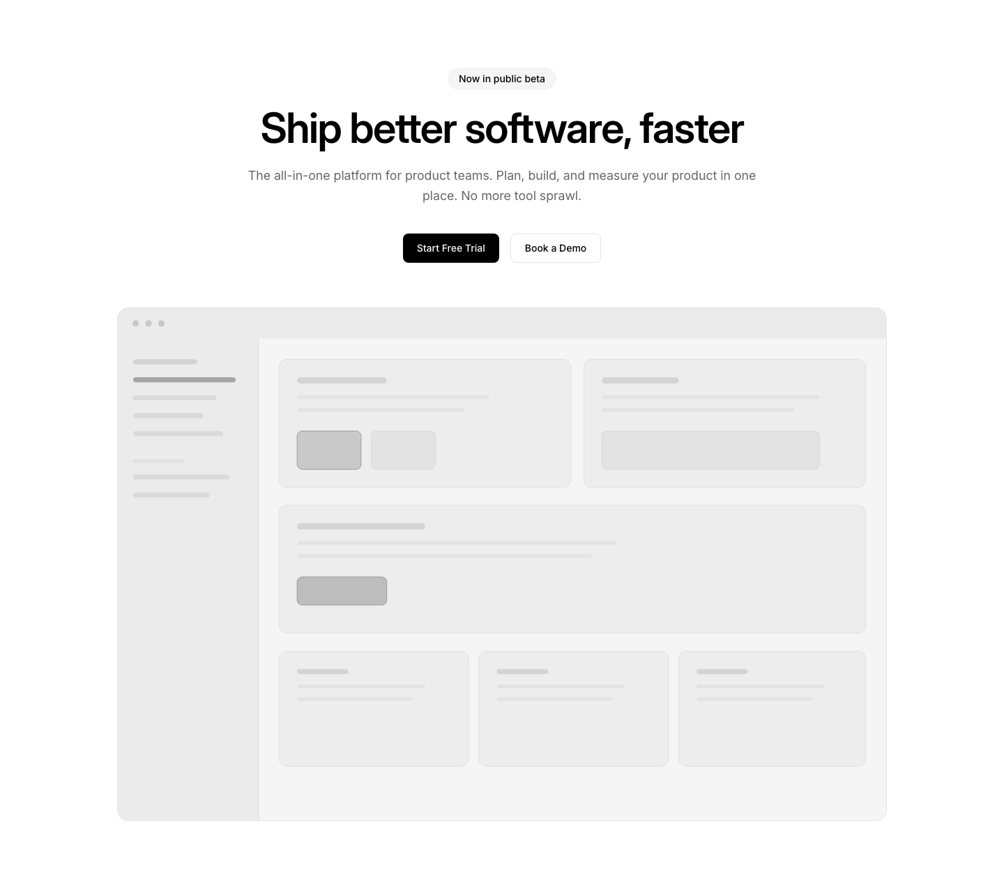
Hero
SaasSaaS hero with product screenshot and trial CTA.
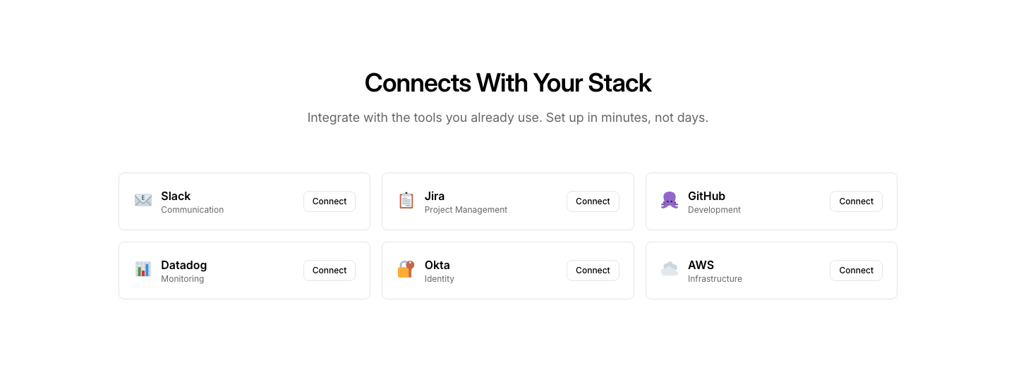
Integrations
SaasIntegration ecosystem grid with connect buttons.
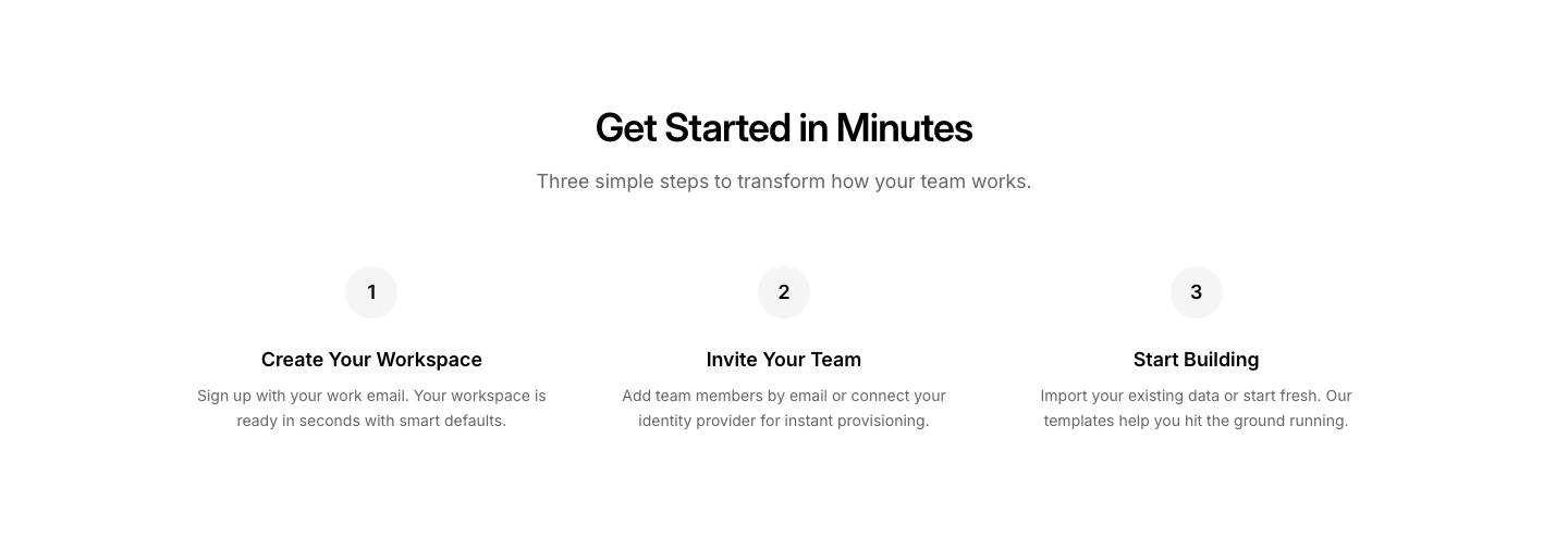
Onboarding
SaasOnboarding steps section showing setup process.
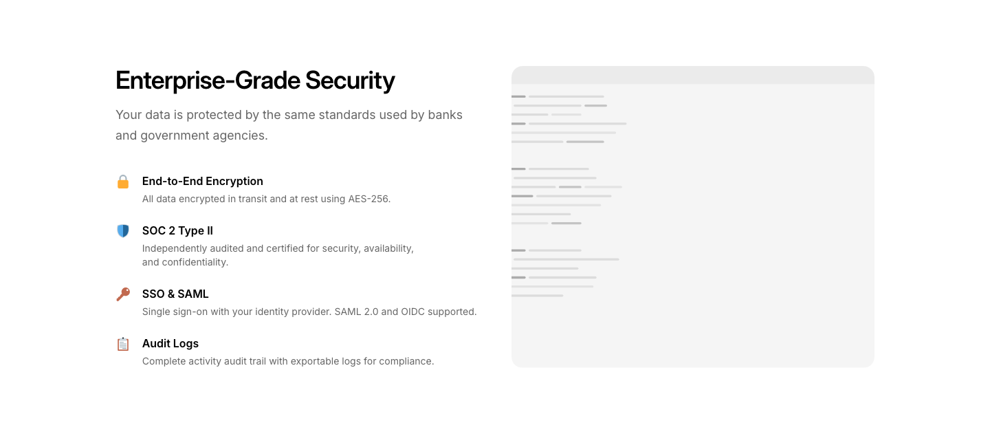
Security
SaasSecurity and compliance feature section.
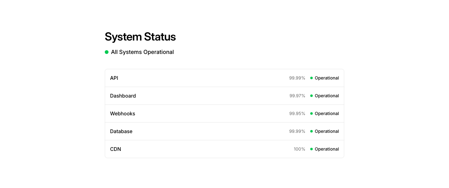
Status
SaasSystem status page with component health indicators.

Autocomplete
SearchSearch input with dropdown suggestions.

Bar
SearchSearch bar with icon, input field, and filter pills.
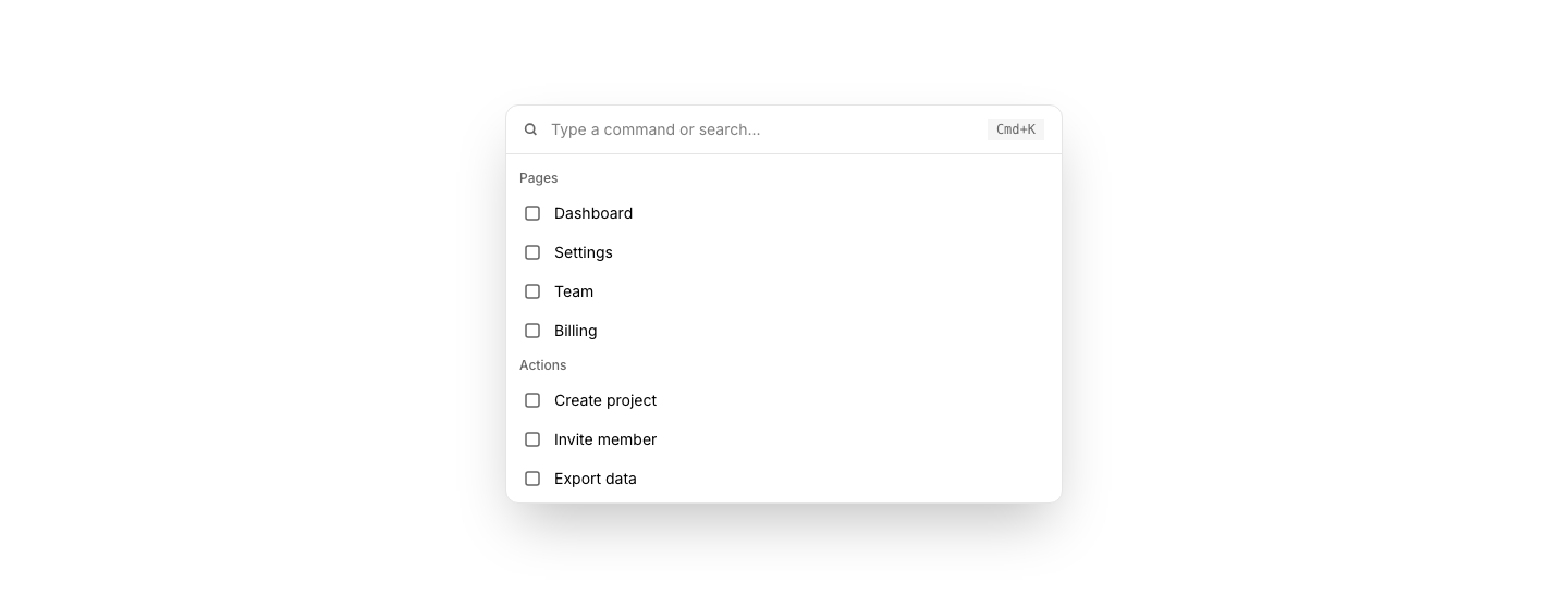
Command
SearchCommand palette-style search modal (Cmd+K).
Filters
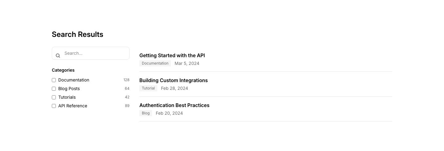
SearchSearch with sidebar filters (category, date, type).

Hero
SearchLarge centered search input as the page hero.
Results
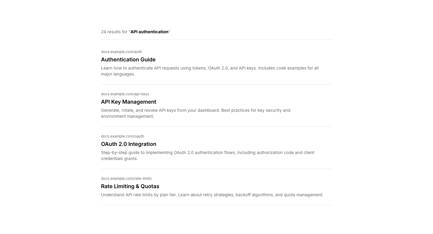
SearchSearch results list with title, excerpt, and URL.
Accordion
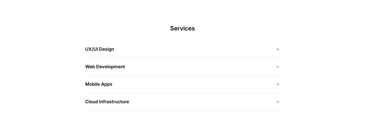
ServiceExpandable service descriptions in an accordion.
Benefit
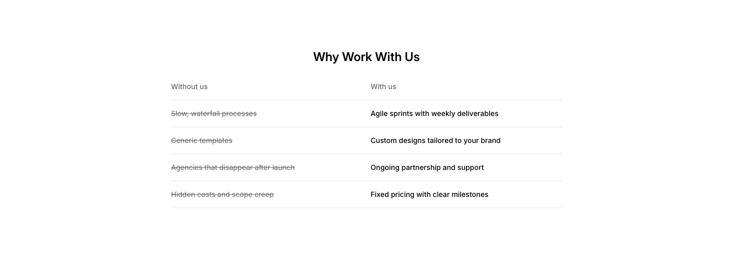
ServiceService benefits grid with before/after descriptions.
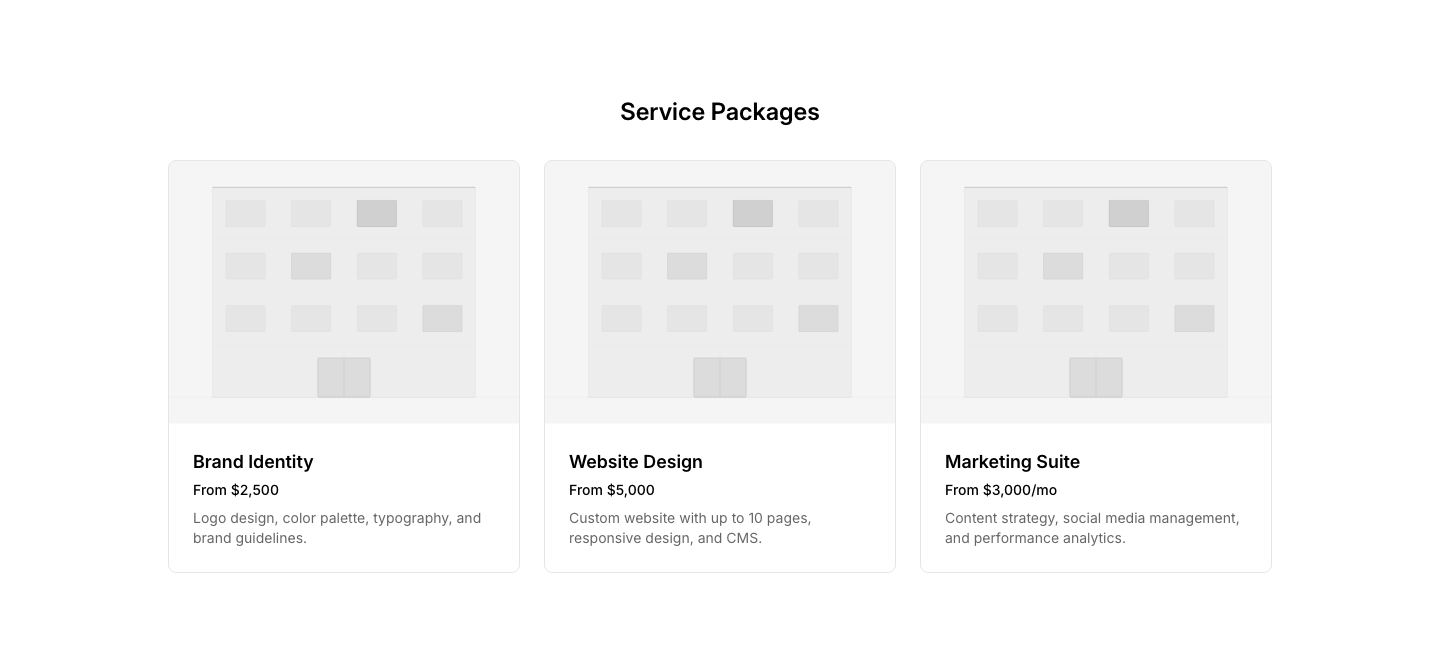
Cards
ServiceService cards with image, title, and pricing.
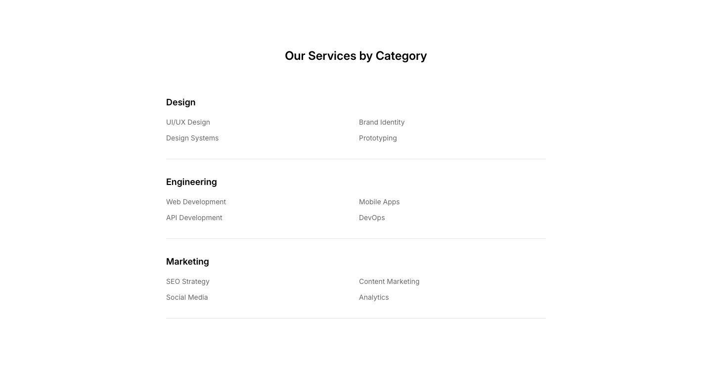
Category
ServiceServices grouped by category with headers.
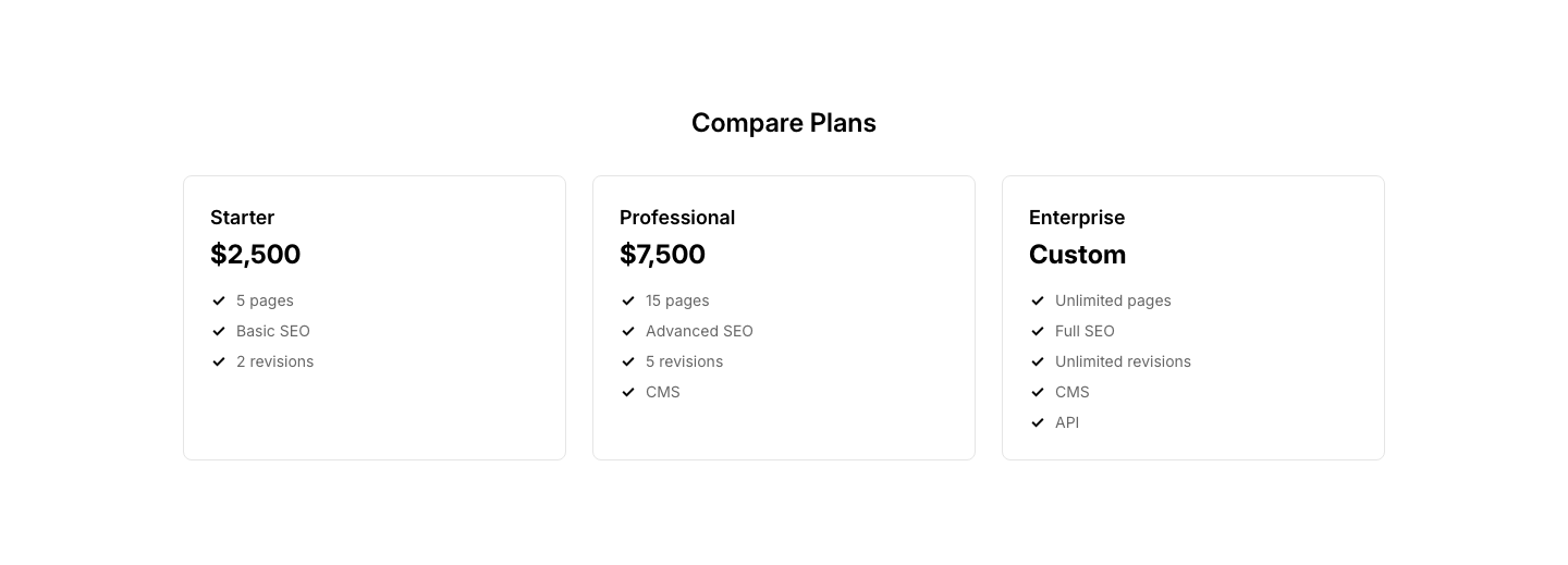
Comparison
ServiceService tiers compared in a table format.

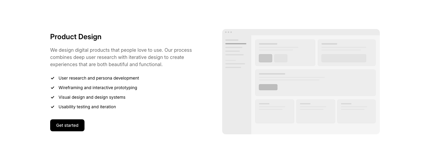
CTA
ServiceService overview with prominent Get Started CTA.
Featured
ServiceSingle service highlighted with image and details.
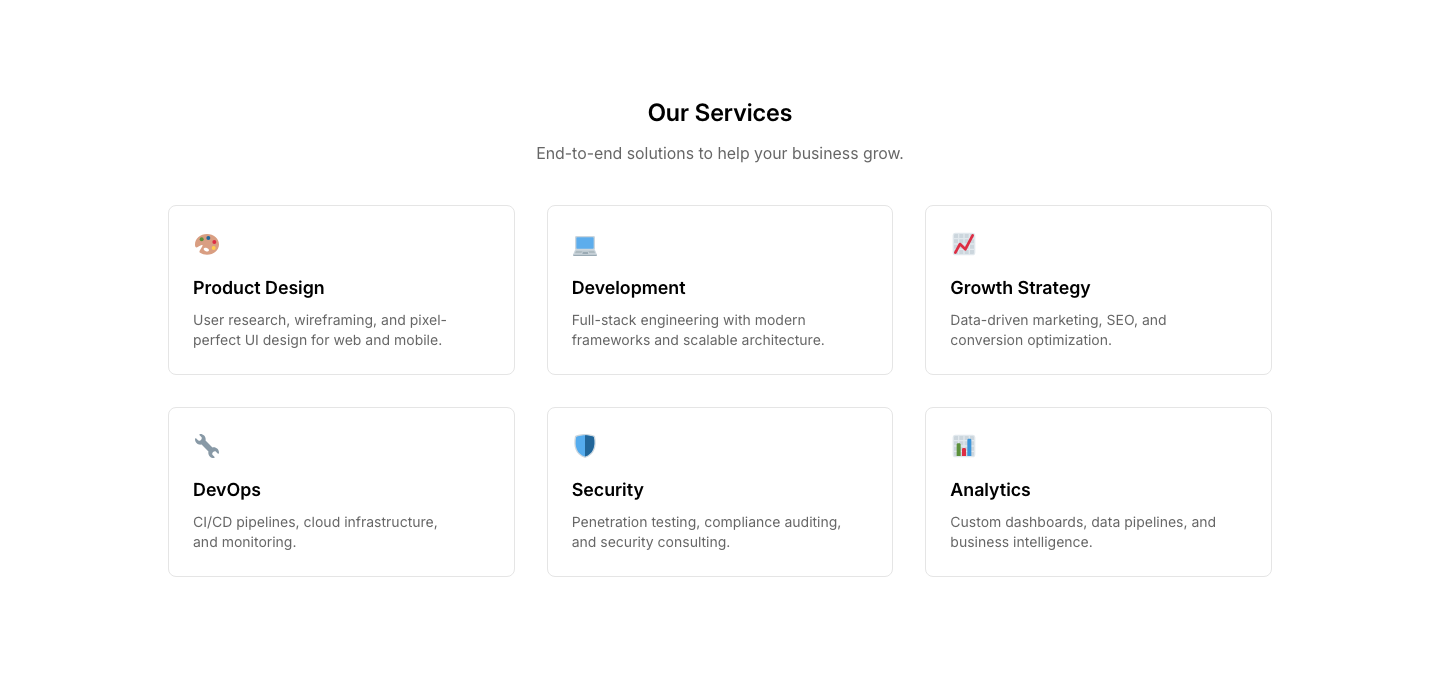
Grid
ServiceGrid of service cards with icon, title, description.
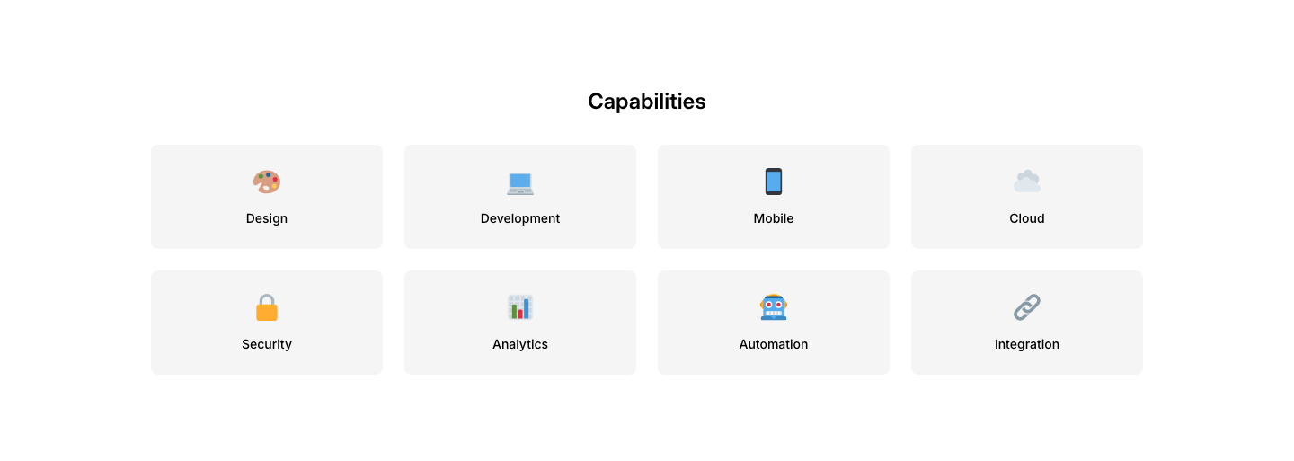
Icon Grid
ServiceLarge icon grid of services with minimal text.
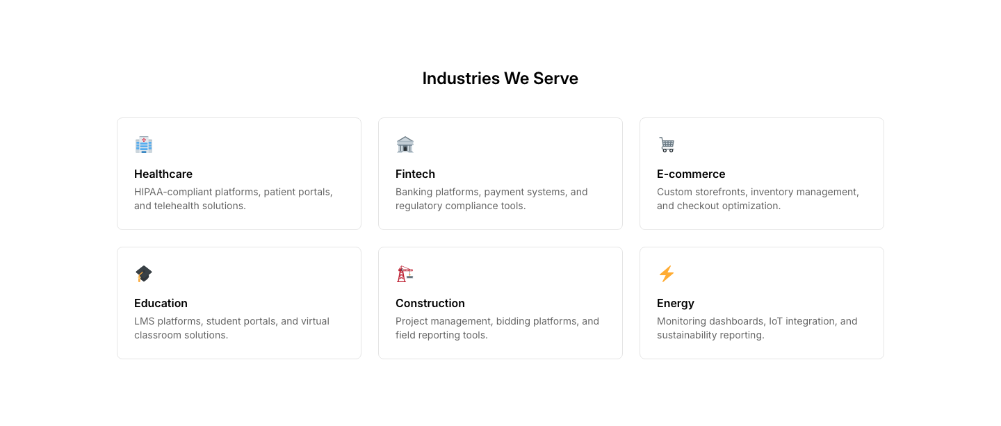
Industry
ServiceServices organized by industry vertical.
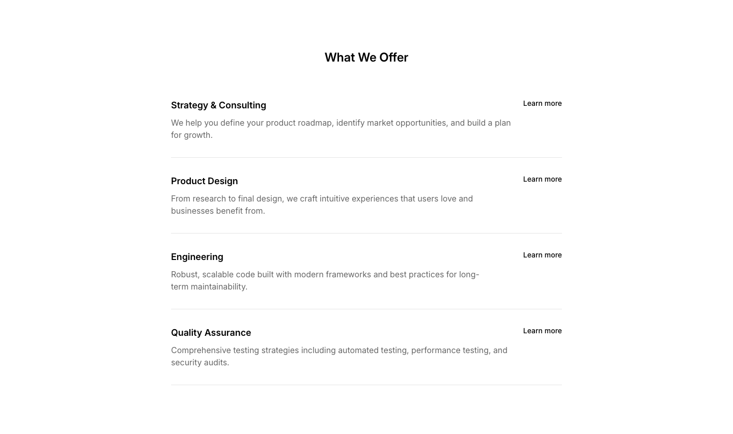
List
ServiceVertical list of services with descriptions and links.
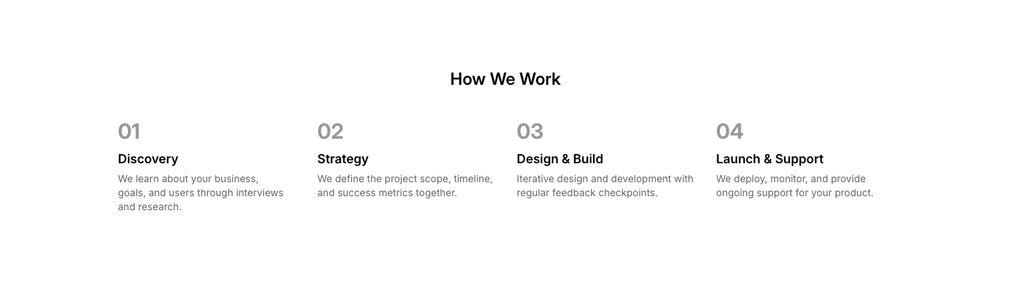
Process
ServiceService delivery process with numbered steps.
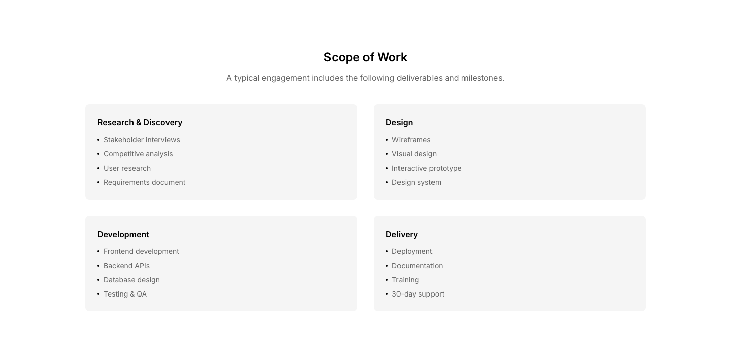
Scope
ServiceDetailed scope of service with bullet points and deliverables.
Tabs
ServiceTabbed interface switching between service descriptions.
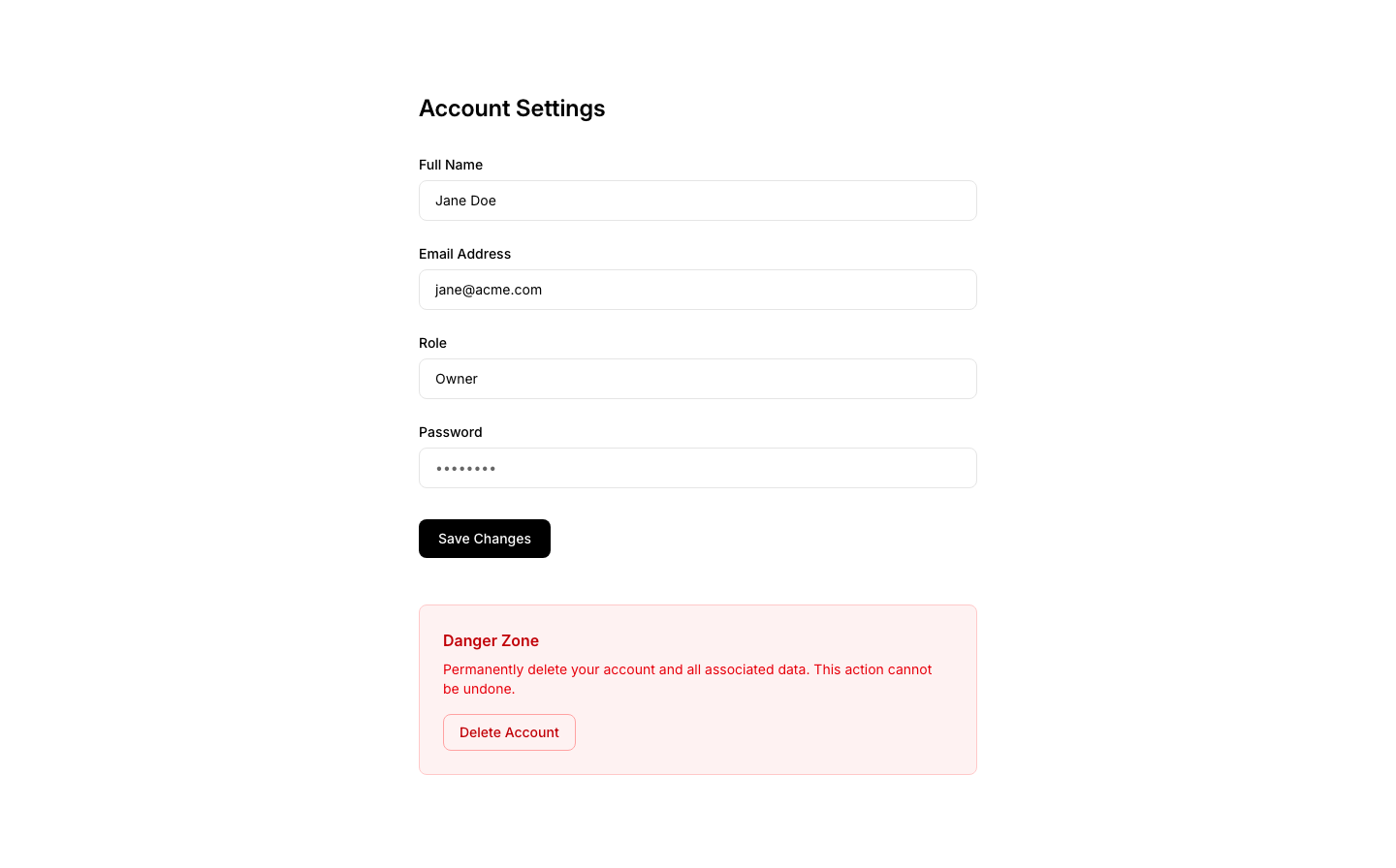
Account
SettingsAccount settings: email, password, delete account.
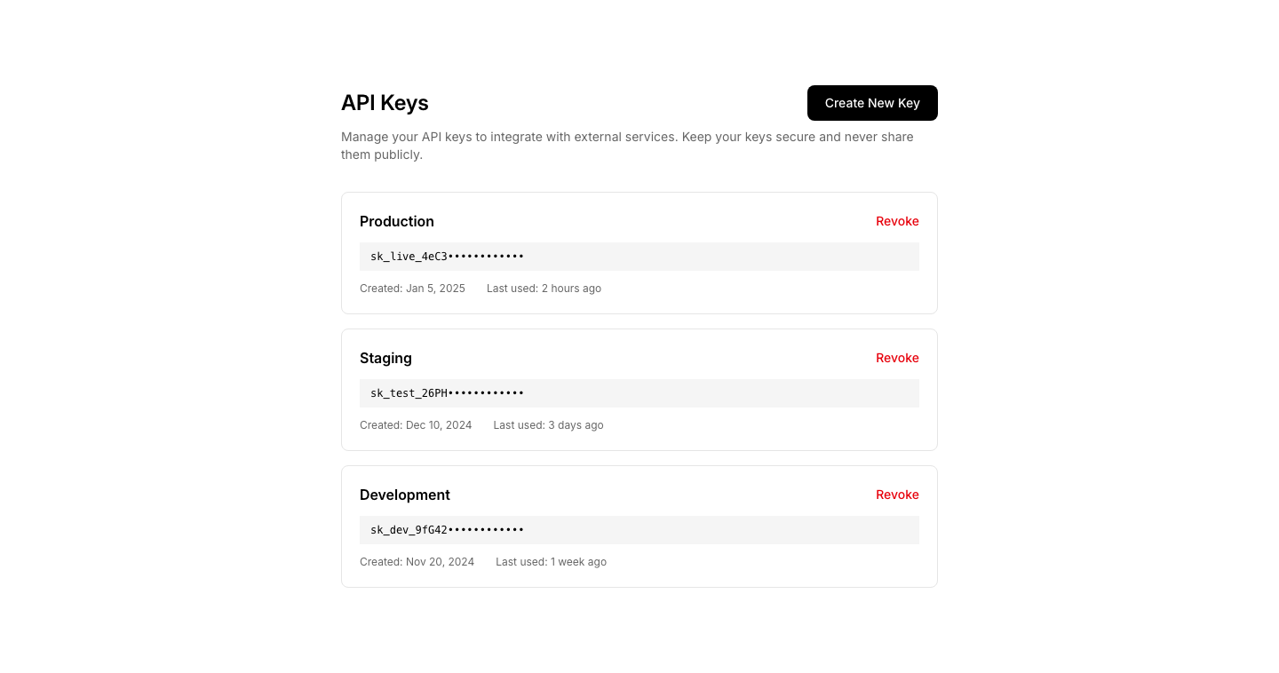
API
SettingsAPI settings with key display and regenerate button.
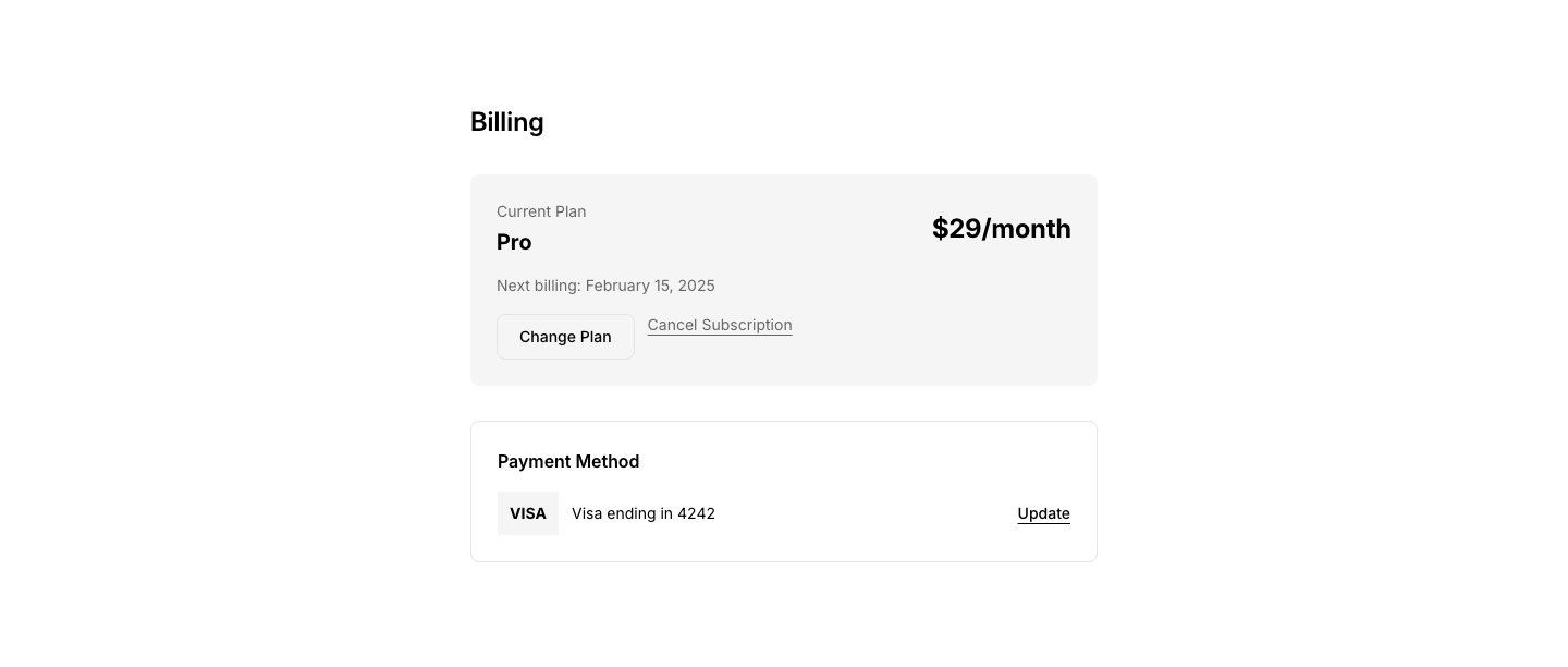
Billing
SettingsBilling settings with plan info and payment method.
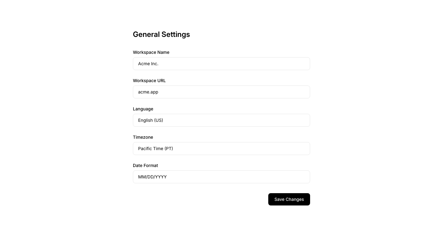
General
SettingsGeneral settings form with labeled fields and save button.
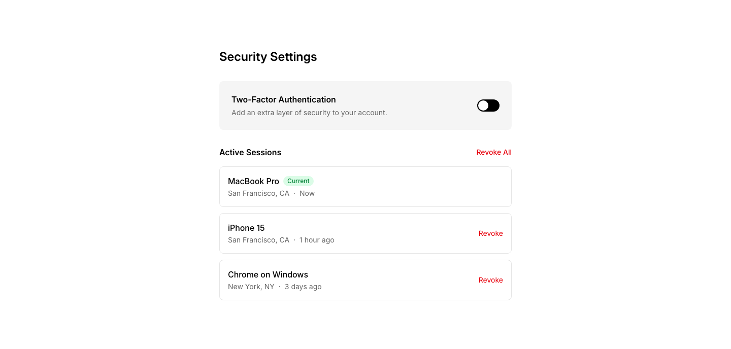
Security
SettingsSecurity settings: 2FA, sessions, login history.
Sidebar
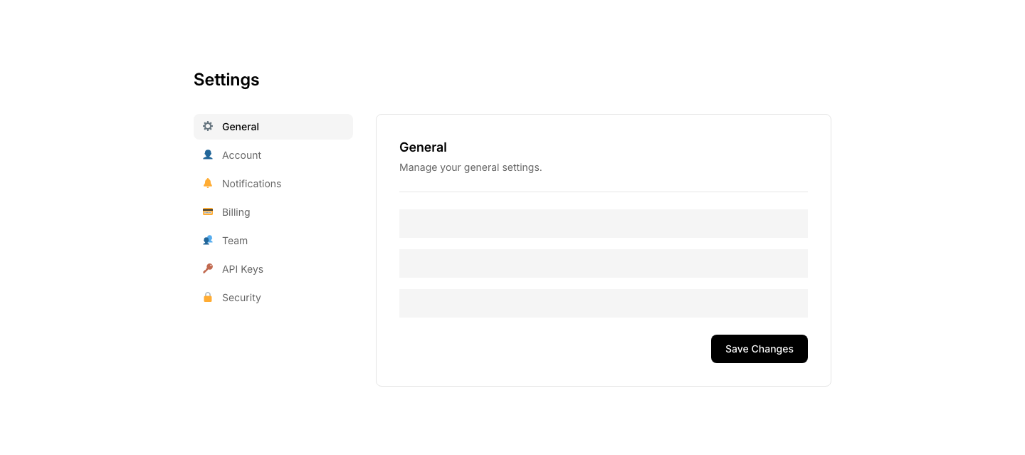
SettingsSettings page with sidebar navigation and content area.
Team
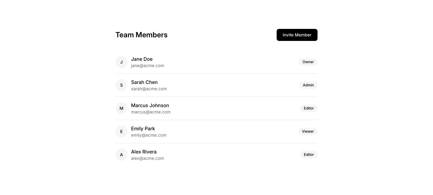
SettingsTeam management: members list with role dropdowns.

Author
SidebarAuthor info card for sidebar.
Categories
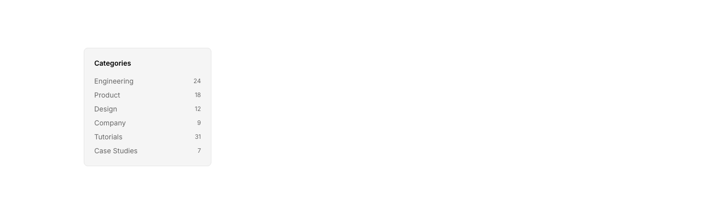
SidebarSidebar with category list and post counts.
Nav
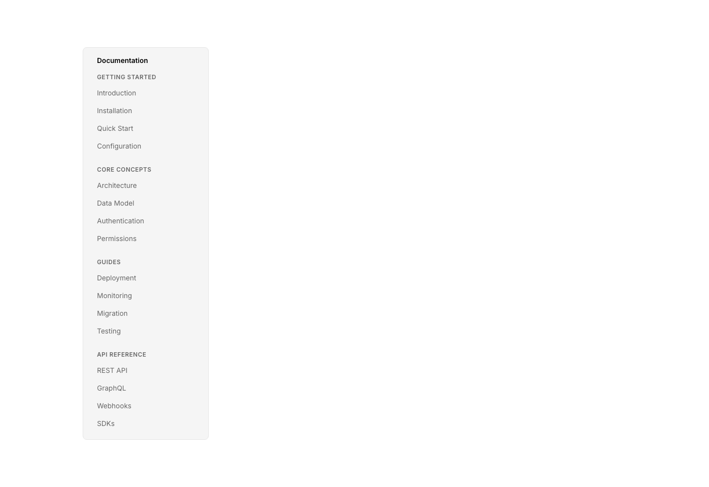
SidebarVertical sidebar navigation with nested links.

Article
SkeletonArticle loading skeleton with image placeholder, title bars, and text lines.
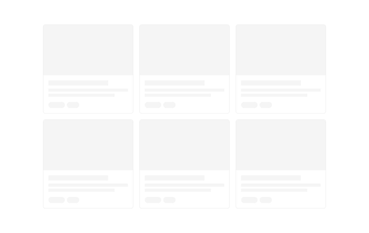
Card
SkeletonCard grid loading skeleton with image, title, and description placeholders.
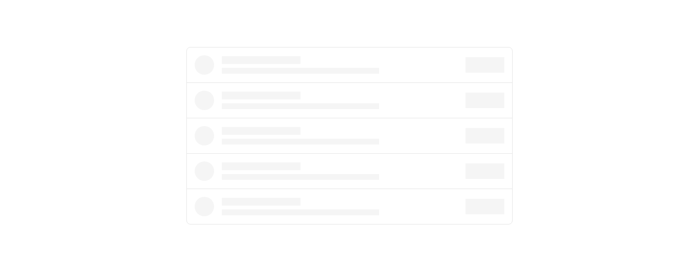
List
SkeletonList loading skeleton with avatar, text lines, and action placeholder.

Profile
SkeletonProfile page loading skeleton with avatar, stats, and bio placeholders.
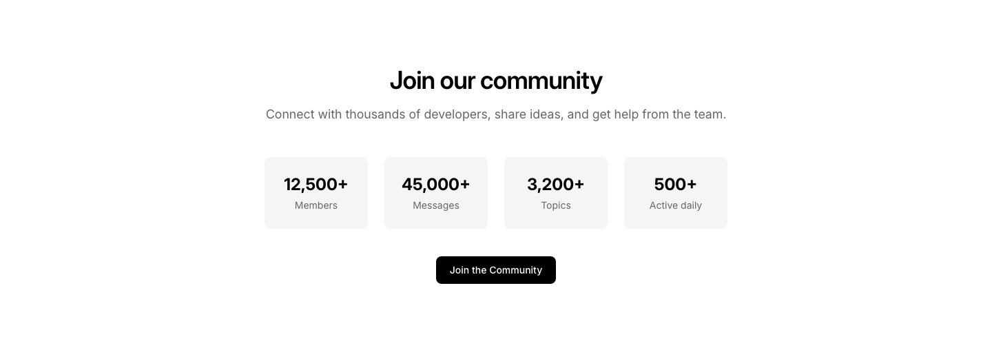
Community
SocialCommunity stats: members, posts, active discussions.

Discord
SocialDiscord/community join card with member count and invite link.

Embed
SocialEmbedded social media post (tweet/post style).
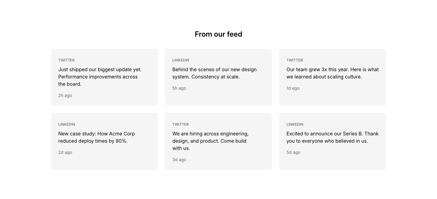
Feed
SocialGrid of social media post cards.
Follow
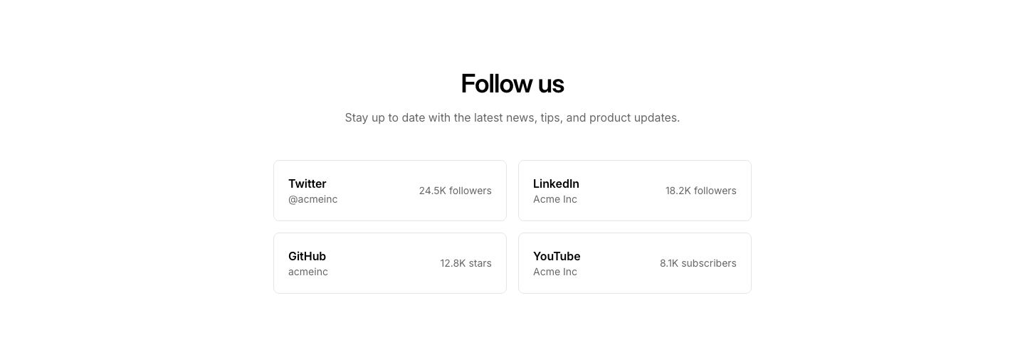
SocialFollow us section with platform icons and follower counts.
Hashtag
SocialUser-generated content section with hashtag header.

Links
SocialCentered list of social platform links.

Proof
SocialSocial proof section with avatar stack and call to action.

Share
SocialShare buttons for distributing a page across platforms.
Wall
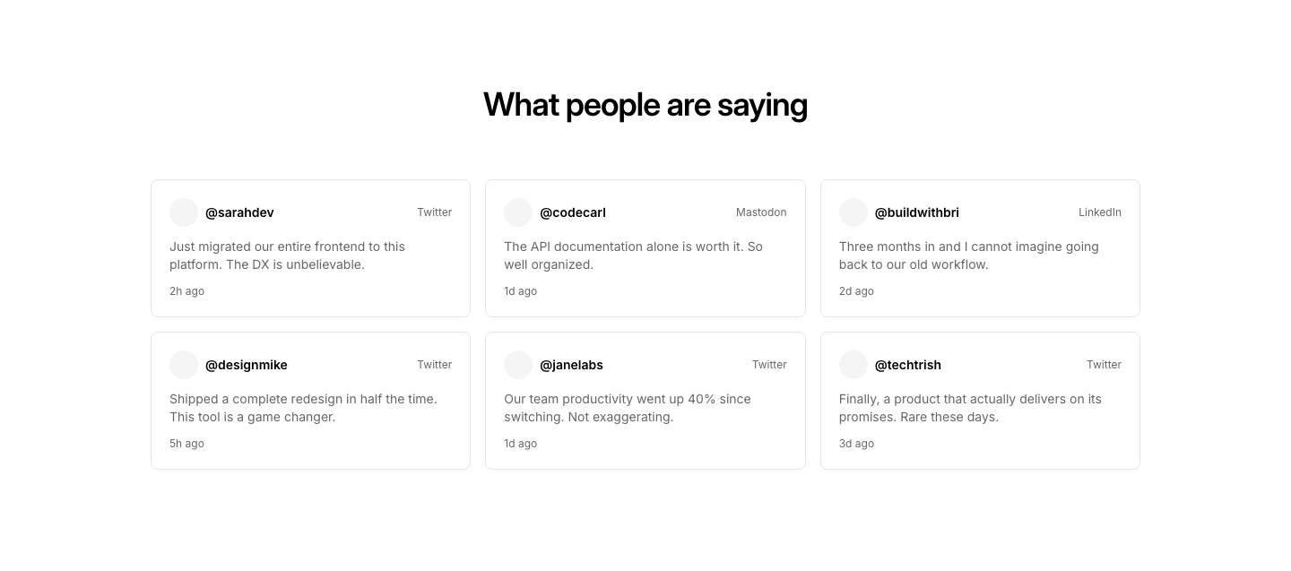
SocialSocial media wall with mixed platform posts.
Cards
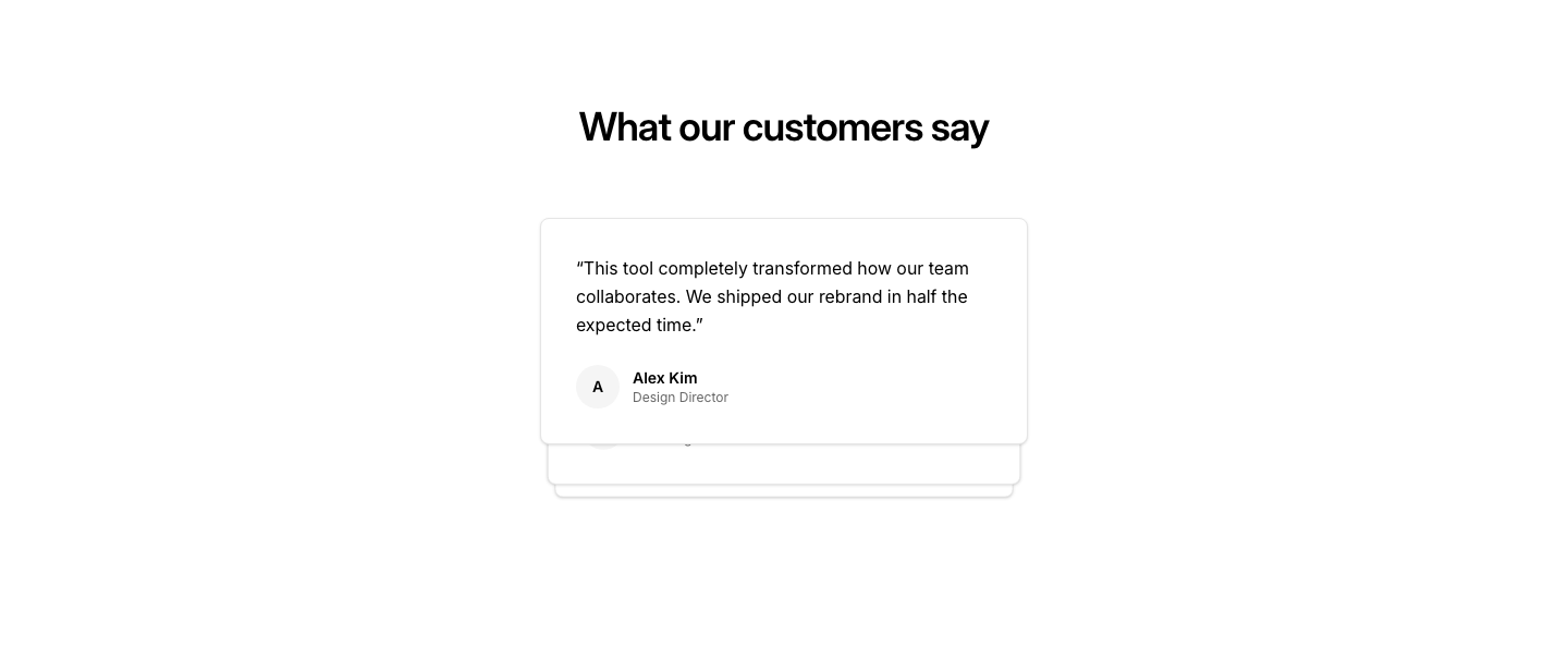
StackOverlapping stacked cards with slight offset creating depth effect.
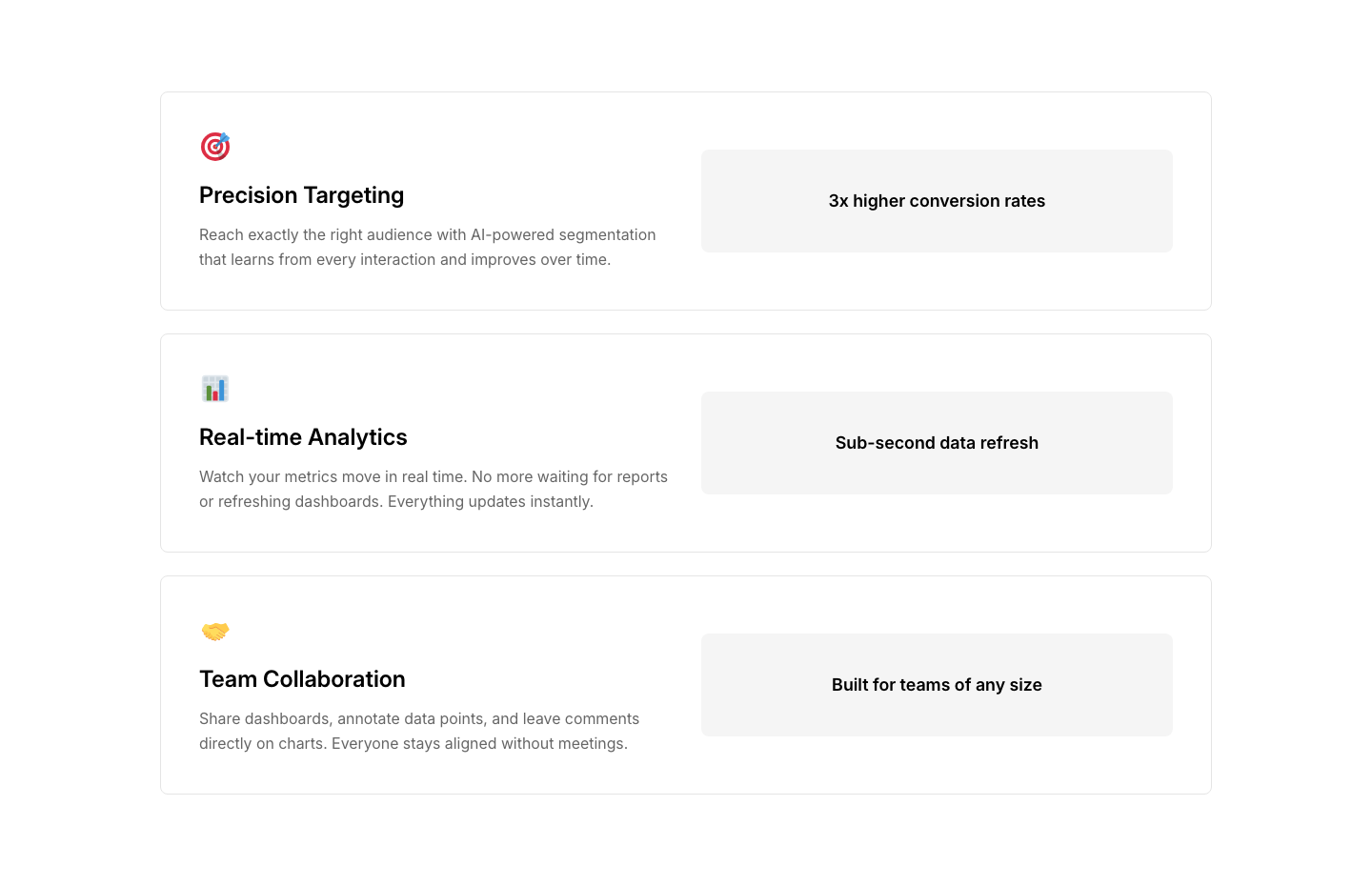
Features
StackVertically stacked feature sections with alternating alignment.
Images
StackOverlapping image stack with rotation and shadow creating a casual photo pile.
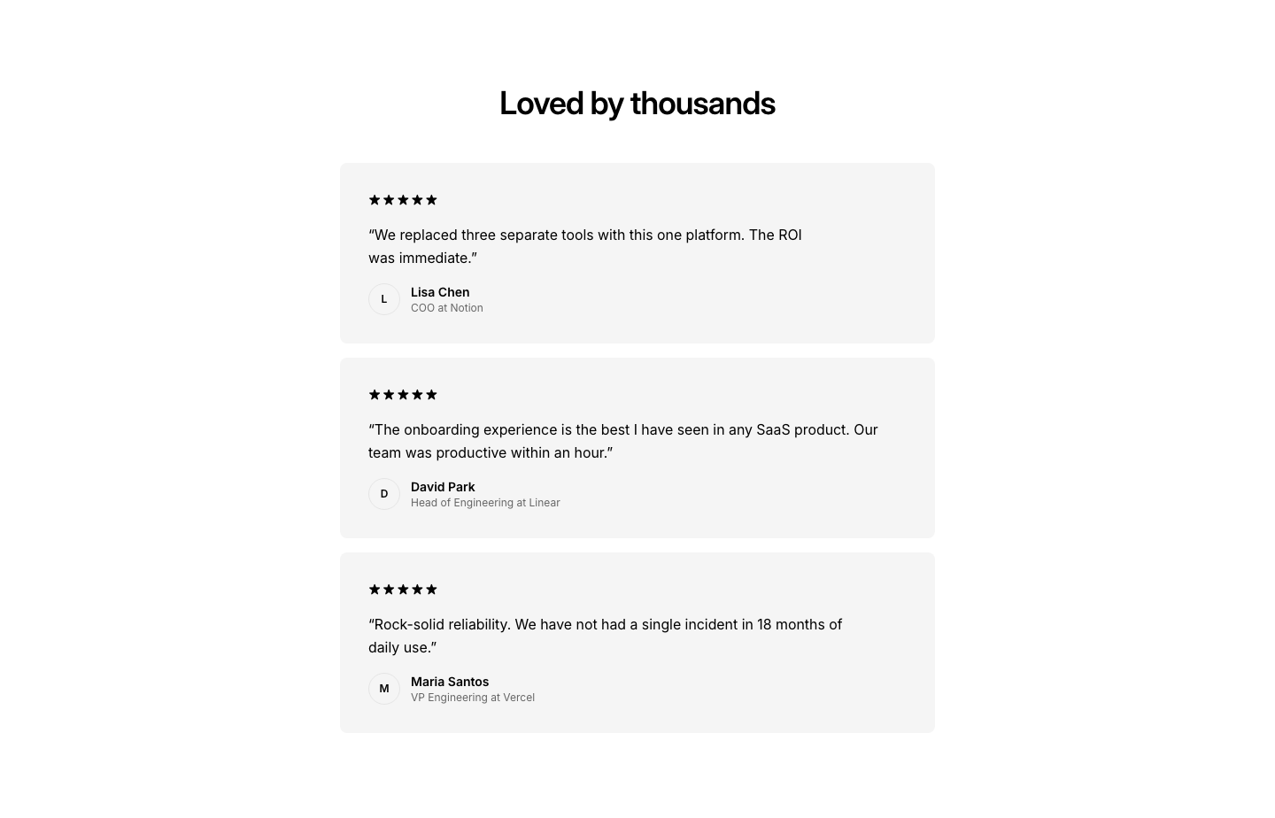
Testimonials
StackVertically stacked testimonial cards with highlighted quote.
Bar
StatHorizontal stat bar with progress-style visual indicators.
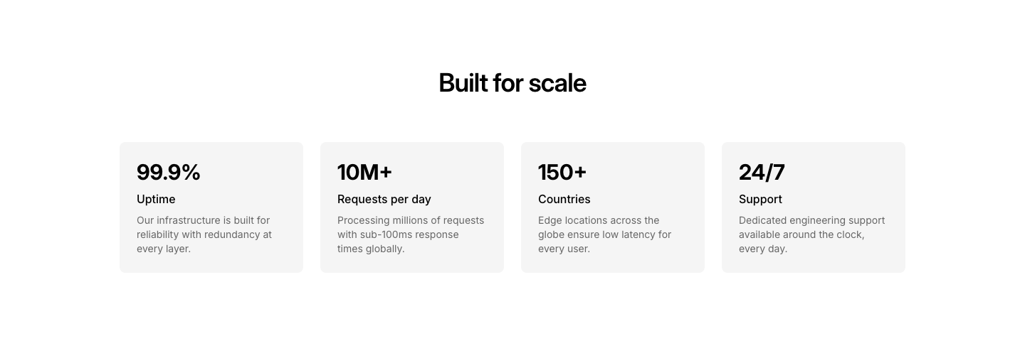
Cards
StatEach stat in its own card with label and description.

Circle
StatCircular progress indicators with percentages.

Comparison
StatTwo stats side by side with a vs divider.
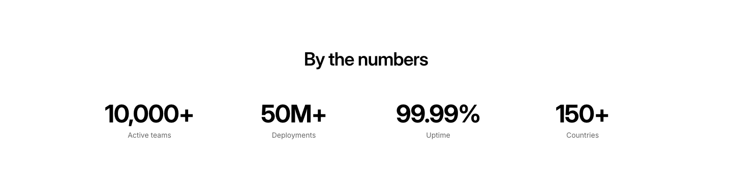
Counter
StatAnimated counting numbers (CSS counter) with labels.
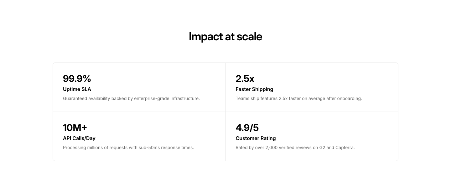
Grid
Stat2x2 grid of stat boxes with borders.
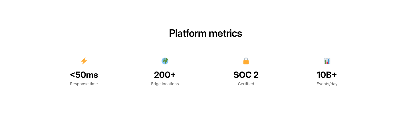
Icon
StatStats with icons above each number.

Large
StatOne big number centered, with supporting text.

Minimal
StatSimple inline numbers with labels, no cards or borders.

Row
StatKey numbers in a horizontal row.
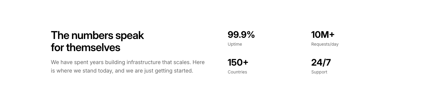
Split
StatStats on one side, descriptive text on the other.
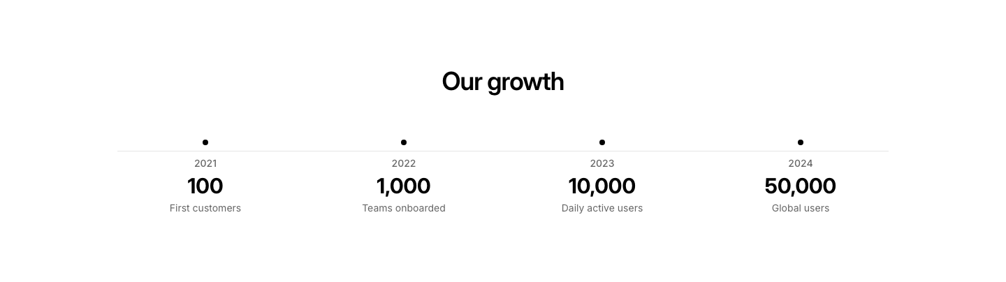
Timeline
StatStats shown along a horizontal timeline.
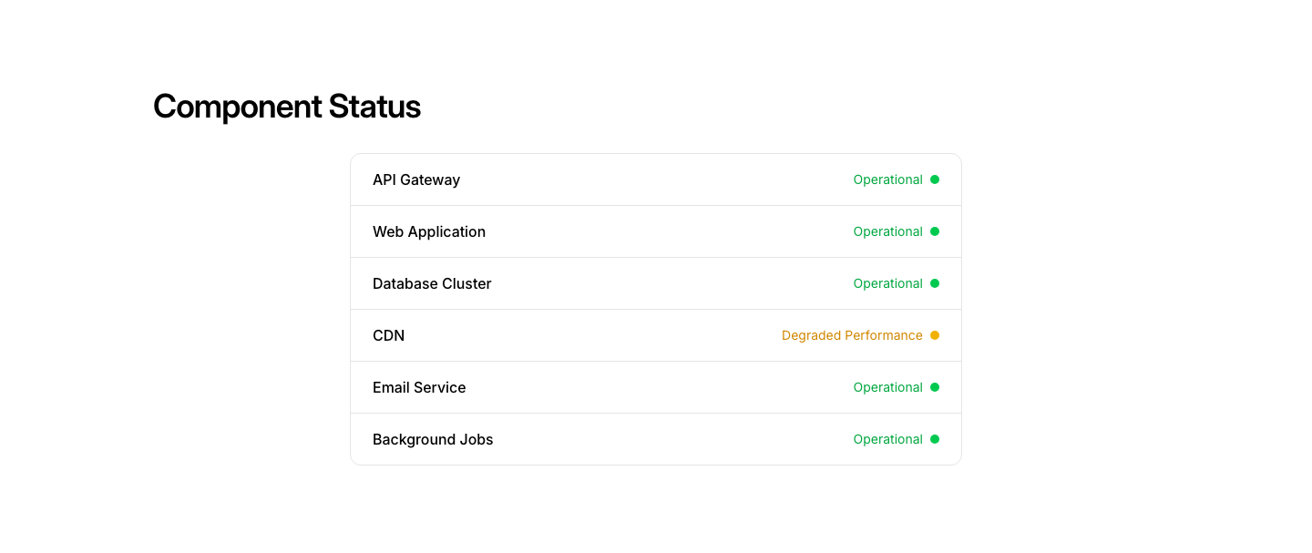
Components
Status PageComponent status list with colored indicators.

Hero
Status PageStatus page hero with overall system health indicator.
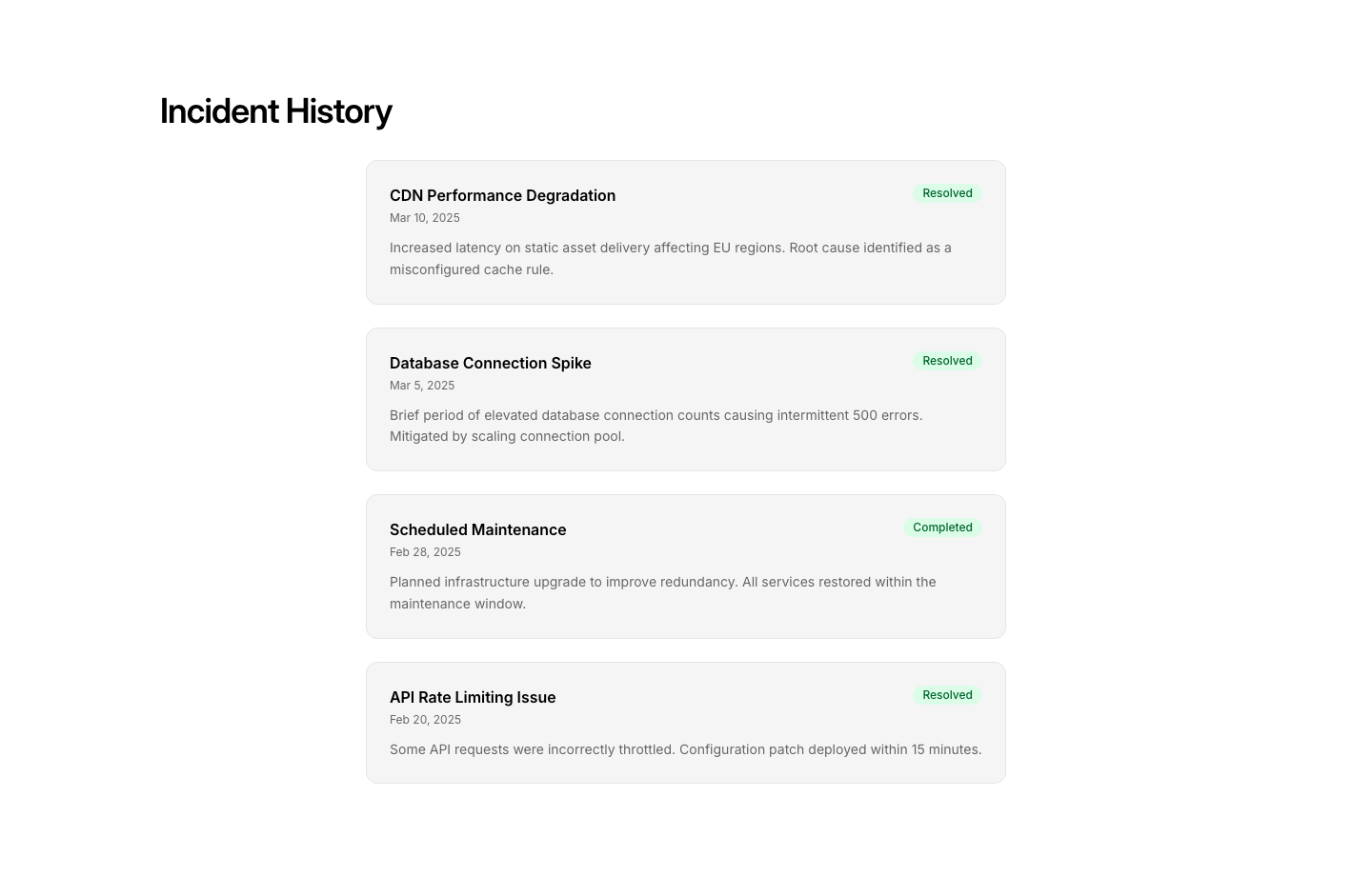
Incidents
Status PageIncident history with timestamps and updates.
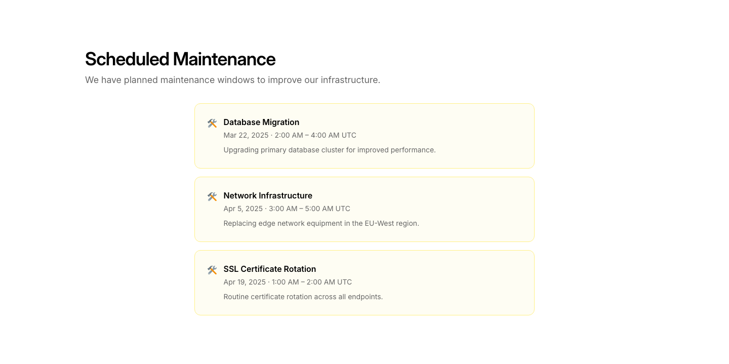
Maintenance
Status PageScheduled maintenance notice with date and duration.
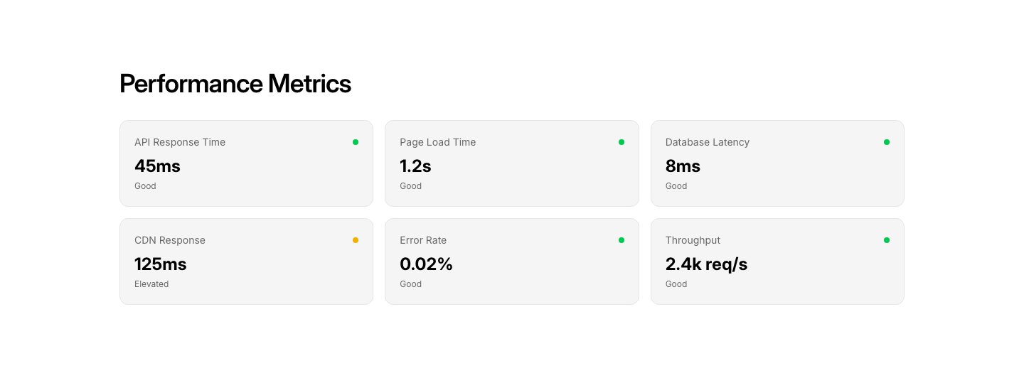
Metric
Status PageResponse time and latency metrics dashboard.

Subscribe
Status PageStatus update subscription form (email/SMS).
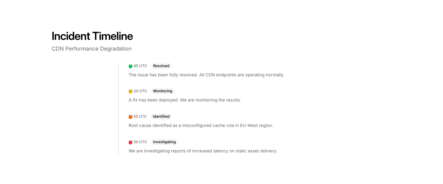
Timeline
Status PageIncident timeline with real-time status updates.
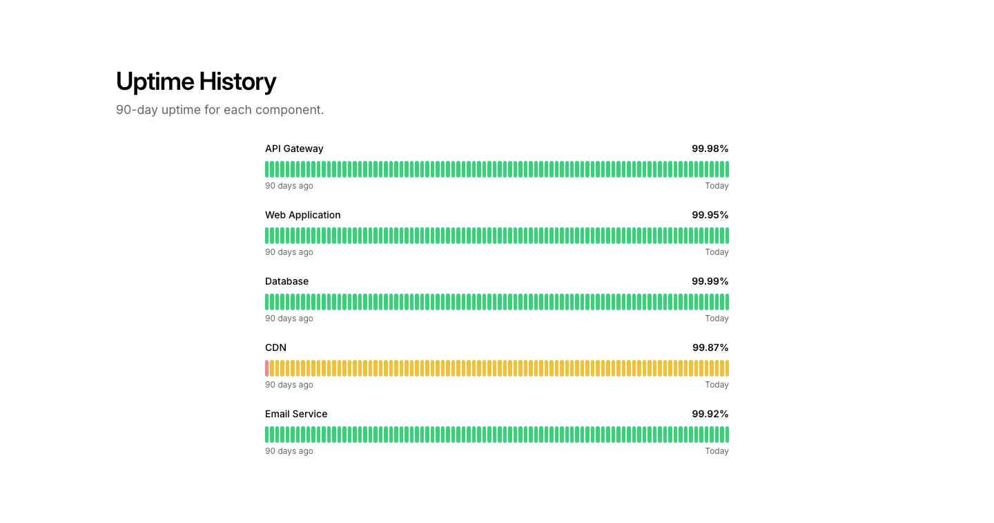
Uptime
Status PageUptime percentage bars by component over 90 days.

Horizontal
Step IndicatorHorizontal step indicator with active/completed states.

Icon
Step IndicatorSteps with icons instead of numbers.

Minimal
Step IndicatorMinimal dots or dashes showing current step.
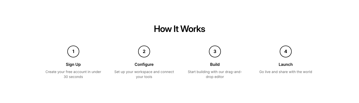
Numbered
Step IndicatorNumbered circles connected by lines.

Progress
Step IndicatorProgress bar style step indicator with percentage.
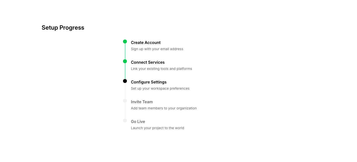
Vertical
Step IndicatorVertical step indicator for sidebar placement.
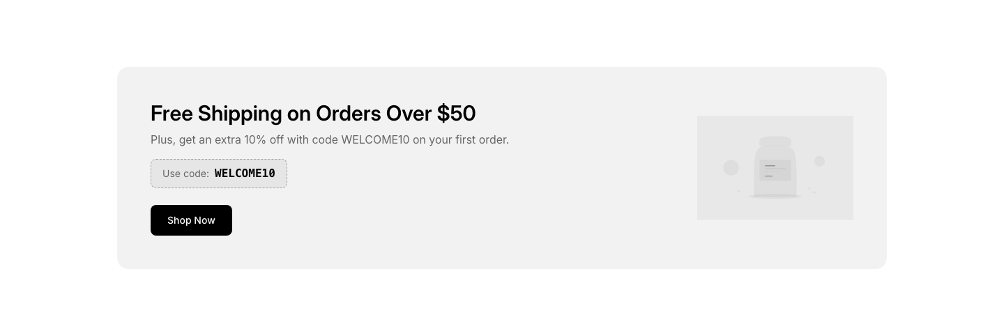
Banner
StorePromotional store banner with CTA and product image.
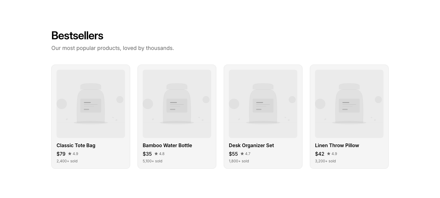
Bestsellers
StoreBest-selling products grid with sales count.
Categories
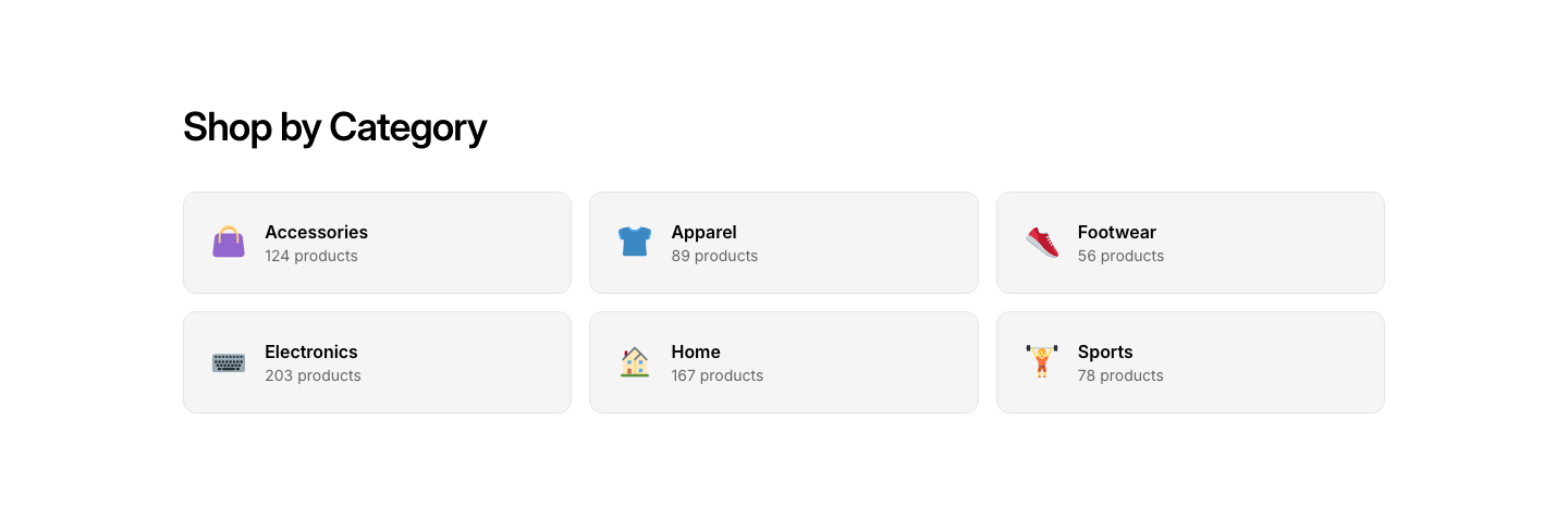
StoreStore category cards with product count and image.
Collection
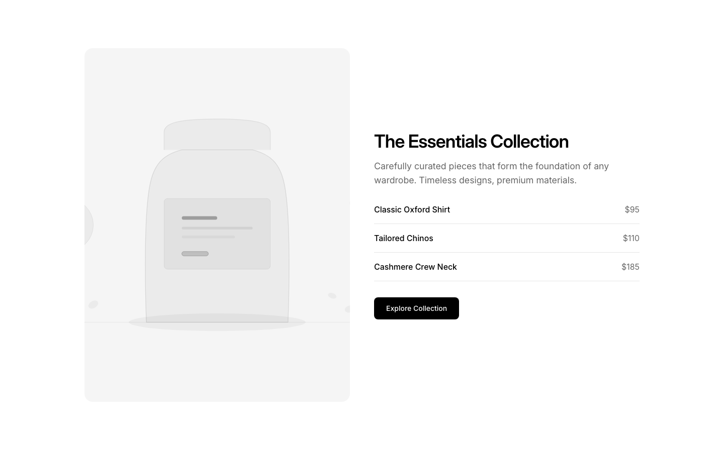
StoreCurated collection showcase with theme image and products.
Featured
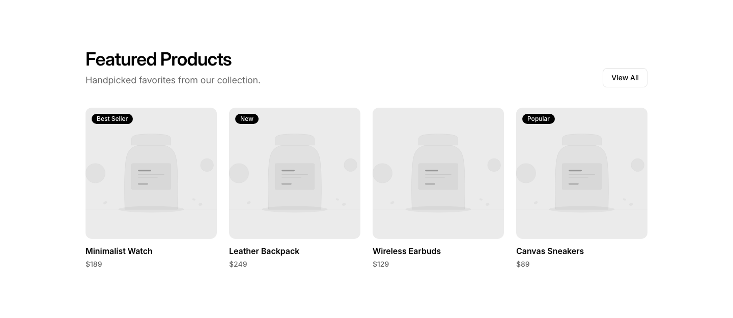
StoreFeatured products section with large showcase cards.
Hero
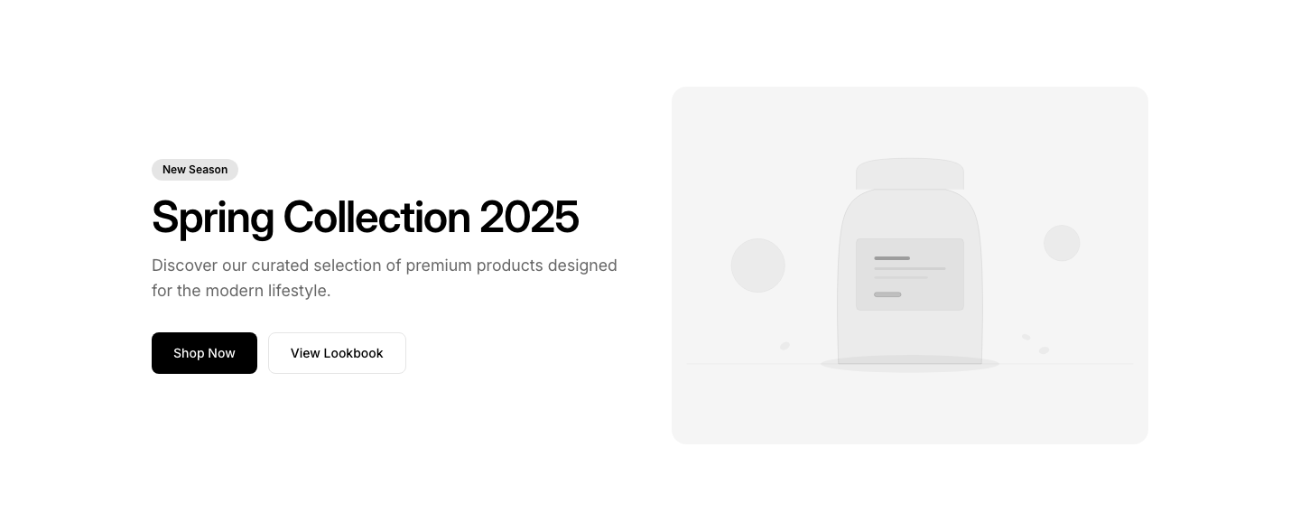
StoreE-commerce store hero with featured products and sale banner.
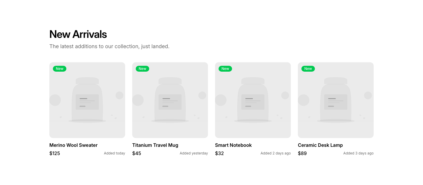
New Arrivals
StoreNew arrivals product row with "New" badges.
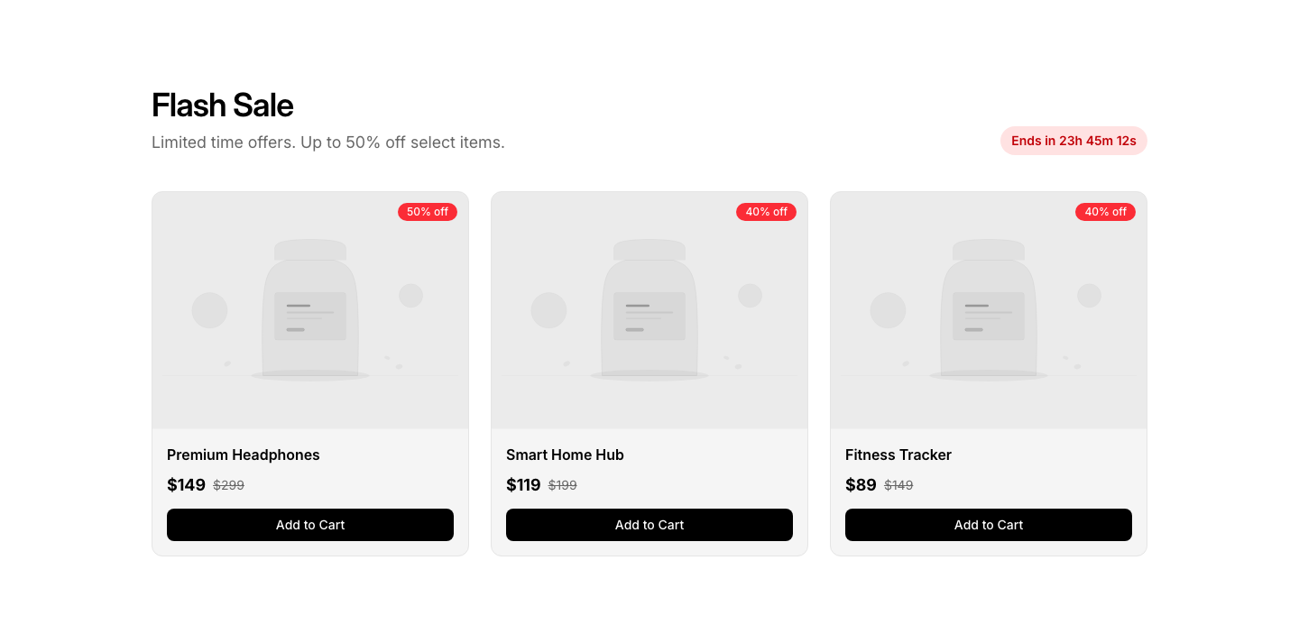
Sale
StoreSale section with original/discounted prices and countdown.
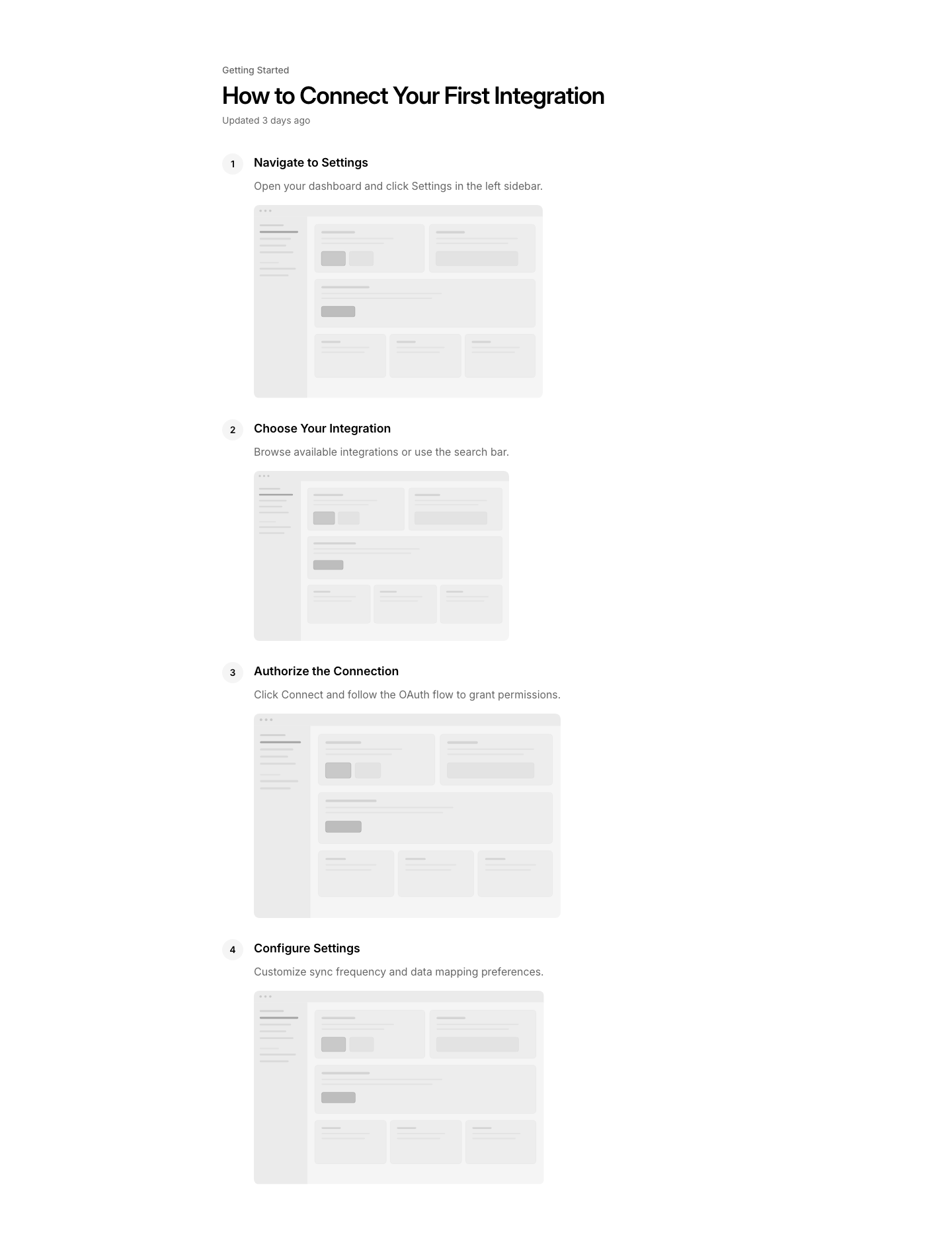
Article
SupportHelp article with steps and screenshots.
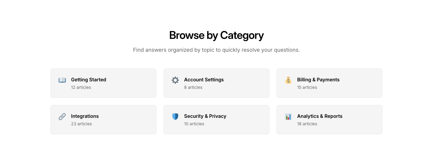
Categories
SupportSupport category cards with icons and article counts.
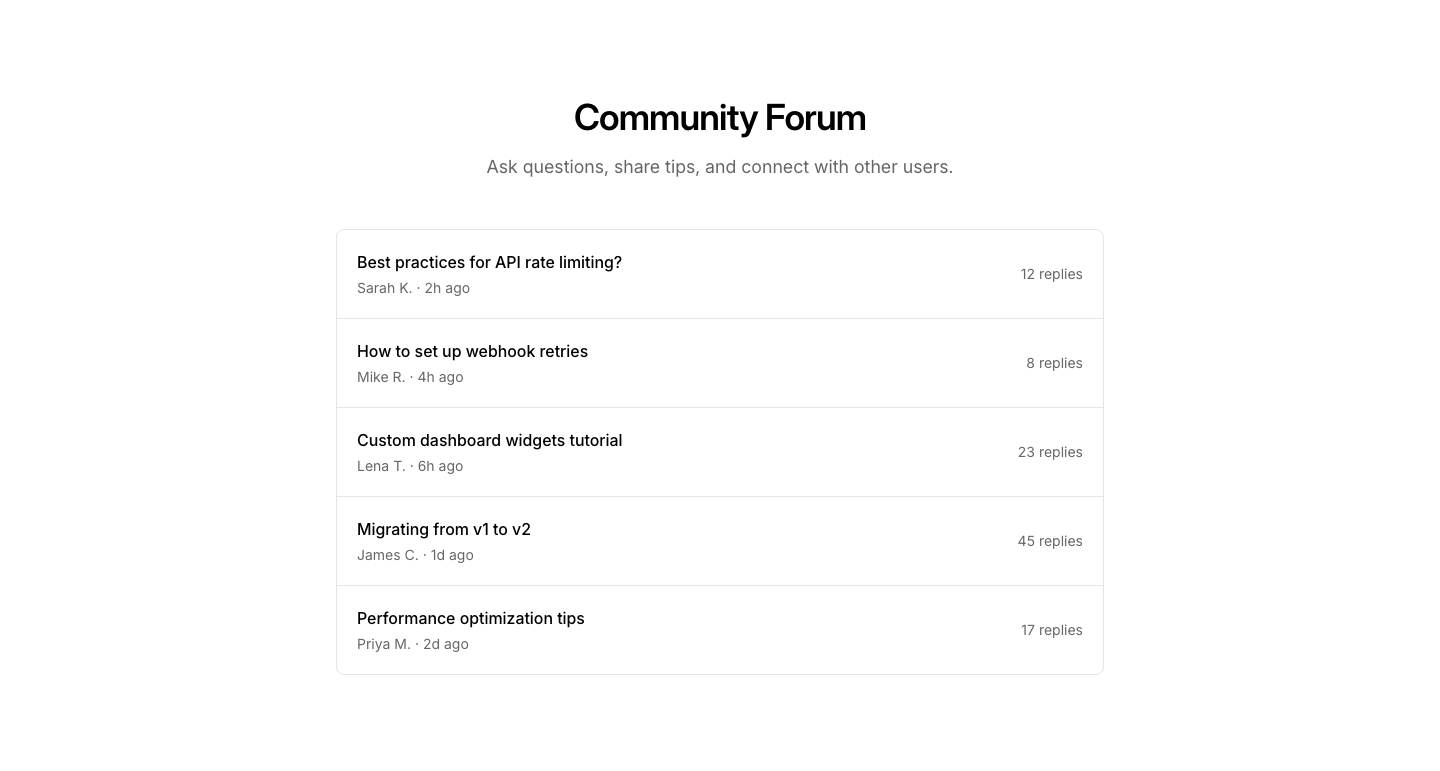
Community
SupportCommunity forum section with recent topics.
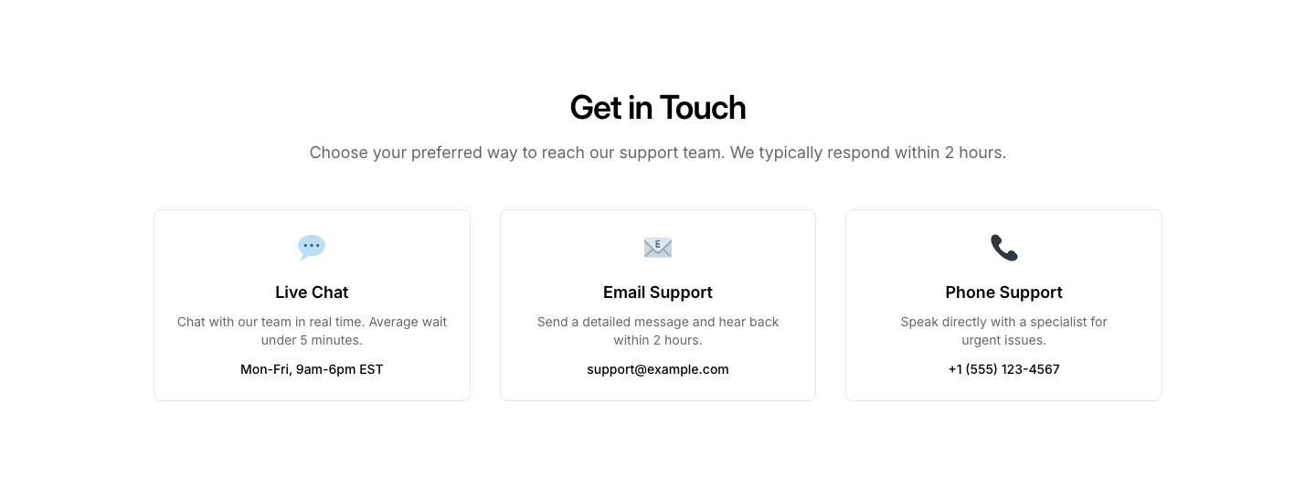
Contact
SupportSupport contact options: chat, email, and phone.
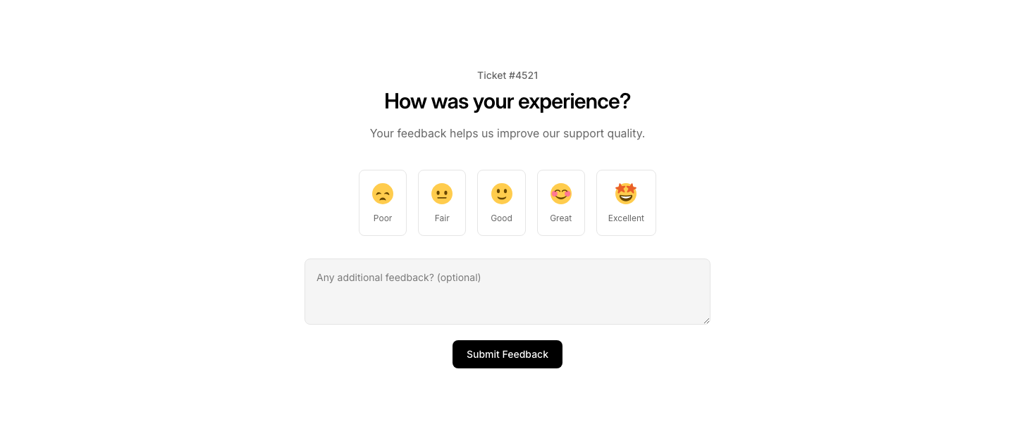
Feedback
SupportSupport satisfaction survey after ticket resolution.
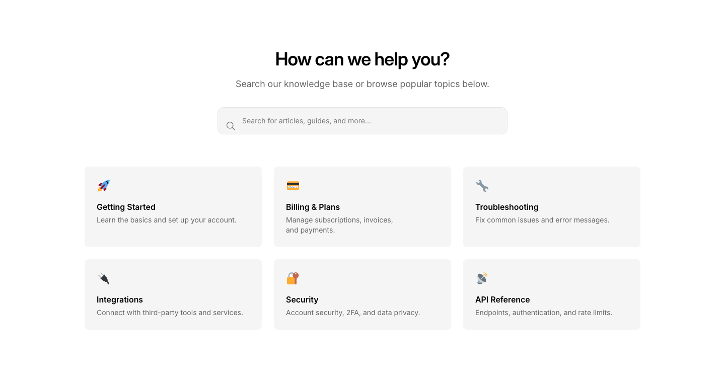
Hero
SupportHelp center hero with search and popular topics.
Status
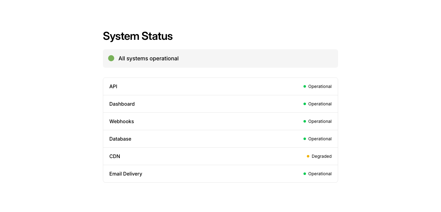
SupportSystem status indicator with incident history.
Tickets
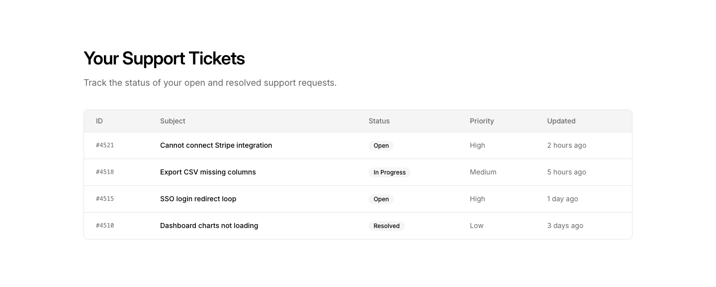
SupportSupport ticket list view with status and priority.
Card
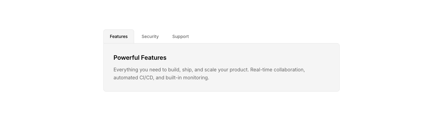
TabTab content displayed inside bordered cards.

Horizontal
TabHorizontal tab navigation with content panels.

Pill
TabPill-styled tab buttons with content panels.

Underline
TabUnderlined tab navigation with smooth transition.
Vertical
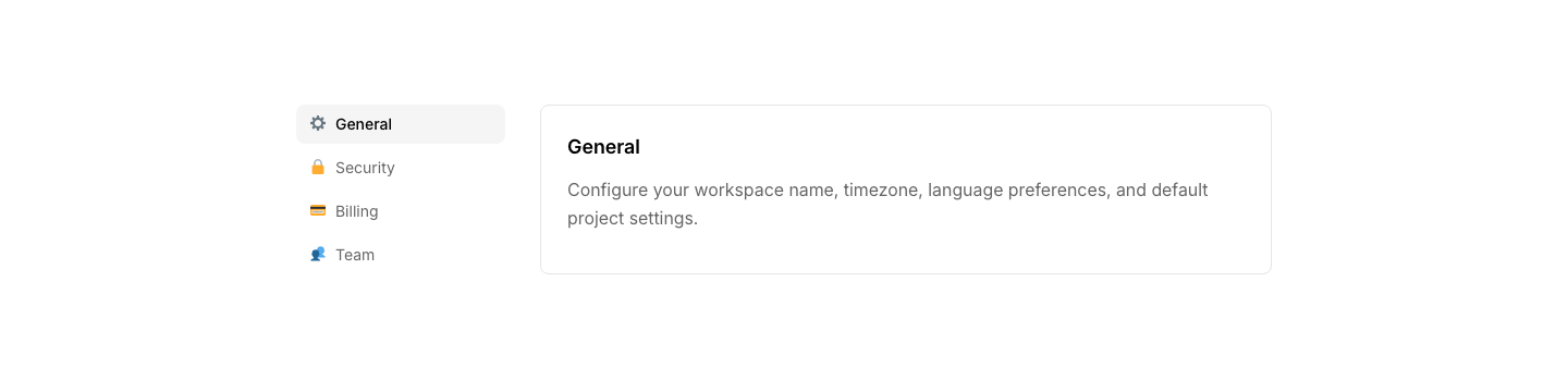
TabVertical tab navigation on left, content on right.
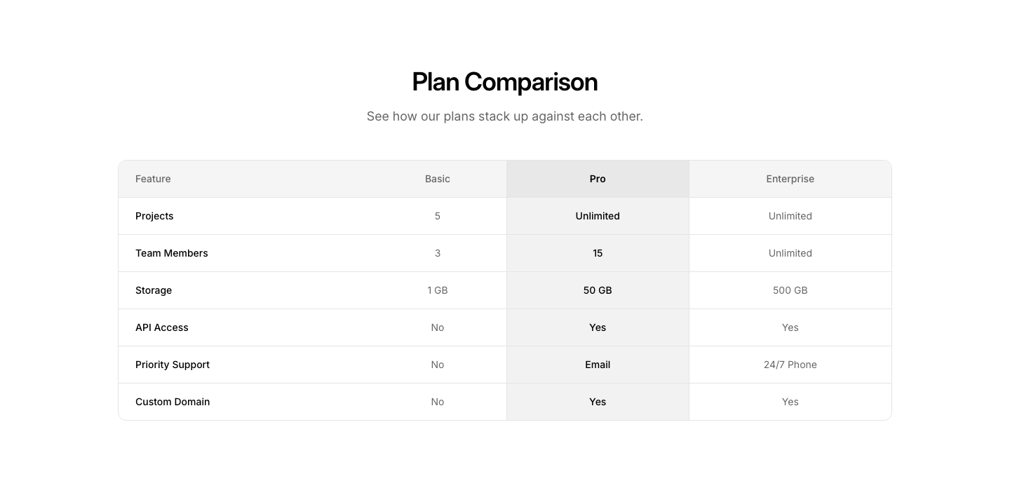
Comparison
TableSide-by-side comparison table with highlighted differences.
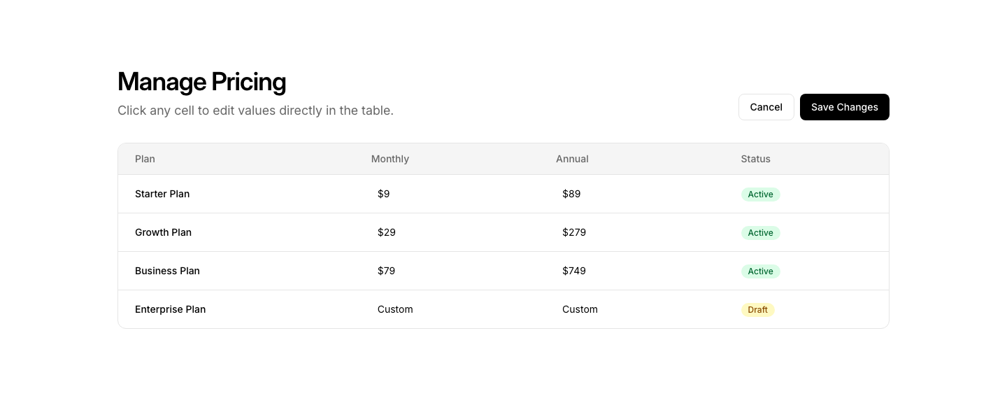
Editable
TableInline editable table cells with save/cancel actions.
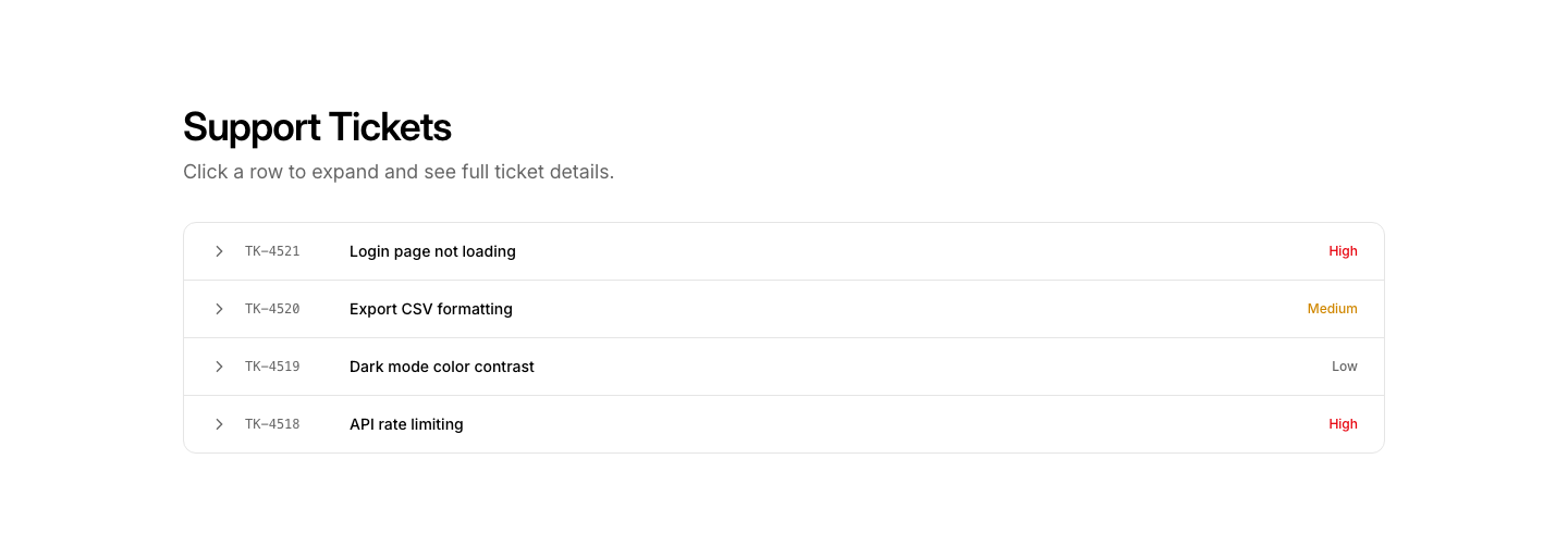
Expandable
TableTable with expandable rows revealing detail panels.
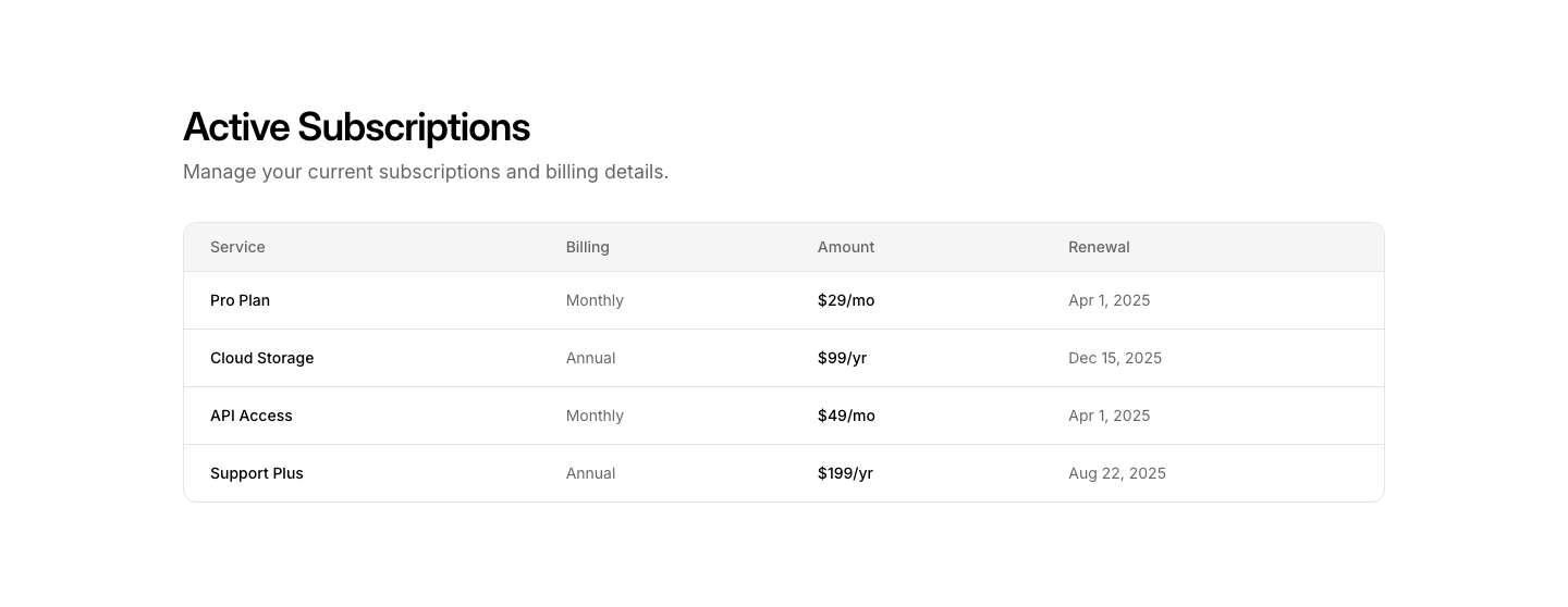
Responsive
TableTable that converts to card layout on mobile.
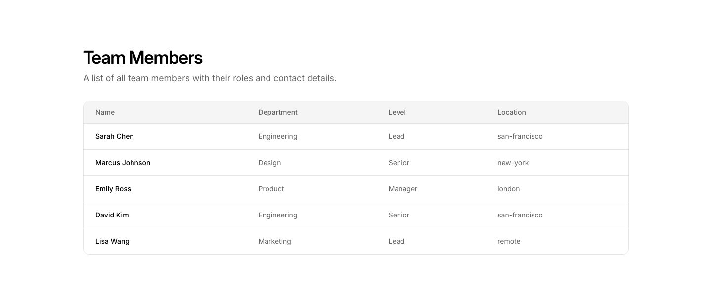
Simple
TableClean data table with header row and alternating rows.
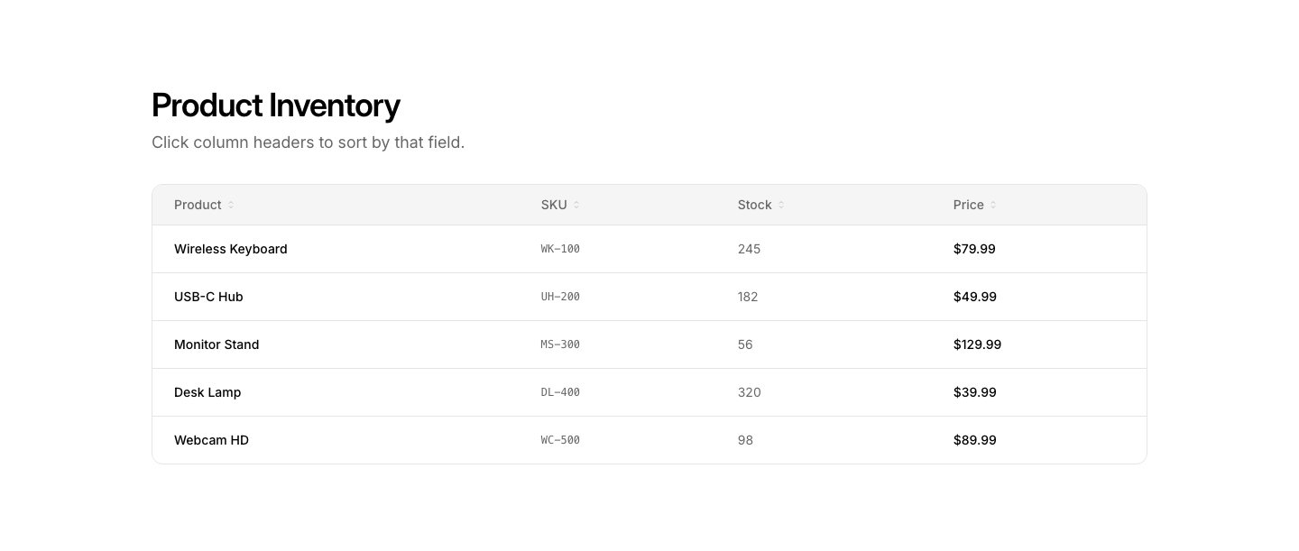
Sortable
TableTable with sortable column headers and direction arrows.
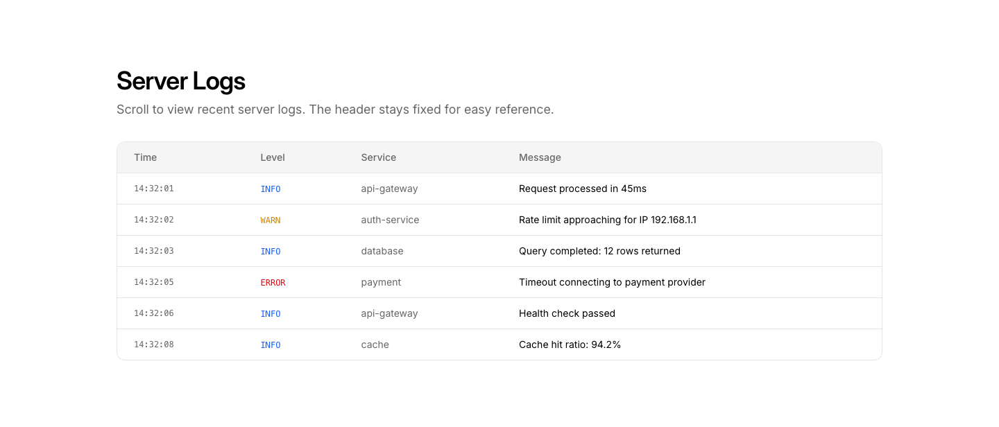
Sticky
TableTable with sticky header that stays visible on scroll.
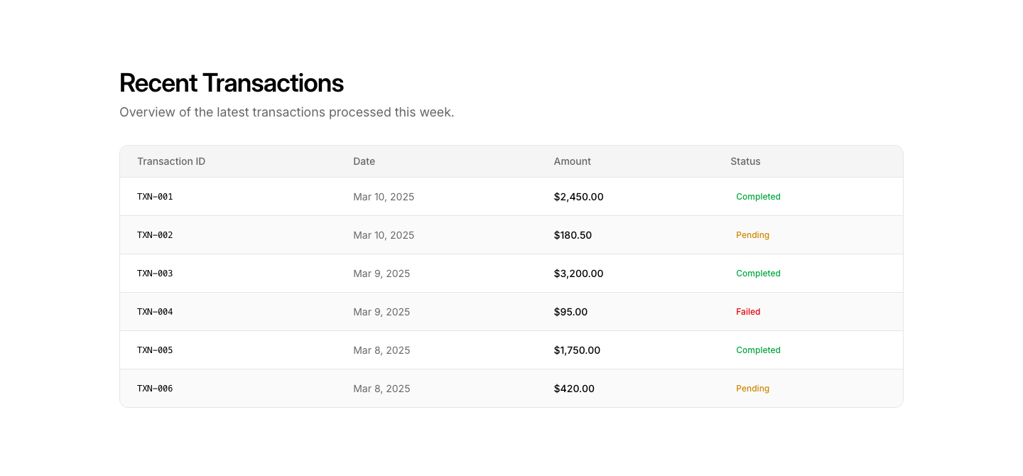
Striped
TableStriped table with hover highlights on rows.
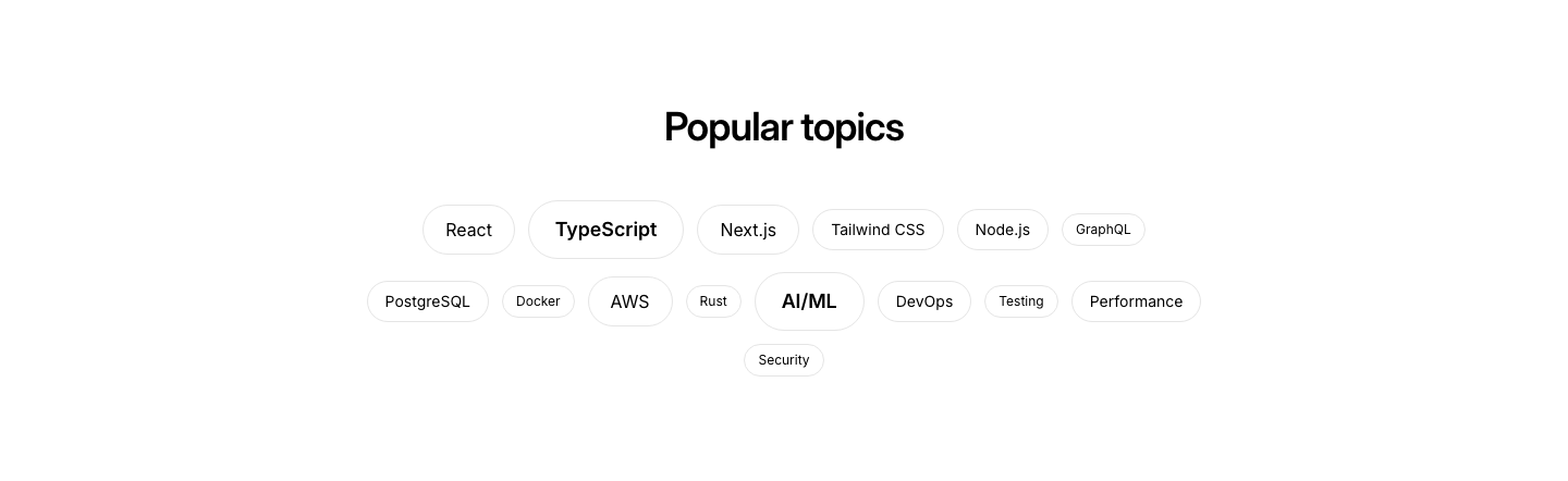
Cloud
TagTag cloud with varying sizes based on popularity.

Filter
TagFilterable tag bar with active/inactive states for content filtering.
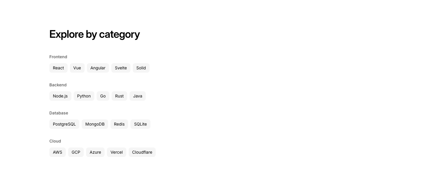
Group
TagTags organized by category groups with labels.

Pill
TagPill-style tag list with icons and counts.
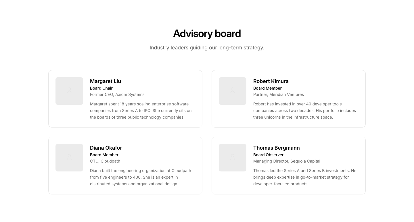
Board
TeamAdvisory board layout: larger cards with bio paragraph.
Carousel
TeamHorizontally scrollable team member cards with snap scrolling.
Circle
TeamCircular avatar photos in a grid layout.
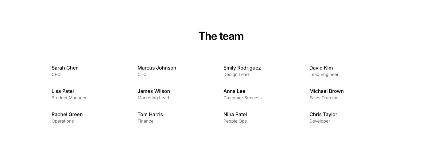
Compact
TeamCompact team grid with names and roles only, no photos.
Department
TeamTeam members grouped under department headings.
Featured
TeamFeatured team member with large photo and bio, plus remaining members grid.
Grid
TeamTeam member grid with avatar placeholders, names, and roles.
Hover
TeamPhoto grid where name and role appear on hover overlay.
Leadership
TeamSeparate section for leadership (large) and rest of team (small).
List
TeamCompact team member list with small avatars, names, and roles.
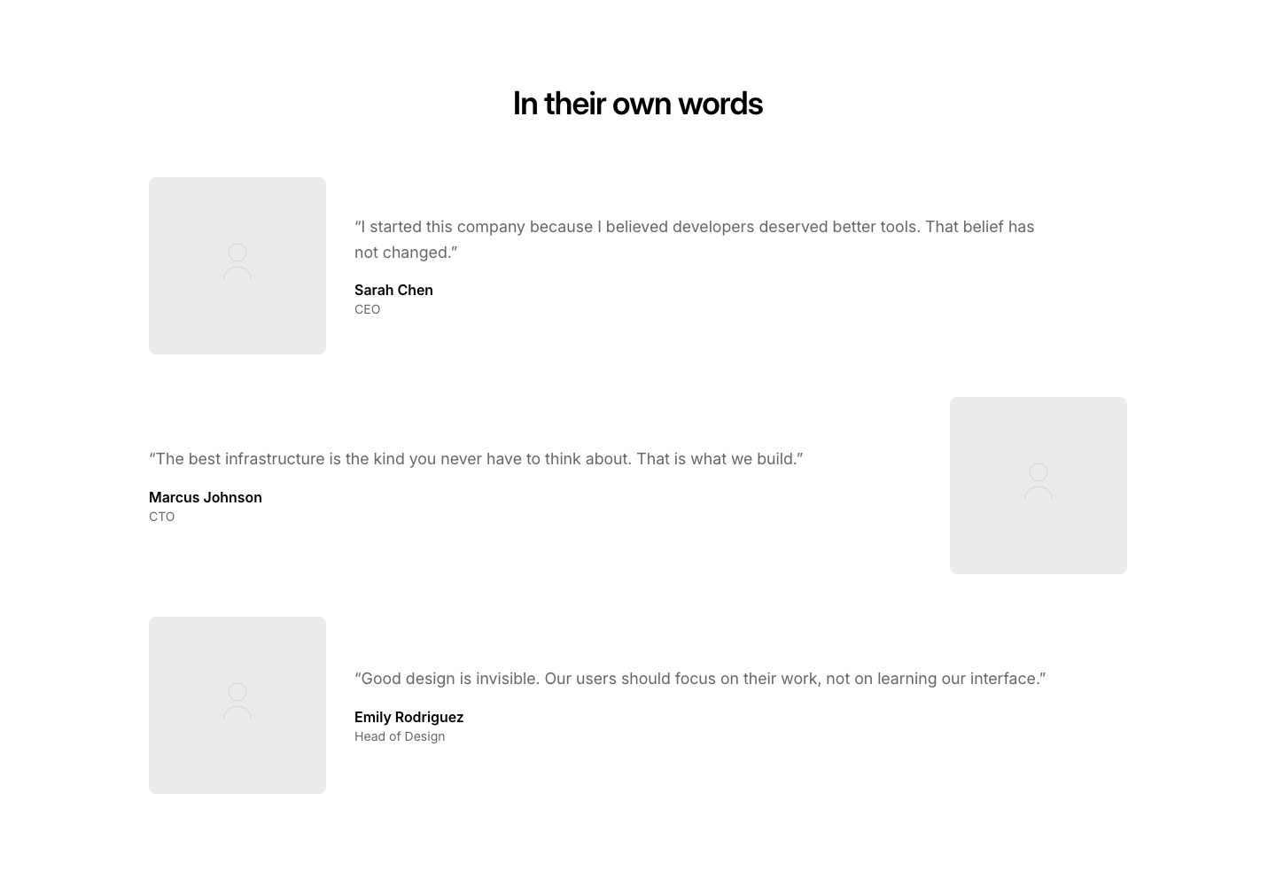
Quote
TeamTeam members with a personal quote next to their photo.
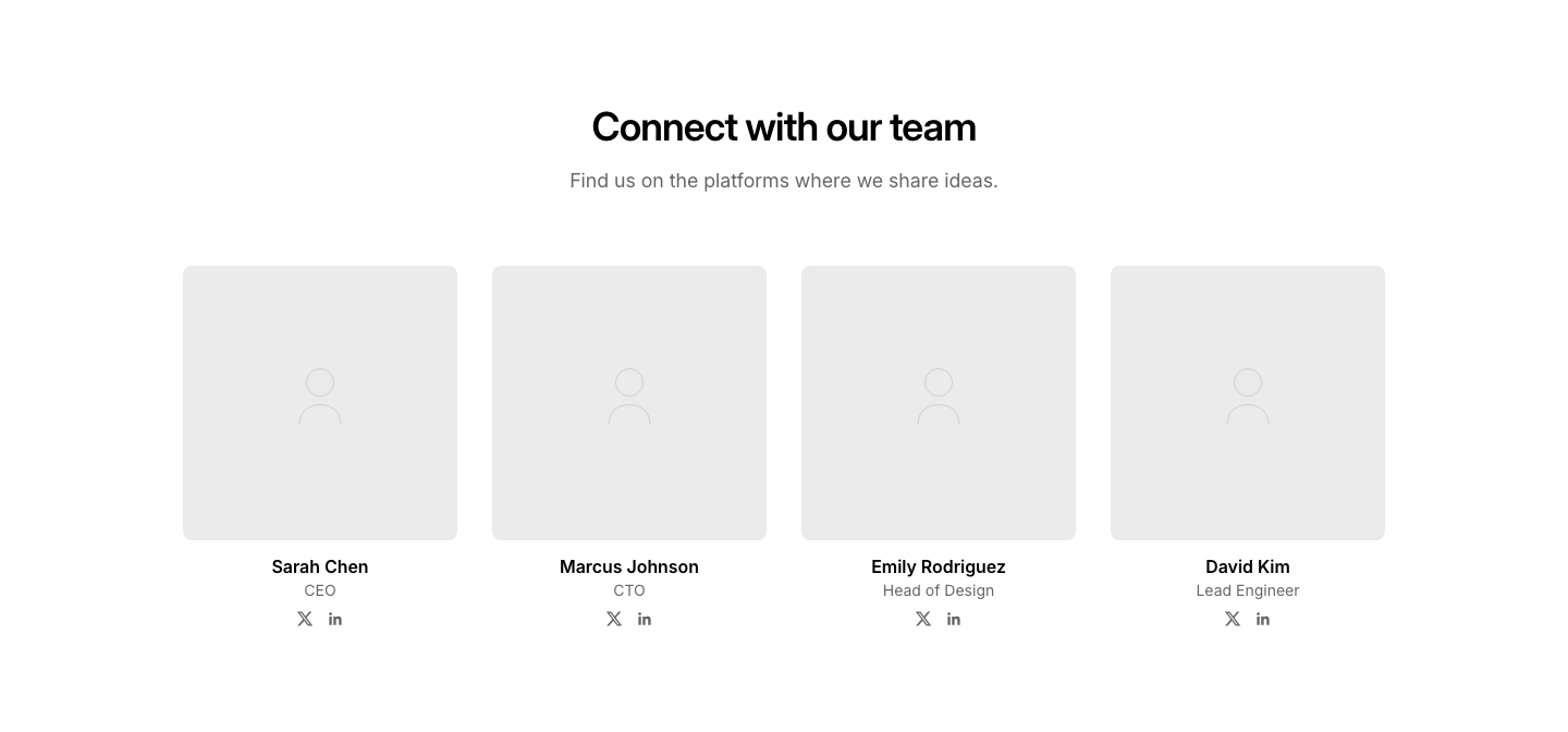
Social
TeamTeam cards with social media links below each member.
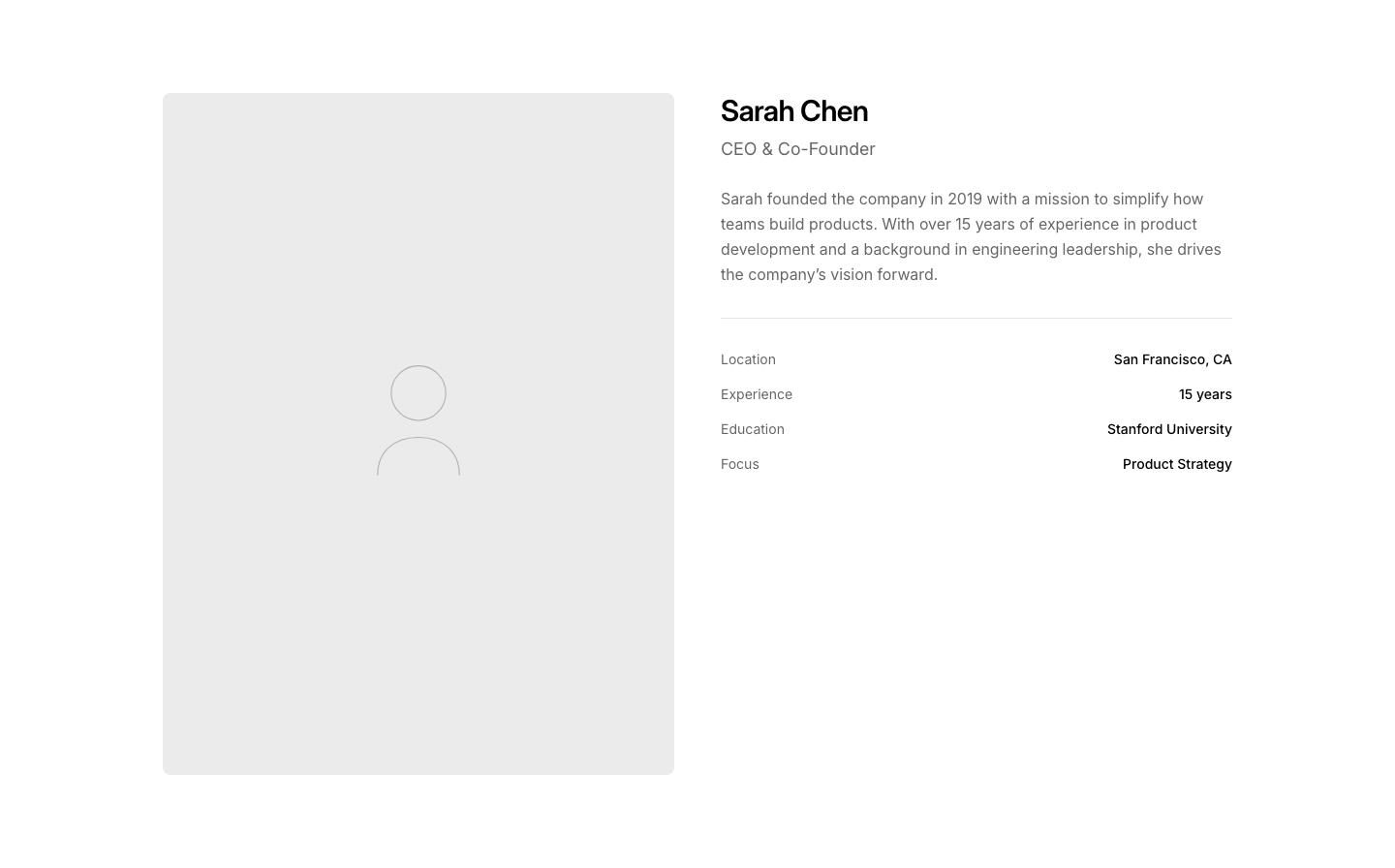
Split
TeamSingle team member profile with large photo and detail rows.
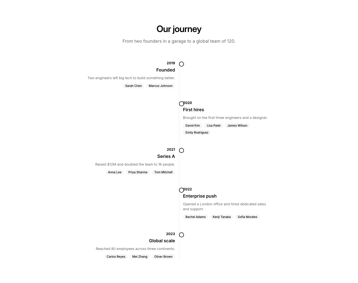
Timeline
TeamTeam growth shown as a timeline of key hires.

Avatar Row
TestimonialStacked avatars with a single rotating quote above.
Bubble
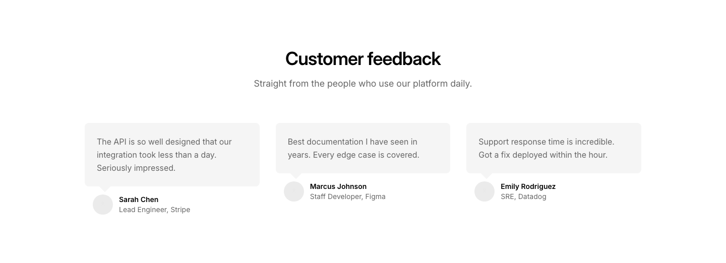
TestimonialSpeech bubble-styled quote cards with avatar below.
Cards
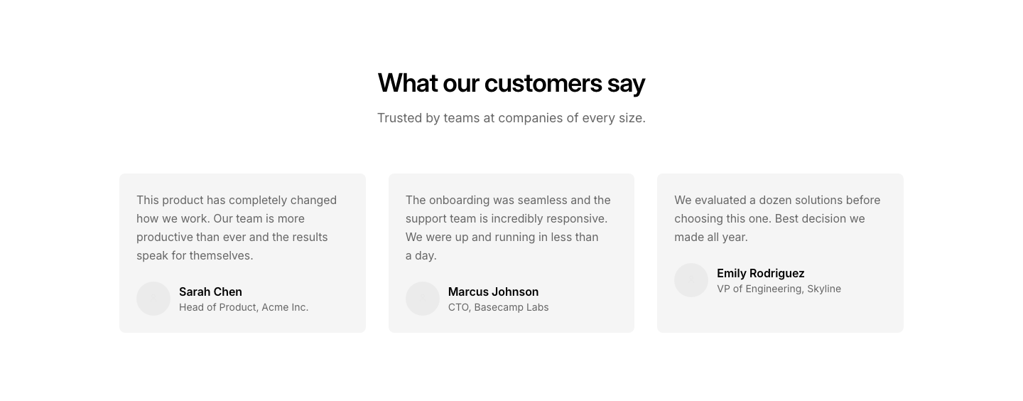
TestimonialGrid of testimonial cards with quote, name, role, avatar.
Case
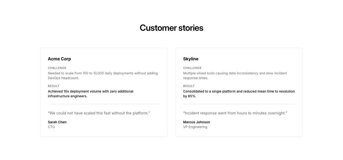
TestimonialTestimonial as mini case study: company, challenge, result, quote.
Featured
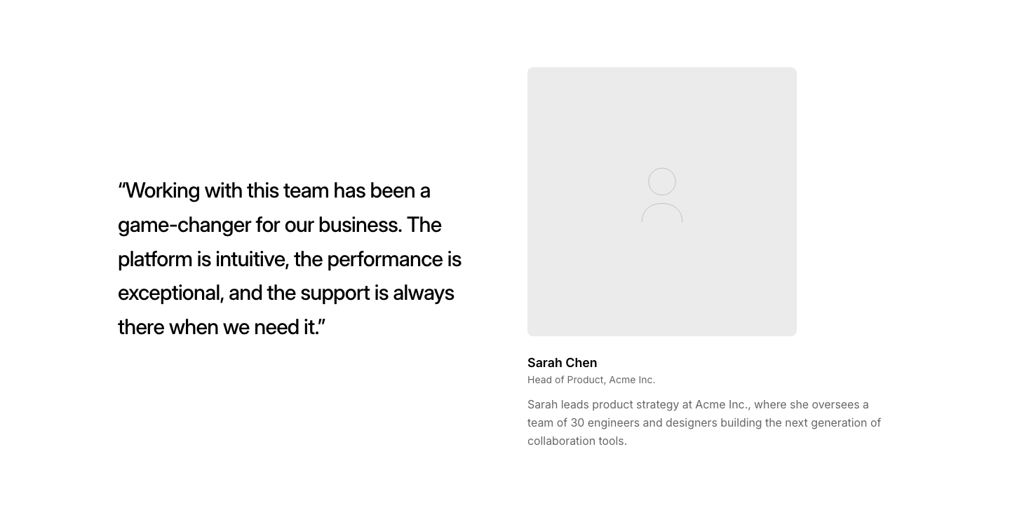
TestimonialLarge quote on one side, author photo and bio on the other.

Highlight
TestimonialSingle centered quote with large quotation marks as decoration.

Inline
TestimonialShort quote embedded inline between other content sections.
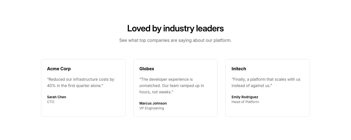
Logo
TestimonialTestimonial cards with company logo above the quote.
Marquee
TestimonialAuto-scrolling horizontal strip of quotes (CSS animation).

Minimal
TestimonialJust the quote text and a name. No card, no avatar.
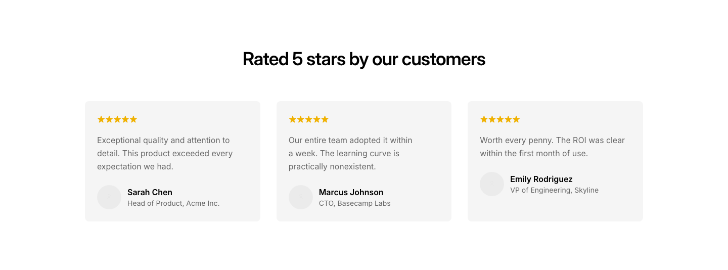
Rating
TestimonialTestimonial cards with star rating above the quote.
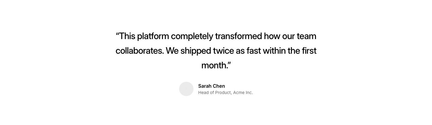
Single
TestimonialOne large testimonial, centered.
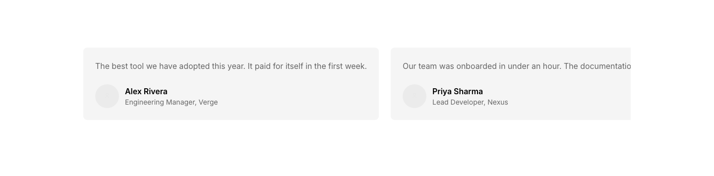
Slider
TestimonialHorizontal scroll row of testimonials (CSS only).
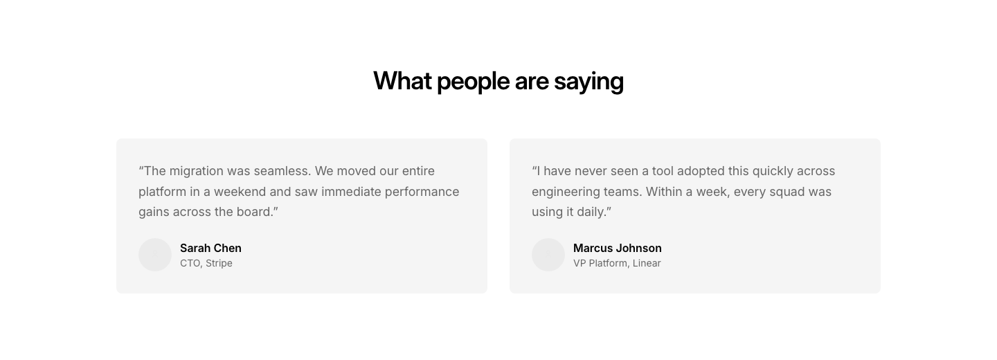
Split
TestimonialTwo large testimonials side by side.
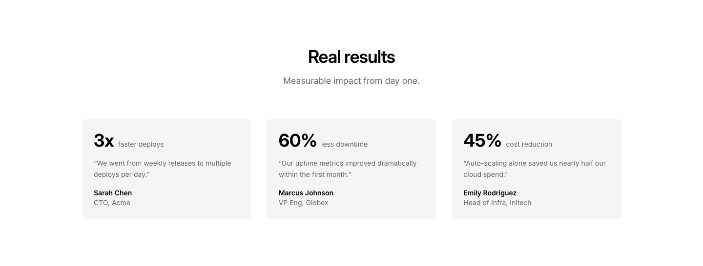
Stat
TestimonialTestimonial with a key metric highlighted.
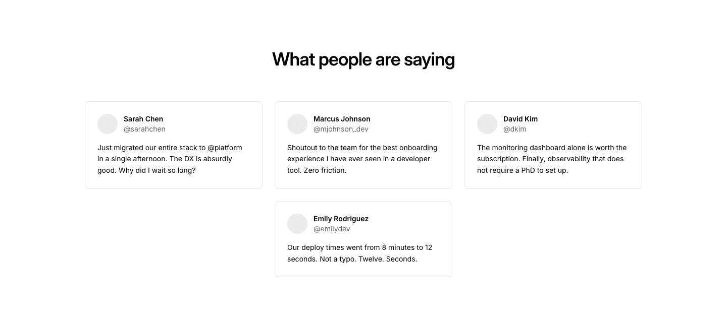
Tweet
TestimonialTestimonials styled as social media post cards.
Video
TestimonialVideo testimonial thumbnails in a grid with play button overlay.
Wall
TestimonialMasonry-style wall of mixed-length quotes.
Cards
TimelineTimeline events as cards with images and descriptions.
Compact
TimelineDense list-style timeline with dates and titles in rows.

Comparison
TimelineTwo parallel timelines side by side for comparison.
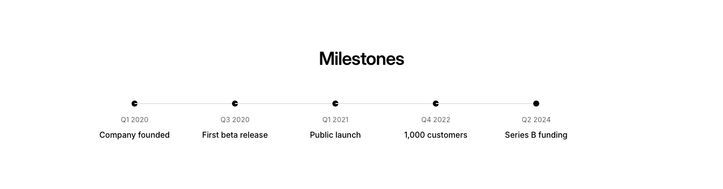
Horizontal
TimelineHorizontal scrolling timeline with date and title milestones.
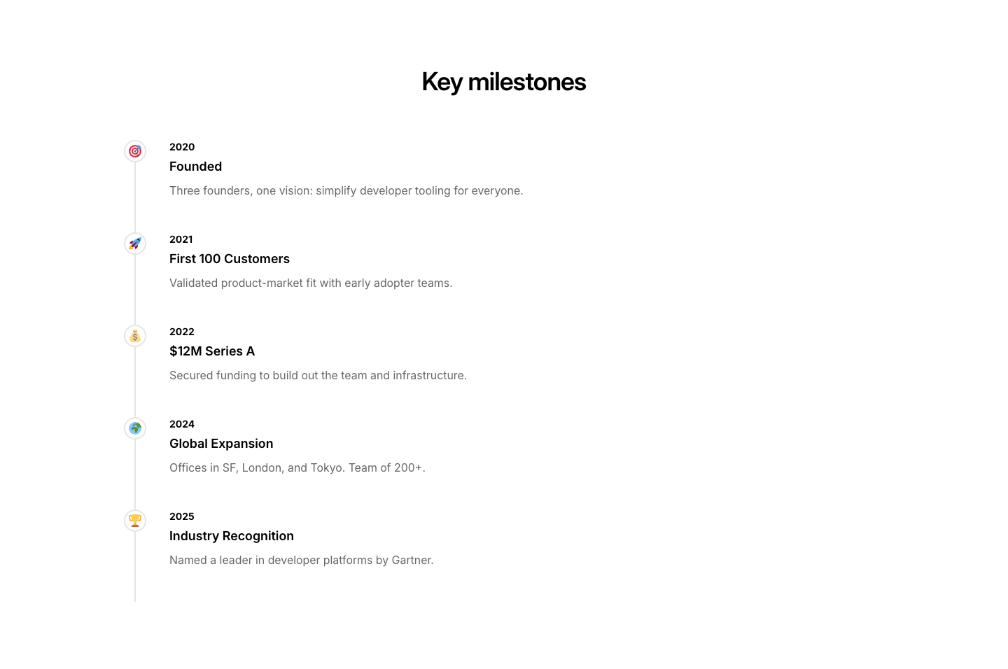
Milestone
TimelineKey milestones highlighted with icons along the timeline.
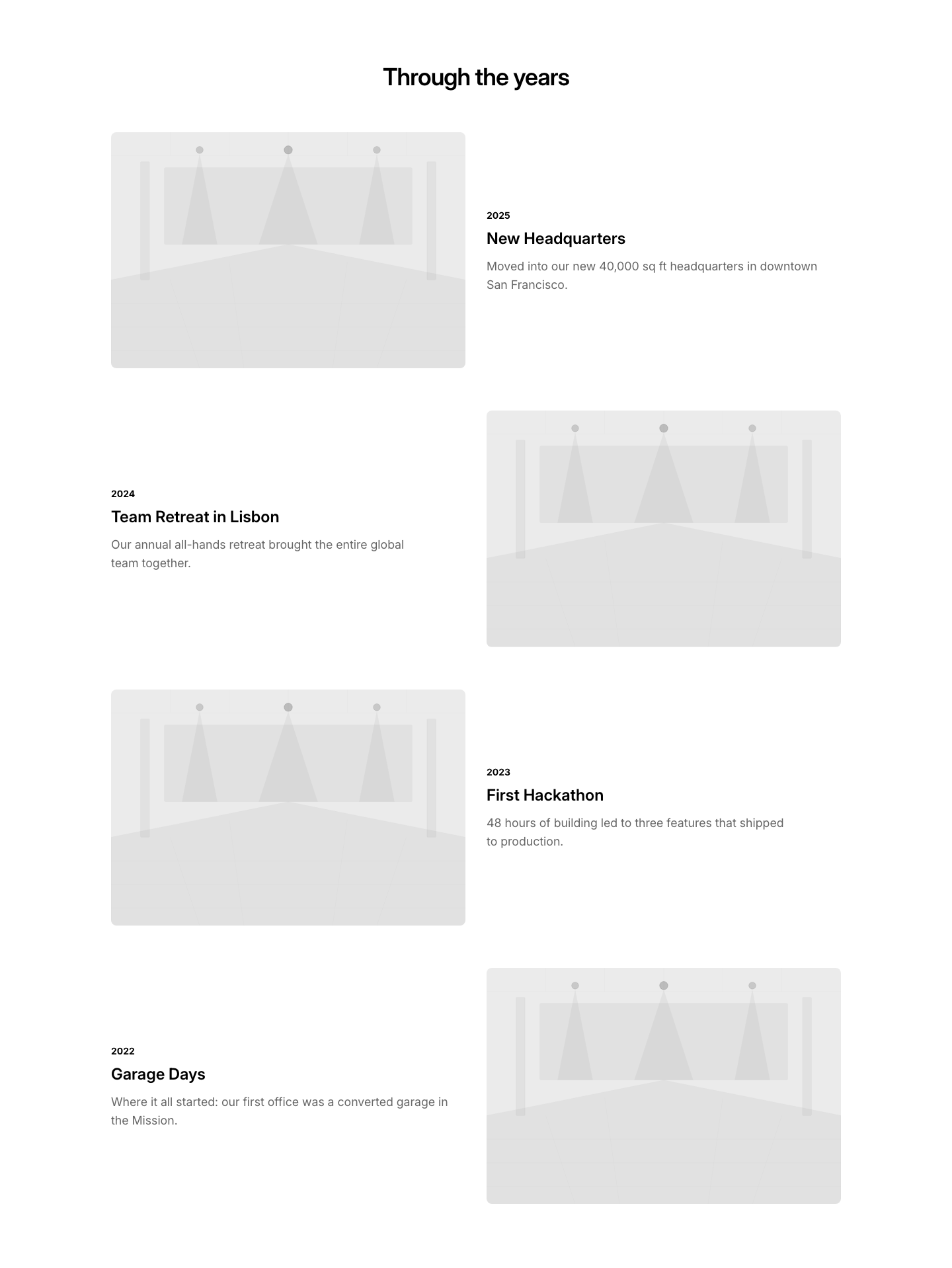
Photo
TimelineTimeline with photos at each event node.
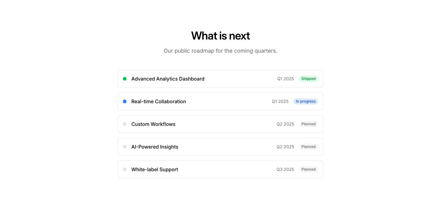
Roadmap
TimelineFuture roadmap timeline with planned vs completed items.
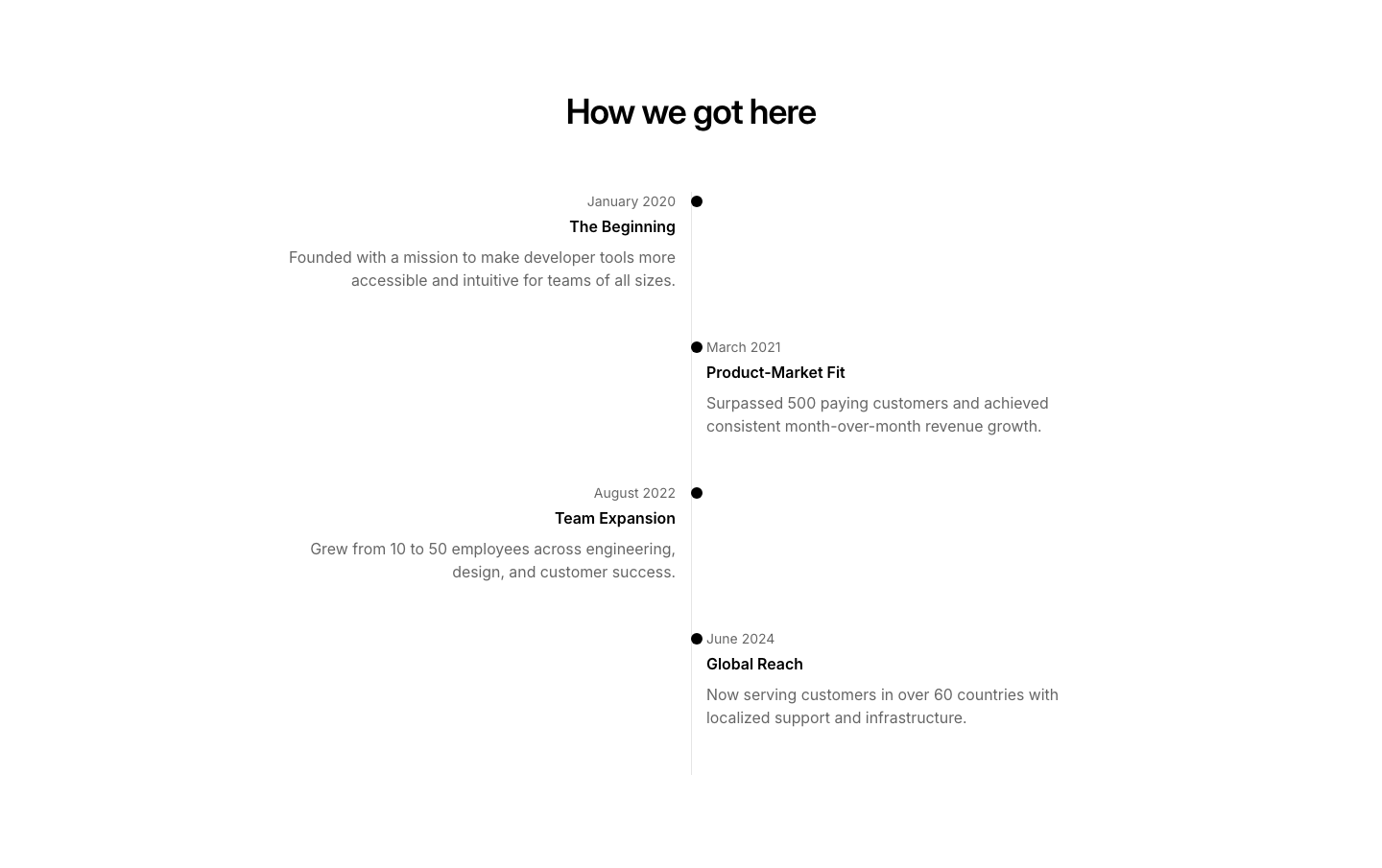
Split
TimelineAlternating left-right timeline with center vertical line.
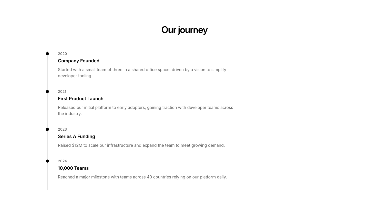
Vertical
TimelineVertical timeline with date, title, and description for each event.
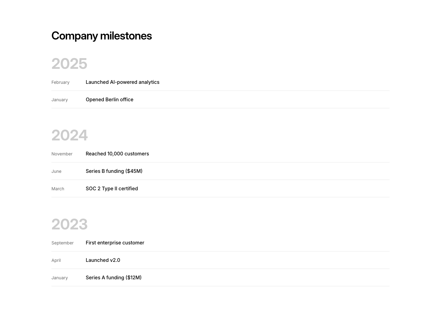
Year
TimelineYear markers as large headers with events grouped below.
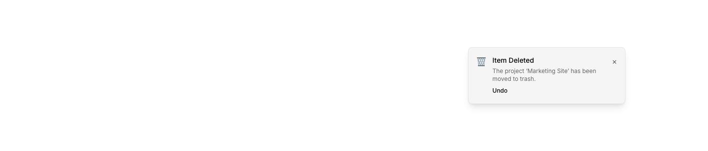
Action
ToastToast with an action button (Undo, View, etc.).

Error
ToastError toast notification with X icon.

Actions
ToolbarAction toolbar with icon buttons (edit, delete, share).
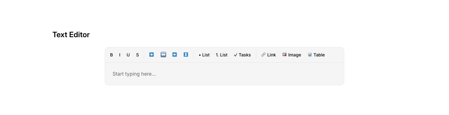
Editor
ToolbarText editor toolbar with formatting buttons.
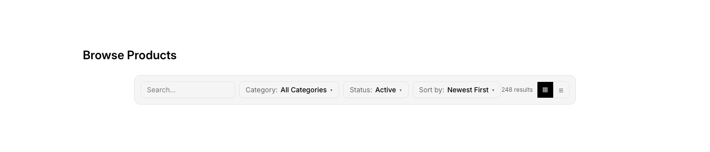
Filter
ToolbarToolbar with filter, sort, and view toggle buttons.

Pagination
ToolbarToolbar with items-per-page selector and pagination.

Card
TooltipRich tooltip card with title, description, and action.

Image
TooltipTooltip with image preview on hover.
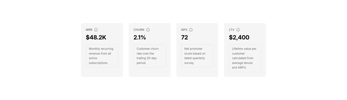
Info
TooltipRow of info items with tooltip-style detail panels.

Popover
TooltipPopover menu triggered by button.

Rich
TooltipRich tooltip with heading, text, and link.

Simple
TooltipSimple tooltip on hover with text content.
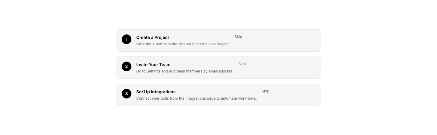
Step
TooltipGuided tooltip pointing to UI elements with step numbers.
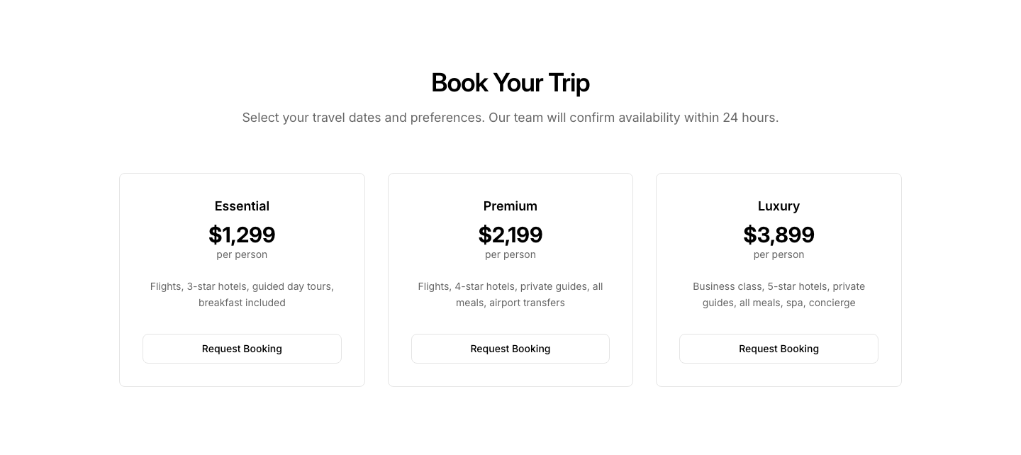
Booking
TravelTrip booking form with options and pricing.
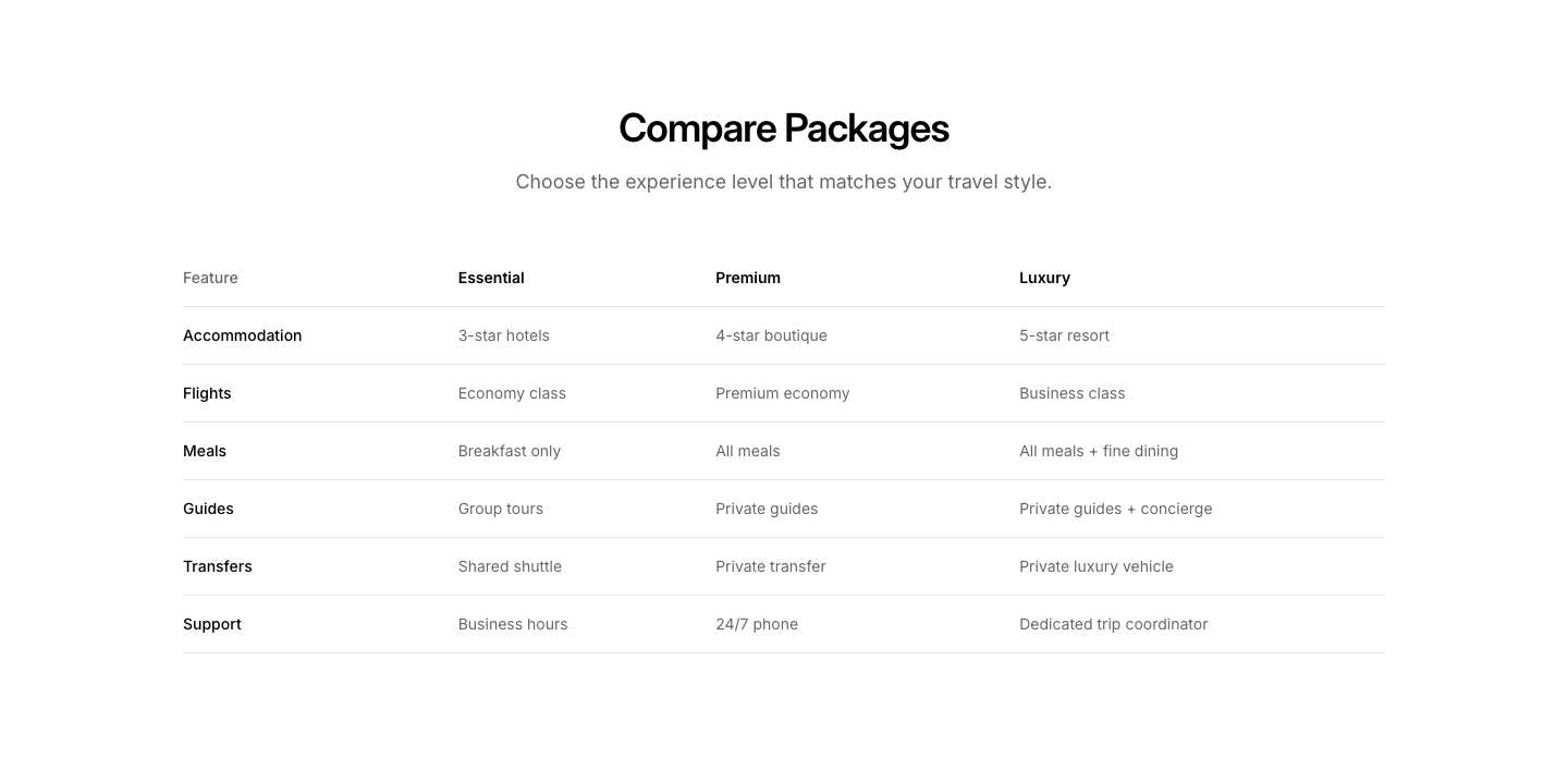
Comparison
TravelTrip package comparison table.
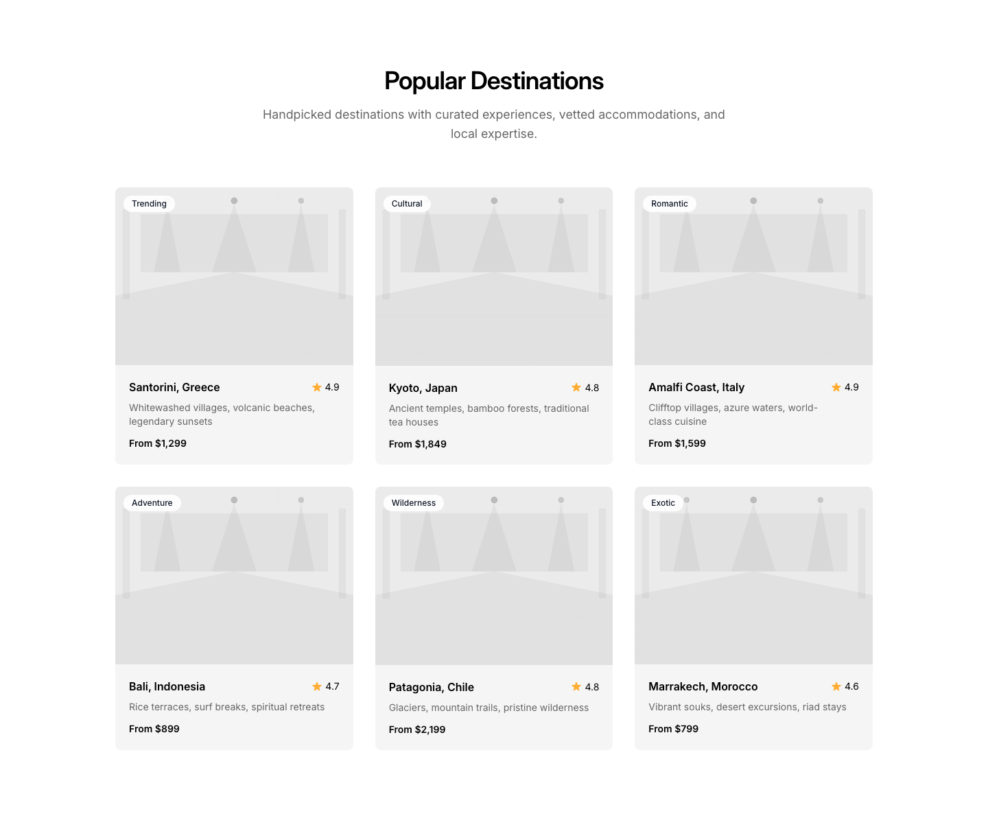
Destination
TravelDestination cards with photos, rating, and price.
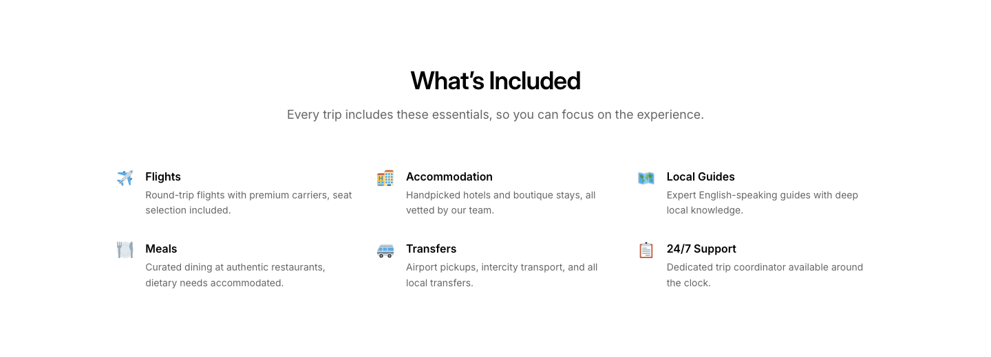
Features
TravelTrip features/inclusions grid with icons.
Gallery
TravelDestination photo gallery with location tags.
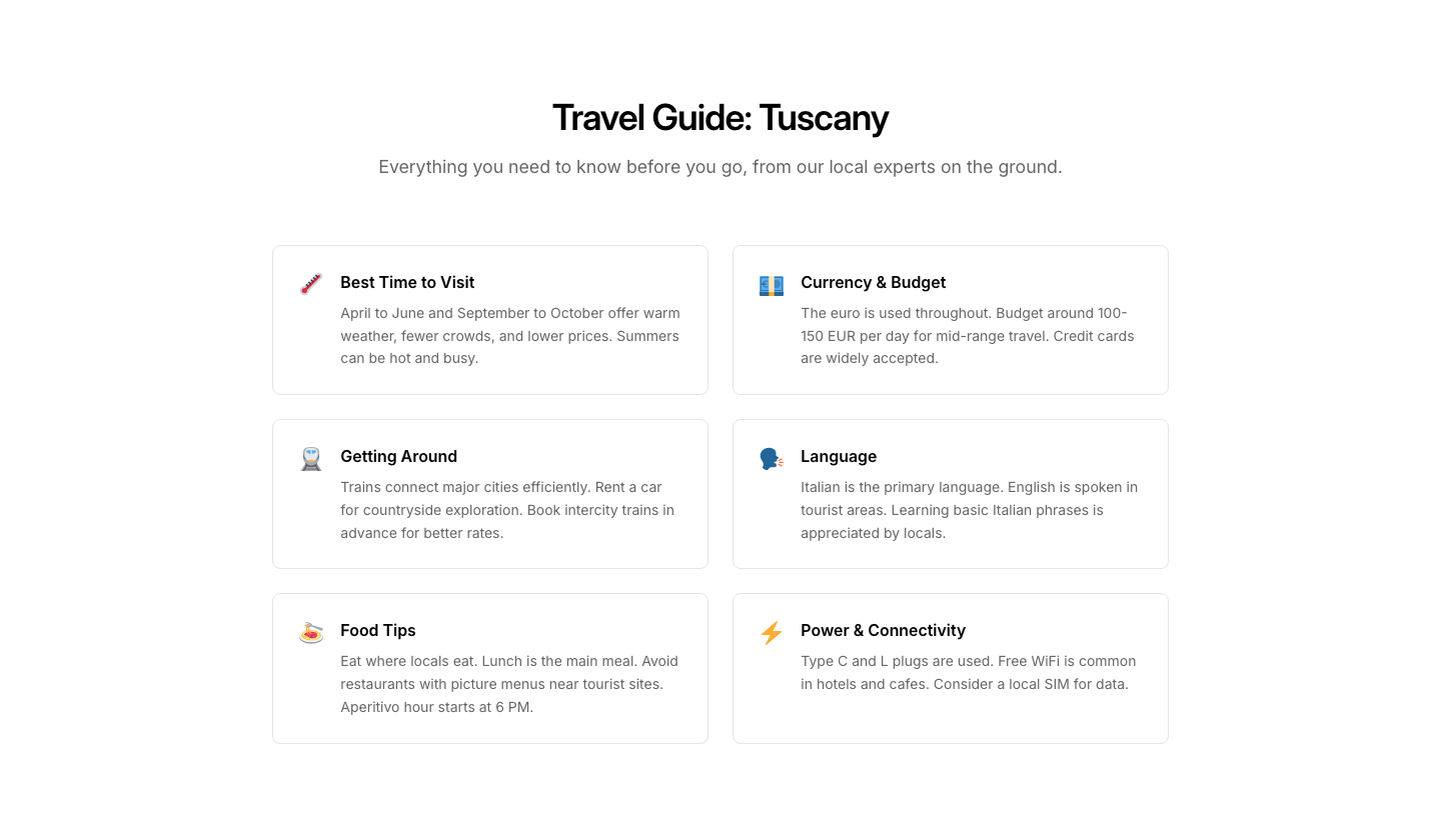
Guide
TravelDestination guide with tips and local info.

Hero
TravelTravel hero with search form (where, when, guests).
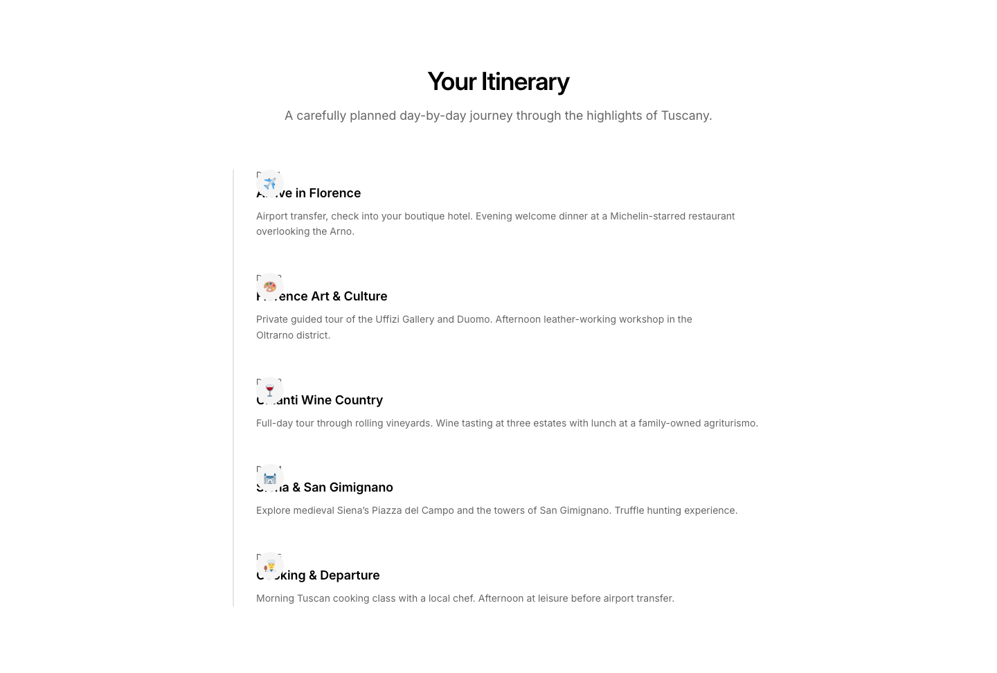
Itinerary
TravelDay-by-day trip itinerary timeline.

Map
TravelRoute map with destinations marked.
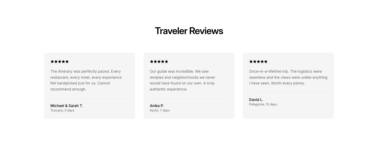
Reviews
TravelTraveler review cards with trip photos.

Featured
VideoLarge featured video with title, description, and supporting details.
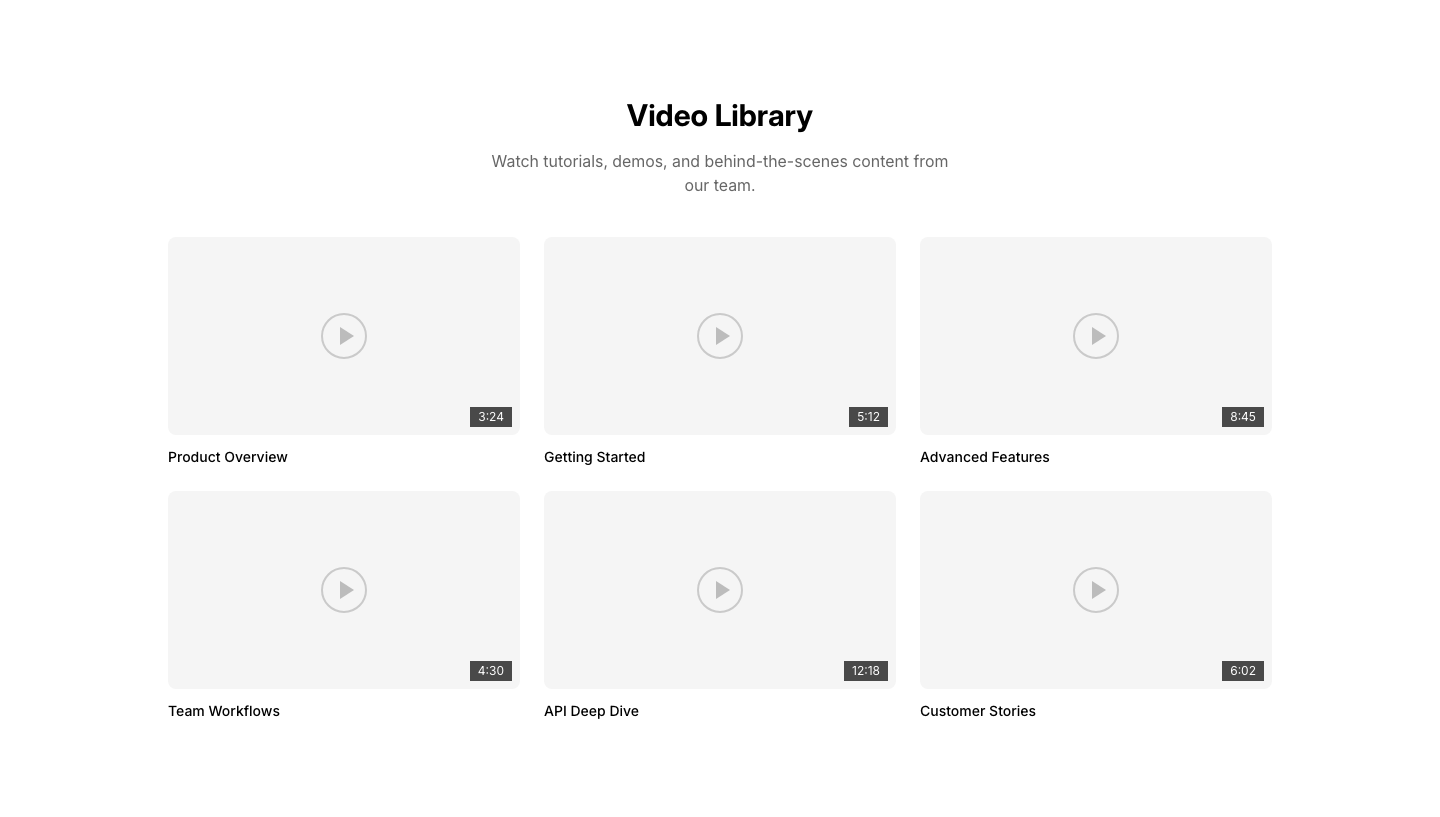
Gallery
VideoGrid of video thumbnails with play overlays and titles.

Hero
VideoFull-section video hero with text overlay and play button.
Inline
VideoInline video player with heading and play button overlay.
Modal
VideoVideo thumbnail with play button and optional caption.
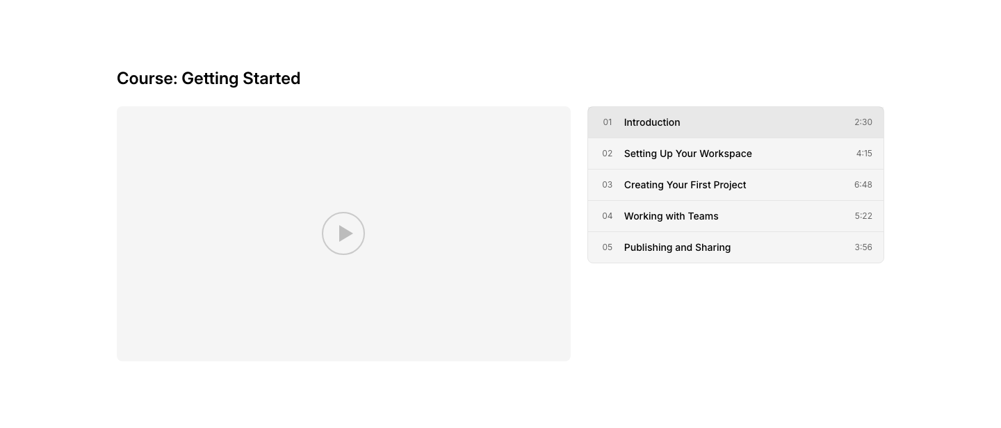
Playlist
VideoVideo player with sidebar playlist of episodes or chapters.
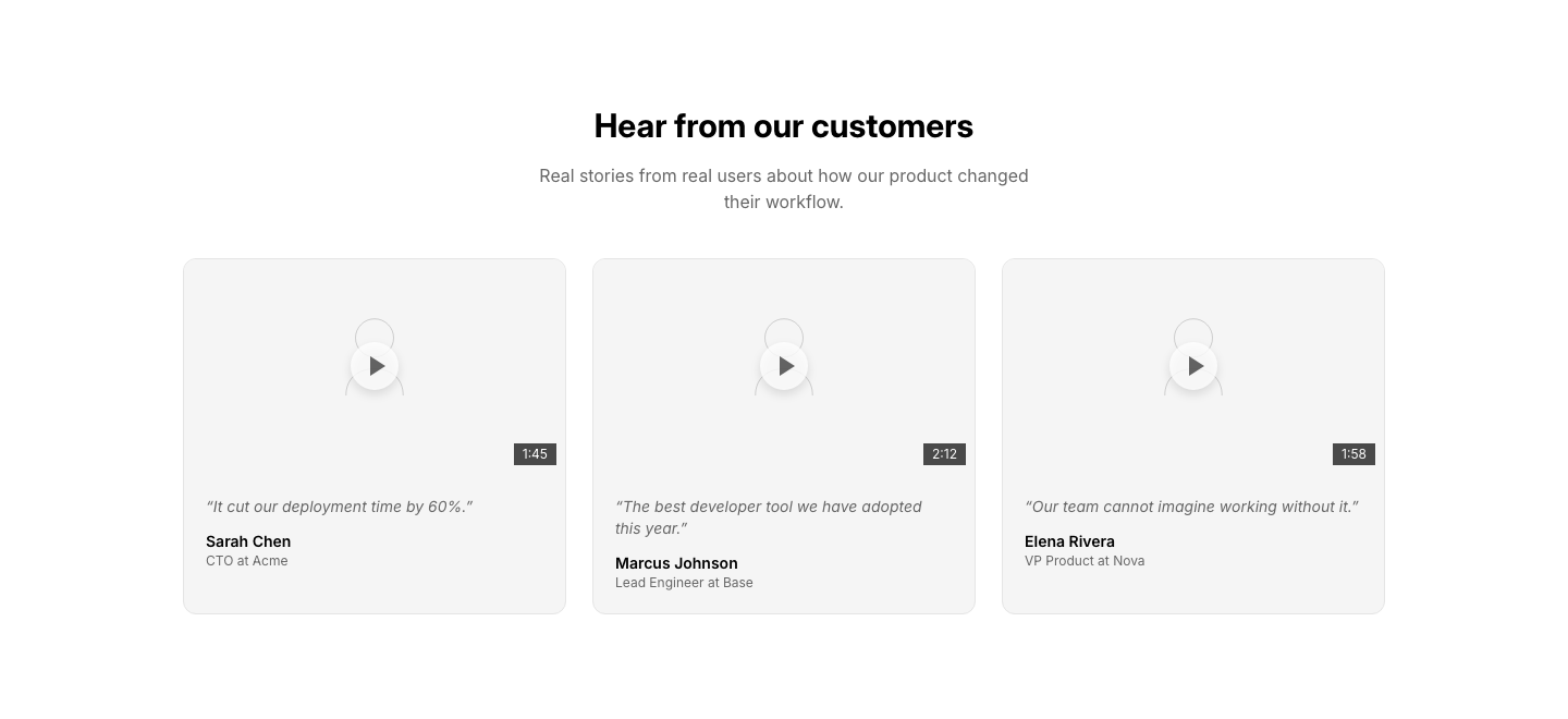
Testimonial
VideoVideo testimonial cards with customer quotes and play buttons.
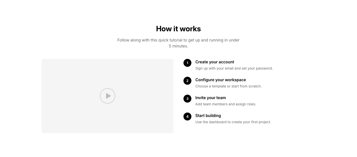
Tutorial
VideoStep-by-step video tutorial with numbered steps and video player.

Current
WeatherCurrent weather display with temperature and conditions.
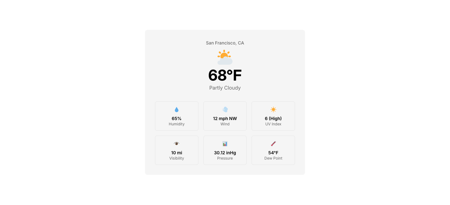
Detail
WeatherDetailed weather with humidity, wind, UV index.

Forecast
WeatherMulti-day weather forecast strip with icons and temperatures.

Minimal
WeatherCompact weather widget with icon and temperature.

Widget
WeatherCompact weather widget card with conditions and details.
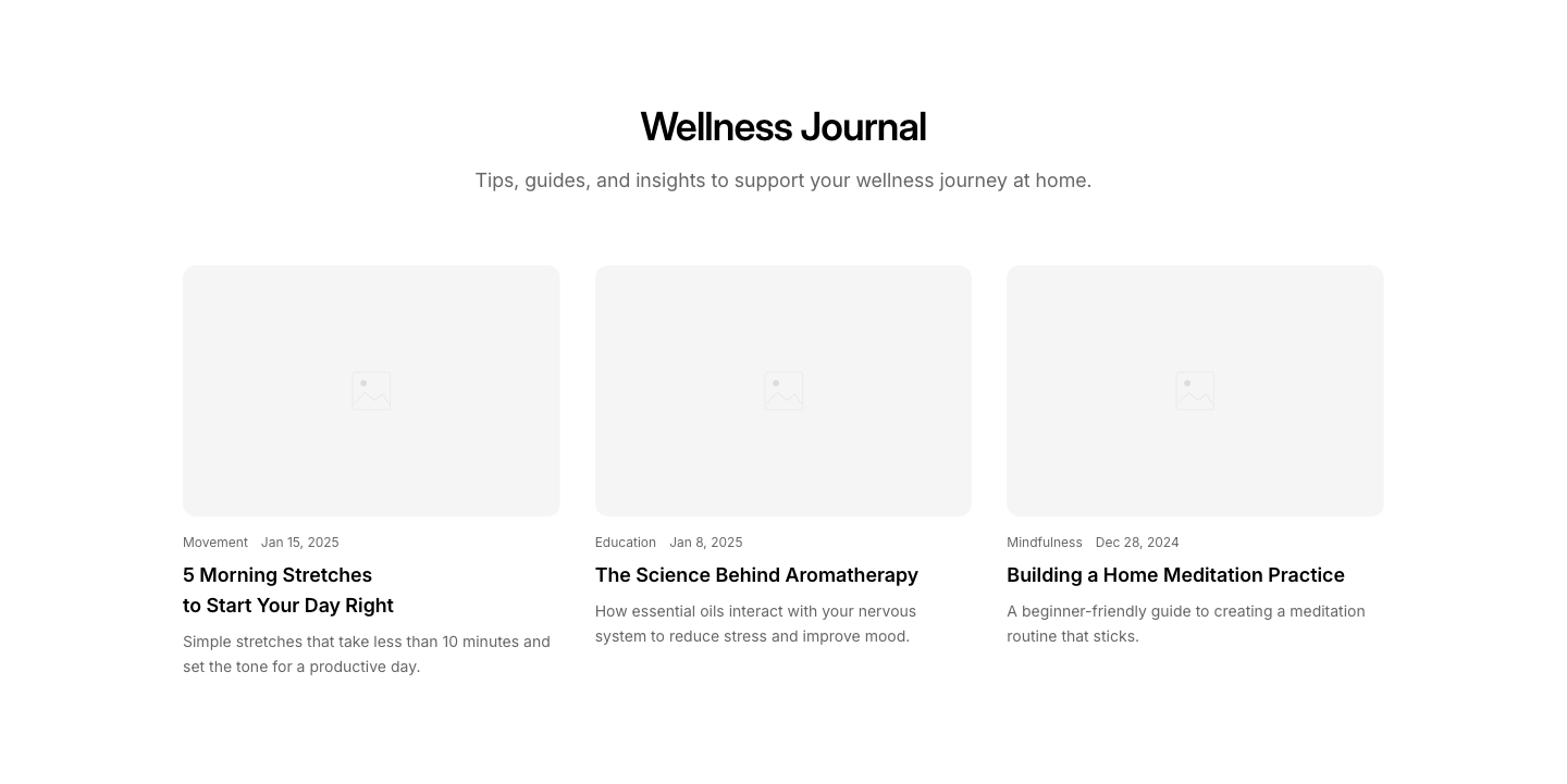
Blog
WellnessWellness tips and articles blog section.
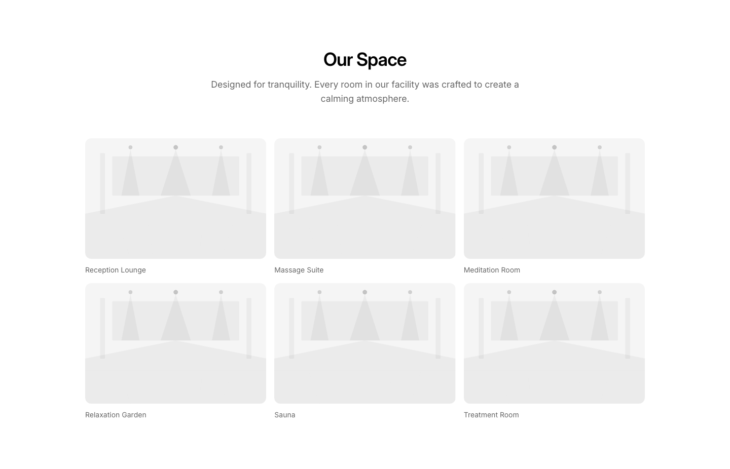
Gallery
WellnessFacility and treatment room photo gallery.

Hero
WellnessSpa/wellness hero with calming imagery and booking CTA.
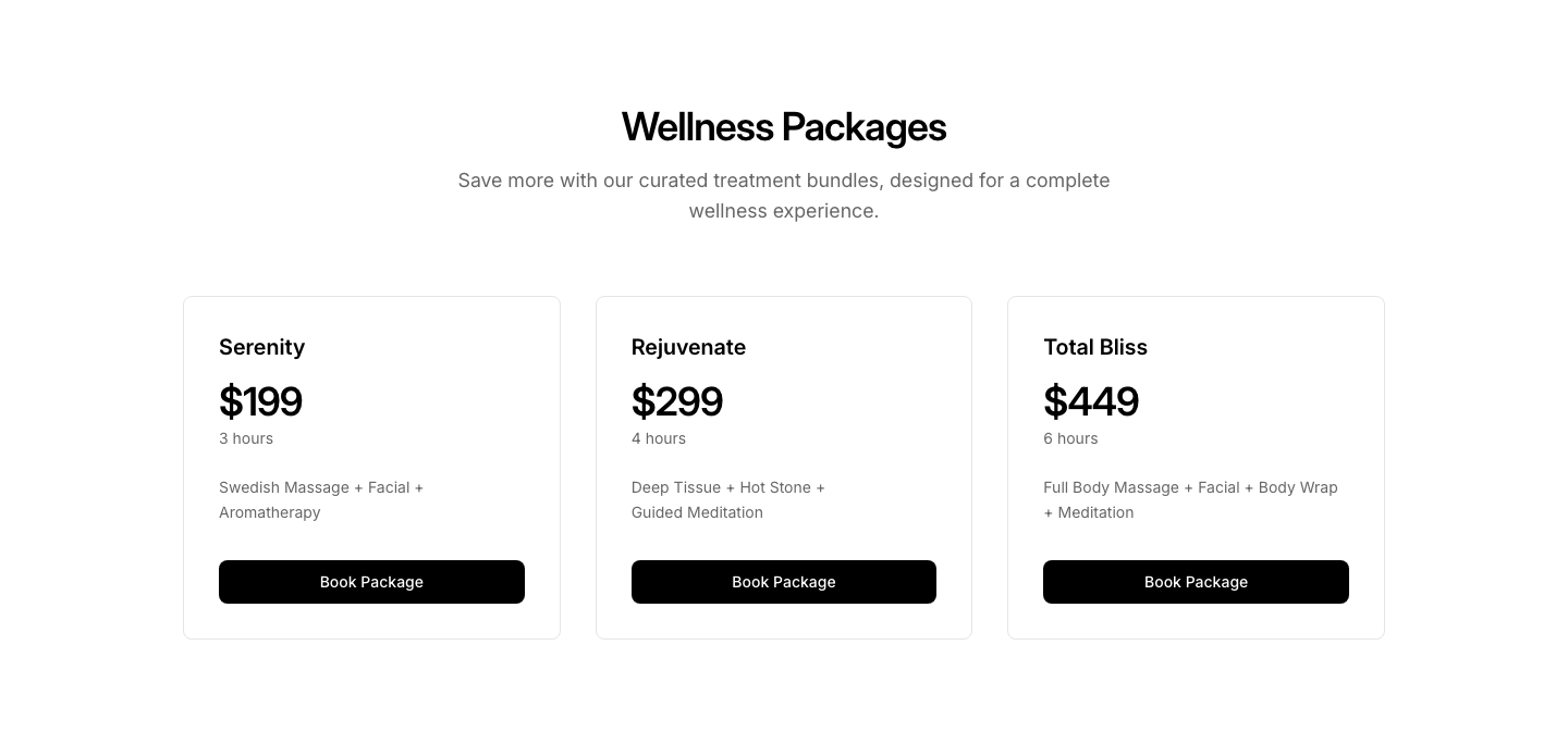
Packages
WellnessWellness package deals with included treatments.
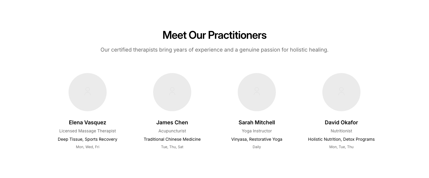
Practitioners
WellnessPractitioner cards with specialties and availability.
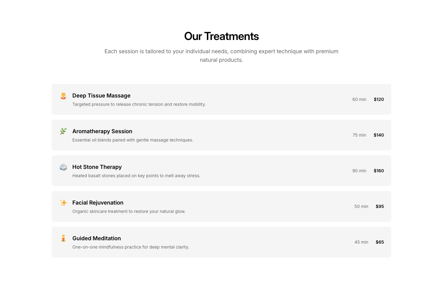
Services
WellnessTreatment/service menu with prices and duration.
No blocks match the selected categories.